Presentation and evaluation: 16 page photo-zine

The zine

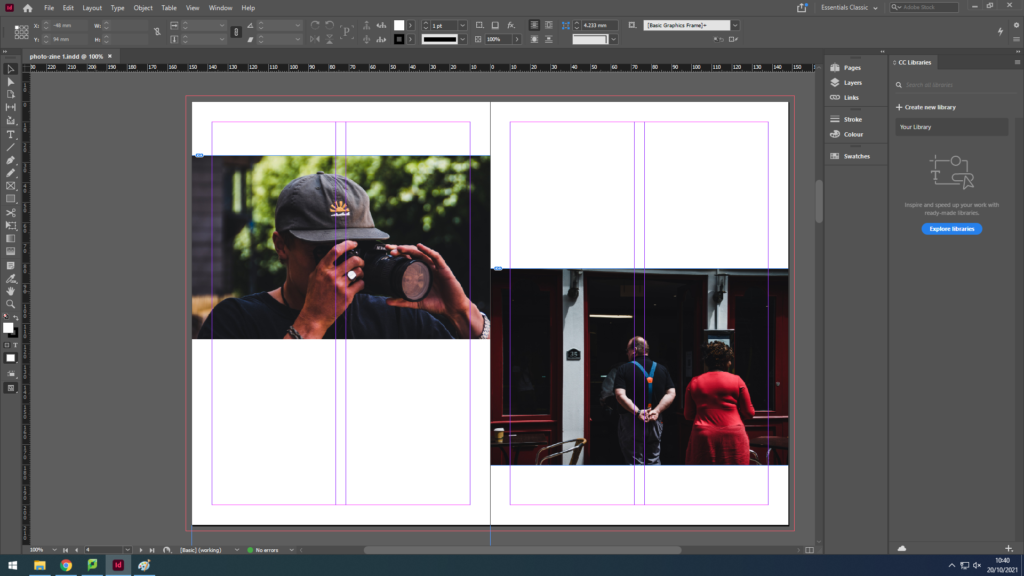
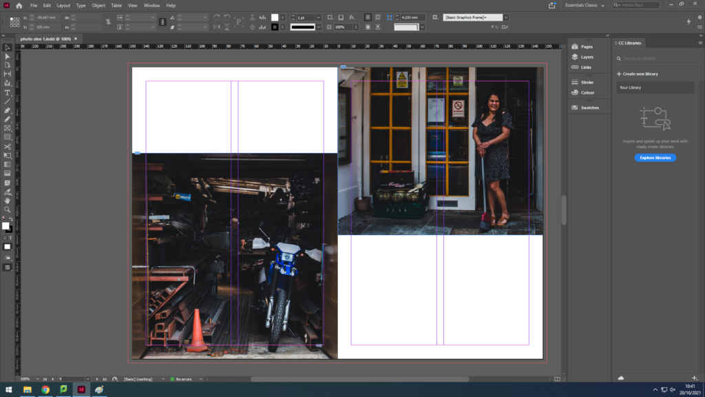
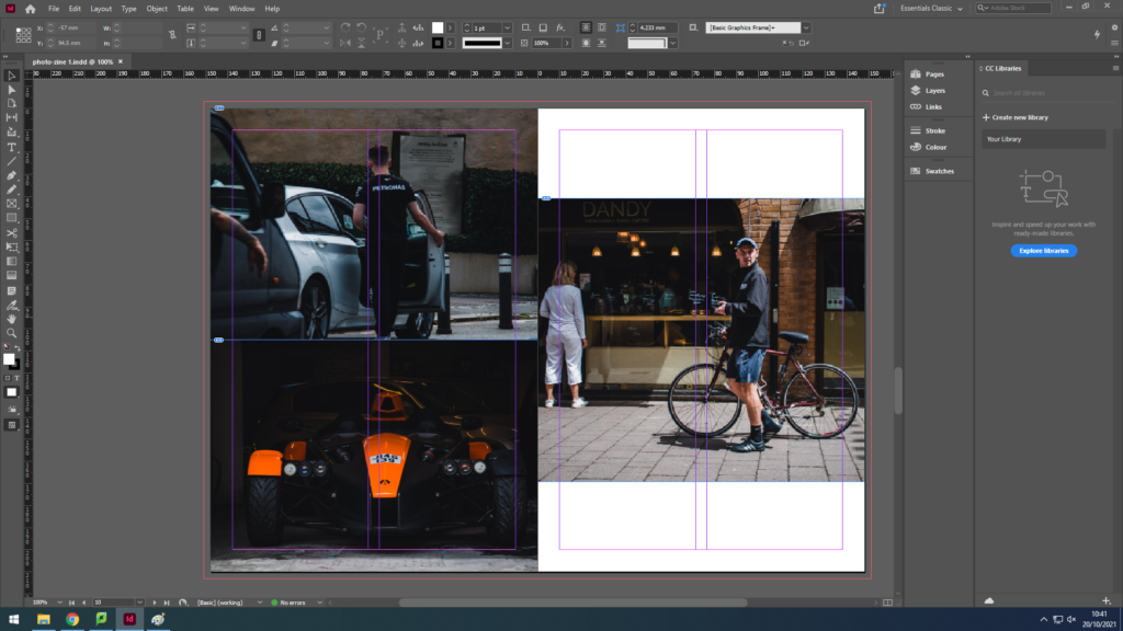
Due to printer issues, I was not able to print my zine successfully, so here is the zine in Adobe Design:

Evaluation

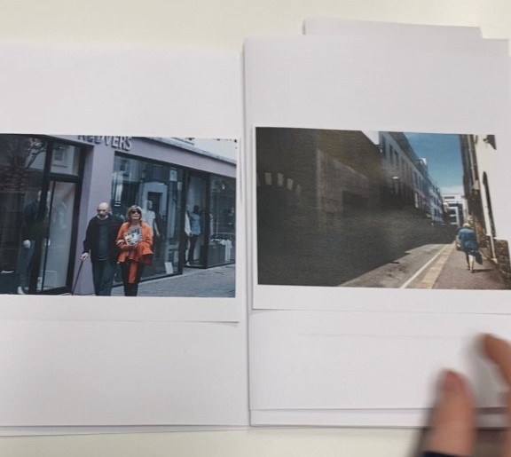
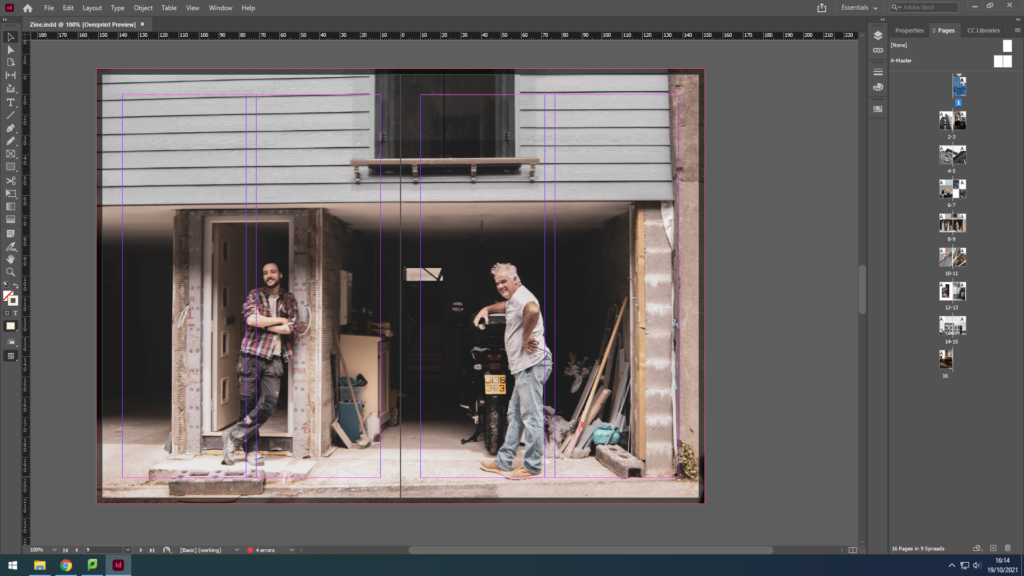
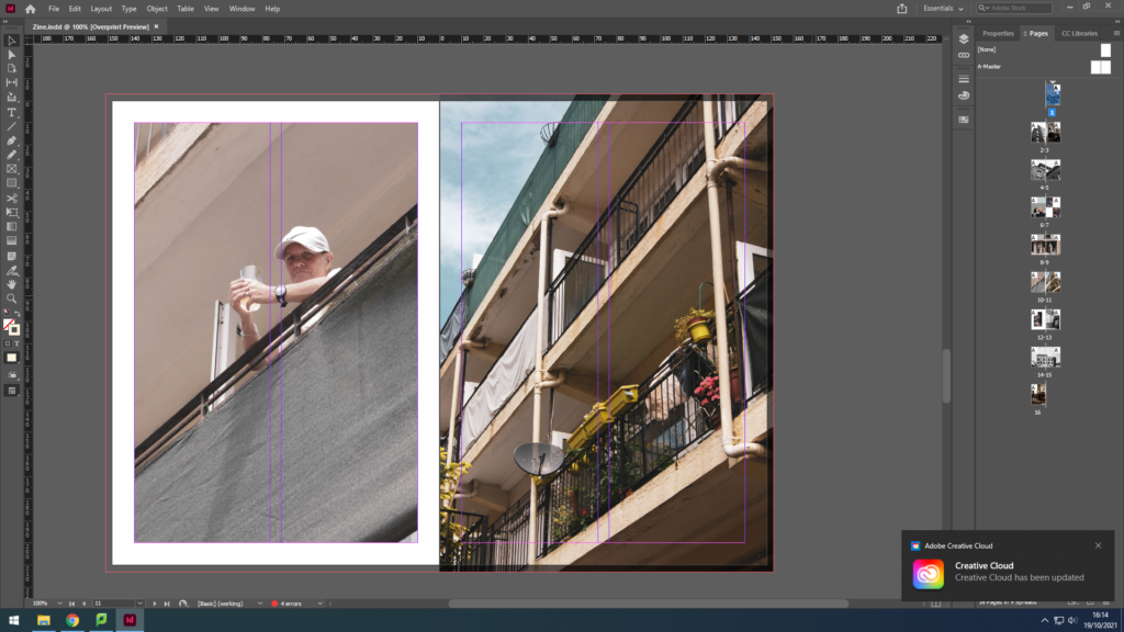
In conclusion, I believe my zine for identity and community powerfully portrays the different uniformity of the Jersey community. For example, I was able to capture the more elderly jersey community; a couple, a man waiting for his beloved, helping each other in love. I also captured the young generation; a young man fixing an automobile. To link the young and the wiser community together I have captured an adult man in his 50s in his garage fixing some items. These 3 examples can clearly show the successfulness of my zine for this project, for, not only does it juxtapose between the old and new generation, but it also makes sure to relate to the ways every individual is unique in their own way, such as, the photograph with the elderly couple gives a sense of unity, dependent on each other whereas the other images show a sense of individualism offering the idea that dependence is old-fashioned, and individualism is the new style.

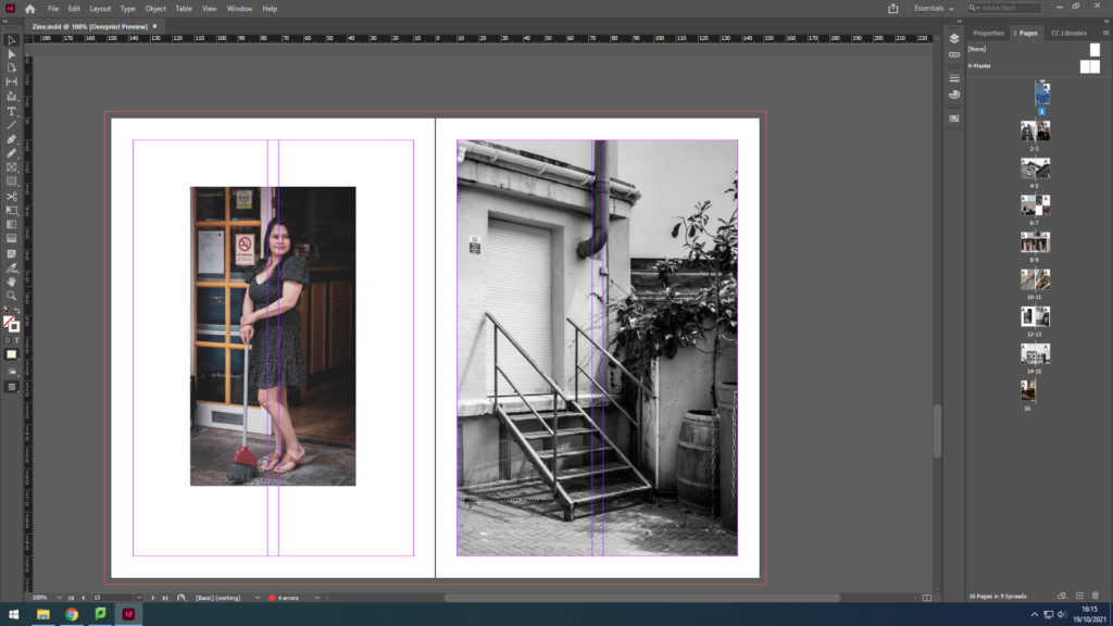
Although, the zine also manages to illustrate other cultures. For instance, we can see a woman, dressed in black who has Asian heritage; she is standing outside the Gradees restaurant as an attempt to allow the residents to taste different foods from her culture like Half Roast Duckling with Orange sauce, which is a common dish in some lovely parts of Asia.

Therefore, we can understandably observe the prosperous of this zine on Identity and Community.

Animation Workshop

In this workshop we were shown how to animate a simple 2D image in Adobe After Effects. We were given a pre-set image with components to move around. We set keyframes for the different components to move them in co ordination with each other.

Here are the keyframes i used t create the animation:

Below is my final animation from this workshop:

Photo Zine

We used Adobe InDesign to create a photo zine of our photography throughout St Helier. We set boarders on the pages to make the images symmetrical and even, and imported out best edited photos from the shoot into the program. I then selected photographs that fit together well to be presented on each page, without over packing the page and cramming photos in. I decided to have some pages with one full image, these images were usually the clearest with high contrast which had a larger impact on the viewer. Other pages had smaller images with up to 2 photos on a page and 4 images on a double page spread. I chose my cover image because of the contrast between the two sides being white with highlights and the other being dark with shadows in the background. I also liked this image because the subjects stayed in the same position that they were in before we walked by to take photos, showing a glimpse into another persons life.

Here are the final pages of the zine screenshotted on Adobe InDesign.

Making a Zine

Once I had chosen and edited my favourite/most successful images, I had to decide where to place them, how to place them and in what order. I began by laying all my printed images (small) on a table and visually putting them into groups and pairs. I made these decisions by looking at certain colours, shapes of the photographs as well as what they were of.

I then took 4 sheets of a4 paper and folded them in half creating a booklet of 16 pages. I made decisions of what images should go where and I stuck them down roughly in the booklet. This was my template to work from.

This then allowed me to easily design my zine in InDesign. I did change a few things and added colour to the background to some of the pages.