Zine making on migrant communities

What are zines?

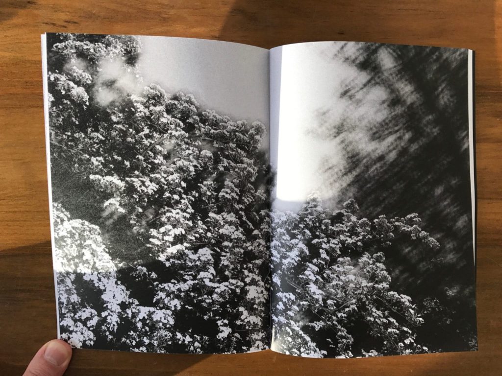
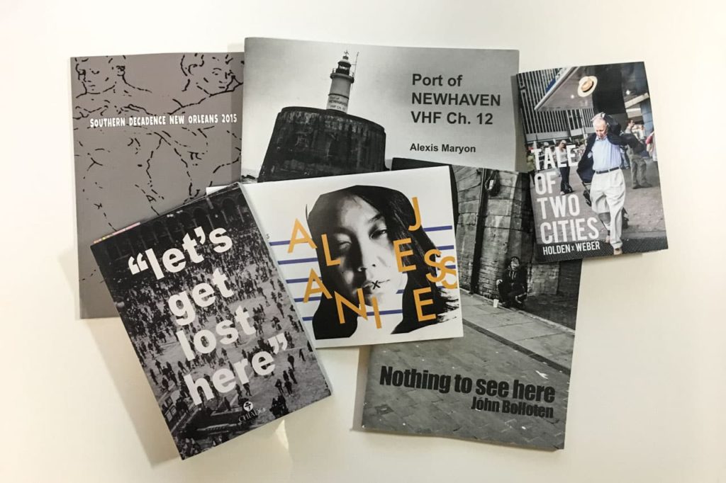
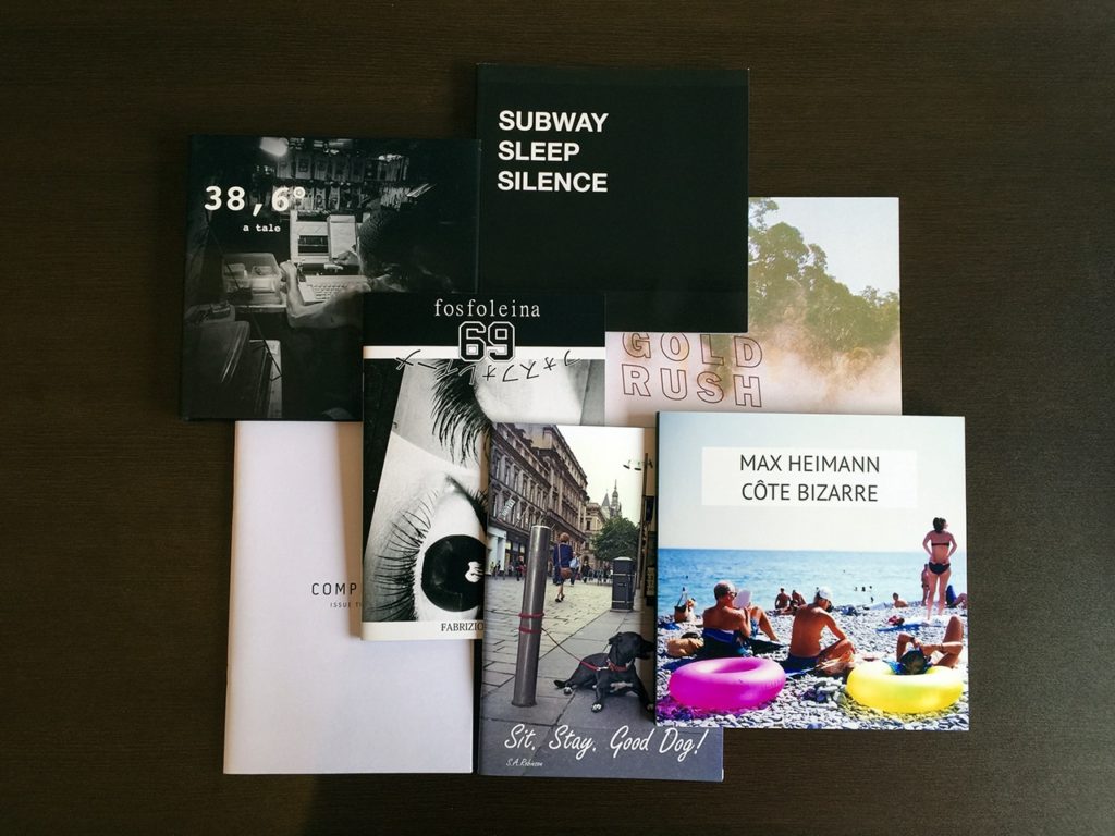
A zine is similar to a magazine; a series of images to present a project of choice in a physical manner.

It allows the artist to control and narrate their own story in the way they find best.

They may include writing but, commonly zines are quite empty in literature but are rich in emotion since an image speaks 1000 words.

The author has the ability to use visual stimuli to express a series of emotion and narrative.


Planning

For this project I will work in Microsoft InDesign since it allows for an easy make of zines.

Front and back cover:

  • Full bleed on both sides
  • Image has to wrap around both covers

Inside pages:

  • The inside images will be allocated differently. For example, in some pages we will have a landscape image with a full bleed, some we will have a series of images in a half diamond shape, in others


How I produced my Zine:

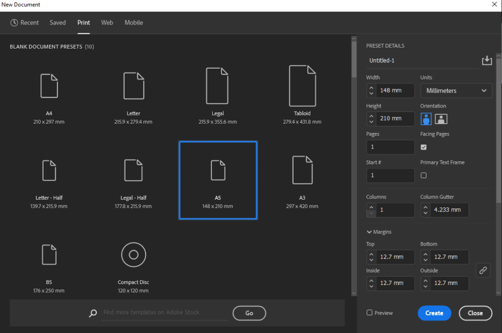
Firstly, I opened Adobe InDesign and selected the A5 pre-set which automatically creates the document in the right size:
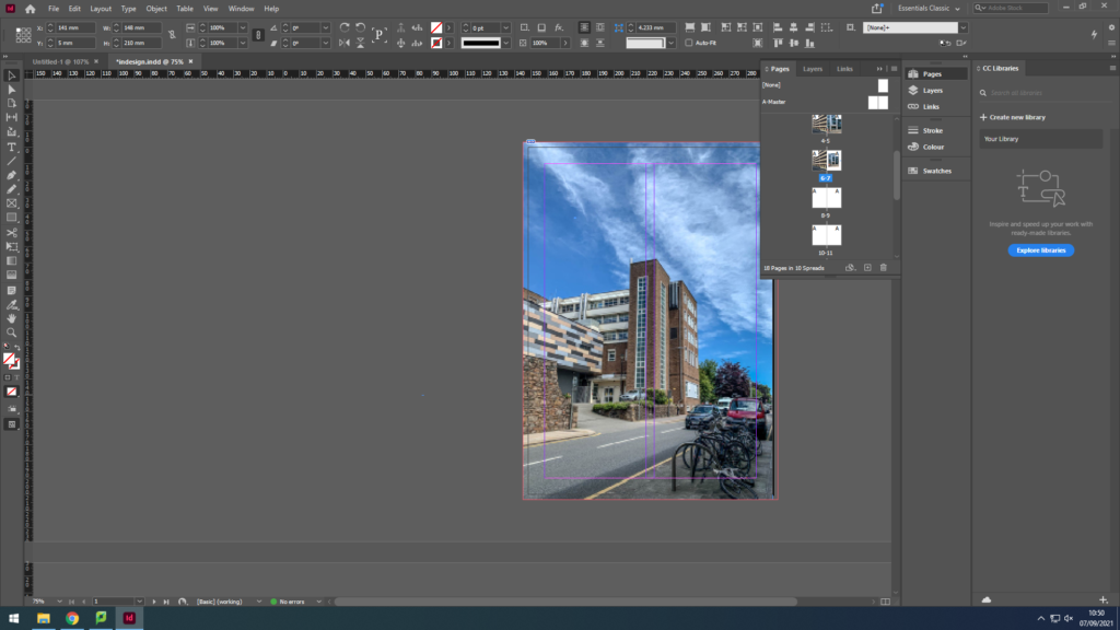
I then started creating my main page with the bleed:
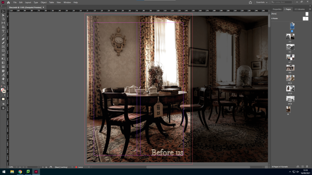
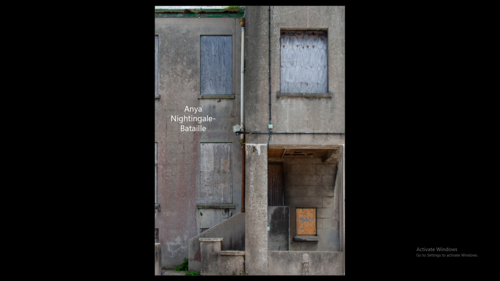
In order to achieve this I had to resize the original image on photoshop in to the right size so that it fits this frame perfectly, and creates a perfect bleed.

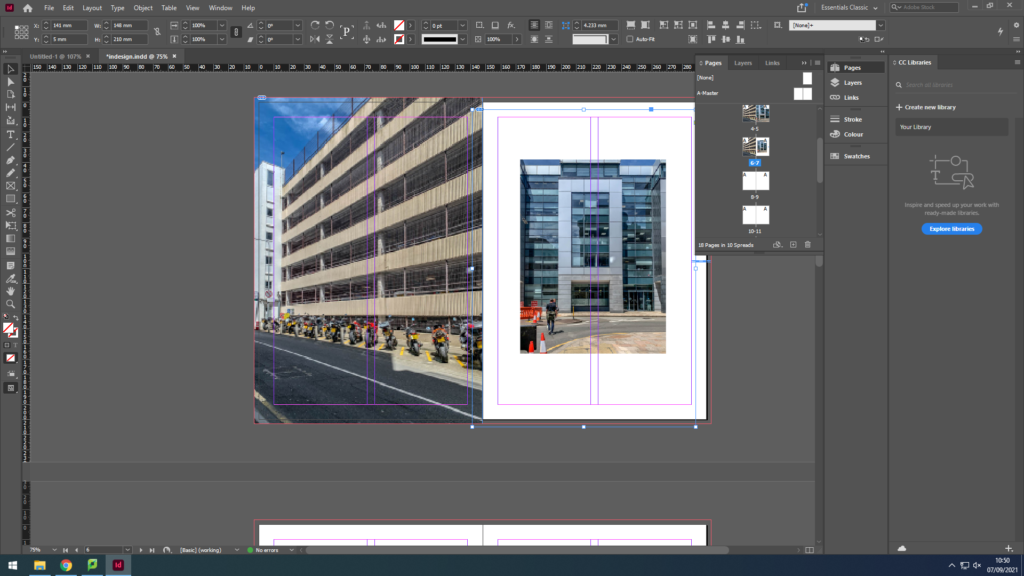
I then started inserting my images by creating an image box and going to file > place and selecting my images.

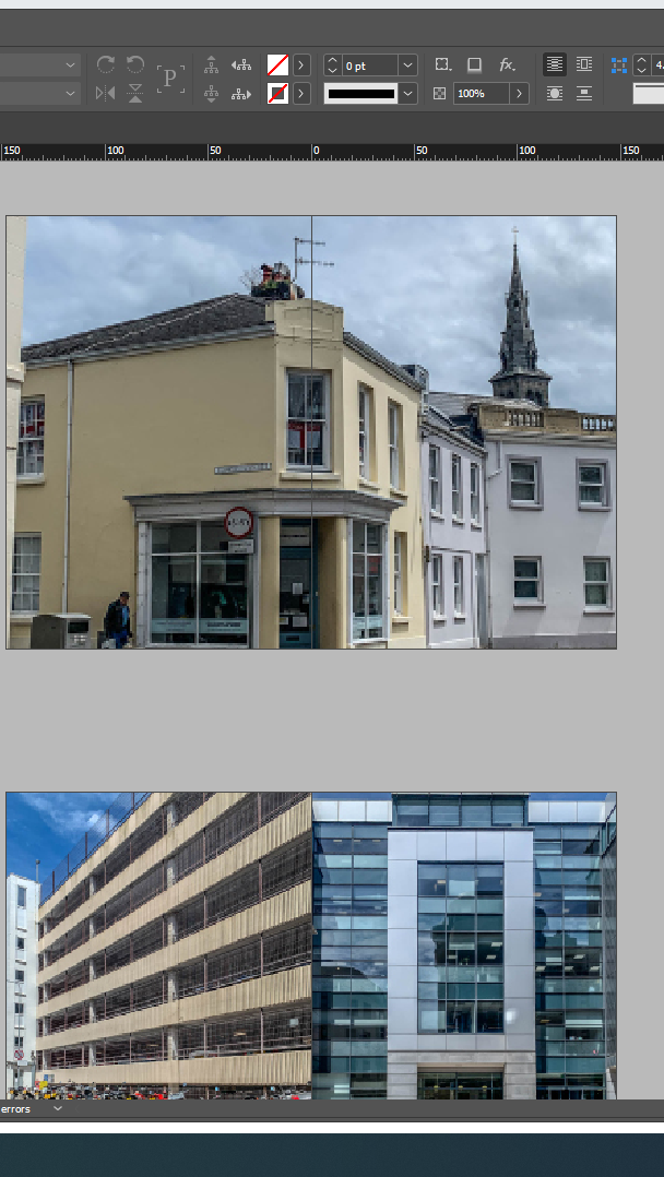
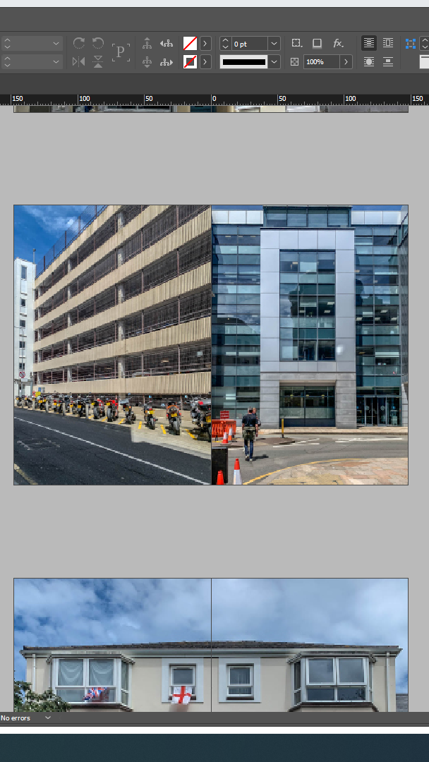
Often I’d select similar images and insert them in a 2 page layout. Such as:
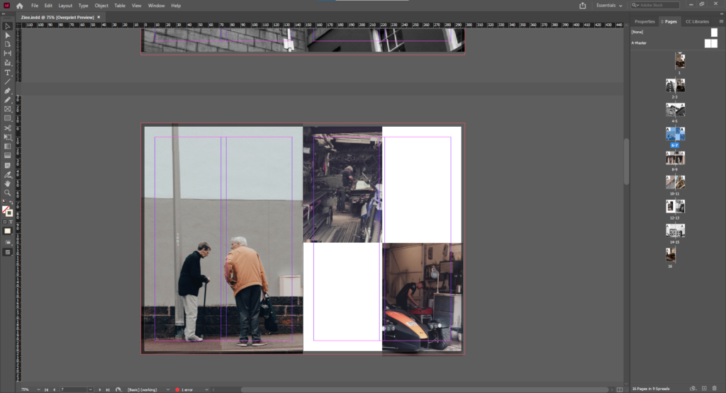
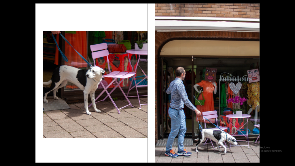
Here we can successfully see that I have selected the images which have the back of people’s heads and creatively placed them so that they relate in a way.

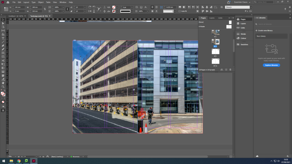
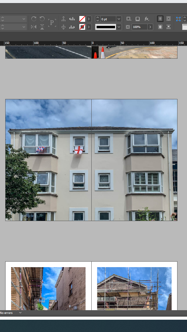
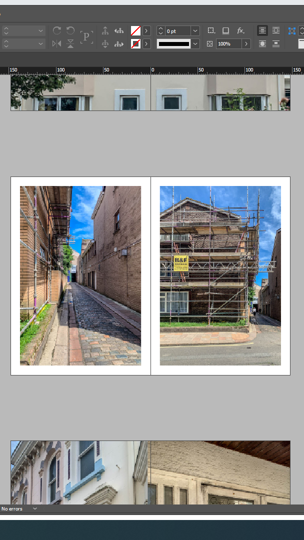
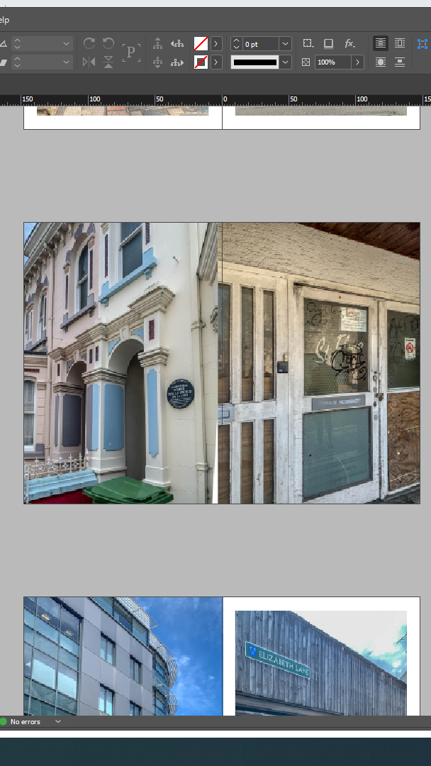
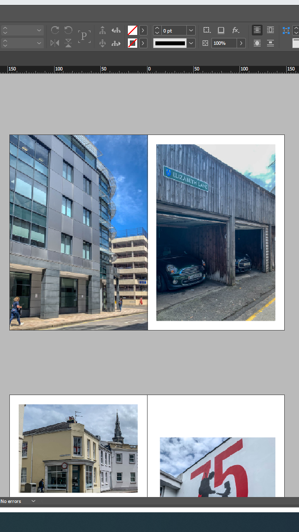
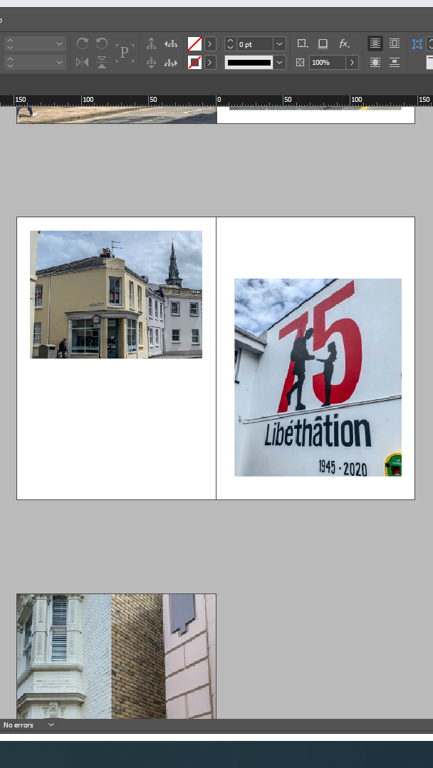
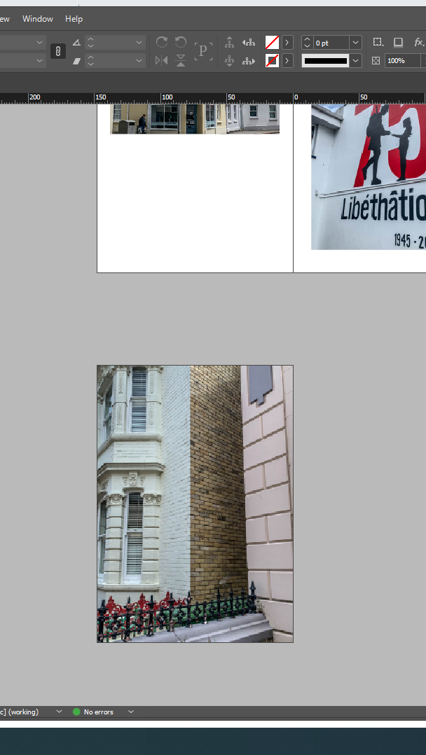
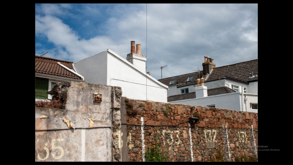
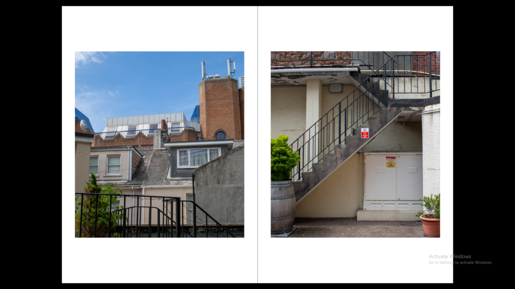
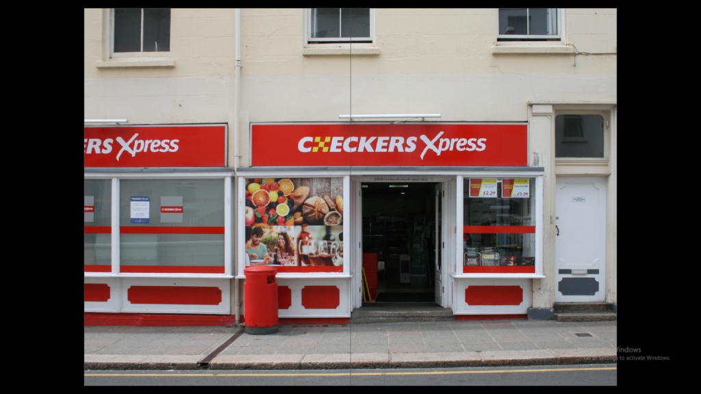
Similarly, I put the pictures that relate to a building together, for example:
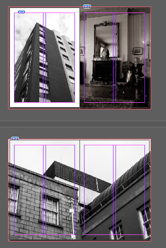
I kept adding images that relate together in my zine in order to formulate a type of story, such as: the community that came before us vs the new one all work together to make the present community.


Justification

I agree to a large extent that my zine making is successful, this is because the location of my images in the zine are aesthetically appealing to me and work towards telling a story. However, in my opinion the zine needs more pictures so this is something I will take into consideration when producing my next zine.

editing on InDesign

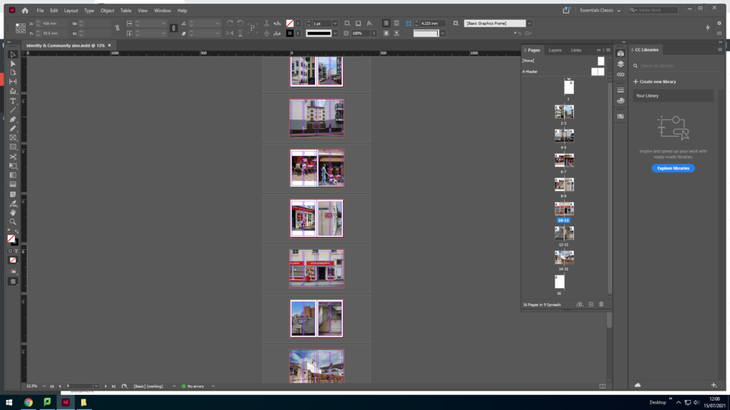
To start off my scenes project, I have been editing everything on InDesign. This software allows me to create a small booklet of all my chosen photos I wanted to use as seen in my previous blog posts that I have edited through Lightroom. Here is my process of how I created my small booklet;

First of all, I had created 16 pages and make sure all the measurements were correct when setting up the layout of m small booklet. I then inserted all my images on each page using a square drop tool and clicking Ctrl + D to insert my photo, which I previously planned out when I created a paper copy version of my scenes booklet. This allowed me to not waste time and already have the order of my images ready and figured out. it took me a while to figure out what size I want my images to be as I had the options of making them really small and position them anywhere I want or make them full bleed which covers every cm of the booklet. I wanted to make sure I have an even amount of sizes distributed across my booklet- where I made some pages full bleed and on the remaining pages I left a white border around the images.

As you can see it took me a while to figure out whether a full photo or white border looked better which is my I normally copied and pasted my pages several times to experiment with the images and see which one I like more and then delete the duplicate copy of it which I no longer wanted. I think it’s important to have a variety of different layouts to make the booklet interesting and not be very repetitive as I think that can be quite boring sometimes for the viewer if they’re consistently flicking through the same page layout.

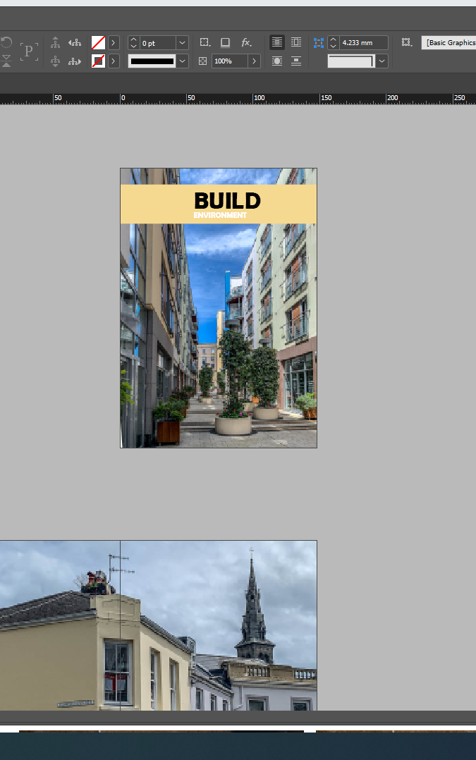
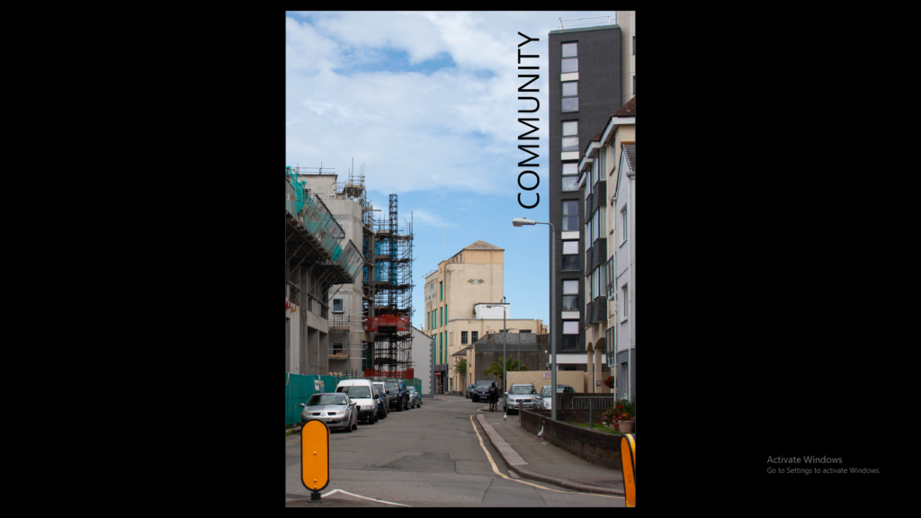
this was my front cover to start off with however I completely changed it after experimenting with different images and realising I had more interesting images to use as the first page which I then added a title on top of as well as a collum block to add some colour. here is the finished front cover…

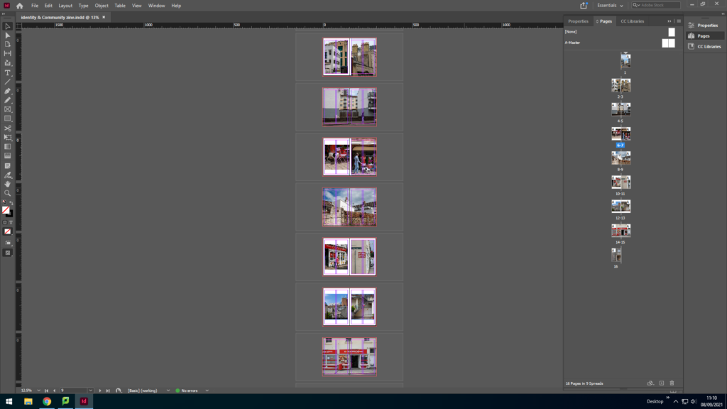
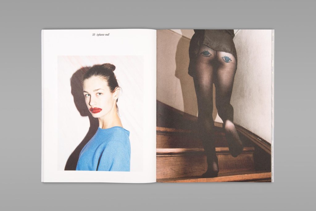
once I was finally happy with every image on the page I made sure I had a variety of different layouts which ill insert here;

and that is my finished booklet with 16 pages, all edited and with different image layouts which I created on InDesign.

Identity + Community: Zine Design and Layout

A photo zine is a collection of photographs laid out in a magazine style. It can include written text as well as photos. They are made to display a photo story.

Research + Analysis

Layout Ideas:

I want to focus on the idea of community and how people have different lives which they encounter different people around town (St Helier). I want to mix neutral tones with bright bold colours to create a contrast throughout the zine to emphasise both colour pallets. I will keep the zine background white.

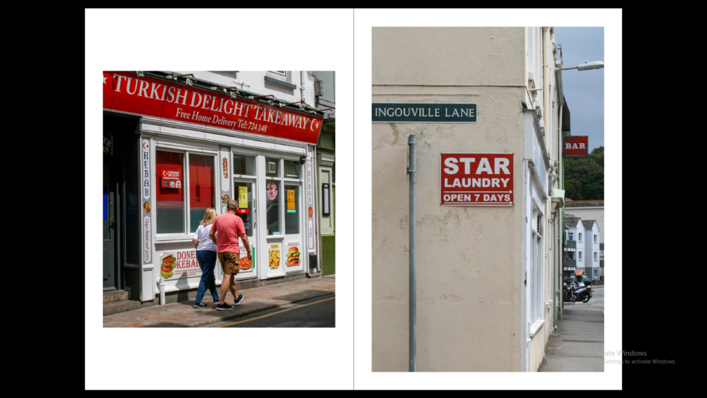
I will include different sized images including double page spreads and square photos. I will keep a maximum of two images per page so the images are still large and it creates space in the zine.

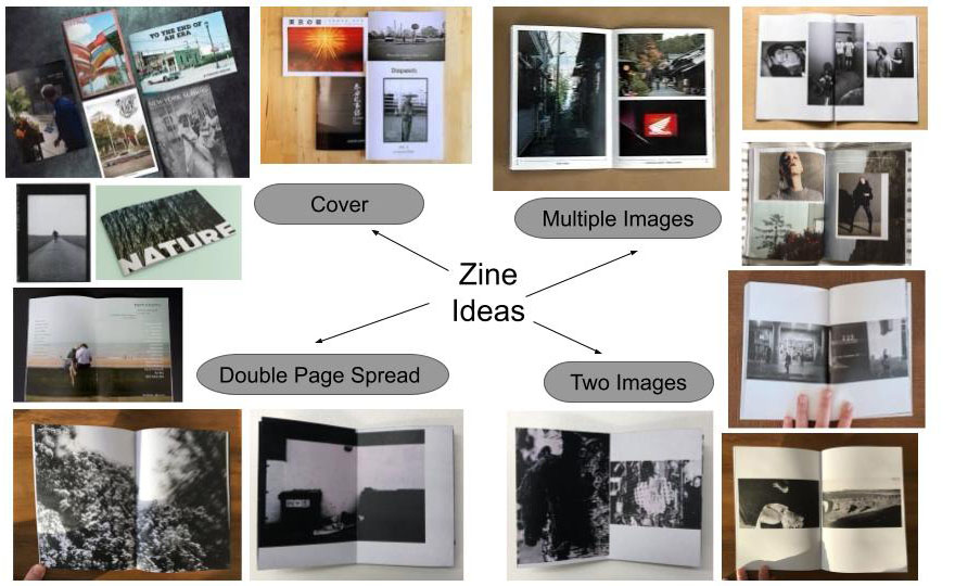
The images which will be sharing a double page spread will be sequences or different images portraying a similar story but perhaps contrasting.

I will not add any text throughout the zine but will add the title ‘community’ and my name on the back cover.

Using InDesign

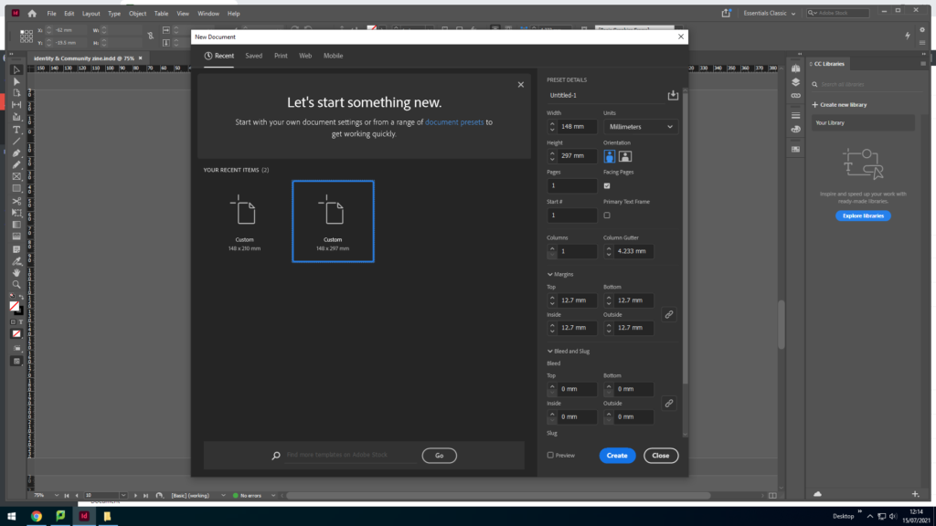
I opened a new document and set the settings to:

This image has an empty alt attribute; its file name is image-124-1024x576.png

Width: 148mm
Height: 210
Pages: 16
Orientation: portrait
Columns: 2
Column gutter: 5mm
Margins: top, bottom, inside, outside: 10mm
Bleed: top, bottom, inside, outside: 3mm

This image has an empty alt attribute; its file name is image-117-1024x576.png

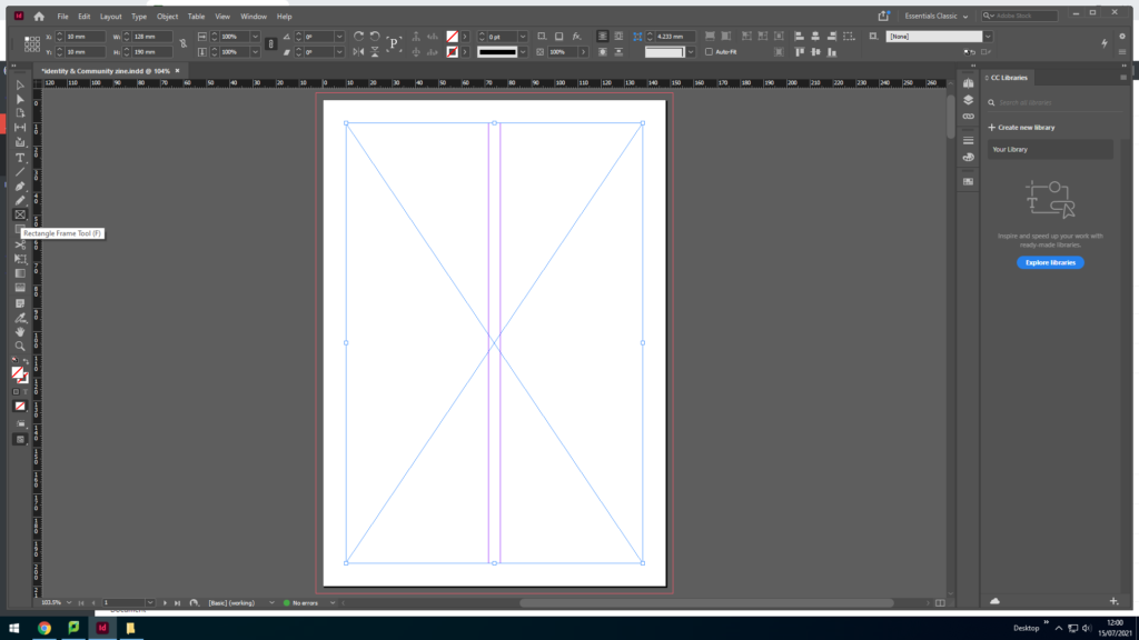
I used the rectangle frame tool to make a box for the image I am going to export.

This image has an empty alt attribute; its file name is image-119-1024x576.png

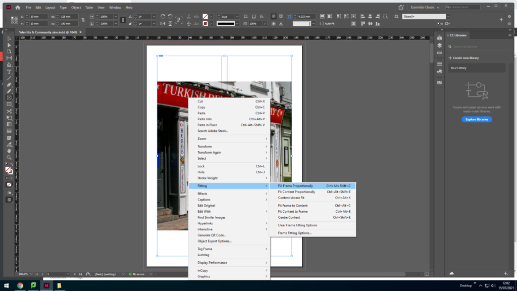
I pressed Ctrl D to export the image into the box then right clicked and pressed fitting to get the image to fit inside the box.

This image has an empty alt attribute; its file name is image-120-1024x576.png

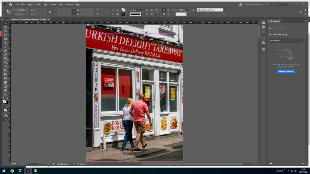
After fitting the image to the box I dragged the image edges to fit to the orange line (the bleed) so that there will be no white edges. To make the image fit I right clicked and went onto fitting and selected fit frame proportionally.

Experimenting + Designing

Layout 1
Layout 2- preferred

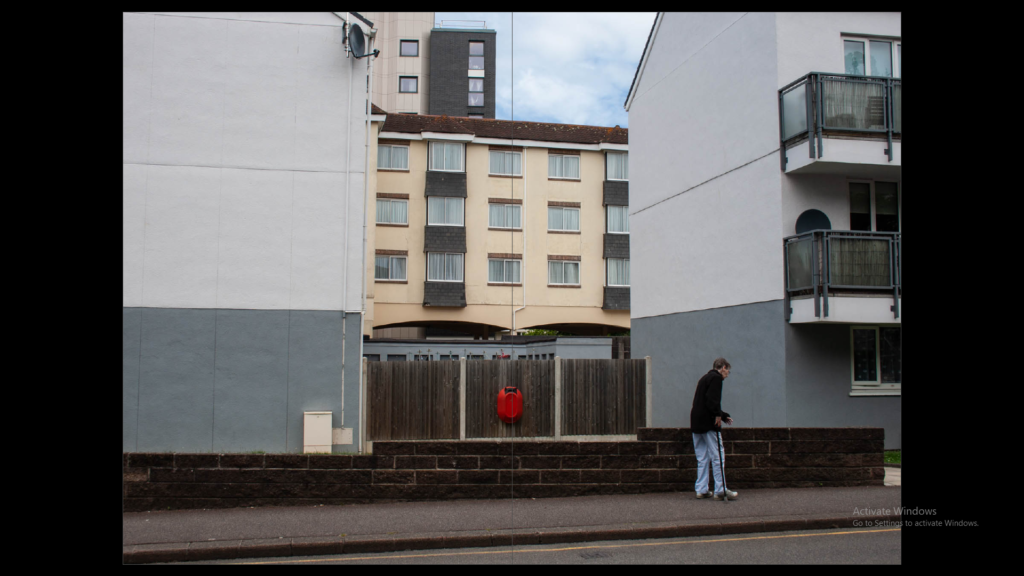
When planning the layout of the images I made sure to go for images which tell similar stories by having the same or similar settings. I focused on the title ‘community’ and went for mainly landscape pictures rather than people. The photos of people that I chose were street style photos which were not staged, catching them in their day.

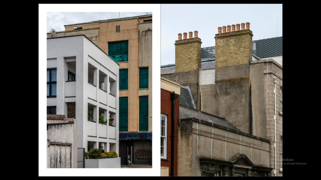
The story I wanted to portray was an average day out in Jersey St Helier but also focusing on new and old. For example the first double page has two different old buildings but it contrasts with the newer buildings. the other pages focus more on landscapes and shops within our community and lifestyle.

Final Layout

page 1
page 2-3
page 4-5
page 6-7
page 8-9
page 10-11
page 12-13
page 14-15
page 16