
Using Indesign, I have created a zine of the images I took over the two photography walks in town linked to identity and community. I have also used titles and a variety of images to link to identity and community.
Create new document
width: 148mm
height: 210
pages: 16
orientation: portrait
columns:2
column gutter: 5mm
margins: top, bottom, inside, outside: 10mm
bleed: top, bottom, inside, outside: 3mm
First Draft

I think the group of images above work well together because they reference different parts of society. The old car references the elderly and that the elderly are still part of the community. The image of the man with the guitar references music as a part of linking people together. The three pairs of shoes represent the idea of family and how a family is like a community. And the man holding the bin bags references the idea of working and providing for his family and community.
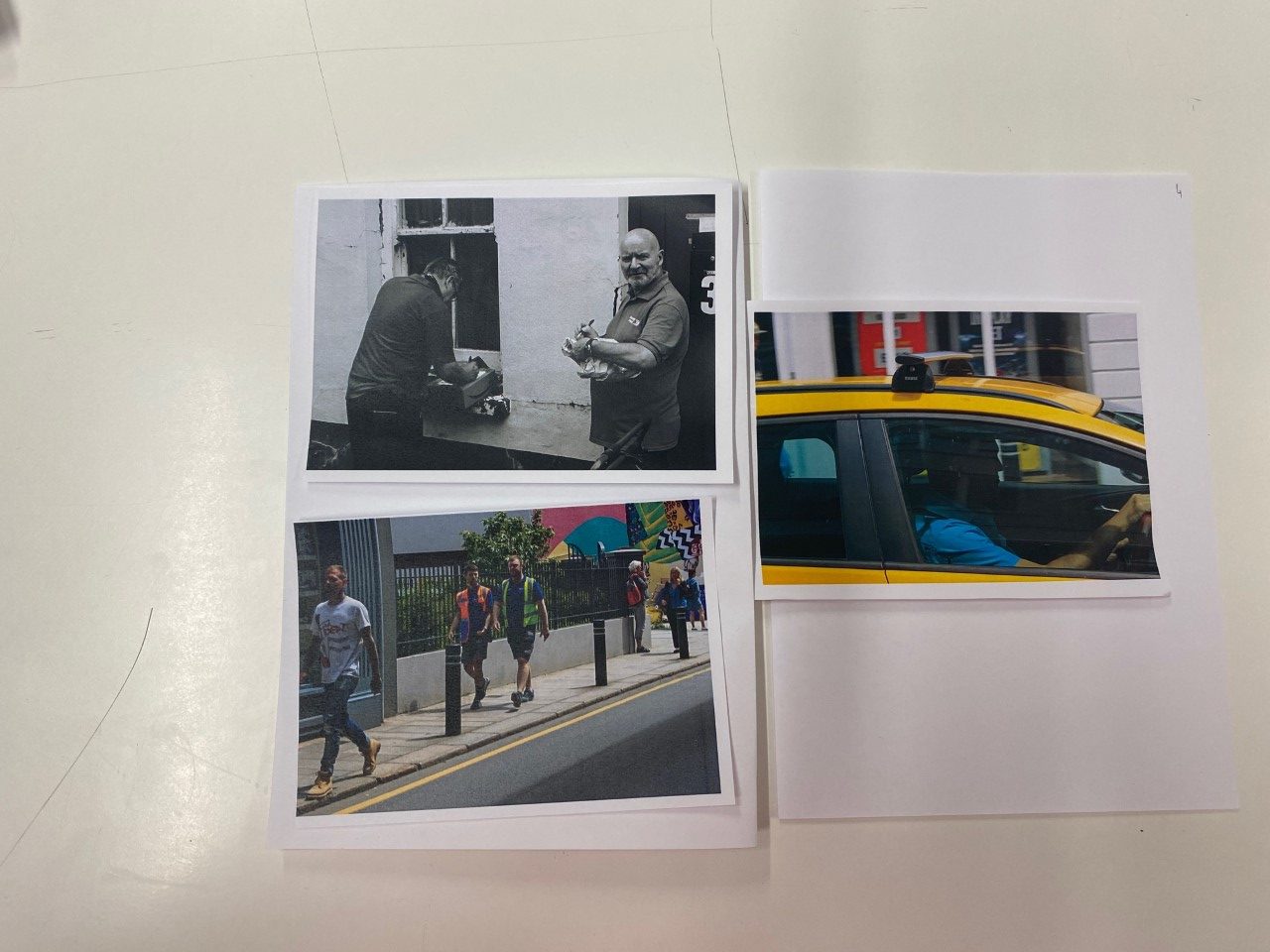
The group of images above work well together because they are candid photographs that show people in there natural environment. I like how people look when photographed without knowing so they don’t have to act in a certain way for the photo.

I grouped the images above together because the two images on the left are both old lanterns and have a good luminance and create a nice glow. I grouped the two images on the right together because they both have similar colourways and together, the two sets of images represent the idea of blue and cold looking images versus orange warm looking images.


I grouped the images above together because they all have good contrasts in bright light and dark shadows and colours.

The images above are all of writing on walls and i like the grouping of the old writing (top left) the new writing (top right), the illegal writing (bottom left) and the new but weathered writing (bottom right).

I grouped the images above together because they both use similar colour schemes and also both are artwork on walls.

Actual Design

I named the zine La Vielle Ville which translates to the old town from French linking to Jersey’s French and Jerriais (Jersey French) heritage. I also used an image of an old mural near the Jersey museum in Le Chemin Du Bel.
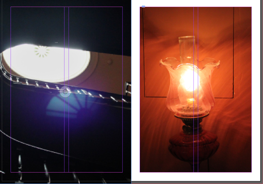
I chose to group the two images above because they both have shimmers from the light. They also oppose each other as the image on the left is very colourless and contains natural light versus the other image is artificial light and has a warm colour.

I chose to use the image above as a two page spread as the spine of the book where it folds is in the middle and looks like two different photos.

I grouped the images above as they both use the same colourway and are both murals on walls.

I grouped the two images on the left as they both relate to community. I grouped the images on the right as the one at the top is an old beer brewery and the image on the bottom right is an image of the Admiral which is a pub and links to beer.


