Design and Layout
In class we were asked to ask to create a zine with our Images from the community/identity project. To create our own zine in InDesign we followed the following instructions:
Create new document
width: 148mm
height: 210
pages: 16
orientation: portrait
columns:2
column gutter: 5mm
margins: top, bottom, inside, outside: 10mm
bleed: top, bottom, inside, outside: 3mm
It was a work of research, analysis and exploration. We explored different design, format, sizes and orientation. We were free to placed the images we wanted and how we wanted to placed them. We were also free to decide our title. This is mine: I decided to title it “Au vieux temps” that means to the old days. I wanted a title that represents the history of jersey communities. I wanted it to be in French because France is part of my identity. Then “in the old days” is an expression used in France

But what is a zine?
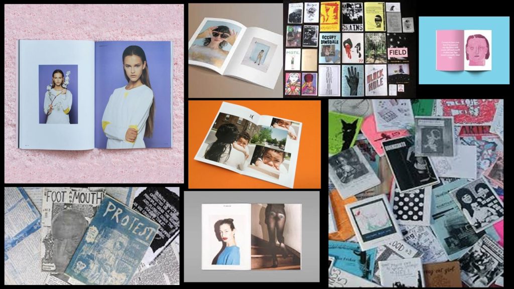
A zine is a self-published, non-commercial print-work that is typically produced in small, limited batches. Zines are created in many DIY ways, but traditionally editions are easily reproduced—often by crafting and then photocopying, folding, and stapling the pages into simple pamphlets. You also may also sewn, taped, glued them. There are no rules! People in general create zines to be more motivated, self-expression and artistic passion. Zines are usually inexpensive and sometimes distributed for free. Zines can touch on a variety of topics from music and art, to politics, sexuality, humor or even personal memoir. Their can be written, drawn, printed, collaged… Zine’s structure may be narrative, journalistic, comic-like, or completely abstract.
PRESENTATION & EVALUATION: PHOTO-ZINE
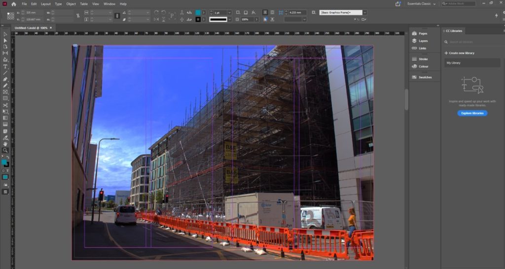
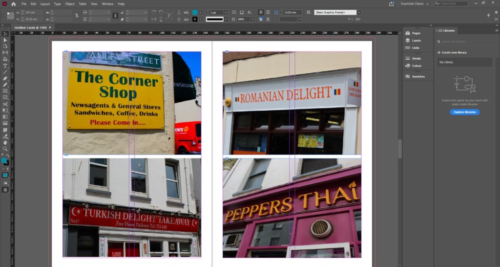
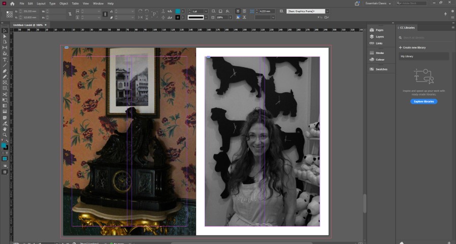
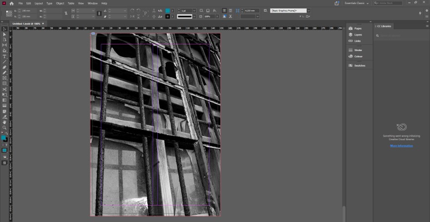
Here’s how I arranged my images. We had to have a total of 16 images with the theme of Community and Identity. I wanted the images (that are in the same page) to have something in common e.g colors, geometric shapes, patterns, people… I find that this activity has let us be creative which I appreciated


