
I have finished my Zine, which I designed in indesign.

This is the front cover, which I made in Photoshop, by using text on a path the follow the same curve as the cars roof, so that the text was parallel to the car, as it look asteycilly pleasing. I used the same blue as the car against the black background to create contrast so the text is easy to read. And I used some blending options to draw attention to the text by making small adjustments to the bevel, stroke, and the inner shadow.

Im starting the zine off with these two images of old cars. I made my favourite image larger by making it full bleed. This works as the cover image is the same as the image on the right, however it is zoomed in more. I have set the theme with the cars which allows me to shift the focus to the newer cars and mechanics and their work place.
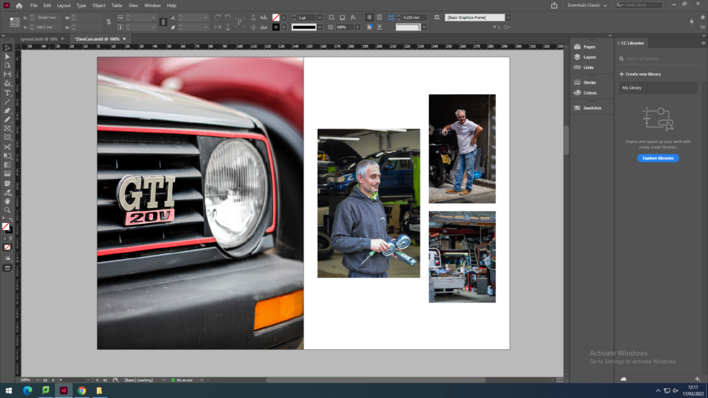
I used an image of a slightly newer car to create a small juxtaposition to the older cars before. Then I used a set of three images of mechanics and people working in garages, so that I can include and introduce a sense of human emotion and charisma into the zine. By having these images on this double page spread allows me to have a double page spread next on both the topics of new cars and mechanics.

I used a double page spread to end the juxtaposition of time with in the images of cars. It is also a double page spread as it includes both the topics of cars and mechanics. I made sure that the number plate wasn’t in the middle of the double page as that’s where the gutter would be and it would have been cut off.
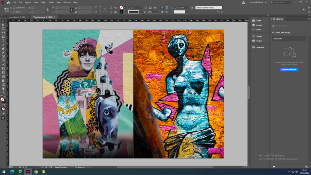
I used these images of street art to shift the focus from cars to more of a general view of the streets and lanes, to personal items. I used the colour orange to link the images on the previous page, as orange is the main colour of the sports car and also the graffiti in the right image.

I used all the colourful colours from the previous page to link to the vibrant colours of the different shoes on the window sill, which is an example of multiple items that being to a person or people. Then the full bleed image of a single object in a staged setup, that shows that there is a lot going on in one photo.
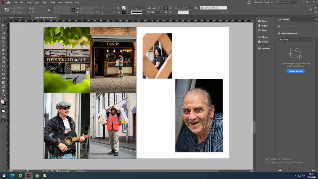
The group of 4 images represent the busy, crowded, chaotic town centre. I used a nicely framed image of a restaurant sign to link the candid image of the man outside a coffee shop. Then since I used a person in the last image, I chose that as the link to the street performer and the man carrying the bags over his shoulder. Then to create a contrast, on the right page I included more negative space. I did this by using a smaller image of a ladies face framed through the fences, with a larger image of an elderly mans face, which gives a more personal feel.
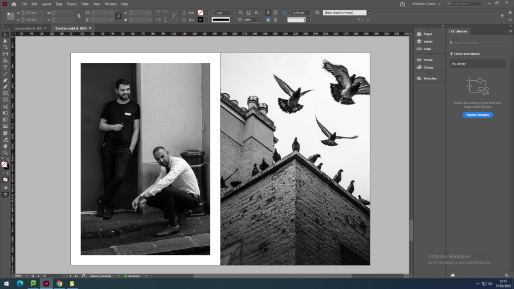
I wanted to include some black and white images so I thought that now is the right place as the pervious page has concluded the images where the subject includes people, however I used a image of people to continue the flow. I made the image on the left have white borders to emphasis the mans white shirts, which also gives the man in the black t-shirt contrast as they are at different levels, and it brings out his face as he is against a dark background. It also allows me to make the image with the pigeons full bleed as it is a visually strong image and shows motion.

I wanted the back cover to end with a simple abstract image. I chose this image as it continues the black and white trend and is complex and interesting as the light from the skylight shows the details on the banister. It could show the journey of Jersey and the history of Jersey since it was taken in the Jersey Museum.
Overall, I am happy with the outcome which I have come up with, as there is a clear path of progression throughout the zine, which is not normally my usual work style, as I prefer to come up with 1 unique image or images that aren’t related. I have also created some very visually strong image and I am proud that I was able to include them and link them to other images that aren’t necessarily as strong.