In class we were asked to ask to create a zine with our Images from the community/identity project. To create our own zine in InDesign we followed the following instructions:
It was a work of research, analysis and exploration. We explored different design, format, sizes and orientation. We were free to placed the images we wanted and how we wanted to placed them. We were also free to decide our title. This is mine: I decided to title it “Au vieux temps” that means to the old days. I wanted a title that represents the history of jersey communities. I wanted it to be in French because France is part of my identity. Then “in the old days” is an expression used in France
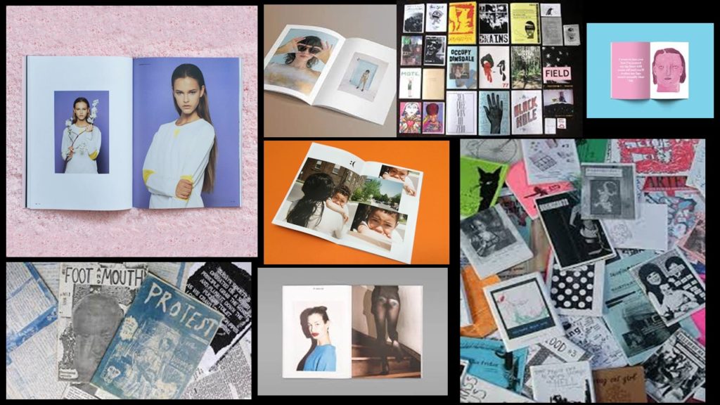
But what is a zine?
A zine is a self-published, non-commercial print-work that is typically produced in small, limited batches. Zines are created in many DIY ways, but traditionally editions are easily reproduced—often by crafting and then photocopying, folding, and stapling the pages into simple pamphlets. You also may also sewn, taped, glued them. There are no rules! People in general create zines to be more motivated, self-expression and artistic passion. Zines are usually inexpensive and sometimes distributed for free. Zines can touch on a variety of topics from music and art, to politics, sexuality, humor or even personal memoir. Their can be written, drawn, printed, collaged… Zine’s structure may be narrative, journalistic, comic-like, or completely abstract.
PRESENTATION & EVALUATION: PHOTO-ZINE
Here’s how I arranged my images. We had to have a total of 16 images with the theme of Community and Identity. I wanted the images (that are in the same page) to have something in common e.g colors, geometric shapes, patterns, people… I find that this activity has let us be creative which I appreciated
I have finished my Zine, which I designed in indesign.
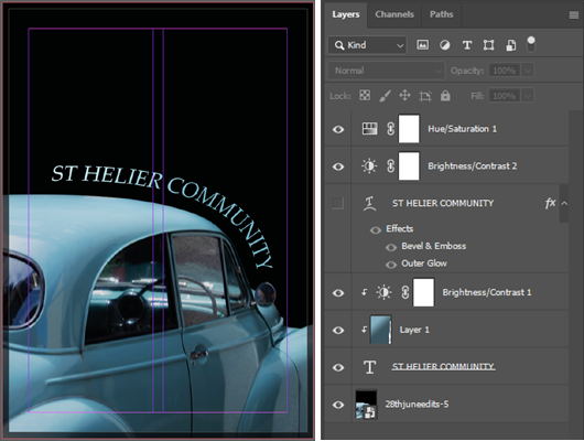
This is the front cover, which I made in Photoshop, by using text on a path the follow the same curve as the cars roof, so that the text was parallel to the car, as it look asteycilly pleasing. I used the same blue as the car against the black background to create contrast so the text is easy to read. And I used some blending options to draw attention to the text by making small adjustments to the bevel, stroke, and the inner shadow.
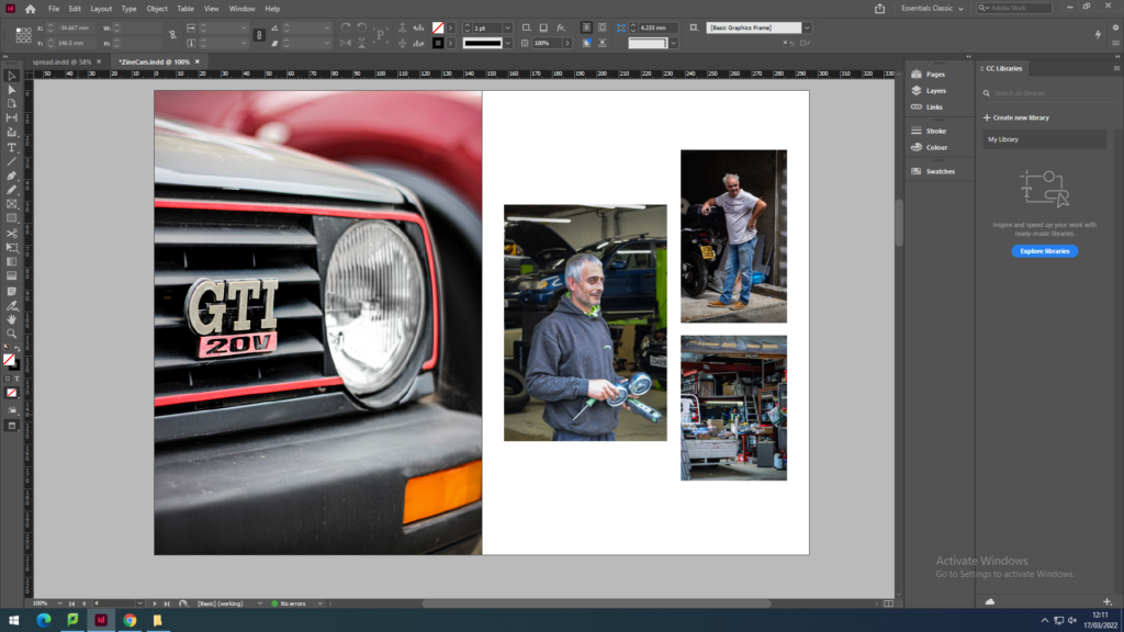
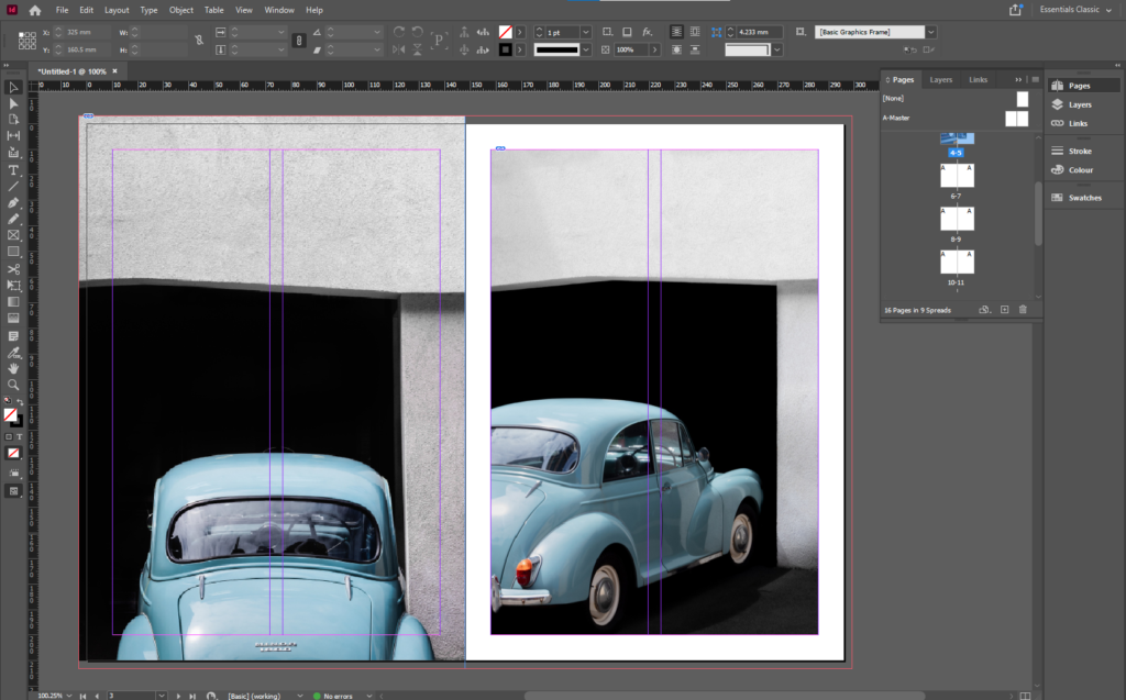
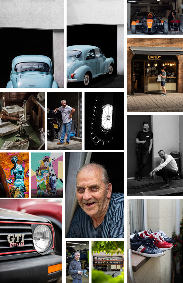
Im starting the zine off with these two images of old cars. I made my favourite image larger by making it full bleed. This works as the cover image is the same as the image on the right, however it is zoomed in more. I have set the theme with the cars which allows me to shift the focus to the newer cars and mechanics and their work place.
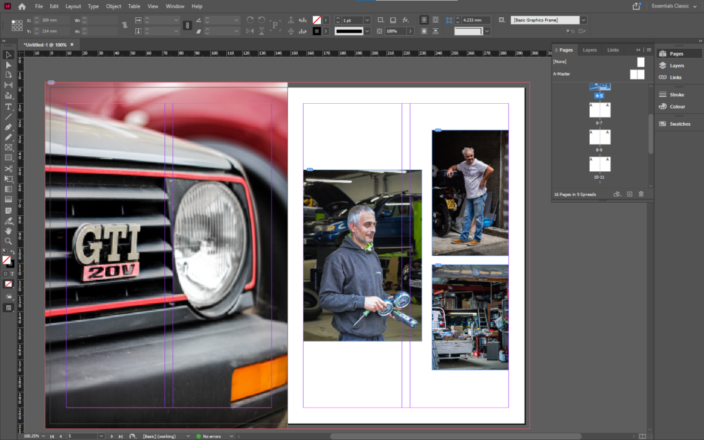
I used an image of a slightly newer car to create a small juxtaposition to the older cars before. Then I used a set of three images of mechanics and people working in garages, so that I can include and introduce a sense of human emotion and charisma into the zine. By having these images on this double page spread allows me to have a double page spread next on both the topics of new cars and mechanics.
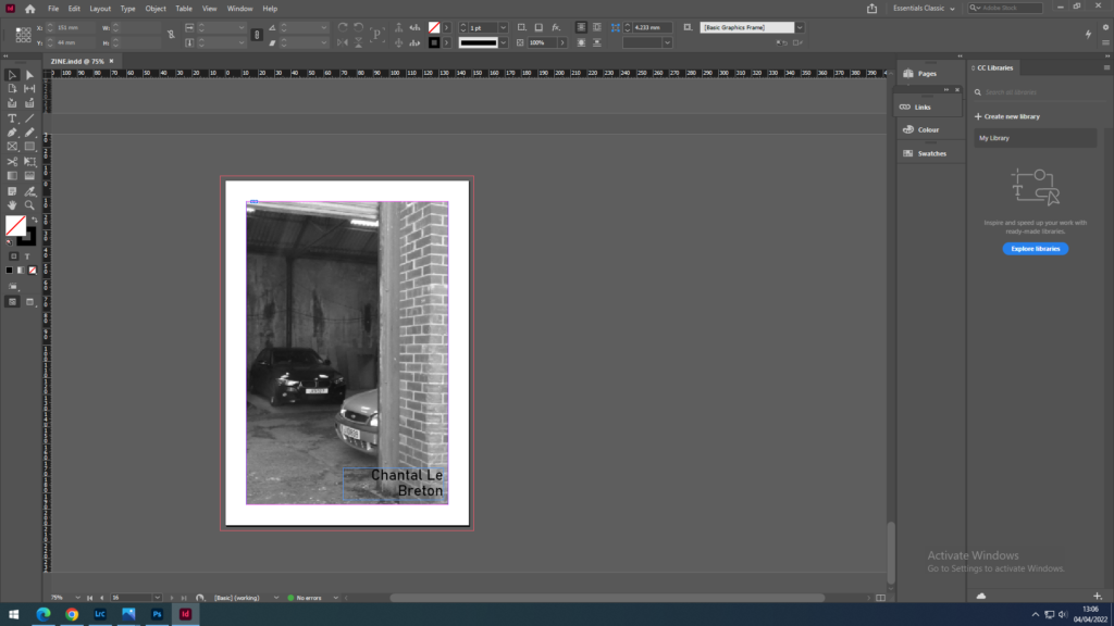
I used a double page spread to end the juxtaposition of time with in the images of cars. It is also a double page spread as it includes both the topics of cars and mechanics. I made sure that the number plate wasn’t in the middle of the double page as that’s where the gutter would be and it would have been cut off.
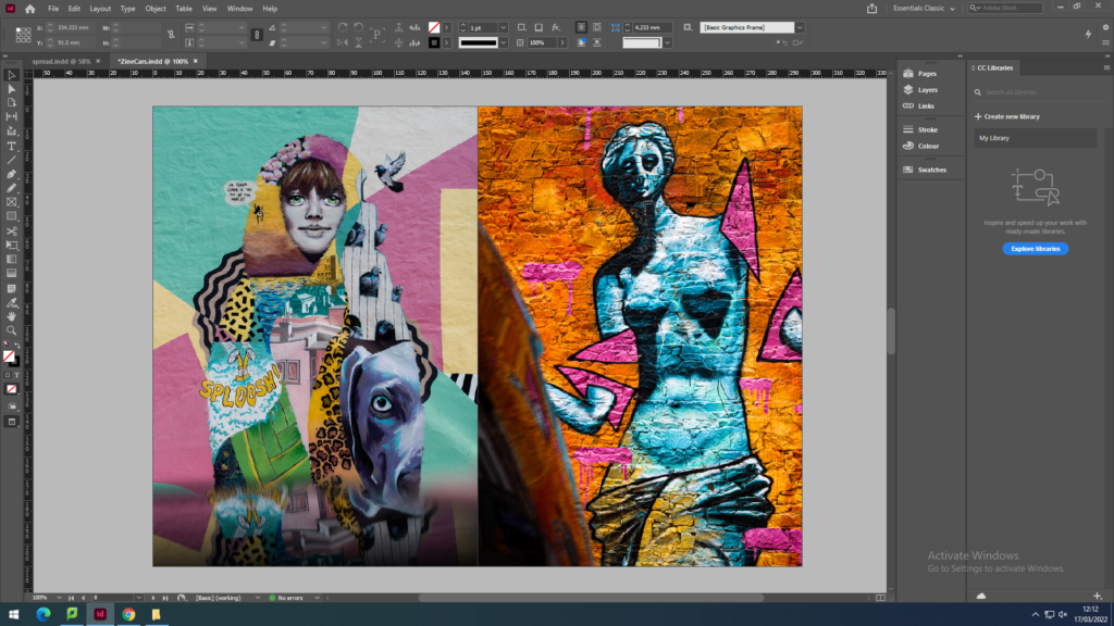
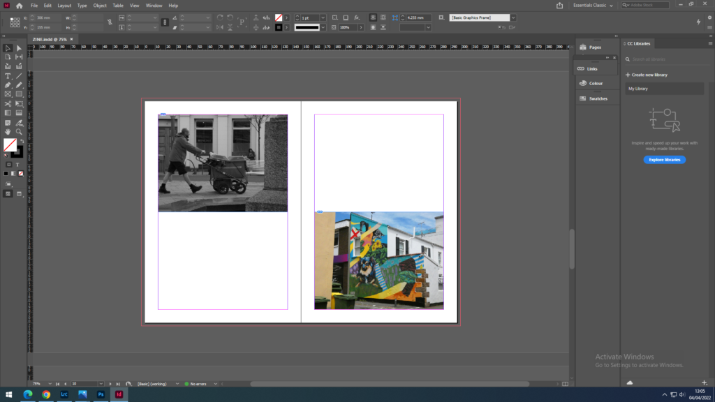
I used these images of street art to shift the focus from cars to more of a general view of the streets and lanes, to personal items. I used the colour orange to link the images on the previous page, as orange is the main colour of the sports car and also the graffiti in the right image.
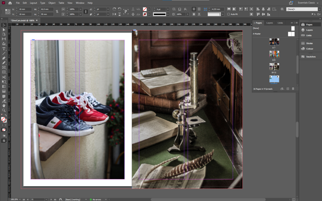
I used all the colourful colours from the previous page to link to the vibrant colours of the different shoes on the window sill, which is an example of multiple items that being to a person or people. Then the full bleed image of a single object in a staged setup, that shows that there is a lot going on in one photo.
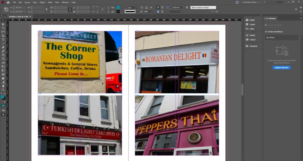
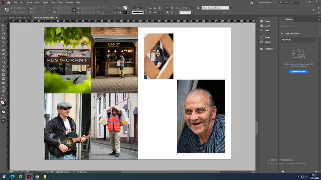
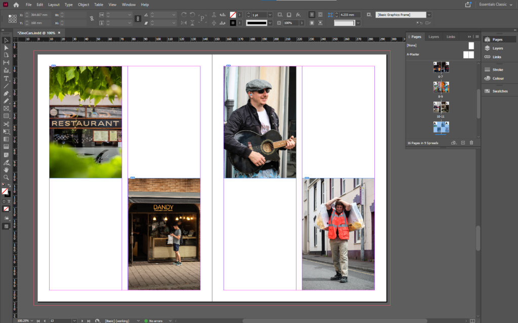
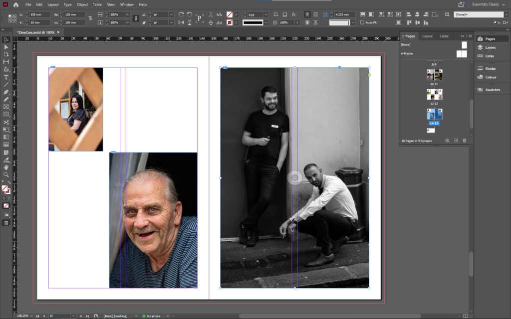
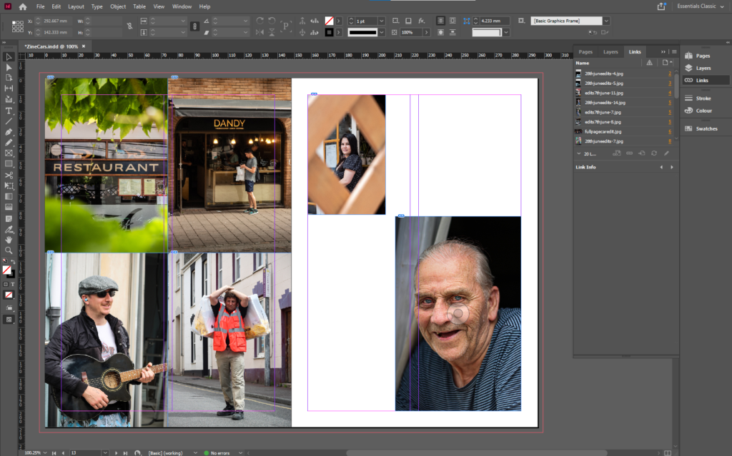
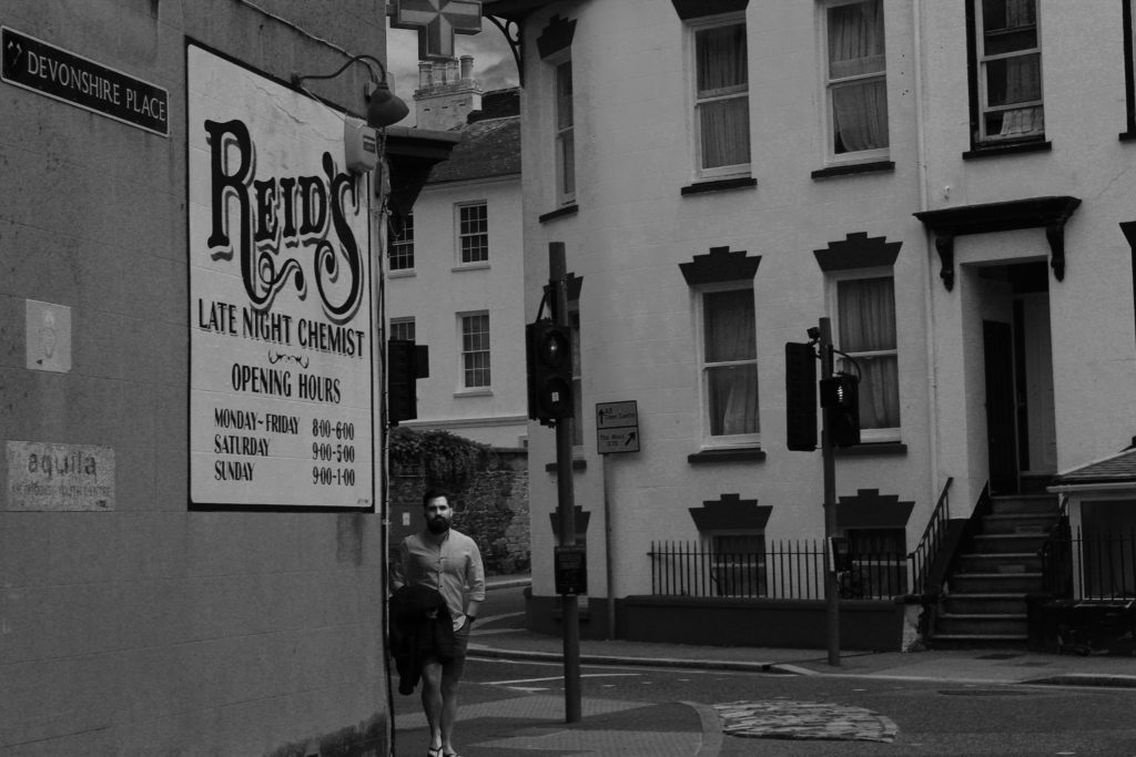
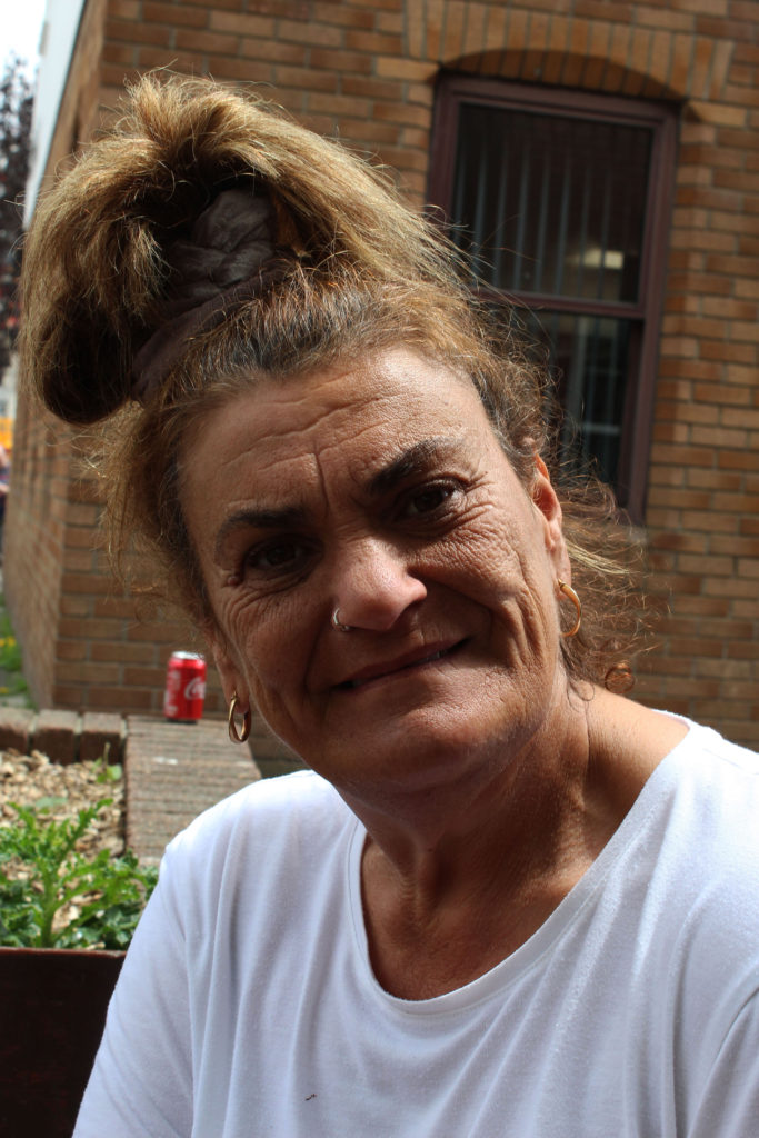
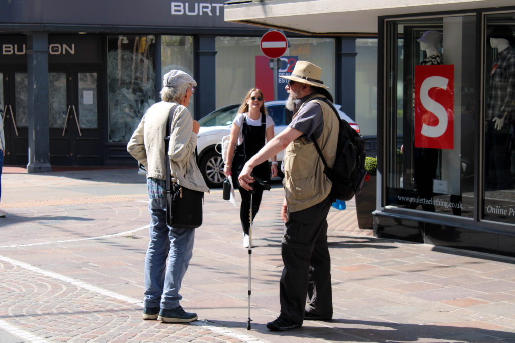
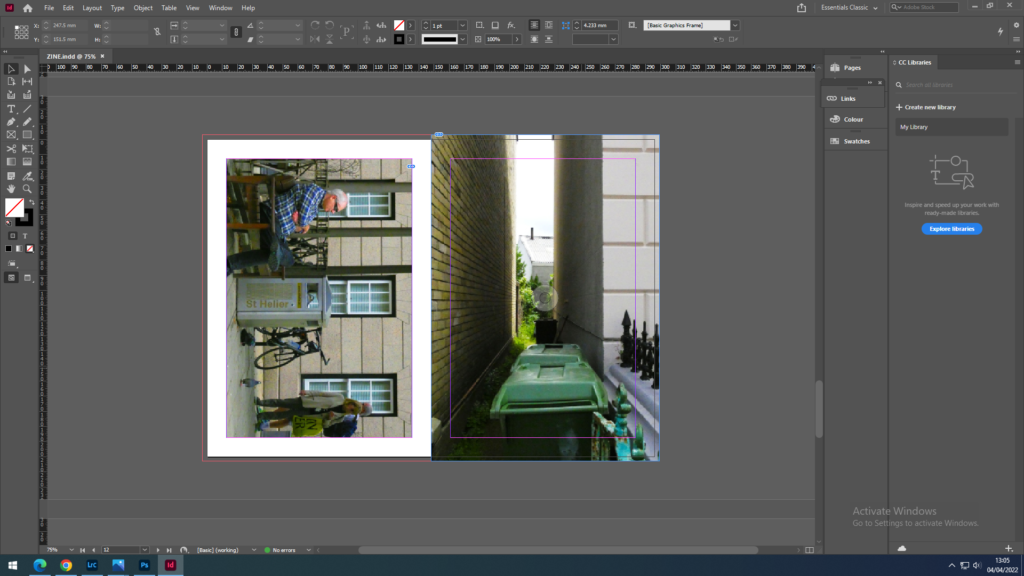
The group of 4 images represent the busy, crowded, chaotic town centre. I used a nicely framed image of a restaurant sign to link the candid image of the man outside a coffee shop. Then since I used a person in the last image, I chose that as the link to the street performer and the man carrying the bags over his shoulder. Then to create a contrast, on the right page I included more negative space. I did this by using a smaller image of a ladies face framed through the fences, with a larger image of an elderly mans face, which gives a more personal feel.
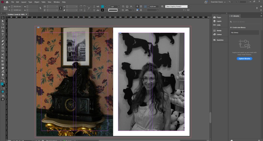
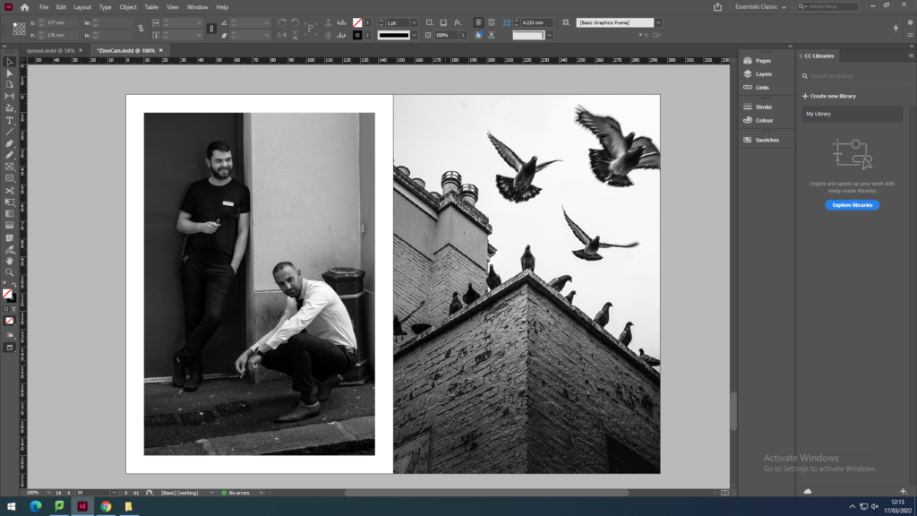
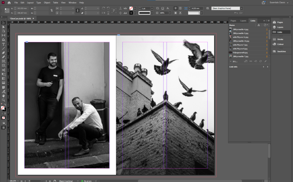
I wanted to include some black and white images so I thought that now is the right place as the pervious page has concluded the images where the subject includes people, however I used a image of people to continue the flow. I made the image on the left have white borders to emphasis the mans white shirts, which also gives the man in the black t-shirt contrast as they are at different levels, and it brings out his face as he is against a dark background. It also allows me to make the image with the pigeons full bleed as it is a visually strong image and shows motion.
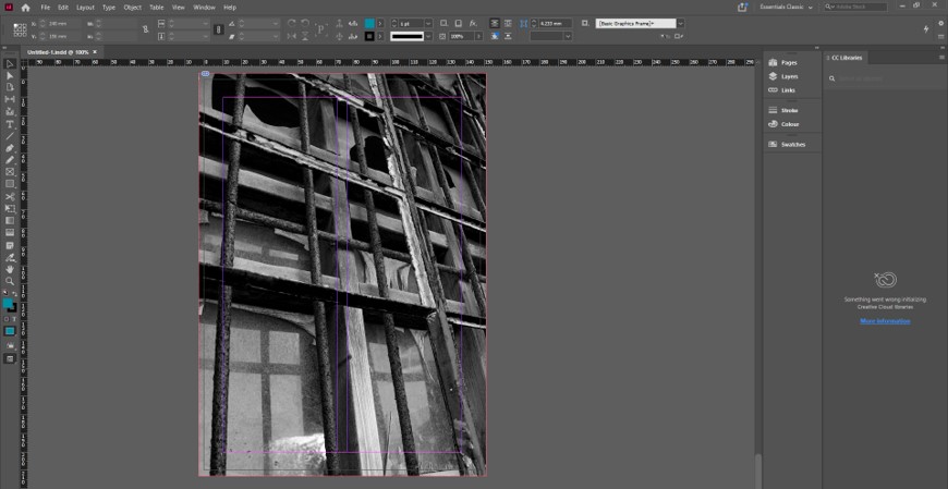
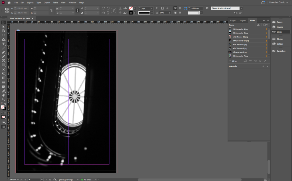
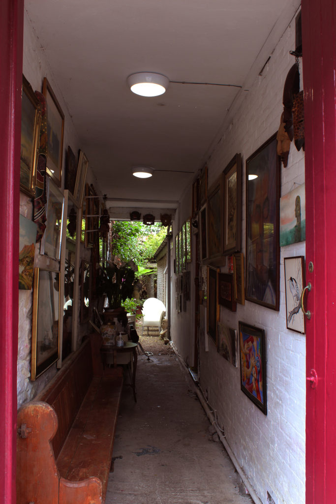
I wanted the back cover to end with a simple abstract image. I chose this image as it continues the black and white trend and is complex and interesting as the light from the skylight shows the details on the banister. It could show the journey of Jersey and the history of Jersey since it was taken in the Jersey Museum.
Overall, I am happy with the outcome which I have come up with, as there is a clear path of progression throughout the zine, which is not normally my usual work style, as I prefer to come up with 1 unique image or images that aren’t related. I have also created some very visually strong image and I am proud that I was able to include them and link them to other images that aren’t necessarily as strong.
All of these examples look factor in, how they want the design to look and feel. The format, size, orientation, narrative, and visual concept. The all have good rhythm and sequencing, with text as well as images, including a title and captions.
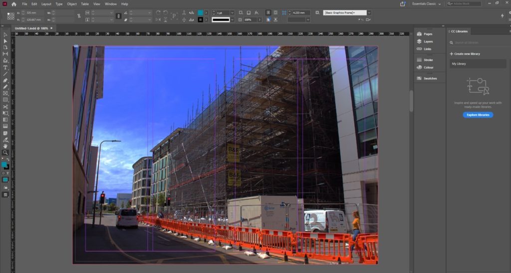
We made the zine in Adobe InDesign, following these instructions to set up the document:
Following these instructions, I made a concept of the layout based off the paper copies I made with my printed out images.
changed
changed
final arrangement
I decided to move and rearrange some images to create space for some more full page image. I like the combination of the 4 all together, as the share a similar link. The top 2 are shops, and the bottom 2 are people working.
I arranged the zine to smoothly change the subject focus from old cars, to new cars, to mechanics, to personal belongings, to street photography of work places, then to half/full body images of people, to close ups of people, then into the final black and white images.
THE FRONT COVER
I decided to use Photoshop to create the front cover as it was easier than trying to do it on the zoomed in image of the car.
First, I used the pen tool to mask a path for the text to go on. I made sure that the path was parallel to the edge of the car, then used a old styled font to keep the old theme consistent.
Overall, I believe that this is the best layout as there is a smooth, consistent flow between images, which tell a story without using any words. I have experimented by changing a few pages and rearranging the layout to come up with the final design.
STORY: What is your migrant community story, for the St. Helier shoot? Describe in:
– 3 words, A migrant community. – A sentence, St Helier Jersey’s migrant community featuring workers and cars. – A paragraph, This shoot represents the working people of St Helier, and their belongings, such as cars and houses. It also displays key features of the town itself.
NARRATIVE: How will you tell your story?
These are some common examples that people use to tell a story:
– Images > new photographic responses, photo-shoots – Archives > images from SJ photo-archive, family album, mobile – Texts > letters, documents, poems, text messages
However, I will only use images I’ve taken. This is because I feel that they tell their own story, as I’ve arranged them into a sequence which allows there to be a flow which guides the viewer through the images and tells a story.
AUDIENCE: Who is it for?
My zine will be aimed at anyone who lives in Jersey, but most specifically, St Helier. Plus, It also helps if they are 14+ as they would understand the images in more depth and detail, making it more impactful for them.
However, most image makers tend to overlook the experience of the viewer. Considering who their audience is and how they may engage with your photo-zine is important factor when they are designing/ making it.
SEQUENCING THE CONTENT – 20 images
I decided not the include any images from the archive as I have taken images which juxtapose each other. Such as, the old blue Morris Minor and the red GTI Golf. This helps tell a story and emphasise differences or similarities between the cars. I will also include other methods such as “zooming out” to create similar effects.
THEME OR STORY
The front cover will be made from a zoomed in image from one of the car photos, as it is one of the main themes.
The start of the zine will contain images related to mechanics and cars. Some of images of the cars will juxtapose each other. New vs Old. The 2 images of the old car images will be full paged on the first 2 pages, as they are major establishing shots.
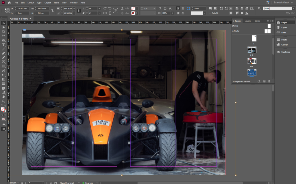
Near the start of the zine there will be a double page spread images of a new, modern car, which symbolise the new technology and the way forward.
There will be a 2 page spread of just street art, both the images will be full page, and both include vibrant colours, which adds a lot of colour into the project.
For the shots of the people, I will start off with 4 multiple shots one one page, of 2 street photos, then 2 full body shots, then transition into head shots and images of peoples faces.
At the end I plan for there to be images of the actual town, such as the pigeon shot, and the scaffolding and the staircase in the Jersey Museum.
I have arranged it so some images juxtapose each other and zoom into each other, creating a smooth transition between images. Most of my best images will be full page as you see a lot of detail when its bigger.
Francis Foot was born in 1885, he is from Jersey, he was the son of Francois Foot (1847-1918) and Louisa Hunt (1843-1934). His father Francois was a china and Glass dealer in Dumaresq Street, at a time when the area was one of the more affluent in St Helier.
Foot started his working life as a gas fitter. However, he soon became fascinated by photography and the early phonographs and gramophone records and realised that he could earn a living from them.
So the family took on a second shop in Pitt Street, where Francis worked as a photographer, while his father and mother sold gramophones, records and other wares in Dumaresq Street. After his father’s death, Francis concentrated his photography business in Pitt Street.
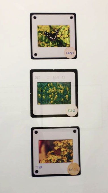
Mood Board
I found the images from Google and Jerripedia. As you can see Foot is focused on event photography and portrait and photographing people.
Analyse – Margaret with Dora and George
This photo was taken by Francis Foot at 13:25, its called Margaret with Dora and George and it was taken in 1920. Foot has taken an image of what looks to be a mum with her two children. Foot used the background of a forest to contrast the white clothing of the children. To make them stand out, perhaps this shows how important the children are to the mother. The simple pattern of the clothes, juxtaposes the texture of the leaves and the trees, which reflects on how simple life used to be in the 20th century. Other than that, it is a basic family portrait.
This images represent, people in jersey and objects/ places from jersey
NARRATIVE: How will you tell your story?
I will use imagery to tell my story because so their can be different intreptation of the story in my image. I’ve purposely arranged them into a sequence so it feels like a little story.
AUDIENCE: Who is it for?
My zine is more for younger people around my age (16 to 20) but in reality everyone can enjoy. Is also for people from jersey so they can enjoy looking to their island. And how beautiful the island is. Here are the images I used for my story:
Who – For one of my photoshoots I plan on capturing street photography style images of people passing through town, running errands, working, chatting etc. I aim to photograph normality and comfort in many of these images by highlighting the warm atmosphere of location.
What – I plan on photographing people living their day to day lives without interfering with or changing anything within the frame, capturing realness and sincerity. I really enjoy taking images in this street photography style as I believe they really allow the observer to feel immersed in the photo as life carries on around them.
Where – I am going to carry out this photoshoot around the Merchant Quarter of St Helier, focusing on the busier streets of shoppers and workers. When researching these areas of St Helier it was interesting to find out which buildings and businesses have drastically changed over the years and which still hold similar shops to those decades ago.
When – I aim to take these images on July 10th as it is a Saturday meaning the St Helier streets will be quite busy, additionally the weather is meant to be bright and sunny which will aid my images in creating a warm atmosphere and mood, and again will increase the chance of more people being in town to photograph.
How – I plan on walking through the Merchant Quarter of St Helier normally, going into shops when I need to and capturing images as I go. I aim to have some images holding a different mood to the rest, capturing singular people on the streets or in shops alone. Additionally, I want to create 3 environmental portraits on my photoshoot with the subject interacting with the camera to contrast the street photography style.
Why – I want to carry out this photoshoot to show the character of this St Helier community by focusing on portraiture and street photography. I am aiming for some my images to show sequences depicting workers to their work and shoppers to their shopping, sort of showing a juxtaposition between them.
Editing – Contact Sheets
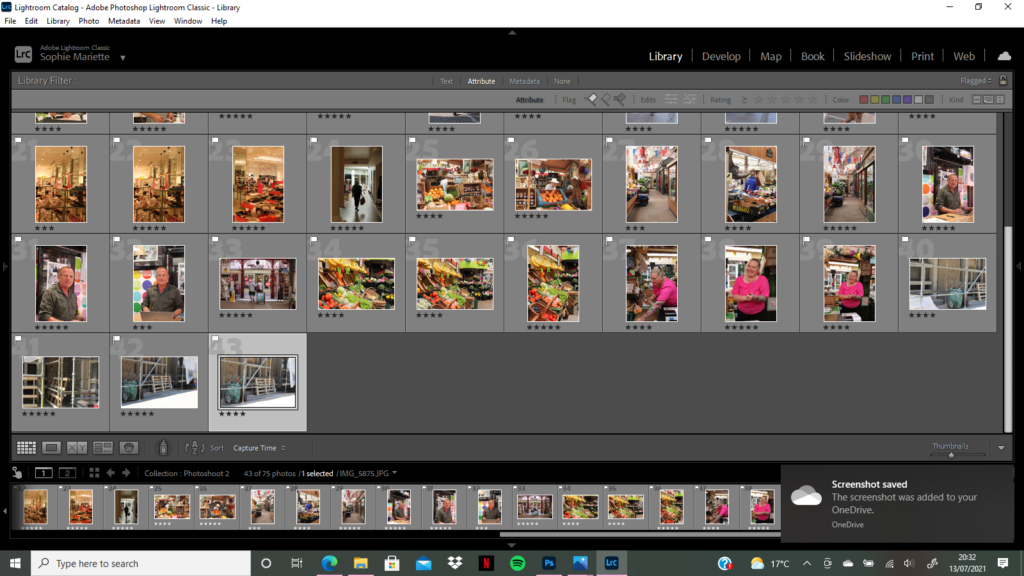
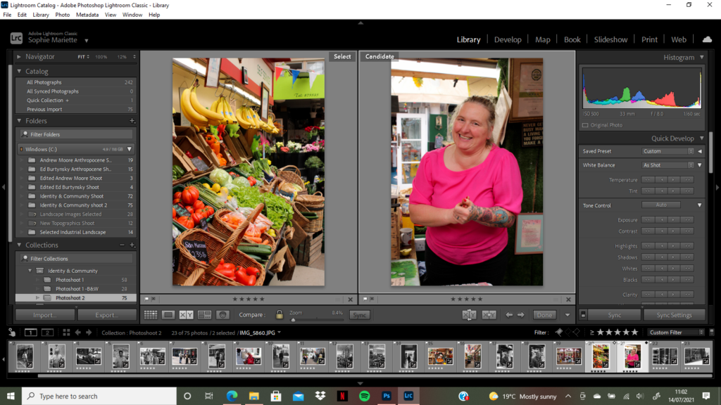
When I first imported all images from my photoshoots into Lightroom I did an initial delete of any photographs I knew were not up to standard, were blurry/out of focus or had issues concerning White Balance or Exposure which there was little point fixing due to another image of the same scene being of better quality. After this first sort through of images I was left with 75 to look at in depth, editing them down with star rating and flagging. I went into ‘Develop’ mode to start filtering my preferred images. I started by using the ‘Flagging’ filter, using controls ‘P’ for a white flag (preferred image) and ‘X’ for a grey flag (disliked image) and holding down ‘shift’ – this allowed my editing process to speed up massively and let me clearly see which photographs were my favourite. Next, I used the ‘Star Rating’ feature to filter each image from 1-5, one star as the worst and five stars as the best, which again helped me select the best images that worked well together in groups, sequences and pairs. .
Experimenting With Sequences
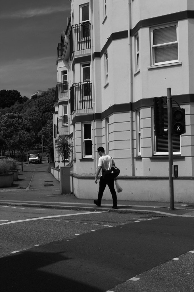
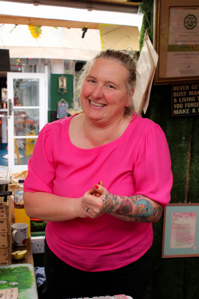
While on my photoshoot through St Helier, I found it important to stop in shops along the way to try and capture some shots of people browsing and buying items for themselves, after I captured this first silhouette style image on the top right of a lady carrying a shopping bag I thought of the idea to also photograph the area of the shop she had come from, showing the motivation for her movement. I really enjoyed how this sequence demonstrated context to the final image captured, almost like a backstory to the scene. When editing the first two images in Lightroom, I wanted to experiment with a black and white filter to add a more dramatic and mysterious atmosphere to the scene as I believe it reflects the ambiguity of the woman’s silhouette and her back turned to the observer. Contrastingly, I wanted to create a similar sequence to the first however using warmer tones and direct address to the camera to create a more welcoming atmosphere. The second two images were captured in the St Helier Market at a fruit and veg stall, I was really drawn to its vibrant colours and tones, juxtaposing greatly with the first sequence. After purchasing some produce from the stall I asked the server whether she would be happy having her photo taken for this project, explaining the interest in the merchant communities. I really wanted to capture a natural and comfortable image of the lady, her warm energy was infectious and I found it important to not stage the image too much in fear of losing this. To capture this vibrant photograph I continued having a conversation with the woman about her day, snapping moments where she would laugh or smile at the camera naturally – I found it so interesting to discover the history of the time she has spent working in the market and how she loves when customers would actually have a conversation with her when she serves them, it was very eye-opening. To reflect this positive energy when editing I made very minimal changes due to the camera already capturing such raw vibrancy, only heightening the brightness and contrast slightly to match the boldness of the fruits in the first image.
Final Edited Sequences
Environmental Portraiture
During my street photography and portraiture photoshoots I wanted to capture 3 environmental portraits with the subject engaging with the camera. The reason I kept this number of portraits low was because I wanted to spend time getting to know the subjects and the field of work they were in, taking the time to understand the to capture an image representing them naturally.
The first image is a photograph of Simon who owns the metaphysical shop Zen, in my image I wanted to reflect the welcoming atmosphere of his business through angles, body language, composition and light. I positioned my camera with Simon in the centre of the frame, his natural body position worked brilliantly with demonstrating the shop’s open friendly mood and the soft artificial lighting provides a range of dark and light tones across his face that hold no harshness or bold disruption to the rest of the image. Additionally, in the background of each environmental portrait I wanted objects depicting each person’s field of work, in this first image I wanted the most negative space however with hints towards the business and its goods, this was because I wanted to reflect the mystery of the shop while also using negative space to highlight and draw the observer’s attention to the main subject, Simon.
My second environmental portrait was taken in Seedee Jons of owner Jono. I wanted to capture Jono in a natural position, however still showing his fun and easy-going personality through angles, body language and lighting. I took my image just below eye-level, standing to the left of my subject and asking him to engage with the camera in whichever way felt most natural to him. I believe this angle contrasts well with my first and last image as the side-on view reflects the business’s cool unique atmosphere of the shop. Furthermore, I wanted this image to hold darker tones with more contrast to mirror the gradient of tones on the shop logo wall in the background of the image. I captured this range of dark and light with artificial lighting and when editing in Lightroom I slightly increased the ‘Blacks’ and ‘Highlights’ of the photo to create this more edgy atmosphere. I also wanted to capture the different shapes in the background of the image, showing the contrast between the geometric rectangle of the mirror behind the subject and the repetition curved circles to the right of the image.
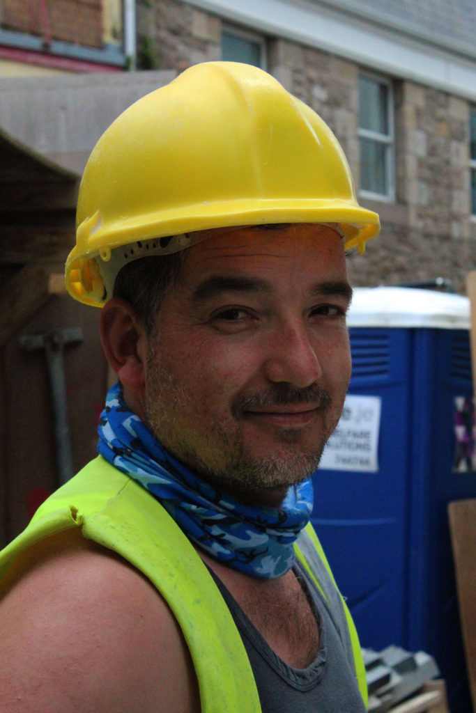
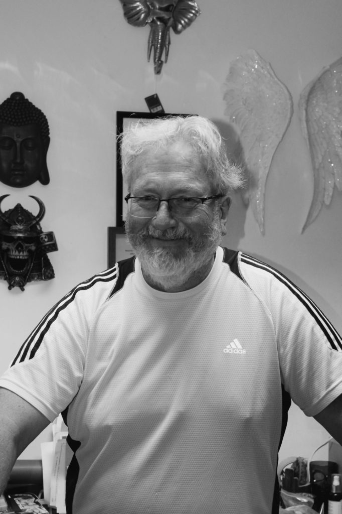
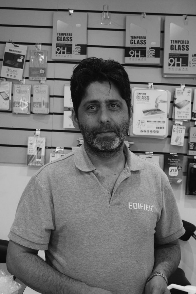
My final environmental portrait was taken of a worker in the Cartridge Centre phone repair shop. I took this image at eye-level, with artificial lighting capturing minimal shadows or distracting highlights over his face. I wanted to capture the repetition of straight leading lines that fall across the background of this image creating a sense of movement due to their link with the business’s fast paced and quick working style to help customers and repair items with tight deadlines. Additionally, the geometric shapes in the background of the photograph also hint towards technology and modernised items showing this job requires more technical thinking and skills. The black and white filter allows the range of contrast and tones in the image to be emphasised, with the darkest tone falling over the subject’s hair and the lightest on the phone products behind him. This draws the observer’s focus towards the centre of the image, with the main focal point on the subjects face.
Street Photography – Colour
Street Photography – B&W
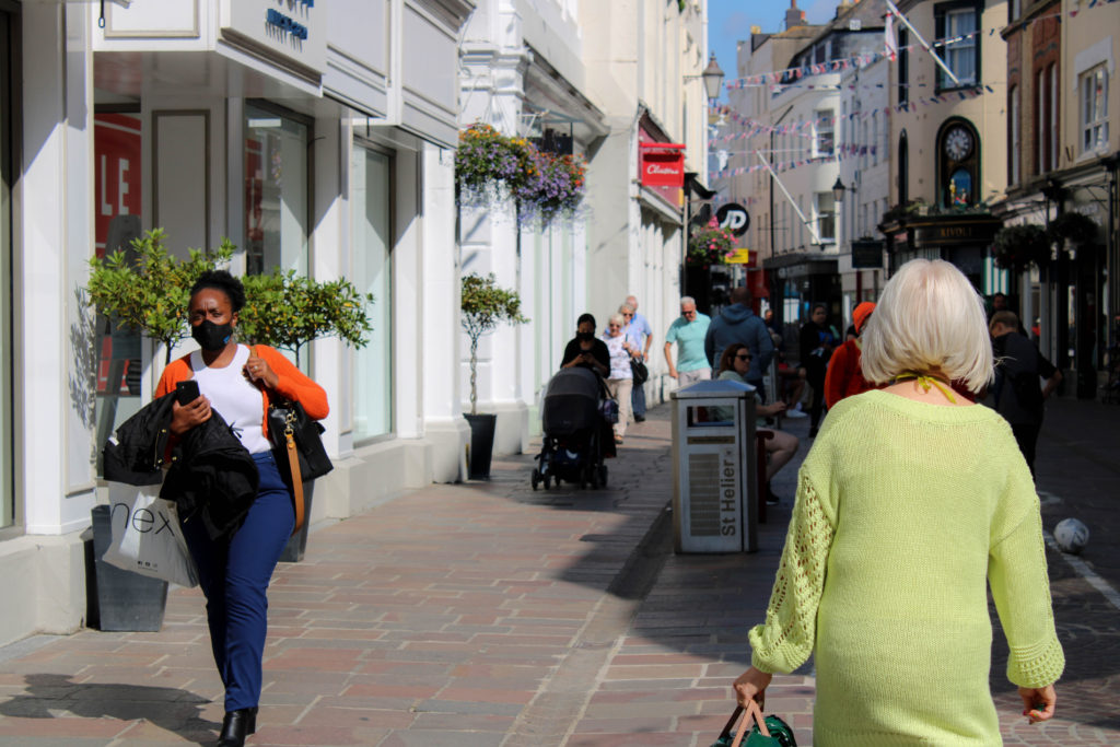
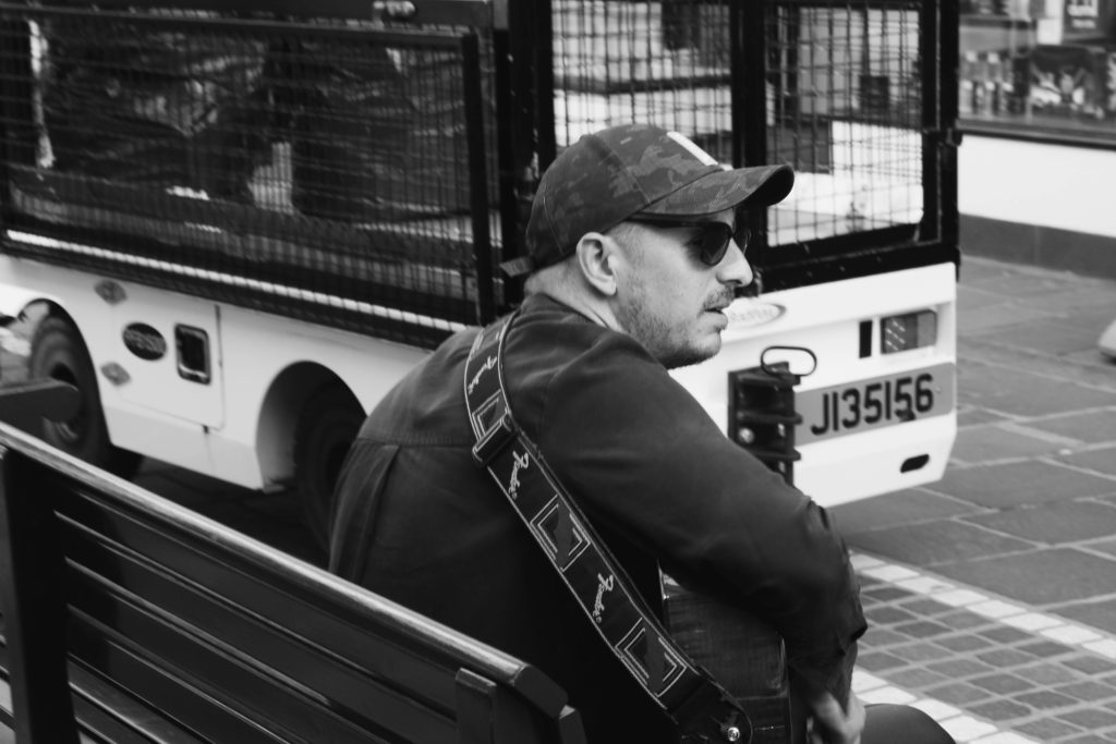
During my photoshoots capturing portraiture and the character of a community I photographed many street photography portraits of people walking the the Merchants Quarter of St Helier. I wanted to do minimal planning for the photos as they were to look natural and unstaged, I captured images of people shopping, walking, talking etc, trying to be as subtle as possible to photograph an organic moment. My first set of images I have kept in colour, doing little editing on Lightroom by only touching up exposure and brightness when needed – I chose which images worked best in colour by looking at my subject’s surroundings where I decided I wanted each colour image to have the repeated motif colour of red somewhere in frame. This red colour appeared frequently in my photoshoot and I loved how much of a vibrant and warm atmosphere it created. Additionally, my colour photographs all have a landscape orientation and all but one have more than one person in frame, capturing more of a community feel and a busier composition. My second set of images held more of a dreary mysterious atmosphere, so I have edited them with a black and white filter to emphasise the darker tones. The subject’s surroundings in the photos are more bare and empty, with only one or two people in frame, some with their back turned or from a side-on angle. In addition, my subject’s facial expressions are not smiley or content and sometimes hidden away from sunglasses or a hat – I wanted to include these images in my final edits as they show a great contrast to my environmental portraits and colour street photography, demonstrating how in a community there is a range of different people, having different emotions and days which can be translated through a photograph in a right or wrong way. The ambiguity of the images leaves it up to the observer’s imagination to decide what kind of person the subject of the image is, but they will never really know.
I decided to name my photobook ‘Culture of the Rock’, as it displays the different lifestyles, jobs, and surroundings of St Helier. I used a mixture of full bleed, half bleed and smaller images as well as vibrant and monochrome images in order to create a juxtaposition of photographs.