essay- jersey archive

How are archives a repository of knowledge? 
 

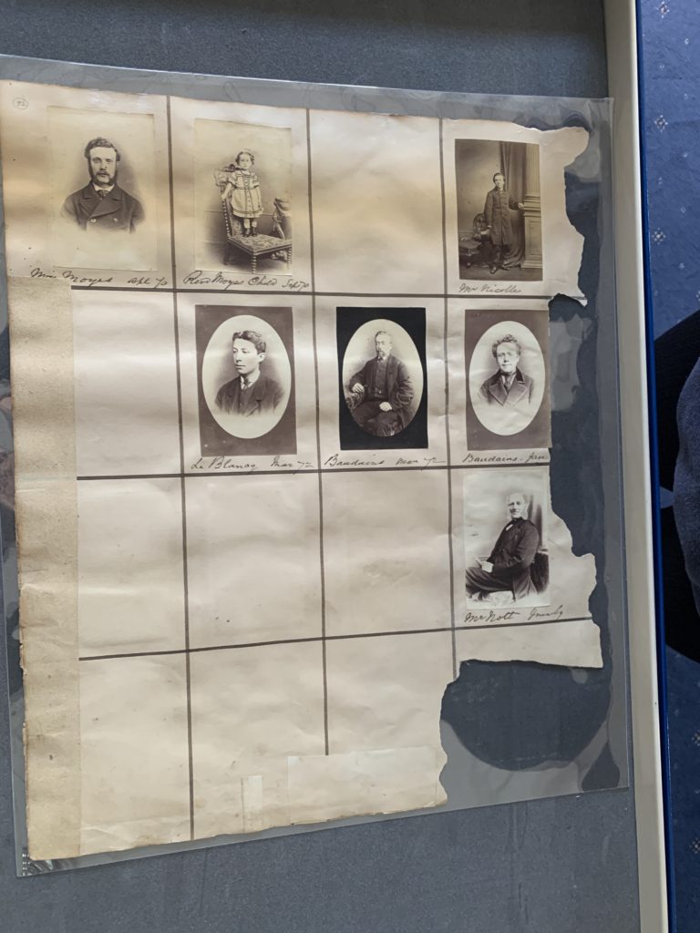
Archives are an extremely important part of our history and help us understand our background through a visual representation. Archives represent three keywords – history, knowledge and power. This is because we learn through looking at images and doing research into our past that allows us to get knowledge about our history and what jersey or any place anyone has lived in looked like before. All this information and archives together gives us power as we can educate ourselves and what we do with this information is powerful as it gives us a more detailed insight into our past. Archival records take many forms, including correspondence, diaries, financial and legal documents, photographs, and moving image and sound recordings. All state governments as well as many local governments, schools, businesses, libraries, and historical societies, maintain archives. To understand the concept of archives in more detail we took a visit to the Societe Jersiaise Photographic Archive. This is where over 36,000 images are stored from the mid-1840s to this present day. We got to learn about different photographers that influenced and shaped jersey photography for life as well as learning about all the unique techniques and processes these photographers used when it came to producing or even taking their photographs- such as daguerreotype, calotype, salt paper prints, wet plate collodion, albumen prints, autochrome and colour transparencies. Personally, the archives I keep are photos on my phone as I have so many, I like to store them for years to be able to look at them whenever I want as well as keeping and making photo albums of images of me and my friends to have a more visual copy of them instead of a digital copy only. 

The photographer we chose to look at on our visit to the Societe jersiaise was Henry Mullins. Henry Mullins was the first professional photographer to come to Jersey and establish a portraiture business in the very early days of photography. Mullins started working at 230 Regent Street in London in the 1840s and moved to Jersey in July 1848, setting up a studio known as the Royal Saloon, at 7 Royal Square. His focus was portrait photography – just under of his 10,000 photos are all digitally stored online and all of them are portraits. He took all his images in black and white and in an environment that fit the background of the individual he was photographing to allow us to gain knowledge and greater insight into what their life may have been like. His images of jersey people give us so much knowledge and him documenting all these different individuals lets us learn about people’s different classes, their wealth, how they dressed and basically how their everyday life may have been for them. Just by looking at all the different people in his images, we can learn about how people in the upper class dressed back in the day as they would usually be the individuals who wore suits or were photographed in offices and presented themselves well compared to the individuals who were dressed in old clothes and in a poor living environment such as just a chair or even standing outside or in a farm. Having Henry Mullins photograph the jersey community and society all the way from the mid-1840s allows us to gain knowledge about our early days and how different people’s lives or jobs were compared to how jersey functions in the present day. 
This image has an empty alt attribute; its file name is 20210628_103308770_iOS-768x1024.jpg
This image has an empty alt attribute; its file name is 20210628_085510290_iOS-768x1024.jpg

This is one of the photographs that Henry Mullins took that I will choose to analyse. This photo is a portrait as that was his main focus. His image is in colour and the technique he used was Daguerreotype, in this image we can see a woman sitting on a chair ready to be photographed. A daguerreotype image is taken  on a mirror-like silver surface and will appear either positive or negative, depending on the angle at which it is viewed, how it is lit and whether a light or dark background is being reflected in the metal. The darkest areas of the image are simply bare silver; lighter areas have a microscopically fine light-scattering texture. The surface is very delicate, and even the lightest wiping can permanently scuff it. Her hair is nicely put together and shes wearing a very formal dress which can tell us a lot about her wealth status, which I’m guessing shes upper class by the way shes dressed and the chair she is sat on looks very fancy. This creates knowledge for us as we get an idea of what women maybe in their later 20s to 30s looked like from different classes. It gives us an insight into how they dressed and what the fashion was like.

Henry Mullins - Jerripedia

to read more about daguerreotype images use this link- https://en.wikipedia.org/wiki/Daguerreotype

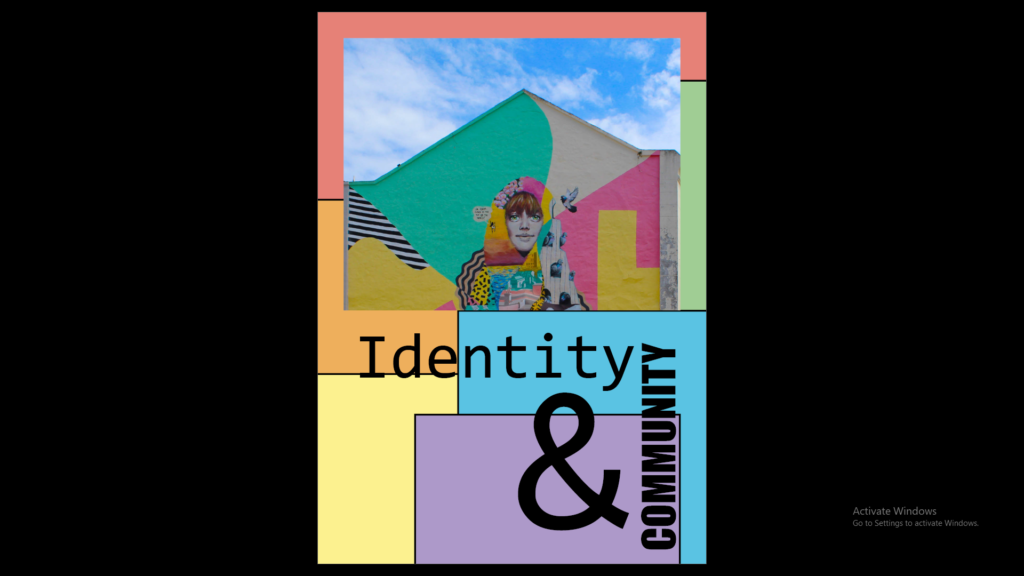
Overall, I think photo archives give us so much knowledge about our society in the early days and how our history has all been photographed in order for us to be able to reflect and keep learning about our past. It gives us such a rich insight into what we used to wear, the different job roles individuals had and allows us to see the difference in class and wealth throughout the years just through simple portrait photography – as Henry Mullins focused on. Photo archives are also important in educating us on how to improve as a society and seeing images from our past they help us in shaping our future. This has inspired me into thinking out my own photography project and our key theme which is identity and community. Just through photographing different individuals in town or around jersey will educate someone else in 50+ years’ time by looking at my images and they’ll be able to gain knowledge of what jersey used to be like in 2021 and onwards, they would be able to see what we wore in this present day and the difference still between our wealth status. Therefore, archives are so important to our society, and it helps us to learn, and we can gain a better understanding of our history as well as gaining knowledge of different individuals that used to live in Jersey as they all shaped our future and our day to day living standards.  

8 Presentation & Evaluation

Evaluation

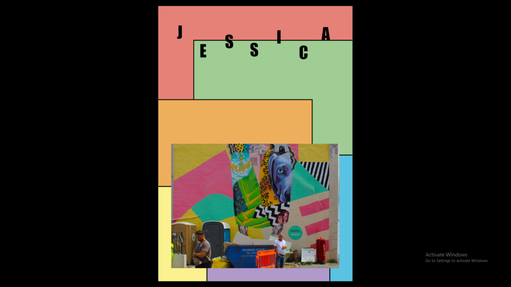
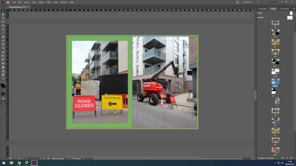
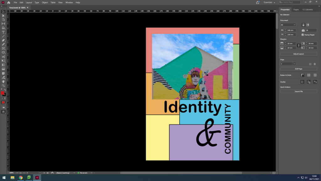
The colourful theme in the zine I used complementary colours in my zine to create strong contrasts throughout because I like how the contrasts emphasises the colour in the photographs. The structure of the images was placed in rainbow order to stop the colour of the background and to make the zine better is by having the background colour of the contrasting photograph on pages 12-13 the same colour as the high viz jacked on page 4.

7 DESIGN & LAYOUT

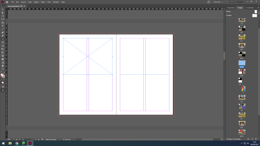
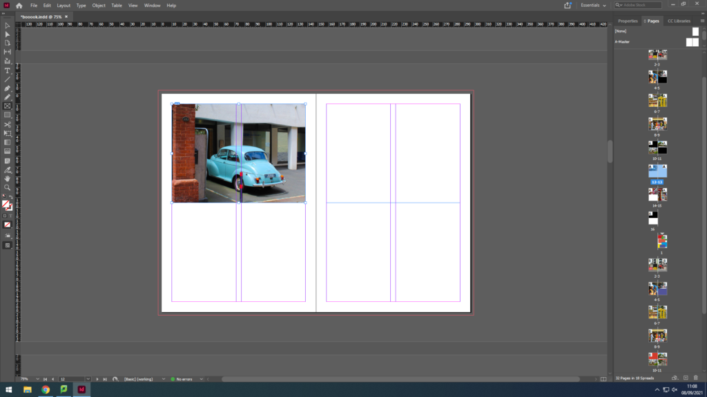
I started by setting up the layout for my zine and how many pages I want for this. Then I selected the frame for my image to go into.

This image has an empty alt attribute; its file name is image-46-1024x576.png
This image has an empty alt attribute; its file name is image-47-1024x576.png

I pressed control D which I selected the image I wanted to put into which in this case was the blue car.

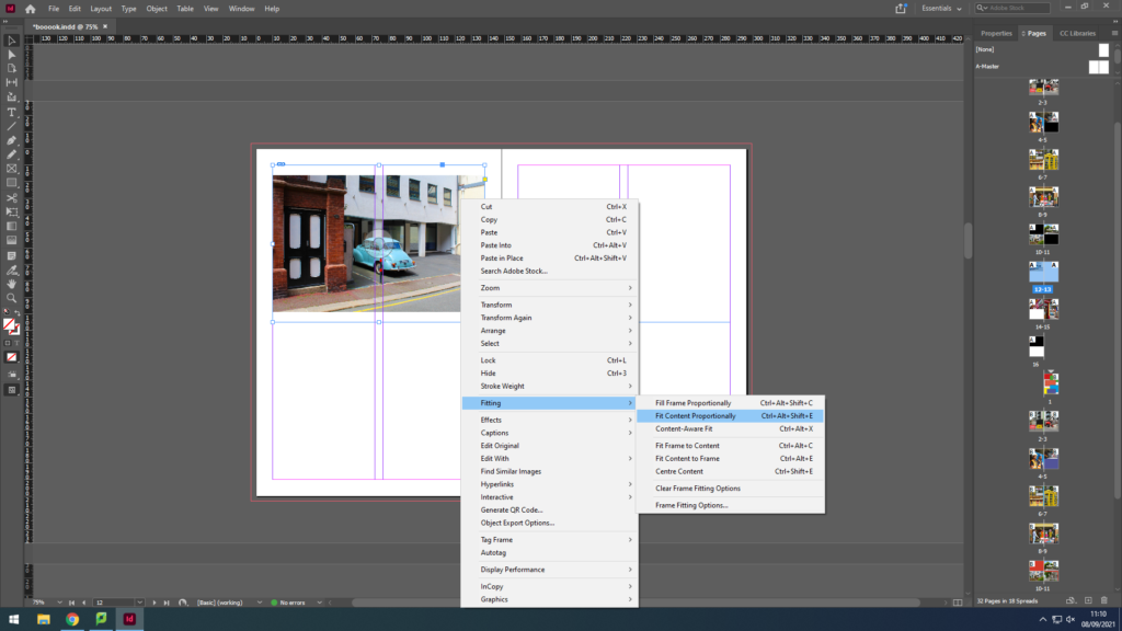
To make the image fit the frame I selected the image then clicked on fitting then fit content proportionately so the whole image fits in the frame.

This image has an empty alt attribute; its file name is image-48-1024x576.png
This image has an empty alt attribute; its file name is image-50-1024x576.png

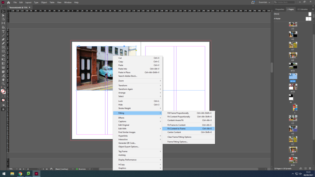
After that I did the same again but clicked on fit content to frame so the image would fit the frame perfectly.

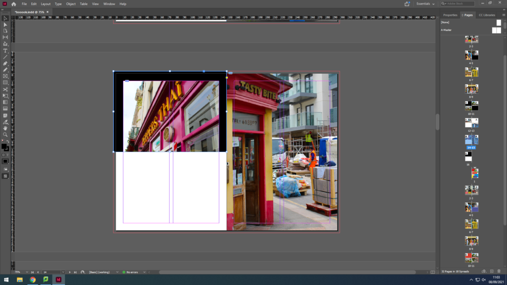
After fitting the images where I wanted them to be I then started playing about with the background by starting with a black and white background but I found that it didn’t fit as the images were too colourful.

This image has an empty alt attribute; its file name is image-43-1024x576.png
This image has an empty alt attribute; its file name is image-44-1024x576.png

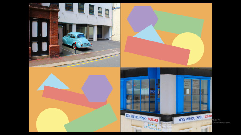
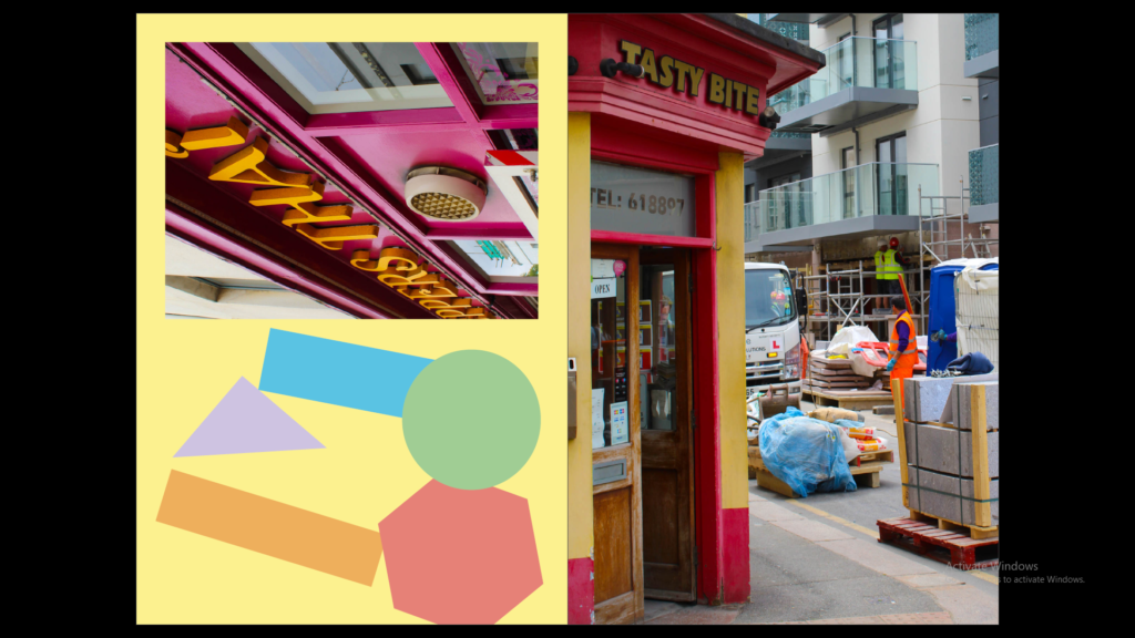
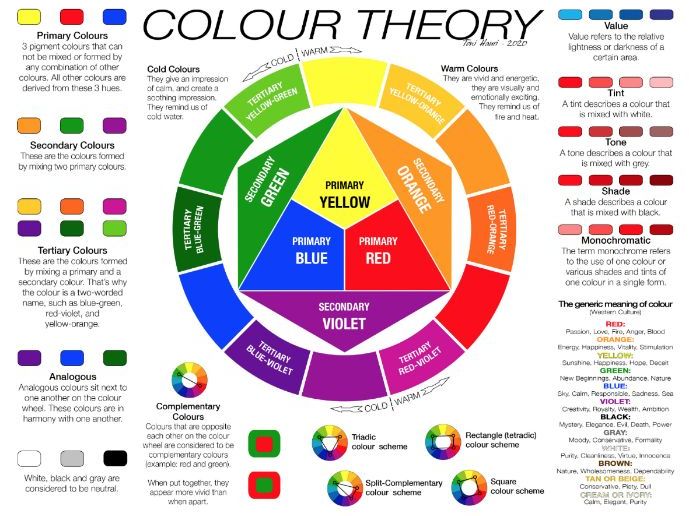
I then explored with different colours and colour theory where I decided to have contrasting colours for the background. For example in the images it has mostly red so the background colour would be green.

I found the original colours I used were too dark so I tried lightening the colours which I found made the images stand out more.

I then decided to play around by flipping some images 90 degrees or even 180 degree and then added some colourful shapes for the empty space to make the zine more fun and colourful.

Colour Wheel - Print Out | Teaching Resources

Identity + Community: Narrative and Sequencing

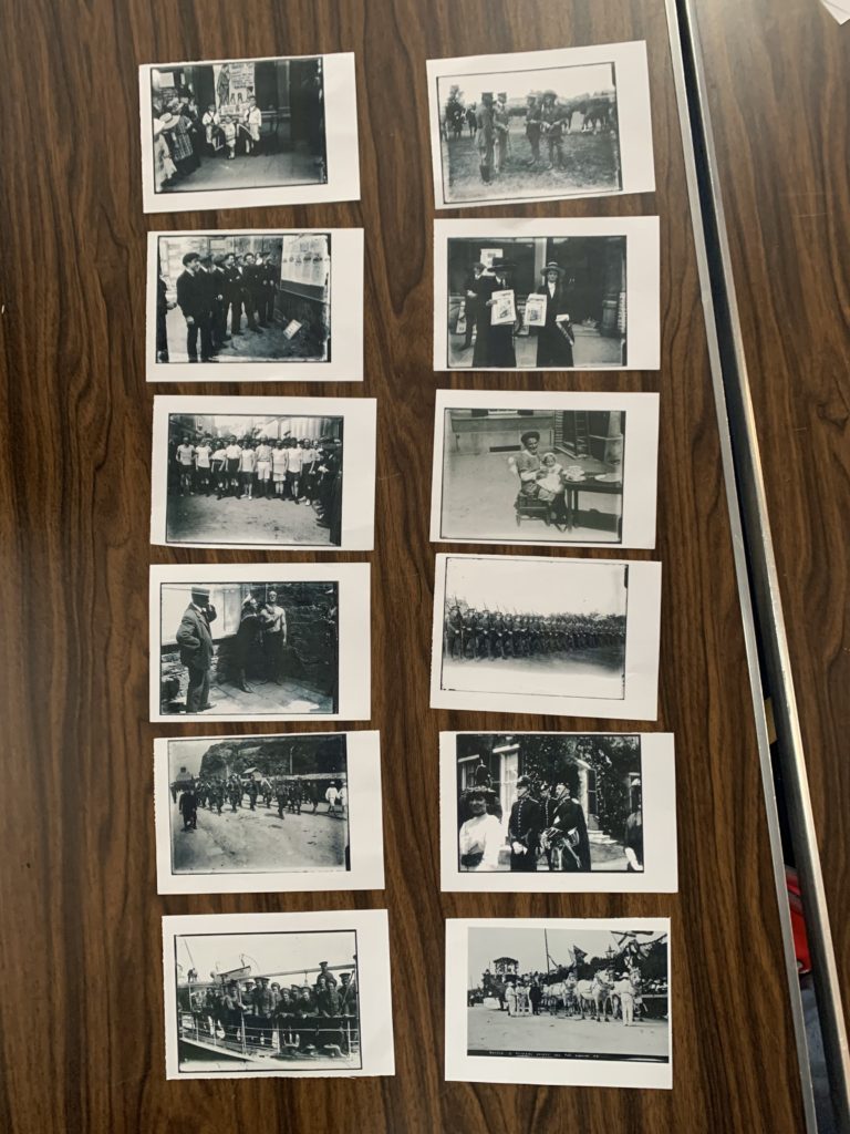
Photo Archive Example

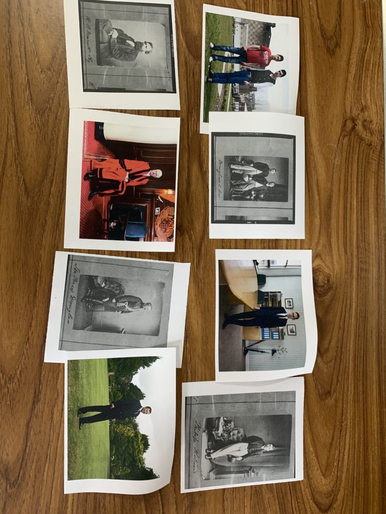
As a group of 4 we decided to order these in a chronological order, telling a story from start to finish. We presented the sequence as two rows going down, like reading a book. It starts with pre-war where the soldiers are training and the war has just started. Continuing to during the war focusing on people left behind and community and the end focusing on the return of soldiers and celebration.

My Own Images

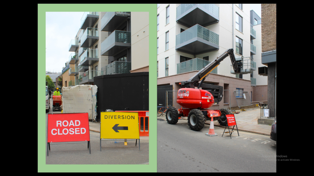
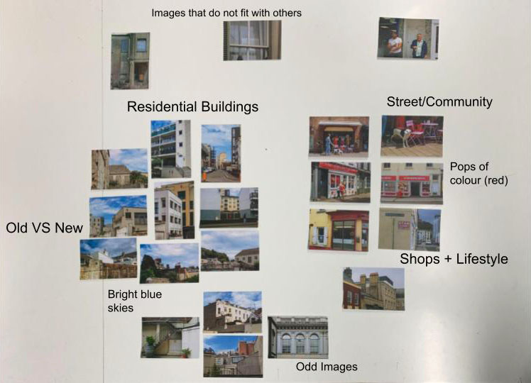
I have grouped the images to show the similarities or differences between the groups. for example on the left I have grouped images to show the difference between new and old buildings but also included similar pictures of the same theme like residential buildings.

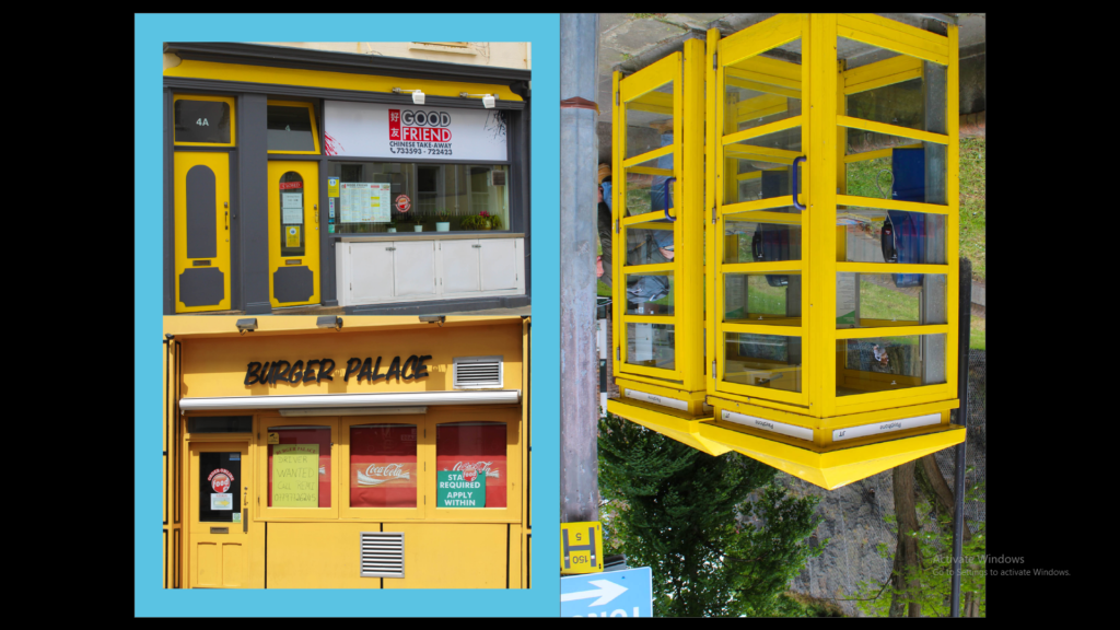
On the right I have grouped the images based on the similarity of the location, being shops. They also have the same red in each image which makes them flow nicely from image to image.

I have separated images that I think will not work nicely with the others or do not match the quality of the others.

Sequencing

Using my own images from the town photoshoots the theme I would like to focus on is community and lifestyle/surroundings. The zine will have a mix of residential buildings and commercial buildings to contrast each other.

The first page will have a full page of a singular image to set the scene for the rest of the zine. Throughout the zine there will be a few double page spreads of individual images to break the zine into parts. There will be street style portraits of people in their everyday routine. I will have no more than two images on one page spread to keep it simple and strong. I will contrast pages by using colour, subject and shape.

6 NARRATIVE & SEQUENCING

What is your migrant community story?

3 words

Colourful, respectful and helpful

A sentence

My migrant community story is about seeing beauty and colour around us even when things are looking dull and gloomy.

A paragraph

With the use of colour it expresses how people feel and colours themselves can be a community uniting people all over the world. We can also use colour when things are dull and gloomy such as the weather by staying inside and colouring. It can unit all types of people such as ones that probably can’t speak your language but colour itself has its own language. We use respect as a foundation of my community as we treat everyone the same and always help those who need it as one day we will receive the same help.

 How will you tell your story?

Images

Photoshoots of my community and how I connect to it and how it has changed me as a better person.

Archives

Family photos of myself and of further back, photos from the Société Jersiaise photo archive and recent photos of my travel from England to Jersey.

Texts

Text messaged from my friends and family talking about my move to Jersey and about the communities I am part of.

Who is it for?

My zine is for all ages as I want the colours to appeal towards the younger ages and I want older members to look at it too as I want them to be aware that it is not childish to express through colour an that it is encouraged to instead. For my zine I don’t want it to be set for just one community but to be for all communities with all different sorts of cultural and social backgrounds.
Identity and Community – Shoot 1

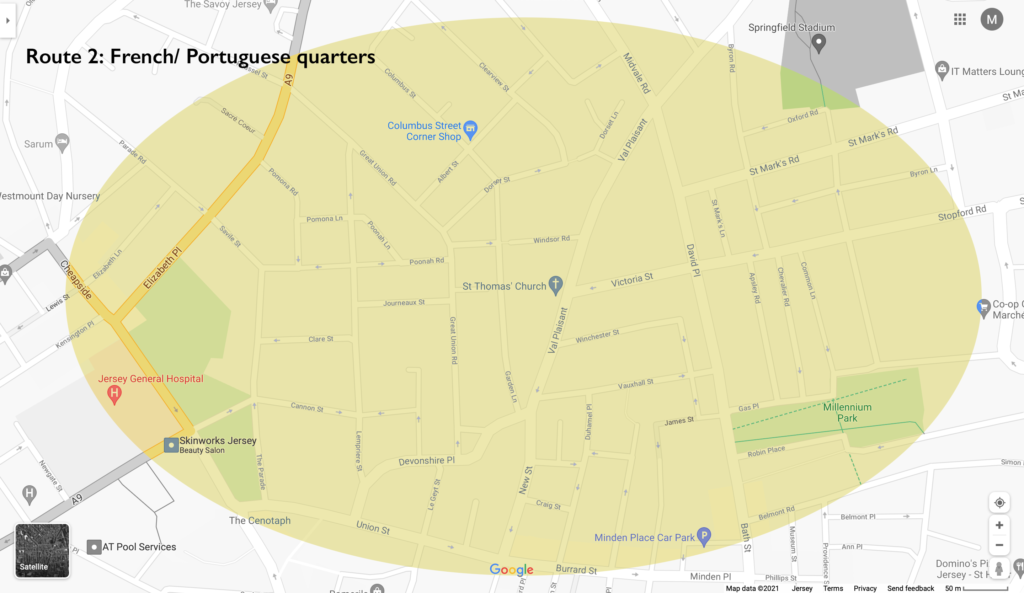
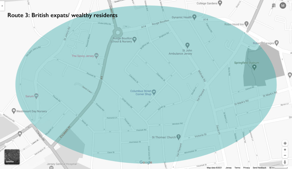
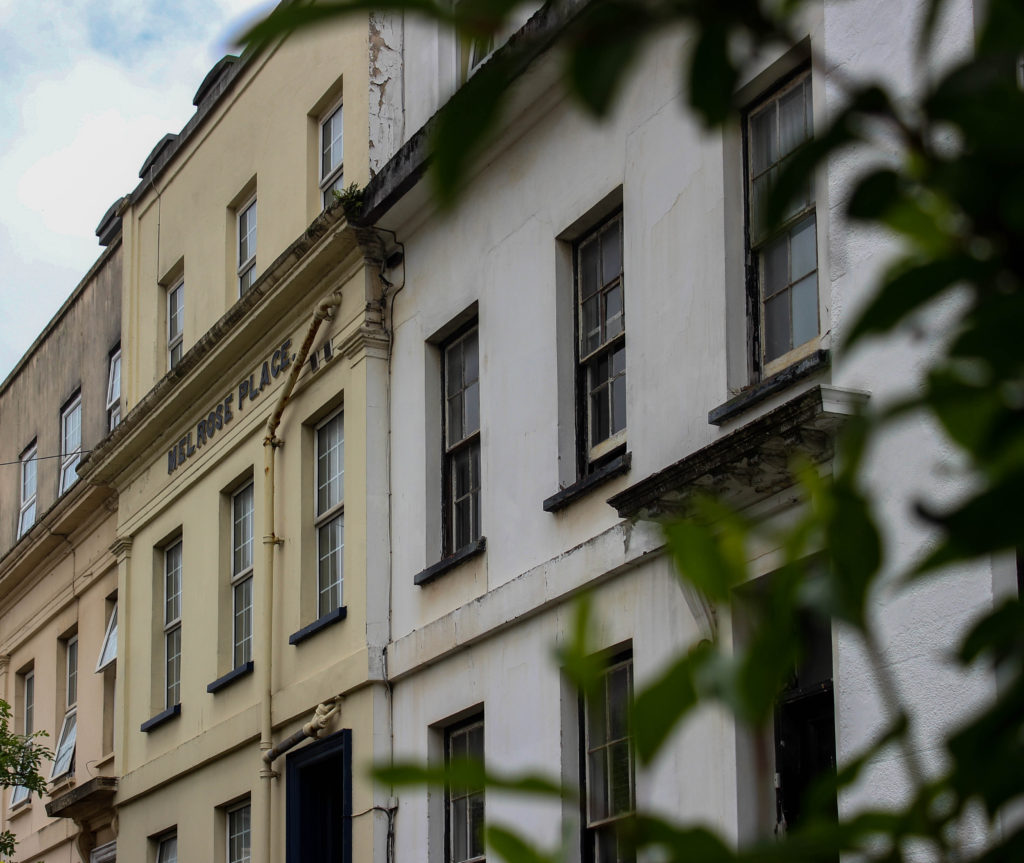
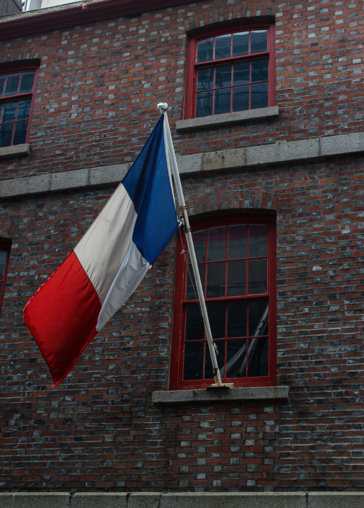
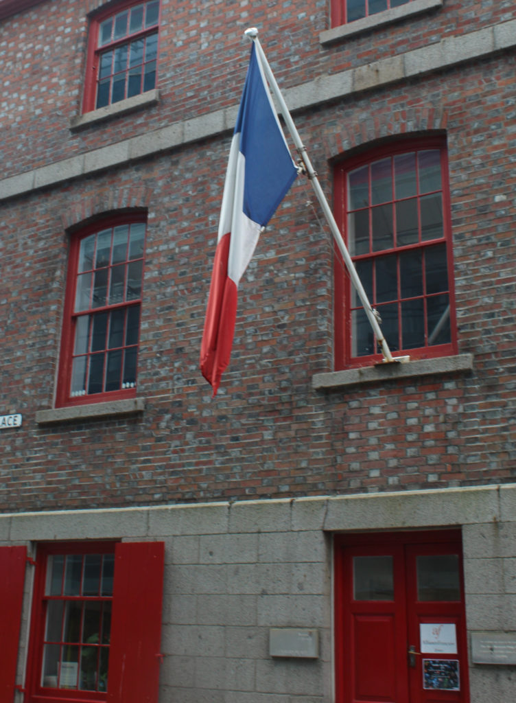
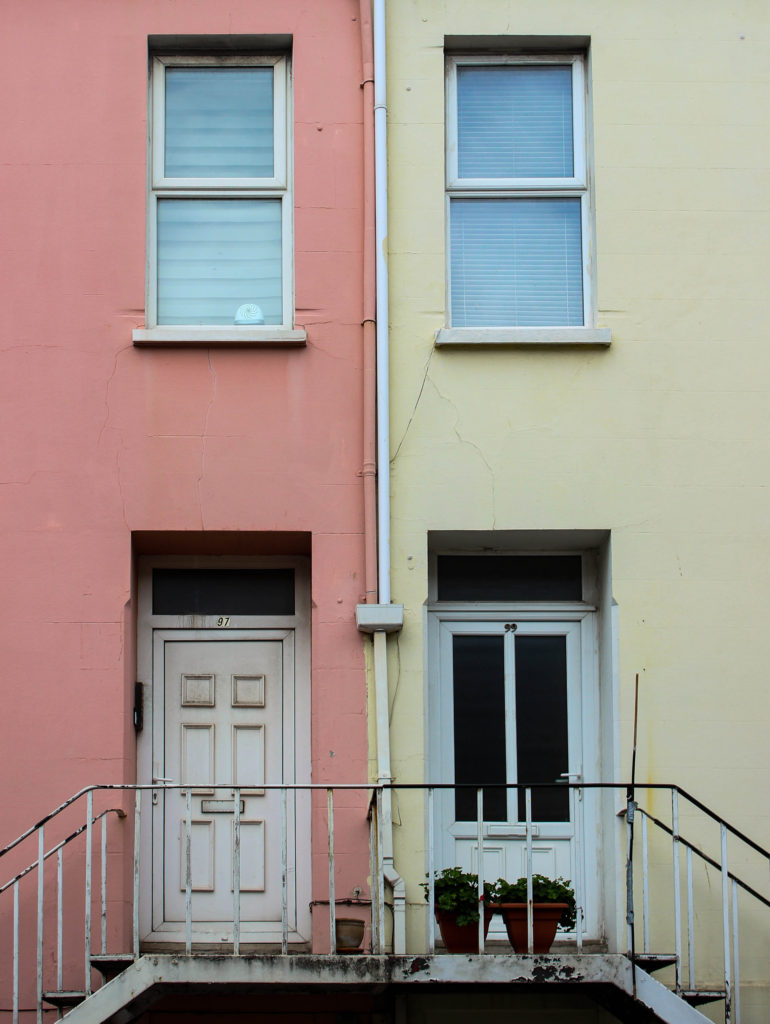
On the 7th of June, the day we visited the ‘People make Jersey’ exhibition at Jersey Museum, we also spent a portion of our day doing practical work. This consisted of walking around certain areas of town, that previously were known as sections of cultures and communities that belonged to different immigrant backgrounds. These three areas that we focused on were known as the merchant quarters (in red), the French and Portuguese quarters (in yellow), and the British expats and wealthier resident areas (in blue). On this walk we aimed to take photographs that showed the environmental differences between these culturally different communities, such as architecture, religious places and symbols, people and businesses. For this shoot we split into groups, with the group I was in focusing mainly on the French and Portuguese quarters.
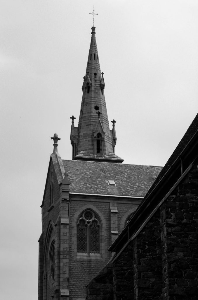
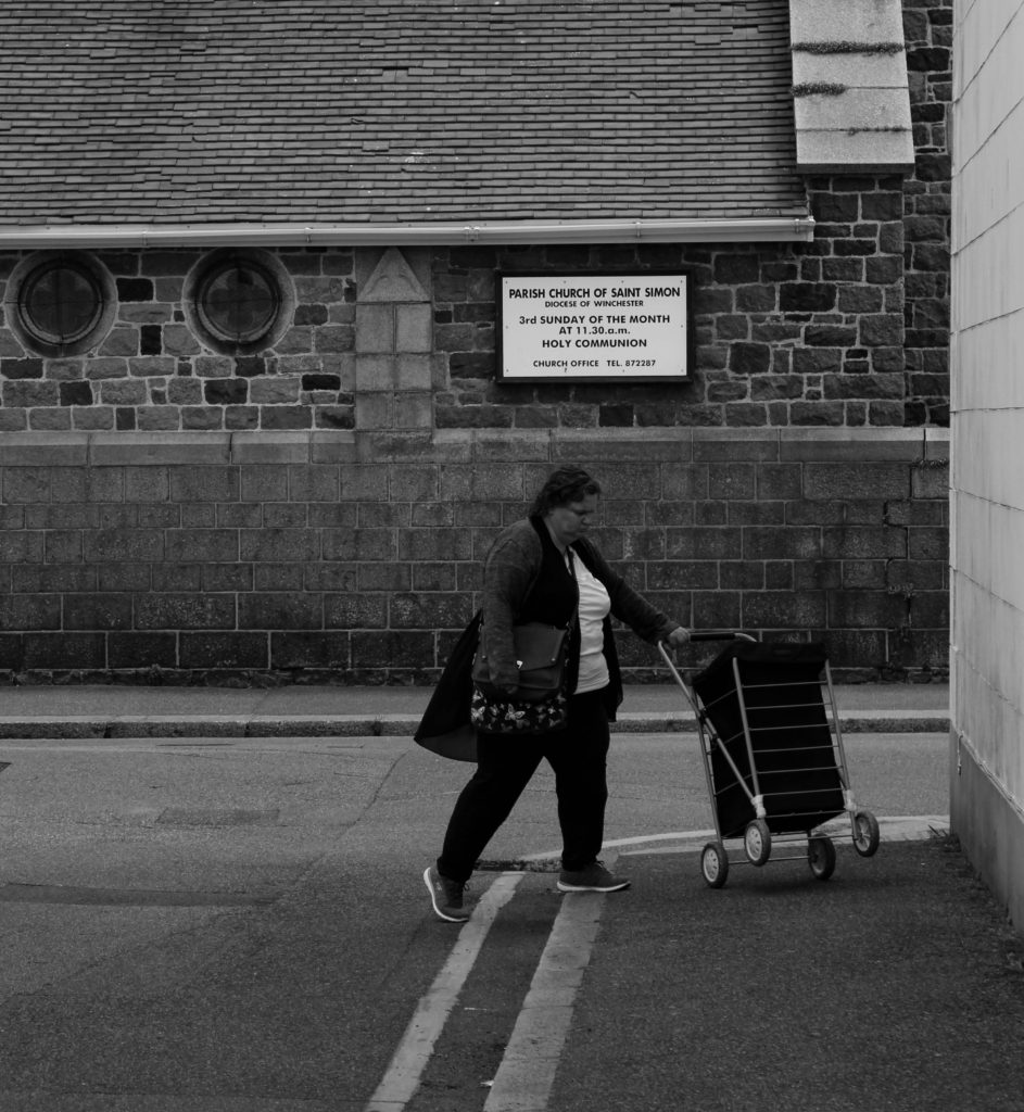
Using the photographs from this shoot I have edited and developed my best images, that I believe help us visualise what makes a community and how they contrast with the other quarters around St. Helier.

Contact Sheets

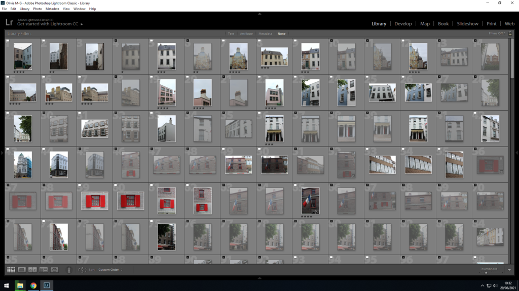
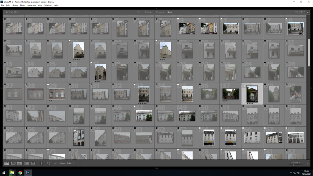
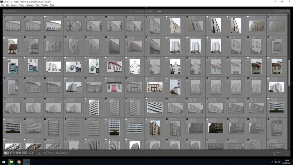
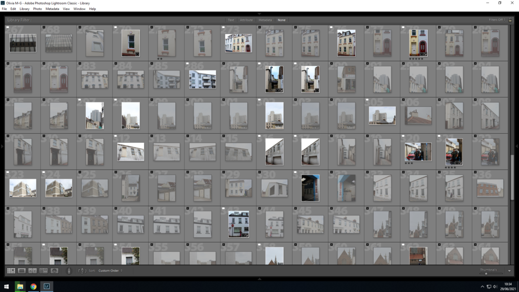
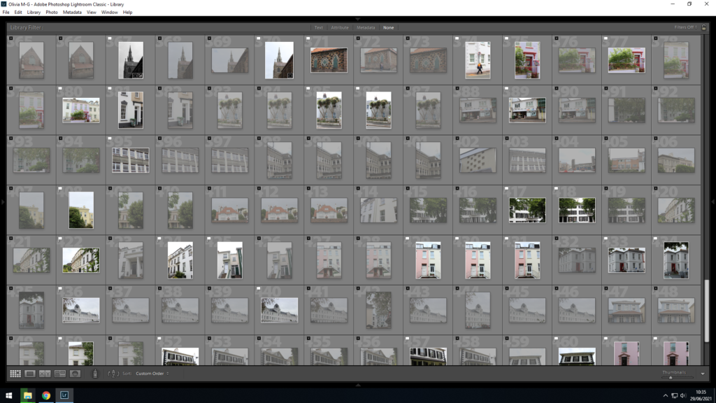
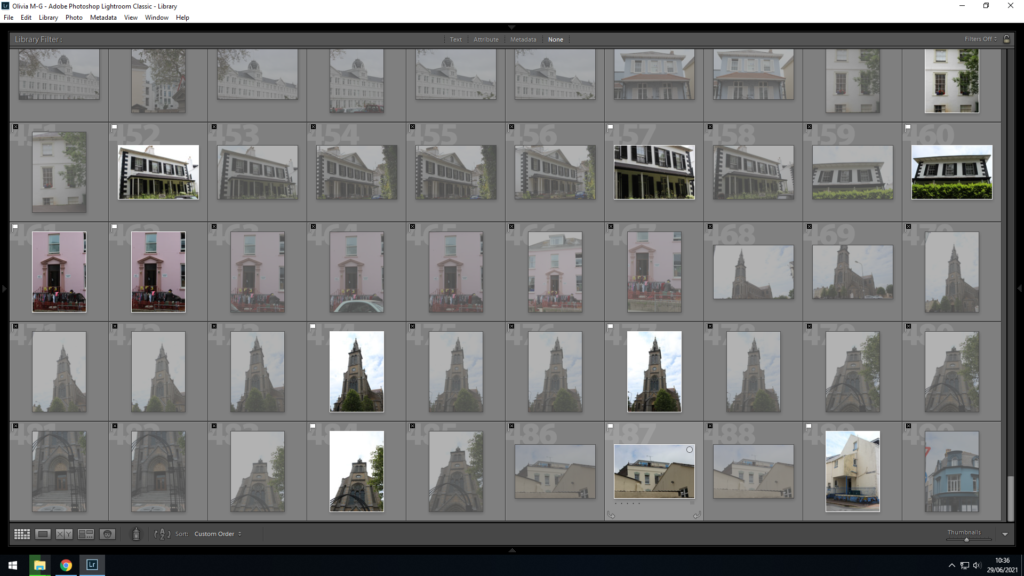
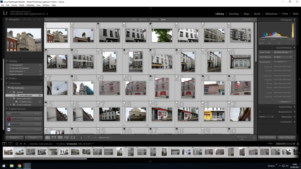
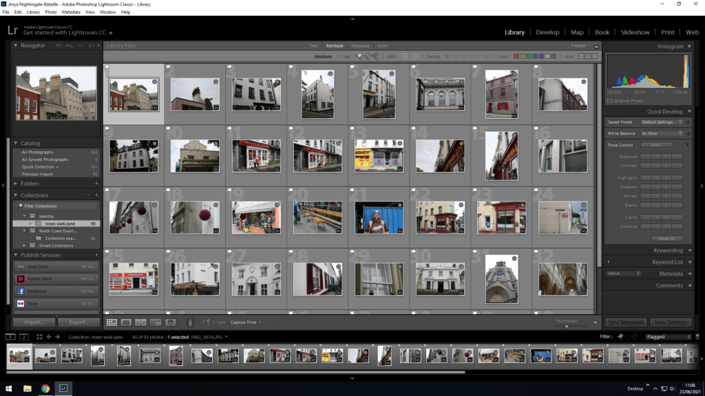
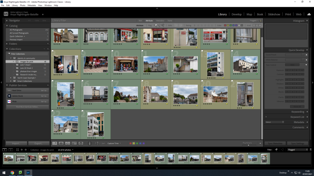
For this shoot I took approximately 400 photographs, so in order to sort through them I used Lightroom to determine which images I would edit. This allowed me to compare photos and decide their relevancy when placed in a sequential format.

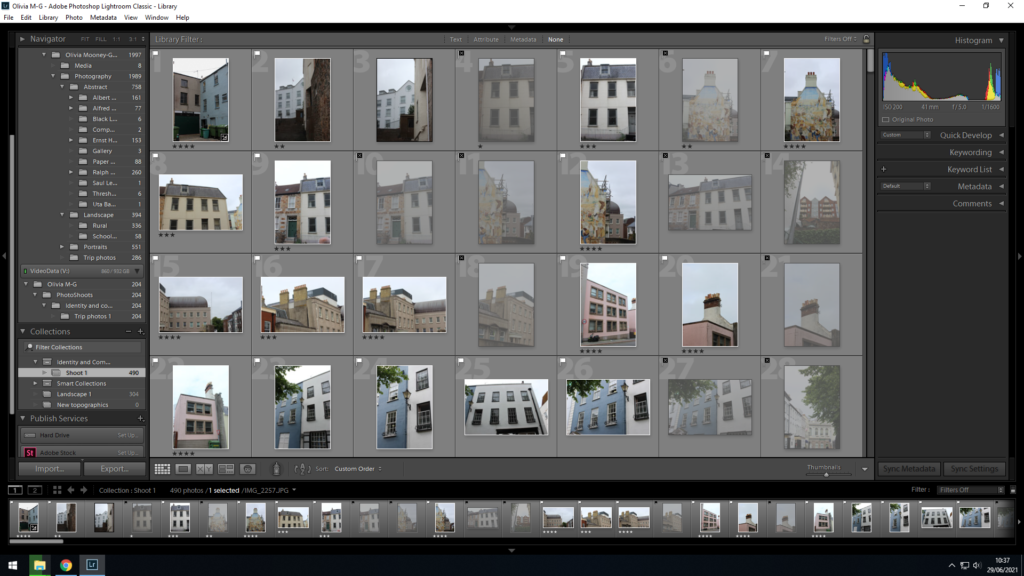
I first imported all my photographs from this shoot into my identity and community collection on Lightroom, and then went on to flagging the images I wanted to look at more closely and edit, and those I didn’t. I did this by using SHIFT P to flag the images in white I thought were my best, and using SHIFT X to flag the images in black that were not good enough to edit, due to them being out of focus or not interesting composition wise.

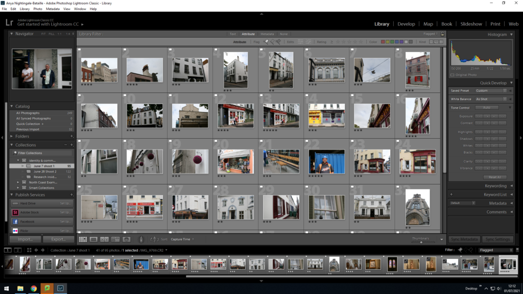
After flagging my images I then went further with my selection process by rating each of my photographs out of 5, in order to determine which images I would edit. The photos with a rating of 4 and over are what I believe were my best captured images

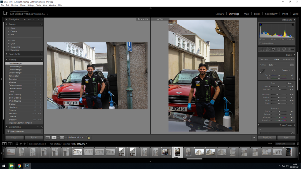
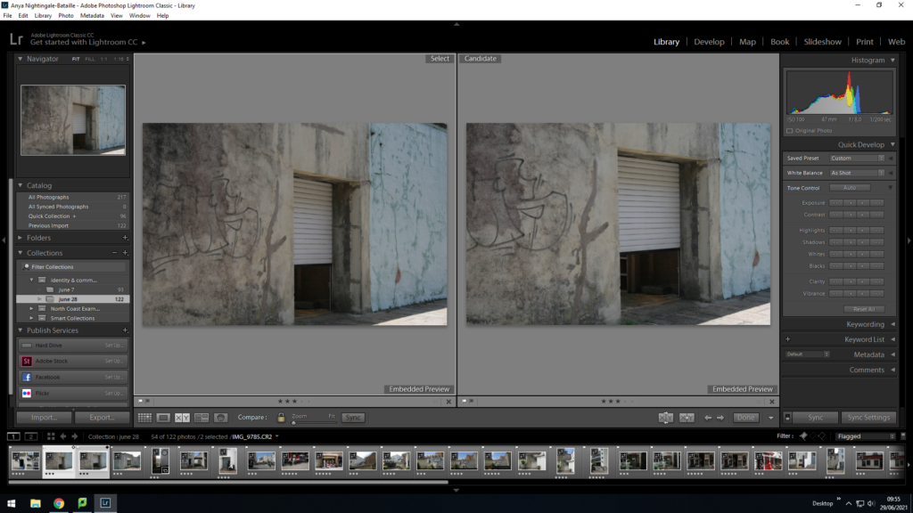
With most of my photographs I used the survey view to help to decide which out of two similar images I should choose to edit and display. This helped me recognise which image was more focused, especially if it was a portrait as I zoomed into the face on both photos and was able to compare them and see which was the best.

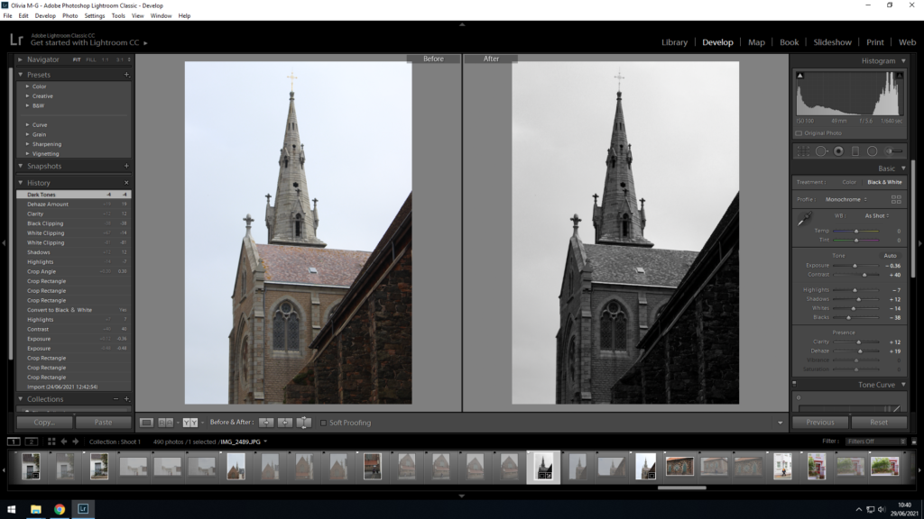
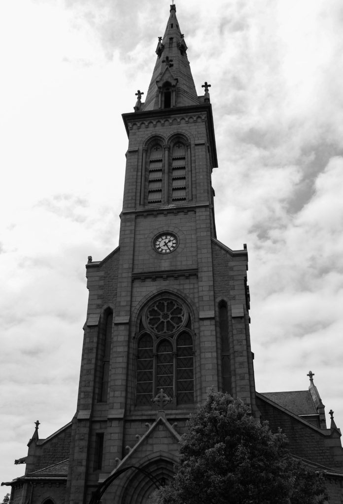
I also used the survey view to see if my image would look better in black and white or in colour, as it allowed me to see the before and after of the editing. I then decided to develop the image in black and white as I believed it created a more dramatic piece and a stronger contrast between the lightness of the sky and the darkness of the structure in the bottom right corner.

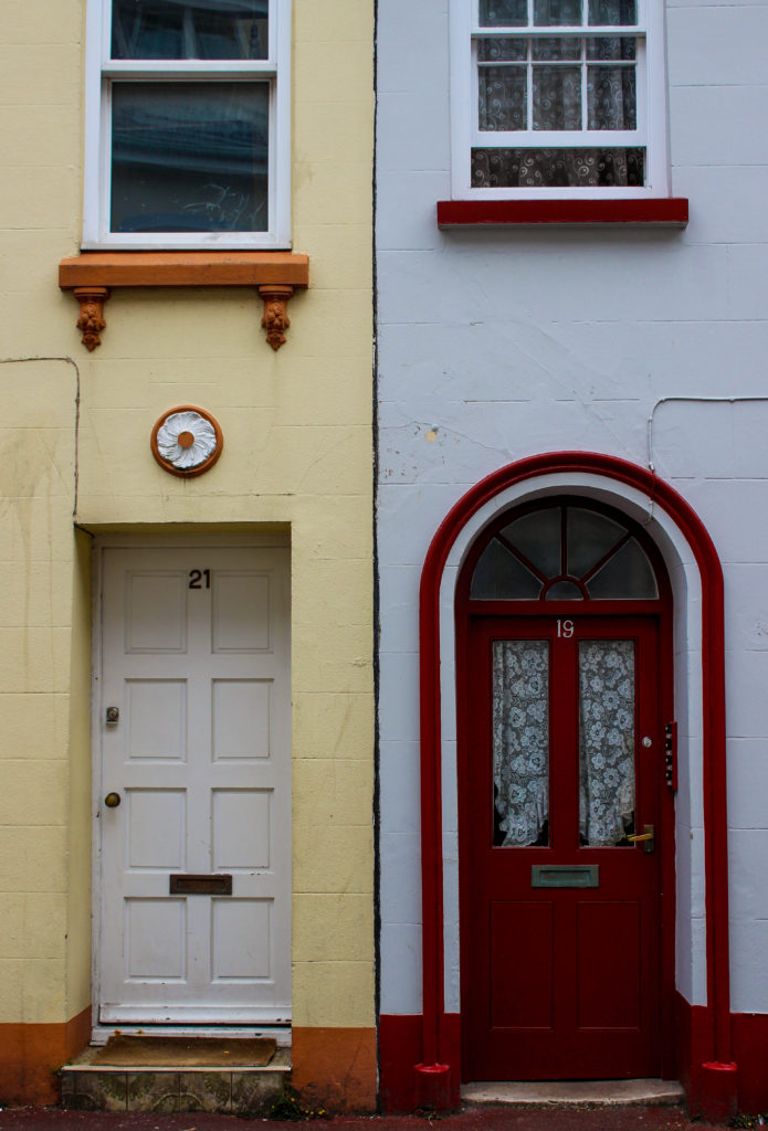
Here I viewed the before and after of my editing of this architectural image. On the right is my developed photograph, in which I increased the contrast and saturation to enhance the duplicity of the two houses. This was useful in helping me decide if my images needed more done to them to stand out more, or if they were over edited.

Edited Images

Lightroom Adjustments

Original Image
Edited Image
Original Image
Edited Image
Original Image
Edited Image
Original Image
Edited Image

How I edited my images

Firstly, I converted the original colour image into black and white to add a uniformed monochromatic theme to the images.

I then adjusted exposure, brightness etc in order to achieve a higher contrast between the black and white tones, and to also give the images a similar tone overall, and making sure none were too dark or too bright.

I decided to make these images black and white as I believe this uniformed theme adds a sense of unity between the communities of Jersey, but also adds a sense of ambiguity to the identities of the people in the images.

Identity + Community: Selection and Editing

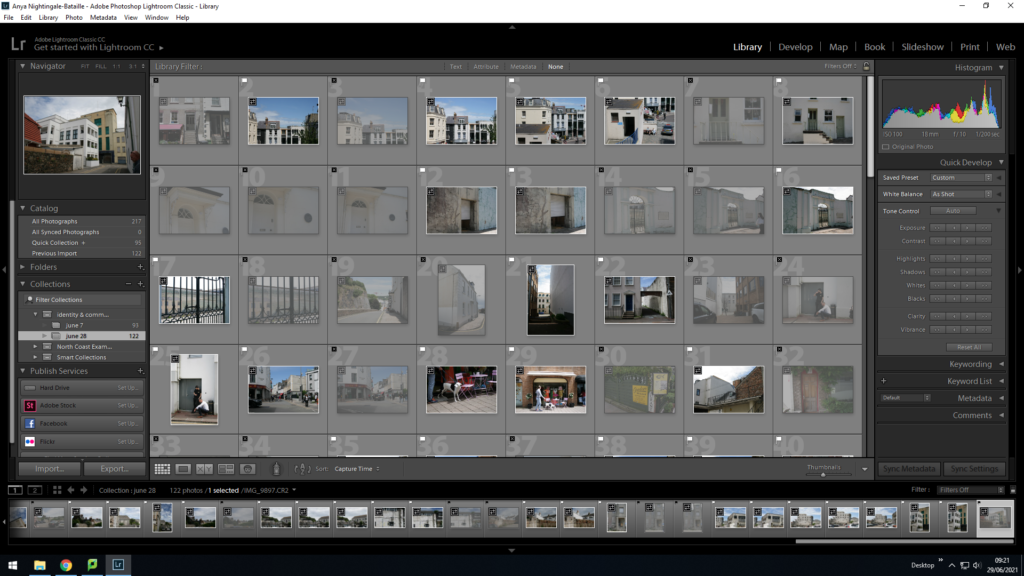
I imported all my photos from both shoots into light room adding them to the Identity & Community collection in sub folders called June 7 and June 28.

Selection

This image has an empty alt attribute; its file name is image-38-1024x576.png
Shoot 1
This image has an empty alt attribute; its file name is image-90-1024x576.png
Shoot 2

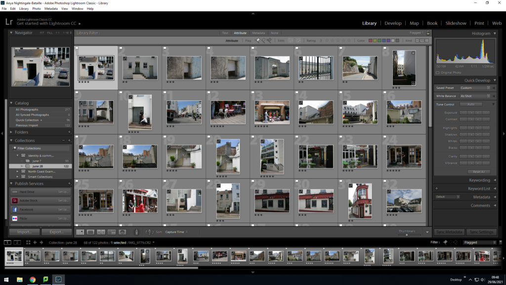
I went through the images, organising them by using the Flag system by clicking the ‘P and X’ keys for ‘Pick and Reject’ to filter out images disregarding any which are out of focus or have an odd composition which does not look good.

This image has an empty alt attribute; its file name is image-40-1024x576.png
Shoot 1

I filtered out the rejected images by pressing the flagged filter.

This image has an empty alt attribute; its file name is image-3-1024x576.png
Shoot 1
This image has an empty alt attribute; its file name is image-97-1024x576.png
Shoot 2

Using the 1-5 star ratings I rated the individual images based on how they looked as a composition. Giving 5 stars for the images I will to most likely use and down to 2 stars for ones I want to get rid of. I filtered out the 2 stars by adding them into rejects (pressing the X key).

Image from Shoot 2

Using compare view I selected images which are similar to compare and pick which one I prefer.

Editing: Colour + Transform

Images from Shoot 2

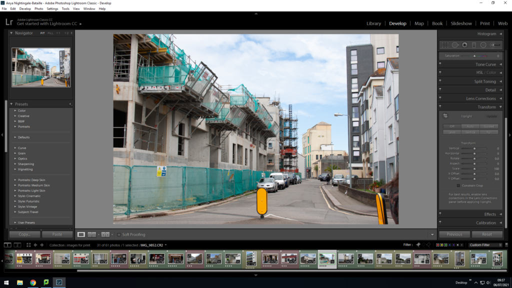
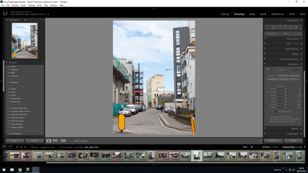
I used the Transform tool to crop and angle the image so that the lines coming from the buildings were straight. I used the auto tool for the angling but cropped the image with the crop tool.

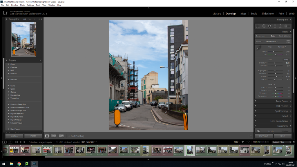
I used the Basic filters to edit the colouring of the image with the main focus to lower the exposure and to increase the colour.

Final Selection

I selected all images from both shoots that I had filtered out as the best and put them into a new folder called ‘images for printing’ to make the final comparisons between them.

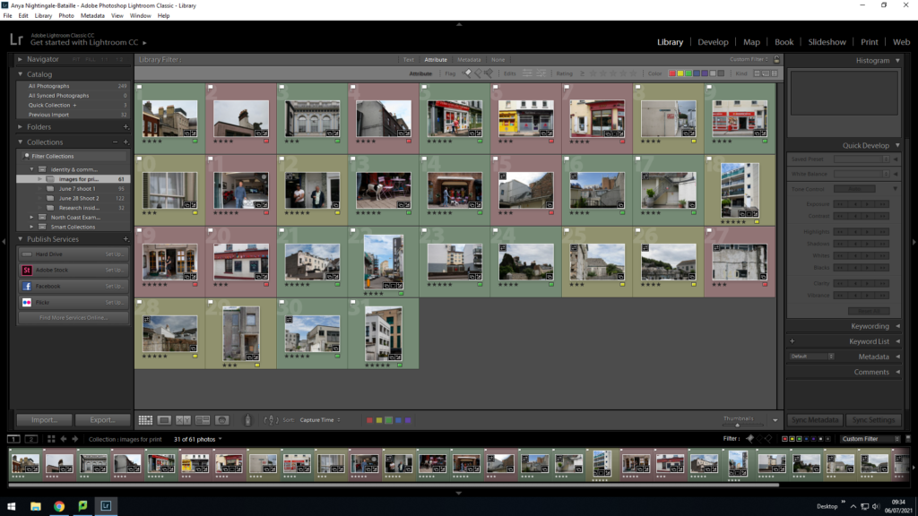
I used the colour tool to colour code my images for printing, green being the photos I want to definitely include in my sequence, yellow being maybe and red being backup photos which I think I will not include.

I went through and set the Red images to reject and edited the images a bit more ready to print.

Jersey museum analysis

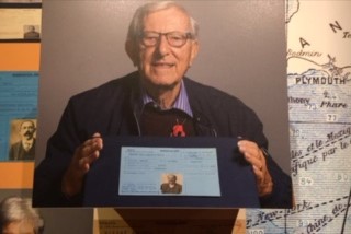
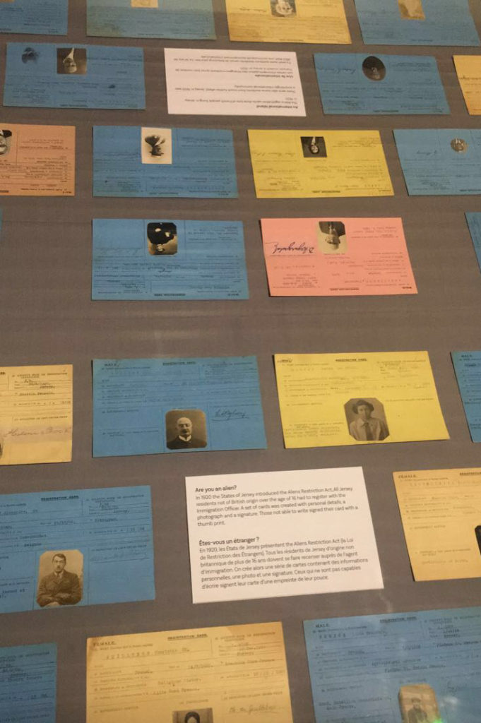
On Monday June 7th, the school had arranged a trip to go to the Jersey Museum to discover an exhibition called ‘ People Make Jersey’. The exhibition showcased how immigration has influenced change in jersey from cultures, buildings and why people decided to immigrate to Jersey over the centuries. We learnt that in the 19th century that the jersey economy was boosted increasingly due to wealthy immigrants coming over. These individuals mainly came over from the UK or British colonies due to the attraction of the tax scheme, mild climate and for the way of life of living on the island. Due to these high value residents coming over to Jersey, this helped with creating local jobs and contributing to the growth of St.Helier in this time period.

After we went around the museum taking pictures of a rich merchants house, we went out on a walk through town with Stewart to take pictures of buildings and chimneys that had a lot more meaning behind them than anyone thought. For example there where buildings that have bricks which where darker than the others and the reasoning behind this was because those brick’s had been charred for a longer amount of time then the other brick’s in the process of making them. As for the yellow chimneys, we got told that they had some sort of military meaning behind them for the Jersey military in understanding which of those buildings that had the yellow chimneys where owned by the Jersey military.

identity and community

People and place 

 On Monday June 7th, we discovered an exibition called  ‘People Make Jersey’ at the Jersey Museum. This exibitionn explores the history of  Inmigration who has influenced and changed jersey. And explores why people have moved in the island over the centuries. We learned about religious persecution and that due to Jersey’s geographical proximity to France, Jersey has provided a refuge and a place of safety for like French catholiques in the 19 century. We discovered that during periods of political appival Victor Hugo and other immigrates across Europe find a refuge in the island during the 19 century. We also learned about economic migration, that people have come to the island to have a better life for their families. They showed us legacy we can see in the island. We saw testimonies from inmigrants.