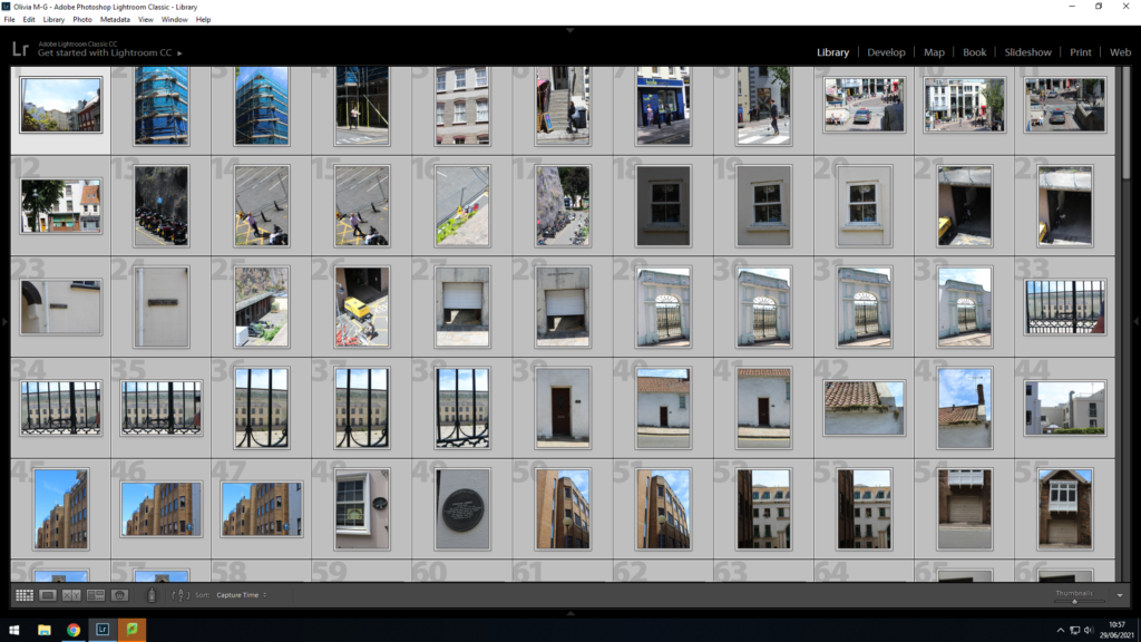
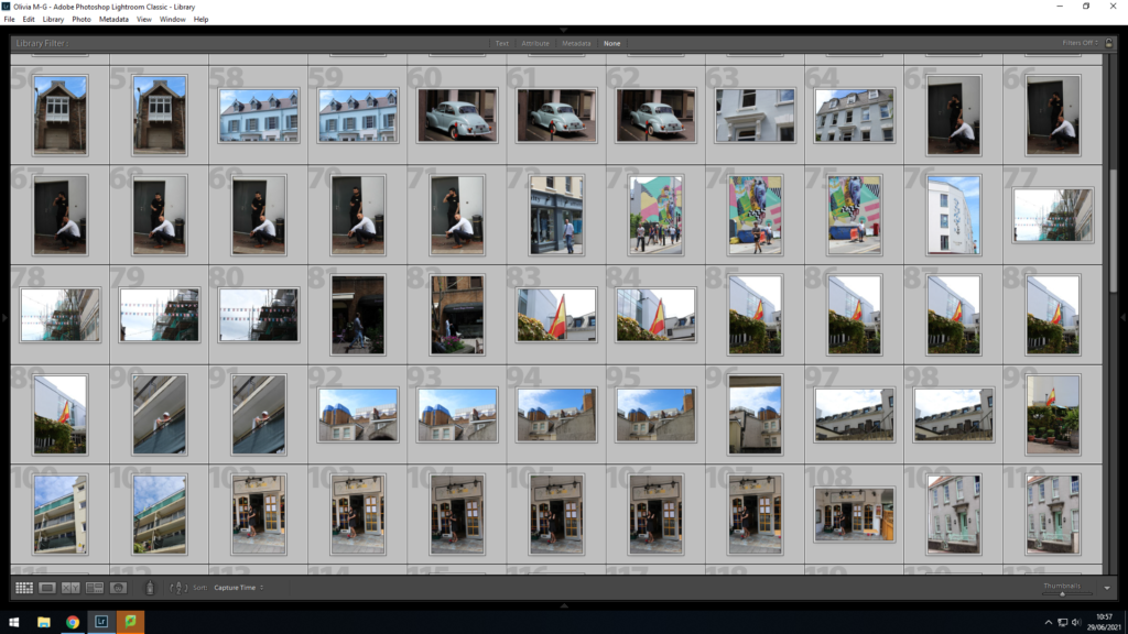
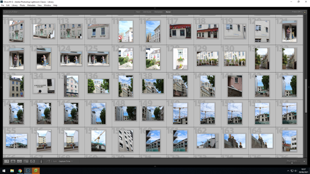
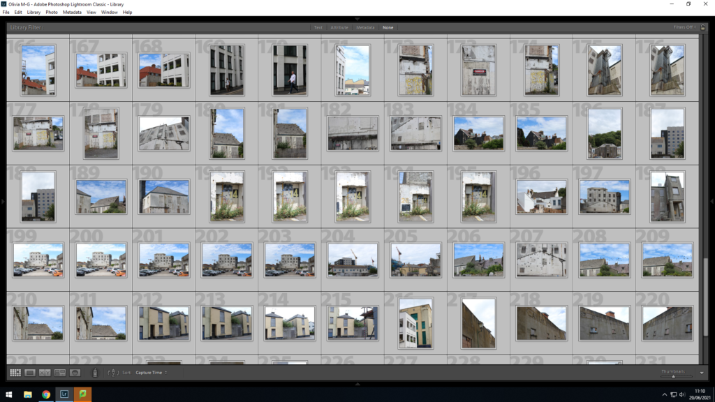
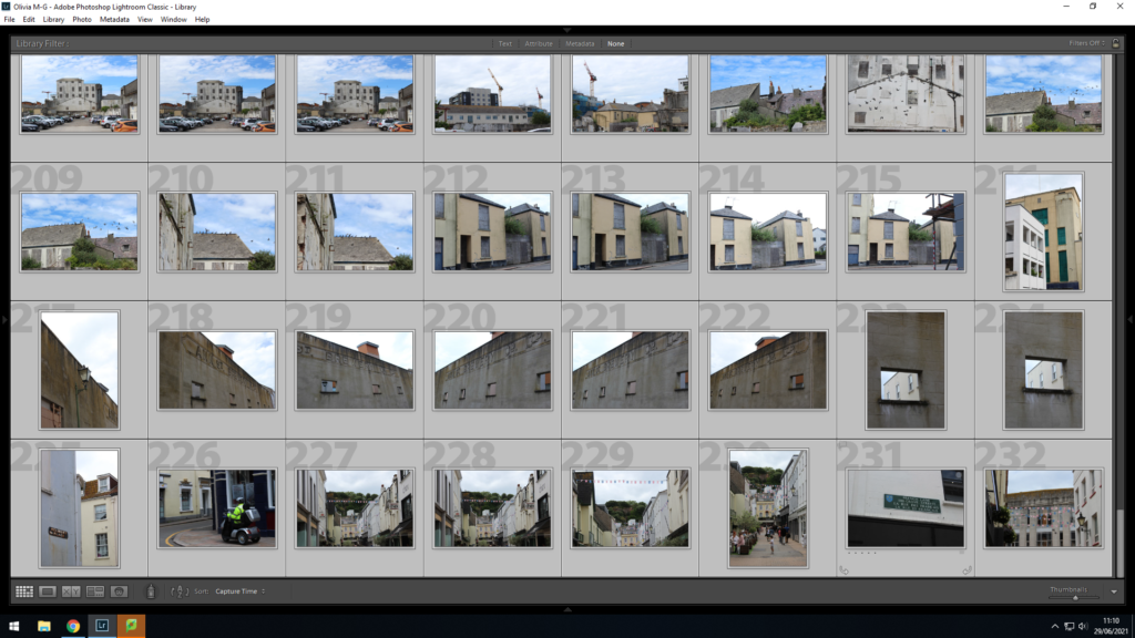
Contact Sheets
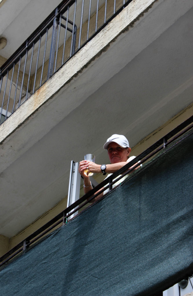
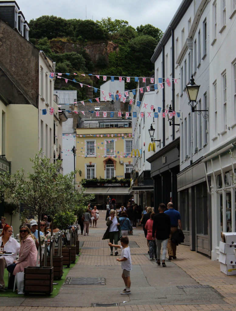
I started by importing all my photographs from the seond photo-shoot we did as a group, during our trip to the Société Jersiaise. After this, I then went through each of my images flagging my best images with white, and my worst in black to start off my selection process. I then went through my white flagged images and started to rate them out of 5, allowing me to see which images I should prioritise editing and those I want to include in my series.
Editing and Developing
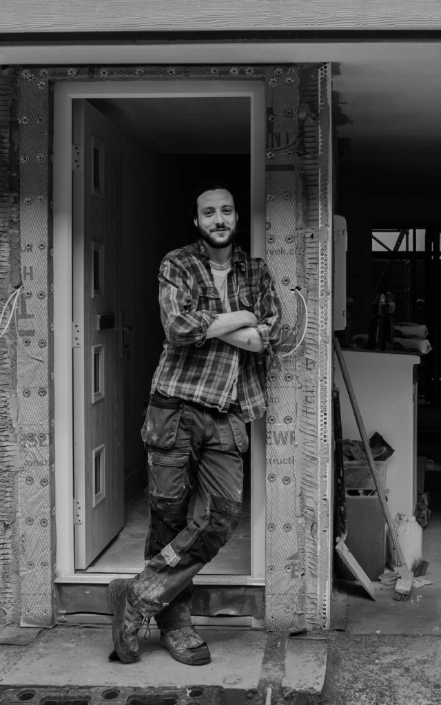
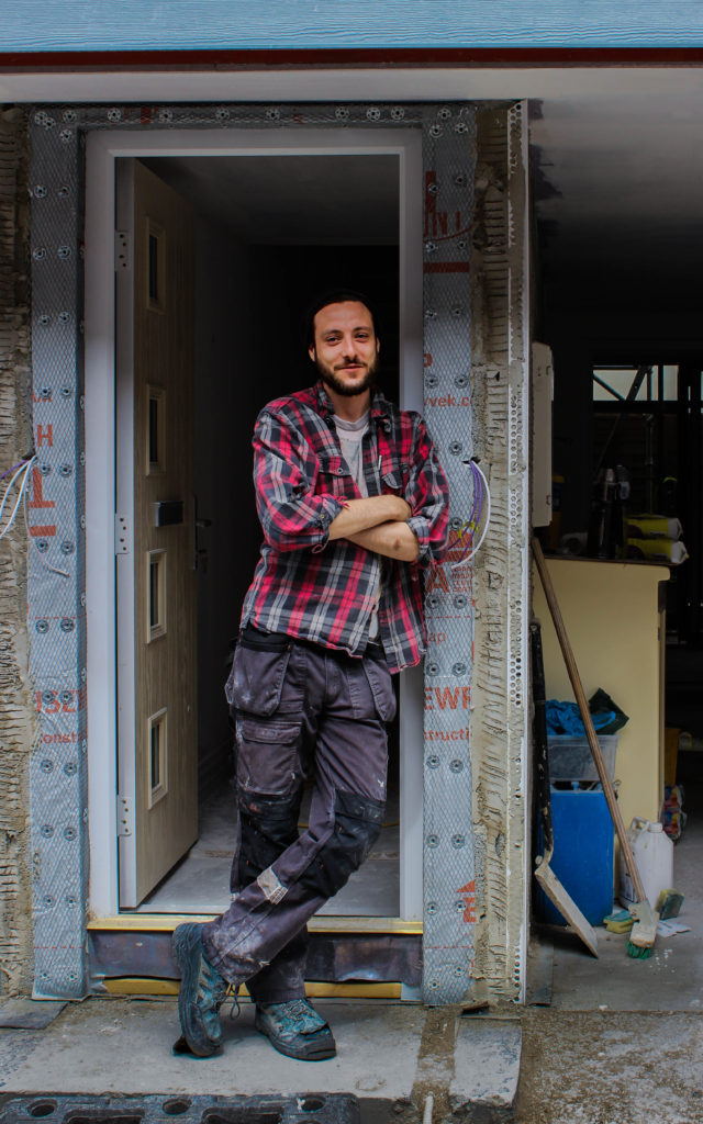
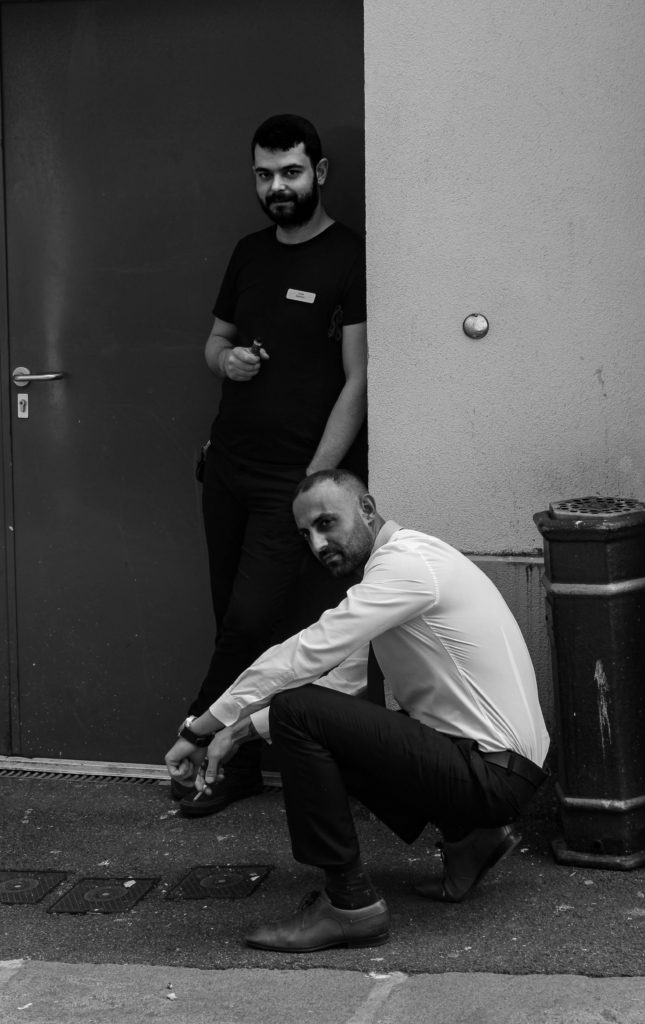
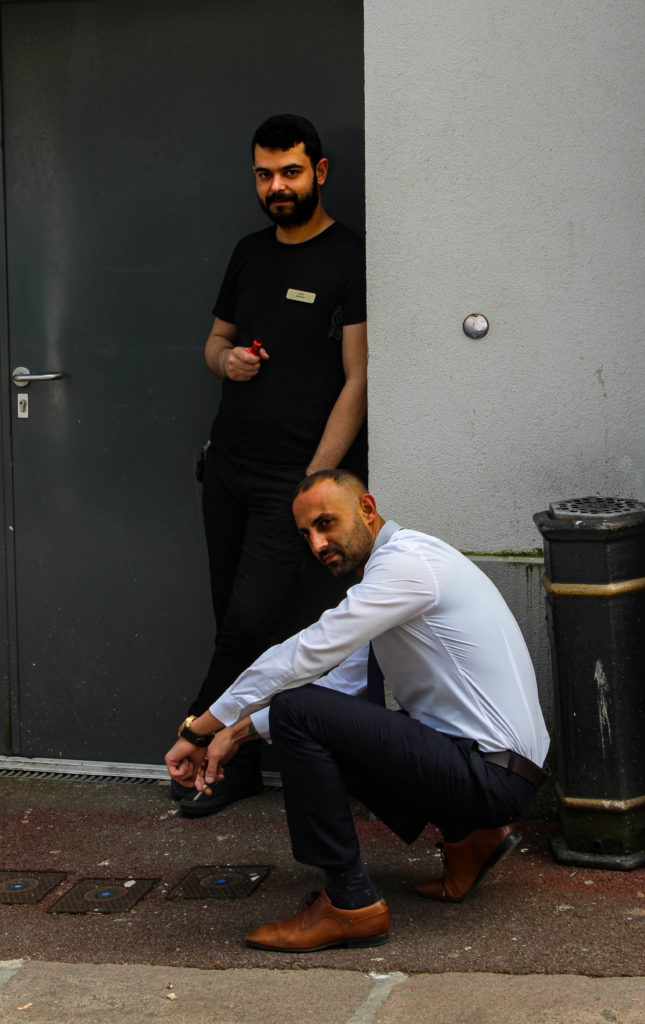
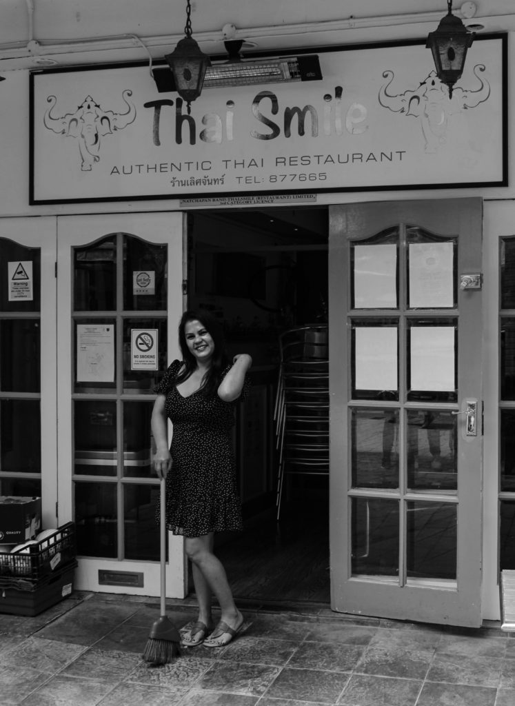
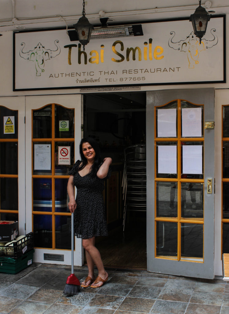
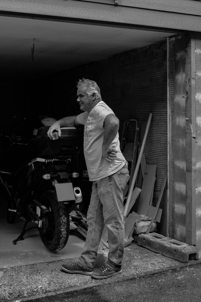
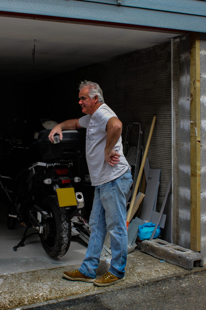
I started off by editing my 5 stared photographs, first of all cropping my images to allow a strong focus on my subjects. I then experimented with black and white for my portrait images, whilst adjusting the exposure, contrast, shadows, highlights, blacks and whites. I did this for each of my portraits and decided to create an edited image in both black and white, and colour for each of them.
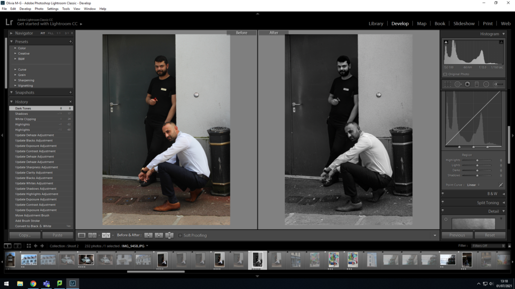
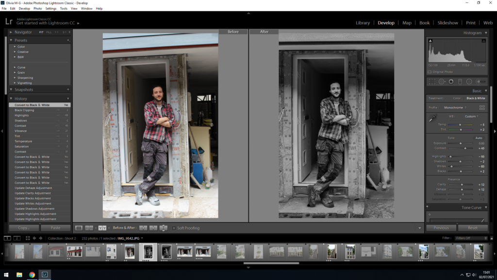
Here I used the survey view in order to compare the difference between my portraits in black and white, and colour. I decided to do one edit of each as I believed when placed in a series, although containing the same things, they would tell two different stories.
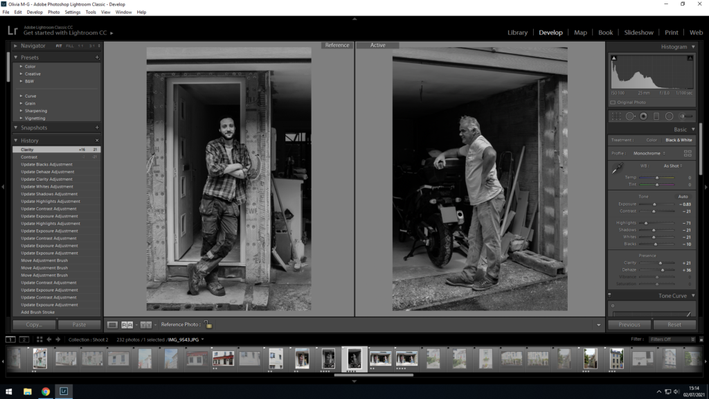
I also used the survey view to make sure that I was editing my images with similar tonal values to each other, in order to make sure they would fit together in a series, without looking too jarring when placed side by side. I ended up editing my black and white images with a strong contrast and darker tones.
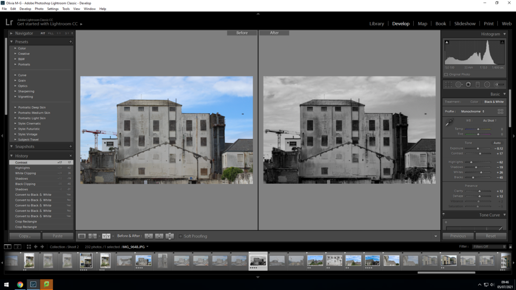
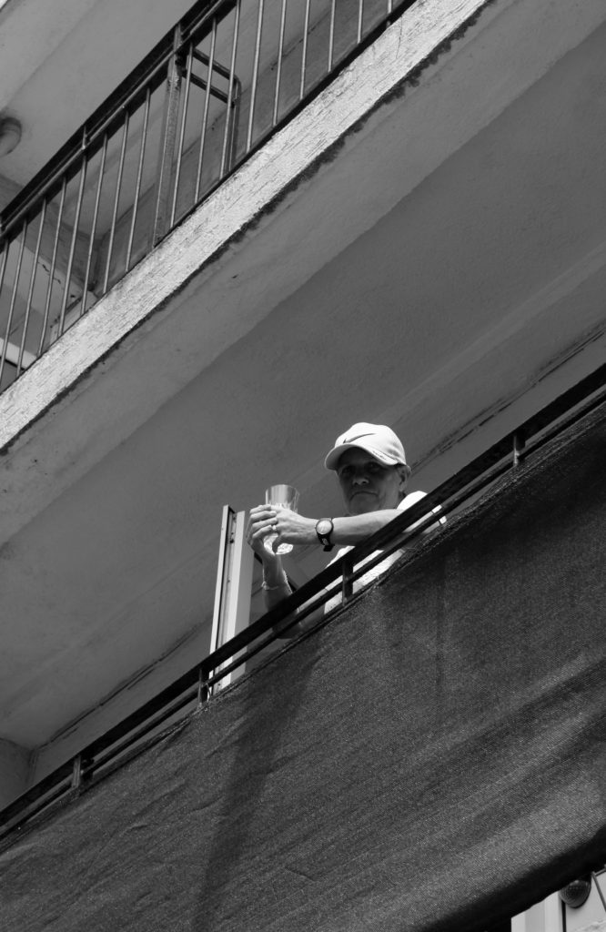
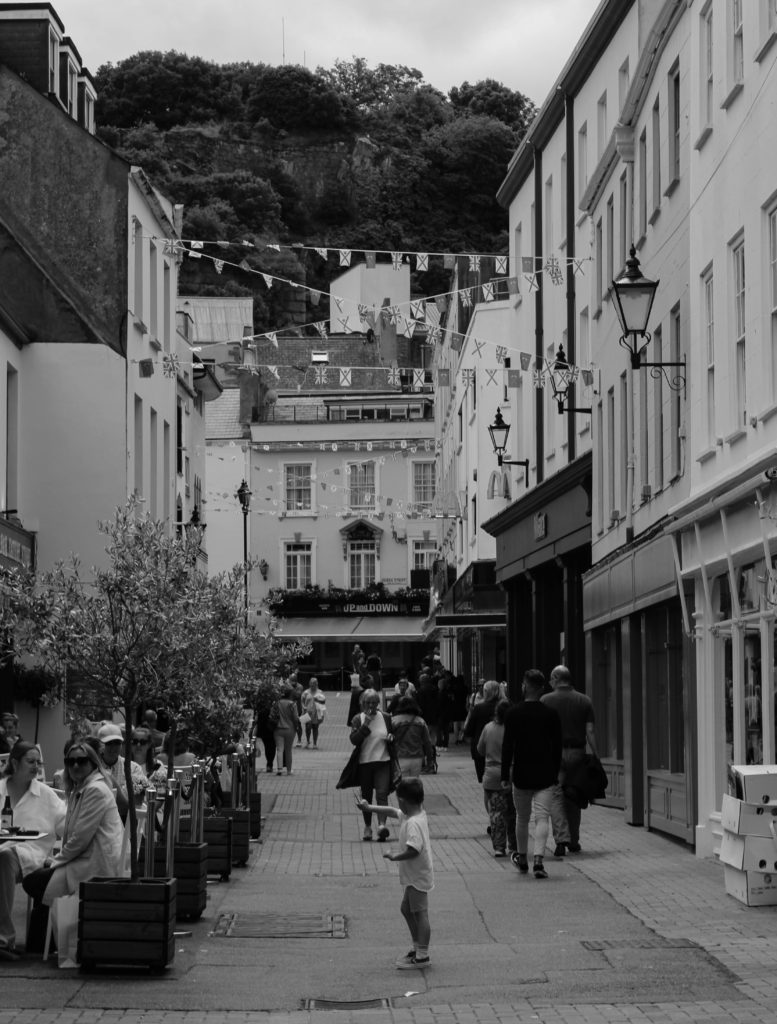
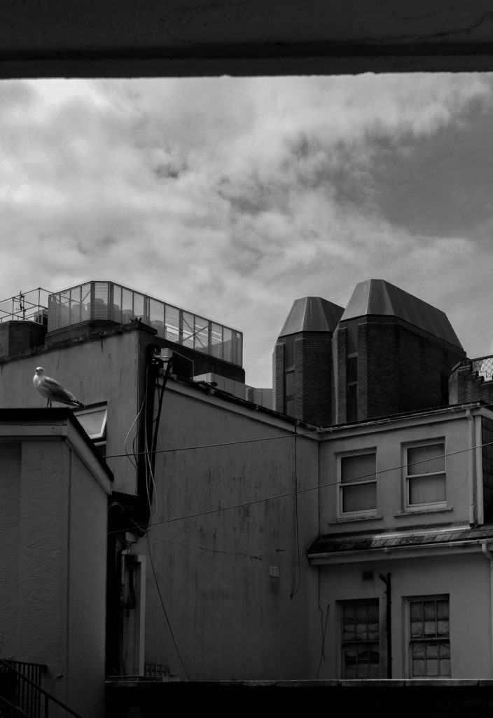
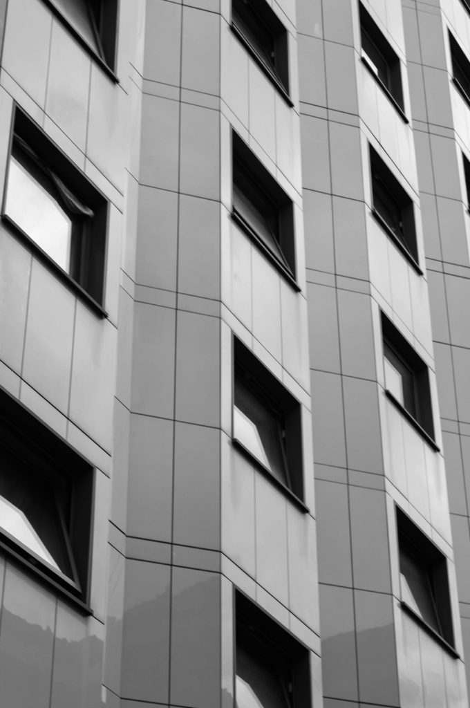
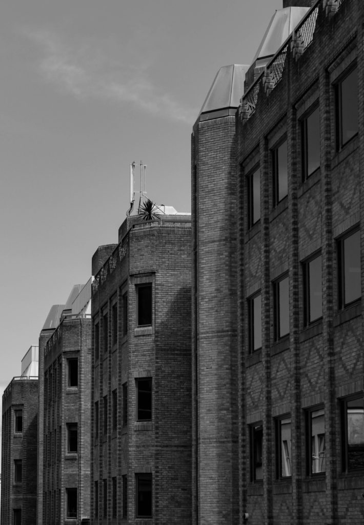
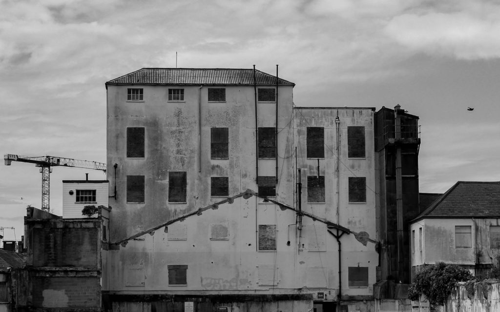
I also experimented with black and white with my architectural photographs, deciding to only create edited images in this style, as I found it emphasised how old or how modern the structures were. This helped me to build up a story and a visual representation of what each part of St. Helier represents and looks like.

