The Photoshoot
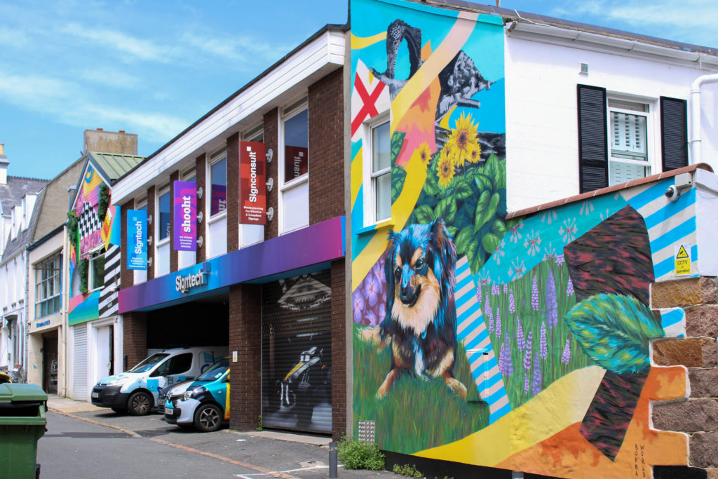
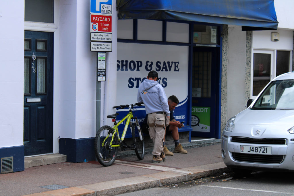
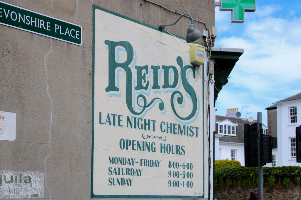
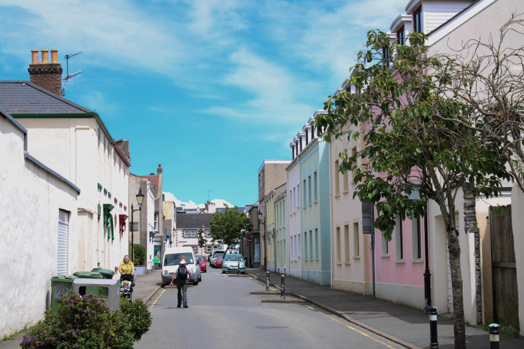
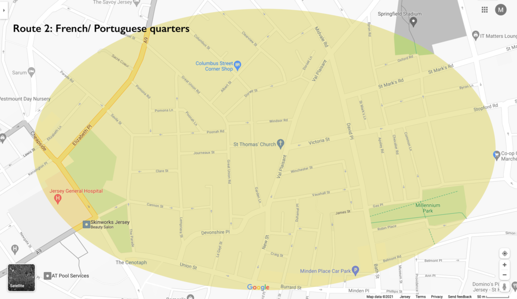
On Monday 28th June, as a photography department, we had a day of learning and information at The Societe Jersiaise Photo Archives. During the day we went out into different areas of St Helier focussing on separate communities who came from different immigrant backgrounds, such as the Merchant Quarter, the French/Portuguese Quarters and the British Quarter. My aim for this photoshoot around town was to capture a sense of place, photographing different buildings, shops, businesses, architecture, streets as well as capturing some environmental shots of people working/living in or just travelling through these areas. The group I carried out this photoshoot with focused on walking through the French/Portuguese Quarters, I was able to plan while walking about the kind of people/places and types of buildings I wanted to take images of. My plan was to photograph the comparison between old and new St Helier buildings, showing how the sense of place changed over time, as new communities entered and old ones left. Additionally, I planned on capturing street photography inspired portraits of these communities to show a range of ethnicities residing on the island – I found it important while taking these images to be respectful around certain areas where people were not comfortable having their photo taken. Altogether, I really enjoyed this photoshoot around different migrant communities, showing a sense of place changing over time and people in a natural and not staged environment.
Editing – Contact Sheets
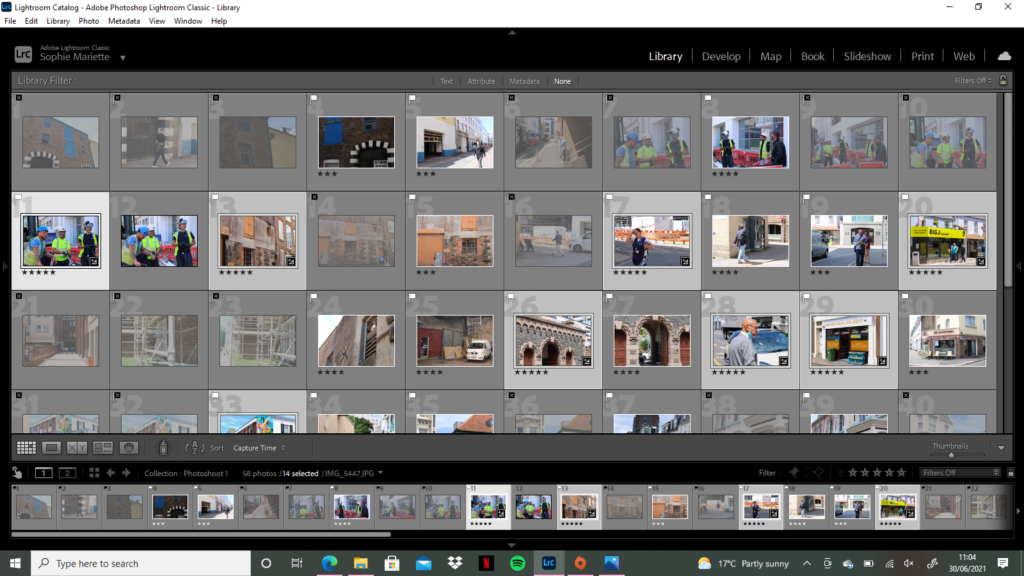
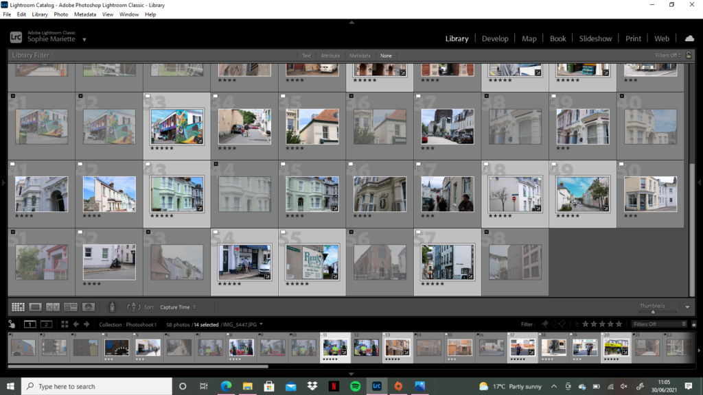
For the editing process of this photoshoot, I took a different approach, in class this week we learnt how to use different filters such as ‘flagging’ and ‘star rating’ using Adobe Lightroom to filter out specific images I liked or disliked to perform a quicker and easier edit. During the photoshoot I took around 100 images in St Helier, before importing them to Lightroom I did an initial sort through and delete of any images I knew that I did not like/did not tell a story or were just not right in lighting/angles – this left me with around 60 images which I imported to edit. Once my images were in Lightroom I went into ‘Develop’ mode to start filtering my preferred images. I started by trying the ‘Flagging’ filter, using controls ‘P’ for a white flag (preferred image) and ‘X’ for a grey flag (disliked image) and holding down ‘shift’ – this really helped speed up my selection and let me clearly see which photographs were my favourite. Next, I used the ‘Star Rating’ feature to filter each image from 1-5, one star as the worst and five stars as the best, which again really assisted me in seeing which images worked better than the others.
Editing – Over Exposed
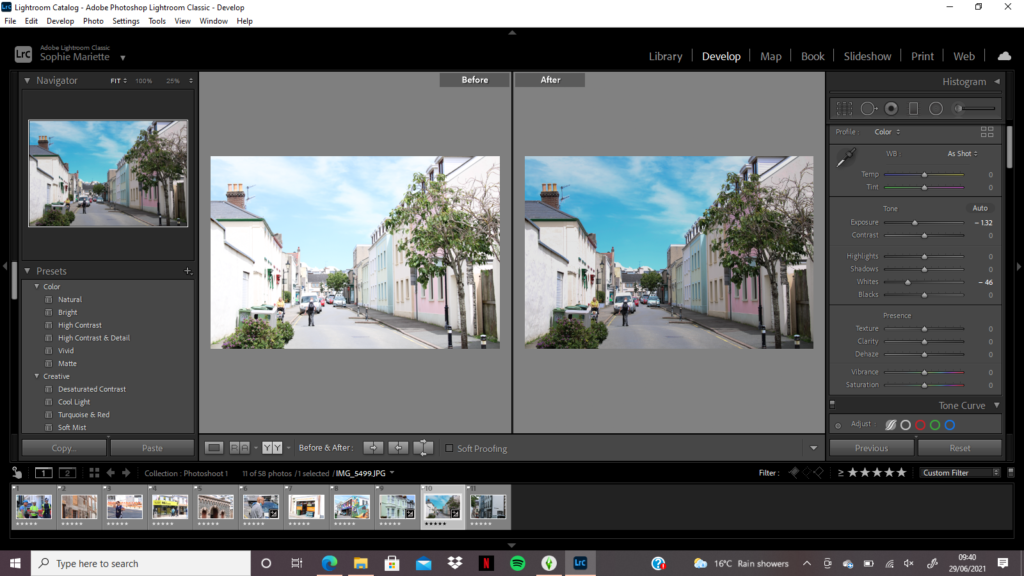
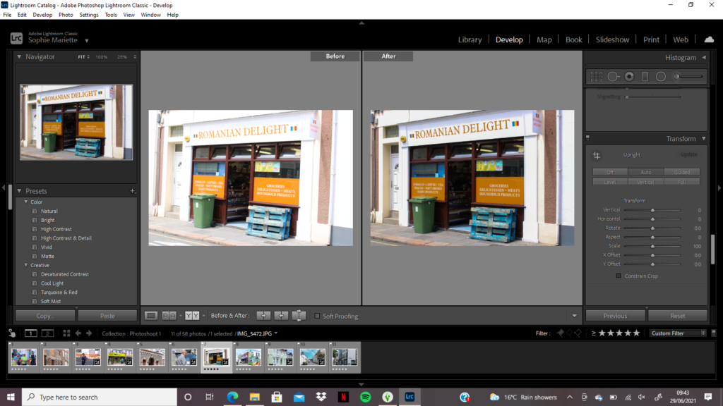
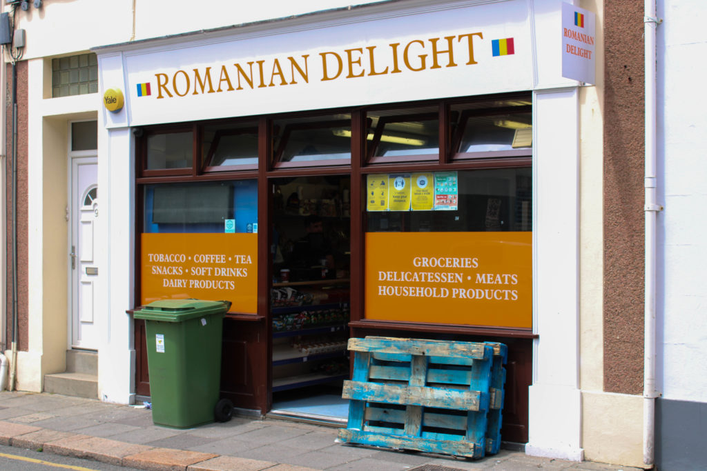
While I was editing my images, I discovered a few came out very over-exposed during the time where I was experimenting with my camera’s shutter speed. On Lightroom I went into develop mode to see whether I could edit these images to correct their exposure – under the ‘tone’ section I lowered the highlights, exposure and blacks. Furthermore, on the image where I have photographed the ‘Romanian Delight’ shop, under the ‘transform’ section I discovered how to straighten my image to create more symmetry and level lines throughout by changing it to ‘auto’. I wanted to edit these images in this way to represent and really show the bright colours of the communities we visited, heightening the vibrancy of the coloured houses and shops to demonstrate their character and beauty in the more secluded areas of town.
Editing – Black and White
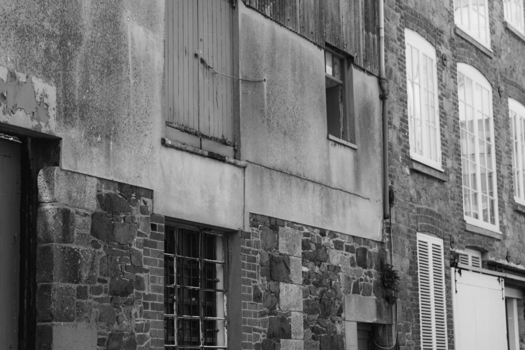
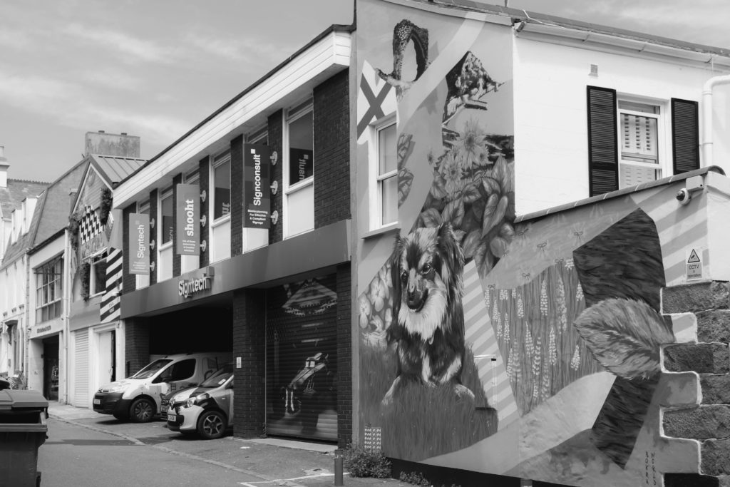
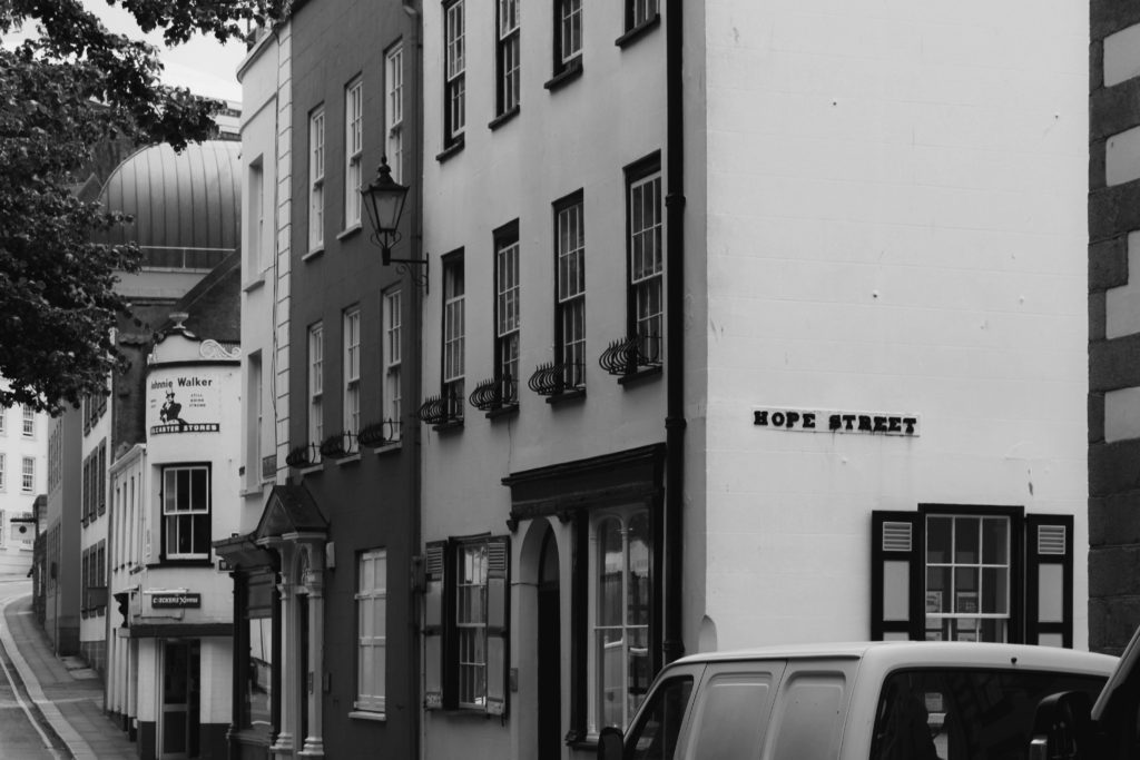
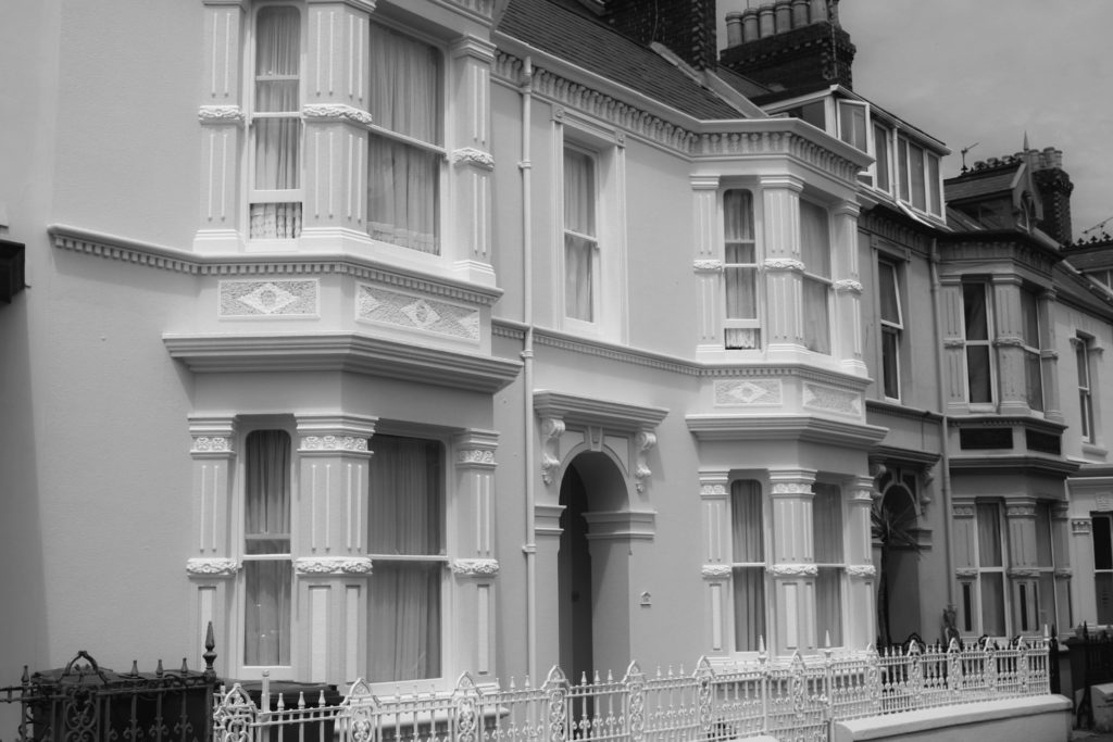
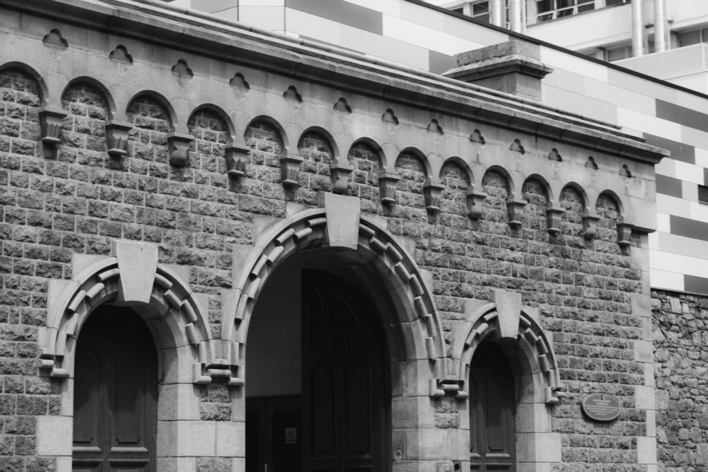
During my editing process of this St Helier photoshoot, I decided to experiment with editing some of my images with a black and white filter. I wanted to edit in this way to see how darker and lighter tones would affect the mood and atmosphere of an image. I produced this edit in Adobe Lightroom, highlighting each of my five star flagged images and selecting the ‘soft black and white’ filter. After seeing what each image looked like black and white, I was able to select my favourite monochrome photos that worked best in terms of contrast and tone. Additionally, I chose these six images due to their link to my theme of this shoot, showing the change of a sense of place in St Helier through it’s architecture. Each image forms a pair with the one next to it, the left hand image represents an older sense of St Helier and the right image shows the more modern/re-built buildings around town. Each pair is a sort of mini sequence showing the progression of architecture, I love the way the ‘older building’ images have darker tones and harsher shadows which symbolizes the possible atmosphere of St Helier’s past around these secluded areas. Contrastingly, the ‘modern buildings’ hold lighter tones with more white and negative space, creating a clean and crisp atmosphere. The natural lighting produces a softer texture, which is interrupted by the repetition of details on each building such as the windows, brick work and doorways.
Final Edited Images
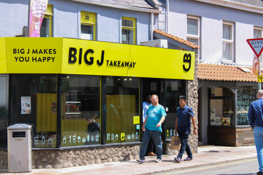
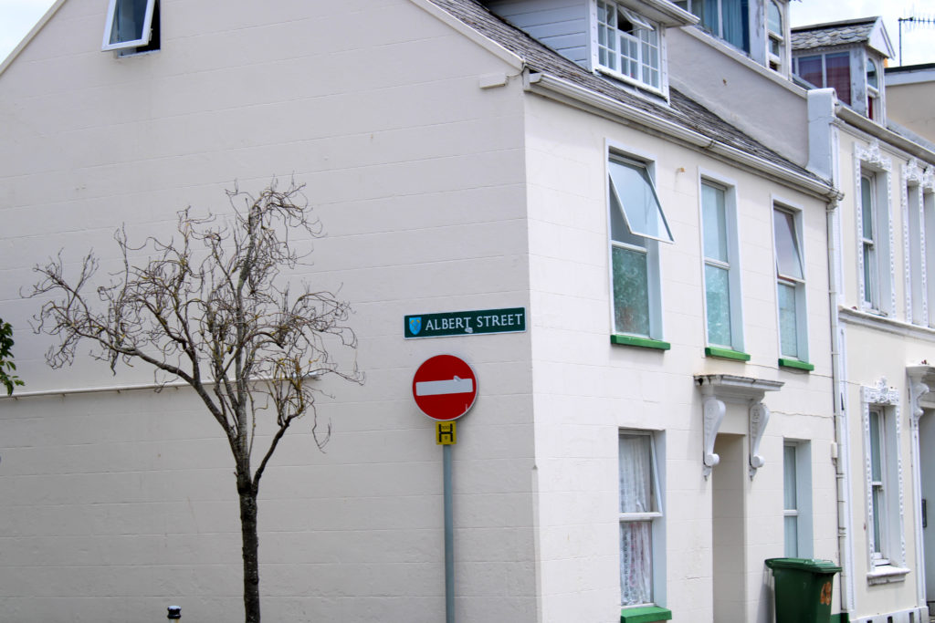
As well as producing black and white edits of certain images from this photoshoot, I have also decided to experiment with how different colours can tell a story within an image. I edited these final photos on Adobe Lightroom, after filtering out my favourites with flagging and star rating, exploring the different features of the app and correcting any mistakes made while photographing outdoors. For example, as shown before in this post, I made the mistake of over-exposing two interesting images, however was able to amend this by turning down highlights, blacks and exposure. Additionally, I wanted to portray the realness and natural atmosphere of these photographic locations, hence why I conducted minimal editing so not to tamper too much with the ‘sense of place’. I wanted vibrancy, however not so overly enhanced that the images looked artificial – I heightened the contrast and highlights of several images to achieve this bright and lively atmosphere. I wanted to edit my images in this way to juxtapose the otherwise empty streets I was capturing, while some images show life and movement, most are static without people to provide character. This was the main reason I wanted to show a sense of place with the area’s architecture, through repetition, space and shape, connoting the idea of a built up landscape of small business and homes which may not seem much to some, but to those living there is their world.

