


Evaluation
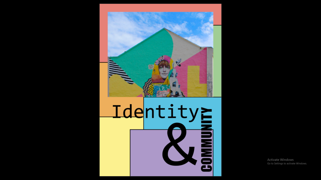
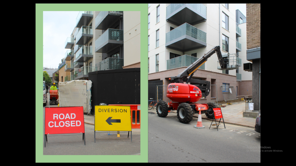
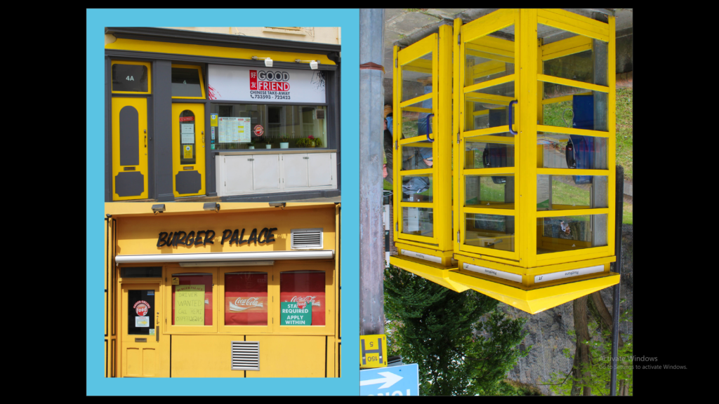
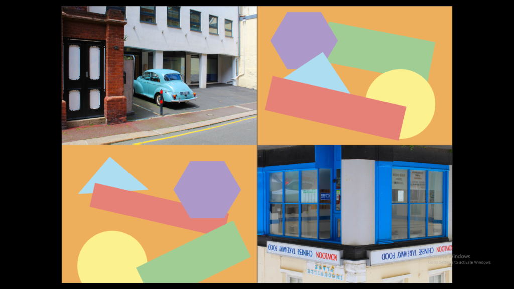
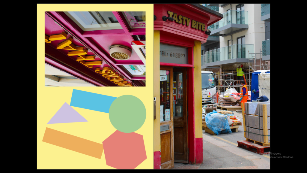
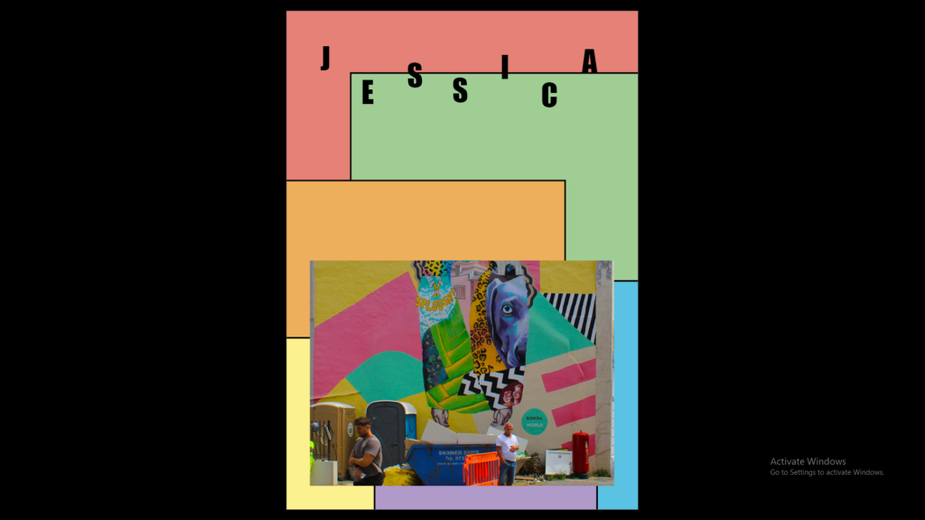
The colourful theme in the zine I used complementary colours in my zine to create strong contrasts throughout because I like how the contrasts emphasises the colour in the photographs. The structure of the images was placed in rainbow order to stop the colour of the background and to make the zine better is by having the background colour of the contrasting photograph on pages 12-13 the same colour as the high viz jacked on page 4.