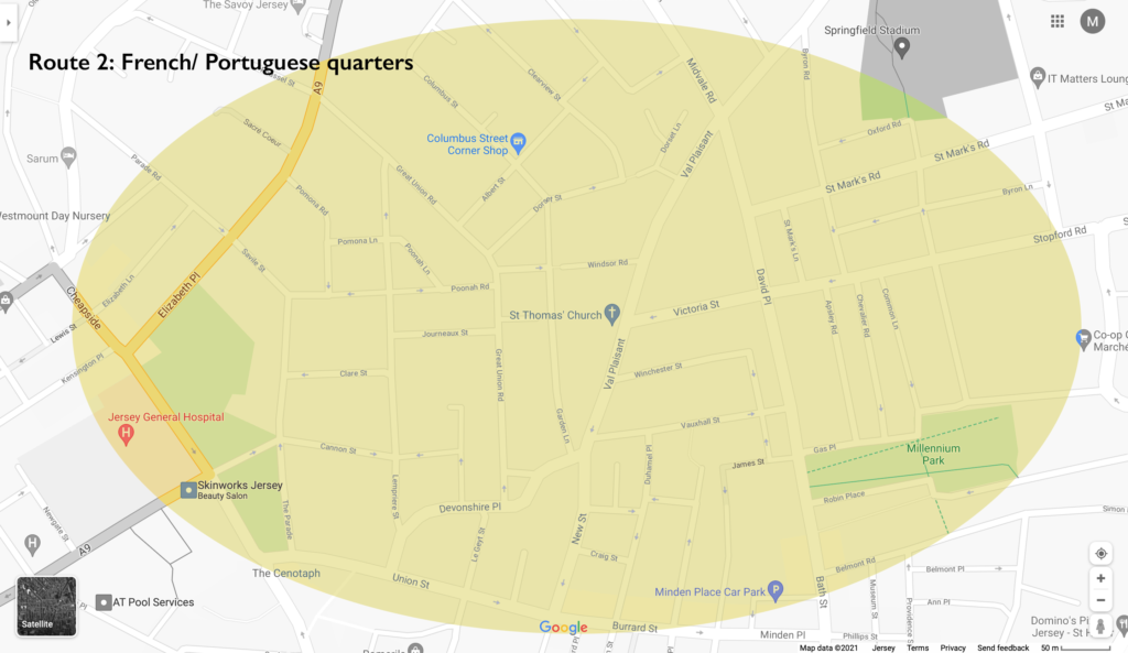
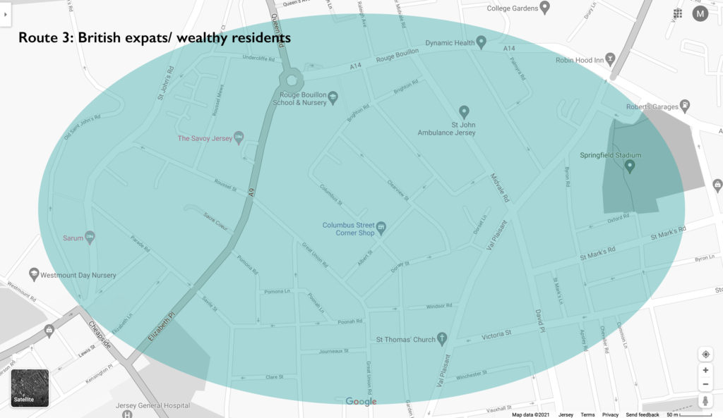
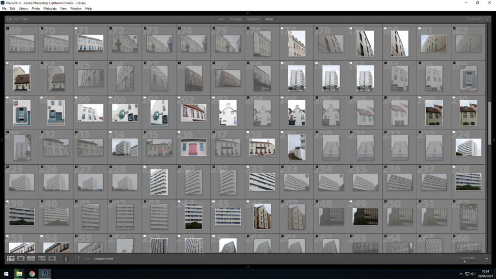
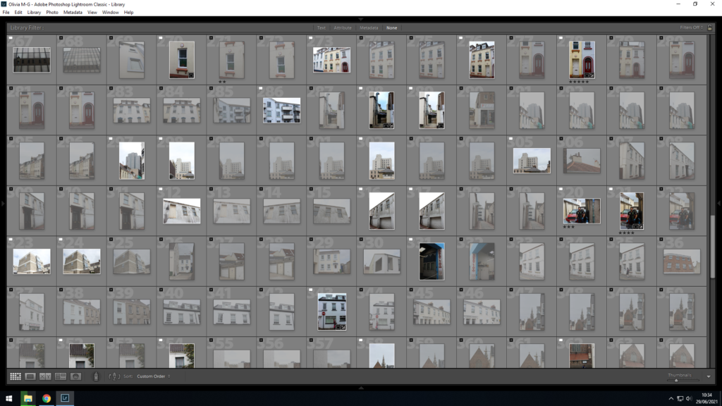
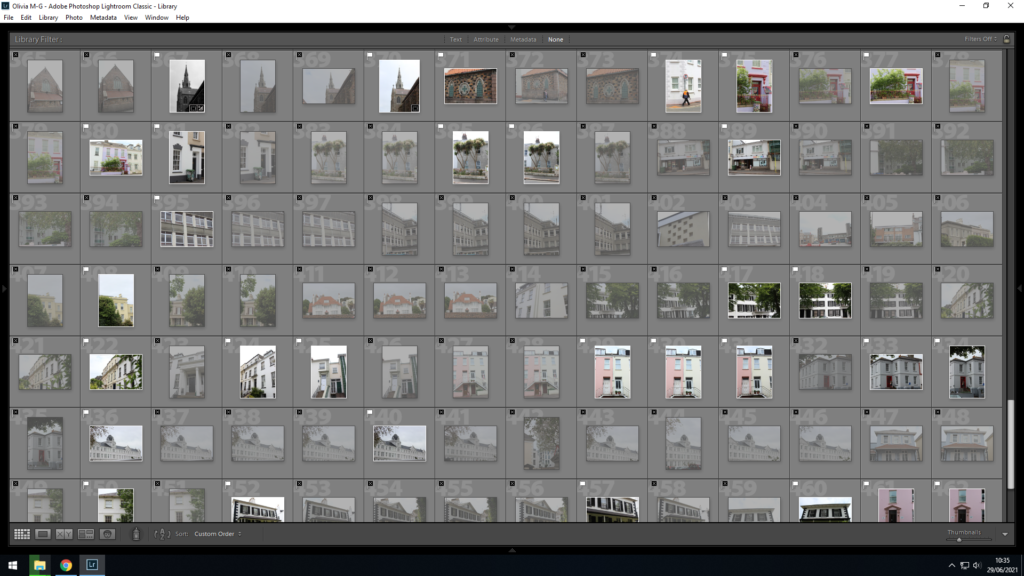
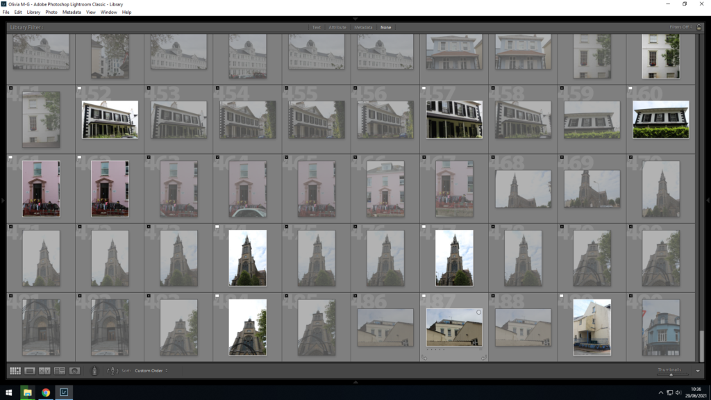
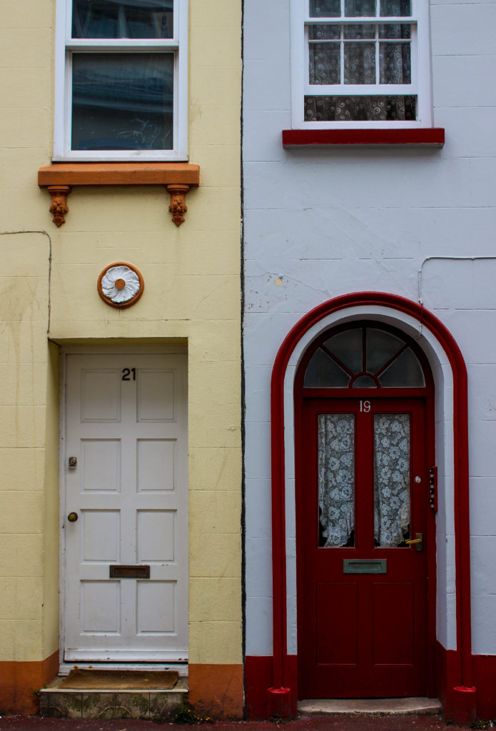
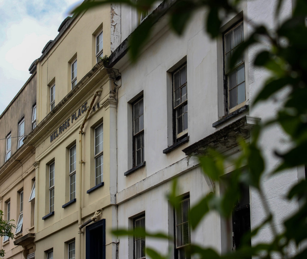
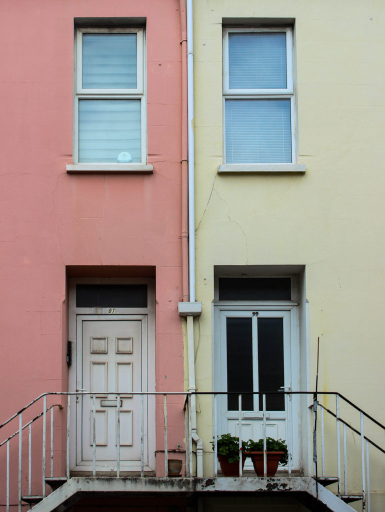
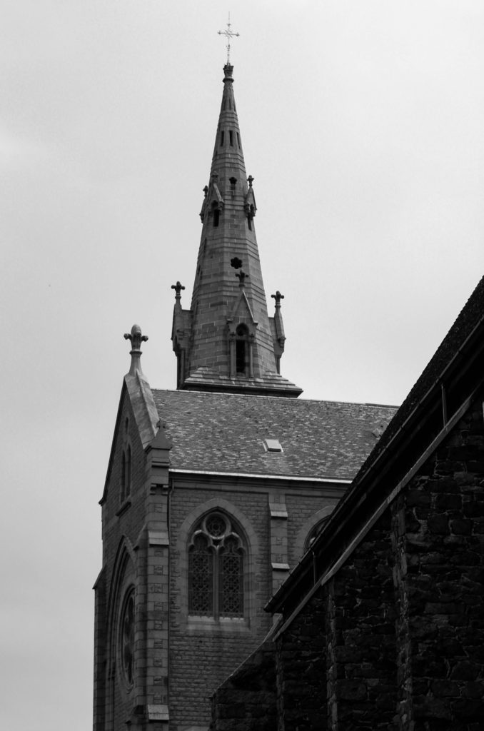
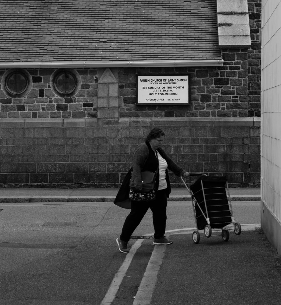
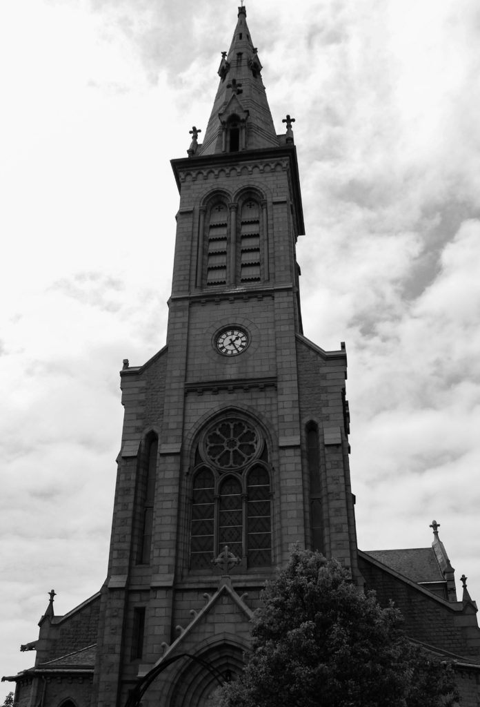
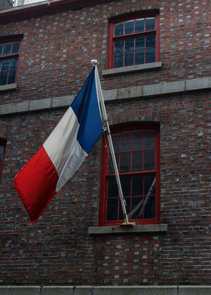
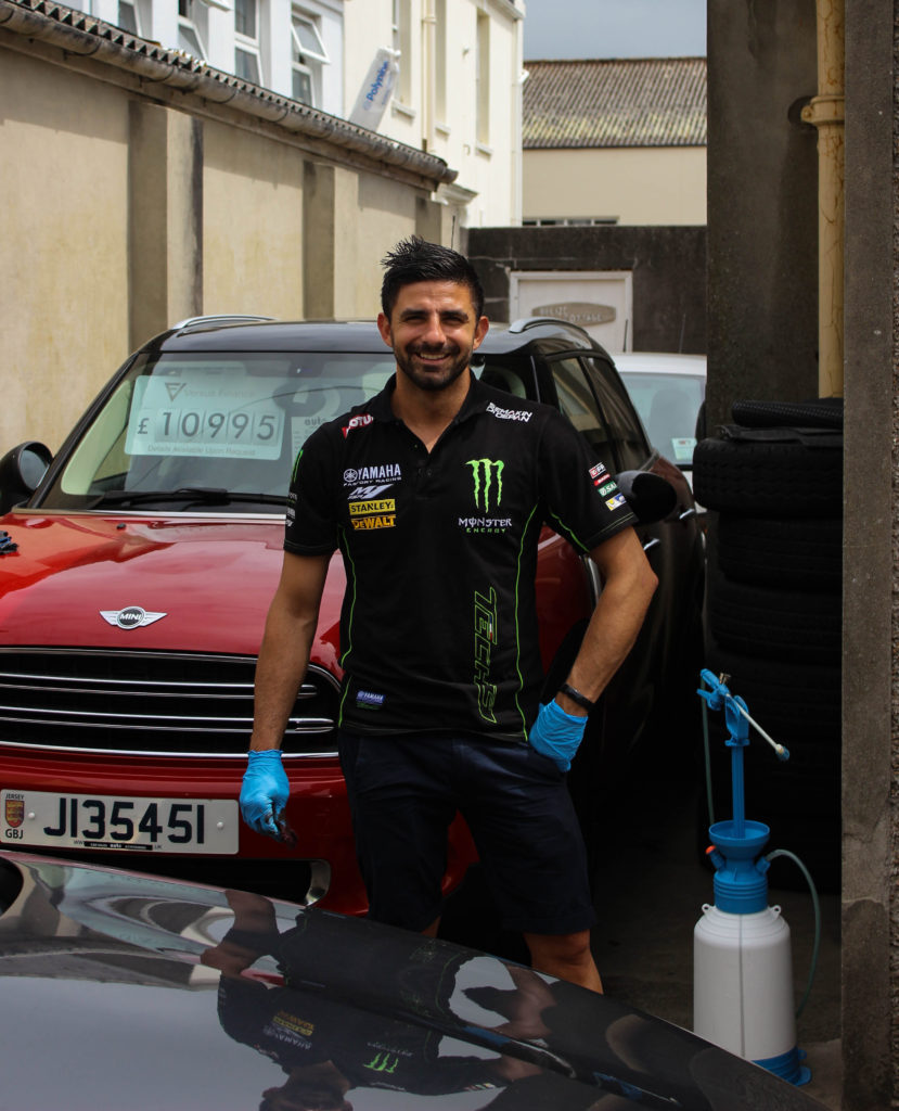
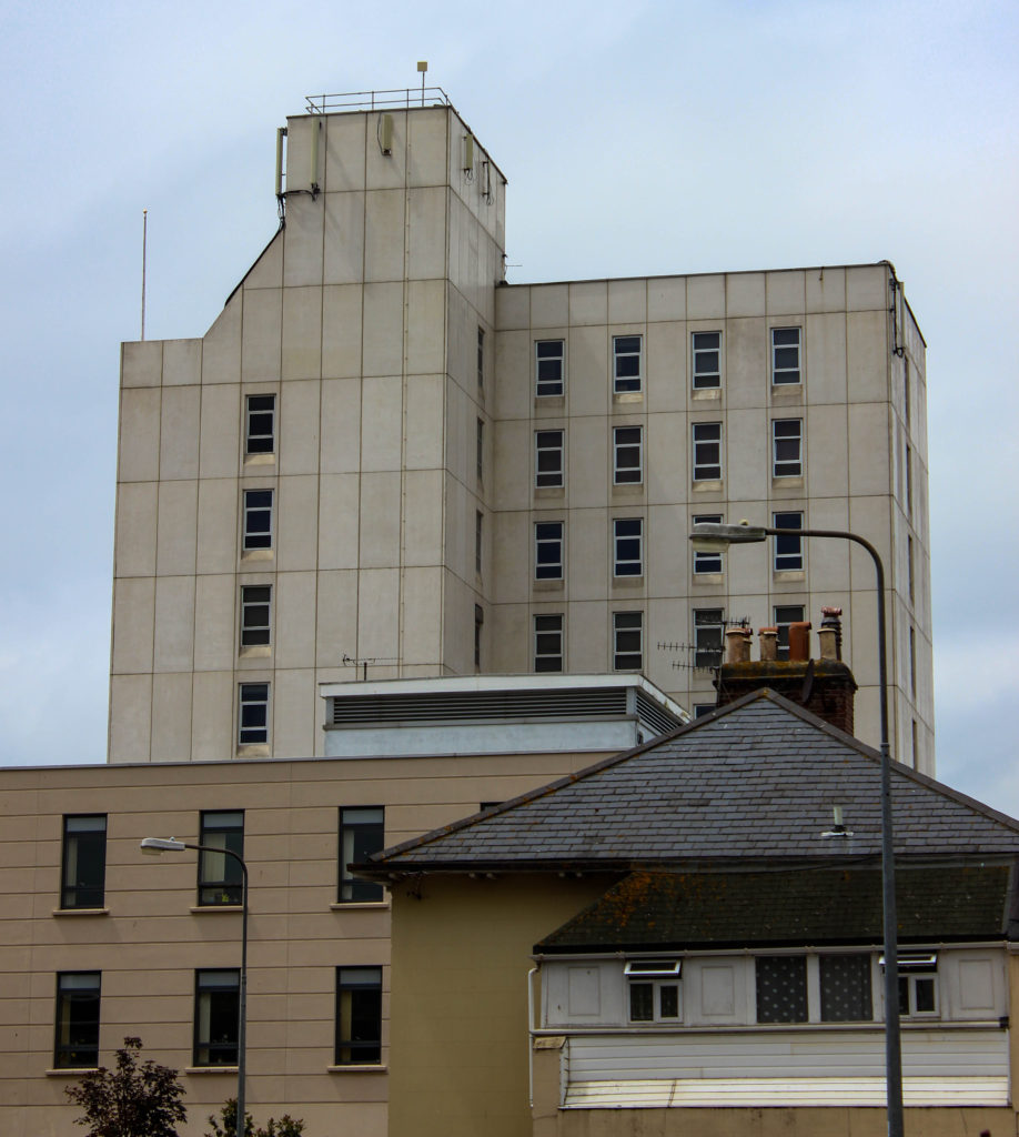
On the 7th of June, the day we visited the ‘People make Jersey’ exhibition at Jersey Museum, we also spent a portion of our day doing practical work. This consisted of walking around certain areas of town, that previously were known as sections of cultures and communities that belonged to different immigrant backgrounds. These three areas that we focused on were known as the merchant quarters (in red), the French and Portuguese quarters (in yellow), and the British expats and wealthier resident areas (in blue). On this walk we aimed to take photographs that showed the environmental differences between these culturally different communities, such as architecture, religious places and symbols, people and businesses. For this shoot we split into groups, with the group I was in focusing mainly on the French and Portuguese quarters.
Using the photographs from this shoot I have edited and developed my best images, that I believe help us visualise what makes a community and how they contrast with the other quarters around St. Helier.
Contact Sheets
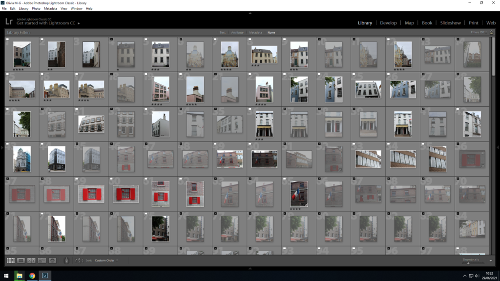
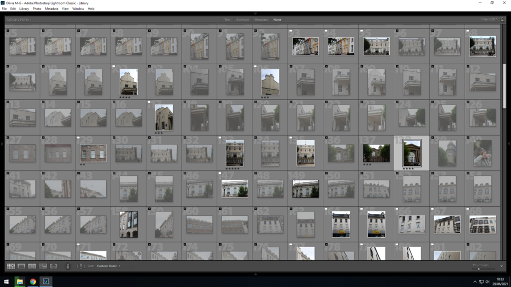
For this shoot I took approximately 400 photographs, so in order to sort through them I used Lightroom to determine which images I would edit. This allowed me to compare photos and decide their relevancy when placed in a sequential format.
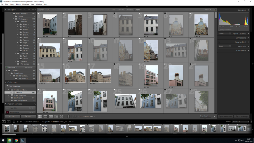
I first imported all my photographs from this shoot into my identity and community collection on Lightroom, and then went on to flagging the images I wanted to look at more closely and edit, and those I didn’t. I did this by using SHIFT P to flag the images in white I thought were my best, and using SHIFT X to flag the images in black that were not good enough to edit, due to them being out of focus or not interesting composition wise.
After flagging my images I then went further with my selection process by rating each of my photographs out of 5, in order to determine which images I would edit. The photos with a rating of 4 and over are what I believe were my best captured images
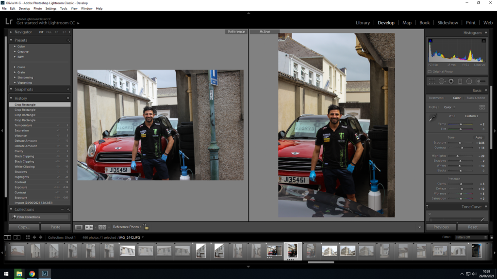
With most of my photographs I used the survey view to help to decide which out of two similar images I should choose to edit and display. This helped me recognise which image was more focused, especially if it was a portrait as I zoomed into the face on both photos and was able to compare them and see which was the best.
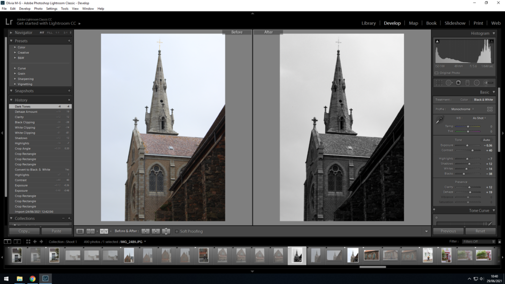
I also used the survey view to see if my image would look better in black and white or in colour, as it allowed me to see the before and after of the editing. I then decided to develop the image in black and white as I believed it created a more dramatic piece and a stronger contrast between the lightness of the sky and the darkness of the structure in the bottom right corner.

Here I viewed the before and after of my editing of this architectural image. On the right is my developed photograph, in which I increased the contrast and saturation to enhance the duplicity of the two houses. This was useful in helping me decide if my images needed more done to them to stand out more, or if they were over edited.


