I imported all my photos from both shoots into light room adding them to the Identity & Community collection in sub folders called June 7 and June 28.
Selection
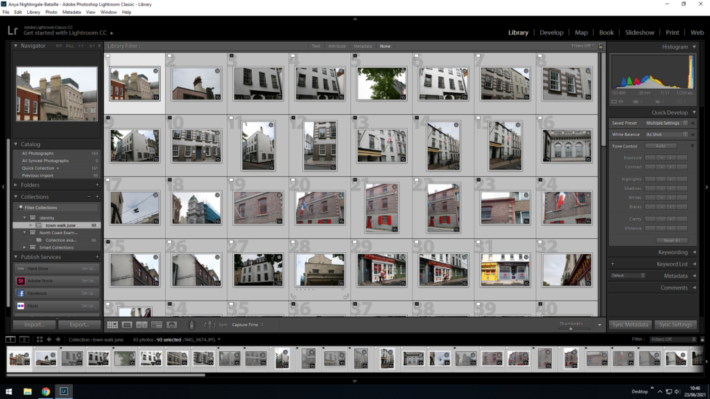
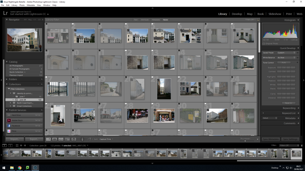
I went through the images, organising them by using the Flag system by clicking the ‘P and X’ keys for ‘Pick and Reject’ to filter out images disregarding any which are out of focus or have an odd composition which does not look good.
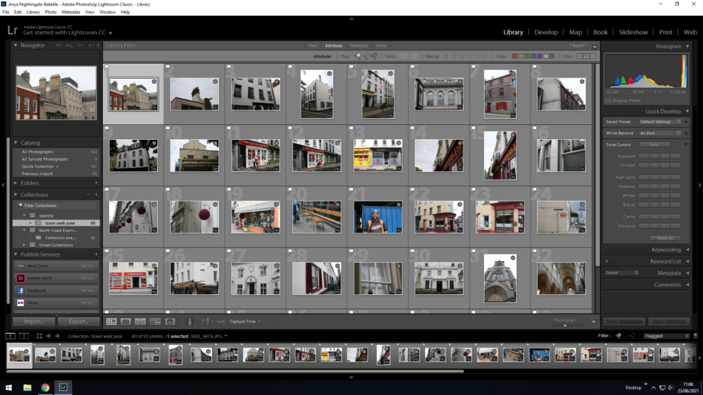
I filtered out the rejected images by pressing the flagged filter.
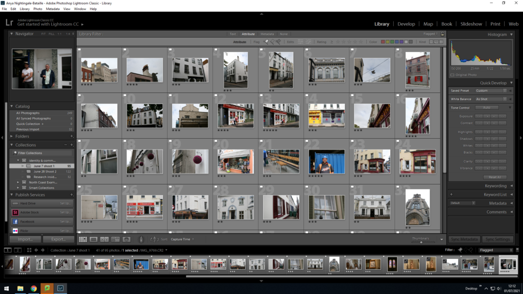
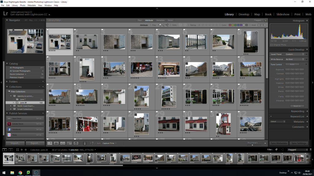
Using the 1-5 star ratings I rated the individual images based on how they looked as a composition. Giving 5 stars for the images I will to most likely use and down to 2 stars for ones I want to get rid of. I filtered out the 2 stars by adding them into rejects (pressing the X key).
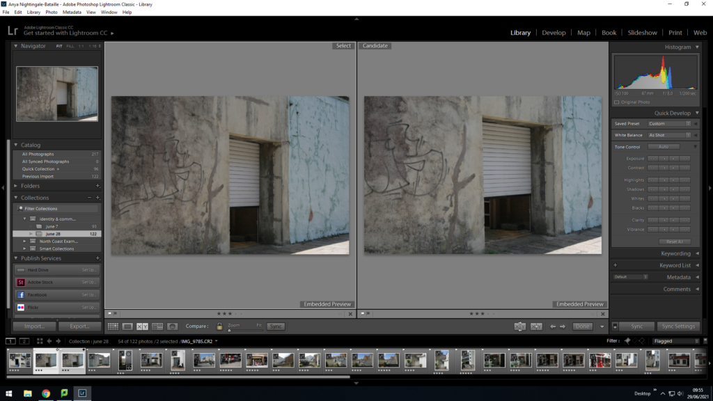
Using compare view I selected images which are similar to compare and pick which one I prefer.
Editing: Colour + Transform
Images from Shoot 2
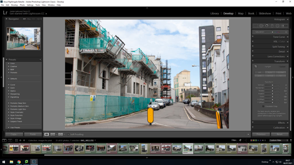
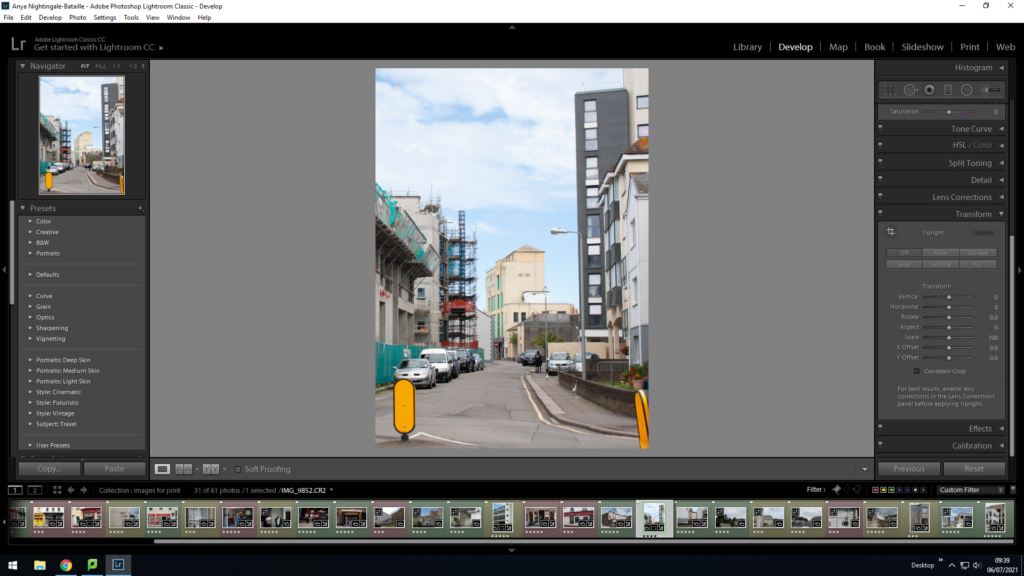
I used the Transform tool to crop and angle the image so that the lines coming from the buildings were straight. I used the auto tool for the angling but cropped the image with the crop tool.
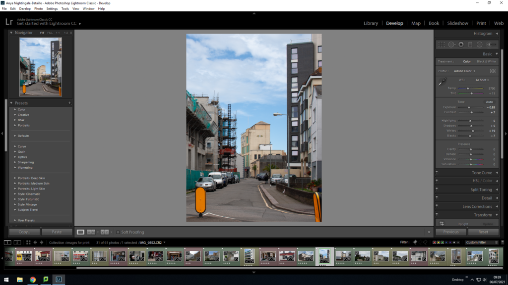
I used the Basic filters to edit the colouring of the image with the main focus to lower the exposure and to increase the colour.
Final Selection
I selected all images from both shoots that I had filtered out as the best and put them into a new folder called ‘images for printing’ to make the final comparisons between them.
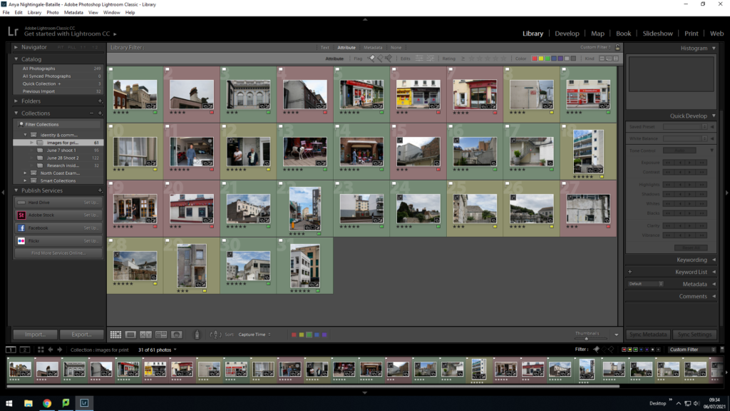
I used the colour tool to colour code my images for printing, green being the photos I want to definitely include in my sequence, yellow being maybe and red being backup photos which I think I will not include.
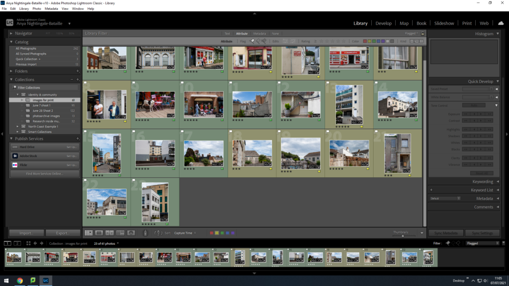
I went through and set the Red images to reject and edited the images a bit more ready to print.
