identity & community – photoshoots

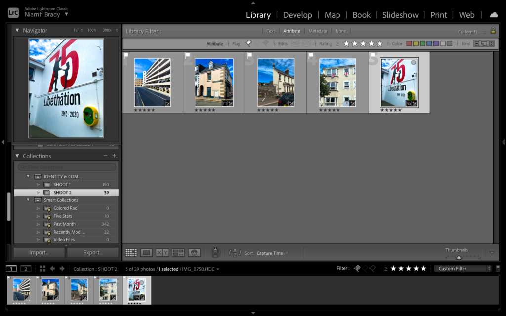
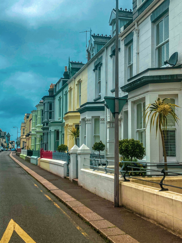
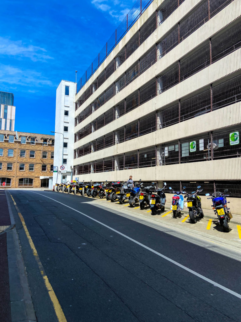
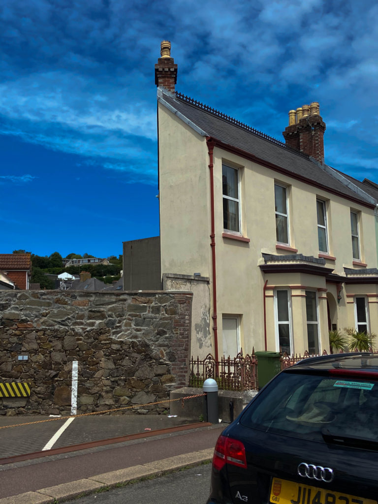
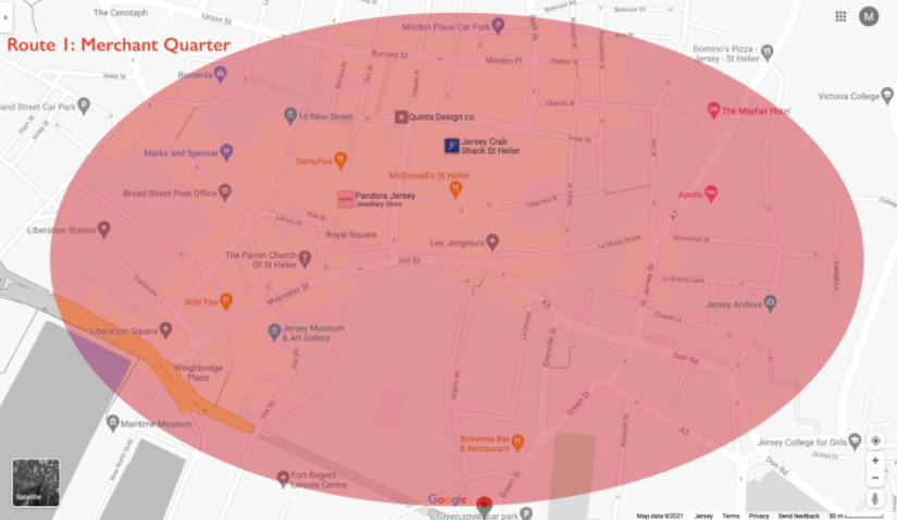
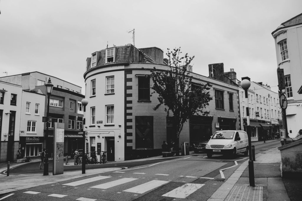
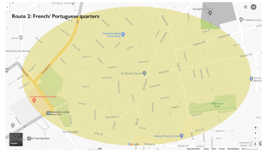
For my first photoshoot I walked the route above (from Royal Sq walk towards St Thomas Church via Broad St, Pitt St, Dumaresq St, Hue St, Le Geyt St, Devonshire Pl, Great Union Road + side streets with character, such as Journeaux St, Aquila Rd, Poonah Rd, Albert St, Columbus St, Dorset St, Clairvale Rd towards Rouge Boullion) and took photographs of anything which caught my eye or sparked my interest. I did my best to ensure that my images were as interesting and as eye catching as possible.

EDITING IN LIGHTROOM

To start with I imported all of my images into Lightroom into a collection called ‘Identity and Community‘ and then into a subfolder entitled ‘Photoshoot 1‘.
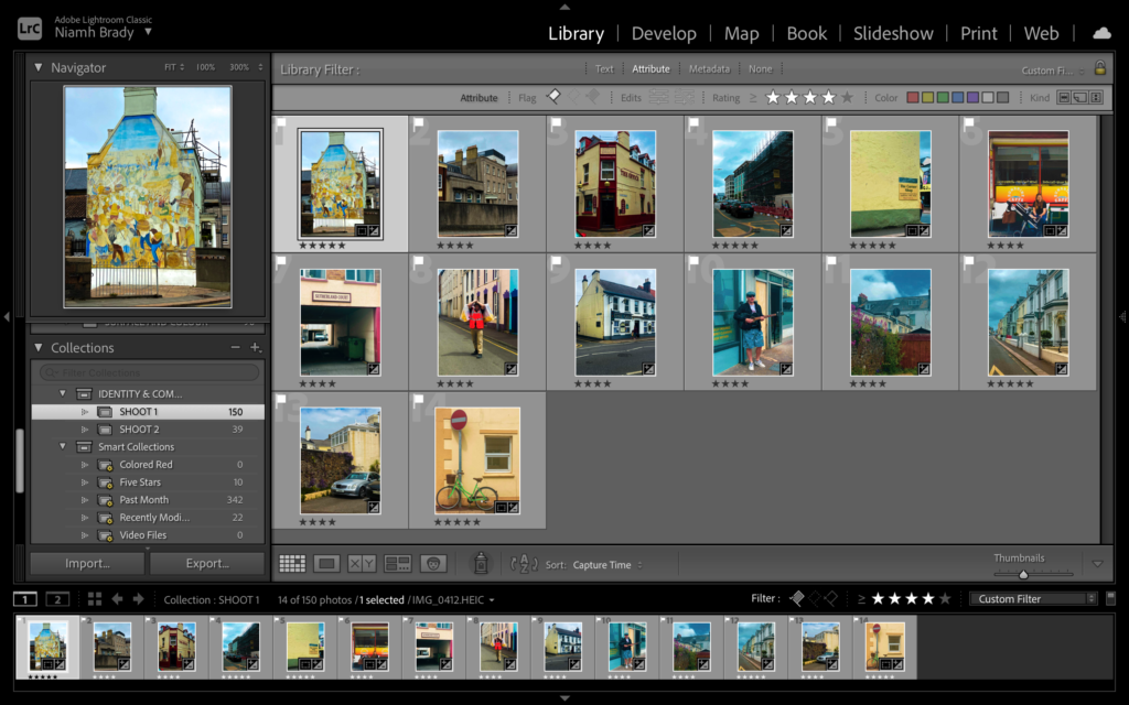
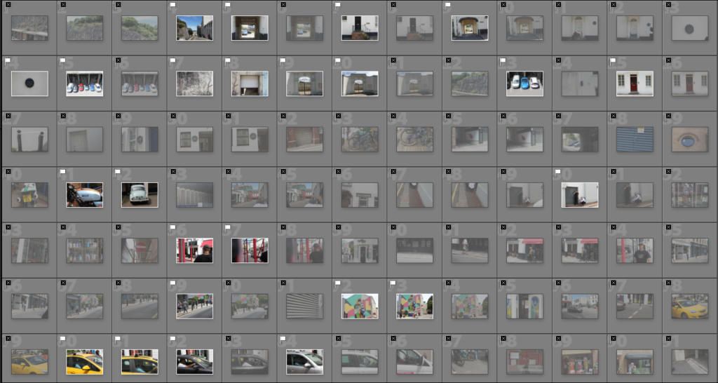
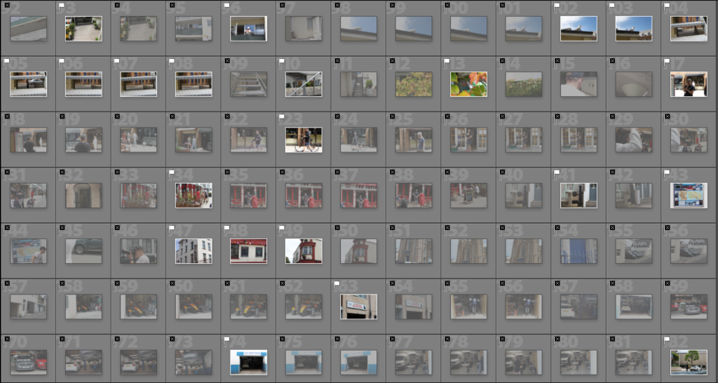
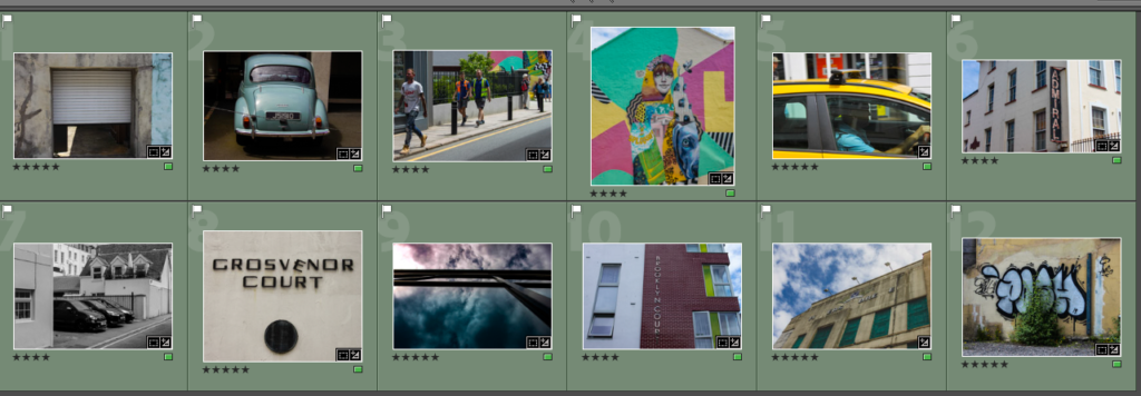
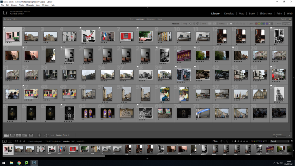
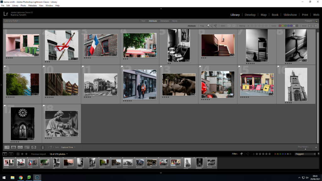
I then went through all of my images with the flag tool, and rejected the ones that I didn’t feel were my best work until I was left with a set I was happy with.

I then decided to give my remaining images a star rating out of 5 until I had my final images from my first photoshoot.

For my second photoshoot, I followed the same route (from Royal Sq walk towards St Thomas Church via Broad St, Pitt St, Dumaresq St, Hue St, Le Geyt St, Devonshire Pl, Great Union Road + side streets with character, such as Journeaux St, Aquila Rd, Poonah Rd, Albert St, Columbus St, Dorset St, Clairvale Rd towards Rouge Boullion). This time, however, I attempted to take photographs of different things that perhaps I hadn’t seen last time, or didn’t think were interesting enough. Again, I tried to keep my images as eye catching as possible. I also used the same methods of editing in Lightroom.

FINAL IMAGES

EVALUATION

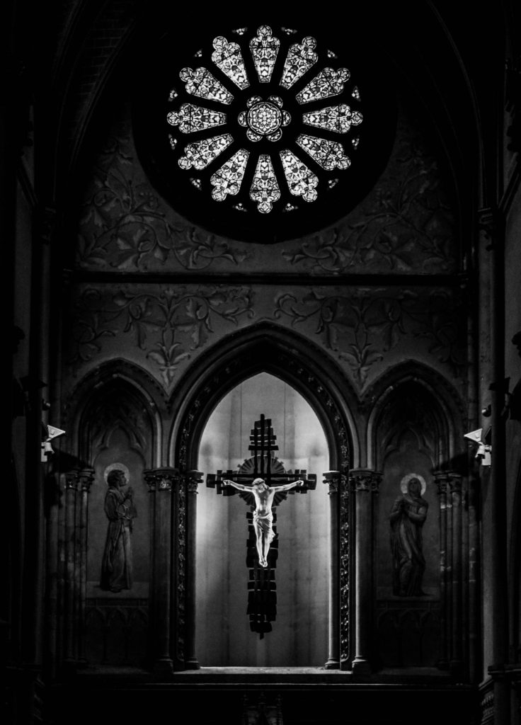
Overall, I think that my images from both of my photoshoots around St Helier produced some good quality images. However, one thing which I could improve upon would be the positioning of the camera when I capture the images. This is because I had to reject some good photographs as they were wonky or blurry. For my next photoshoot my aim is to think more carefully about where I am positioning the camera as well as myself in order to produce an abundance of quality work.

identity and community – jersey museum

‘Every Jersey resident has an immigration story – whether their family came here 500 years or five years ago. This exhibition explores some of these stories and the ways in which immigration has shaped and influenced the Island we know today.’

Jersey’s first permanent settlers arrived around 7,000 years ago. They were driven by a changing climate to seek a new and sheltered place where they could plant their crops and raise their families. Since that time, waves of immigrants have arrived in Jersey. Some were fleeing religious or political persecution and they found refuge in this Island. Others were economic migrants seeking a better way of life for themselves and their families, from retired English army officers in the 19th century to Breton farm workers in the early 20th century.

The French Wars of Religion took place during the 16th century between Catholics and Huguenots (Protestants). Consequently, many Huguenots fled to Jersey in order to escape being persecuted for their beliefs. In fact, so many Huguenots came to the island that an additional market day had to be introduced to cope with the crowds. Large numbers of Protestants left France after 1685, when the Edict of Nantes was revoked, which took away their right to practice their religion. This therefore led to an influx of Protestant immigrants who established many small businesses on the island. The shipping industry was created on the back of the Atlantic cod trade.  The first large scale commercial shipyard was built in Jersey in 1815.  The industry benefited from the Island’s tax-free status, being able to import timber more cheaply than competing British shipyards.  Much of the labour in the shipbuilding industry was migrant labour from other parts of the British Isles.  The shipbuilding and shipping industries began to decline in the 1860s as a result of a depression in world trade and the switch from sail to steam.

From 1820 the Jersey economy was boosted by the first real inflow of wealthy immigrants, largely retired military offers, half pay officers and senior officials from the colonies.  These individuals came mainly from the UK or British Colonies and were attracted by the tax regime, mild climate, improved travel and the Island way of life. It was estimated that there were 5,000 English residents in Jersey in the early 1840s three-quarters of these were half-pay officer s and their families.  Their local spending power would have created local jobs and contributed to the growth of St Helier during this period.  High Value Residents continue to come to Jersey for many of the same reasons.

https://www.jerseyheritage.org/family-history/jersey-immigration

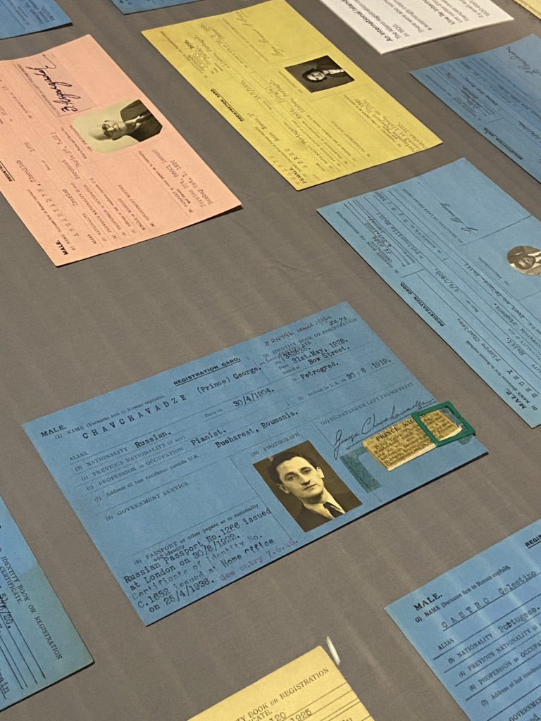
The part of the exhibition which I found the most interesting was the ‘Alien Registration Cards’, which were introduced as a result of the Aliens Restriction Act passed in February 1920. Under this new law, all aliens over the age of 16 living in Jersey were forced to register with an Immigration Officer, no matter how old they were or how long they’d been living on the island. The Alien cards were issued up until the 1960s and, initially, any woman who married a foreign national was also required to register for a card, as well as anyone of foreign parentage. 

https://www.jerseyheritage.org/news/alien-registration-cards-added-to-jersey-heritage-s-online-catalogue

Identity and Community Walk

Photo-Shoot

When we went to the archives to learn about what archives contain and are, we also went on a second walk around town. We went to places linked to the French quarter of the Community.

Filter Through Images

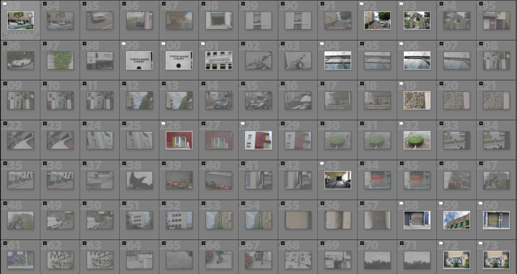
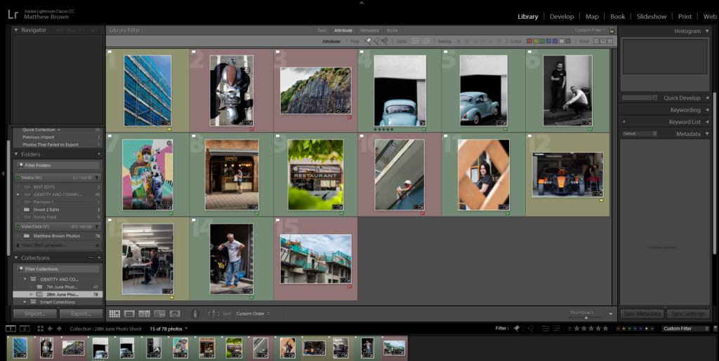
From the 395 images taken on the walk, I chose to flag 68 of the best to then choose a few for my final outcomes.

I then went on light room and gave each of the remaining 68 images a colour. Either green for the best, yellow for the ones I am unsure about and finally red for the ones I will not use.

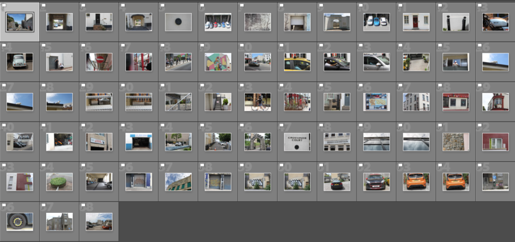
From the 68 images I flagged as good, I only gave either green or yellow to less than half of them leaving 30 to be looked at further and finalized. I chose to use the 13 images I rated as green that would be edited and used as the best from the photo shoot.

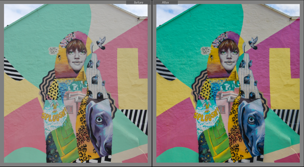
Before and After Edits

To edit the original image above, I cropped and aligned the image before adding the photo colour preset vivid to the image. This preset added drama to the clouds making them slightly blue and much more distinct. Next I slightly lowered the exposure bringing out the details in the highlights. I then increased the contrast making the blacks darker and whites lighter creating a deeper sense of drama in the image. I then lowered the highlights as I felt that the image was too bright and the clouds didn’t have a lot of detail because of the brightness. I then increased the dehaze removing the foggy feel of the clouds bringing out a contrast between the blue window and red sky. Finally I increased clarity slightly to make the clouds more vivid and dramatic.

To edit the image above, I cropped the image so that the image was aligned with the pole to the right of the image. I also changed the colour preset to vivid to bring out the harsh blacks and bright whites to contrast each other. It also gives the plants a deeper green and flowers brighter yellow. I also slightly lowered the exposure to bring out the finer details and increased the contrast to make the blacks darker and whites lighter.

To edit the image above, I first cropped the image so that the figure was central and was the only focal point. I next applied the vivid filter to bring out the diverse colours and slightly played around with the temperature. I then increased the contrast and played around with exposure. I then decreased highlights slightly and played around with the hue and saturation of all the colours to make them pop more. Finally, I increased clarity to make the contrast between the colours sharp and precise.

Edited Final Images

Identity And Community Photo Shoot 2

We went on a walk around the Merchant Quarters, and took photos on our walk.
Route 1: Merchant quarter around St Helier Parish Church > Royal Sq, Library Pl, Bond St, Broad St, Mulcaster St, Hill St, Snow Hill, La Motte St, Colomberie > follow onto Ann St, Hillgrove St (French Lanes), Wesley St, Ingouville Pl, Belmont Pl/ St towards Minden Pl, Rue de Funchal walk towards Val Plaisant towards St Thomas Church.

Editing in Lightroom Classic

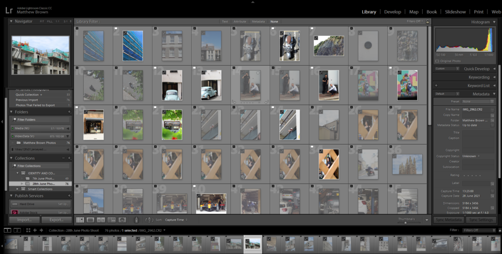
I imported all my photos from the walk into Lightroom Classic, then used the P and X method to filter out the good/bad images.

Example

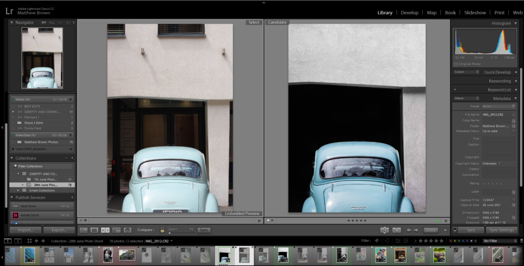
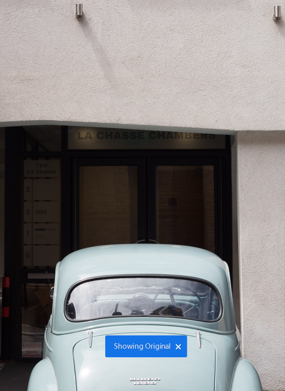
This is an example of my editing process using the 2 images of the old cars.

BEFORE AND AFTER

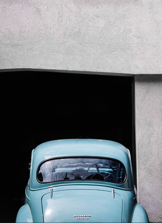
For this edit, I wanted to show how simple life was in the old days without technology and other distractions. I started by removing the detail in the background where the door was. I then removed the modern lights on the wall with the spot healing brush, as they conflicted with the old car, as it is the main focus. I used the adjustment brush, to create a mask on the background then brought the shadows, and blacks down to make it completely black, to create a simply composition, made from the white wall, black background and the car.

BEFORE AND AFTER

I used the same process as the other car image, so they would match in a collection. Then I used Photoshop to edit the chain out of the photo, as it was distracting.

Editing a monochrome image

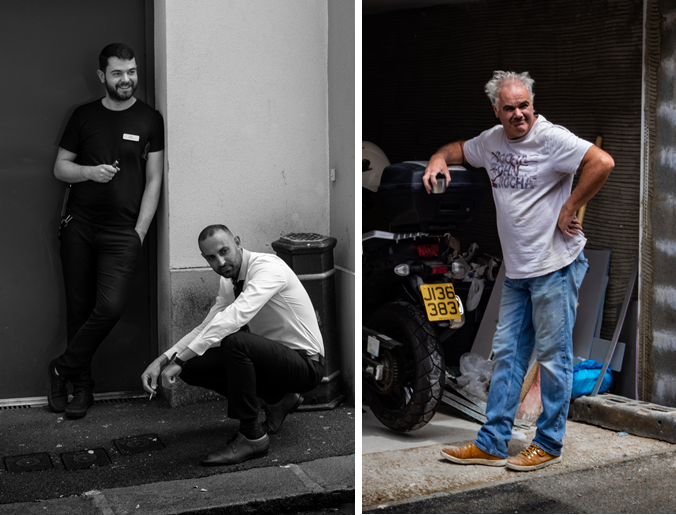
I made this photo into black and white to add more mood and make it more serious. The composition of the subjects is good as they are at different heights. It would of been better if they swapped places, so it wasn’t black on black, and white on white.

Final Image Selection

Meaning of the colours:
– Green = Good
– Yellow = Medium
– Red = Bad

All the green colour coded images are the final images, and will be displayed below.

Final Images

Analyse

Overall, I like how my images turned out. Most of the images were colourful, and used different techniques.

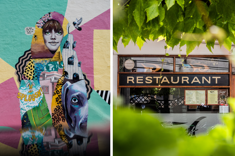
The street art image was taken using my phone as a reflection, so that way I didn’t have to include all the people walking on the pavement. Instead, it created a unique reflection.

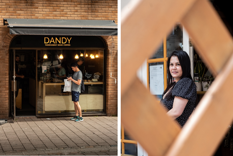
The restaurant and the portrait of the lady, were both using the framing technique. It helped removed unnecessary features and it leads the eye to the subject.

I really like the images of the cars. I was able to accomplish the simplified style I was going for by darkening the shadows, and removing modern light. the teal/light blue car really stands out against the white walls, and dark floor and background.

Shoot 2

For this shoot, I walked around most parts of the French/Portuguese quarters. I took many photographs of the community, where they live and their local businesses.

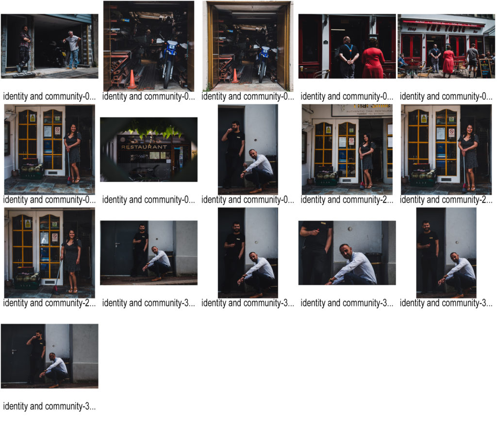
Best edited images contact sheet

Favourite Image

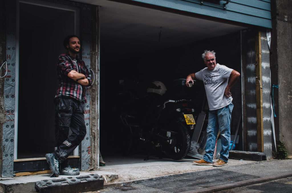
This is my favourite image because it shows the similarities within a community and how many people within it have similar interests and can get along. Such as these two people getting along and posing for the camera mid-conversation.

I like this photo because of the high contrast from the shadows adding depth to the image. This is shows in the garage where the light on the motorbike fades to black as it gets further away and deeper into the room. I also like the texture and patterns on the walls behind both of the subjects, it adds variation to the image making it less flat.

Narrative and Sequencing

Narrative

STORY: What is your migrant community story?
Describe in:

  1. 3 words – A migrant community.
  2. A sentence – How migration to Jersey in the past affected current times.
  3. A paragraph – My migrant community story is about how immigration to Jersey from hundreds of years ago has affected current Jersey life and architecture in ethic areas. It focuses on the difference of buildings and genuine life within these areas, depending on which ethnic group resides there.

NARRATIVE: How will you tell your story?

Using my own images from walking round St Helier and comparing my images to images from the Jersey Archives of the same areas from the past and how these areas have changed.

AUDIENCE: Who is it for?

My story will be aimed at the older generation of immigrants to Jersey as I feel like it will resonate well with that age group and create a sense of nostalgia, as well as proving how Jersey has changed throughout the years.

Sequencing

In terms of sequencing, I want to keep a pattern of juxtaposition. To do this, I will use contrasting images of both vibrant colour as well as monochromatic images. I was also alternate between sizing and orientation, and also using double page spreads. This will create my theme of Jersey life, which will feature street photography portraits as to represent the citizens of Jersey in their day-to-day life.

Here is an example of how I would sequence my images to create juxtaposition.

Editing Proccess

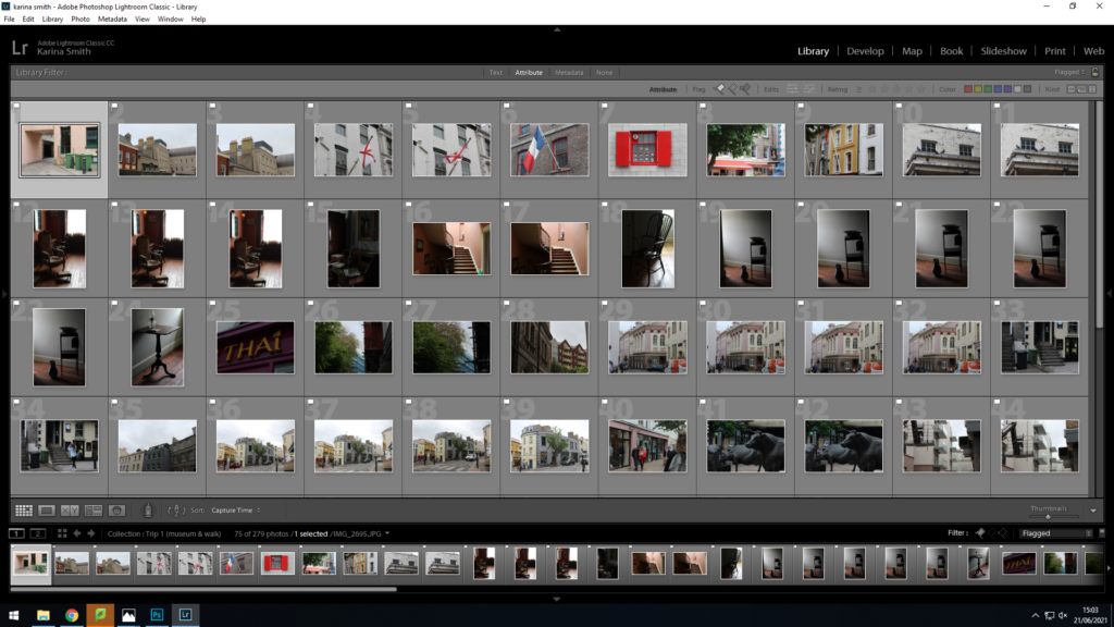
In Lightroom all while holding shift, I used the letter X to discard an image and the letter P to flag it- this created my first selection (as you can see above- my flagged images).

After the previous steps, I went through the flagged photographs, rating them from 1-5 stars one by one. Some were very similar so I compared them and got rid of most.

As the final step, I chose my favourite images of all and using Lightroom I made adjustments- surprisingly after editing them, some of the images rated two or three turned out better than some of the ones rated four or five.