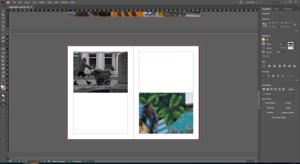
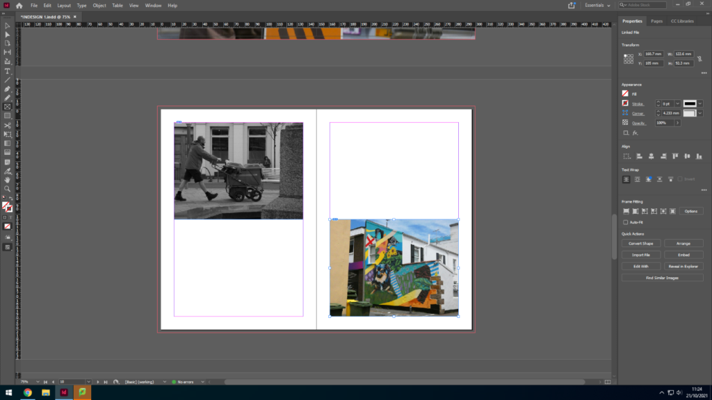
jersey archive- photoshoot 2

We went to the Jersey Archive, and I’m going to use Lightroom to edit all my images and select the ones I want as well as rate them to be able to find my best images for my sequences collection.
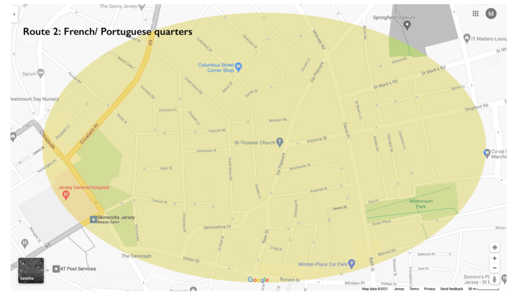
here is a map showing where we walked around to take these images, mostly the French and Portuguese quarters as well as some rich resident areas

here is the process;

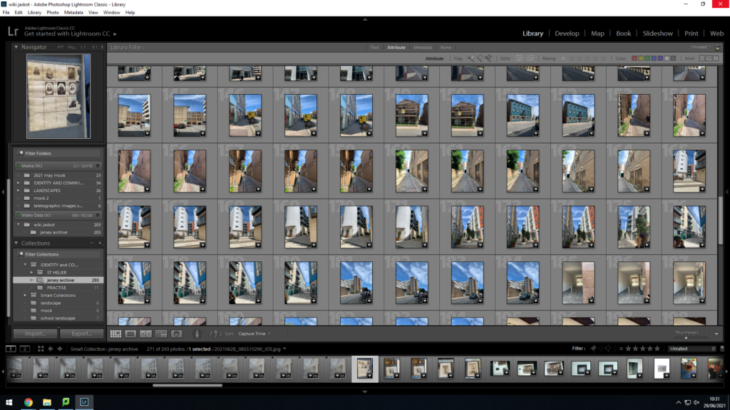
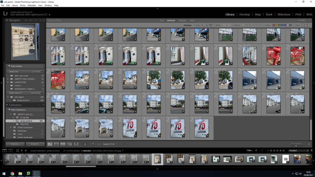
these were all my images i imported..
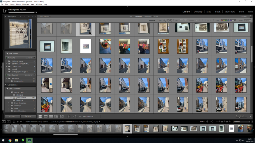
In order to pick the images that turned out the best and not have any repeating images, I used the tool of pressing either P or X, this would help me select the images I actually wanted to work with, here are the images that I all pressed P on;

as you can see , this helped me narrow down my choices and work with a less amount of photos however with the ones I really liked and wanted to continue editing.
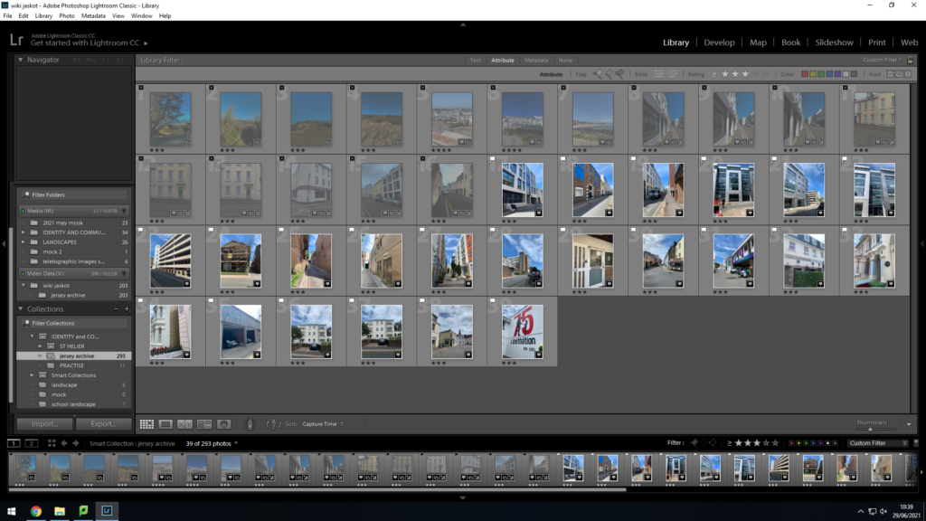
I rated all my images either 2 or 3 stars, 2 being I may need to re think them and 3 being I want to continue editing them now, I then switched the filter onto images rated 3 stars or higher and these were the final images I ended up with, now ready to edit them.

The images that I rated 3 stars stayed in my library and I then decided to develop them and edit them. I did two versions of editing, I kept them in colour and developed them and after that I changed them all to black&white to see what version I like more-

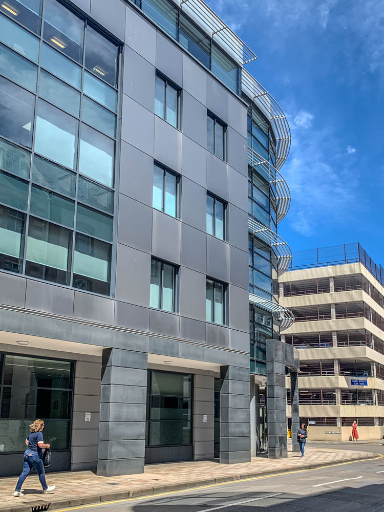
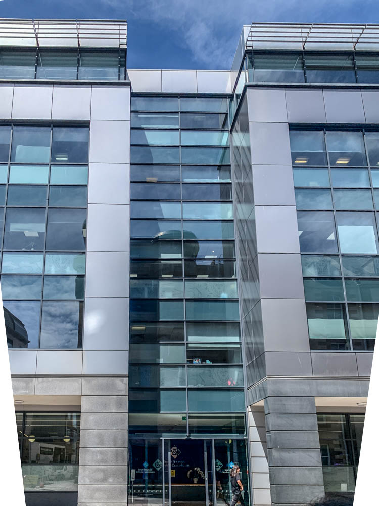
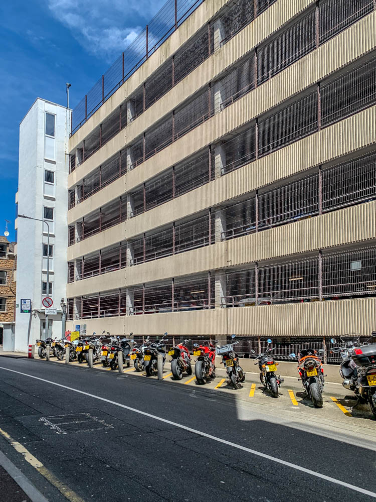
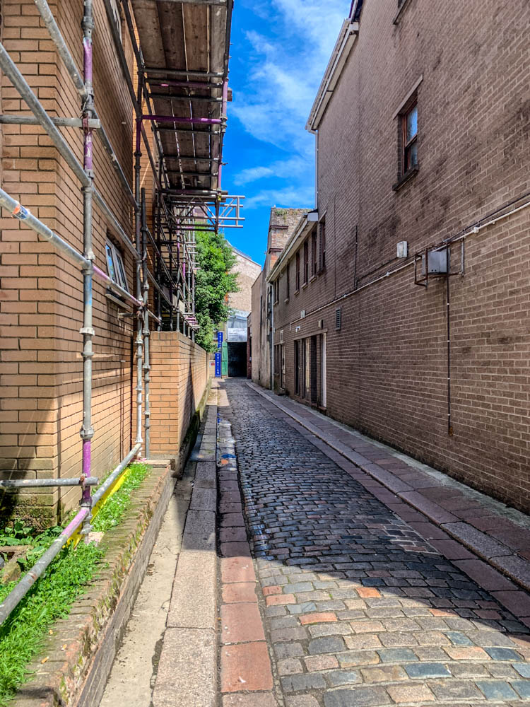
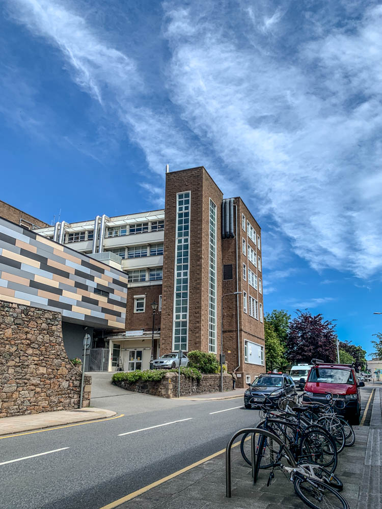
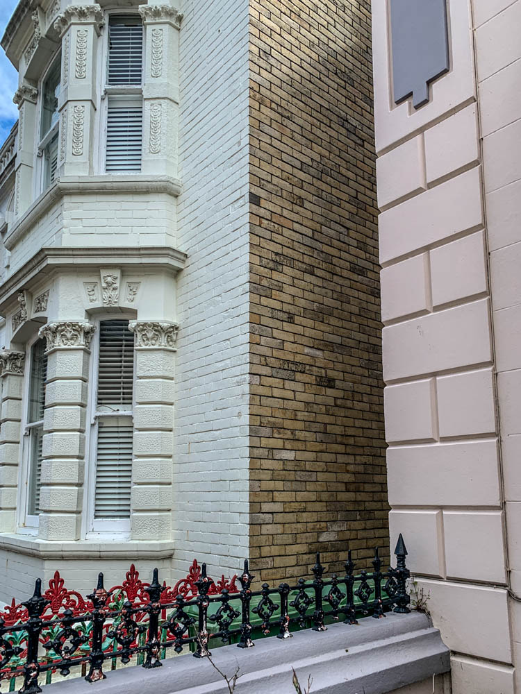
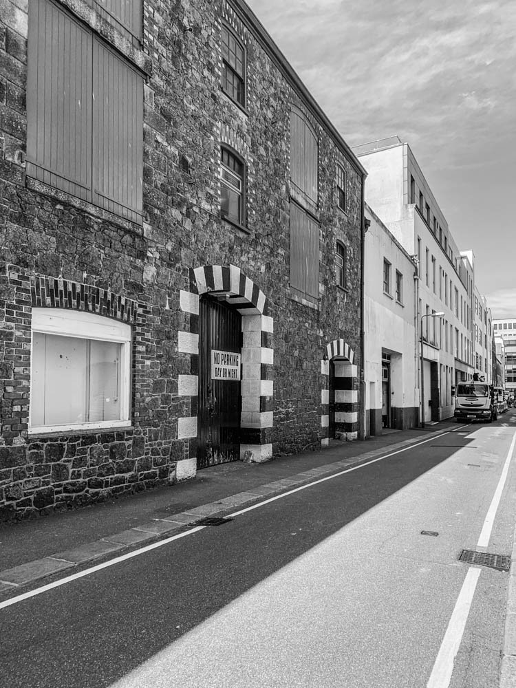
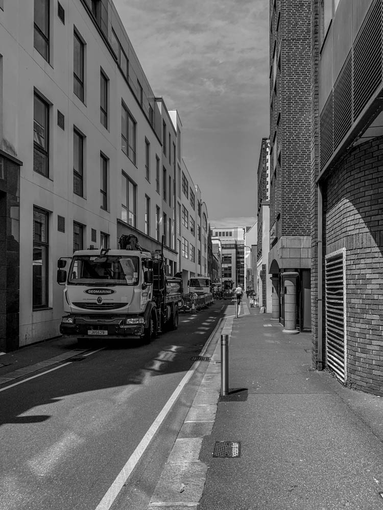
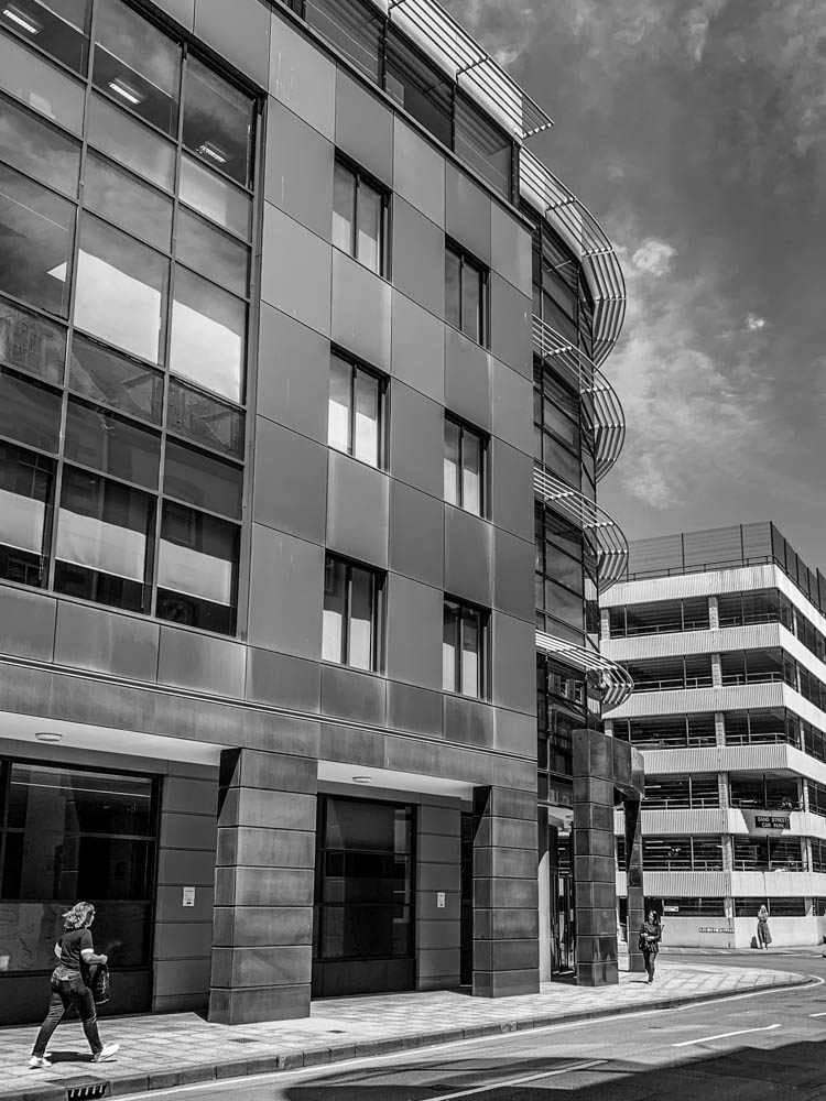
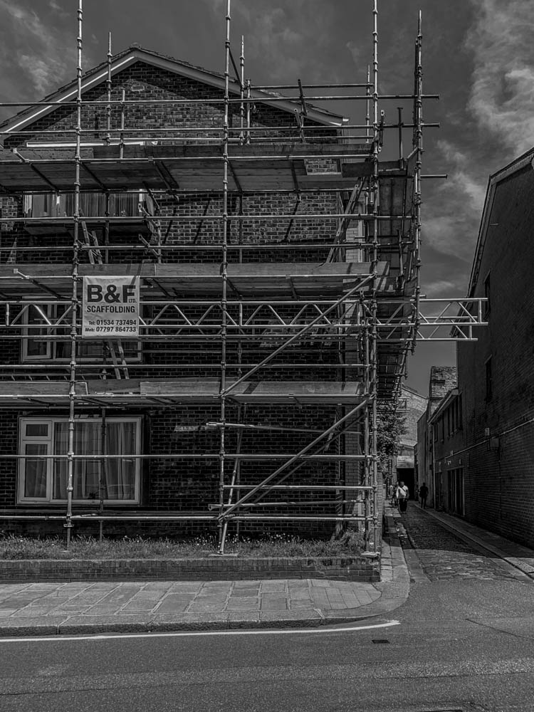
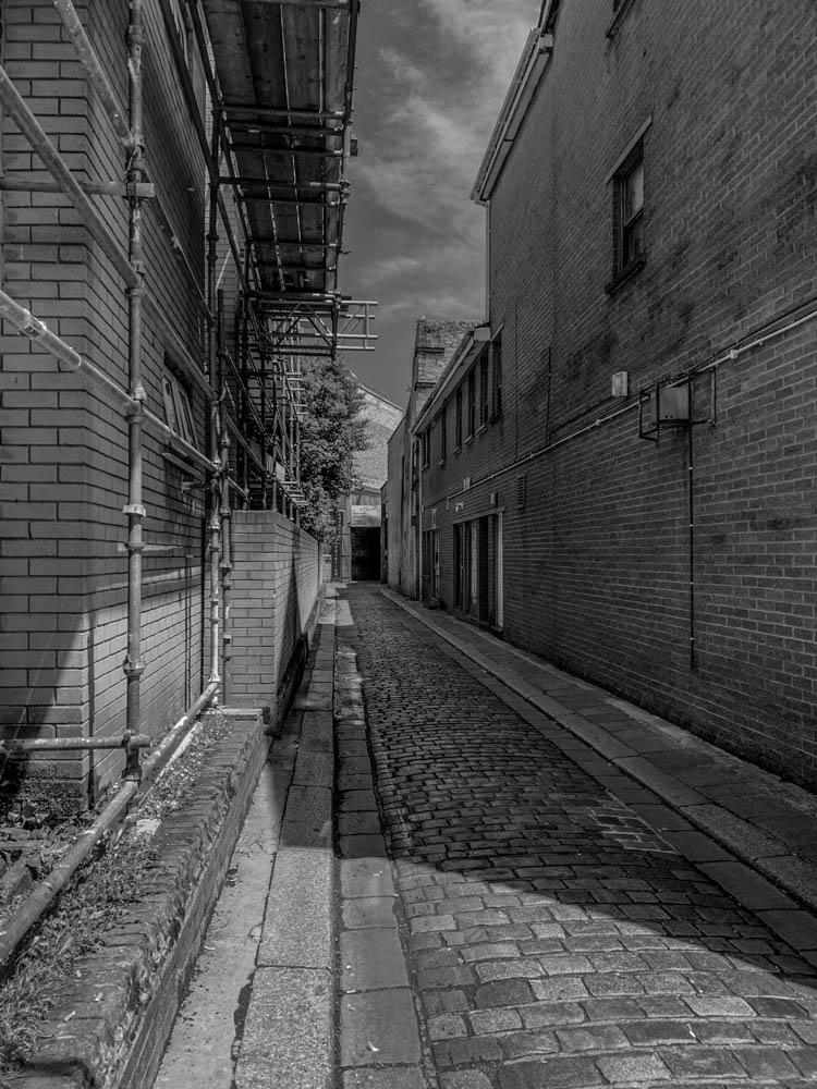
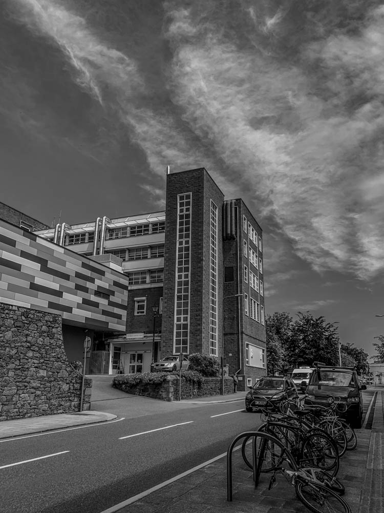
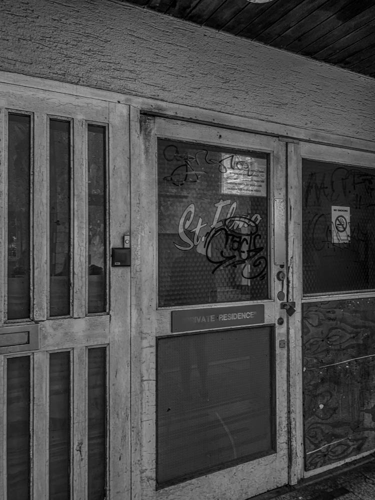
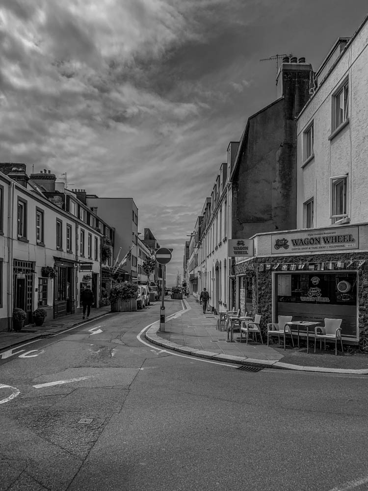
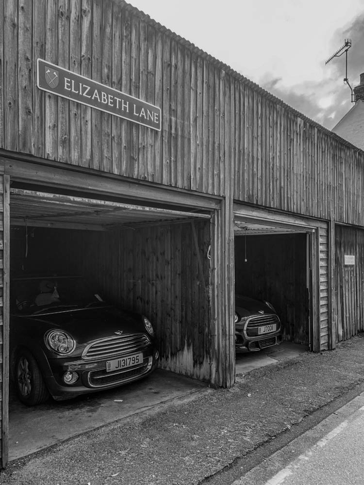
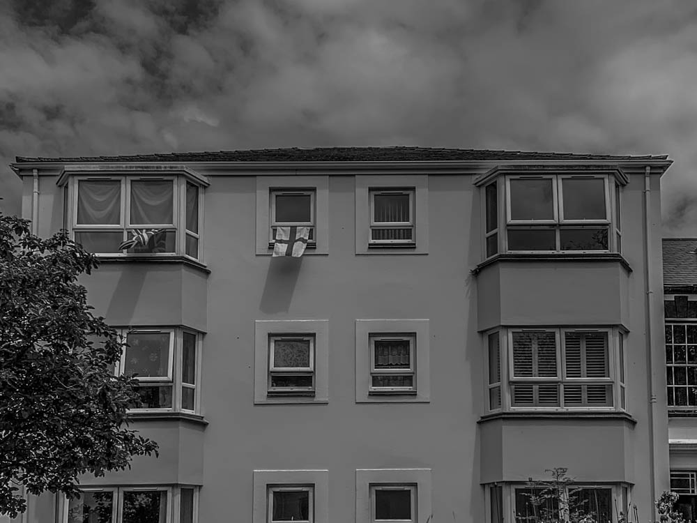
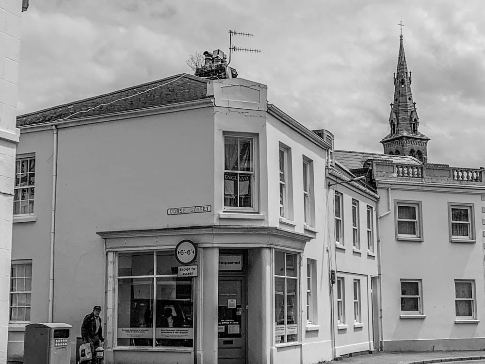
Here are my final developed images;

in colour;

in black and white;

these are my final images that I have developed and edited. I edited my set of images in colour using different contrast and exposure options to make sure they were edited in the way I was happy with how they look and I tried to keep the same style throughout all my images to not have any images that dont fit in or stand out too much.

Once I was happy with editing my coloured version set of images I also wanted to turn them all black and white and develop them further on. I did this to see whether I prefer the coloured or black and white set of images.

I do like how vibrant my coloured set of images are and turned out however I think when it comes to sequencing my images and putting them into a small book I will use the black and white set of images as it does match the photographers I’ve been looking at more as nearly all the old images of Jersey are in black and white to and I think I matched the tones between all the images well.

Identity and Community Photoshoot

Photoshoot plan

Identity and Community Photoshoot

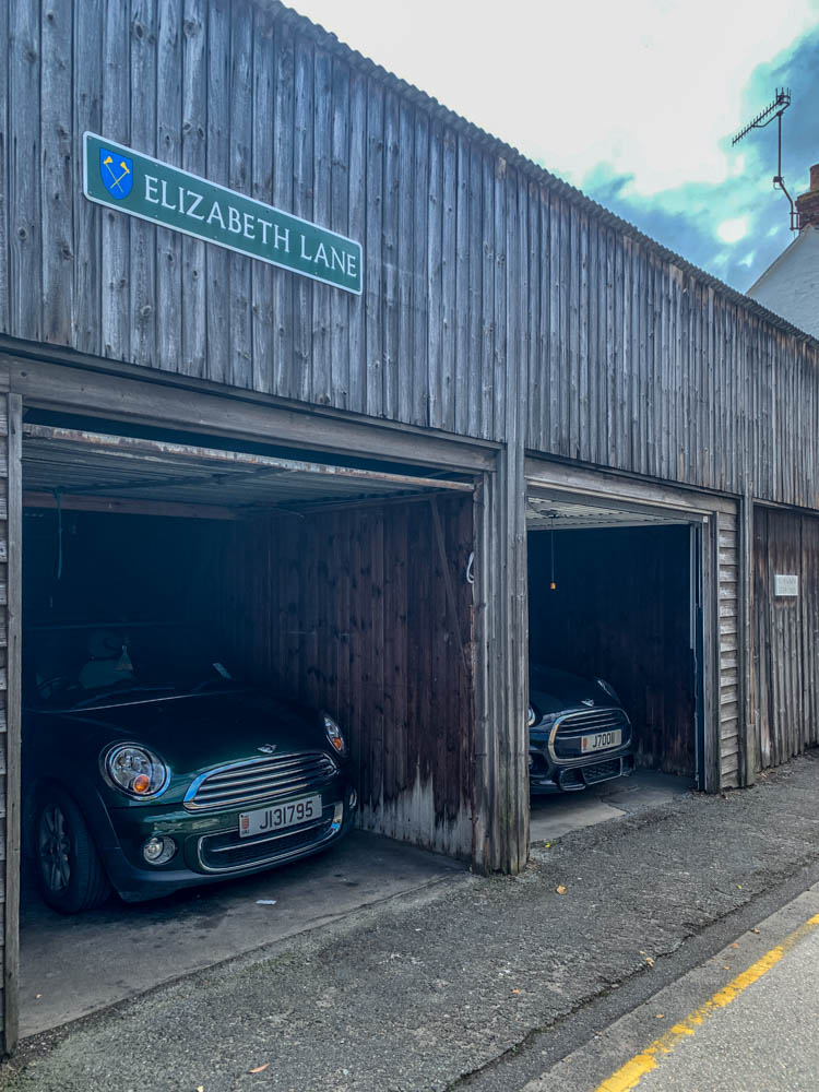
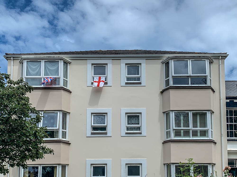
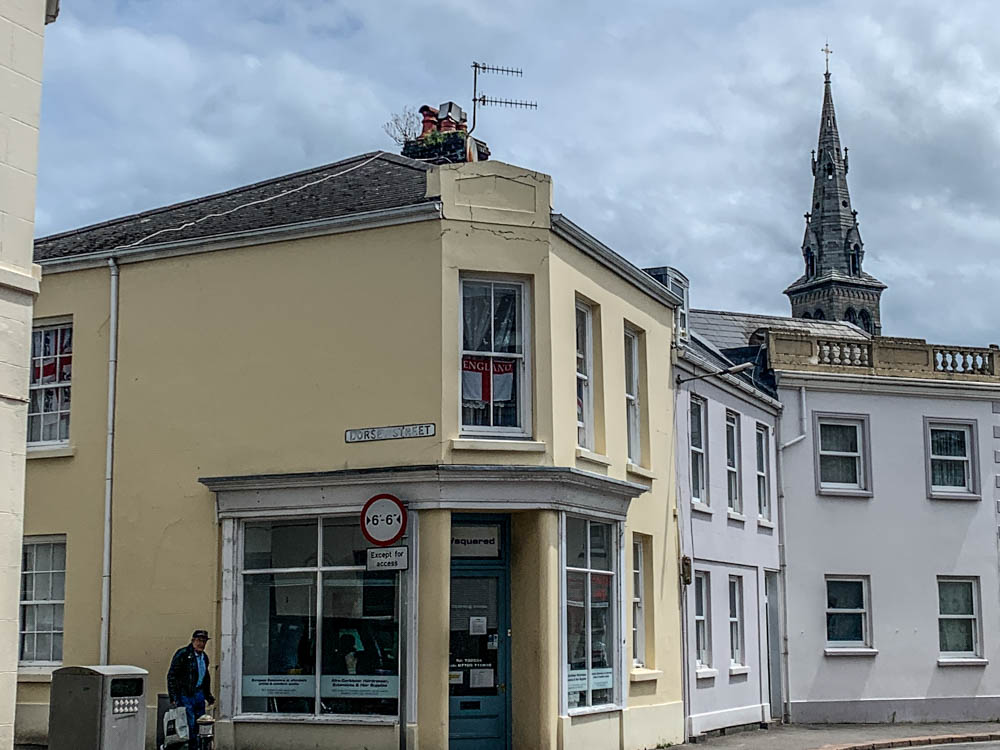
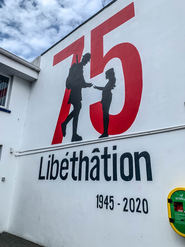
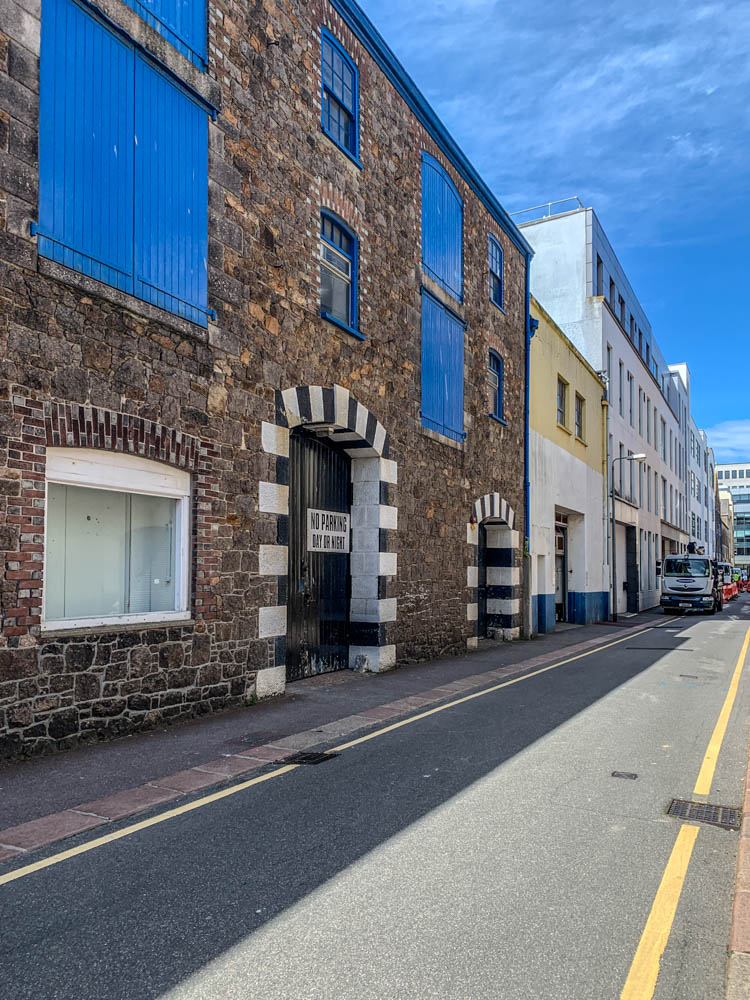
In this photoshoot, we walked around certain areas of town in order to capture elements of community and identity. I tried to focus my work on identity of communities reflected in the architecture of the area, such as English-style buildings and more colourful, unique building designs. I also managed to capture candid portraits that reflect a particular part of that person’s identity, such as their job or hobbies.
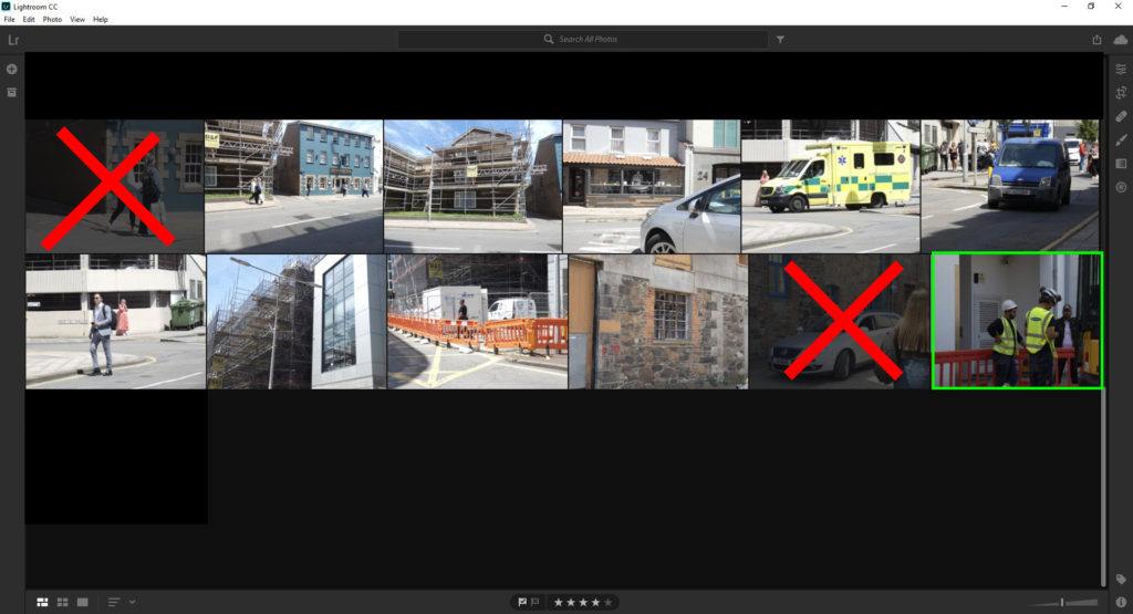
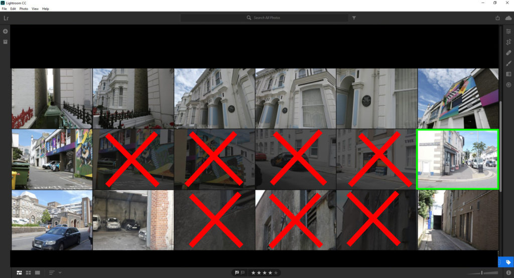
I think my photos highlighted in green are my most successful images as the distinctively capture the identity of a singular person or a group of people. The way the images capture both the person’s clothing as well as the surroundings around them, such as a building site or an area where a a particular community inhabit provides an easier outlook onto that person’s life through their career or hobbies.

I believe the images with a red cross through them are my least successful as the theme of identity and community can only be applied very vaguely, as majority of these images are close-ups of random buildings or have distractions in the image, such as other people on the trip taking images at the same time.

To edit these images, I will add a black and white filter and make the contrast slightly more exaggerated. This is to give them a similar appearance to the images in the archives, and provide a vintage atmosphere to the images.

People make jersey trip

We went on a trip down to the Jersey Museum to start our year 13 project on Identity and Community. We visited the ‘People make jersey – our stories of immigration’ exhibition to learn more about our communities immigration stories. Lucy Layton put together the exhibition in order to show that every Islander had their own ‘Jersey story’ to tell and the variety of people who make up Jersey’s community. The exhibition starts with Jersey’s first permanent settlers, who arrived around 7,000 years ago and where originally driven by a changing climate to seek a new place where they could plant their crops and raise their families. It then follows the waves of immigrants who have arrived in Jersey over the centuries.

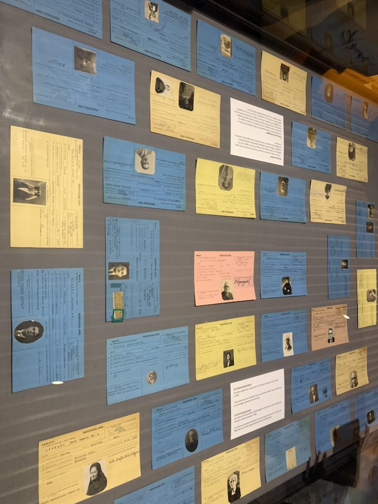
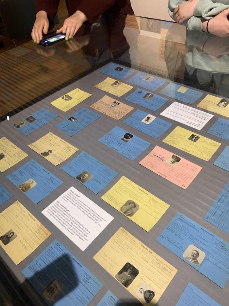
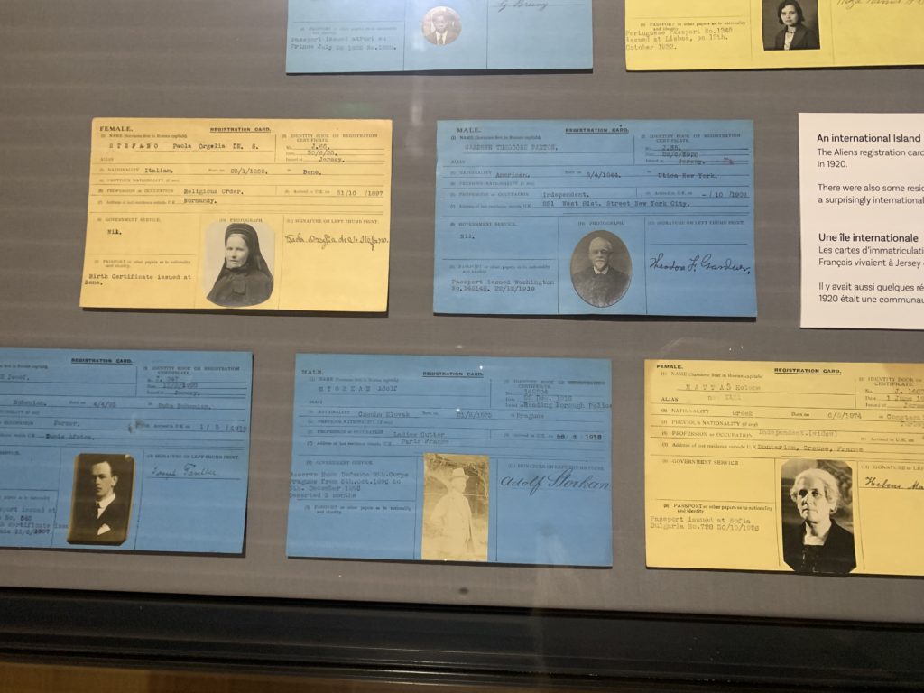
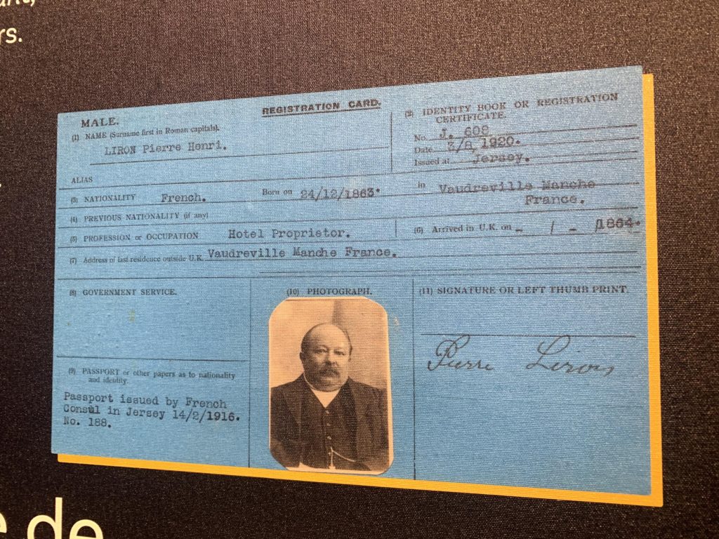
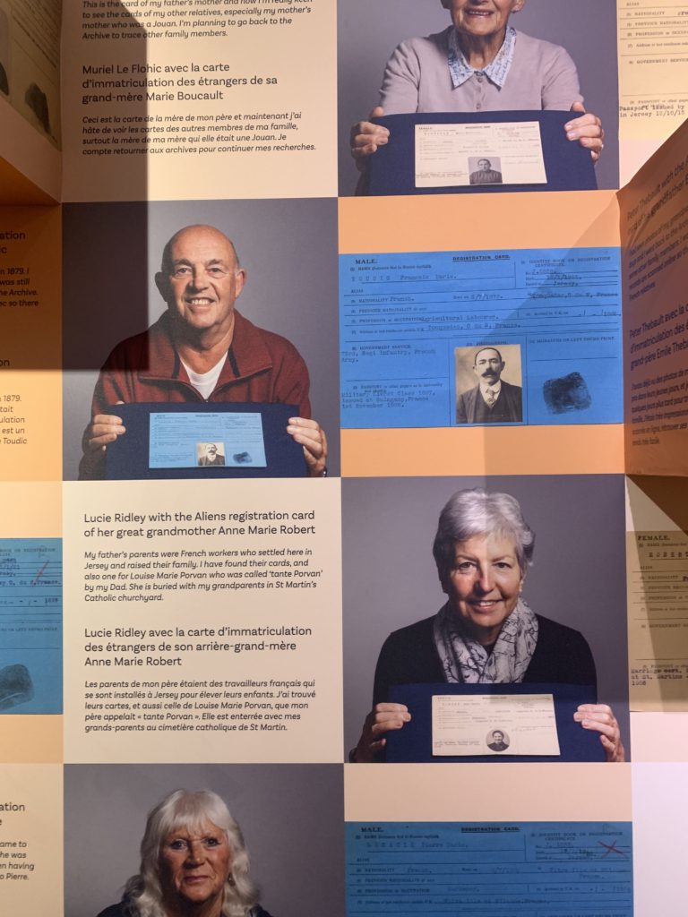
In the exhibition their was a glass table which had displayed many different types of passport cards and there was the Aliens registration cards, which showed lots of French people living in Jersey in 1920.

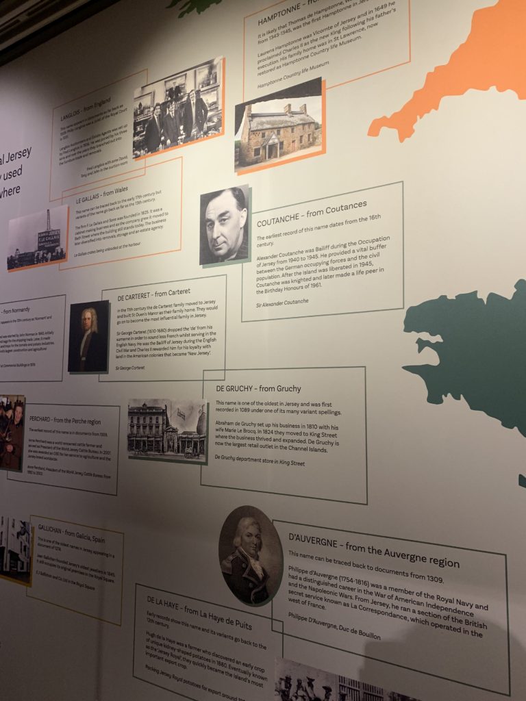
They also had a wall with many Jersey surnames and describing the history and origins of these names.

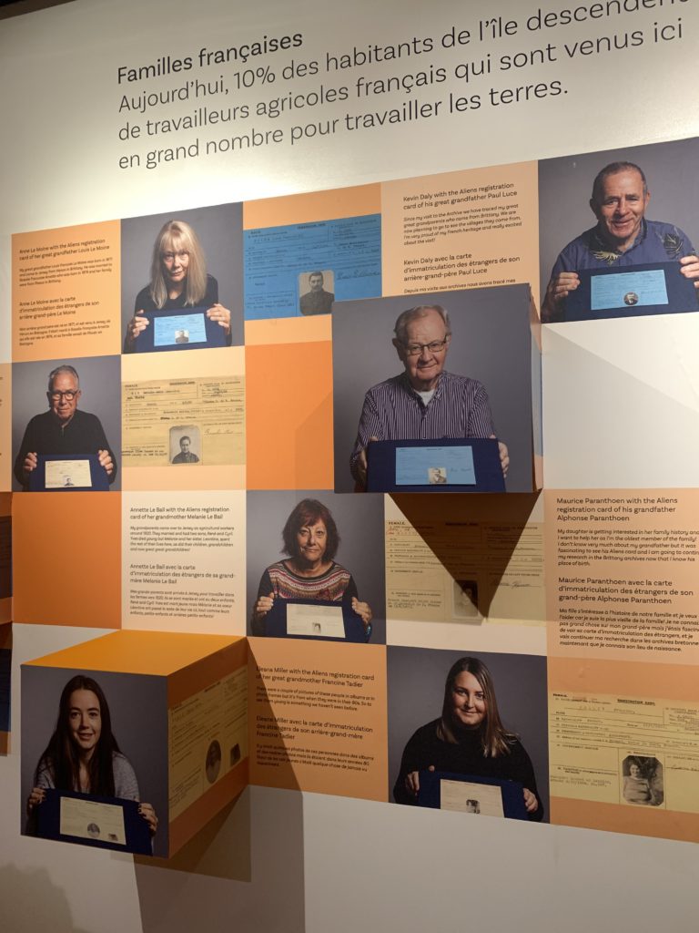
In the exhibition they created a wall which shows the current generations holding their older generations registration cards and next to them was a little bit about their family history.

Around the museum they had placed objects belonging to immigrants and people who were sharing their stories. They had many different objects like an old potato grater used to make polish dishes, a Portuguese passport , a old Spanish doll and a old kettle.

Zine Design and Layout

To make the ‘Zine’, we used InDesign to create a 16 page booklet to display our images based on the theme of identity and community. My images will be set out in landscape, with different sized images to create interest and contrast in both colour and size. The inside pages won’t have any text as I want the zine to focus purely on my images. I am still deciding on a title for my Zine.

InDesign Process

Zine Measurements –

Create new document
width: 148mm
height: 210
pages: 16
orientation: portrait
columns:2
column gutter: 5mm
margins: top, bottom, inside, outside: 10mm
bleed: top, bottom, inside, outside: 3mm

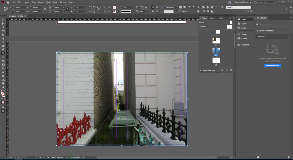
Once the basic zine is created, and the design and layout has been decided. Photos are then added. To do this, I used the rectangle frame tool and worked out the size of my image.

Once the frame for the photo has been correctly sized, I clicked import photo to add my image into the frame. For my zine I am alternating between the sizes and colours of the images, which is why I have paired black and white images with colour images. Also, each page contains different sized images, for example some pages have an image to the edge of the bleed, whilst others shave a page with another photo.

Once the image has been imported, the image must be resized to fit the frame. To do this, I pressed fitting, and fit content to frame. The fitting of the image depends on the size of the frame, therefore a bigger frame will display a larger image. Repeat this process until all 16 pages in the zine are filled.