artist reference- identity and community

for my first chosen photographer I have decided to look into Will Lakeman‘s work. He looks into social housing buildings and photographs many different buildings and flats which show the whole structure and community of Jersey.

some of his work-

I wanted to look at his work and take inspiration from him as I want to photograph town and look at the community within st. helier.

The second contemporary photographer I want to look at is Robert Adams he is an American photographer who has focused on the changing landscape of the American West. His work first came to prominence in the mid-1970s through his book The New West and his participation in the exhibition New Topographics. He looks at the community by focusing on taking photos of simple buildings and areas of a city that identify a place.

some of his work-

analysis of their images-

Will Lakeman image-

This image I have chosen to analyse uses lots of colour as well as having extremely dark almost completely black areas in order to create a very sharp and powerful contrast between the beaming coloured lights. This photo was taken at night or perhaps just right after the sun has set as there are still some light blue undertones in the sky however that could just be the powerful reflection of the coloured lights. The lights in each flat are very bright which capture the viewers attention directly at the building as the rest of the image is just a dark background consisting of cars and street lamps. The building being centered right in the middle of the image has a powerful effect as it makes it the main focus and grabs your attention right away being able to see all the different colours of the light that are shining through the flats. The trees on the ground level have also been positioned well in the image as the two trees at the front are well lined up with the two columns of windows going up the apartment building. I think this image really makes you think about how there are so many little lives in each window in the building and almost every colour reflecting tells a different story as everyone in the building thats living there has such a different background. I think this photographer captures the idea of Identity and Community’ very well as identifies Jersey as lots of buildings with so many stories inside and it can give you an idea of what town would look like if you were going to walk through it at night. I think Will waiting for the perfect time , night time, to capture this image as it let him capture all the different colours and night time is when the day is coming to an end which means that is when everyone is home together which creates this safe feeling of the community being shown.

Robert Adams image-

ROBERT ADAMS (B. 1937)

In contrast to Will, Robert Adams image I chose to analyse is very different and the complete opposite. I like how simple yet effective Roberts images are at capturing the community to show what the living environment of that city is. His image contains very strong contrasts between black and white, as well as using a variety of different tonal shades. This allows you to see all the houses more clearly as they stand out extremely from the dark shades that surround them. The composition of this image is done very well as the houses are photographed on the bottom half of the image and the sky is the upper half of the image. This separates the image well and creates an even divide between the two. The sky is a lot lighter than the houses which creates a very powerful contrast. I dont think there’s any meaning behind Robert Adams images as his focus was to just photograph the simplicity of buildings and different communities in certain cities or towns he visited.

EDITING IN LIGHTROOM – photoshoot

French and Portuguese quarters;

To start my editing process i imported images into a new collection i made. I used ctrl and P and X to select my favourite images. By clicking P lightroom would flag my image making it one of my chosen images and clicking X made sure I dont use the images when editing further/into the second stage.

After selecting my favourite images, I use the star ratings to rate my images from 1-5 stars. Images that I rated 3+ stars i will keep and continue to edit them in the next stage.

Once i filtered out my images and kept the ones with 3+ star ratings I used the compare tool to decide which image I like more when I had 2 similar images

I then went onto develop mode and edited all my final chosen images.

some of my final and edited images;

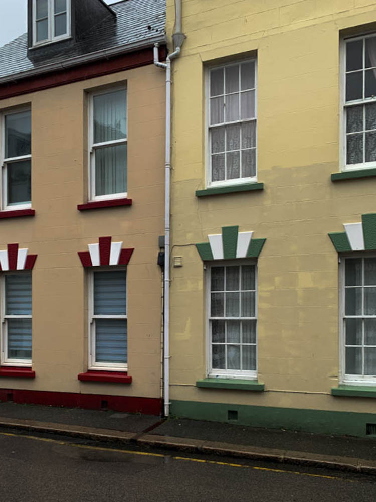
I took photos in St.Helier around town of the where the rich quarters used to be back in the days as well as mixing it with some roads that are known to be the french and Portuguese roads , most of buildings used to be huge houses with many floors and rooms however now they all have turned into flats and usually get sold for quite a cheap price.

identity and community- research

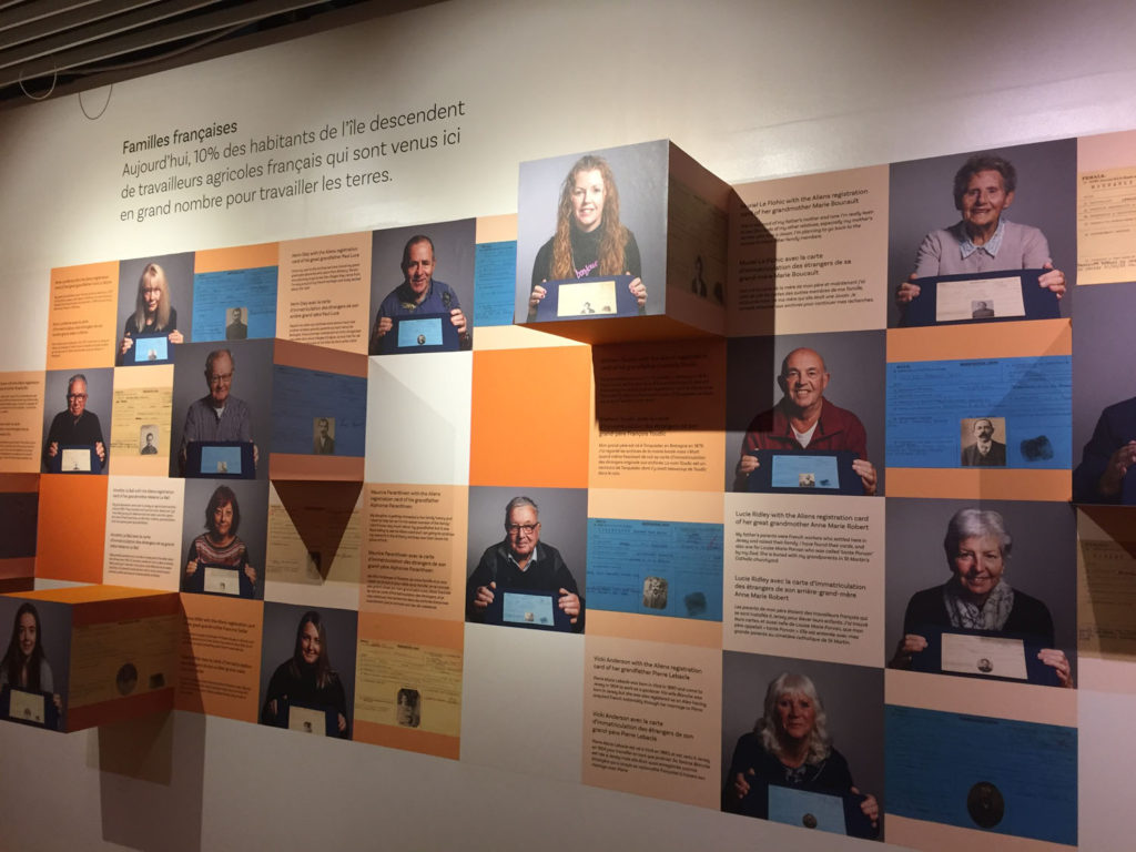
To start our Year 13 project, we have started looking at the culture and immigration of Jersey. By looking at these aspects in more detail it creates a better understanding of what life used to be like at Jersey and the culture/history behind certain areas and buildings we have here. Taking a trip down to the Jersey Museum allowed us to visually see and learn about the migration with-in Jersey and what caused it and how it was during those times. The exhibition allowed everyone to learn about different stories and how Jersey was influenced and impacted by this.

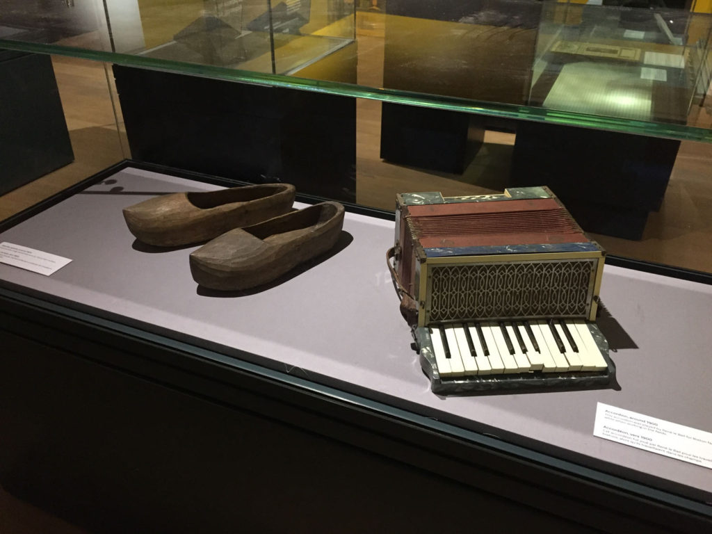
here are some images of what was at the exhibition and for context;

all of these displays allowed us to see the history of immigration visually and more clearly.

here’s an example of one story for reference-

Jean Janvrin was one of the merchant traders who operated the triangular cod trade between the Gaspé, the West Indies and the Mediterranean. The Janvrin family had been involved with the transatlantic trade for several generations.

In common with many traders Jean maintained a base at St Aubin on the Rue du Crocquet. His house, L’Anciennette was located on the right hand side of the road in part of the building that is now St Aubyn’s Hotel Apartments. The house was bought in 1803 by Jean from Thomas Pipon’s creditors. Pipon had gone bankrupt and the house was sold into the Janvrin family in order to help him pay his debts.

CONTEMPORARY Artist Inspiration – Dana Lixenberg – (Identity And Community)

Who is Dana Lixenberg?

Dana Lixenberg (born 1964)s a Dutch photographer and filmmaker. She lives and works in New York and Amsterdam. Lixenberg pursues long-term projects on individuals and communities on the margins of society.

Her most recent project is called “Imperial Courts”, and was made between 1993-2015. It is a project about Imperial Courts, a social housing project in Watts, Los Angeles. The project contains work made over a period of 22 years and consists of a book, exhibition and web documentary

“Austere and involved perspective” was her style as quoted by Muse Magazine, by one of her most great supporters.

Mood Board

This images were constructed from Dana Lixenberg’s website in the Portrait section.

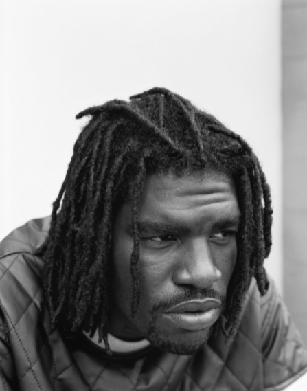
Analysis – “Brian” – 2015

Firstly, Lixenberg has positioned her subject in a way which creates a moody composition. The subject, isn’t making eye contact , which signifies anger and wanting to be alone, to not talk to anyone. The subject is also slightly leaning forwards to create an engaging pose, and he has his body and shoulders slightly away from the camera for a more natural feel.

This image was shot in natural daylight, so the subject is well lit. It is most likely a overcast day, as the whites in the image aren’t overexposed, and there are shadows on the subject face, which helps to create depth and define facial features.

Lixenberg used a low aperture e.g. f/1.8 and focused on his eyes, to completely blur the background which helps keep the focus on the subjects face. It also slightly blurred the subjects jacket as well, which created a distinction between his chin and the jacket has they are of similar colour. The background is a good choice, as is completely white, which draws attention to the subject.

Lixenberg, probably used a 50mm lens as the subject fills up most the frame. She was close to the subject to get a sharper image. The reason why I think she shot with a 50mm lens, is because anything over 50mm it can make the subjects facial features seem flattened, and anything under 50mm creates lens distortion.

Overall, I like the aesthetic which Lixenberg was going for. I think it is a great image, and an interesting subject. The detail in his hair and beard help create a unique composition to demonstrate mood. The black and white effect makes us pause and look closely. Removing colour from a picture helps the viewer to focus on a subject’s emotional state.

Links

Imperial Courts introduction video made by Dana Lixenberg:

http://www.imperialcourtsproject.com/portrait/introductie-slide/#

GRIMM Gallery about Dana Lixenberg:

https://grimmgallery.com/artists/42-dana-lixenberg/

MUSE Magazine about Dana Lixenberg:

A great supporter of Dana Lixenberg’s “austere and involved perspective”, he was the first in the United States to publish a portfolio of her Imperial Courts series

https://www.musemagazine.it/dana-lixenberg/

Photo shoot In the style of Dana Lixenberg

I will plan a shoot in her style in a separate blog post. Where I get up close headshots of people using a low aperture, and a 50mm lens. I will ask people in town with interesting facial features.

artist reference – historical

The photographer I want to study in more detail and analyse his work is Henry Mullins. Henry Mullins is a very famous photographer especially in Jersey’s history as he was one of the first famous photographers to influence Jersey photography. The unique thing about his photography is that all his images were portraits of people. This is quite important and powerful for our history as it shows us visually what individuals of different class looked and dressed lie in the 80s. His photography allows us to see a visually representation of Jersey’s culture back in the day and how much it has evolved over all these years up until now, such as fashion

Henry Mullins started working at 230 Regent Street in London in the 1840s and moved to Jersey in July 1848, setting up a studio known as the Royal Saloon, at 7 Royal Square. Initially he was in partnership with a Mr Millward, about whom very little is known. By the following year he was working alone and he continued to work out of the same studio for another 26 years.

For a brief period in the 1860s he also worked in London, but judging by the collection of his photographs which is now held by La Société Jersiaise, he found plenty of willing sitters in the island prepared to pay half a guinea (promoted as “one half of that in London”) to have their portrait taken by him.

analysis of one of Henry’s photographs-

Henry Mullins - Jerripedia

As you can see this photo is a portrait photo that has been taken in black and white. His face and body has a much darker tone compared to the background that is just all plain white, this nicely contrasts together and makes him stand out in the portrait. Mullins would have mostly likely used natural lighting and photographed this young man in a studio as the background is all white or even in his own home. He’s positioned to be photographed directly in the center of the image which makes him the main subject and focus, as this is a portrait photograph. You can probably figure out his class and wealth status just by having a look at what he’s wearing. He’s dressed in a neat dark suit with a tie which suggests he’s most likely middle or upper class as he would definitely need to have money to buy a good looking suit instead of just being in old slacks and photographed in a farm. Him being dressed well also suggests he probably has a good earning job and his hair looks well put together too. This is why Mullins taking portraits is very important and empowering as you can see and tell so much just from one image.

Some more examples of Henry’s photographs-