
RESEARCH
On Monday the 7th of June; the last day of the exhibition, we visited the “People Make Jersey – our stories of immigration” exhibition, at the Jersey Heritage museum in St Helier.
The exhibition is based on the fact that, “Every Jersey resident has a story of how they come to be living in the Island, whether their family came here 500 years ago or five years ago. ‘People Make Jersey’ explores some of these stories and the ways in which immigration has shaped and influenced the Island we know today.”
The oldest items in the exhibition belonged to Jersey’s first permanent settlers, who arrived around 7,000 years ago. The created basic stone tools and lived in a sheltered place where they could plant their crops and raise their families.
Picture of tools, Jadeite polished stone axe and ring. These would have been brought into Jersey from mainland France around 6,000 years ago.
It then follows the waves of immigrants who have arrived in Jersey over the centuries. Some of the people were religious, which introduced different cultures and beliefs into the island.
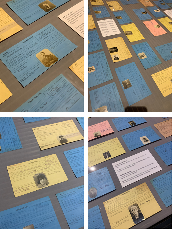
There was an glass display island in the exhibition which displayed lots of passport type cards. These were the Aliens registration cards, which show lots of French people living in Jersey in 1920.
There were also some residents from much further afield. Jersey in 1920 was a surprisingly international community. E.g. Belgium, Toulouse, and Czech Slovakia.
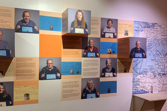
There was a wall which featured the current generation holding there ancestors registration cards, this was a good way to visualise the different cultures in Jersey and its history.
Near to the registration cards, there was a map on the wall, which mostly focused on France. It showed where some of the popular surnames originated from. In the old days the surname just meant where you were from, e.g. John Coutanche, who was from Coutances, France. These are all the names and places displayed on the map :
UK
– LANGLOIS from England
– LE GALLAIS from Wales
– HAMPTONNE from Southampton
FRANCE
– DE CARTERET from Carteret
– DE LA HAYE from La Haye de Puits
– DE GRUCHY from Gruchy
– COUTANCHE from Coutances
– LE BRETON from Brittany
– NORMAN from Normandy
– PERCHARD from the Perche region
– LE POIDEVIN from Poitou
– D’AUVERGNE from Auvergne region.

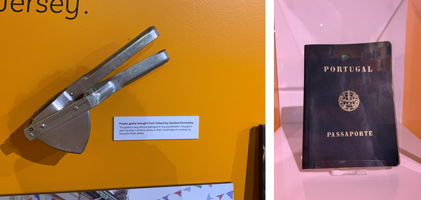
There was a wall that had items which people brought to Jersey when they first came. Each person had one item that had a significant value/memory to them. Some of the weird/interesting items was a, Potato grater, which was brought to Jersey from Poland by Karolina Klonowska, as it was very old and belonged to here grandmother, she brought it to Jersey so she could cook her favourite Polish dishes. There were other items such as dolls, passports and, musical instruments such as a flute.
Around the exhibition there were old images of Jersey maps, notes and news papers. I thought they were interesting as so much has changed over the years, for example the Waterfront wasn’t even there in the map, as it was build recently. These are the Old vs New comparisons using images from the exhibition and new versions from today.
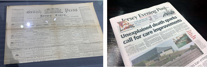


PHOTO SHOOTS
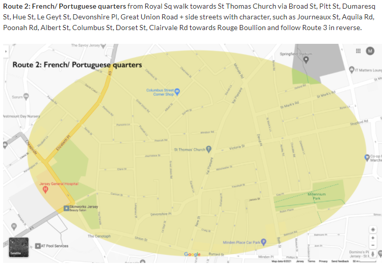
After the exhibition, we visited the Victorian part of the museum, and went on 2 walks round town. The first walk we were looking at the different types of bricks and stones in the buildings. There was this one building which have blue bricks that reflected in the sunlight (the building with the French flag). The second walk we went round town. This is a image of a map where we went. We took photos as we walked around town of the buildings and anything we saw, mainly focusing on:
MIGRANT COMMUNITIES IN ST HELIER
– a sense of place
– character of community
– people, portraiture
EDITING IN LIGHTROOM CLASSIC
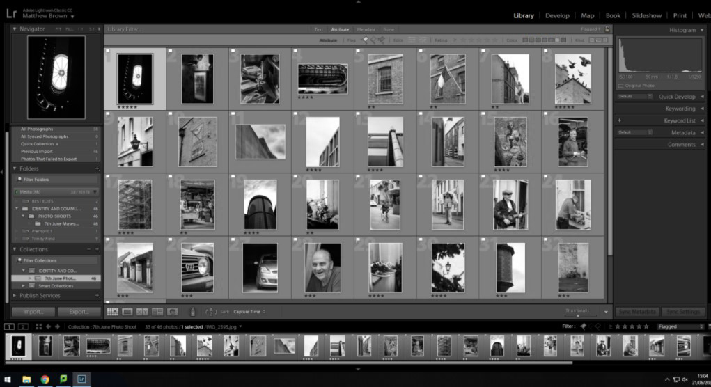
I imported all my images into Lightroom from the museum trip on the 7th June.

This is the selected flagged images, that use the p (pick) and x (reject). The white flag is placed on the good images, where as a black flag on the rejected images. I used this to filter all my images, which was around 300 to get it down to 10-30 good images.
I did basic adjustments to the images, increasing clarity, decreasing dehaze, increasing contrast etc. Including gradient and radial filters.
I took some of the images into Photoshop (using edit in –> Adobe Photoshop, option in Lightroom) and removed distracting elements such as ropes and security cameras.
I tried a black and white, (monochrome) look to see if it would add more drama and create a moody atmosphere.
Then I used Lightroom compare view to compare the edited black and white image with the edited colour image.
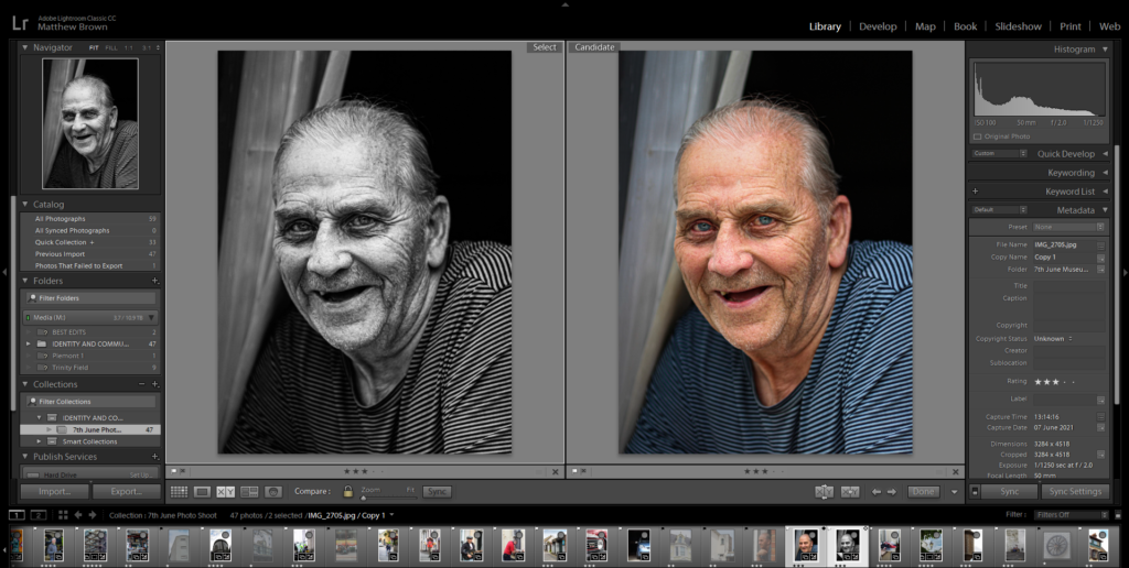
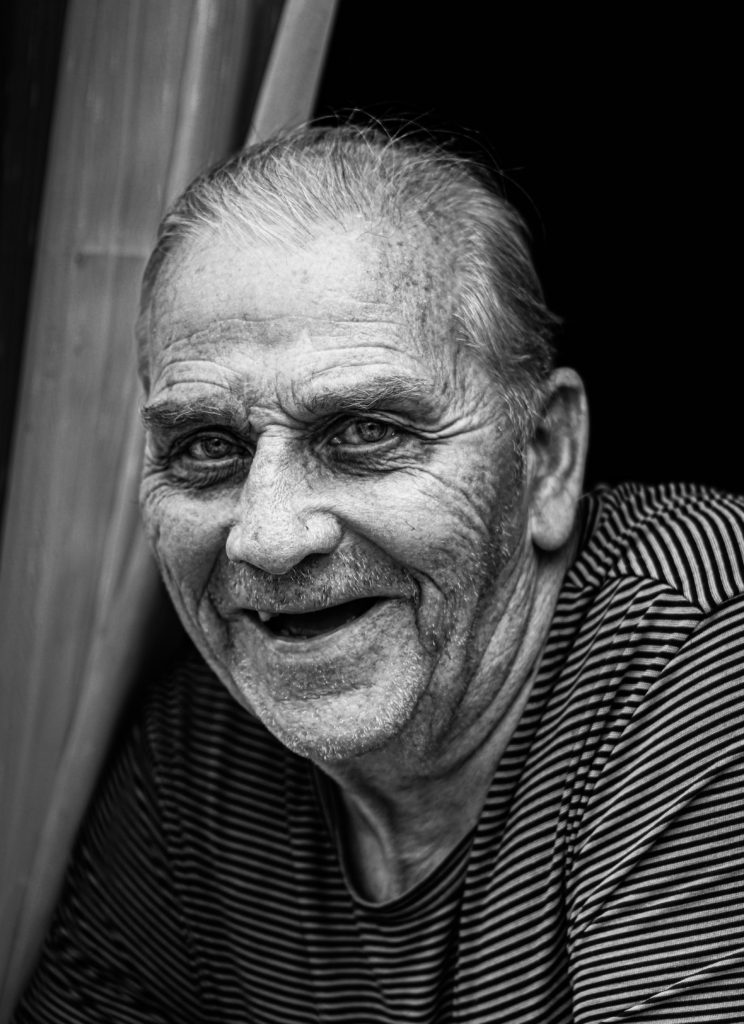

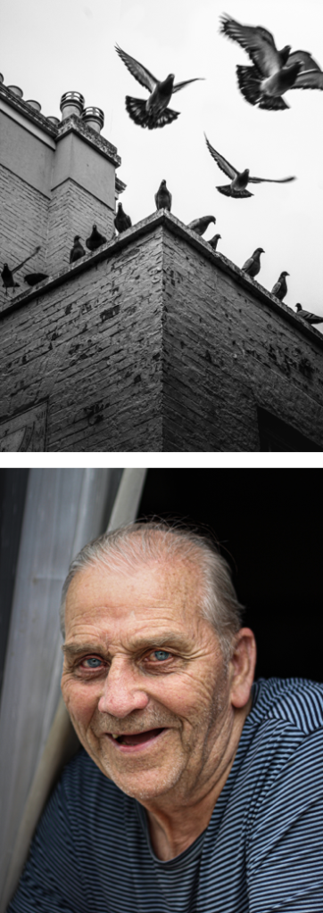
Portrait – I like how the black and white brings out the details, and adds more age to the image. This works well due to the subject being of age. Although, I prefer the colour version as it shows more personality, which is crucial in portrait photography. The detail in his eyes and mouth is more defined in the coloured image, the colours also create depth, which is hidden in the black and white version.

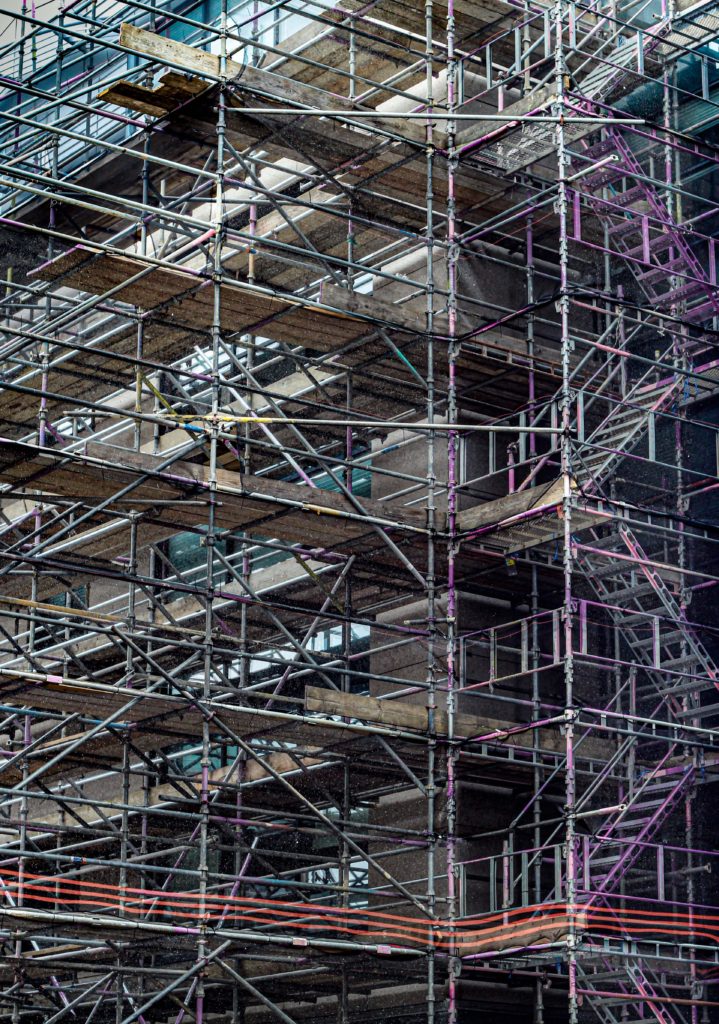
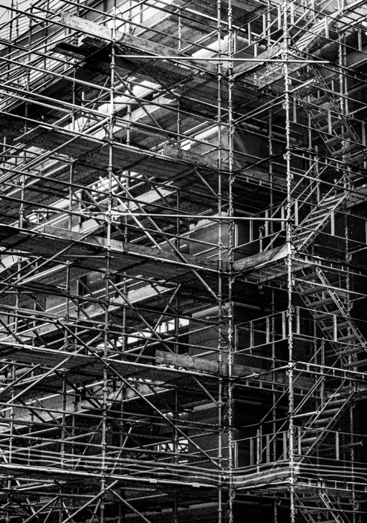
Detailed Image – There is lots of detail so, the black and white image separates the whites and the blacks making them more defined creating depth. It gives a cleaner look the the image, but this is not the aesthetic I wanted as it is a messy, dirty building site. Which is why I like the coloured image more, as I shows sections of dull colour between the metal poles.
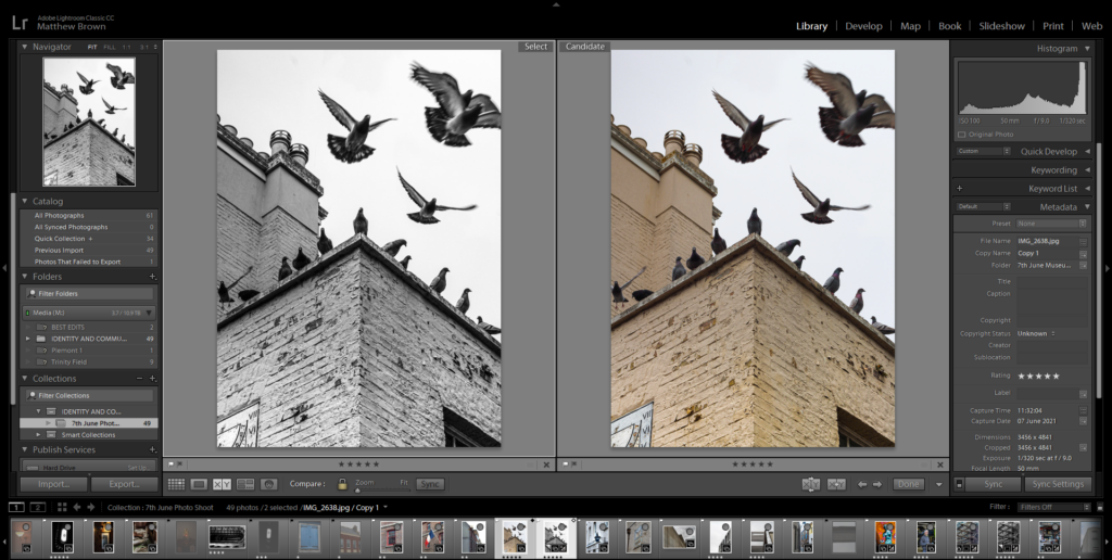

Fast Shutter Speed Image – This image shows motion in the faster flying birds, whist still freezing time as the birds fly. I like this image better in black and white, as there is more contrast and detail, compared to the coloured version. It also helps bring out the shadows in the birds more.
CHOOSING MY FINAL IMAGES
Lightroom made it easier to see all my images, as they were all in one place. Lightroom has different view features, such as, full screen, compare view, and survey view.

I used the survey view to display my good images, them I ordered them best to work using the star system inside Lightroom.

The purple colour tagged image was the best/my favourite, so I marked it 5 stars. This becomes useful when I have to make a zine, so I can just filter by 4+ stars, so I get my best images.
I colour coded my images based on its topic. Ill will try to keep it consistent throughout to year, so it is easier to find images.
The colours are:
– Yellow – Indoors
– Green – Outdoors
– Red – Portrait (environmental) / People
– Purple – Black and white photography

These are the final images in Lightroom, I then exported them into my PHOTO-SHOOTS folder in a sub-folder called June 7th Edits.
FINAL IMAGES


The larger images are my favourite ones, as there have a really nice compositions and colour.
Overall, there was a good variety of images, consisting of portraits and street photography. My favourite type is street photography, just walking around and using temporary objects to create foreground elements, since I use angles, reflections, and shapes to create my images, E.g. the car reflection in the orange street art image.