artist reference- identity and community

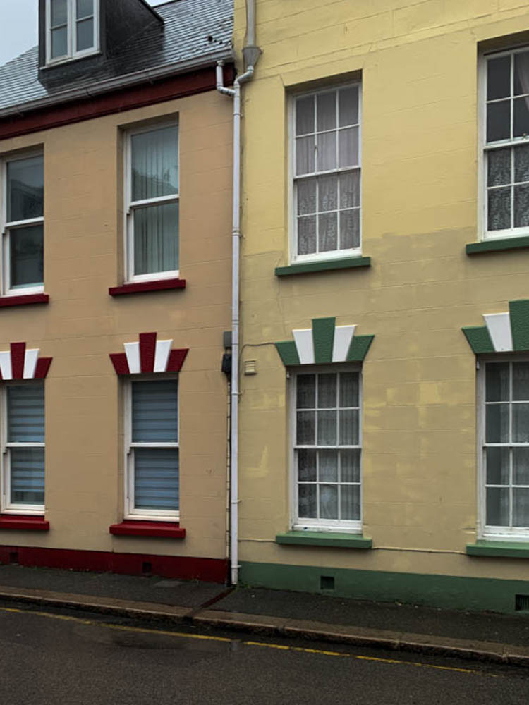
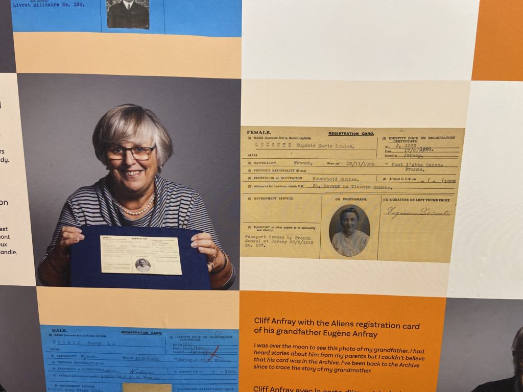
for my first chosen photographer I have decided to look into Will Lakeman‘s work. He looks into social housing buildings and photographs many different buildings and flats which show the whole structure and community of Jersey.

some of his work-

I wanted to look at his work and take inspiration from him as I want to photograph town and look at the community within st. helier.

The second contemporary photographer I want to look at is Robert Adams he is an American photographer who has focused on the changing landscape of the American West. His work first came to prominence in the mid-1970s through his book The New West and his participation in the exhibition New Topographics. He looks at the community by focusing on taking photos of simple buildings and areas of a city that identify a place.

some of his work-

analysis of their images-

Will Lakeman image-

This image I have chosen to analyse uses lots of colour as well as having extremely dark almost completely black areas in order to create a very sharp and powerful contrast between the beaming coloured lights. This photo was taken at night or perhaps just right after the sun has set as there are still some light blue undertones in the sky however that could just be the powerful reflection of the coloured lights. The lights in each flat are very bright which capture the viewers attention directly at the building as the rest of the image is just a dark background consisting of cars and street lamps. The building being centered right in the middle of the image has a powerful effect as it makes it the main focus and grabs your attention right away being able to see all the different colours of the light that are shining through the flats. The trees on the ground level have also been positioned well in the image as the two trees at the front are well lined up with the two columns of windows going up the apartment building. I think this image really makes you think about how there are so many little lives in each window in the building and almost every colour reflecting tells a different story as everyone in the building thats living there has such a different background. I think this photographer captures the idea of Identity and Community’ very well as identifies Jersey as lots of buildings with so many stories inside and it can give you an idea of what town would look like if you were going to walk through it at night. I think Will waiting for the perfect time , night time, to capture this image as it let him capture all the different colours and night time is when the day is coming to an end which means that is when everyone is home together which creates this safe feeling of the community being shown.

Robert Adams image-

ROBERT ADAMS (B. 1937)

In contrast to Will, Robert Adams image I chose to analyse is very different and the complete opposite. I like how simple yet effective Roberts images are at capturing the community to show what the living environment of that city is. His image contains very strong contrasts between black and white, as well as using a variety of different tonal shades. This allows you to see all the houses more clearly as they stand out extremely from the dark shades that surround them. The composition of this image is done very well as the houses are photographed on the bottom half of the image and the sky is the upper half of the image. This separates the image well and creates an even divide between the two. The sky is a lot lighter than the houses which creates a very powerful contrast. I dont think there’s any meaning behind Robert Adams images as his focus was to just photograph the simplicity of buildings and different communities in certain cities or towns he visited.

EDITING IN LIGHTROOM – photoshoot

French and Portuguese quarters;

To start my editing process i imported images into a new collection i made. I used ctrl and P and X to select my favourite images. By clicking P lightroom would flag my image making it one of my chosen images and clicking X made sure I dont use the images when editing further/into the second stage.

After selecting my favourite images, I use the star ratings to rate my images from 1-5 stars. Images that I rated 3+ stars i will keep and continue to edit them in the next stage.

Once i filtered out my images and kept the ones with 3+ star ratings I used the compare tool to decide which image I like more when I had 2 similar images

I then went onto develop mode and edited all my final chosen images.

some of my final and edited images;

I took photos in St.Helier around town of the where the rich quarters used to be back in the days as well as mixing it with some roads that are known to be the french and Portuguese roads , most of buildings used to be huge houses with many floors and rooms however now they all have turned into flats and usually get sold for quite a cheap price.

identity and community- research

To start our Year 13 project, we have started looking at the culture and immigration of Jersey. By looking at these aspects in more detail it creates a better understanding of what life used to be like at Jersey and the culture/history behind certain areas and buildings we have here. Taking a trip down to the Jersey Museum allowed us to visually see and learn about the migration with-in Jersey and what caused it and how it was during those times. The exhibition allowed everyone to learn about different stories and how Jersey was influenced and impacted by this.

here are some images of what was at the exhibition and for context;

all of these displays allowed us to see the history of immigration visually and more clearly.

here’s an example of one story for reference-

Jean Janvrin was one of the merchant traders who operated the triangular cod trade between the Gaspé, the West Indies and the Mediterranean. The Janvrin family had been involved with the transatlantic trade for several generations.

In common with many traders Jean maintained a base at St Aubin on the Rue du Crocquet. His house, L’Anciennette was located on the right hand side of the road in part of the building that is now St Aubyn’s Hotel Apartments. The house was bought in 1803 by Jean from Thomas Pipon’s creditors. Pipon had gone bankrupt and the house was sold into the Janvrin family in order to help him pay his debts.

CONTEMPORARY Artist Inspiration – Dana Lixenberg – (Identity And Community)

Who is Dana Lixenberg?

Dana Lixenberg (born 1964)s a Dutch photographer and filmmaker. She lives and works in New York and Amsterdam. Lixenberg pursues long-term projects on individuals and communities on the margins of society.

Her most recent project is called “Imperial Courts”, and was made between 1993-2015. It is a project about Imperial Courts, a social housing project in Watts, Los Angeles. The project contains work made over a period of 22 years and consists of a book, exhibition and web documentary

“Austere and involved perspective” was her style as quoted by Muse Magazine, by one of her most great supporters.

Mood Board

This images were constructed from Dana Lixenberg’s website in the Portrait section.

Analysis – “Brian” – 2015

Firstly, Lixenberg has positioned her subject in a way which creates a moody composition. The subject, isn’t making eye contact , which signifies anger and wanting to be alone, to not talk to anyone. The subject is also slightly leaning forwards to create an engaging pose, and he has his body and shoulders slightly away from the camera for a more natural feel.

This image was shot in natural daylight, so the subject is well lit. It is most likely a overcast day, as the whites in the image aren’t overexposed, and there are shadows on the subject face, which helps to create depth and define facial features.

Lixenberg used a low aperture e.g. f/1.8 and focused on his eyes, to completely blur the background which helps keep the focus on the subjects face. It also slightly blurred the subjects jacket as well, which created a distinction between his chin and the jacket has they are of similar colour. The background is a good choice, as is completely white, which draws attention to the subject.

Lixenberg, probably used a 50mm lens as the subject fills up most the frame. She was close to the subject to get a sharper image. The reason why I think she shot with a 50mm lens, is because anything over 50mm it can make the subjects facial features seem flattened, and anything under 50mm creates lens distortion.

Overall, I like the aesthetic which Lixenberg was going for. I think it is a great image, and an interesting subject. The detail in his hair and beard help create a unique composition to demonstrate mood. The black and white effect makes us pause and look closely. Removing colour from a picture helps the viewer to focus on a subject’s emotional state.

Links

Imperial Courts introduction video made by Dana Lixenberg:

http://www.imperialcourtsproject.com/portrait/introductie-slide/#

GRIMM Gallery about Dana Lixenberg:

https://grimmgallery.com/artists/42-dana-lixenberg/

MUSE Magazine about Dana Lixenberg:

A great supporter of Dana Lixenberg’s “austere and involved perspective”, he was the first in the United States to publish a portfolio of her Imperial Courts series

https://www.musemagazine.it/dana-lixenberg/

Photo shoot In the style of Dana Lixenberg

I will plan a shoot in her style in a separate blog post. Where I get up close headshots of people using a low aperture, and a 50mm lens. I will ask people in town with interesting facial features.

artist reference – historical

The photographer I want to study in more detail and analyse his work is Henry Mullins. Henry Mullins is a very famous photographer especially in Jersey’s history as he was one of the first famous photographers to influence Jersey photography. The unique thing about his photography is that all his images were portraits of people. This is quite important and powerful for our history as it shows us visually what individuals of different class looked and dressed lie in the 80s. His photography allows us to see a visually representation of Jersey’s culture back in the day and how much it has evolved over all these years up until now, such as fashion

Henry Mullins started working at 230 Regent Street in London in the 1840s and moved to Jersey in July 1848, setting up a studio known as the Royal Saloon, at 7 Royal Square. Initially he was in partnership with a Mr Millward, about whom very little is known. By the following year he was working alone and he continued to work out of the same studio for another 26 years.

For a brief period in the 1860s he also worked in London, but judging by the collection of his photographs which is now held by La Société Jersiaise, he found plenty of willing sitters in the island prepared to pay half a guinea (promoted as “one half of that in London”) to have their portrait taken by him.

analysis of one of Henry’s photographs-

Henry Mullins - Jerripedia

As you can see this photo is a portrait photo that has been taken in black and white. His face and body has a much darker tone compared to the background that is just all plain white, this nicely contrasts together and makes him stand out in the portrait. Mullins would have mostly likely used natural lighting and photographed this young man in a studio as the background is all white or even in his own home. He’s positioned to be photographed directly in the center of the image which makes him the main subject and focus, as this is a portrait photograph. You can probably figure out his class and wealth status just by having a look at what he’s wearing. He’s dressed in a neat dark suit with a tie which suggests he’s most likely middle or upper class as he would definitely need to have money to buy a good looking suit instead of just being in old slacks and photographed in a farm. Him being dressed well also suggests he probably has a good earning job and his hair looks well put together too. This is why Mullins taking portraits is very important and empowering as you can see and tell so much just from one image.

Some more examples of Henry’s photographs-

Identity + Community: Photo Archives Essay

How do archives function as repositories of knowledge?

Archives show us the past and educate us on the history through visual evidence.

Société Jersiaise

The Société Jersiaise was founded in January 28, 1873. They have now been collecting photography for 140 years, holding history with context helping present generations gain knowledge of Jersey. Photography arrived in Jersey in 1840.

Thomas Sutton was a pioneer who developed new camera equipment and photographer equipment. In 1859 he developed the panoramic camera with a wide-angle lens and in 1861 he developed the first single lens reflex camera. In 1861 Sutton took and developed the worlds first colour photo of a Tartan ribbon with James Clerk Maxwell who directed him to take three photographs of the ribbon through different coloured filters for each . He also worked on the development of dry photographic plates.

This image has an empty alt attribute; its file name is Tartan_Ribbon.jpg
The world’s first permanent colour photograph, Ribbon, by Thomas Sutton, 1861
E16MullinsMulti2.jpg
Multi-portraits, a technique used under licence by Henry Mullins

Henry Mullins was the first photographer to come to Jersey in 1848 and after his death he had a collection of 20,000 negatives which was given to La Société in 2006.

He first started working in London but then moved to jersey in July 1848 to set up a studio which was initially a partnership but the year after he was working alone and continued to do so for 26 years.

For a short period in the 1860s he also worked in London but based on his photographic archives at La Société Jersiaise, he found more people in Jersey prepared to pay to have their portrait taken by him.

William Collie took images of French Migrant Workers which some were early forms of staging photography as he had his friends dress up to create images. In the archive he currently hold 157 photographs.

He also was one of the pioneers of the photographic processes which help lead to paper prints invented by William Fox Talbot.

William Collie Market Women.jpg
One of the earliest photographs printed on paper. Jersey market women, by William Collie, 1847

From looking at the photos from the past we learn of the physical developments from the past such as the difference between our buildings, roads and land. We also learn the difference in society and the way of life, such as jobs and dress sense. As a family we have many old photos kept in physical photo albums but also albums on phones and social media platforms such as Facebook which also show the difference between looks and society from 10 years ago. Also we have archives of text messages which are kept on our phones and tell us a little about our personalities, because if someone was to read them they would have enough to be able to judge you as a person.

Edwin Dale

Edwin Dale - Jerripedia

Edwin Dale was a photographer who took pictures of jersey in the early 20th century (between 1910 and 1920), specifically landscapes. He focused on Harbour scenes and steamships, churches, houses, country lanes and coastal views, sport and the railway. He also took some portraits of working people. He travelled around the island on his motorbike to take his photos.  

His photos are part of the Photographic Archive at La Société Jersiaise and private collectors. He photographed events such as the Royal Visit of 1911. In 1914 around 40 of his images were published as a series of postcards.

Edwin Dale’s work helps us learn about the past of Jersey such as building developments and lifestyle changes.

Examples Of His Work:
St Helier Harbour
A penny farthing bicycle
Victoria Avenue

From studying Edwin Dales work we can gain knowledge of the past and how Jersey has changed with new technology and inventions. Like in ‘A penny farthing bicycle’ (shown above) an old traditional bicycle is pictured showing the difference between modern bicycles. Also, the other two images show a difference in the landscape, for example the harbour has now changed completely as in the photo it is used as the main harbour for big boats but now is used mainly by fishermen. Furthermore, in recent years the land around La Colette has been expanded with landfill.

Image Analysis

Key Themes– Edwin Dale’s work is inspired by every day life and taking images best showing the everyday life that would have been in the early 1900s, 100 years ago.

Context– A picture of a man standing on top of a traditional Vraic Cart pulled by a white horse on a field. A man in the background holding a pitchfork and a line of horses in the back. It is taken from eye level with the cart in the centre of the image. The title ‘Vraic Cart’ educates the audience because before knowing the title I did not know what was gong on, but the title tells us it is a cart using Vraic to fertilise the soil. It also implies that this is the main focus of the image and is maybe why he took it, to solely educate the future society.

File:Lib17EdwinDaleVraicCart.jpg
Vraic Cart, Edwin Dale

Formal Elements– The image is in black and white which makes the image have a high tonal range and creates a large contrast between the shadows and highlights. The image is taken outside meaning Dale replied on the natural lighting. At first the image looks a bit dark in nature but then if you look closer there is a shadow on the ground meaning it was a sunny day which changes the mood of the image as it is just an average day and Dale is probably out on a capturing the natural everyday working people. The image follows the rule of thirds as he has positioned the line of houses in the top third of the image and has kept his main subject (the horse varic cart) in the centre.

Conclusion

Referring back to the essay question (How do archives function as repositories of knowledge?) I think that it is obvious that we can learn a huge amount from archives of any sort, specifically photographic archives as they can help us visualise and see things like how they did in the past. For example they are a good way to see how they lived in the past and how technology has changed, showing the difference between the past and the present. They can also show the difference between the lives of different class, gender, race and religion and how they lived together as a community but also the difference with those groups to the present day.

To develop my own work forwards I would like to adapt a similar style to Edwin Dale by taking images in the style of photojournalism. for example I could go to town where it is busy and take images capturing the lifestyle of people and them in their routines going to work, shopping or socialising.

Identity and Community – ‘People Make Jersey’ exhibition

The ‘People Make Jersey’ exhibition showcased within Jersey Museum, allowed us as students to explore the rich history Jersey contains as well as its vast number of occupants that have helped shape that history. This exhibition displayed just how much variety Jersey has in terms of culture, describing the Island as a mixing pot of people who have come from countries all over the world, or even people who’s families have been here for centuries. From visiting this exhibition I have learnt of the many different stories of migration that played a crucial part in creating Jersey’s cultural identity, varying from religious and political refugees to economic migrants.

One section of the ‘People make Jersey’ exhibition focused on the many ‘Alien’ registration cards, which were introduced in 1920 and issued to migrants who had relocated to Jersey. These cards displayed various pieces of information such as the profession, previous residence and nationality of the person, alongside an image of them. This therefore gives us a visual representation of the many different backgrounds and stories Jersey holds in small fragments. In addition, this also allowed for the public of Jersey to be given an opportunity to view images and information of distant family members, that established their roots on the island, for the first time, providing them a link to their diverse family histories.

Another section of the exhibition on the other hand, looked at family names that are often associated with being typical ‘Jersey’ names which contain a long line of family history on the island. Originally, these typical ‘Jersey’ names were in fact used to identify where certain immigrants were from, with names such as Le Breton, De Gruchy, Norman and more originating from various areas in France, and names such as Hamptonne, Le Gallais and Langlois originating across Great Britain. Even hundreds of years later after first arriving in Jersey, these predominant names can still be seen and recognised as an important part of the island, with establishments like Normans and De Gruchy, located in town, still running to this day.

However, when reflecting on the statement ‘Every Jersey resident has an immigration story – whether their family came here 500 years or five years ago. This exhibition explores some of these stories and the ways in which immigration has shaped and influenced the Island we know today.’ displayed within the exhibition, I found that the section that explained the English influence to Jersey life, to be personally the most interesting aspect. This is as although I was born on the island, the rest of my family originated mainly from Manchester and had no previous links with the island. I was even more so fascinated with the small piece of the exhibition that explained the introduction of the English education to the island, made first available to the boys at Victoria College, due to the fact that my mother first moved to the island to continue her career as a teacher, as a result of Jersey being in a shortage of the profession.

IDENTITY AND COMMUNITY – PEOPLE MAKE JERSEY MUSEUM EXHIBITION + TRIP + Shoot 1

RESEARCH

On Monday the 7th of June; the last day of the exhibition, we visited the “People Make Jersey – our stories of immigration” exhibition, at the Jersey Heritage museum in St Helier.

The exhibition is based on the fact that, “Every Jersey resident has a story of how they come to be living in the Island, whether their family came here 500 years ago or five years ago. ‘People Make Jersey’ explores some of these stories and the ways in which immigration has shaped and influenced the Island we know today.”

The oldest items in the exhibition belonged to Jersey’s first permanent settlers, who arrived around 7,000 years ago. The created basic stone tools and lived in a sheltered place where they could plant their crops and raise their families.

Picture of tools, Jadeite polished stone axe and ring. These would have been brought into Jersey from mainland France around 6,000 years ago.

It then follows the waves of immigrants who have arrived in Jersey over the centuries. Some of the people were religious, which introduced different cultures and beliefs into the island.

There was an glass display island in the exhibition which displayed lots of passport type cards. These were the Aliens registration cards, which show lots of French people living in Jersey in 1920.

There were also some residents from much further afield. Jersey in 1920 was a surprisingly international community. E.g. Belgium, Toulouse, and Czech Slovakia.

There was a wall which featured the current generation holding there ancestors registration cards, this was a good way to visualise the different cultures in Jersey and its history.

Near to the registration cards, there was a map on the wall, which mostly focused on France. It showed where some of the popular surnames originated from. In the old days the surname just meant where you were from, e.g. John Coutanche, who was from Coutances, France. These are all the names and places displayed on the map :

UK
– LANGLOIS from England
– LE GALLAIS from Wales
– HAMPTONNE from Southampton

FRANCE
– DE CARTERET from Carteret
– DE LA HAYE from La Haye de Puits
– DE GRUCHY from Gruchy
– COUTANCHE from Coutances
– LE BRETON from Brittany
– NORMAN from Normandy
– PERCHARD from the Perche region
– LE POIDEVIN from Poitou
– D’AUVERGNE from Auvergne region.

There was a wall that had items which people brought to Jersey when they first came. Each person had one item that had a significant value/memory to them. Some of the weird/interesting items was a, Potato grater, which was brought to Jersey from Poland by Karolina Klonowska, as it was very old and belonged to here grandmother, she brought it to Jersey so she could cook her favourite Polish dishes. There were other items such as dolls, passports and, musical instruments such as a flute.

Around the exhibition there were old images of Jersey maps, notes and news papers. I thought they were interesting as so much has changed over the years, for example the Waterfront wasn’t even there in the map, as it was build recently. These are the Old vs New comparisons using images from the exhibition and new versions from today.

OLD NEWSPAPER VS NEW NEWSPAPER
OLD MAP VS NEW MAP
OLD FRENCH MONEY

PHOTO SHOOTS

After the exhibition, we visited the Victorian part of the museum, and went on 2 walks round town. The first walk we were looking at the different types of bricks and stones in the buildings. There was this one building which have blue bricks that reflected in the sunlight (the building with the French flag). The second walk we went round town. This is a image of a map where we went. We took photos as we walked around town of the buildings and anything we saw, mainly focusing on:

MIGRANT COMMUNITIES IN ST HELIER
– a sense of place
– character of community
– people, portraiture

EDITING IN LIGHTROOM CLASSIC

I imported all my images into Lightroom from the museum trip on the 7th June.

This is the selected flagged images, that use the p (pick) and x (reject). The white flag is placed on the good images, where as a black flag on the rejected images. I used this to filter all my images, which was around 300 to get it down to 10-30 good images.

I did basic adjustments to the images, increasing clarity, decreasing dehaze, increasing contrast etc. Including gradient and radial filters.

I took some of the images into Photoshop (using edit in –> Adobe Photoshop, option in Lightroom) and removed distracting elements such as ropes and security cameras.

I tried a black and white, (monochrome) look to see if it would add more drama and create a moody atmosphere.

Then I used Lightroom compare view to compare the edited black and white image with the edited colour image.

Portrait – I like how the black and white brings out the details, and adds more age to the image. This works well due to the subject being of age. Although, I prefer the colour version as it shows more personality, which is crucial in portrait photography. The detail in his eyes and mouth is more defined in the coloured image, the colours also create depth, which is hidden in the black and white version.

Detailed Image – There is lots of detail so, the black and white image separates the whites and the blacks making them more defined creating depth. It gives a cleaner look the the image, but this is not the aesthetic I wanted as it is a messy, dirty building site. Which is why I like the coloured image more, as I shows sections of dull colour between the metal poles.

Fast Shutter Speed Image – This image shows motion in the faster flying birds, whist still freezing time as the birds fly. I like this image better in black and white, as there is more contrast and detail, compared to the coloured version. It also helps bring out the shadows in the birds more.

CHOOSING MY FINAL IMAGES

Lightroom made it easier to see all my images, as they were all in one place. Lightroom has different view features, such as, full screen, compare view, and survey view.

I used the survey view to display my good images, them I ordered them best to work using the star system inside Lightroom.

The purple colour tagged image was the best/my favourite, so I marked it 5 stars. This becomes useful when I have to make a zine, so I can just filter by 4+ stars, so I get my best images.

I colour coded my images based on its topic. Ill will try to keep it consistent throughout to year, so it is easier to find images.

The colours are:
– Yellow – Indoors
– Green – Outdoors
– Red – Portrait (environmental) / People
– Purple – Black and white photography

These are the final images in Lightroom, I then exported them into my PHOTO-SHOOTS folder in a sub-folder called June 7th Edits.

FINAL IMAGES

The larger images are my favourite ones, as there have a really nice compositions and colour.

Overall, there was a good variety of images, consisting of portraits and street photography. My favourite type is street photography, just walking around and using temporary objects to create foreground elements, since I use angles, reflections, and shapes to create my images, E.g. the car reflection in the orange street art image.

Identity and Community

The Trip

On Monday the 7th June we met at the Jersey Museum so that we could see the last day of the exhibition to do with Identity and Community. The exhibition was to do with the history of immigration from different parts of the world and the stories behind those who came here. This included historical information from the 1800 – 1900’s and information from the first and Second World War. The idea of the exhibition was to hear the stories from people who came 500 years ago or 5 years ago and how ‘People make Jersey’. We went to the exhibit at 9 am on Monday the 7th to see the last day of the exhibit before it was taken down.

The exhibit had information about settlers in Jersey spanning from recent settlers and settlers up to 7,000 years ago.

Above I have grouped the images I took at the museum showing the idea of identity and backgrounds of people in Jersey. I took photos of some of the people of Jersey talking about their heritage but also examples of how the non-native people were treated. To the bottom right of the images above, there are small coloured cars given to people coming to Jersey to live called “Alien Cards”.

Above I have grouped images I took of maps new vs old and examples of old publications. It shows a newspaper and book as well as a map of France and England showing where the origins of “Jersey” names come from. I am interested by the maps as it shows how much we have changed the layout of St Helier. It is also interesting that we have reclaimed land and built more space for Jersey to spread and thrive.

Finally, above I grouped photos that were historical items you wouldn’t see now for example a pair of old clogs, old money, an old accordion, an old crown and finally a stone age flint tool. This shows the diversity in the past of Jersey and how it was influenced by people who came from many different places.

My Images

After taking photos inside the museum, we moved on to take photos in town to look at the different sections of town that were for the different migrant communities. On the first walk we went on, we went from the Jersey Museum to the St Helier Church.

Lightroom

From the 400 images I took on the first photo shoot, I only flagged 51 that I liked and may wanted to use. I then filtered them down into red green and yellow. I only edited the yellow and green rated images. This left me with a final 16 images to edit.

To edit the image above, I applied the vivid colour filter and increased vibrance/ hue slightly to make the colours more vivid.

Artist Inspirations – Niall McDiarmid

Who is Niall McDiarmid?

Niall McDiarmid is a Scottish photographer and he mainly documents the people and landscape of Britain. McDiarmid was born in 1967 in Scotland and over his photography career has had his work shown at the Museum of London, Bristol and the National Portrait Gallery in London.

Mood Board

Faces of Our Times: The People of London - Interview with Niall McDiarmid |  LensCulture

McDiarmid positioned the subjects to be in the centre and slightly to the right of centre. The camera is also zoomed out slightly so we can still see the facial expression of the main subject but also the background of the natural street showing people doing their own things.

The subject is being naturally lit but some parts of the image are quite dark. The colour yellow is used as a form of repetition in the image and appears multiple times. Firstly the subject is wearing a yellow jumper. He also appears to have yellow tobacco and another box that is yellow. The van behind him is yellow and the flag behind him is also yellow. I believe this repetition is used to show how the subject is different from other people who aren’t wearing yellow in the background behind him.