colour- controlled conditions

In general I like to explore with colours in my work and specifically for this theme I have used a lot of colour. Over the years the meaning of colours has evolved and depending on the sociocultural context and other factors such as age or gender, they are capable of evoking one or more sensations. The most curious thing is that, despite its long history, it is still an area in which much remains to be discovered.

Colour Theory/History


Colour theory is a set of principles for choosing the best colour combinations. This harmonious relationship of colour can be represented visually with what we know as a colour wheel. Within the colour wheel there are two ranges of colours, warm (expressing joy, passion or enthusiasm) and cold (expressing relaxation, success or professionalism).
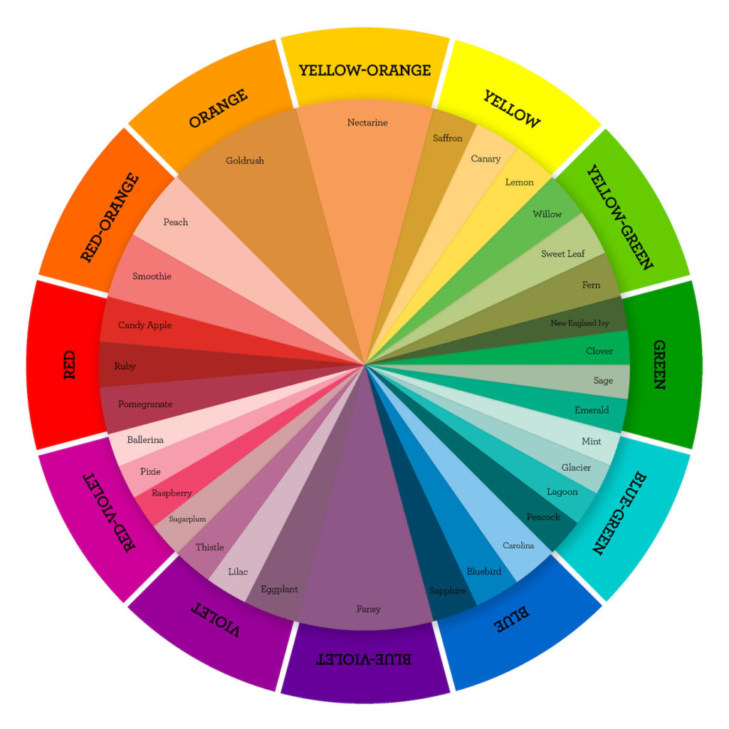
To understand how colours affect us we must be clear about these basic concepts. We must keep in mind that when photography was born (1839) everything was in black and white, so the first photographers could not count on color as an ally to build their compositions. They had no choice but to focus on other aspects such as light, lines or textures to make photos stand out more among them. From 1935 on, the first color slide film (Kodachrome) began to be used and that opened up a whole world of possibilities. Modern photographers could now show a more realistic representation of a scene and with colors similar to those seen through the human eye. Although color photography would also have another purpose, because photographers were going to find a new way to attract attention and add impact to their images

Todd Hido
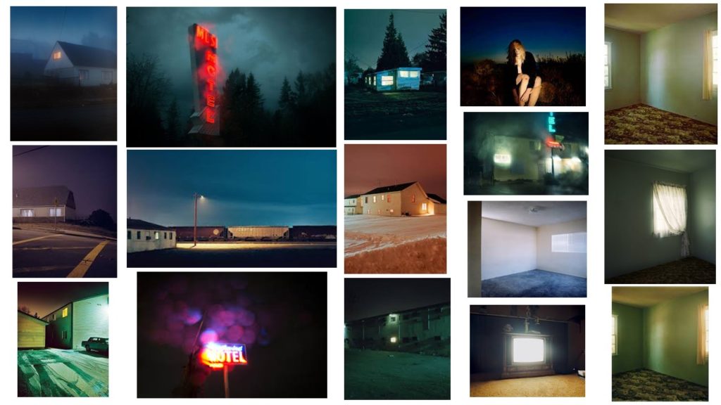
The majority of Todd Hido’s photos of rural scenes are taken during single, lengthy drives. The principle subject of his work is the nature of normal and counterfeit light in the American scene, as in reflected sunrays or the enlightenment of a TV pouring from a mysterious window. Todd Hido use a lot of cold colours that gives you the feeling of isolation and abandonment.

	

case study- Yves MARCHAND & rOMAIN mEFFRE

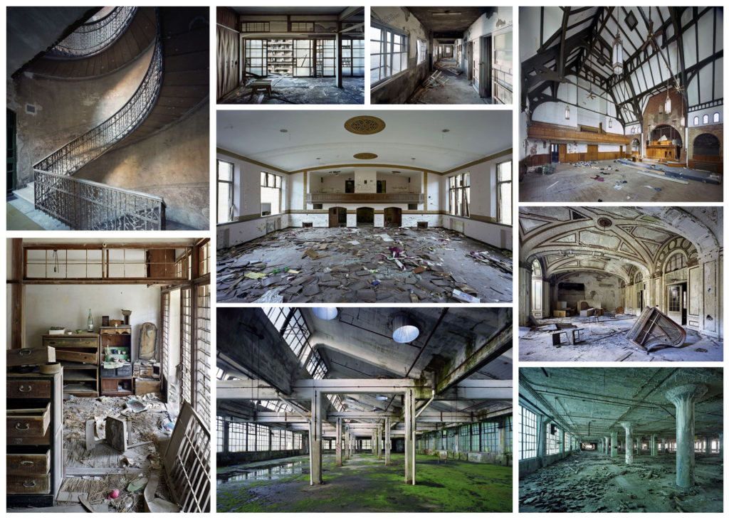
Yves Marchand (born in 1981) and Romain Meffre (born in 1987) are two French photographer who met through a mutual interest in contemporary ruins. They began their collaboration in 2002 by exploring Parisian urban remains before their interest took them to Detroit, where a thorough exploration of the city lasting five years resulted in their seminal work, ‘The ruins of Detroit’. Their other projects after that include ‘Theatres’ where they discovered and documented the sorry state of theatres they came across while travelling around America.

Image Analysis

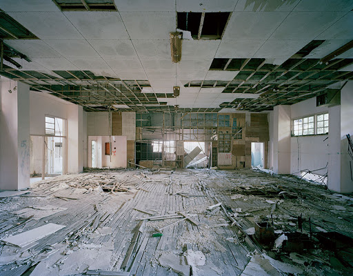
This image has been taken inside with the natural light coming through the windows. This image is filled with dull colours, mostly neutral tones like beige and creams. I think this image shows Anthropocene well as it shows a building that has been built from wood and such materials that have been sourced from the Earth and then abandoned to rot and ruin the landscape. This has a massive impact on landscapes and the Earth as people are cutting away nature and ruining habitats to build homes and buildings that are abandoned and left to decompose. There are over 19 million vacant buildings in America where the land could have been left untouched. I believe that I may be able to find a vacant building that I can take images of.

Photoshoot 2

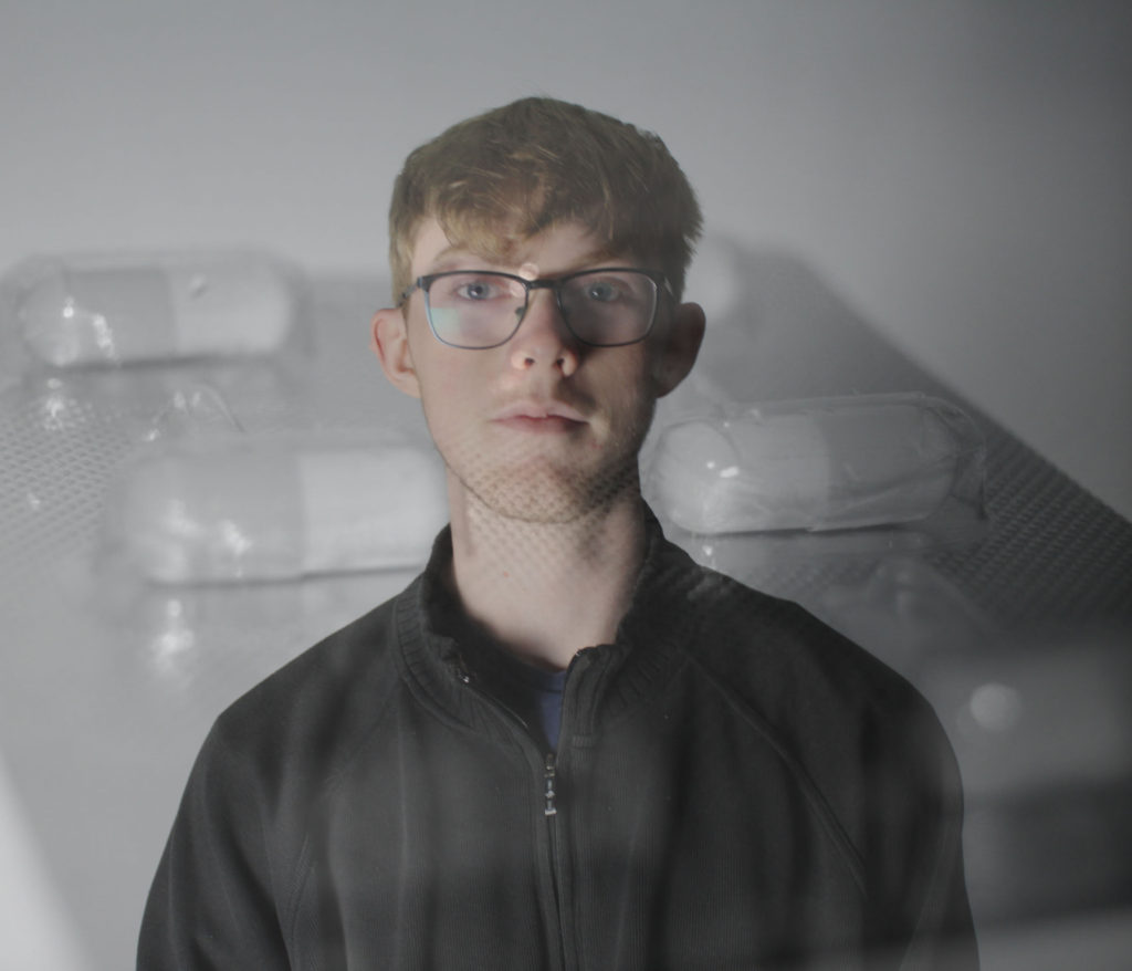
For this shoot I wanted to highlight the fact that even when we need to heal ourselves, we harm the planet in the process.

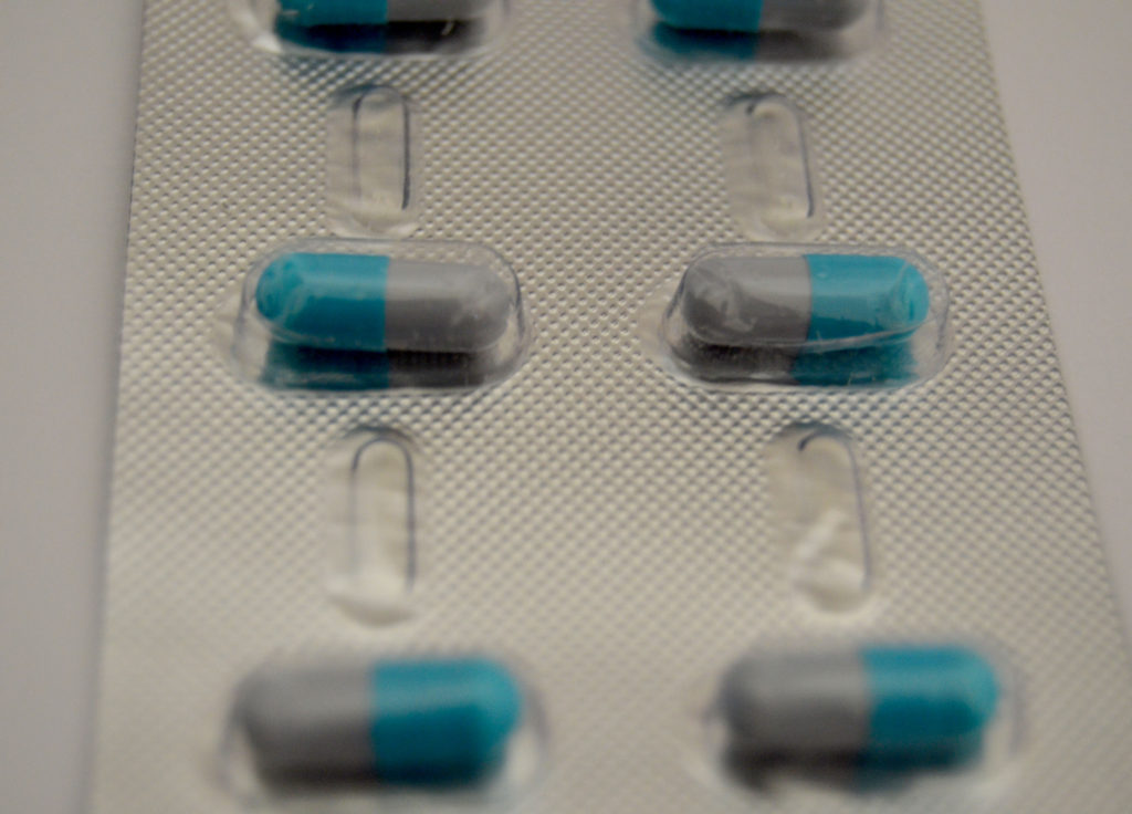
I took pictures of a packet of capsule tablets which were encased in foil and plastic wrapping. The capsule itself is made from a kind of plastic which dissolves in our stomach acid. By having these types of tablets we are constantly adding to the plastic productions.

In addition to this, I wanted to emphasise the fact that the whole population now relies on medication. As more diseases are found, there is a higher demand for cures/vaccinations to be found at the same time. This then means the production of plastic waste increases as well as the funds that need to go into pharmaceuticals around the world. This has become more apparent recently as COVID 19 took over throughout 2020- the present day. The whole world was relying on the pharmacists around the world to find a vaccine to prevent the spread of COVID. This lead to the government needing to provide millions of pounds to ensure that the NHS and labs throughout the country were safe enough to work in but also so that they had enough protective clothing and equipment to help those who caught the virus to keep as many people safe as possible.

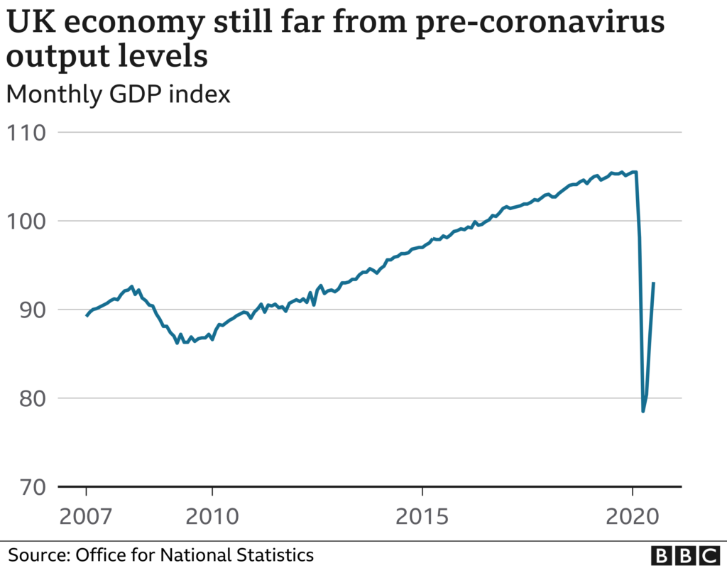
Lockdown had a major impact on the UK’s economy as shown here:

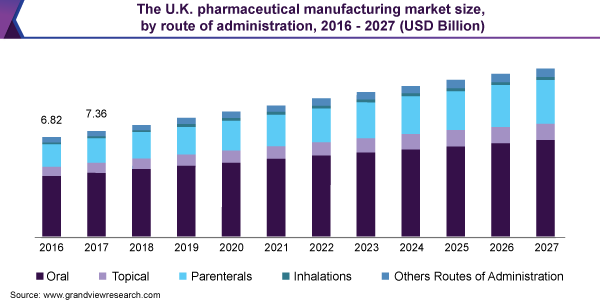
However, there is evidence that even more money will be put into the NHS and pharmaceuticals in the next coming years:

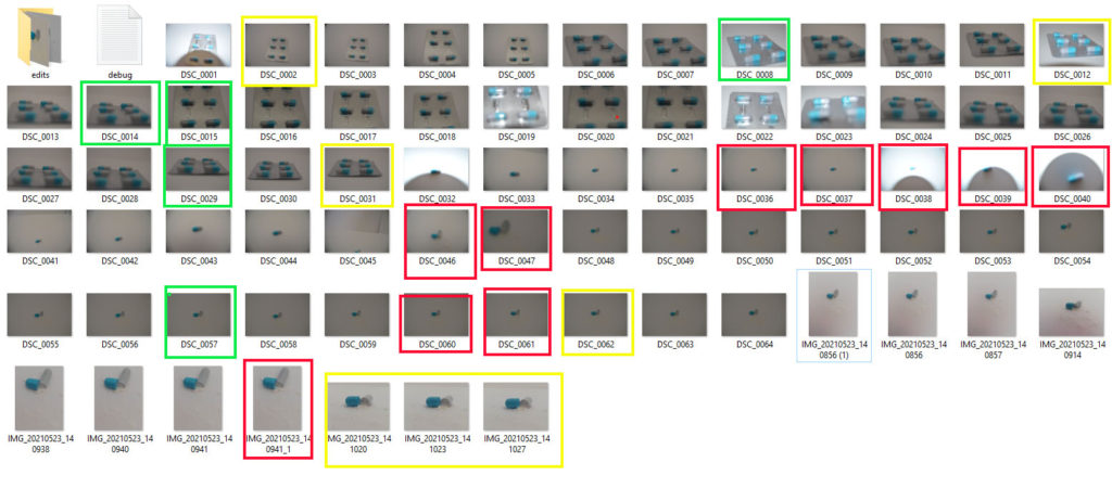
Contact sheet

Final Outcomes

Best Images

For this image, I went into photoshop and increased the contrast from 0 to 22 and decreased the brightness from 0 to -15. This helped enhance the texture of the plastic and foil wrapping. I also put the image into black and white, I did this to show that even the things that help us can harm us. I think this works well with the two ends of the tablet. The darker side represents the harm that plastic does to our environment and the lighter side is how plastic can help us, like for packaging our medication and keeping things fresh.

I also think that the fact that the image is in black and white also represents the dangers of medication. Even though they are made to help people, they can quite easily kill . Some can take to many without realising and cause serious harm to themselves. The contrast in the colours of the medication can represent this fine line.

The two colours of the medication could also represent the fact that in America, there are fees for medication and medical care. This was problematic especially throughout the pandemic because if someone who was financially struggling , they wouldn’t be able to afford the medical help they needed which then meant that they had to struggle and live in pain. But, if you had enough money to afford the medication/ help you would be able to recover quickly and get on with your life.

I created this image by merging the image above with the colour version and flipped it. I did this to try and represent the mass production of medication that happens each year. I wanted it to be a circular image to show that there is a routine in this industry and once the routine has finished it begins again. I also mixed the coloured image with the black and white to show the range of medication that is created and sold to different people around the world.

The Corona Virus put a huge pressure on the Pharmacists around the world to work constantly around the clock. This meant there was a mass production of test tubes, syringes and pipets, all of which are made from plastic.

Experiments

For this shoot I took images of my friends, first individually and then together. I did this to show that people became united during the pandemic. It also represents the fact that people get closer when they are in certain situations that can cause panic. I chose to put the black and white image behind Aaron and the coloured medication behind Kiera to show that they are different people and have totally different lives. But when they are together I put the coloured medication behind them to represent that they are in the same situation and are connected in some way or another . This represents the world when the pandemic hit and everyone had to go into lockdown.

CC – Photoshoots

Gerry Johansson Inspired Photo-Shoot

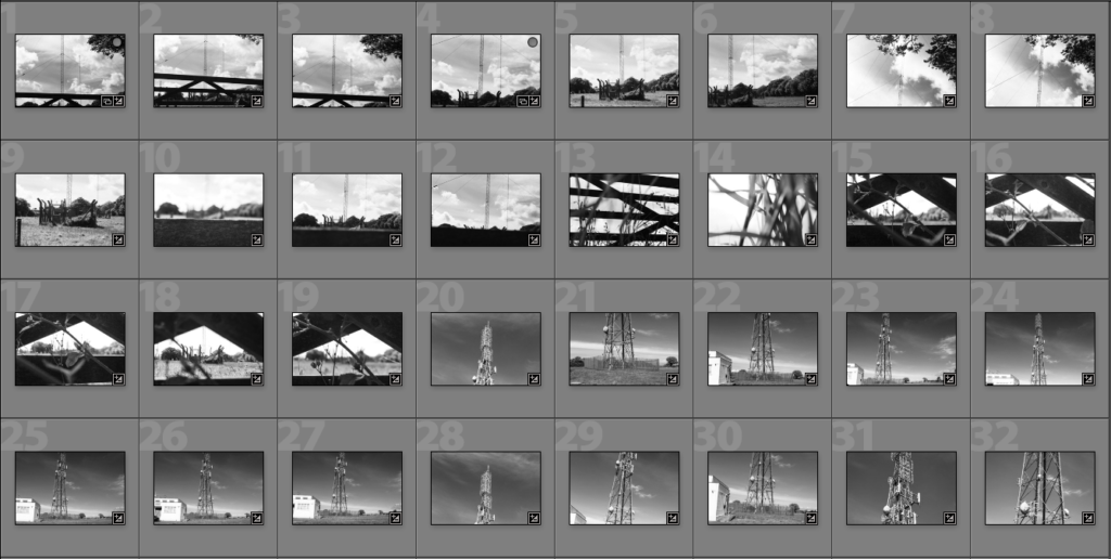
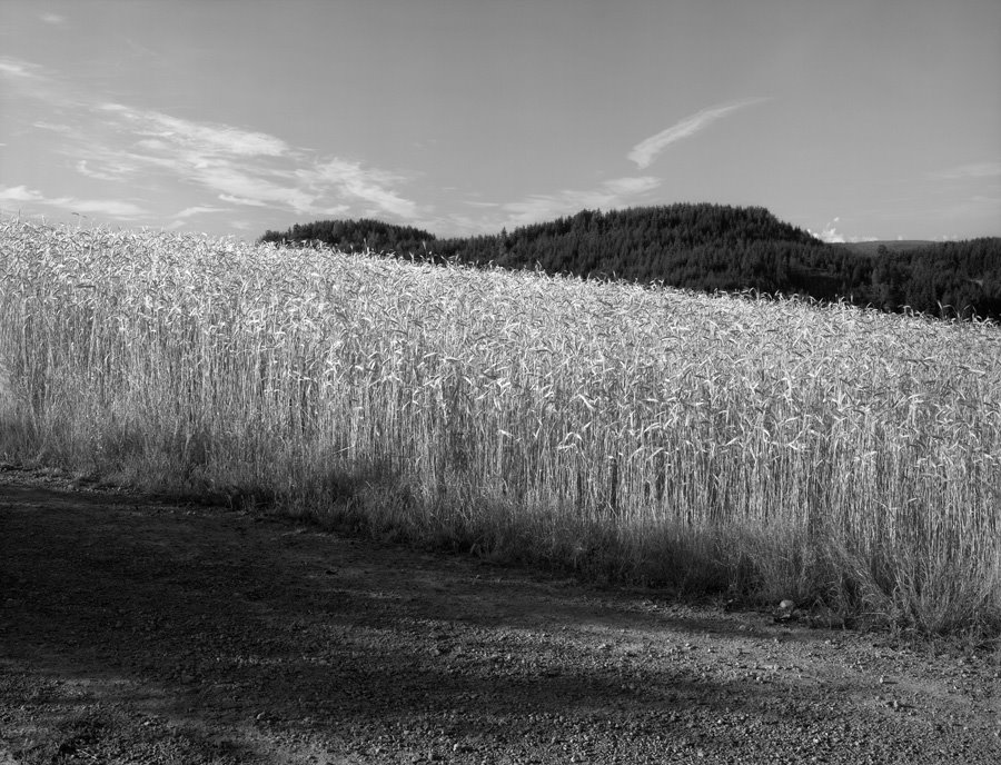
For the photo shoot above, I went to photograph cell towers and before putting them into the contact sheets, I edited them all into black and white. The images resemble Johanssons images and after further evaluation I will choose 3 final images for this photo shoot.

Best Images Edited Before and After

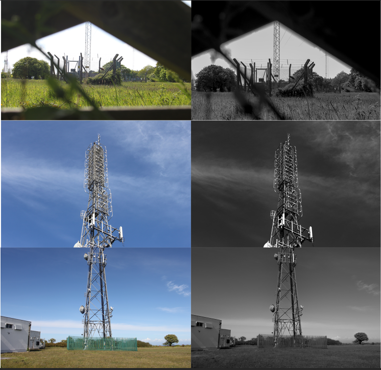
To edit the images above, I lowered saturation turning the images from colour into black and white. I then edited exposure and contrast making the images darker and slightly more detail. This editing makes the images have a good tonal contrast which is what I was aiming for.

Johansson Inspired Photo-Shoot 2

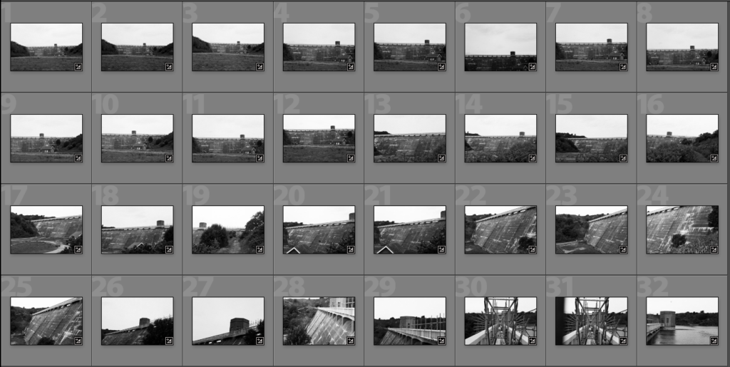
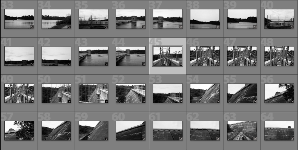
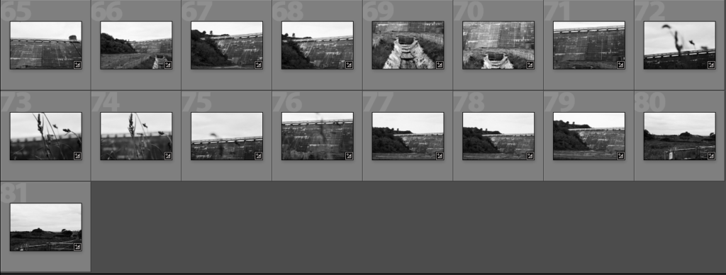
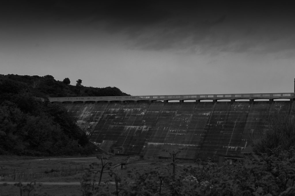
For the photo-shoot above I went to a reservoir and took photos of the wall. I took the original images and batch edited them in light room so that they were black and white. I then chose which images looked the best and edited them further in Photoshop.

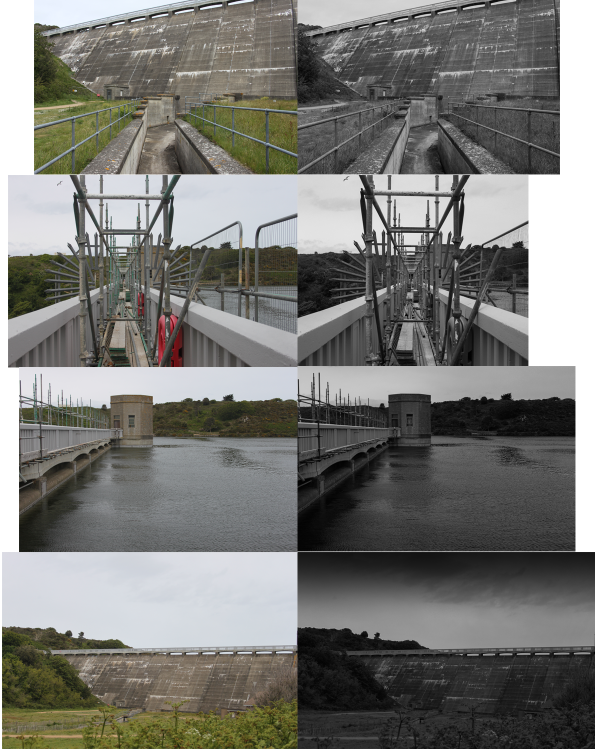
Best Images Edited Before and After

For the edited images above, I did the same as the previous photo shoot and lowered saturation and used contrast and exposure making the images darker with a good tonal contrast. I also used a graduated filter on the final image to make the clouds more ominous and bring out harsher tonal values.

Andy Hughes Inspired Photo-Shoot

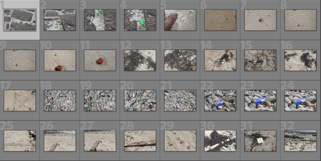
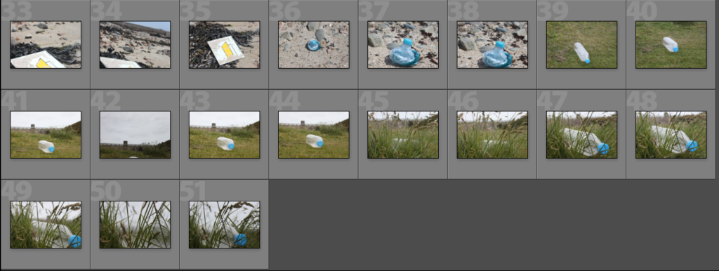
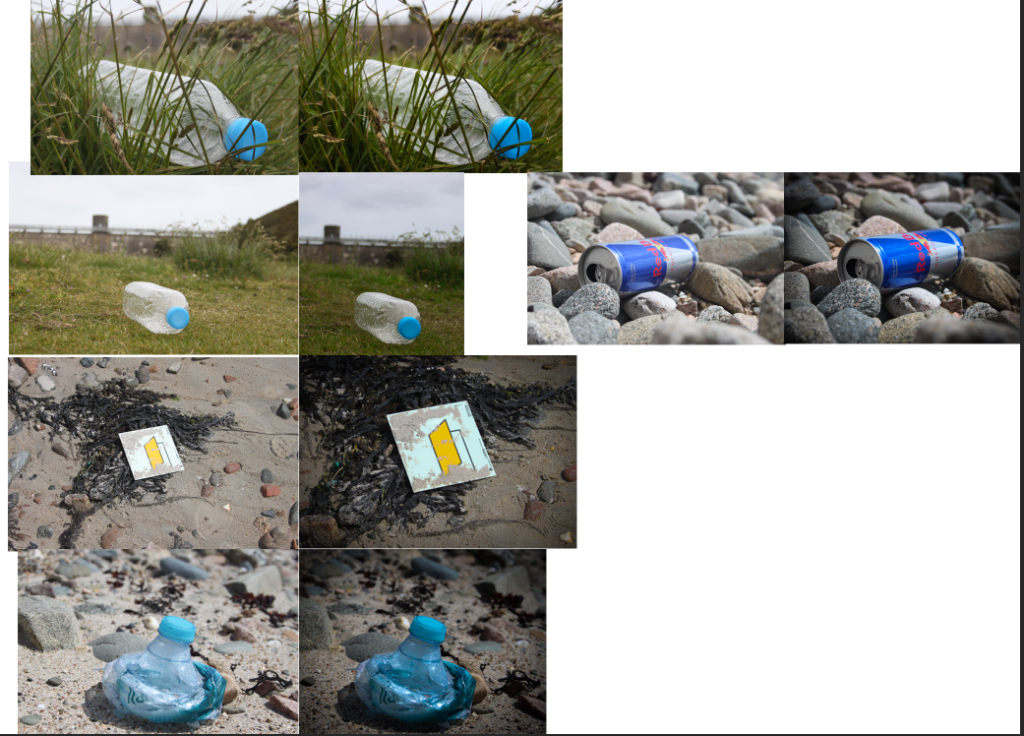
For the photo-shoot above, I added a few images I took when taking the other photo-shoot to the original Andy Hughes beach shoot. I went to the beach and reservoir to look for plastic waste rubbish and I photographed the rubbish I found.

Best Images Edited Before and After

To edit the images above, I lowered the exposure and upped the contrast slightly to make the images slightly darker. I then upped the colours making the grass and colours of the rubbish more vibrant. I slightly cropped a few images and added graduated filter to the edges of some images to make the edges darker.

Why did I take photos of cell towers and reservoirs?

I took photos of cell towers because they are thought to be ugly and dangerous things that cause cancer. However one of the main reasons I like Gerry Johansson as a photographer is his definition of beauty. He says that beauty is different for everyone and people express themselves through it. Johansson’s definition is not something he finds aesthetically pleasing, but something he can look at for a long time. Cell towers are thought to be ugly towers polluting nice views of the sea, however I decided to take photos of cell towers to show that anything is capable of being interesting enough to count as ‘beauty’. Also I believe we need to look at things not usually associated with beauty and understand what they do before making a judgement. For example, cell towers connect family and friends across the world in a matter of seconds. They also provide internet connection so that we can do work, watch tv and shop online.

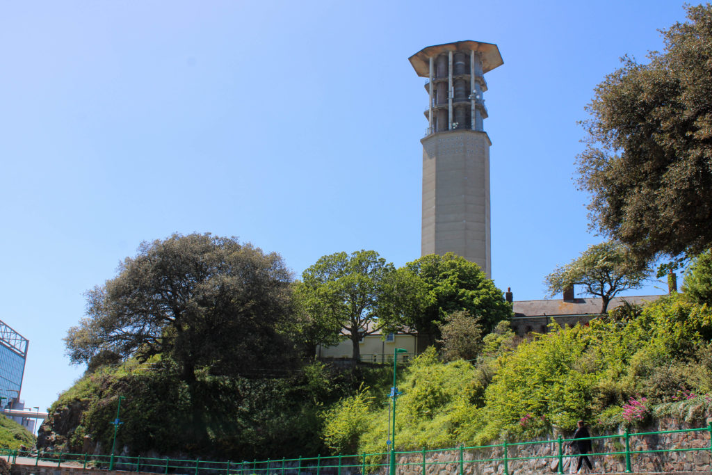
Similarly, I photographed reservoirs to bring to light the extent humanity has come to prepare for the worst so that society can continue. The reservoir I photographed is nearly 60 years old and is still standing strong. A route around the reservoir is roughly 4.5 km and the reservoir holds 938.7 mega litres of water. This amount of water is equivalent to 375.48 Olympic sized swimming pools and could sustain the whole of Jersey’s water consumption for 5 weeks. The reservoir may not be the most aesthetic structure on the island however, due to it’s important job and its colossal size, It shows the extent technology has come to prevent the worst and prepare.

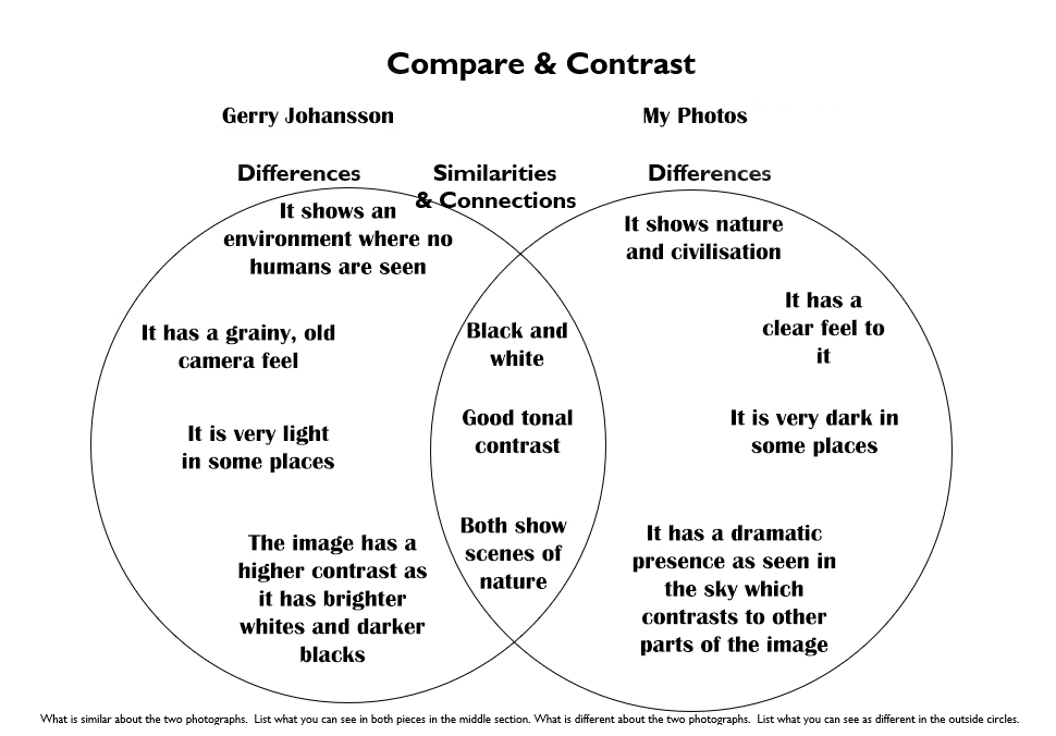
Compare and Contrast

The F Blog: Guest: Gerry Johansson
Gerry Johansson
My Interpretation

My image has features similar to an image taken by my photographer. However, I have added some features from other photographers I have covered in previous blog posts. I have taken the drastic tonal contrast from Lewis Baltz who I covered in the first new topographic blog post.

Anthropocene – Andrew Moore Photoshoot

Why Andrew Moore?

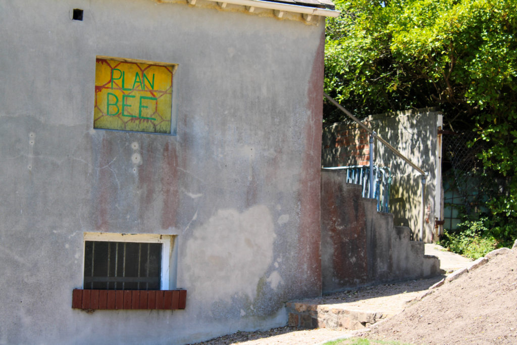
Andrew Moore’s work depicting the effects of time on natural and built landscapes has greatly inspired me while researching for this Anthropocene project. I really enjoy the way Moore captures his images from a different perspective to Burtynsky and how he demonstrates the way nature is trying its best to overcome the effects the human race is having on the environment. I wish to reflect this element of Moore’s work through landscape photography of overgrown scenes while also capturing images showing areas of nature by the side of industrial buildings. I believe this will further the Anthropocene idea on society’s impact on the world by showing the impending modernization creeping into each photograph. Additionally, Moore’s use of saturated colours and natural lighting allows the observer to understand the subject better, for example letting them acknowledge how nature; when left alone and undisturbed by humans, has the ability to form beautiful natural landscapes and areas that are not overwhelmed by industrialized structures.
Photoshoot Plan

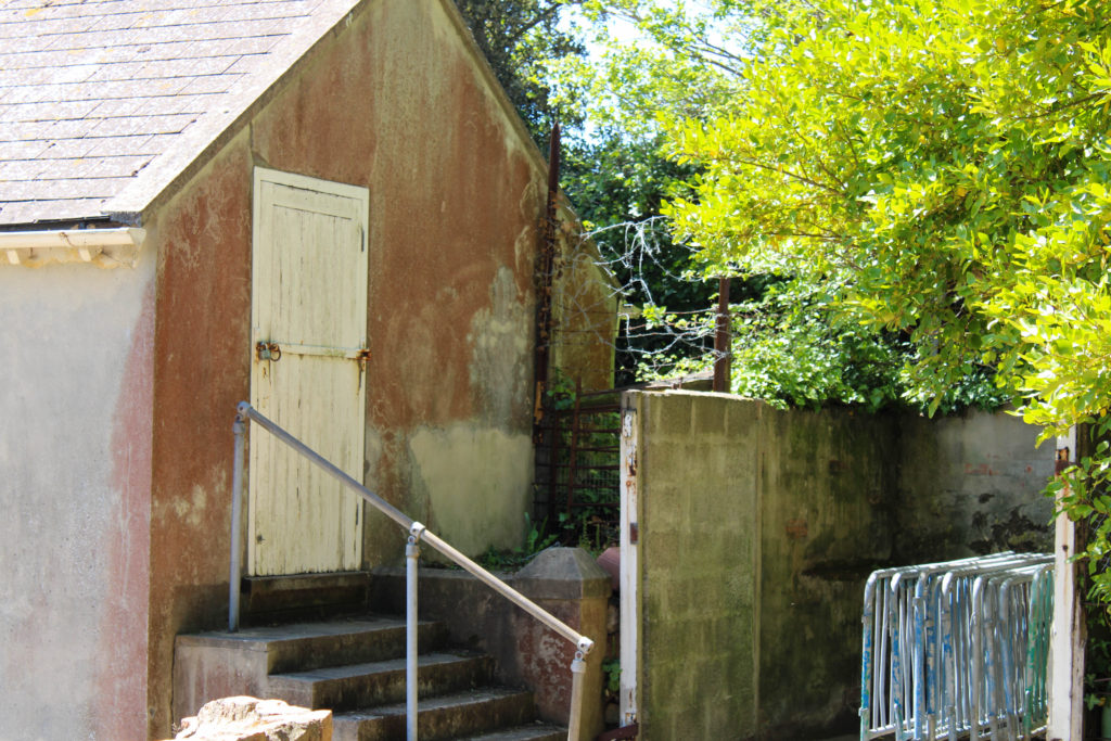
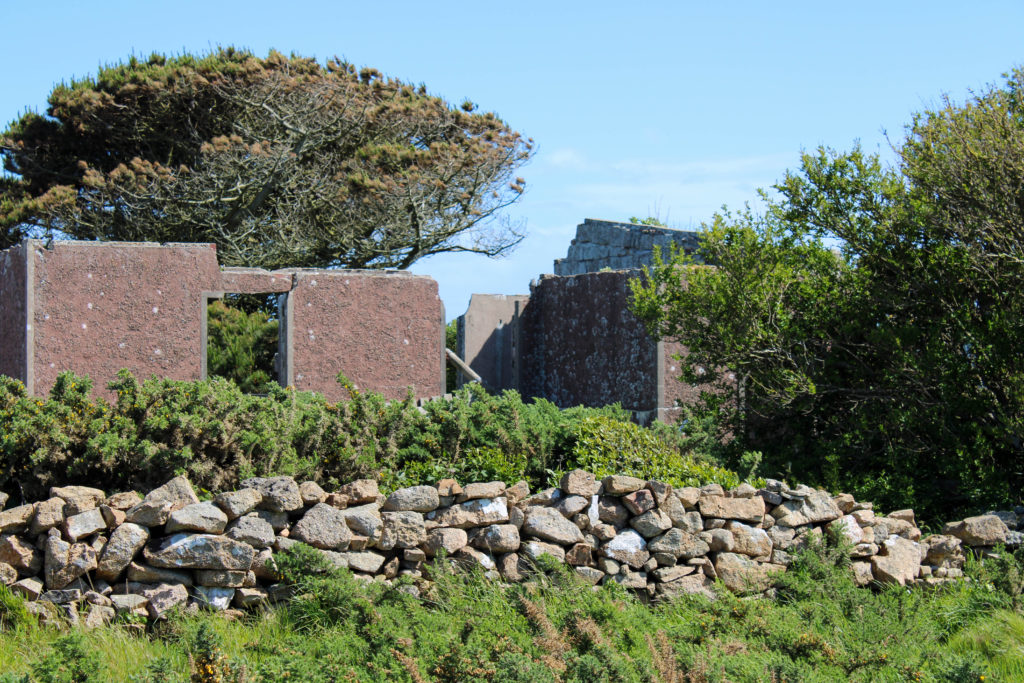
What – I plan on capturing images of landscapes which have been impacted by humans with buildings, greenhouses, ruins and industrial sites – however with nature still trying to make an appearance, fighting back against the urbanisation. I wish to capture elements of the natural environment juxtaposed with modern structures to represent the imminent world industrialisation.

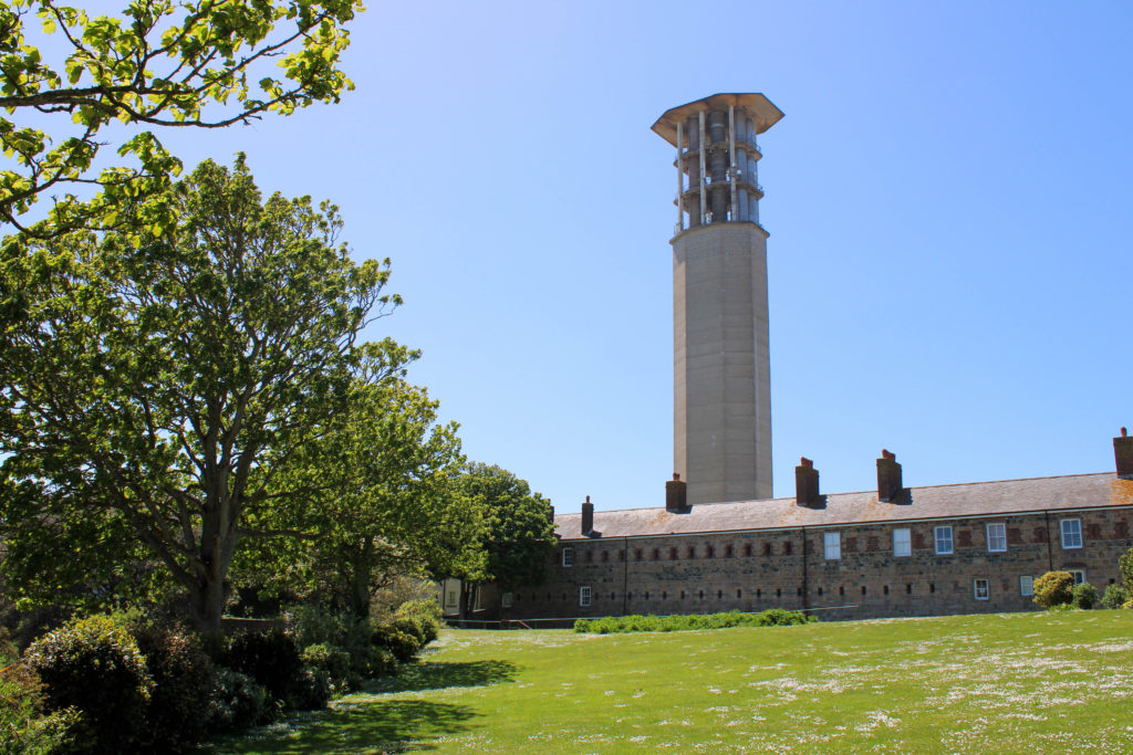
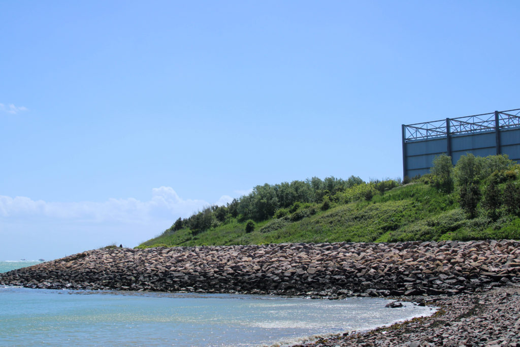
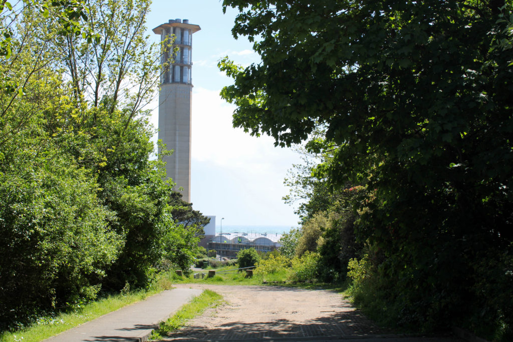
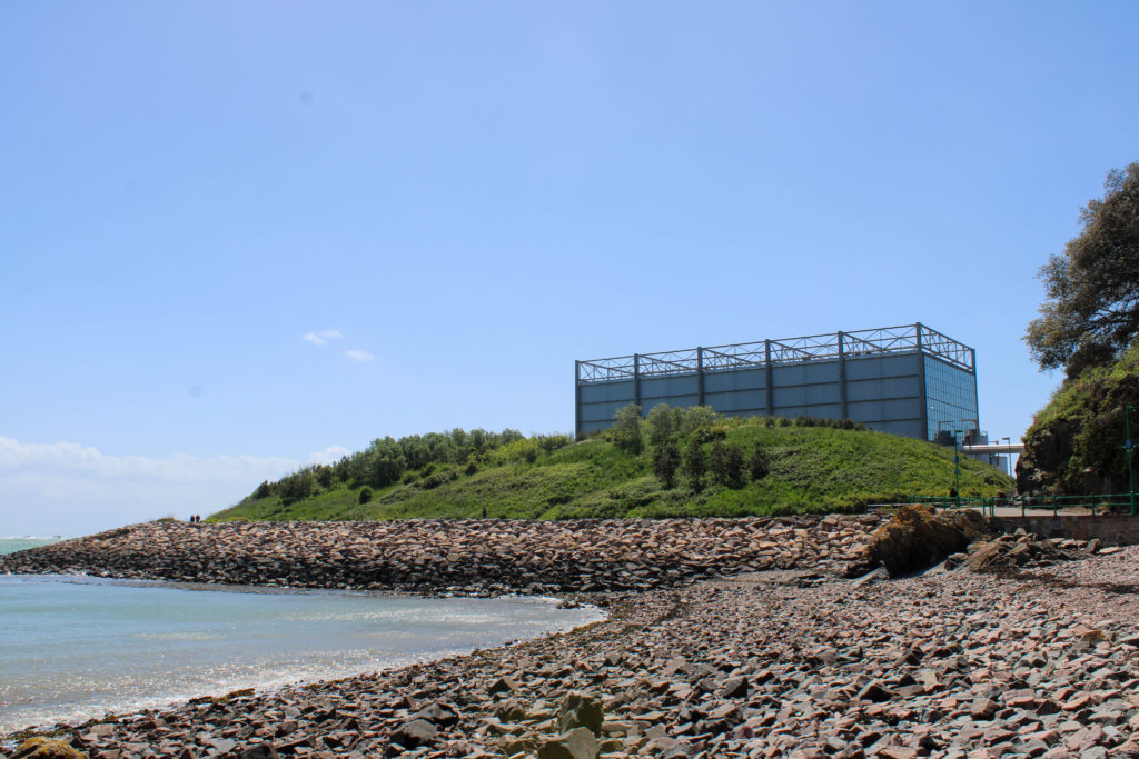
Where – I aim to produce this photoshoot around many locations on the island; the first, where I wish to photograph the difference between nature and industrial structures, is at Le Quesne Barracks, Mount Bingham in St. Helier. I also plan on walking down to the beach at Halve Des Pas to capture the natural landscape with tall structures from La Collette in the background.

When – My plan is to conduct this photoshoot on Friday 21st of May due to the forecasted sunny weather, as I am taking my images inspired by both Edward Burtynsky and Andrew Moore on the same day. The bright weather will aid my photoshoot as it will create harsh shadows and emphasise natures vibrant colours, symbolising the beauty in the untouched natural environments around us, which are slowly being destroyed and forgotten.

How – Similar to my shoot inspired by Edward Burtynsky, I will use natural sunlight to capture my images. I also plan on standing from a lower eye-level point of view and getting closer to the main subject of my photos to reflect Moore’s more grounded style of photography.

Why – My aim in producing this photoshoot is to mirror the work of Andrew Moore by capturing natural landscapes which have been effected by the human race with buildings and structures creeping into each photo. Additionally, I want to photograph areas of landscapes that have been tampered with by humans however where nature is retaliating against the urbanisation of it’s natural habitat.

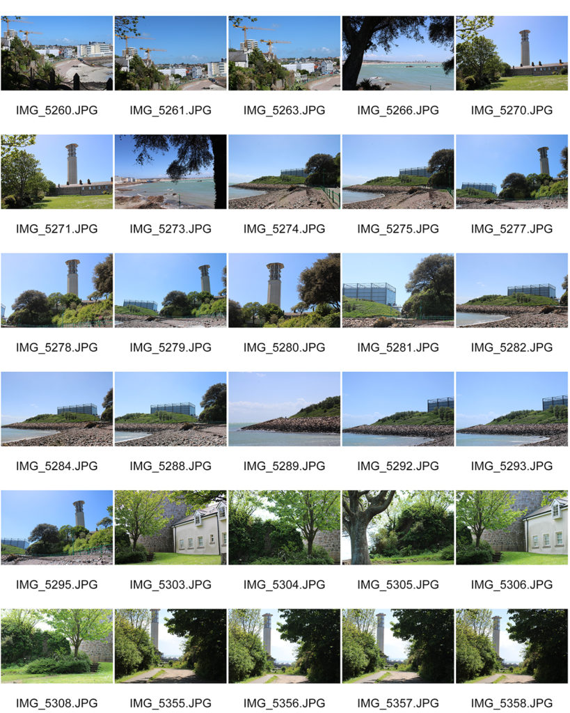
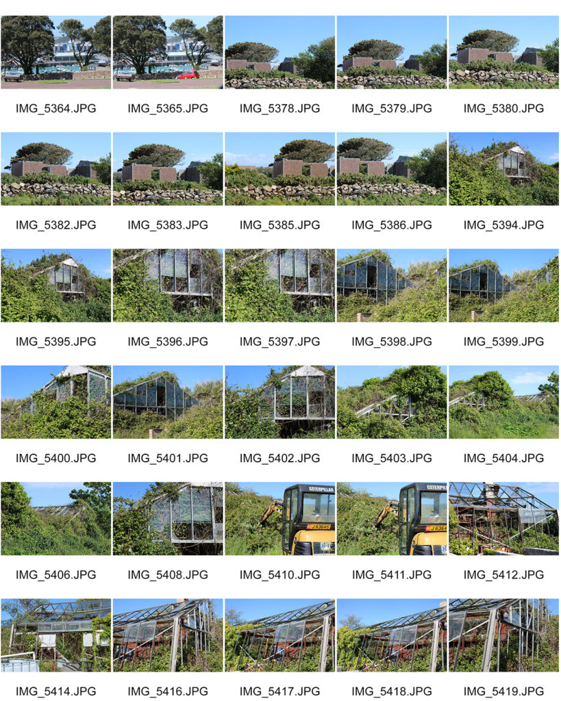
Contact Sheets

Selected Images

Image Analysis

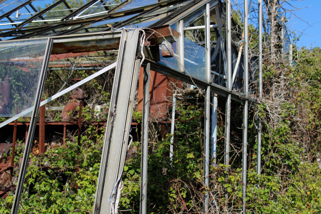
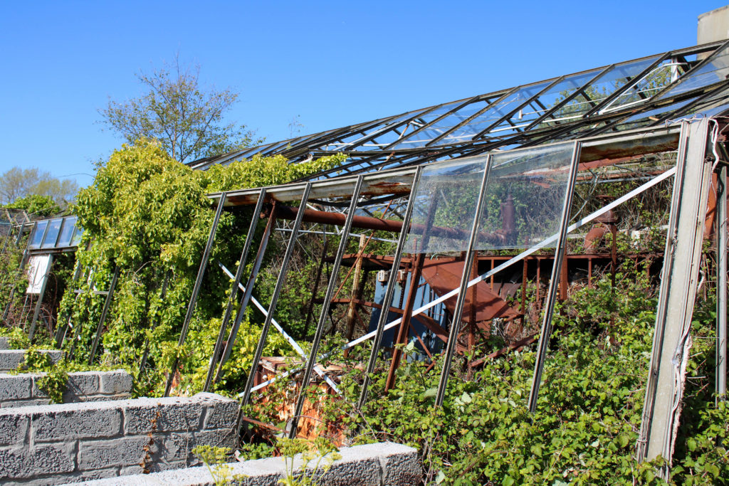
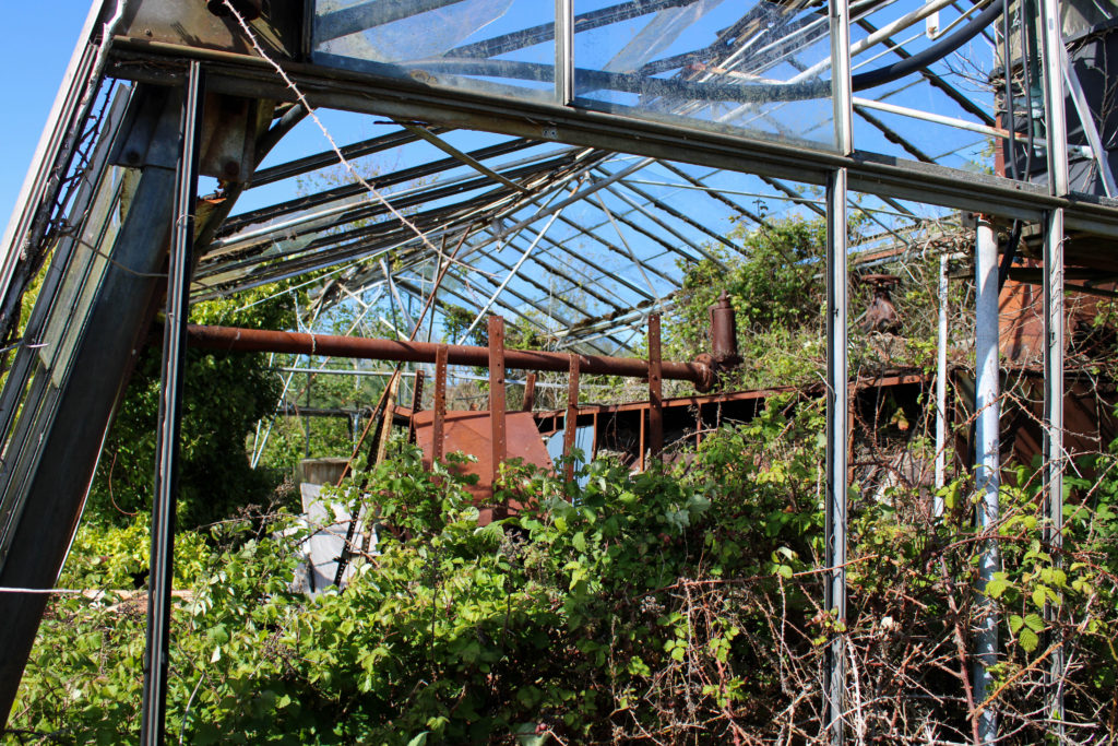
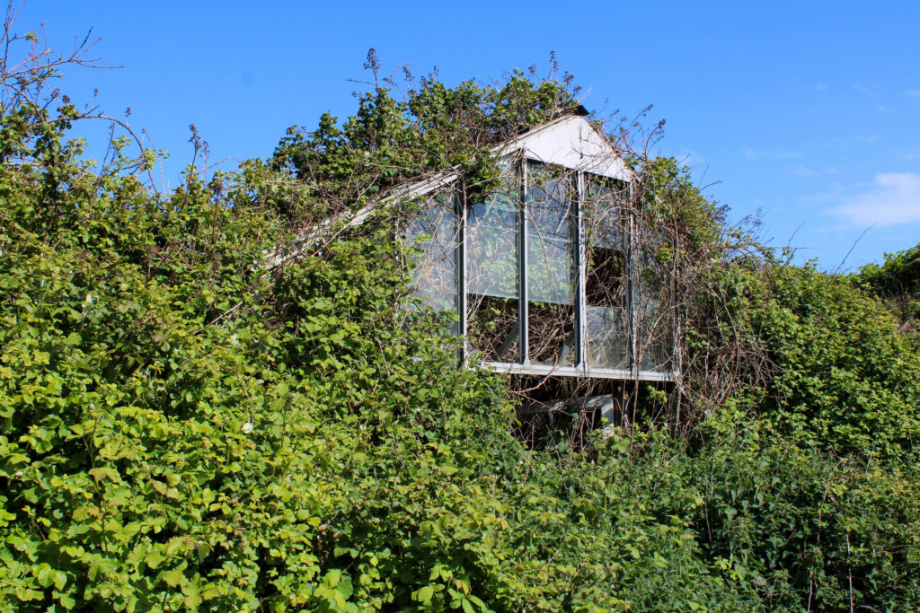
I have chosen to analyse this image from my Andrew Moore inspired photoshoot as it represents the idea of nature fighting back against industrialization. I captured this photograph at an abandoned greenhouse in Grouville, during mid-day using natural lighting to reflect Moore’s style of photography. The first element of my image that I really enjoy is my capturing of straight leading lines, creating direction in the photograph and guiding the observer’s attention into the center of the image. These thin abstract lines create geometric patterns from the mid-ground to the background and symbolize the rigid systematic way that humans are impacting natural environments. These artificial shapes contrast greatly with the organic pattern formed by the cluster of bushes and leaves which are reflected throughout the image. The texture created by these brambles is rough and spiky which gives the impression that nature is having to fight for its environment through force as society’s modern architecture will not let it thrive. Furthermore, the actual location of where this image was taken links to the Anthropocene idea even more as it is planned to be destroyed in order to make room for new housing and apartments. The context of the location shows how little humans are caring about the natural world, connoting the idea that they will let their beautiful landscapes become abandoned to make profit on industrializing and destroying them in the future. Additionally, the high saturation of colour in this image helps the observer to understand the value in our natural environments as it connotes the idea that when nature is left to thrive on its own it can create beautiful surroundings – however the vibrancy is juxtaposed with the dull monochrome greenhouse structure which symbolizes how nature is trapped behind the industrial bars of man-kind.

Natural Landscapes

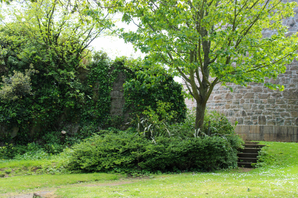
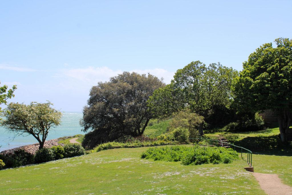
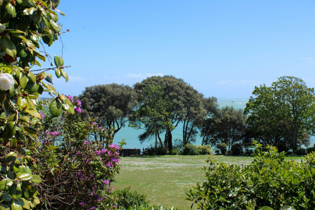
During my Andrew Moore inspired photoshoot, I captured elements of the landscapes that I was in which showed nature, untouched by man and thriving in its natural environment. I wanted to photograph these landscapes to link to my initial idea of presenting the three different stages of industrialization, showing nature unharmed, nature fighting against man-made structures and nature destroyed with urbanization taking over – in my final presentation of images I wish to use these natural landscape images as the first photo in the sequence of three. I wanted to highlight the beauty of nature through vibrant colours and the use of negative space in the skyline – I believe this gives the impression of a clear clean future of surviving natural landscapes, which contrasts significantly with the other two elements of my Anthropocene project.
Final images and display ideas – Darian Mederos inspired photographs (Anthropocene)

Final Images

Image Gallery

Ideas for displaying

To display these photographs, I can also use the idea of burning the edges of the paper to create an intense contrast between the muted tones of the photograph and the intense black of the burnt edges.

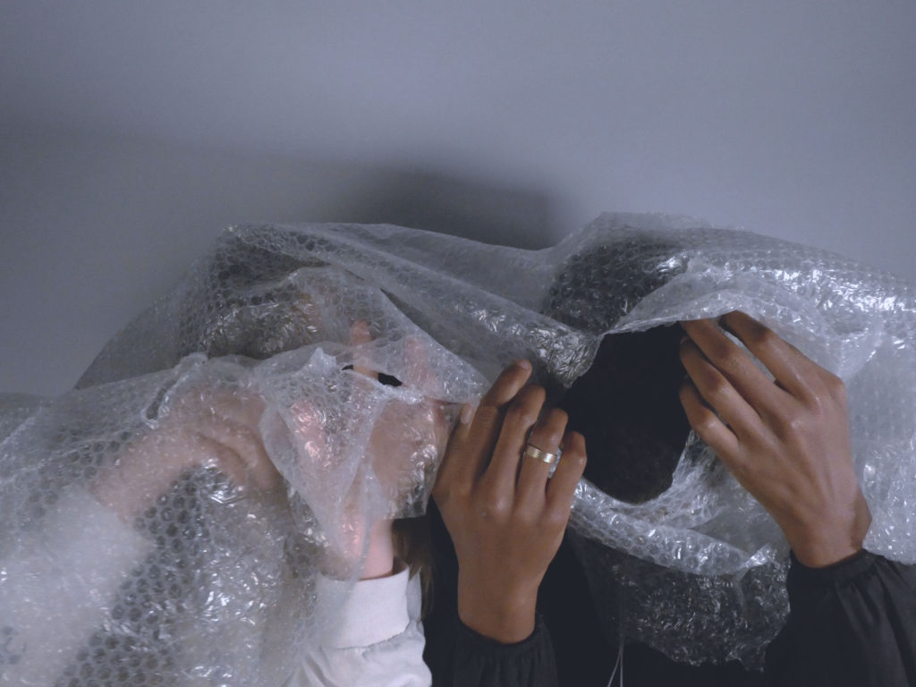
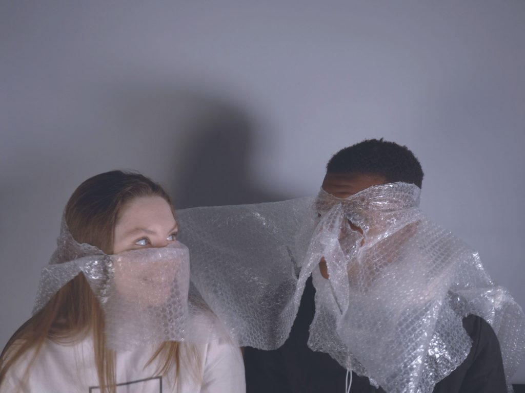
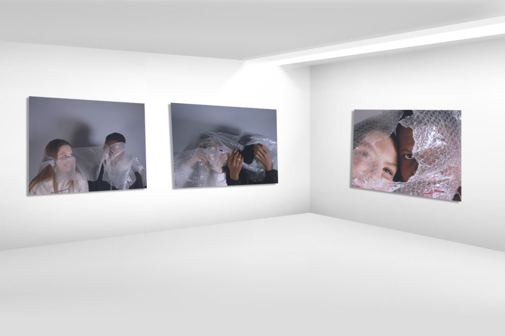
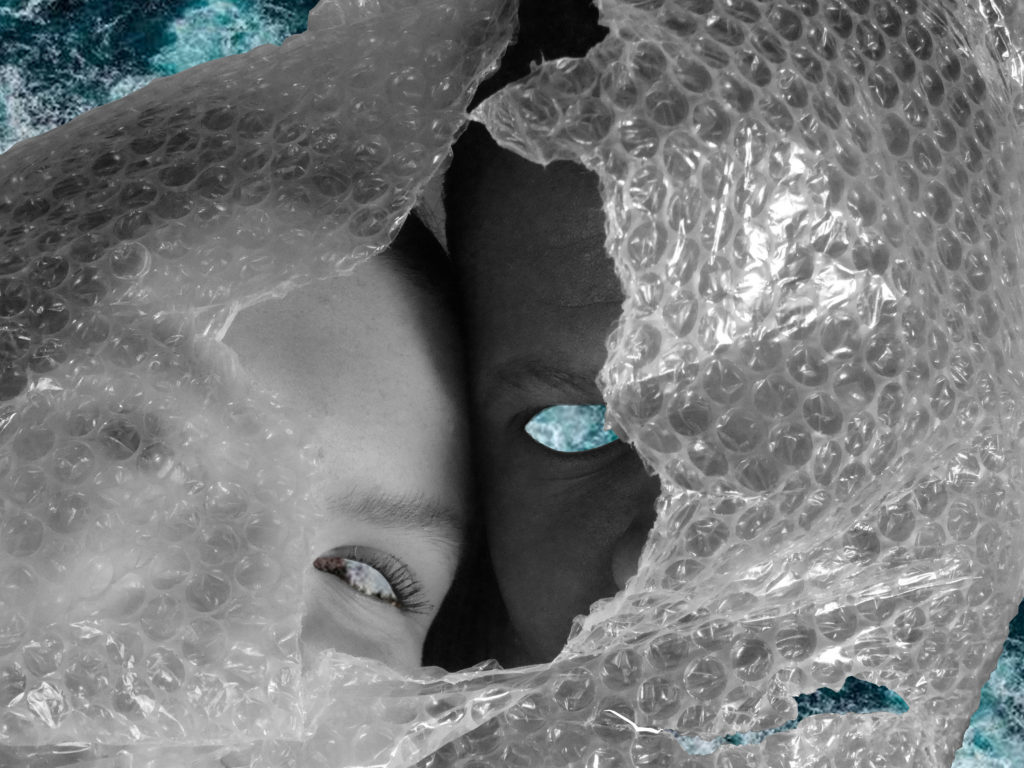
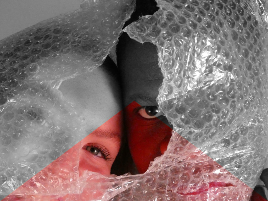
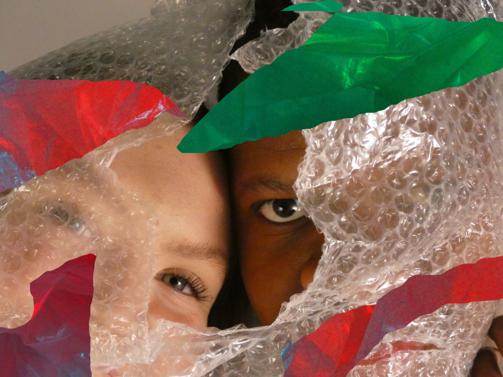
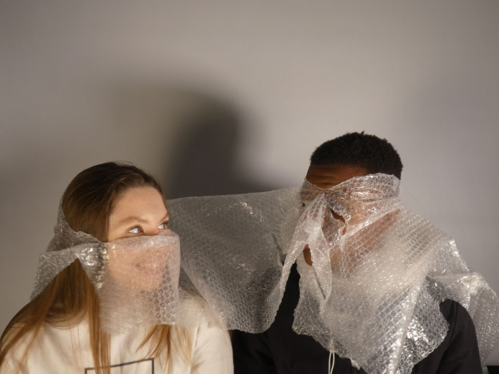
Alternatively, I could incorporate juxtaposing textures in my display by using real bubble wrap over sections of the photograph. I can also use this idea as a form of physical editing rather than editing my images purely using photoshop.

Jeremy Carroll

Portrait of Jeremy Carroll (from Facebook)

Jeremy Carroll is a photographer and artist who wants to change the world and by doing this he must change how people see things.  In order to illustrate what plastic pollution is doing to fish and sea mammals, he created an exhibit called “Entanglement.” It shows humans entangled in the waste that is most commonly found in seawater and along beaches.

Famous Images

Jeremy Carroll focuses on sharing the impact plastic has on the environment and sea creatures through images of humans facing the same problems. Humans often feel more remorse when they see arm done to things they view as their equal.

Image Analysis

The red rope and plastic around the models neck is central and is what draws the viewer in as soon as they look at the image. The colour red could have been used to emphasise the fact that the person is now in danger or it could represent the blood that is drawn from the tightness of the plastic around the neck. In the centre of the model’s neck, you can see signs of struggle with the wrinkles that have formed and the fact that you can see the model’s hands trying to loosen the items that are currently shortening their life right before their eyes.

Carroll used a white background to ensue that the model was the centre of the viewer’s attention. The model also takes up a lot of the image which helps direct the viewer to look at the different materials and textures restricting their airflow. The different textures also emphasise the smoothness of the models skin and how it looks like it can easily be broken. This helps show the innocence of the creatures that get caught in these kinds of traps daily.

On the model’s neck, there is bits of yellow rope which had fallen. This helps emphasise how easy it is for plastic and debris to get into the ocean. It just shows that not every bit of plastic was put into the ocean on purpose. The shadows on the model’s neck look like marks that have been left there from how tight the plastic was wrapped round.

Comparing Darian Mederos’ work to my own (Anthropocene)

Comparison between Darian Mederos’ work and my own

Portrait of Camilla by Darian Rodriguez Mederos on artnet
“Portrait of Camilla” – Darian Mederos (2020)
My work

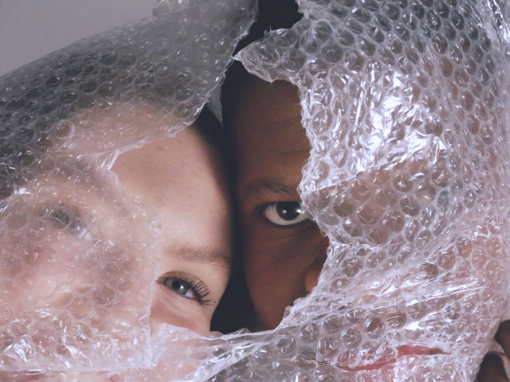
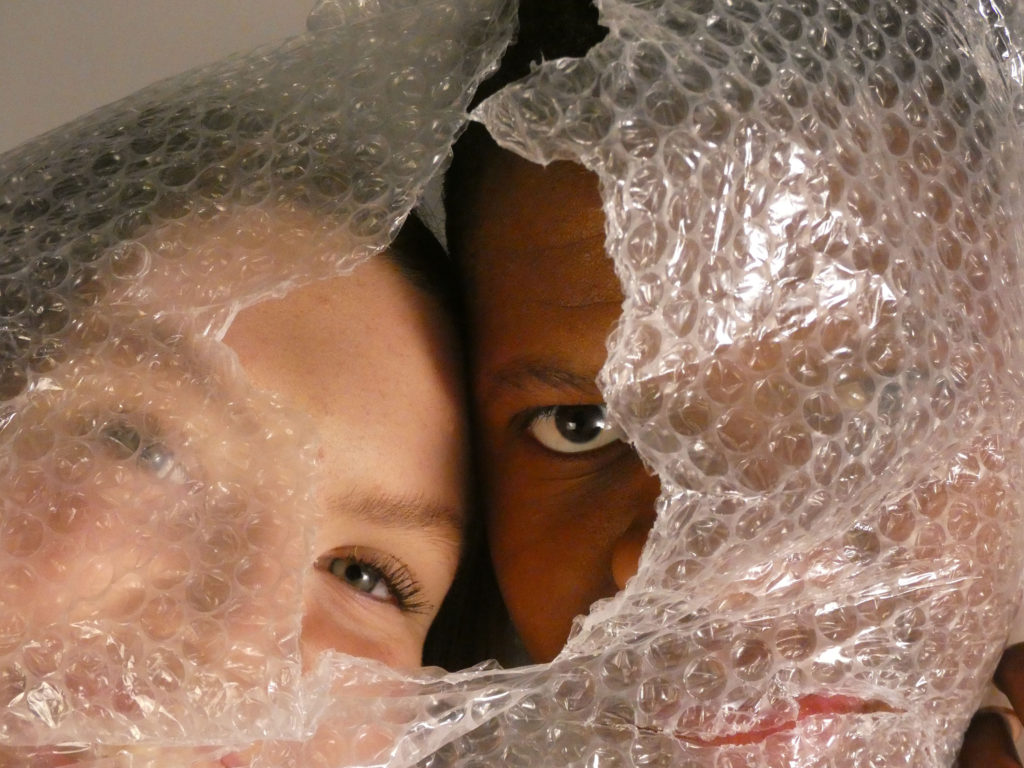
My work is similar to the work of Darian Mederos in the sense that bubble wrap is used to create a sense of enigma, as the face is not fully revealed or has a slight blur. Cooler tones with muted colours can also be seen within both images as well as the use of slightly harsher shadows and highlights. There is also a sense of depth of field in both photos as particular sections of the image are in focus. For example in Mederos’ work, the bubble wrap is in focus which blurs out the entire face, whereas in my work the holes in the bubble wrap allows for areas of the face to be in focus.

However there is also prominent differences between the photographs, such as my photo being a close up images rather than a full portrait. Furthermore, the bubble wrap in my work has been ripped, so sections of the face can be seen in focus, in contrast to Mederos’ work in which the whole face is blurred. An obvious difference between my work and the artists work is that Darian Mederos’ work is a painting, however I am using his work for inspiration rather than to recreate exactly.

Overall, I believe I successfully created my own work with the influnce of Darian Mederos as my inspiration for the theme of Anthropocene. I thought Mederos’ work represents Anthropocene in a unique and subtle way although it can carry a deeper meaning.

Further Photoshop experimentation – Darian Mederos (Anthropocene)

Experimenting with Photoshop

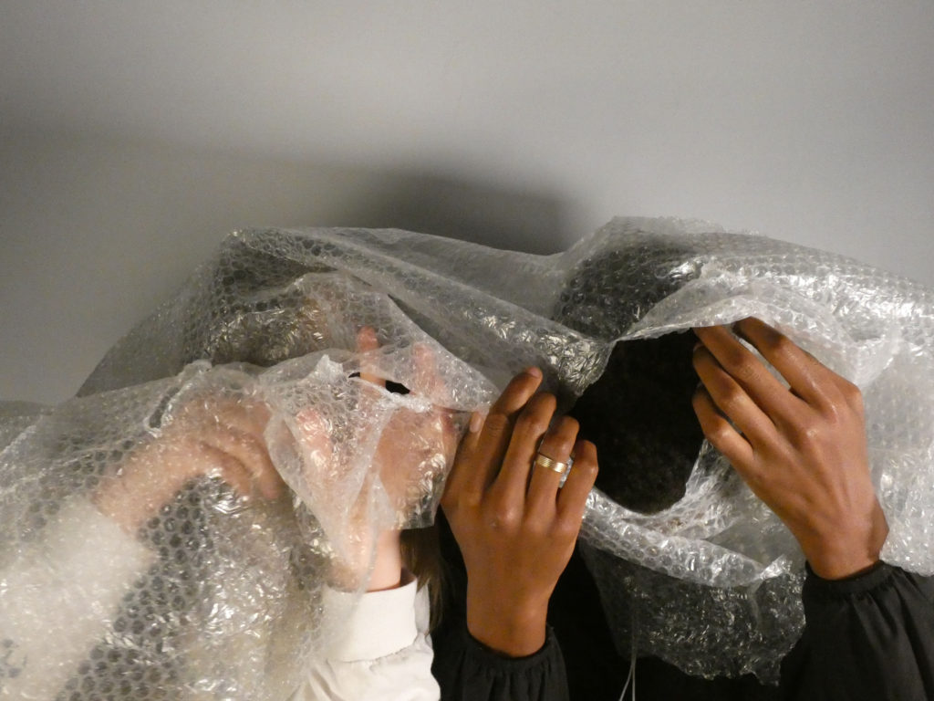
Original Image
Edited through change in exposure and curve levels.
Edited using polygon lasso tool, image layering and black and white filter.
Edited using iris blur and altering curves and exposure.
Edited using polygon lasso tool and editing colour hues of sections.
Edited using magnetic lasso tool and cutting shapes from Naomi White inspired photoshoot.

Darian Mederos inspired image editing (Anthropocene)

Original and Edited Images

Original Image
Original Image
Edited Image
Original Image
Edited Image

How I edited my Images

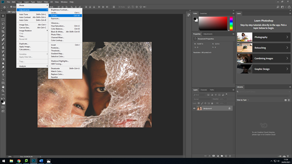
I began with altering the brightness and contrast of the image, I increased the brightness and lowered the contrast of the image to make the tones more subdued.
I then altered the curves of the photograph to further mute the tones and increase the overall brightness of the image without getting rid of the distinct shadows and highlights.
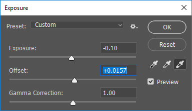
I lowered the exposure and increased the offset of the photograph to add brightness to the photo, but also keep the contrast of shadows and highlights.
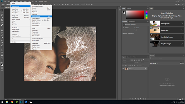
Next, I added a slightly blue hue to the image as some of Mederos’ work have a cooler tone, which I thought would suit the theme of Anthropocene more than a warmer tone as it creates a more chilling atmosphere to the image.
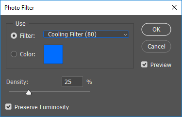
Finally, I added a cooling filter to enhance the darker tones of the image and further the slightly menacing feeling to the image in order to keep to the theme of Anthropocene and create a deeper message and undertone.