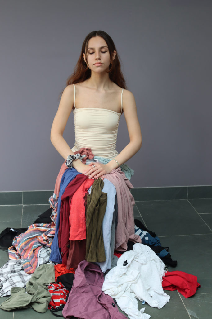
Anthropocene

What is Anthropocene?

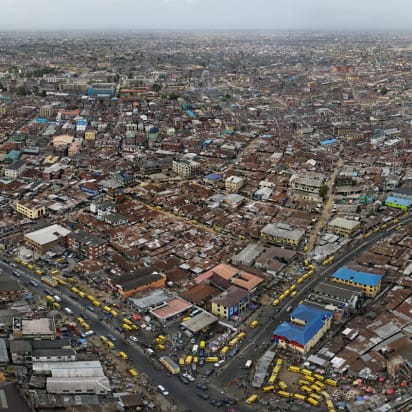
According to National Geographic, The Anthropocene Epoch is an unofficial unit of geologic time, used to describe the most recent period in Earth’s history when human activity started to have a significant impact on the planet’s climate and ecosystems.

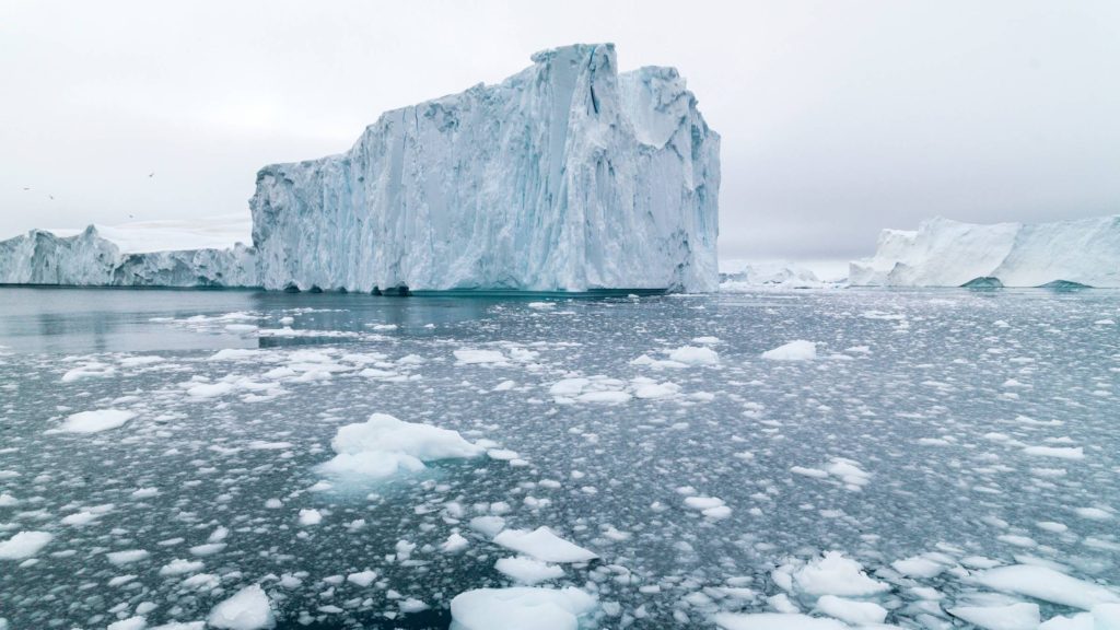
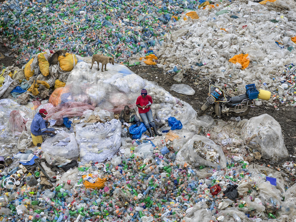
Anthropocene focuses on the idea of mans impact on the planet, specifically post industrial evolution. In light of the global climate crisis, this topic is becoming increasingly popular to explore by photographers who aim to bring to crisis to attention. One such organisation is the ‘Union for Concerned Photographers’ or UCP who dedicate time to creating images based on the idea of Anthropocene to highlight key issues of climate change to potentially make a difference. The issues of Anthropocene are various, they range from the melting of the polar ice caps to the over abundance of plastic. These issues effect everyone which makes it even more important.

Mind Map of Ideas
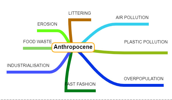
I decided to base my project on fast fashion because I feel that as a topic it is much more relevant to me as I myself am guilty of using fast fashion to get cheap clothes and therefore am part of the problem. I hope that this project will help me better understand my contribution to climate change and potentially make my carbon footprint better.
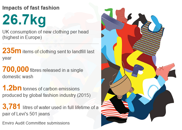
Fast fashion is harming the planet, MPs say - BBC News

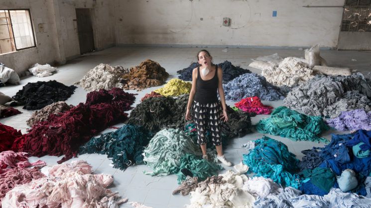
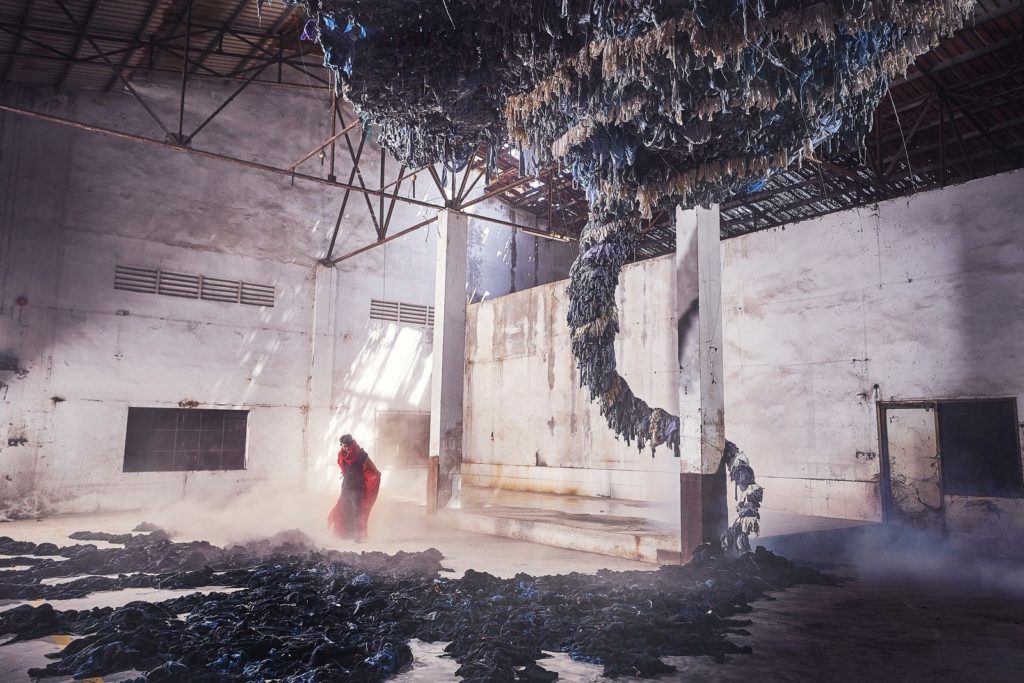
I was inspired by artist and photographer Benjamin-Von-Wong, whose stunning and creative photographs illustrate the immorality of the fast fashion industry.

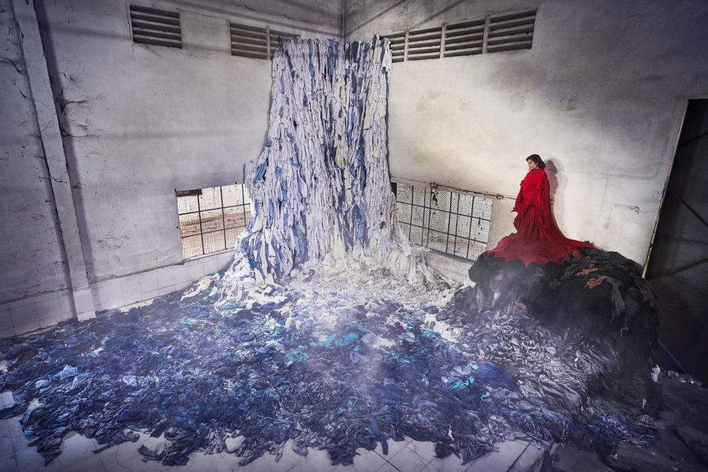
Work by Benjamin Von-Wong

KEYWORDS

SWEATSHOP, WAREHOUSE, STORMY,DIRTY, COLD, STORMY

FORM

The photo is a scene in a bare and grimy warehouse. From the ceiling leading to the floor is a tornado fashioned out of clothes presumably from the fast fashion industry. A woman dressed in red stands at its base. As a tornado is a type of natural disaster its reflects how the fashion industry does immense damage. This is impactful on the environment through climate change, the labourers who are payed the bare minimum and are forced to working terrible and unhealthy conditions, and the consumers who wear cheap materials that can do damage to the skin. The light seems to be natural, coming from seemingly a crack in the ceiling suggesting that the building is abandoned and creating a dystopian narrative. It leads directly to the woman indicating that she is important as well as the leading lines from the end of the ‘tornado’ leading to her. The room used is very spacious with not much in the room except the tornado and model leading to feelings of isolation and loneliness. There is very little colour except from the red of the model clothes again showing her importance to the photo.

CONTENT

The photo is reminiscent of the Dhaka garment factory collapse in 2013 that killed 1,134 people and injured many more. The vast majority of the injured and the fatalities were low payed clothes makers for companies such as Gucci, Moncler and Versace, going against the misconceptions that fast fashion is only an issue connected with budget fashion chains such as Shien or Misguided, making fast fashions impact on the environment a problem most people in the western world contribute to. The red clothing of the model connotes the dystopian novel the handmaids tail, perhaps reflecting how the lives of the workers in these factories are intensely controlled by consumerist culture in a way that seems dystopian.

PROCESS

The most challenging part of this photo seems to be prop placement of the clothes tornado. It was made from recycled clothing from the warehouse which had gone bankrupt, giving the clothes a new lease of life. It was shot on a 16-35mm f4 lens

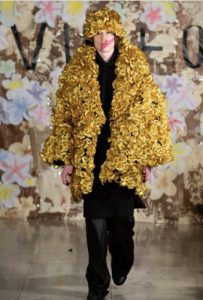
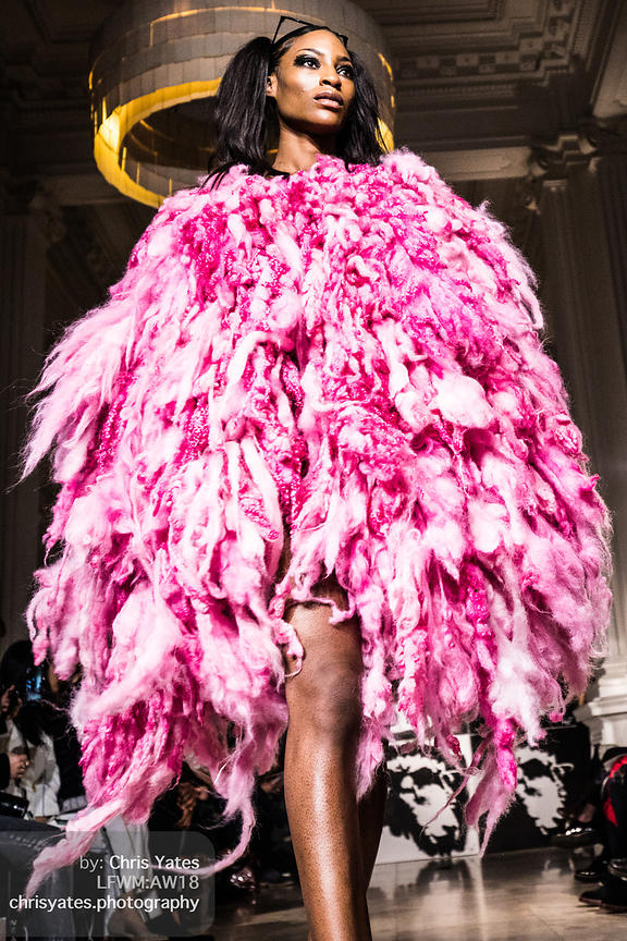
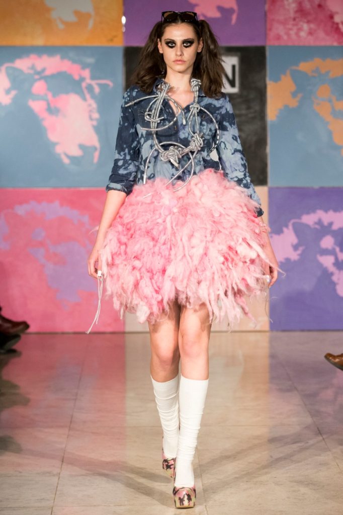
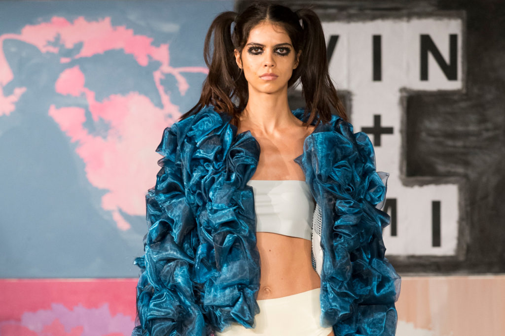
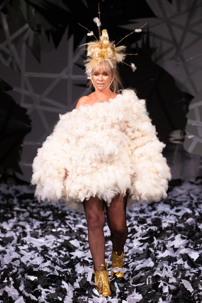
I was also inspired by the work of fashion designers Vin and Omi who created a line of sustainable fashion from recycled materials and handmade eco fabric made from cow parsley.

Work by Vin and Omi

KEY WORDS

SUSTAINABLE, ECLECTIC, MAXIMALIST, VIBRANT

FORM

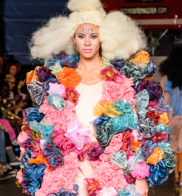
The photo is of one of the models walking for Vin and Omi’s collection at London fashion week. They are wearing a very a very garish ensemble that looks like they have had scrunchies superglued to their clothes. The look is very gender fluid which adds to the idea that the effect of fast fashion involves everyone. The lighting is very artificial, as is normal for fashion shows and completely covers the model. The model takes up the majority of the shot leaving little space for background space and subsequently making the model important. The repetition of the ruffles is very expressive and adds a variety of colour to the shot. It is in the eclectic, maximalist style which makes it interesting, if a little overwhelming, to look at.

CONTENT

The poodle symbol on the poodles head links to the shows subtitle ‘poodles and pentagrams’ which they say links to their form of eco religion ” growing out of the need to save the planet.” which links to the idea that they are not a brand but an ideology. The white undershirt beneath the ruffles could represent the purity of their intentions regarding their brand as well as the hope that they can aid in ending the fast fashion industry and in turn make the world a better place.

PROCESS

The process for creating this outfit comes from the eco material flaxley. To make this material, cow parsley and flax are women together. The models hair also links to this as it looks like poodle fur. There is a possibility that it actually is poodle fur as the pair also have an initiative called the no kill coat where they collect fur from pets and spin it into wool to use in their clothes.

Comparing my inspirations

The most obvious difference between my two case studies is that one is a photographer whilst the other is a pair of designers and therefore created very different outcomes. Von-Wong’s work is very gloomy and depressing and focuses on the effects on the people who make the clothes while Vin and Omi work to demonstrate how to fix the solution whilst also making it look beauty. Von-Wong uses his work to push a narrative but Vin and Omi offer a solution and use their work as a display of optimism that we can solve the problem of fast fashion.

Sketching ideas

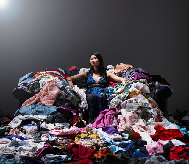
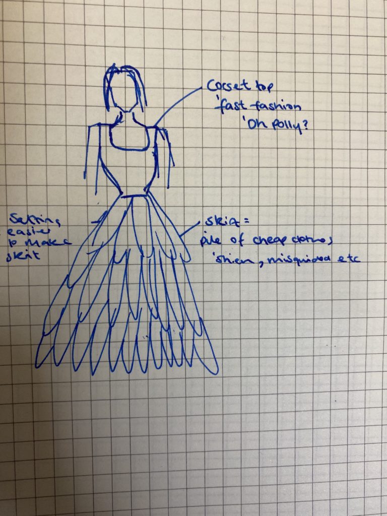
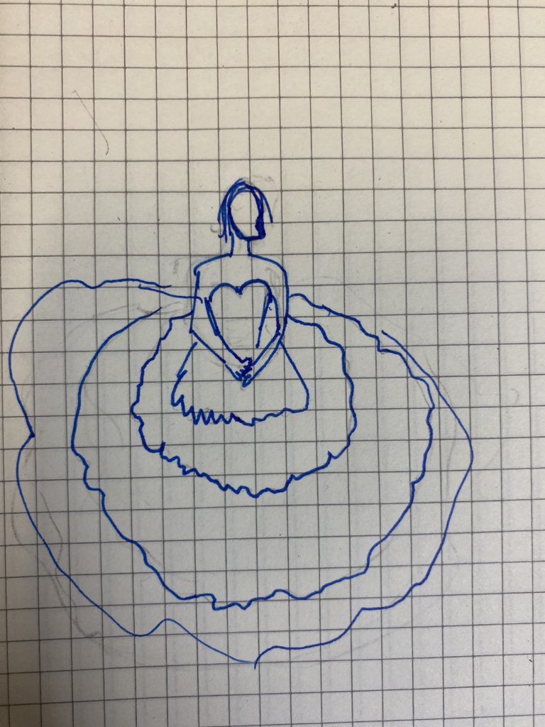
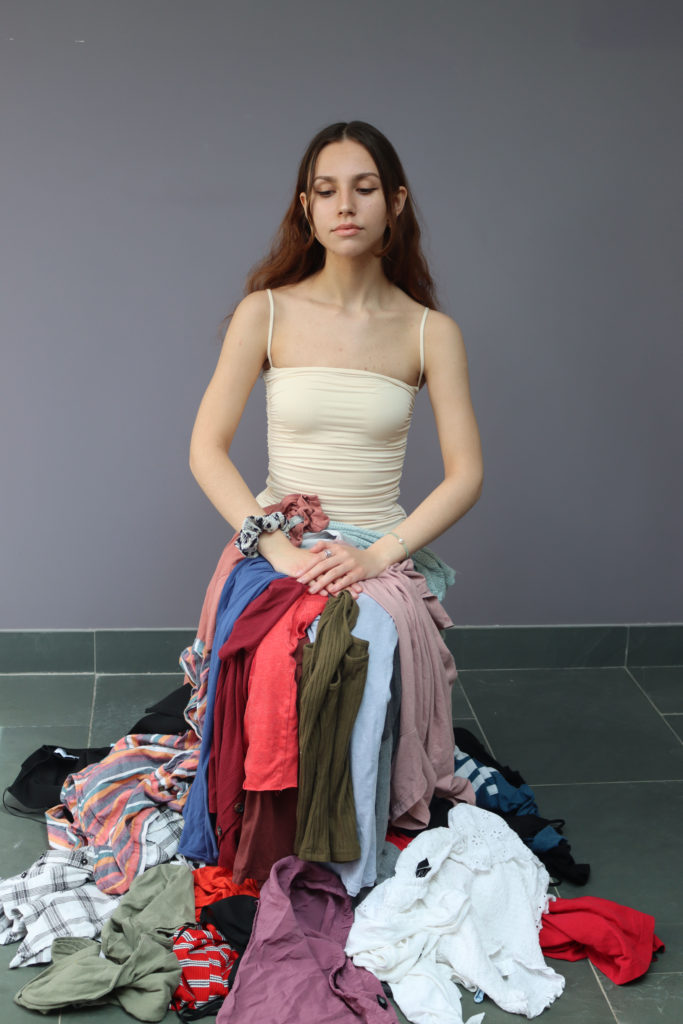
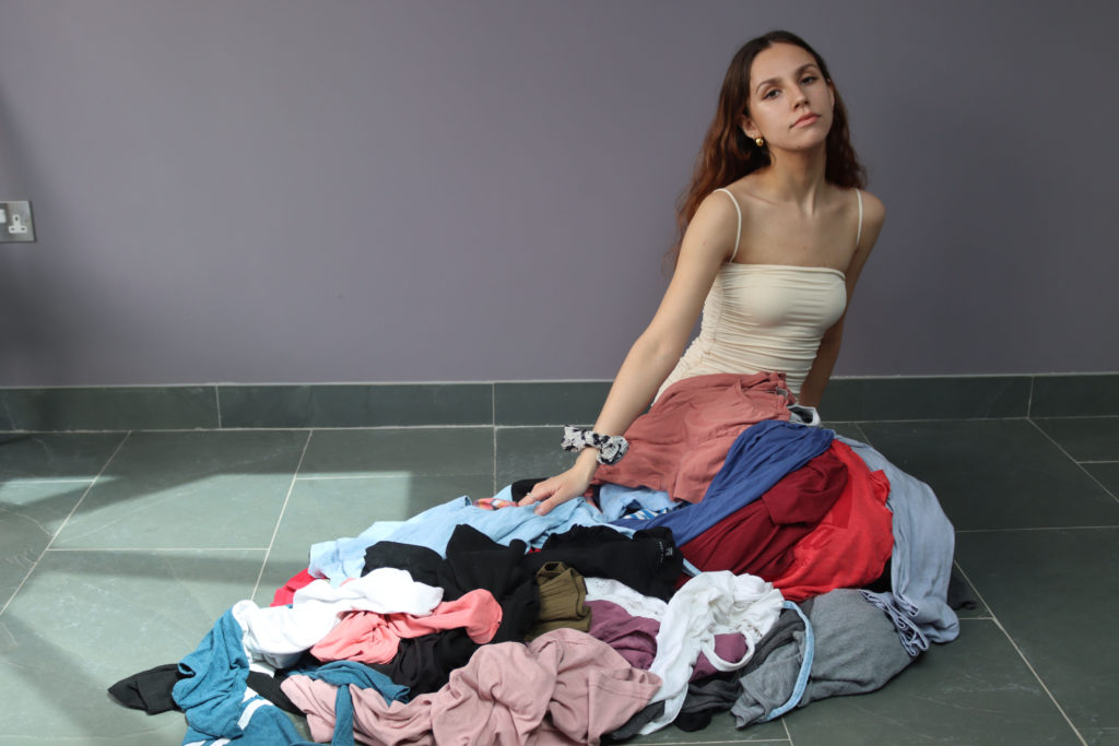
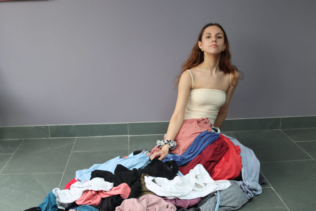
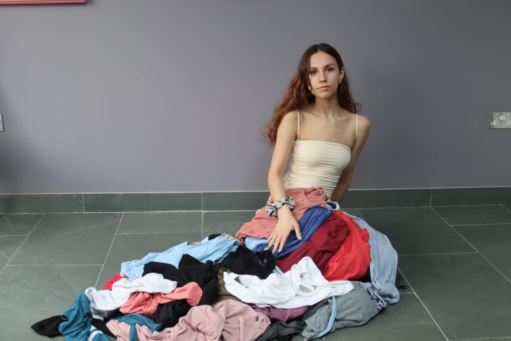
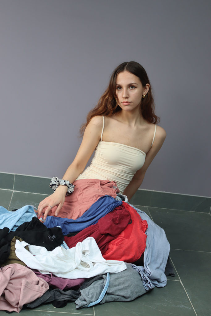
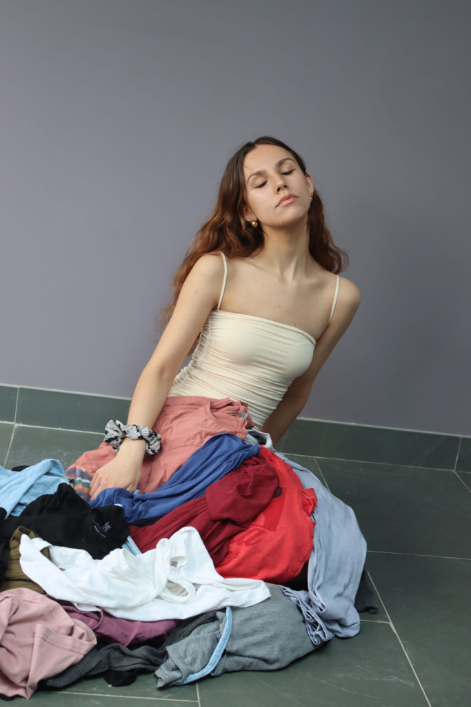
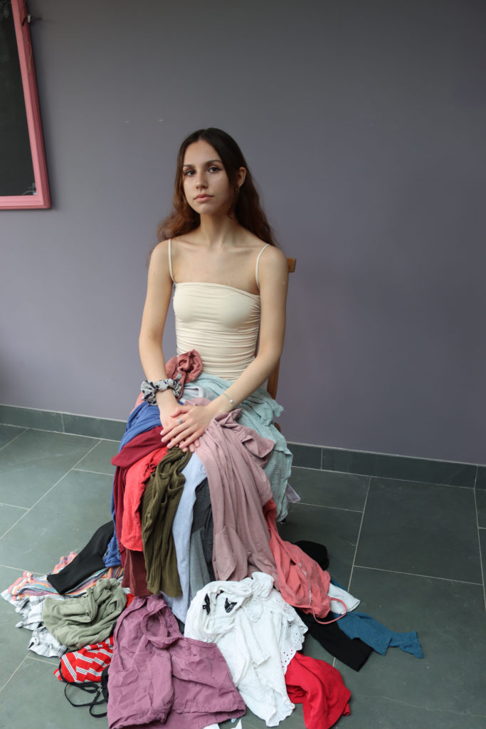
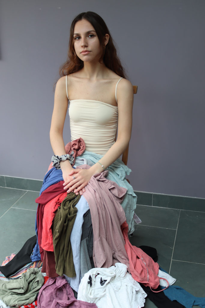
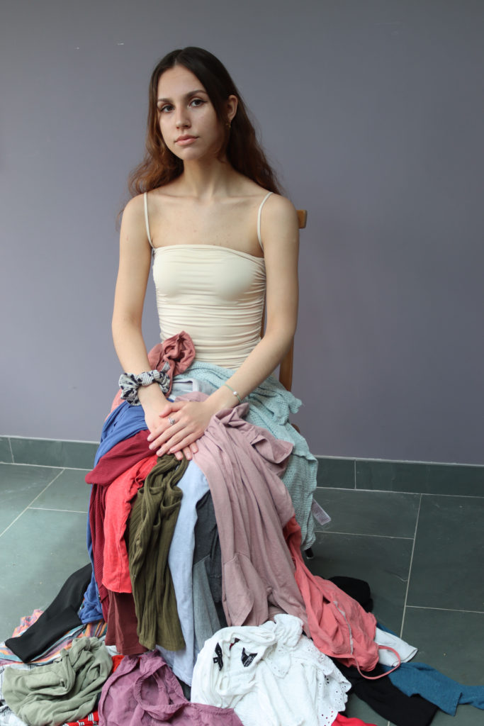
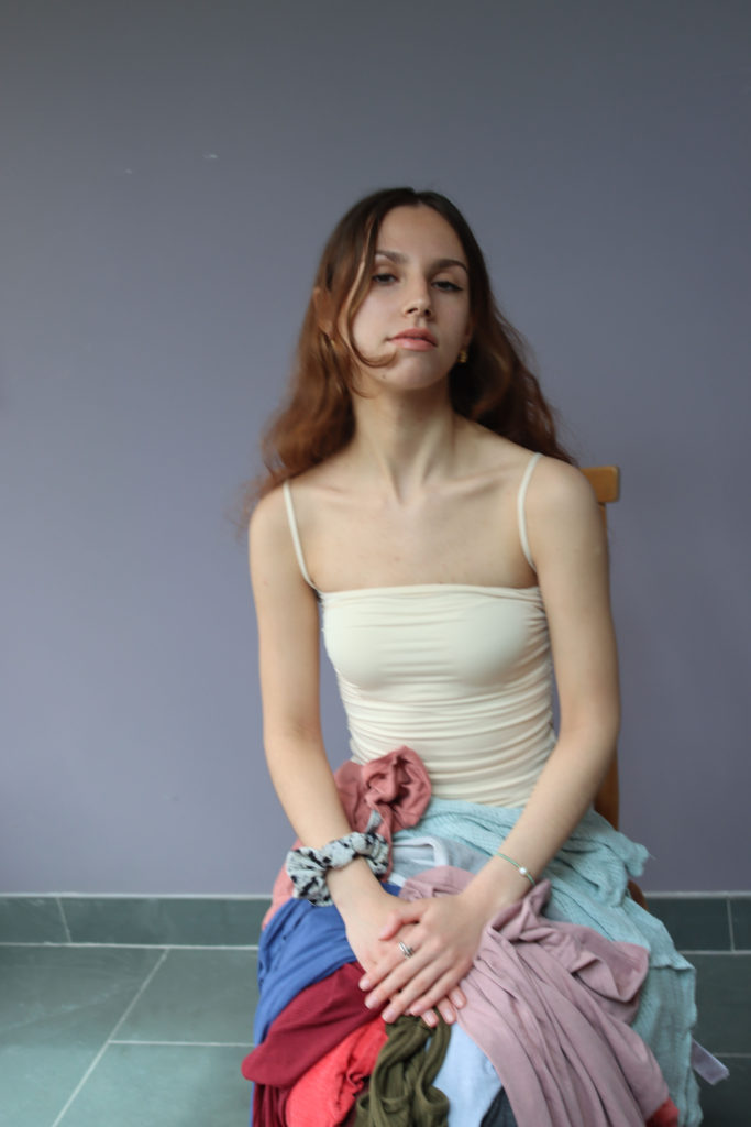
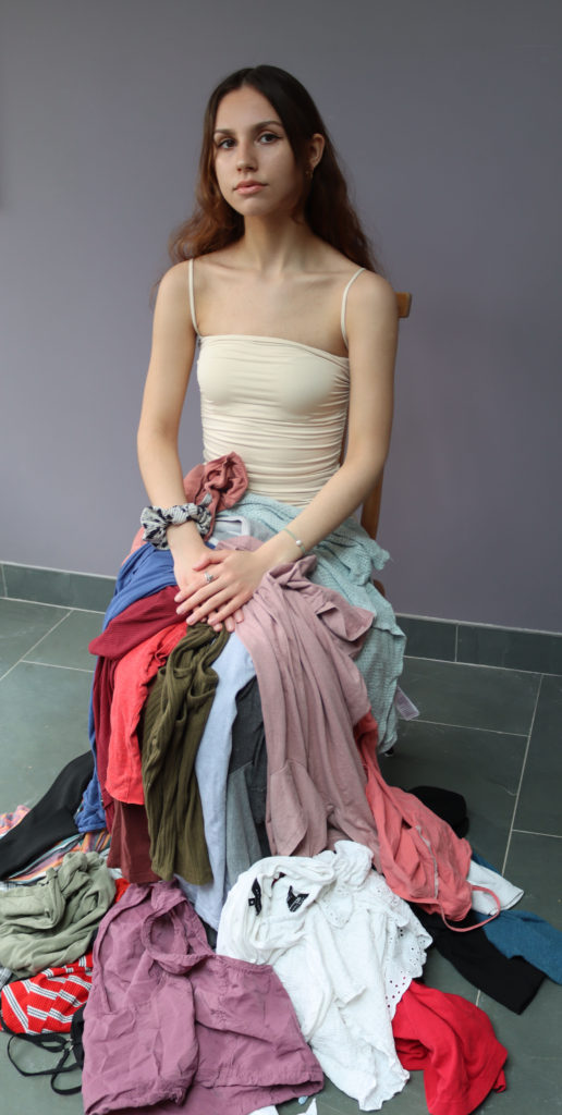
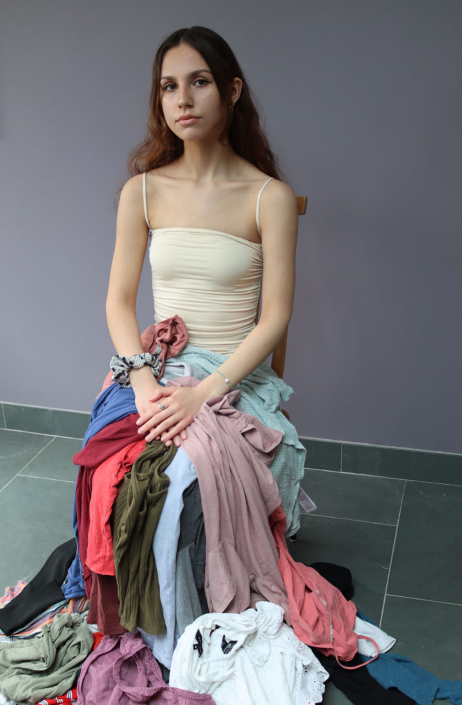
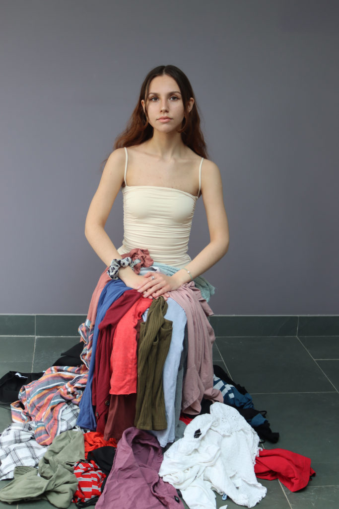
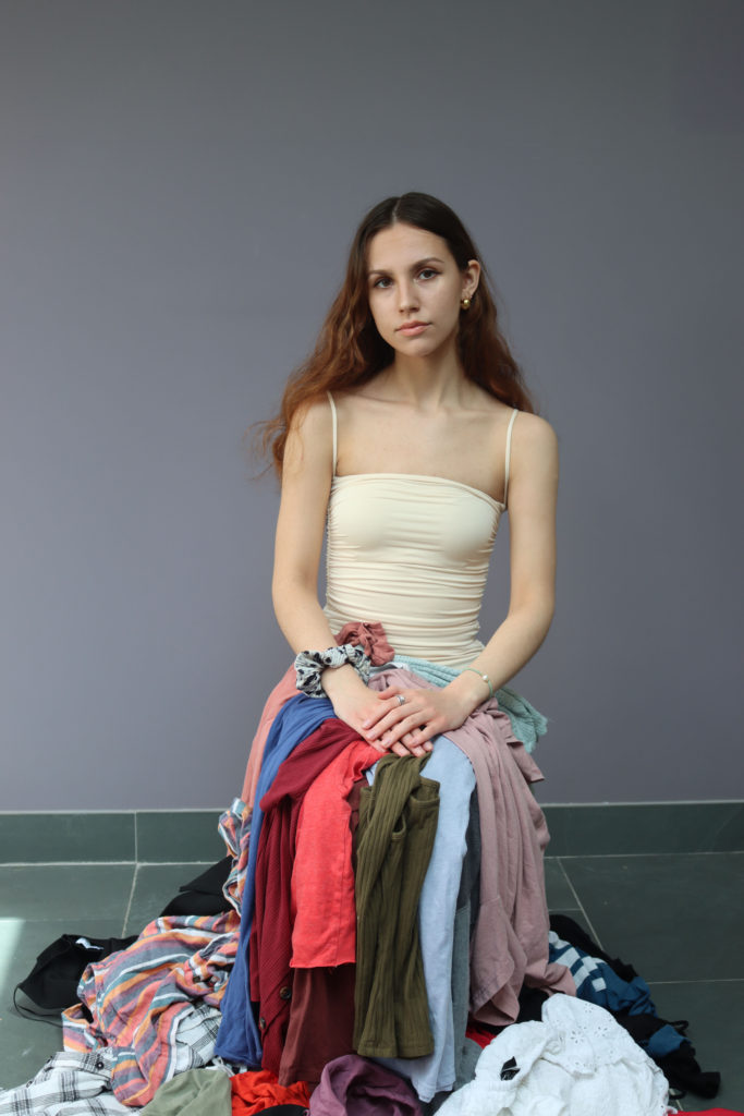
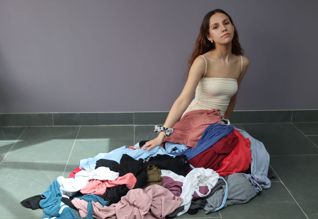
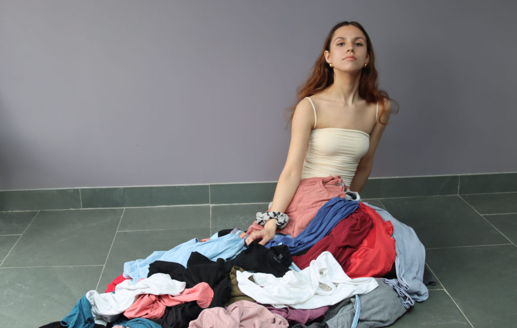
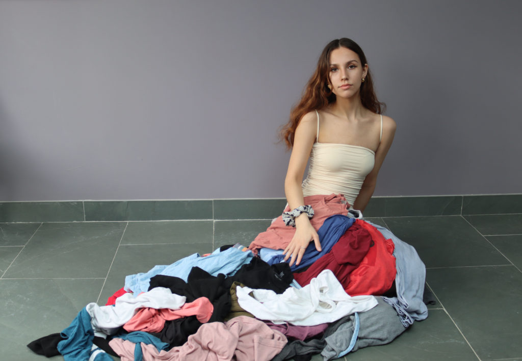
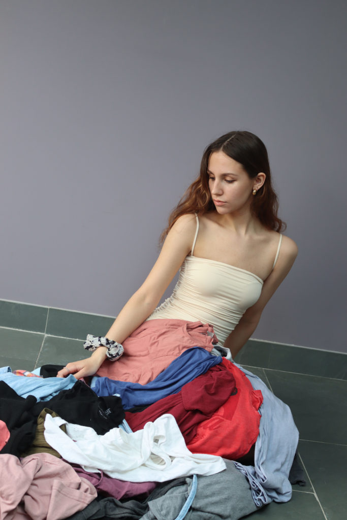
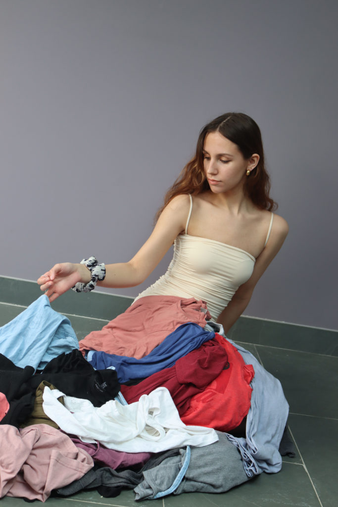
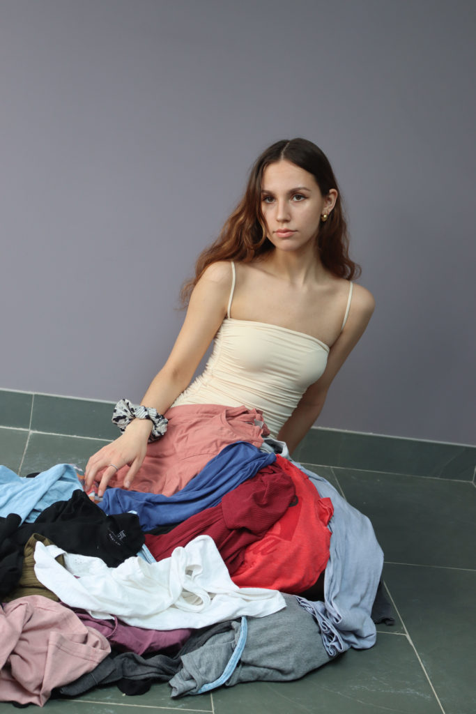
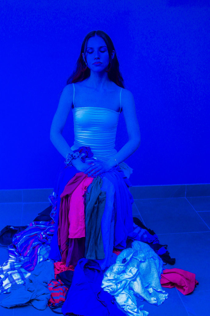
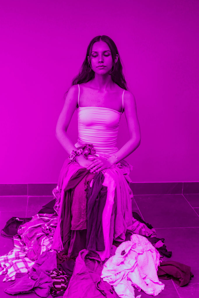
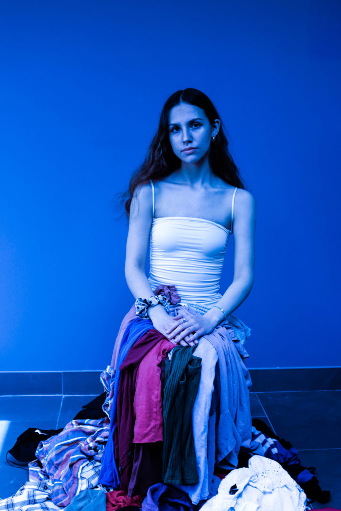
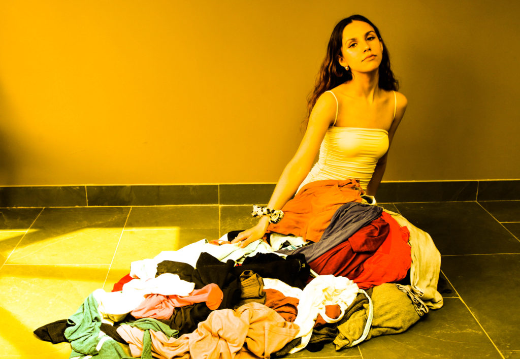
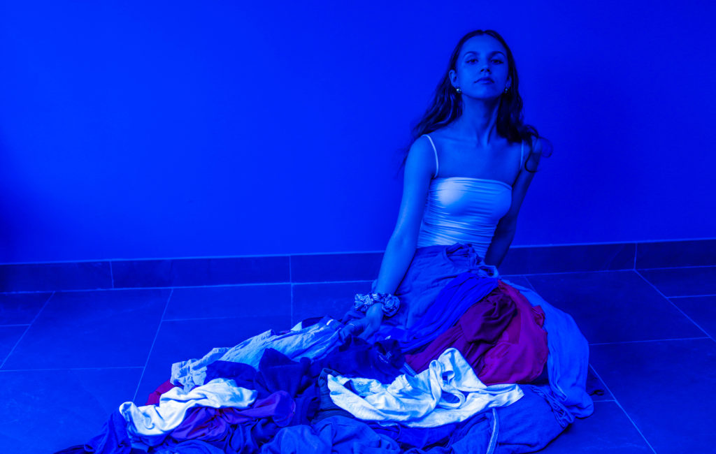
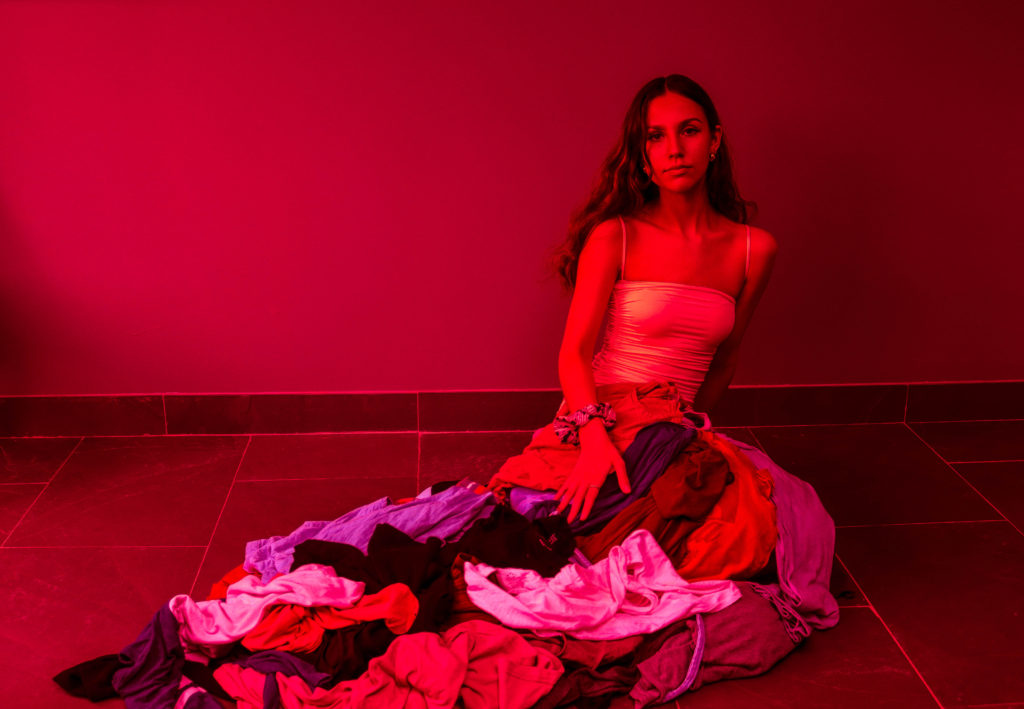
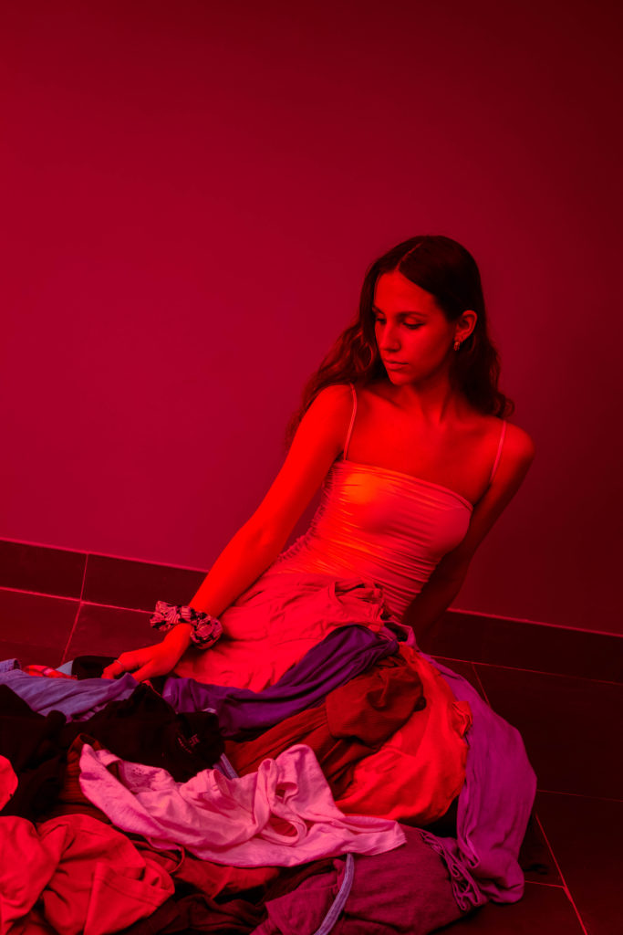
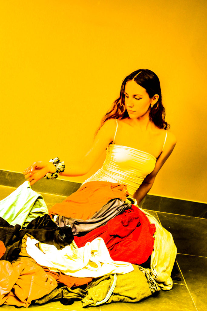
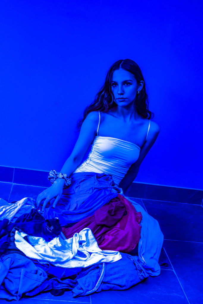
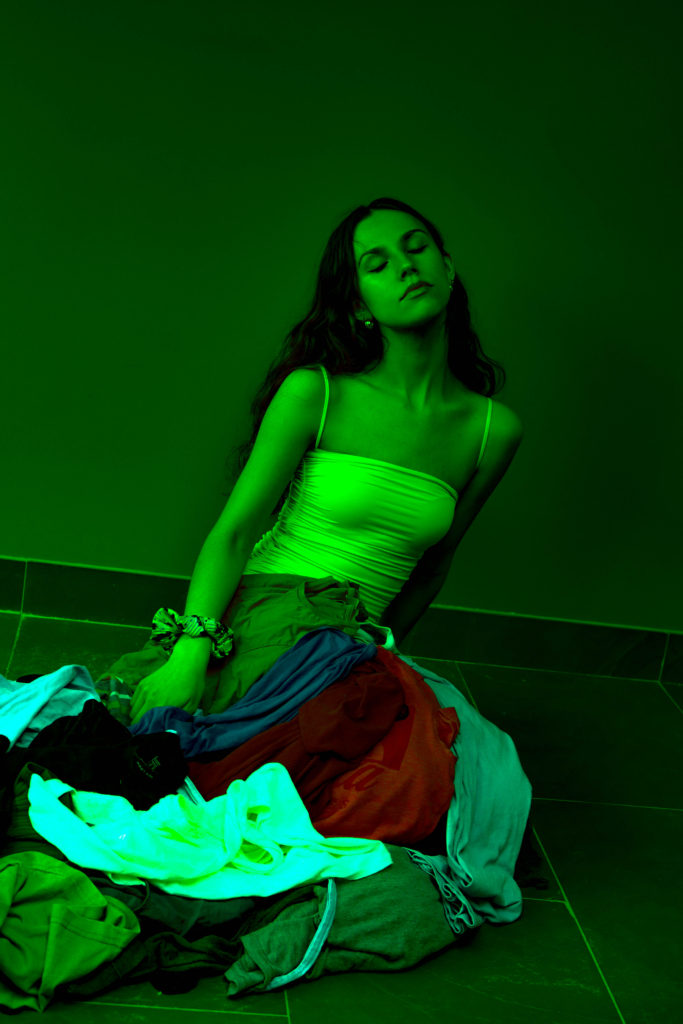
My main idea is based on Barbie dress birthday cakes that I had when I was little. The concept is that my model will be wearing a corset style top and her legs will be covered by a pile of fast fashion garments, fashioned to look like a skirt. It is a portrait project but I may take some of the photos in landscape.

Shoot Plan

WhoZuzanna
WhatWearing skirt from old clothes
When14/05/21
WhereHome- in front of kitchen wall
Notescollect old clothes and move furniture to create DIY studio

CONTACT SHEET

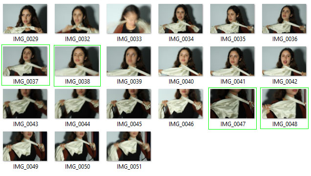
From this shoot I selected my favourite photos and highlighted them in green. A lot of the photos have background furniture such as plug sockets and artwork peaking through but I am not worried about this as they can easily be cropped out. Additionally there are quite a few distracting quite scratches in the wall being but it shouldn’t take too long to edit that out either. I had my model wear an Oh Polly dress as the bodice of the dress as it is a common example of fast fashion aimed at girls to wear once on a night out and then throw away.
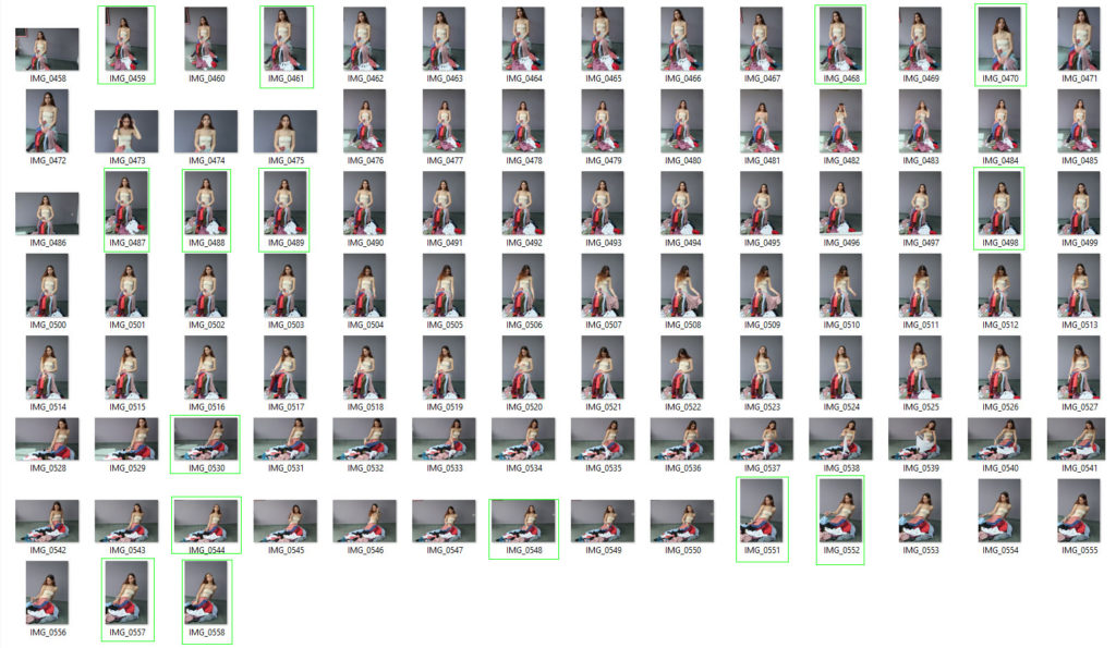
Here is a selection of my best photos, shown as they were taken

Here are the same photos but with distracting background pieces cropped out and slight imperfections removed with the spot healing tool on photoshop

Using the spot healing tool to slightly smooth out the skin

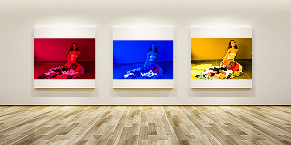
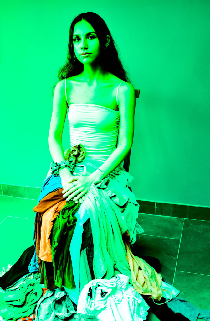
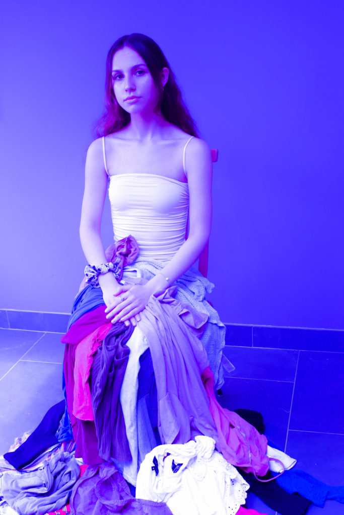
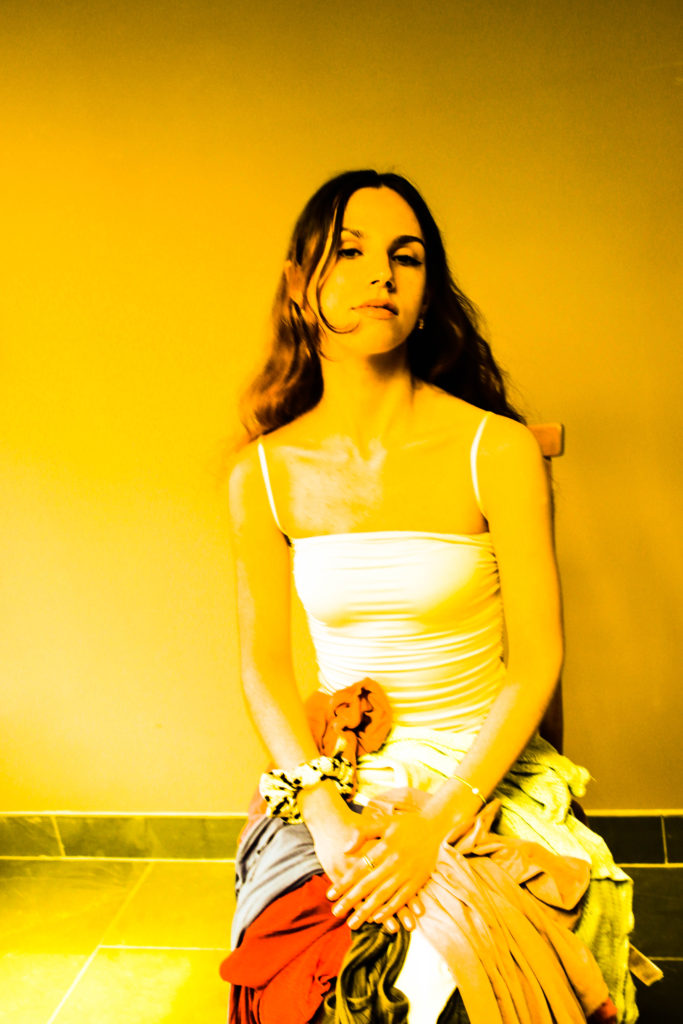
I used the software Lightroom to further edit my photos. The idea was to use vibrant and unnatural colours to reflect the harsh chemical dyes that employees in clothing and fabric factories have to work with. These dyes are often damaging to the skin and cause the workers to sustain painful injuries as well as develop potentially more harmful medical conditions due to constant exposure. I used tools on Lightroom such as contrast and clarity to create a more synthetic, plasticky look resembling cheap manufactured clothes.

Collection 1

Collection 2

Collection 3

Out of all the collections, number 3 is my favourite. It emulates the pop art movement, specifically Andy Warhol, who, like me, used art to condemn over-consumption, greed and capitalism

New Idea

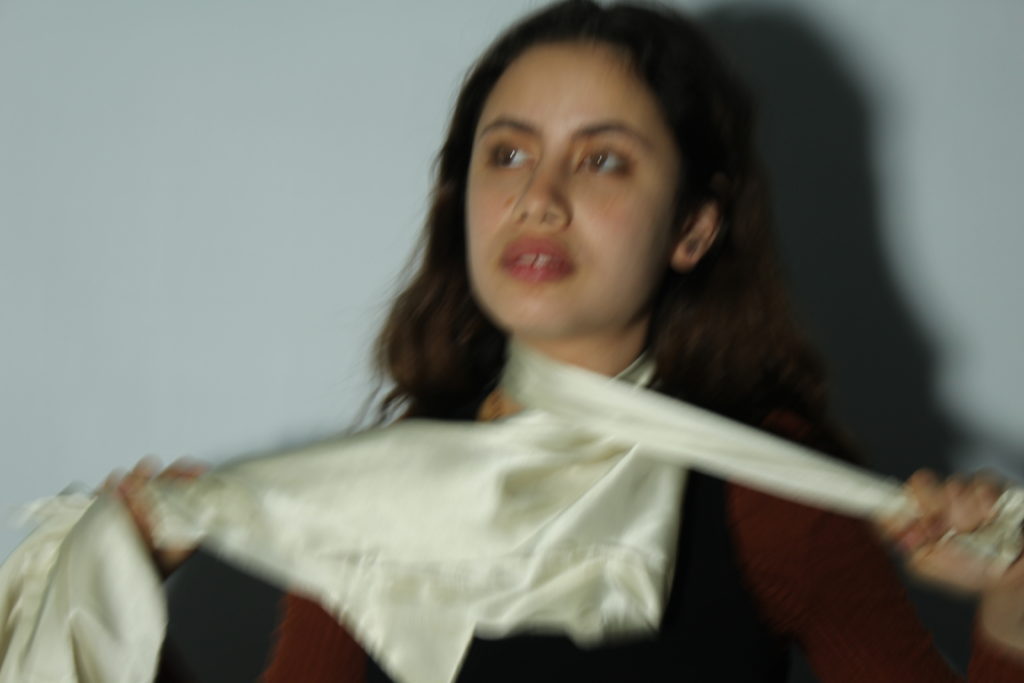
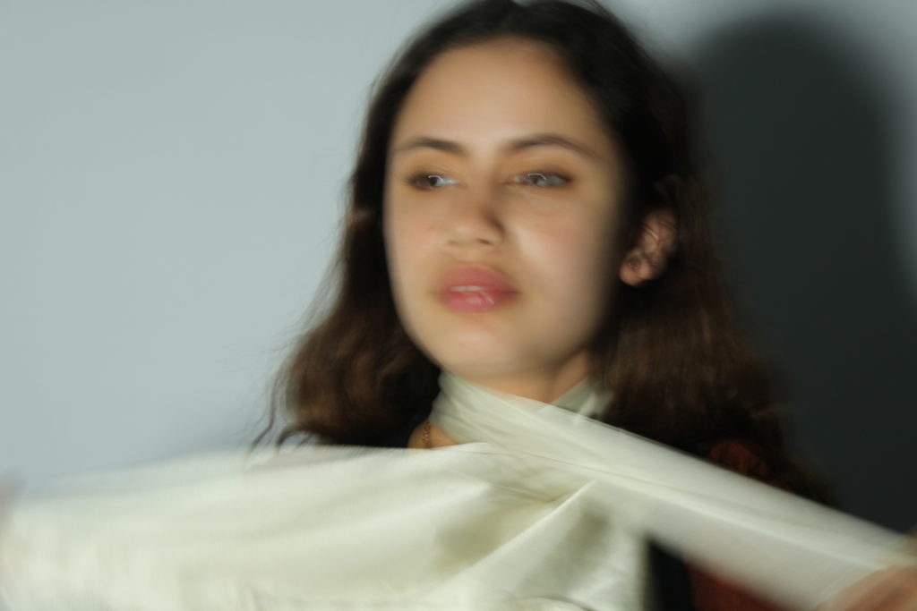
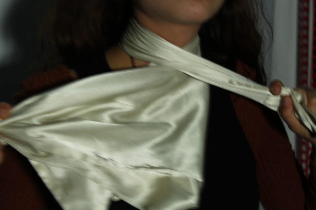
Another idea I have is reflective of the Dhaka garment factory collapse, in which 1,134 workers died. To do this I want to use the clothes against the model. With poses such as being crushed or strangled by the clothes. Using the same concept as my first shoot I will be using old clothes that would otherwise be thrown away. The photos will be taken in the school studio with a proper white backdrop compared to the kitchen wall I used for my first shoot when there wasn’t a studio available. Hopefully this means there will be less flaws to edit out as there were previously. Instead of full body shots, I plan for these to use the face or neck as a focal point.

SHOOT 2 PLAN

WhoCarmen,
WhatStrangled by fast fashion
When25/05/21 morning
WhereStudio
NotesBring clothes able to wrap around

Second Shoot Contact Sheet

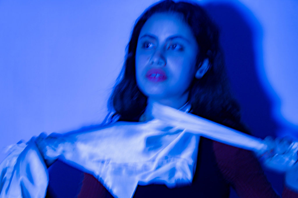
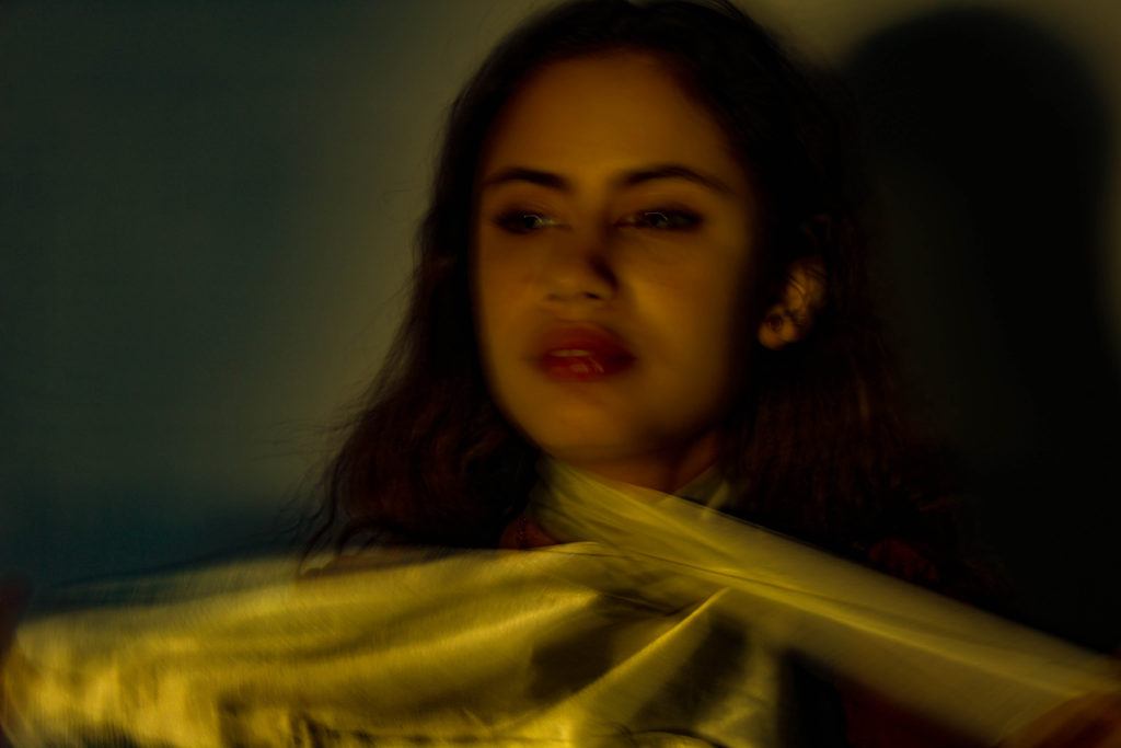
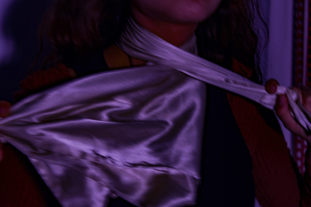
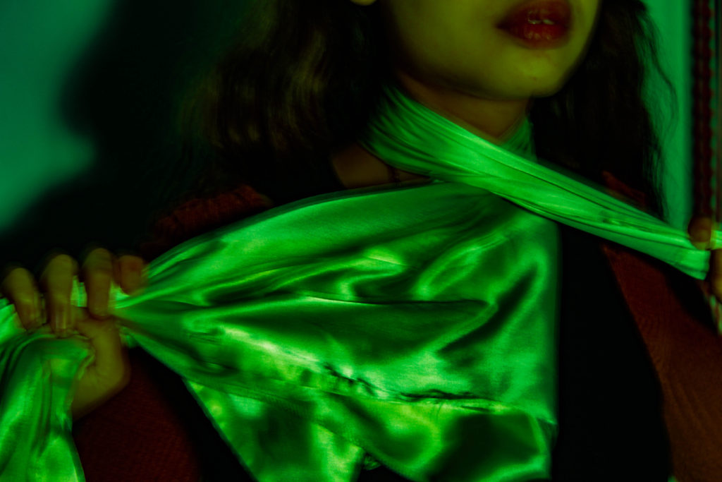
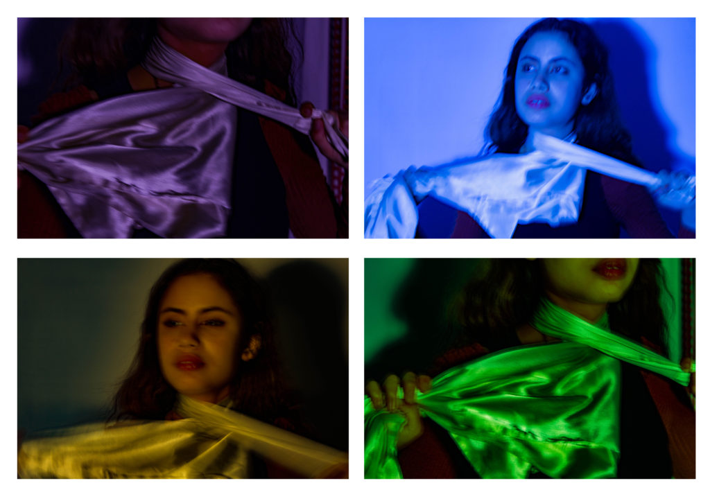
From this shoot I selected 4 that I felt worked best in conjunction with my ideas. I ran into a few problems whilst shooting this. The 2 models I had arranged to shoot with were unable to come so I had to find another at extremely short notice. Another problem was with the camera, I found it really difficult to take any of the photos without them coming out extremely blurry. At first this was really annoying however when I took the time to properly look at the photos I really liked the effect the blurring had on them so decided to keep them as they are. I also think that it strengthens the narrative that the people who make the clothes for big companies like ASOS and Shein have their identities blurred.

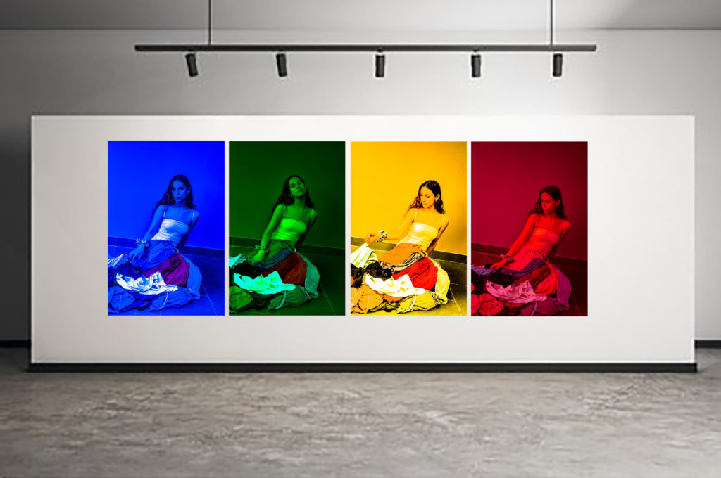
Similar to my other shoot I experimented with colour to make my photos more interesting but this time made the colours much more subtle and understated as the photo is obvious enough with the material strangling the model. These photos have a much darker more melancholy feel to them much more reflective of Von-Wong’s work than my other photos.

Collection 4

DISPLAYING

On photoshop I moved my photos in their collections onto empty gallery space or on a white background.

Collection 1

As colour is an important aspect of this project, I decided to display this set of photos in the style of the colour spectrum, ordered as such. The photos mimics vibrant fashion campaigns, adding an ironic twist to my shoot.

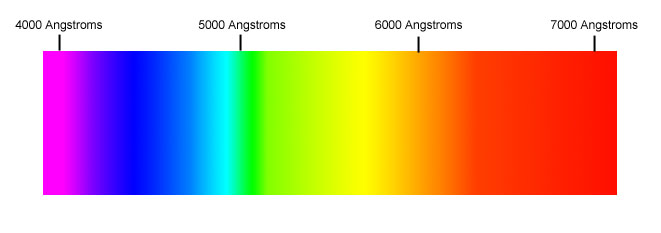
The Beyond Retro Guide To… Monochromatic Dressing.

Collection 2

Collection 3

Collection 4

Like with my other collections I ordered these photos using the colour spectrum and whilst I like how it turned out it seems to look like the Microsoft windows logo which ideally it wouldn’t.
Conclusion

Although the individual photos from Collection 3 were my favourite, as a collective, displayed using the colour spectrum, I think that collection 3 is the most put together and therefore my best. It effectively conveys my message on fast fashion but still manages to look like art you would display at home.

Comparison with case studies

Similarities and differences to Von-Wong

Creating something out of obsolete materials, creating a narrative based on the fast fashion industry from the centre- the place it’s made. Von-Wong’s work is a lot more gloomy and depressing than my final outcomes. He displays realism while mine is more abstract. His is much more prop based in part due to a larger budget and team helping him. His is landscape and focuses more on the scene itself rather than just the model as I did. His background is a derelict building where mine is just a DIY backdrop. His photo works as a scene to tell a story where mine uses repetition.

Similarities and differences to Vin and Omi

Both very fashion based. Use of bright and vibrant colours to show hopefulness. Mine is more pop art inspired and heavily edited whereas, because its taken directly from a catwalk it is pretty bare. Neither is monochrome, we both use a variety of colours to keep the photo interesting. The items of clothing are both similar, made up of mismatched material however, instead of recycled materials they create their own eco material

REFLECTION

Through my research into this project I have learnt a lot about the fast fashion industry and it’s deadly effect on the environment as well as the lives of the people who produce the clothing. The project has shown me how I myself as an avid consumer of fast fashion contribute to the problem and will be trying to buy more sustainable clothes from now one as well as avoiding companies that employ labourers from sweatshops in order to help combat the problems associated with them e.g the mistreatment of low level/ low pay workers and it’s contribution to climate change. If I was to do anything differently I would have done my second shoot well before the deadline so that even if things went wrong I would have more time to fix it and redo it. I would also take more photos to allow more for selection to end with a better photo. I think my photos have ended up looking really good and I’m happy the way they all turned out. I have really enjoyed this project and am confident about the photos I have submitted and feel that they fit very well with the idea of ‘Anthropocene’

FINAL IMAGES

Final images

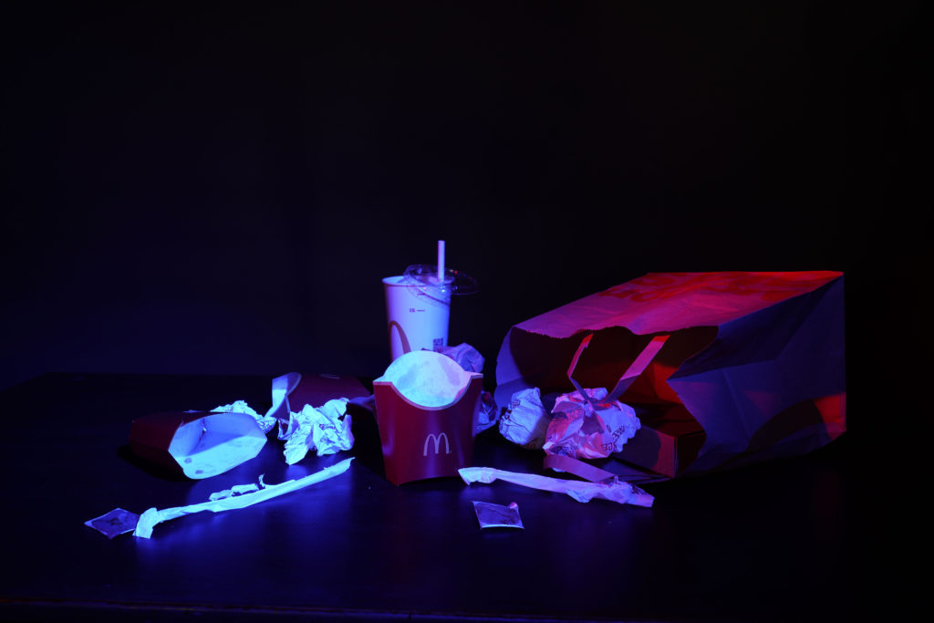
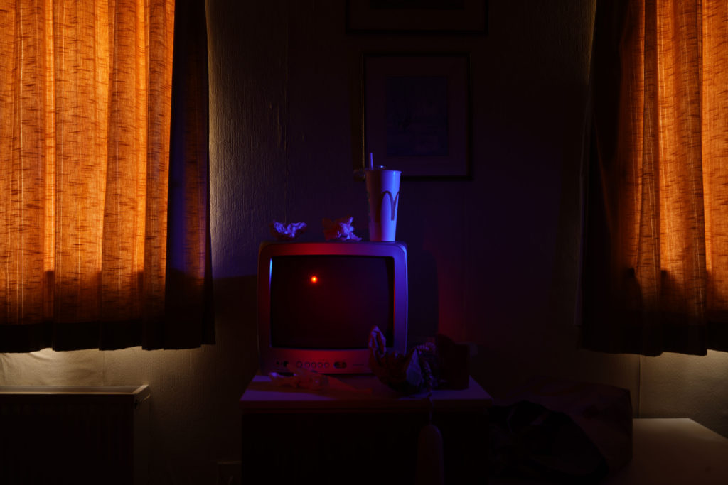
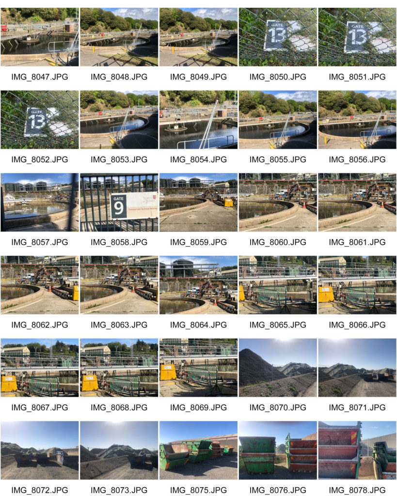
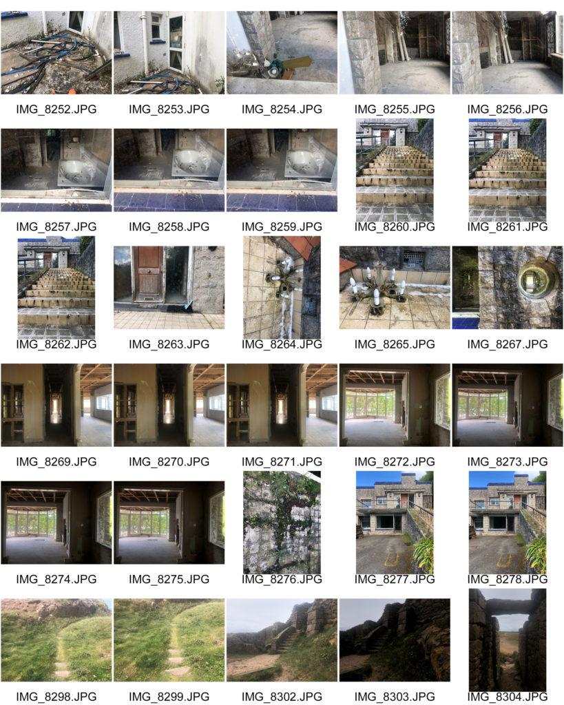
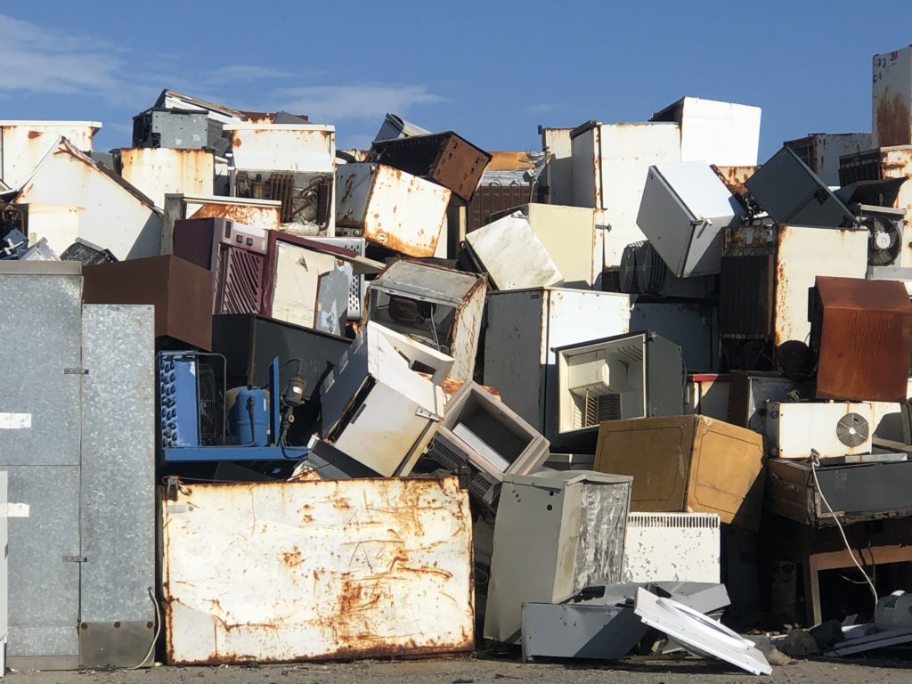
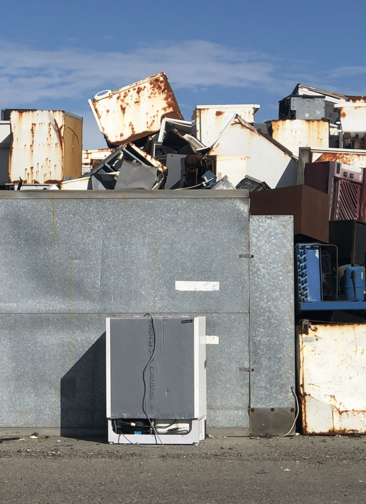
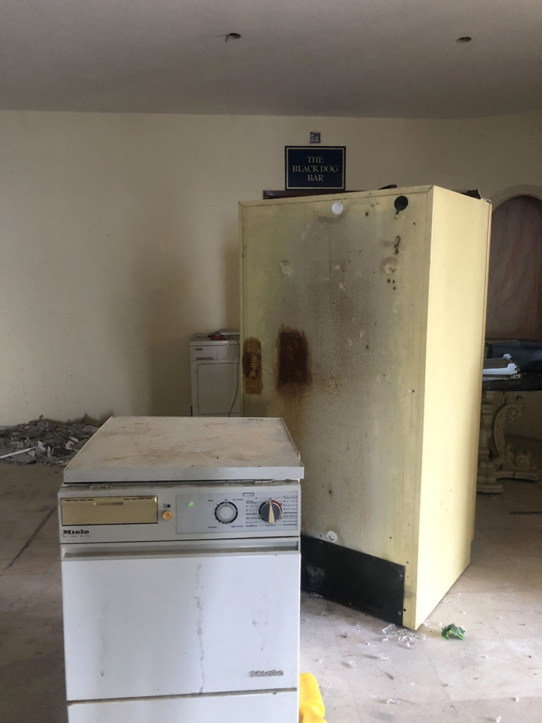
To recreate Troy Paiva’s style I used two continuous lights and added a grid and coloured gels to them. The grid allowed me to narrow the light so that it only lights specific part of the objects I wanted. The colours gels allowed me to add contrasting warm and cool colours just like Troy Paiva does. The camera was set to a very slow shutter speed of between 30 seconds and 8 seconds of exposure time. Since we where shooting in the dark this permitted some ambient light to get sucked in to the exposure. As I moved from the location to location, I had to change the shutter speed to adapt to the ambient environment and in some shots I decided to use flash light rather than continuous light. This helped to isolate the subjects. Off course the camera was always on a tripod. This is very important for slow exposures.

photo that I chose:

The three first pictures are from the same shoot ”Domestic waste”. Each of those three pictures presents different waste. The image I especially like is the first one the ”McDonalds rubbish” because it makes you question how something that is loved by young, old people can be very bad for the environment and pollutes our planet. Those packaging can be found everywhere like on street floors or the beach … But what if we took the packaging of our favourite fast food and turned it into an inspiration from a 17th century painting. Is like what Mat Collishaw or Krista van der Niet does. Let’s convert our waste into art!

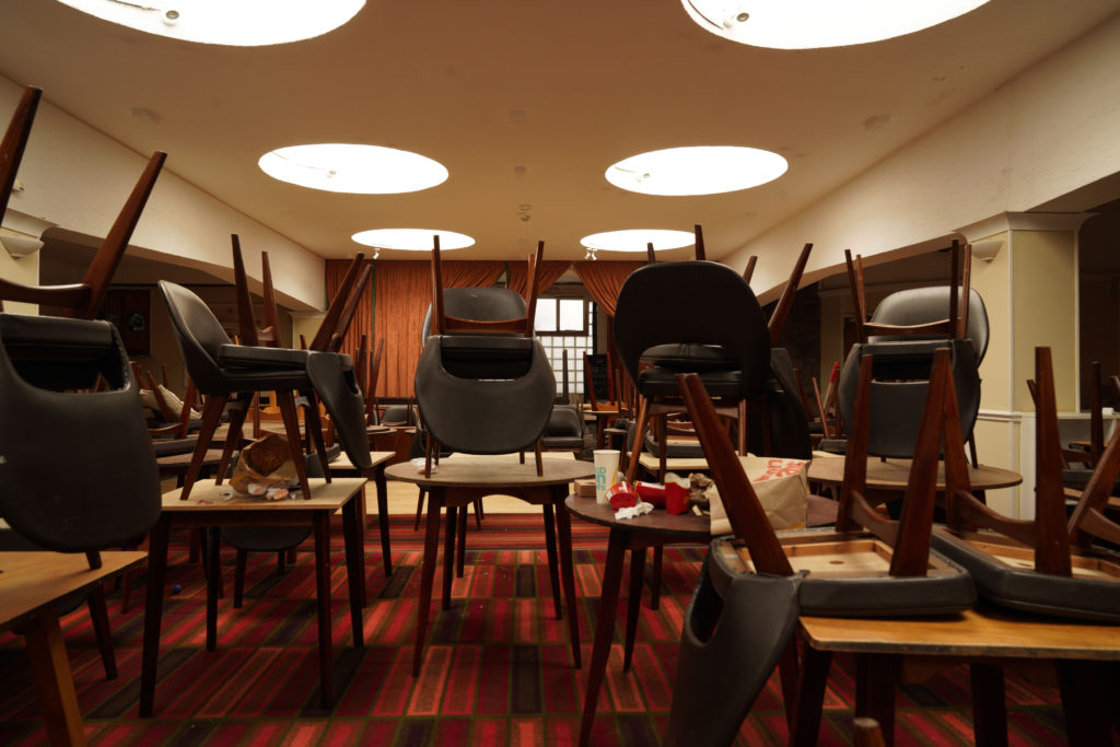
The second picture I especially like is the third one since
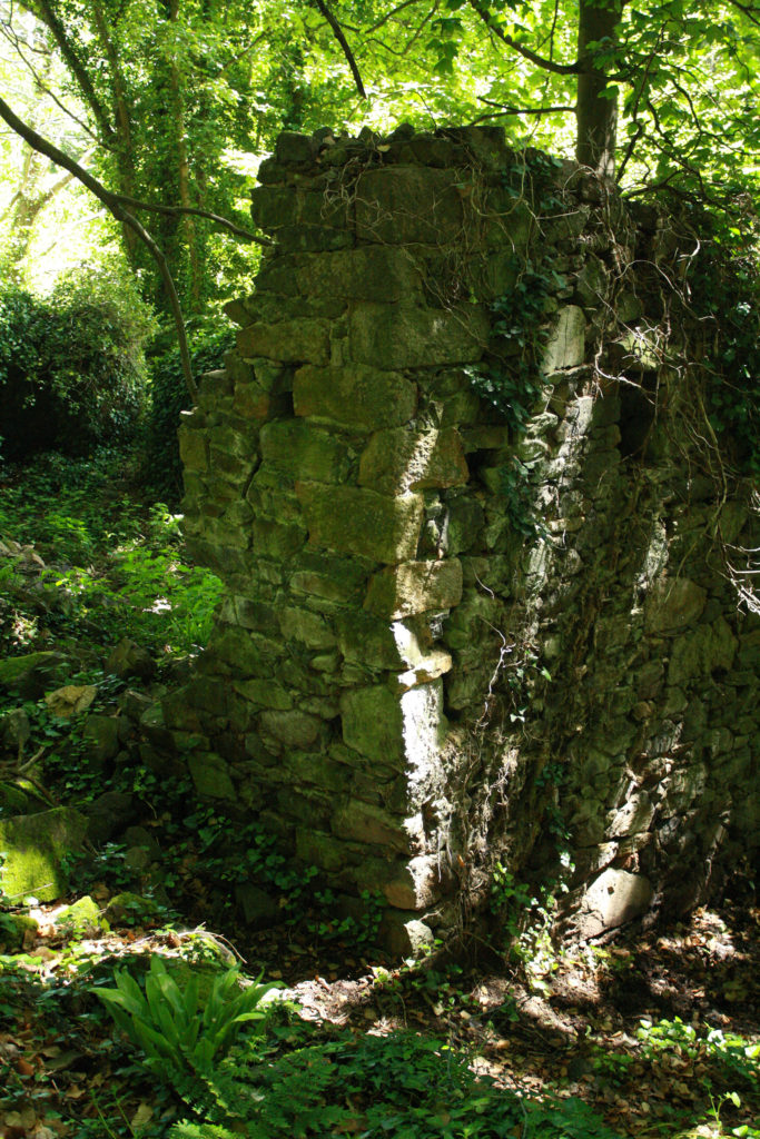
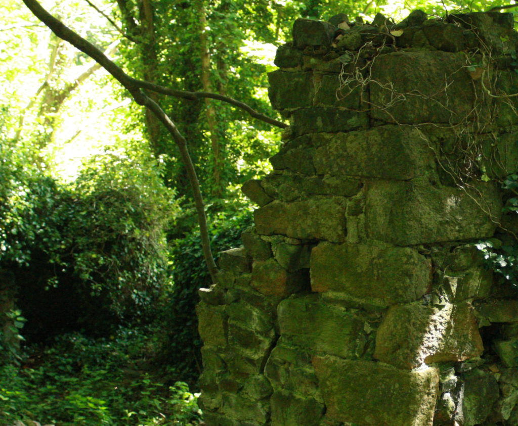
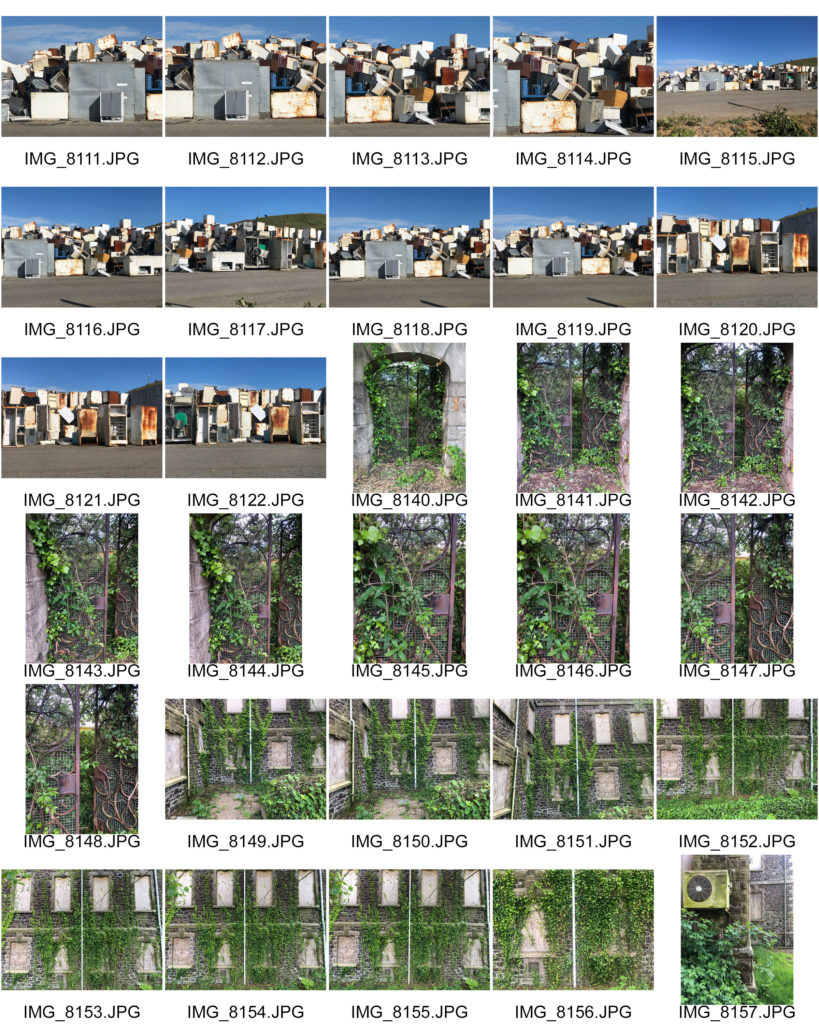
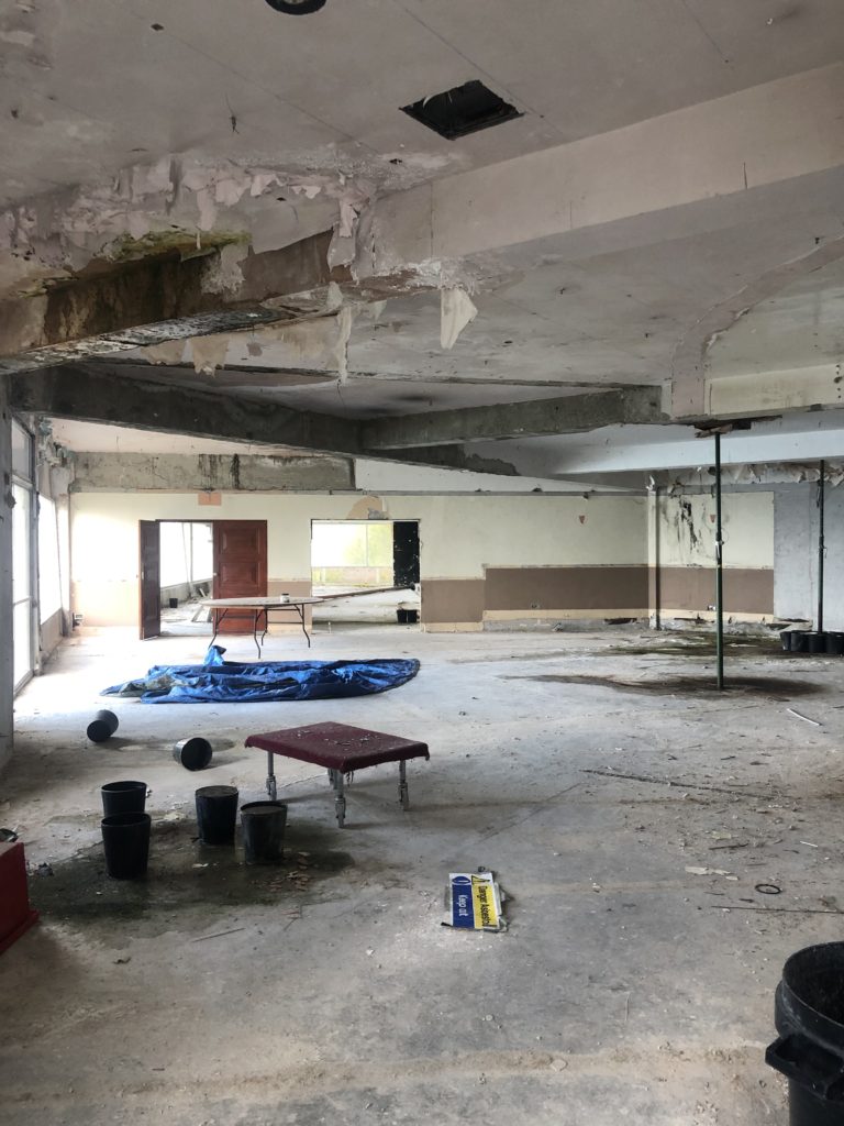
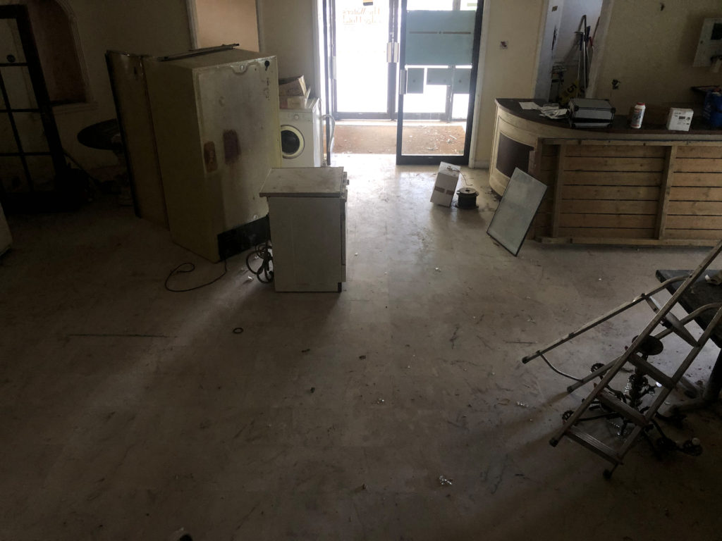
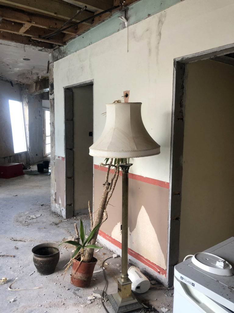
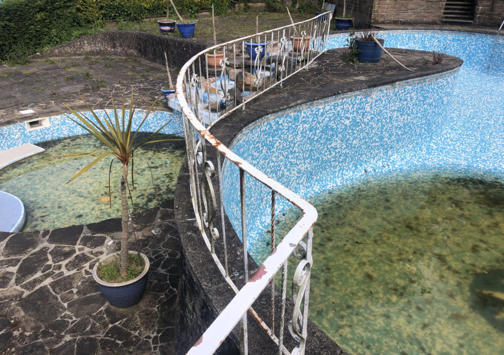
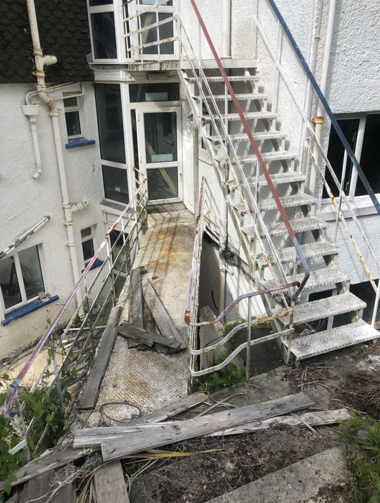
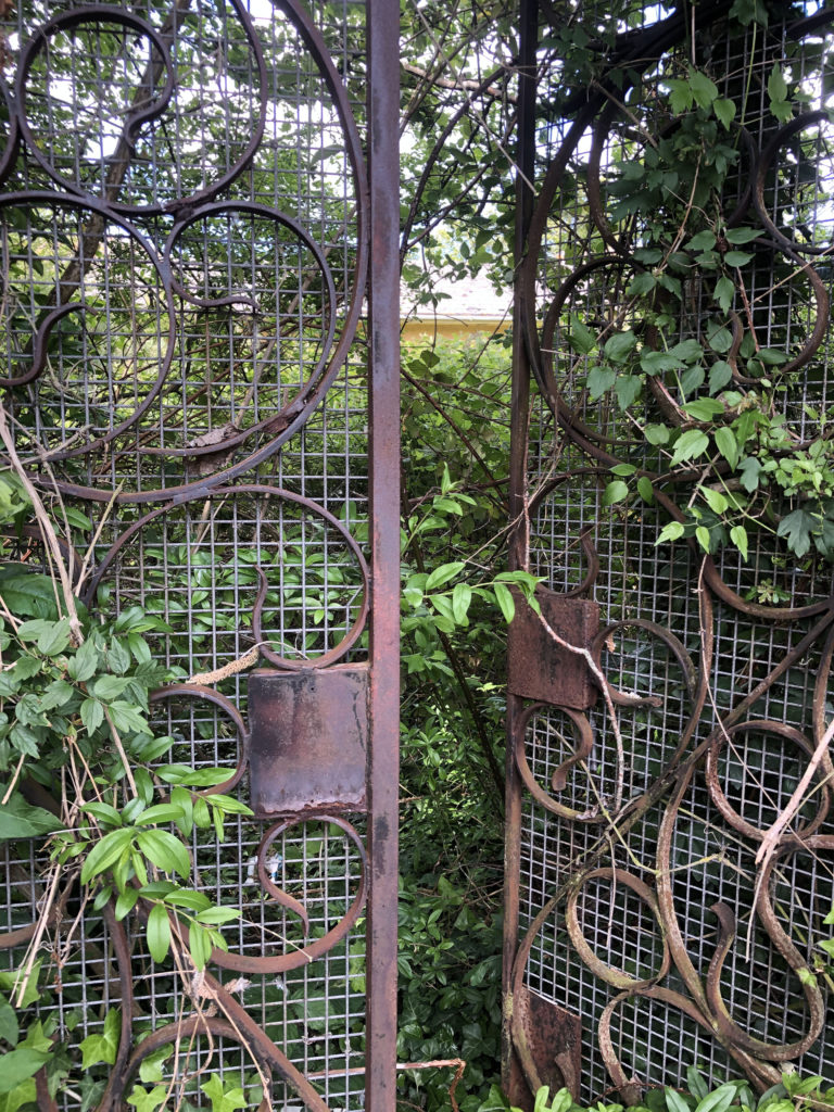
we can see a place that use to be used, now completely abandoned. The colours and patterns of the floors let us guess from what period the hotel was. We can see the unused chairs left on the tables, rubbish everywhere the carpet is dirty… and all this makes me think about what this room was for before, why is it no longer used. The only thing left now are the memories. The last two photos are from my second shoot ”Ingrained in nature”. This shoot had a different meaning for me since I wanted to represent the fight that nature must wage against an anthropogenic element, in the end nature tries to adapt to it and grows up despite everything. The building is hidden in nature,
and its colours are the same as the forest: brown, green, yellow, blue

Review and Reflection

I like the finals results of my photos I think I managed to interpret what I wanted to show. In the first controlled conditions I did, I was a bit disappointed because I didn’t focus on little details because I was not well organized in terms of time. But in this controlled conditions I got better organized and I managed to put the details I wanted like well place the objects, change them, transform them and I also explored more in my idea than the last time. Another thing I had to improve in my last controlled conditions was lighting and sincerely I think it’s something that I handled well in this theme.

Photoshoot 1

This shoot was inspired by Jeremy Caroll. As well as including Caroll’s style I wanted to highlight the topic of air pollution as well as water pollution.

I wanted my images to show the impact that people have on the world. Even by eating something with a plastic wrapper humans are negatively impacting the world and pouring plastic into the oceans.

Water Pollution (plastic)

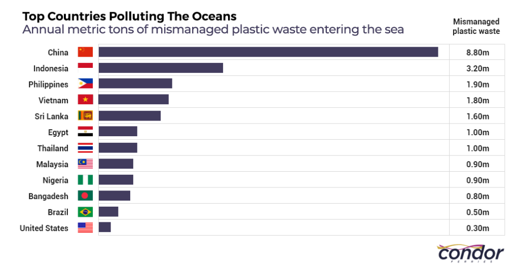
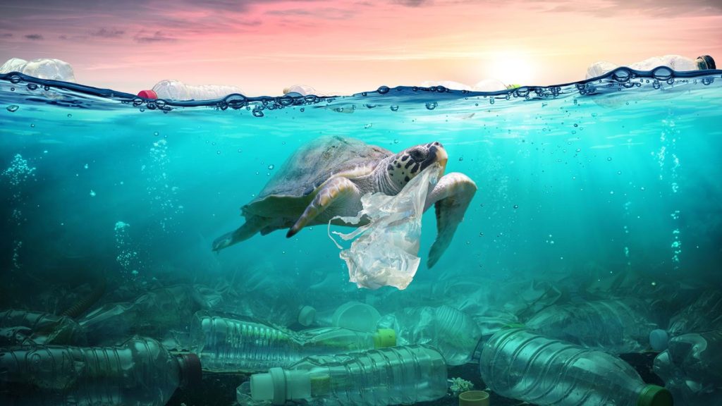
Plastic is accumulating in the world’s oceans at a staggering rate. An estimated eight million tons of plastic – the equivalent of over 26,600 Boeing 747 planes – are swept into our seas and oceans every single year, mainly via rivers and coastal urban centres.

500 marine species are known to be affected by plastic pollution.

Nurdles – the pre-production pellets from which most plastic items are made – are a significant direct source of microplastic pollution. Because of their small size and the way in which they are transported and handled, millions of these pellets are spilled in factories and other sites every year, and are often washed straight into storm drains and out to sea.

Ocean plastic pollution | Fauna & Flora International (fauna-flora.org)

Air Pollution (smoking)

Unfortunately, the environment is the worst hit by activities of the tobacco and cigarette industry. Until everyone learns to start doing something about this trend, they might be in for some big trouble in the nearest future. This article will focus on some of the negative effects of tobacco on different elements of the environment, as well as steps that must be taken to prevent the looming damage.

The smoking industry is designed by its own processes to harm nature. The kind of land needed to grow tobacco is often not gotten, except by chopping down of trees. Over time, deforestation has cost our environment. And continuing in the process of deforestation will do more harm than good.

Land Pollution (plastic and global warming)

In 2019 a new report “Plastic and Climate” was published. According to the report, in 2019, production and incineration of plastic will contribute greenhouse gases in the equivalent of 850 million tonnes of carbon dioxide (CO2) to the atmosphere. In current trend, annual emissions from these sources will grow to 1.34 billion tonnes by 2030. By 2050 plastic could emit 56 billion tonnes of greenhouse gas emissions, as much as 14 percent of the earth’s remaining carbon budget.

Plastic pollution on land poses a threat to the plants and animals – including humans who are based on the land. Estimates of the amount of plastic concentration on land are between four and twenty three times that of the ocean. The amount of plastic poised on the land is greater and more concentrated than that in the water.

Plan

WHOKiera and Miriam
WHATStrangled by plastic+vaping
WHEREstudio+house
WHEN05/05/21

Contact Sheet

Final Outcomes

Best Edited Images

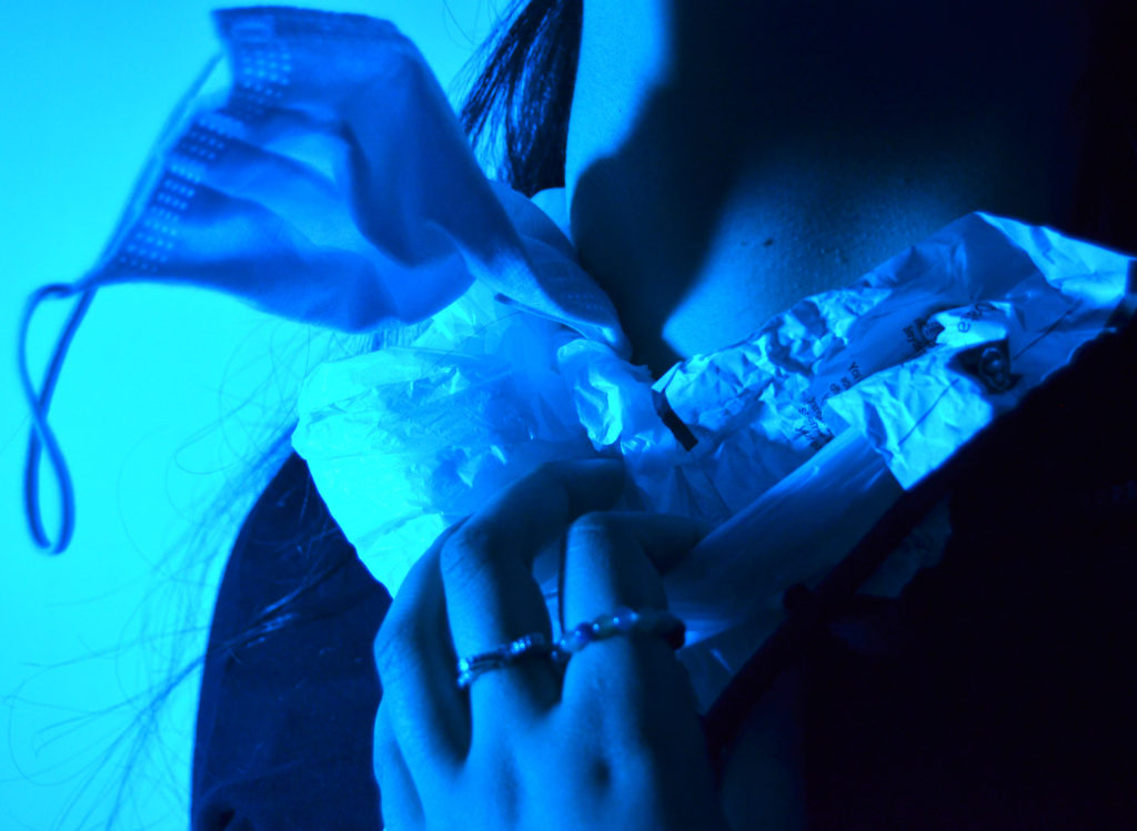
For this image I used a blue and green gel on top of my light which was on the highest brightness and had a slight warm tone to help the green shine through however I wanted it to be a cool blue to emphasise the coldness of the ocean and the the fact that humans can be seen as cold hearted since we are so careless with what we do with our rubbish. The blue background also helps emphasise the fact the image is focusing on the treatment of ocean life.

I liked the shadow that the mask created on my model’s neck as it helps represent the deeper parts of the ocean and that plastic effects them as well even though they are hundreds of miles deep. The shadow could also emphasise the fact that millions of creatures are dying due to plastic.

I used a mask in my image to show that the current pandemic has caused lots of damage to the environment. For example, many people have the disposable masks which can easily break, they’re also very light weight and if dropped, can easily float away out of reach and can land anywhere. Even the COVID 19 tests have plastic packaging which is only used once and then binned and destroyed.

I zoomed in to 35 mm on my camera and stood quite close to my model to ensure that her neck, which is getting strangled by rubbish, was the main subject. I wanted my model’s hand to be in the image to show signs of struggle and pain to further show that if humans were in this situation more people would want to help and stop what is going on. I also used a fast shutter speed and got my model to move her head and hands so that I could get a more realistic image.

I like the fact that there are a range of textures in the image. The mask, crumpled bits of paper and the plastic bag all have a harsh look to them which nicely contrasts the smoothness of the model’s neck. I got my model to keep her rings on her fingers to show that it’s not only large bits of plastic that are the problem.

There is a very cool tone to this image which I believe is good to help present the important issue. The blue and black colours in the image link to the saying ‘blue and black’ which is often said when someone got hurt and badly bruised. I feel like the colours in my image are a metaphor of how our world is slowly deteriorating and getting beaten till it will break.

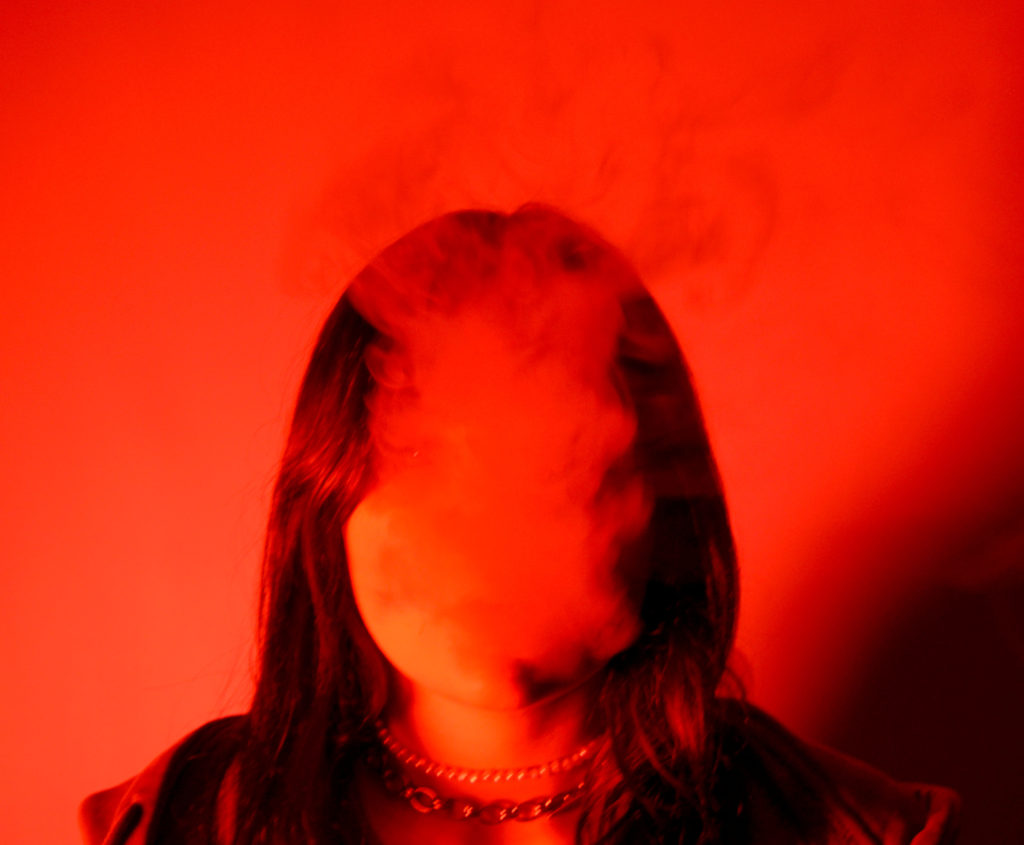
This image was taken to represent air pollution and the damage it does to our bodies. I used red LED lights for my main source of lighting as I wanted the image to be quite dark. I chose the colour red to help emphasise the dangers of smoking and also emphasise the fact that our air is slowly getting polluted by fumes from cars and industrial sites. The thick smoke represents the fact that the air we breath in isn’t clean and we are slowly damaging our bodies.

The smoke is in front of my model’s face to emphasise that we aren’t really seeing what’s happening in the world and that we are normalising things that should be changed. Smoking not only does it damage and kill your lungs, it is also putting a strain on the environment making the trees take in more CO2 and since trees are decreasing in numbers due to deforestation, we are getting less O2 in our atmosphere.

The image is blurred to represent the fact that the world is changing ridiculously quick. The image has quite a smooth texture all together. The smoke, because it’s so thick, helps smooth out the model’s face and when the smoke rises above the model, it looks like its a shadow on the middle of the wall.

The shadow in the bottom right of the image represents the fact that we are slowly beginning to change the the world for the better. It could also however represent the irreversibility of the damage we have done to our planet, and it is looming over us, slowly growing and becoming more and more apparent.

I used a quick shutter speed for this image as I wanted to capture the smoke at different stages so that I could pick the best looking images. Since the smoke is in front of my model’s face, I think that it allows the model to represent the whole world watching its planet get slowly destroyed. The smoke being thick also represents the amount of chemicals that get released into our atmosphere each day.

For this image I zoomed in at 25mm and stood about a metre away from my model which I think was a good decision as I wanted to focus on her face and above so I did a headshot and left quite a large gap above her head to allow the smoke to rise.

The chains around the models neck links to the fact that when you smoke you are slowly damaging your lungs and the chain looks like her airflow is being restricted which is what we as a community are doing to ourselves when we release harmful gases and chemicals into our atmosphere.

I chose this image because I thought that it looked like my model was praying for help whilst they were tied up with rubbish. I wanted my model to represent the struggle the animals go through, however I feel like this image looks like it represents the people who are noticing the damage that the animals are put through and they are pleading for help and for people to notice the harsh reality of what the world looks like.

The green lighting helps this idea of people wanting to help the animals who are in danger. Green is a colour often associated with life and new beginnings. I chose the green lighting to emphasise the fact that even though plastic effects oceanic life quite significantly, land creatures and the land itself gets effected equally as bad.

I asked my model to keep her rings on as I noticed that one of them was made from microplastics which are now known to be even more dangerous for animals as they mistake the plastics for things like small eggs or insects.

Final Analysis

I believe that my final images worked well with Carroll’s work since I used the same concept as him. However, I focused on keeping little things in the images such as jewellery and also wanted to use coloured lights to create more of an atmosphere and have a story behind it.

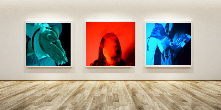
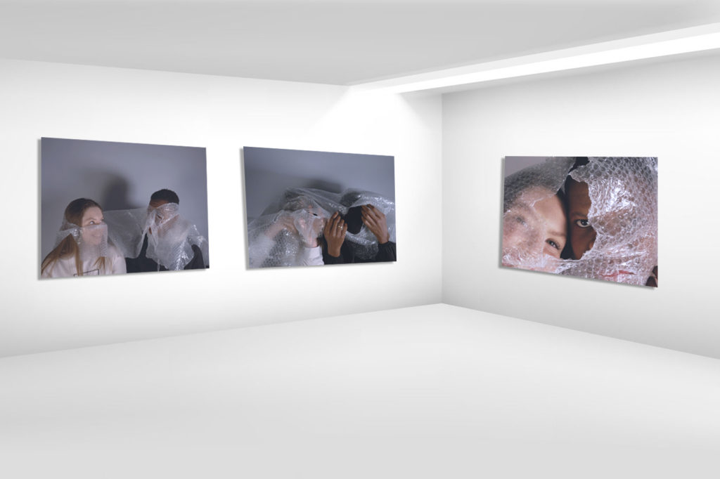
For my first gallery, I wanted to put the red image in the middle because it’s the most eye catching out of all three of my images. The red also has connotations of danger and I thought that it would be best to put that in the middle so that the viewer can subconsciously understand that the images are about the danger we are putting ourselves and our planet in.

The other two images next to it have a cooler tone which is less harsh than the bright red. Although they are cooler toned, they are more aggressive images due to the fact that people are tied up or are seen struggling.

For this gallery I wanted to do the same pattern as the one above. However, I wanted to show that the two blue images result in the red image. Where smoke takes over your body, and you put yourself in danger. Just like when people emit fossil fuels into the atmosphere we are damaging the planet’s ozone layer, and consequently putting ourselves in danger. The middle image could be seen as a warning, and the other two images is the world before things get permanently damaged.

anthropocene photoshoot 1

For my first photoshoot under the stimulus of Anthropocene, I have taken inspiration from Jeremy Carroll and Darian Mederos. I have chosen these two photographers as my influences as I believe that their own images are very thought provoking, and stimulate a very particular mood and feeling. In this photoshoot, I aimed to take the main principles of each artist’s images and use them to create captivating and interesting photographs.

CONTACT SHEETS

SELECTED IMAGES

EDITING AND EXPERIMENTATION – COLOUR

EDITING AND EXPERIMENTATION – CROPPING

Alexandra Bellissimo

Alexandra Bellissimo

Portrait of Alexandre Bellissimo

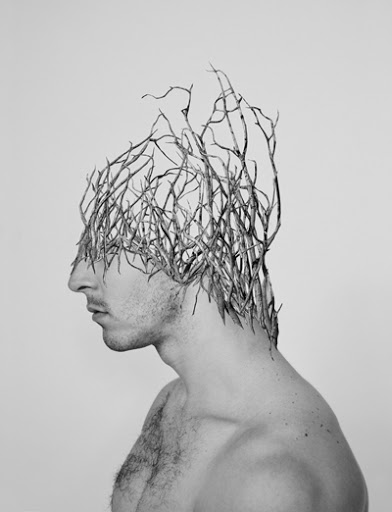
Bellissimo’s work extends beyond regular photography. Her work explores the physical and psychological relation between nature and human beings when combined through the use of collage. She precisely cuts out bits of different images and layers them together. Her work evokes a sense of empathy, intimacy and harmony while humans and nature coexist.

Images

For more of her work look at this website.

http://alexandrabellissimo.com/

Image Analysis

This image was taken in with a plain white background with white lighting; this helps the viewer focus on the model. The model has a hole where his eye should have been, the fraying around the eye shows that the hole was put there by force, just like how humans intentionally damage our world by leaving rubbish around. If you look closer at the hole in the eye, you can see there is a lighter section nearest the nose. It almost looks like bark. This shows the connection between humans and nature. When we damage nature we damage ourselves in the process.

The hole in the models eye could also emphasise the fact that we as a species ignorant and we are choosing not to notice the damage that we are doing to the world. However, the fact that the we can see the model’s other eye represents a glimmer of hope that we can change the world before it’s too late.

The model’s mouth is also slightly open which could represent that maybe the model wants to say something however is too afraid to speak up. He could also represent the people that are saying something. But because there’s such a small amount of people who aren’t afraid to speak up about these matters, compared to the population of the world, the small gap could represent the world’s view on their views and they feel like their view is insignificant.

anthropocene action plan

My idea for this controlled conditions is to focus on two types of photography; still life / object photography and portraiture. Through these types of photography my aim is to effectively and successfully explore and portray the stimulus of Anthropocene. The photographer’s whose work I have been inspired by are Jeremy Carroll, Darian Mederos, and Naomi White. I have chosen these photographers as I believe their images accurately convey the mood, feeling and tone of the photographs I am aiming to produce as my final piece.

PHOTOSHOOT PLAN

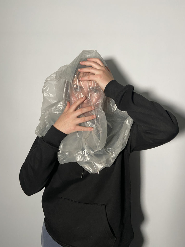
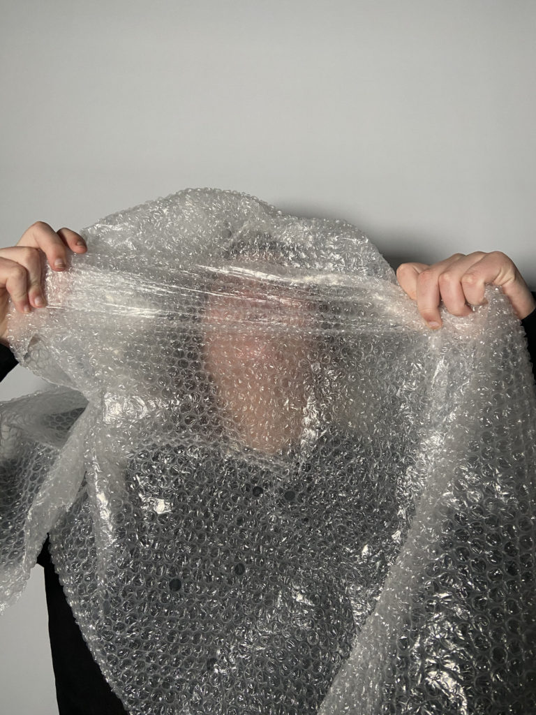
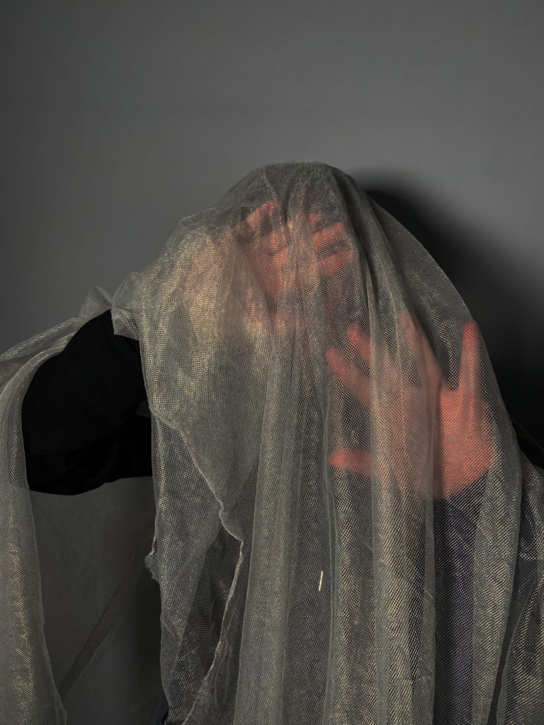
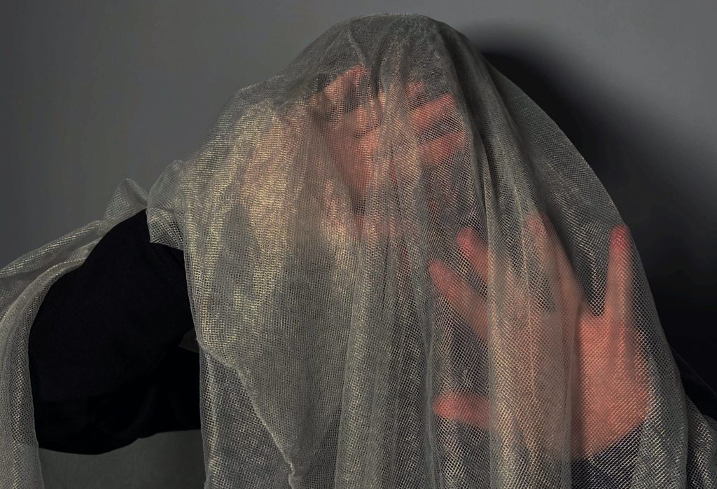
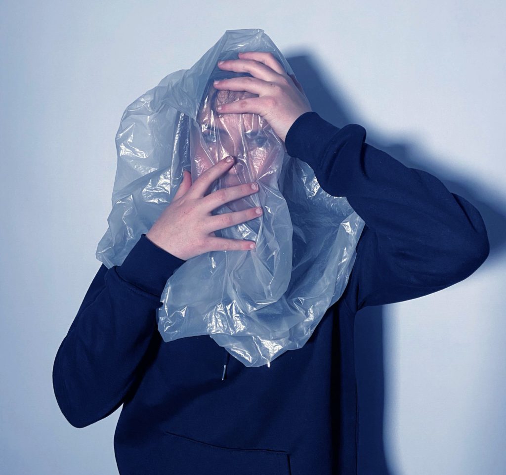
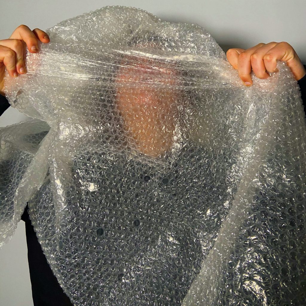
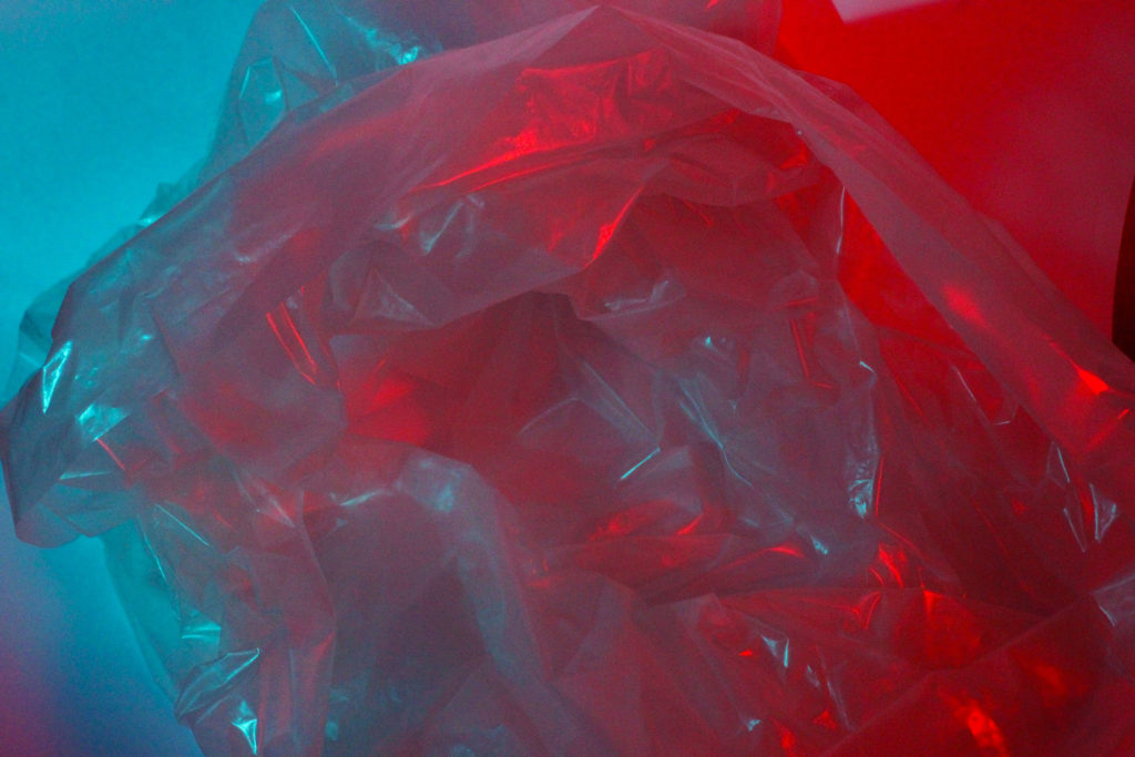
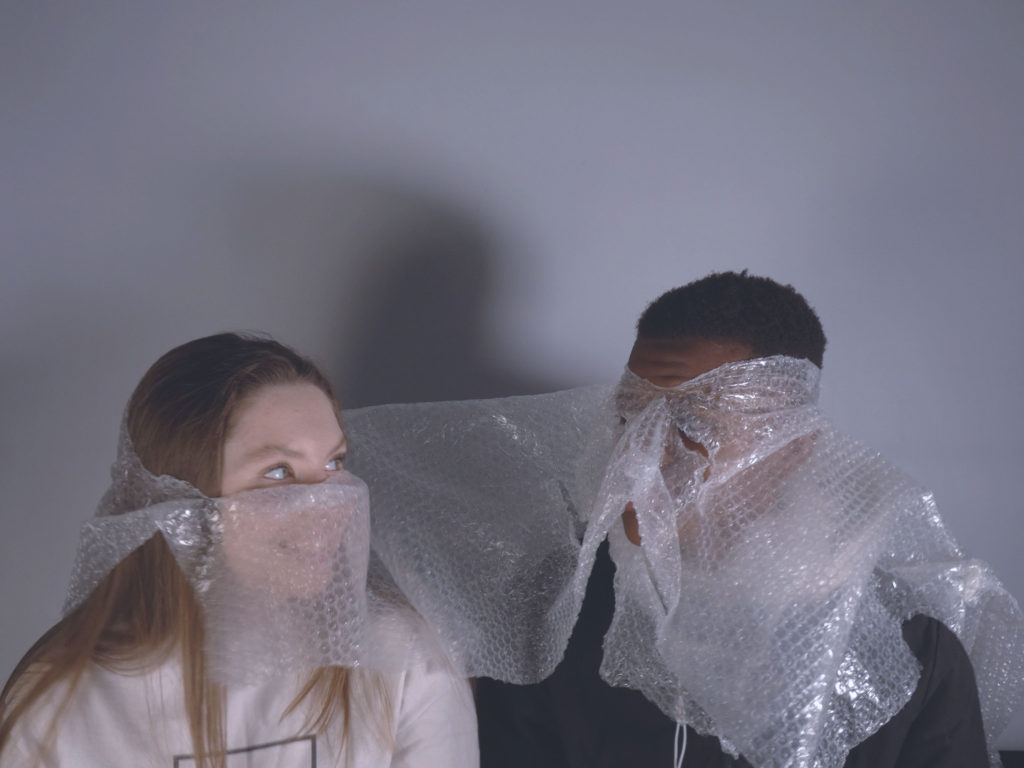
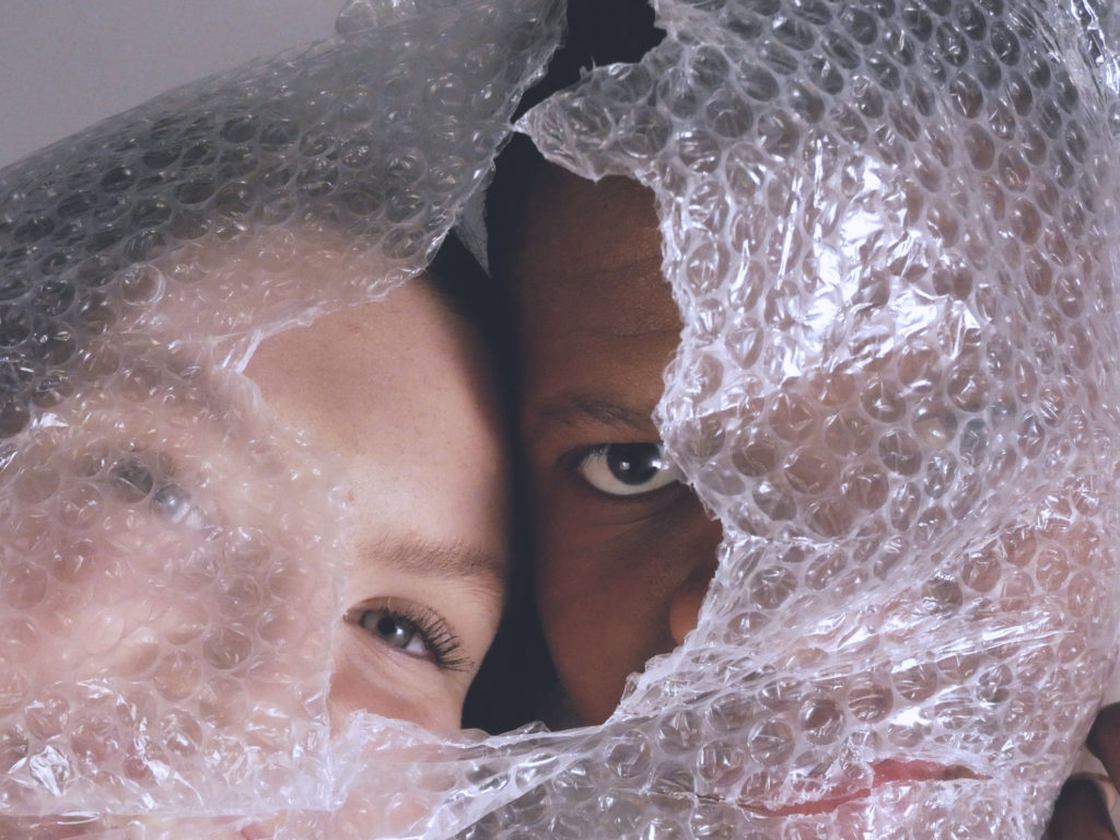
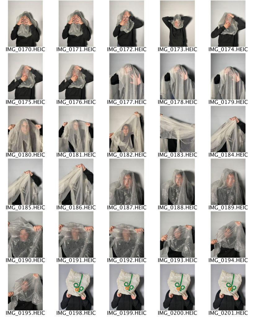
WHAT – For my first photoshoot inspired by Jeremy Carroll and Darian Mederos, I plan to take photographs of my subject covered in different objects such as plastic bags, bubble wrap, and netting in order to convey the theme of plastic pollution. For my second photoshoot, I plan to take photographs of plastic bags, inspired by the work of Naomi White.

WHERE – For both of my photoshoots I plan to take my photographs in a studio, in order to get rid of any natural elements in my images, and have them be completely focused on seeming artificial.

HOW – For my first photoshoot, I plan to use the plain white backdrop in the photography studio to give my images a formal and somewhat stilted feel, as I want the focus to be on the subject and not on the background. For my second photoshoot, I plan on utilising a different form of lighting and take my images from a bird’s eye view in order to create an unconventional aesthetic.

WHY – My overall aim for both of my two photoshoots is to capture images which reflect and draw inspiration from the work of Jeremy Carroll, Naomi White, and Darian Mederos, without producing an exact replica of their respective pieces.

anthropocene additional artist references

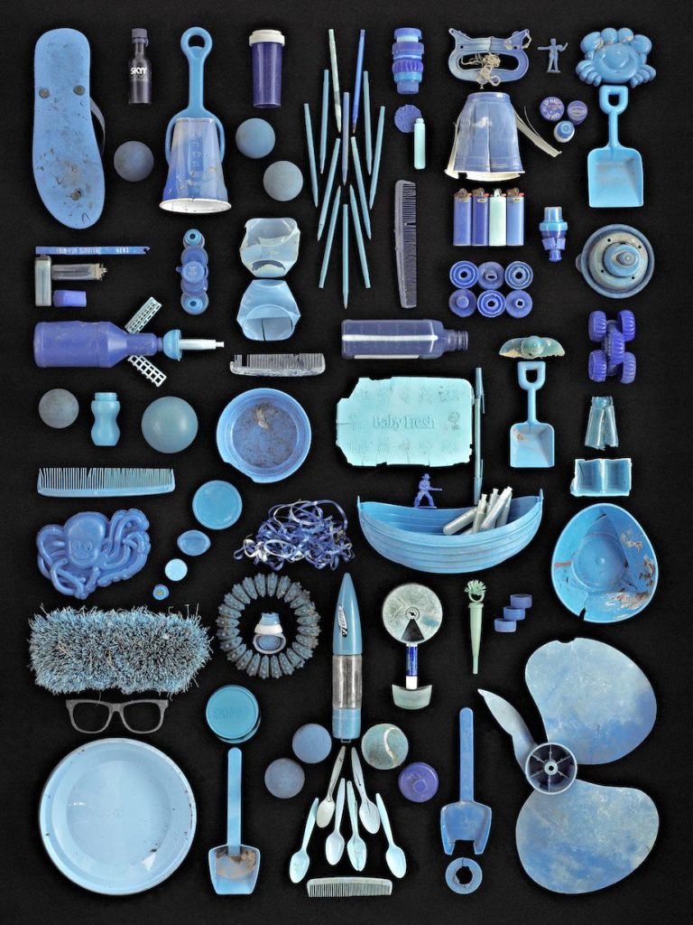
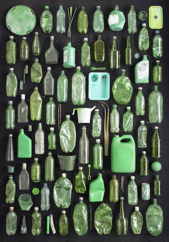
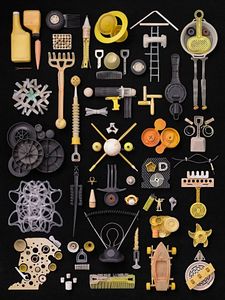
BARRY ROSENTHAL

Barry Rosenthal a fine art photographer and sculptor. He studied photography at the Dayton Art Institute in Dayton, Ohio and at the Apeiron Workshops in Millerton, New York with notable photographers Emmet Gowin and George Tice. “Found in Nature”, started in 2007 as an offshoot of his botanical work, has evolved from miniature collections of found objects into large-scale images that represent ocean borne trash. By using a combination of sculpture and photography and breaking down the found object trash into themes of type, color or whimsy, Rosenthal is able to bring awareness to the global issue of ocean pollution.

DARIAN MEDEROS

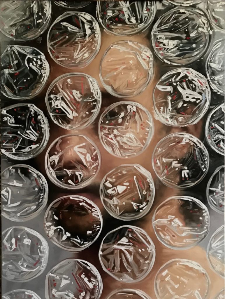
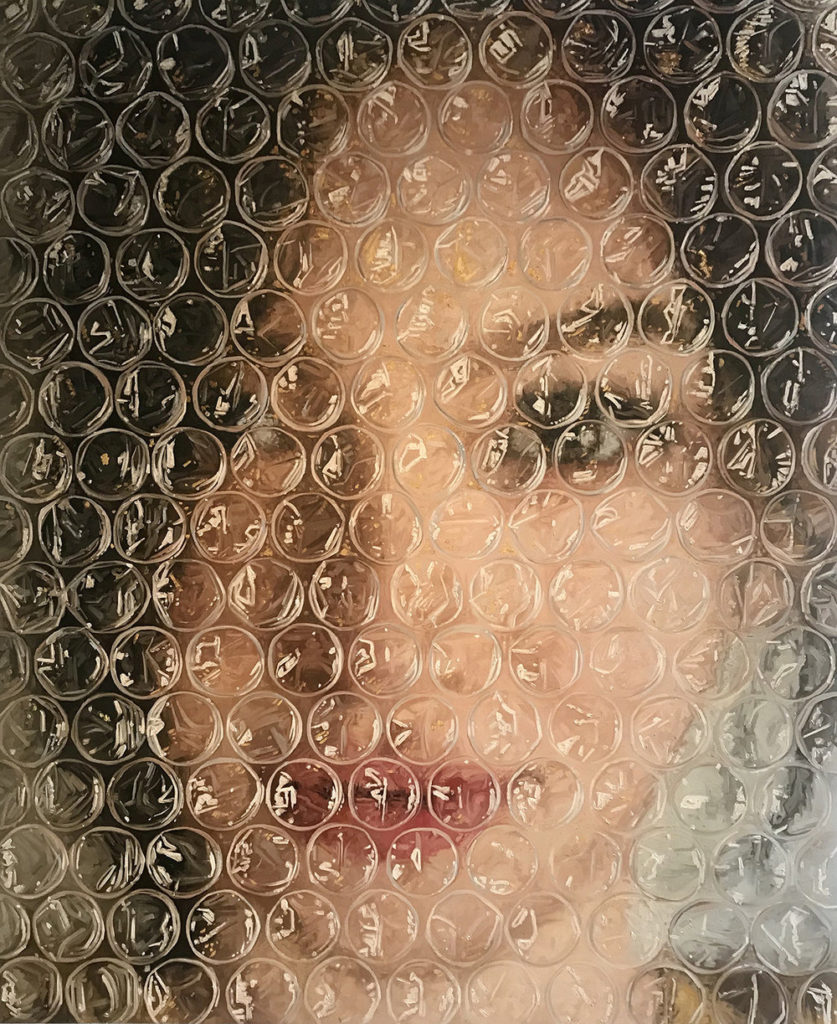
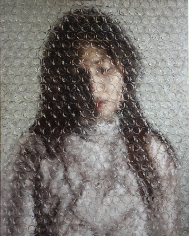
Cuban prodigy, Darian Mederos’ work focuses on the ubiquitous human face.  Emotive and replete with meaning, our faces encompass the vast human experience, revealing everything at once or nothing at all. Even in concealment there is nuance. Our expressions cross borders, race and culture, they are a common thread among humanity. Mederos attended his first two years of art school at Leopoldo Romañach in his hometown of Santa Clara, Cuba. Always striving to do be better, he applied and was accepted to the much-lauded, and oldest art school in the Western Hemisphere, La Academia Nacional de Bellas Artes San Alejandro, in Havana, Cuba.
Anthropocene Project Evaluation

Naomi White

Naomi White | Engulfed, Plastic Currents (2012) | Available for Sale | Artsy
“Engulfed” from “Plastic Currents” series – Naomi White (2012)
My work

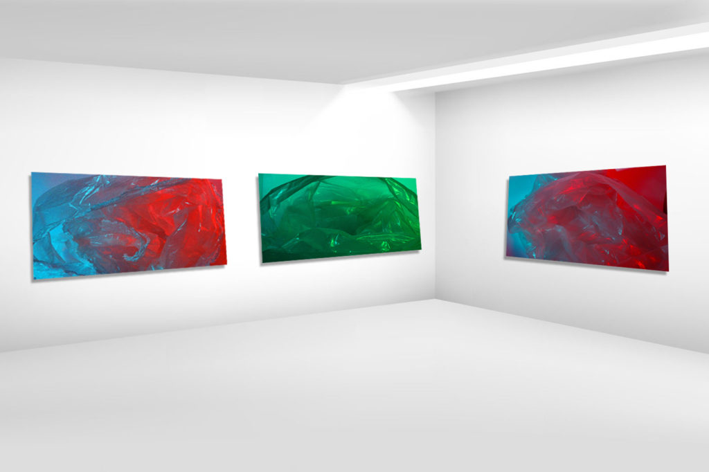
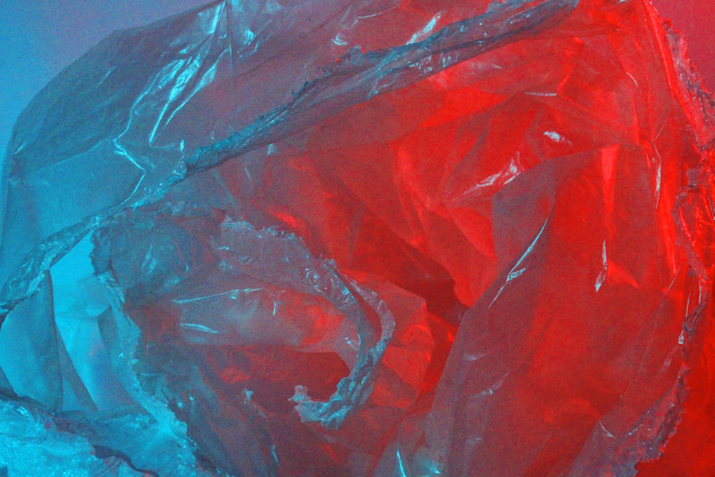
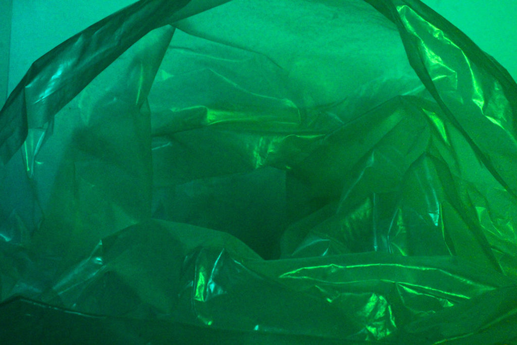
In my opinion, I think I was successful in creating work influenced by Naomi White for the theme of Anthropocene because although my work is not a complete recreation of Naomi White’s work, I feel like they have distinct similarities such as the use of plastic bags and contrasting colours, and the influence of White’s work can be reflected through my work. I decided instead of using the same, blinding white background to contrast a coloured plastic bag, to use coloured acetate over the studio lighting in order to achieve the same juxtaposing tones seen in White’s work. This is partly due to the lack of resources I had as I could not find a coloured plastic bag so instead I improvised and used a clear plastic bag and projected the colours using light. Furthermore, my work focuses more on taking photographs of the inside of the bag rather than the outside. I believe this decision allows for the abstraction of the images to be enhanced, as the photo is more ambiguous and the object cannot be recognised straight away.

If I was to have another attempt at creating my own work with the influence of Naomi White, I would prepare more in advanced to find a coloured plastic bag or use the same blinding background as seen in White’s work in order to achieve a clearer contrast of colours, rather than the opposing colours blending together. Also, I would take more images so I had a wider choice of photographs to choose from for my final pieces.

In terms of the theme of Anthropocene, I feel like Naomi White’s work has a distinct relation to aspects of Anthropocene as she uses a man-made and artificial material that is a crucial cause of both air and sea pollution to create art, this is why I chose her to influence my work as I also feel like she takes a more abstract approach to the idea of Anthropocene and how humans have made a negative impact on the environment.

Darian Mederos

IMG_1042.jpg
“The Wait” – Darian Mederos (2019)
my work

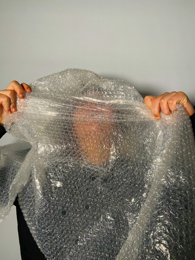
I believe that I was also successful in my attempt to produce my own photographs with the influence of Darian Mederos, as they both produce a similar message in terms of Anthropocene, although it is done in a more subtle way compared to Naomi White’s work. I think there is visible similarities between my work and the work of Darian Mederos, the most obvious being the use of bubble wrap in order to disguise sections of the face or body. Both my work and Mederos’ work have the same, cool-toned hues which I think assists to enhance the deeper message of the images. To add my own influence into my work I decided to rip holes in the bubble wrap to disguise only parts of the face rather than the entire body, aswell as using the bubble wrap in more of a physical way by wrapping sections of the face and body in the plastic material. I did this because I felt like by simply covering the lens in a layer of bubble wrap, my images would be too similar and when I use the plastic in a more invasive method, it allows for the theme of Anthropocene to be more distinct and spreads a message that because of humans mass-producing artificial materials such as plastic, we are simply harming ourselves aswell as our environment.

If I were to use Darian Mederos as an influence for my work again, I would maybe take a more personal approach to the photographs by adding more emotion to the images through the face of the model, rather than the blank expression on the models in the majority of my photos. I could also use an alternate background or setting in order to further the personal aspect of the images.

Although Darian Mederos’ work consists of paintings rather than photographs, I still think he is a suitable reference in terms of Anthropocene because Mederos also uses plastic within his art, which can be interpreted into alternate messages in relation to Anthropocene. I chose Darian Mederos as an influence for my work as his work focuses on portraiture, which I believe would give a wider variety to my final images overall. Anthropocene can also be seen in his work in a more subtle way than Naomi White’s work and his images are a lot more personal, and I think this furthers the idea of humans destroying themselves with their own creations.