CC – conceptual Realism

WHAT IS CONCEPTUAL REALISM?

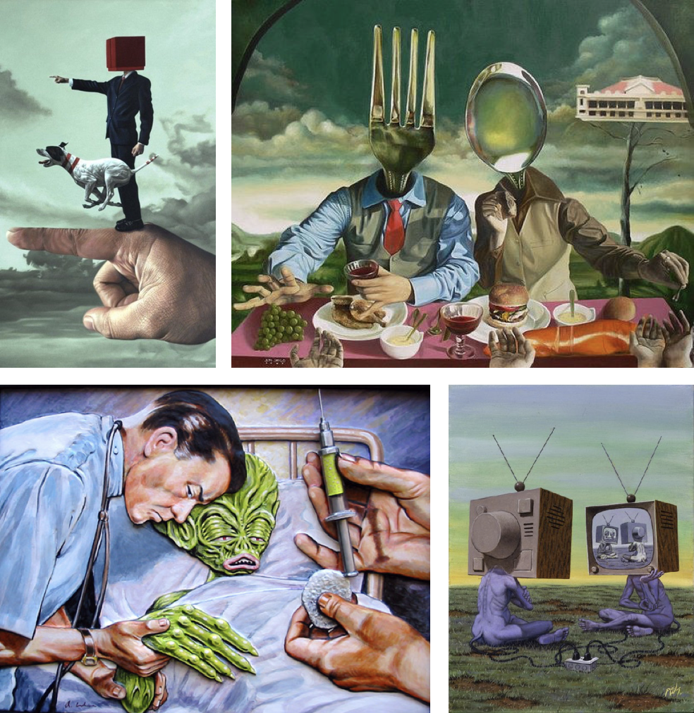
Conceptual realism is the theory that abstract universals, unobservable general classes or ideal types have a reality that is independent, equal and sometimes superior to the reality of their individual parts or specific examples.

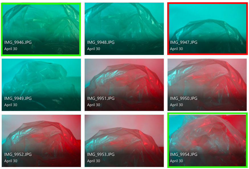
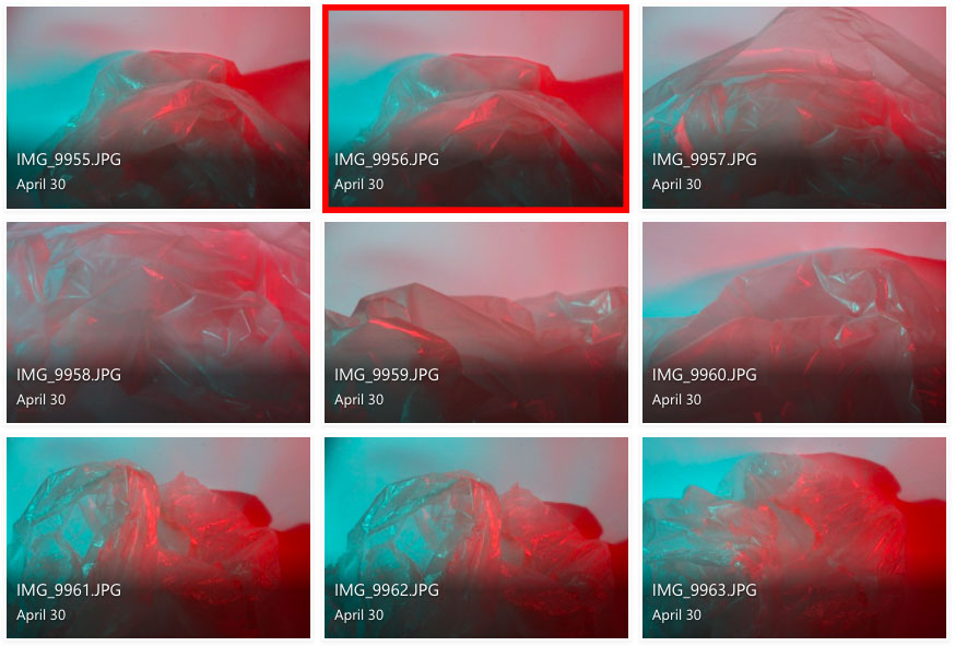
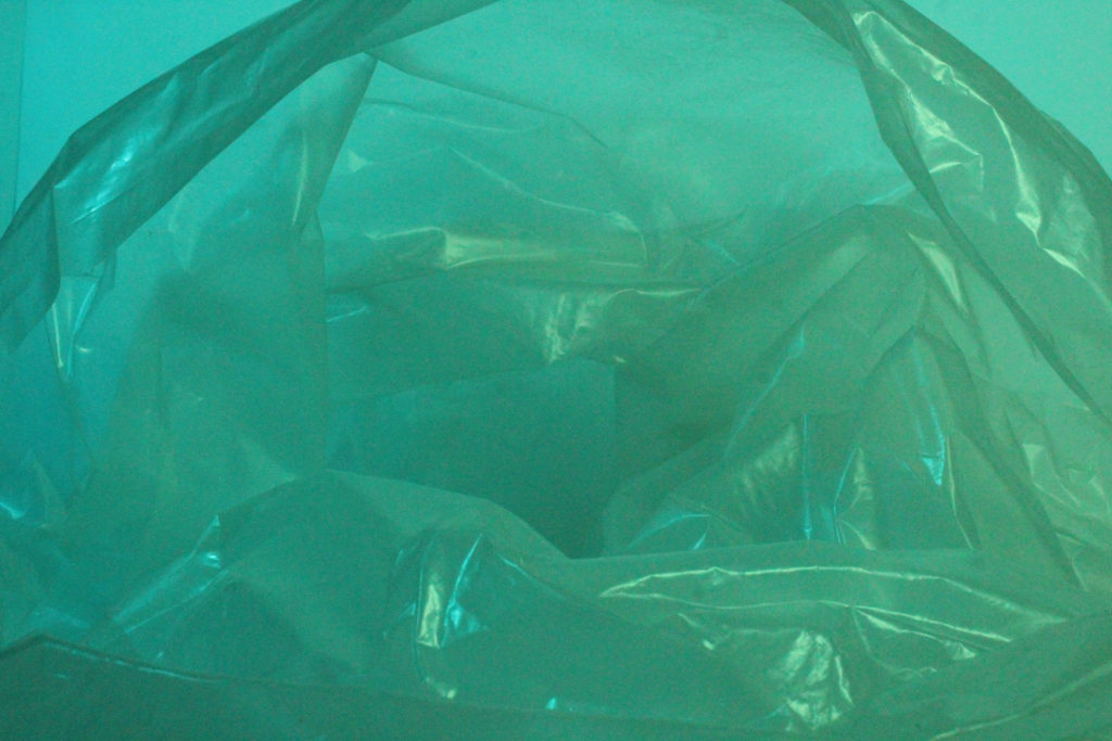
These images display the “abstract universals” to an extreme extent, almost what someone is imaging or a weird dream.

The first one shows how it can be almost realistic, and this is the style which I will base my main piece on, as well as Dillon Saw and Sebnem Coskun.

HOW IM GOING TO ACHIEVE THIS?

I my case, I am going to create a piece which visualises conceptual realism on the topic of plastic pollution. I will create a crazy concept promoting the negativity of plastic pollution, all whilst staying in the boundaries of when someone sees my work, they ask themselves, “Is that a photo?” and “Is this real?”

Naomi White inspired photoshoot (Anthropocene)

Photoshoot plan

Naomi White inspired photoshoot

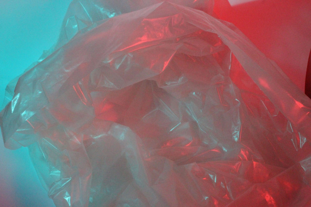
I feel like the images highlighted in red are my least successful images as the contrast in tone and texture aren’t as prominent and I just think overall these images are not as interesting to look at.

In my opinion, the photographs highlighted in green are more successful images as the contrasting tones are more enhanced within these images, and there is also a strong juxtaposition in texture. I feel like these images overall are better recreations of Naomi White’s work compared to my other images.

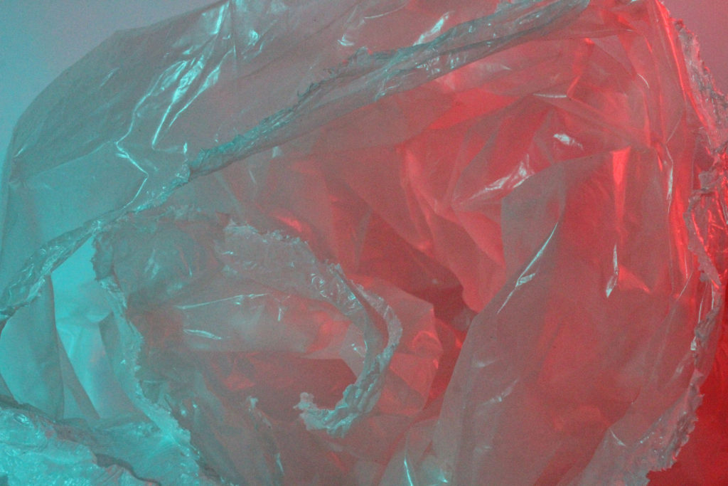
To edit these images I will further enhance the vibrant, contrasting colours to create an intense juxtaposition between colours.

Camera and light settings

To achieve these results in my photoshoot, I used bright studio lighting to create harsh shadows and highlights within the photographs. I also covered the lights with a layer of coloured acetate which reflected the colour off the plastic in order to project the juxtaposing colours and create a clear contrast.

I kept the camera on it’s manual setting and adjusted the shutter speed to a faster speed of 1/1000, the aperture as f/32 and an ISO of 50 as I wanted the image to be still-life and I didn’t want to capture any blurry movements.

My best images

Anthroposcene Introduction

The word Anthropocene is largely used in science and was a word given to our current geological epoch, being the stage in the geological time scale where humans are having the greatest effect on the earth in an environmental and climate viewpoint.

This word was adapted by a group of photographers who began to take initiative into creating a visual perspective for how humans effect the earth.

Anthropocene focuses on concepts such as pollution, recourse mining, urbanisation, deforestation, climate change and so on, all as a result of human activity.

CC – Sebnem Coskun – Anthropocene

SEBNEM COSKUN – (2nd Photographer)

Sebnem Coskun is an underwater photographic fine artist, who has recently won the first prize in Nature and Environment category and the finalist award in the Photographer of the Year. As for the category in which she won the award, it is the Asia category.

Coskun won the prize in Nature and Environment category with her image. In her image, she took a diver surrounded by COVID-19 waste in the Mediterranean Sea. So, she took this photo of a Turkish diver last year in the Bosporus Strait (similar to a river).

The goal for Coskun as a photojournalist was to raise awareness about plastic pollution in the seas.

This was the award winning photo :

A great success from Turkish photojournalist Şebnem Coşkun

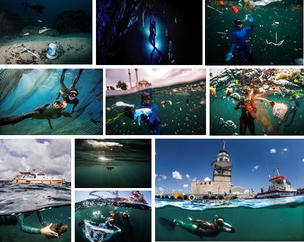
She has taken many other photos which visualise the plastic pollution in our seas.

SOME OF HER OTHER PHOTOS

ANALYSE

Coskun took this photo in Istanbul, Turkey. She quoted the UNDP’s World Free Diving Record-man Sahika Ercumen, who said, “I’ve been swimming between plastic more than fish in recent years in the Istanbul Strait”

The photo clearly and successfully visualises how much plastic there is in the ocean, by using a underwater dome for the camera. This way you can see under and above the water. This creates a nice contrast between the dark teal of the ocean and the bright white in the clouds.

The composition has been nicely executed, as the underwater part is the main focus it takes up most of the image, compared to the sky. The sky is partially blurred, although this does draw attention to the main focal point the plastic pollution.

There aren’t many vivid colours, except for the pieces of plastic, this helps highlights the main problem, as you notice it first.

Overall, I like the whole concept of the image, as it gives a whole new unique perspective. It successfully highlights Coskun’s main goal, which was to raise awareness about the water pollution as well as plastic pollution.

WHY I CHOSE HER?

Coskun has inspired me to follow her footsteps and create a piece which raises awareness about plastic and water pollution in our ocean. I thought it was a good topic as it is a big part of Jersey’s “lifestyle”, as we are on an island.

HOW IM GOING TO ACHIEVE THIS?

There are many ways to achieve this effect, such as :

Option 1 : I could actually arrange a diver to swim under water and I take photos with a GoPro or underwater camera. I could take plastic props and float/sink them under water (them clean them up after) or, edit them in the Photoshop. However, this is time consuming, could cost money and, the props might not work or the water could be too murky. So this may not be the best way.

Option 2 : I could simulate being underwater, for example, going to a studio, fill the room with a fog/smoke then make the studio light blue, to create the illusion of being underwater. Then hang the props from the ceiling with invisible fish line. Although, they would like they are hovering instead of floating. Also, it would not look identical to the ocean, but its is more creative.

Option 3 : Finally, I could create an almost 100% realistic image in Adobe Photoshop, I would take photos of coastal/beach features, such as, rocks, the sea, buoys, and boats. Edit them, and create an environment to put the images of plastic/rubbish into. Overall, I think this idea is the best, as I have experience at using Adobe Photoshop, and would be relatively easy to get images for.

EXPANSION ON OPTION 3 (FINAL IDEA)

For my final piece, I plan to have a half underwater/ half above water like Coskun’s image I analysed, the under water part would have lots of plastic bottles, fishing equipment (crab nets) and, other rubbish in, and maybe a boat in the centre of the image, as it would help the viewer work out the perspective of the image.

I would use the photos of plastic bottles, nets and other rubbish that I got from my photoshoots. Then, I would add them into the water, after I have made the landscape and sea.

For the underwater shot I would use an old photograph a fish tank/aquarium to get a clearer vision underwater (checked if I was allowed to use it first with Mr Cole), and the above water shot I would go to the beach. And finally put it all together in Photoshop.
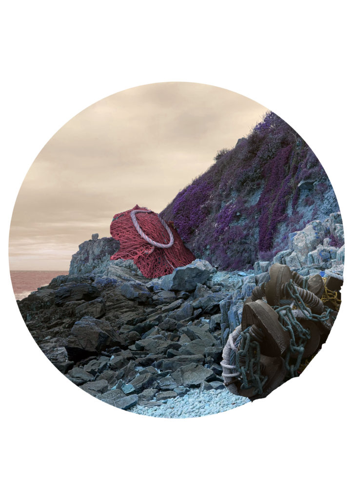
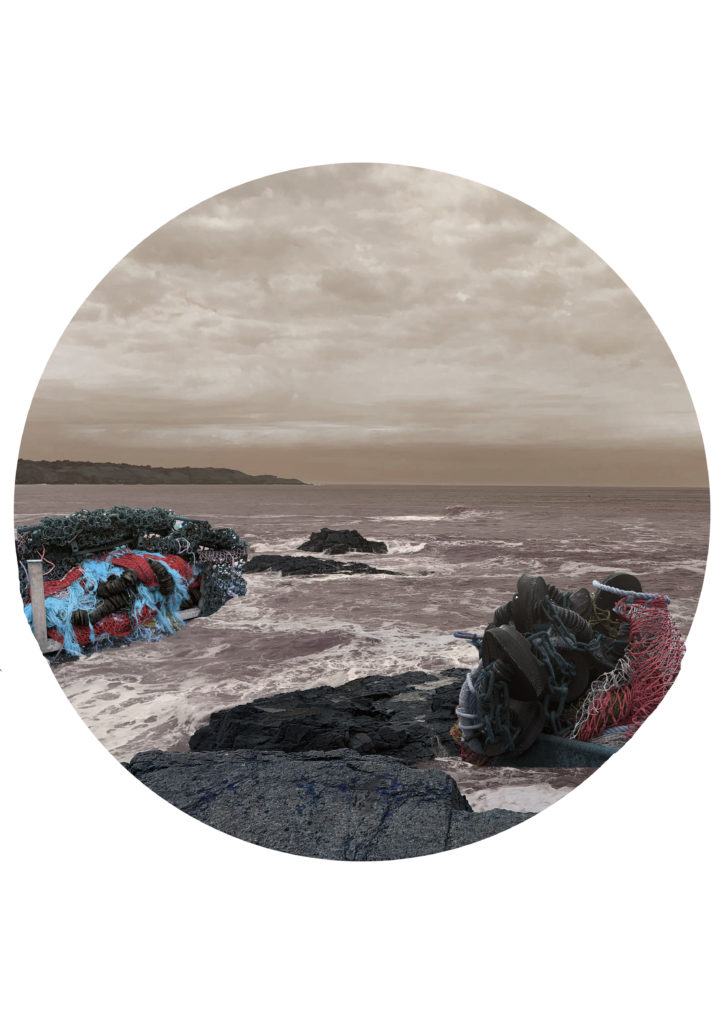
Anthropocene: Final Outcomes + Editing

Framing

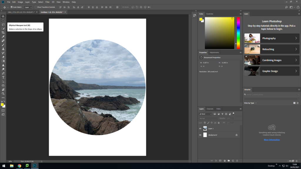
I wanted to incorporate Yao Lu’s style of framing and cropping the image because I like how it is different to the standard rectangular shape and adds a different aspect to the image. I used the Elliptical marquee tool to cut out a circle from the original image and transferred it onto a new plain A4 document.
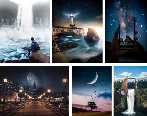
Photo Montage

A photomontage is made of an assembly of photographs cut and glued together physically or digitally, giving a photo a different appearance, by rearranging and overlapping photos to create a new photo.

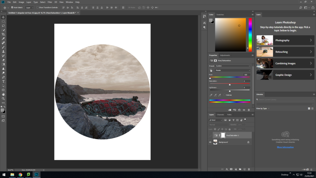
Before editing my photos onto the landscape I used adjustments to change the lighting to match each other. I used the quick selection tool to select what I wanted from the singular photos of the fishing nets and copied and pasted them onto the circular photo. I then used the lasso tool to clean up the edges and get rid of the parts I did not want.

Colour Adjustments

I adjusted the Hue so that the green and blue tones were warmer and appeared more red and yellow because I think that this works better than the original colouring of the image.

Final Outcomes

When the prints arrive I would like to cut them into perfect circles and present them all together as small circles in a square or in a row on the same board, rather than being on separate boards or individually framed.

case study- GEORGE MARAZAKIS

Greek photographer, George Marazakis (born in 1976 Creta Island Greece), takes Anthropocene as both concept and title for a series that looks at a new epoch engendered by the greed of mankind. He studied mechanical engineering and works for the Greek Ministry of Justice. In his series ‘A Cure for Anthropocene’ he says that an external observer could describe Anthropocene as an autoimmune disease attacking its own body. However, what it would consider as a disease is our very existence and the cure, the ecological movement, does not aim at the salvation of the planet but at the salvation of human existence on the planet. Humanity’s impact on the Earths geology is so crucial that the 11,650 years old Holocene, the current Geological epoch, is proposed to be replaced by a new one called Anthropocene, from the Greek word ‘anthropos’ for human.

Image Analysis

This image has been taken in natural lighting from what looks to be a slightly raised view that is far away. The image is somewhat dull as the grass is a pale green even where the sun is shining on it and the rest of the background is only filled with white and grey tones. I think this image shows Anthropocene well as it clearly shows a natural landscape of a cliff, however it has a man made math all the way down it as though it has been cut and scarred the landscape. This image is a perfect example of a small portion of humans impact on the Earth as most cliffs now have paths that have been purposely made or have paths that have been made by humans walking the same way constantly and the grass wearing away over time. I believe with Jerseys huge range of cliff path walks I can take images inspired by George Marazakis.

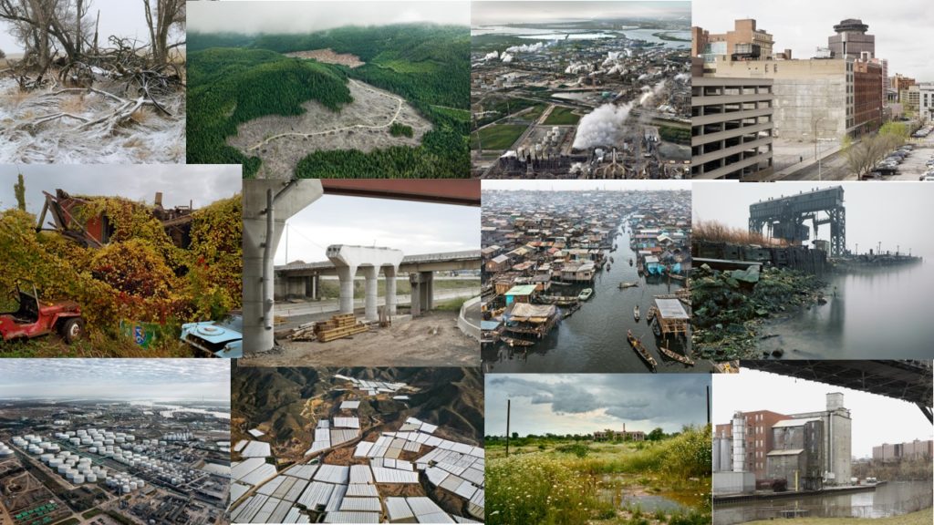
The New Topographics

The new topography relates to an exhibition by William Jenkins of stripped back landscape photos relating to the urban expansion of the 70s

Stephan Shore is a urban photographer known for his vivid, bright and colourful photography. His book, Uncommon Places documents his journey around America and gives energy to the most mundane objects such as gas stations and signs. This almost technicolour style is what I want to emulate in my own work.

West 9th Avenue, Amarillo, Texas, October 2, 1974

KEYWORDS

Retro, Old Hollywood, American, Desert, Warm, Grime

FORM

This photo is of a large sign in Amarillo, Texas. It appears to have been left in disarray and is a reminder of the Golden Age with the retro 50s font and light pastel colours that are once again popular. It seems like the sign is for a shop or attraction, evident by the wording, ‘OPEN FRI SAT SUN’. The vintage qualities of this image are further emphasised through the warm yellows of the landscape which instantly age it, connoting photos and other objects yellowed with age.

CONTENT

The photo was taken in the aftermath of the Watergate crisis, just 2 months after the resignation of president Richard Nixon. The dated and worn sign could be used as a metaphor for aging political practises and opinions. just like how old Hollywood and the golden era for film was ending. It was also taken at the time of the Chipko movement, peacefully protesting for conservation of trees. It could be argued that the contrast between the grimy sign in a desert wasteland contrasted with the minimal amount of greenery is reflective of this.

PROCESS

The photo book this image is from was taken on a road trip around america showcasing a variety of landscapes. Because of this a small portable camera with limited photography equipment was probably used to take it. Due to the brightness of the sun it is easy to hazard a guess that the photo was taken with an aperture of around f/22 with an ISO around 100-200

Urban Landscape photo-shoot

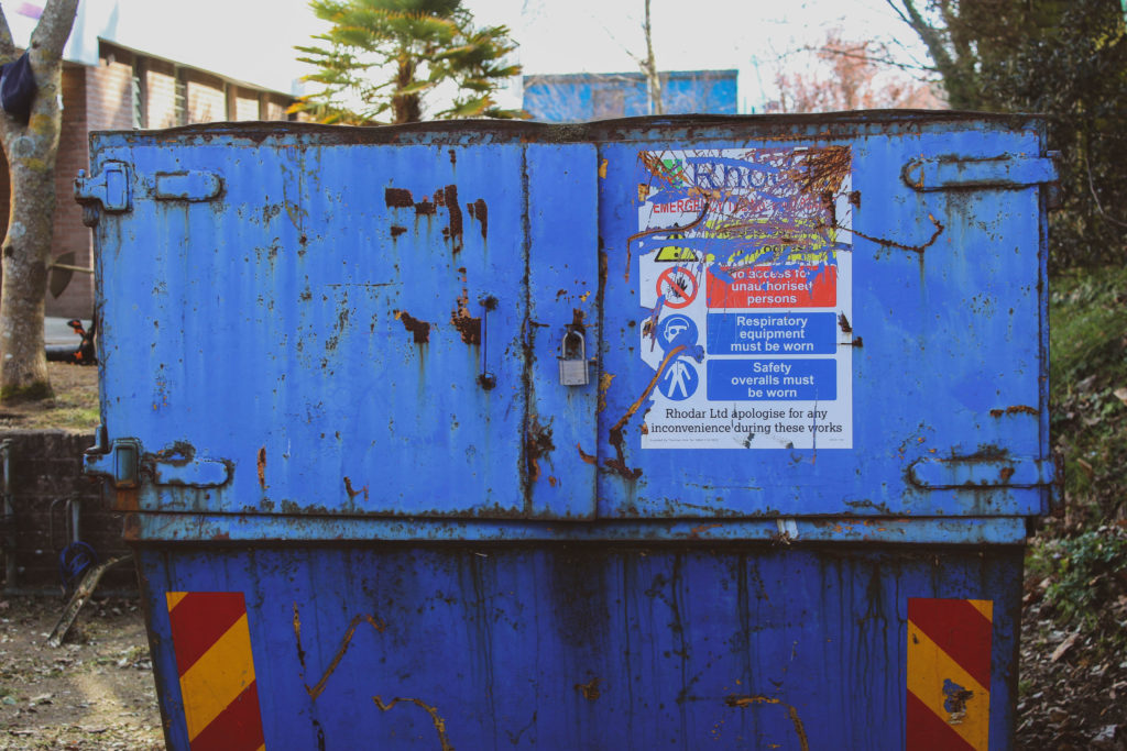
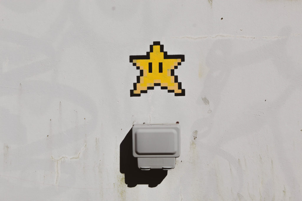
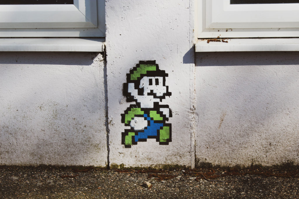
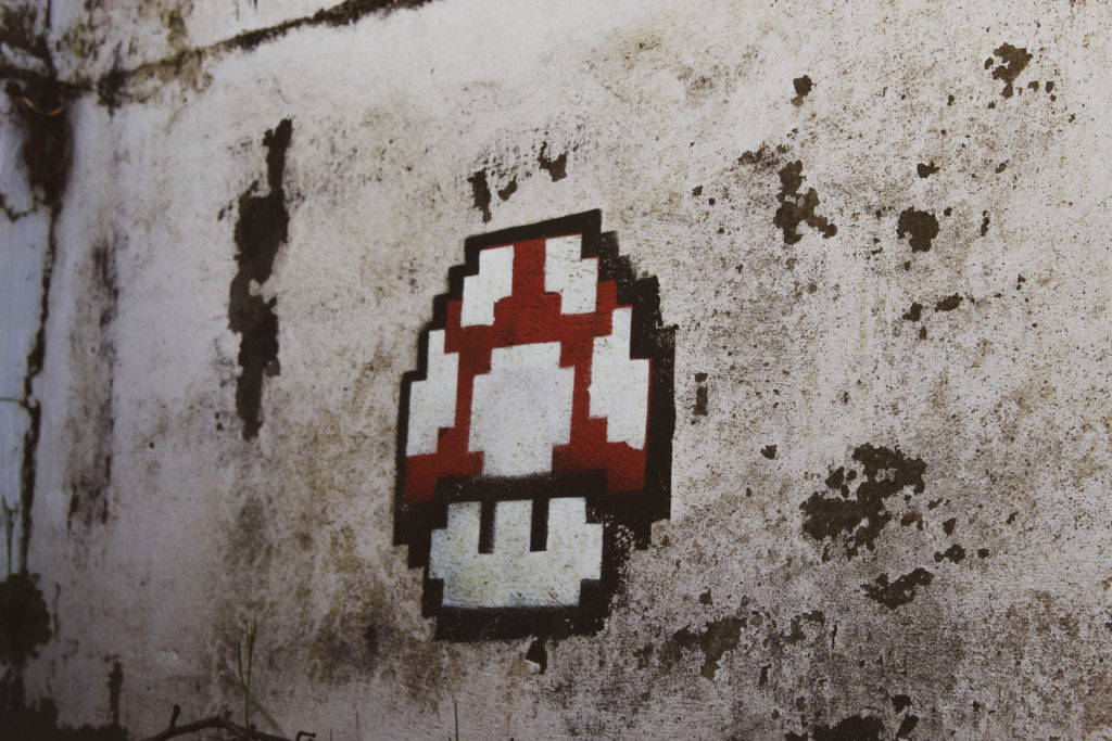
Urban landscape photography is the practise of taking images in urban areas e.g industrial buildings. I was inspired by the work of Stephan shore who’s nostalgic photographs of signage around America in the 70s really resonated with me. On this shoot I walked around the school campus finding areas of industrial build-up and also coming across graffiti from the video game Mario which I felt reflected Shores work.

For my photo shoot, I walked around the grounds of highland college as well as oak-field sport center and took photos of urban images that caught my eye. I saw a lot of colorful signs around the area and, on walking to Highlands college I found a lot of Mario graffiti that I feel added more character to my images. Based on this, and my study on Stephan Shore, I decided to focus on these signs and drawings for my project.

I used adobe Lightroom to create a more pastel toned colour palette which more closely resembled the work of Stephan Shore, the photographer my work is focusing on. This colour palette also created a feeling of reminiscence with its faded look.

I chose to display my photos in this grid format as it replicates the uniformity of industrial areas. I purposely centred the sign of the community centre as it is the central idea. The Mario graffiti is positioned surrounding the sign and complimenting each other with the directions moving.

On reflection I am pleased with this outcome but would make it sharper by doing more cropping to make the photos look more uniform

CC – Dillon Saw – Anthropocene

WHO IS DILLON SAW? – (1st Artist/Photographer. Altered Landscapes)

Dillon started taking photos to capture beautiful sunsets in full detail that his phone couldn’t. After, he shot mostly landscapes and city-scapes, although he also enjoys portraiture. However he creates unique pieces in Adobe Photoshop by manipulating photos.

This is his Website where he showcases his work and information.

This image has an empty alt attribute; its file name is image-51.png

WHY I CHOSE DILLON SAW?

The main reason I chose him was to incorporate his way of work into my work and final piece, with the photo manipulation.

Although, Dillon Saw also focuses on natural landscapes and views, such as waterfalls and space and photos of galaxy’s.

I plan to make a main piece focusing on water/plastic pollution pollution inspired by Sebnem Coskun, but in the style of Saw’s work.

After, I make the water/plastic pollution piece, and still have time, I will create a piece in Saw’s style. I plan to take photos of the stars, galaxy and the Moon, as well as landscapes to create a final altered landscape in Adobe Photoshop, inspired by Dillon Saw, as a secondary piece.

IMAGE ANALYSE

I chose to analyse this image as it displays the fantasy and surrealism aspect that I’m looking to incorporate into my work.

Firstly, this image was created in Photoshop, I estimate the amount of images used in this image to be 5-7. Starting with the hills (maybe the hills in the foreground +1), possibly the tree, the birds, the sky, the Moon, and the stars.

Saw has positioned the two main elements along the vertical centre line, the tree and the Moon. This creates a focus on mainly the moon as the sky takes up most of the image. It being on the centre line allows the moon the take up a larger space in the image, which shows that Saw has thought about composition. This creates a theme and mood, which is a space/galactic, that can come across as calming.

Keeping the calming aspect, the dominant colours being blue and purple is its own dynamic in itself. The colour purple is often associated with power, mystery, and grandeur which links back to space and the never-ending universe. The colour blue represents faith, confidence, and loyalty, which has ties to the planet that we live on, that we see everyday, and are familiar with. The combination of blue and purple creates a sunset/evening scene that shows the transition to night fall that exposes the view into space.

The moon having pointed ends and being brighter then its surroundings, it draws attention to itself and separates it form the calming environment, which is full of natural lines, therefore it contrasts with the prefect curves of the moon. Making the moon the main focus. This creates an uneasy feeling as space is the main focus. The fact that it is in a surreal/man-made, created environment can cause people the think how much of space is unknown, and how we will never know 100% what is out there.

Anthropocene – Mindmap and Ideas

Anthropocene Moodboard

Initial Ideas

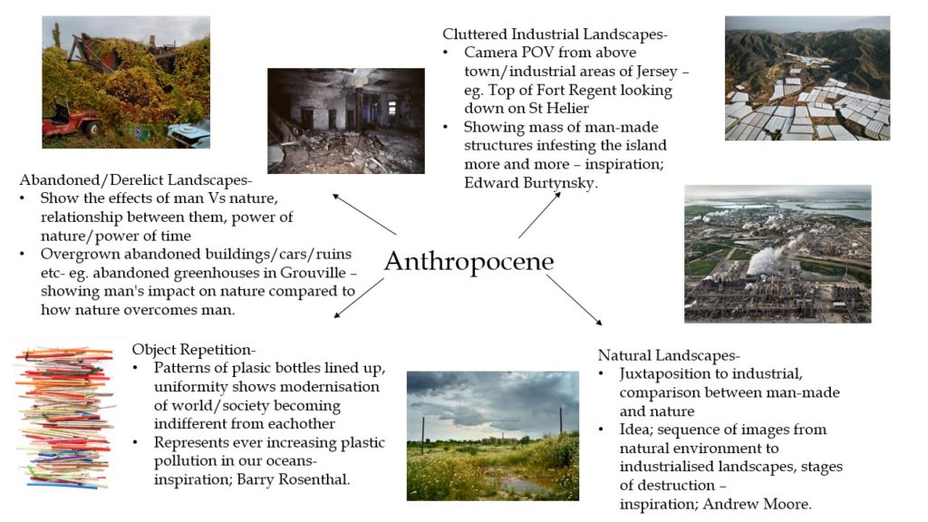
After researching different object, portrait and abstract photographers and analysing their techniques to portray ‘Anthropocene’, I have decided to focus my project on landscape photography as I would like to demonstrate how man-made structures are increasingly impacting our natural environment. I plan on capturing landscapes around Jersey in three different stages; the first highlighting the beautiful natural areas in reservoirs and woodlands, the second showing areas of Jersey where nature can still be seen however man’s impact is taking effect and the third exhibiting the cluttered industrial landscapes of our island. My concept is to produce three final images in a sequence, with each image showing the increasing levels of environmental destruction and foreshadowing how a future of mass industrialisation is growing closer every minute.