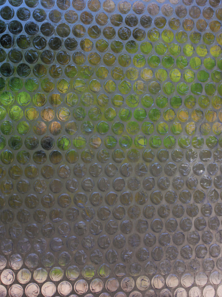
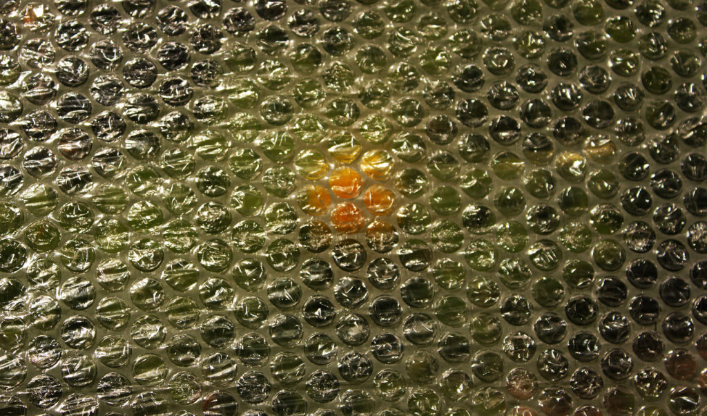
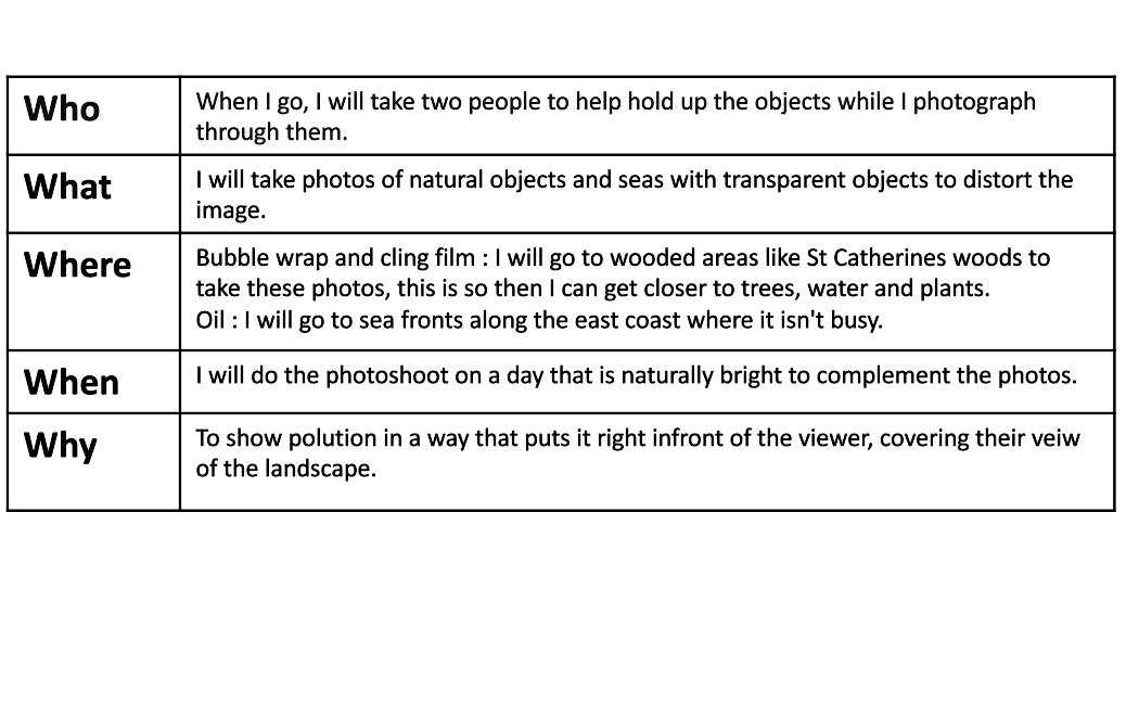
Planning and Preparation
Contact sheets

Choosing and Editing
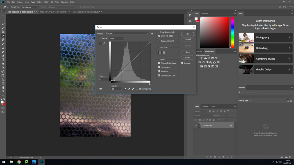
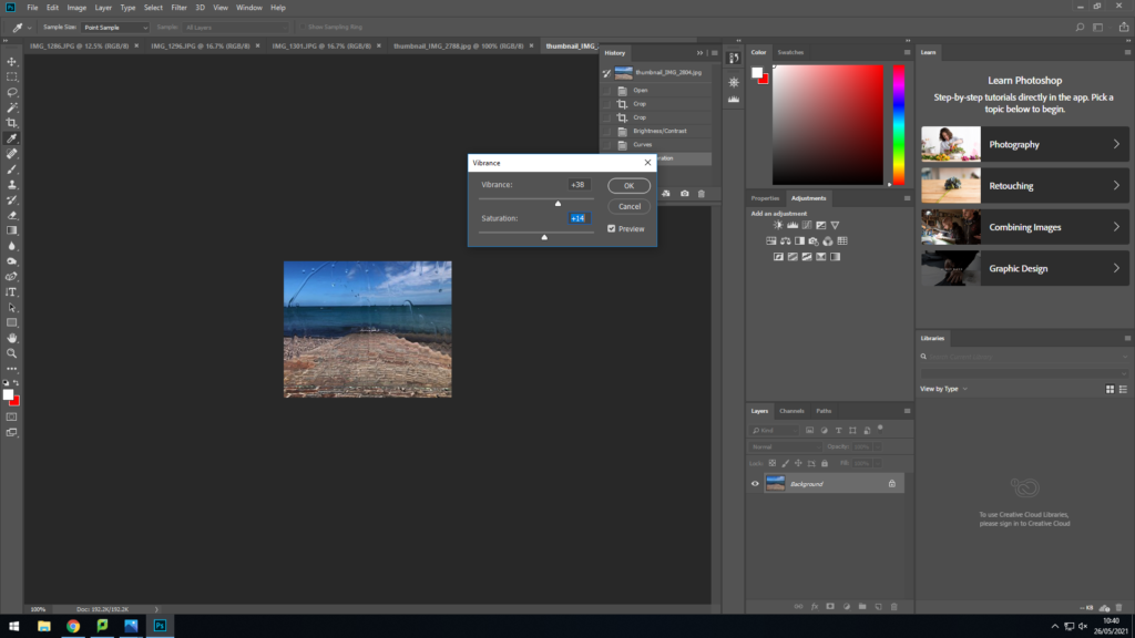
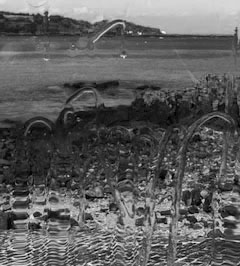
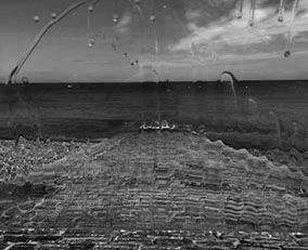
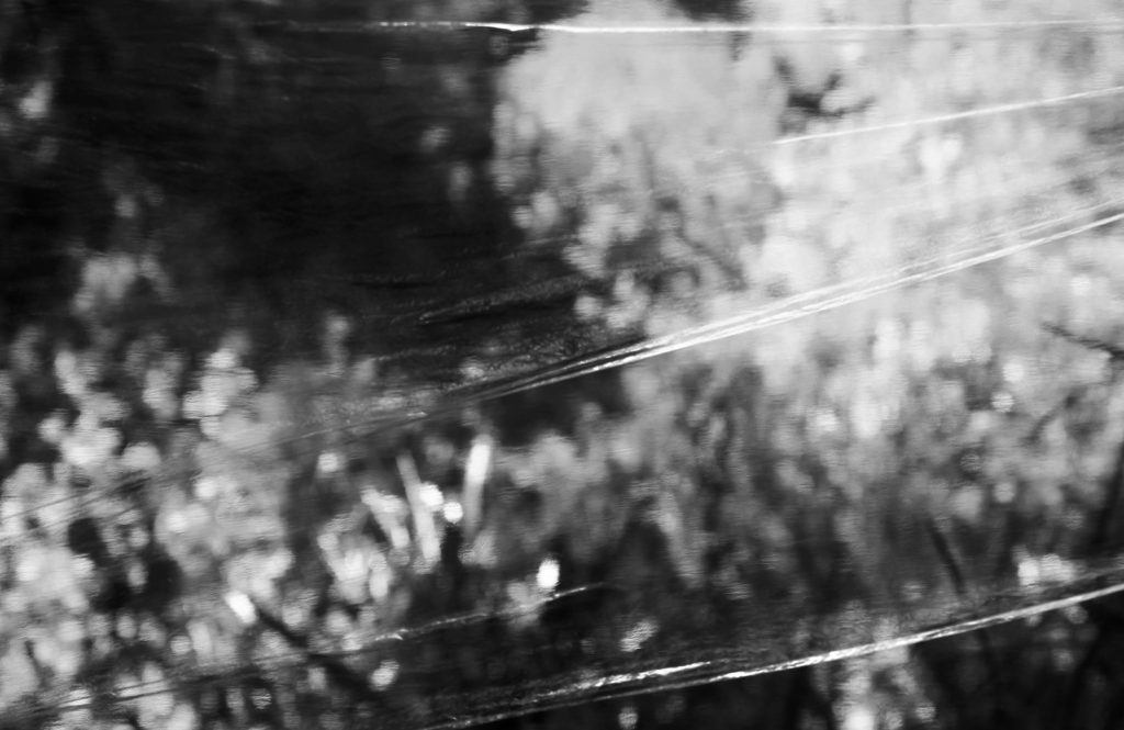
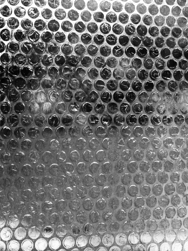
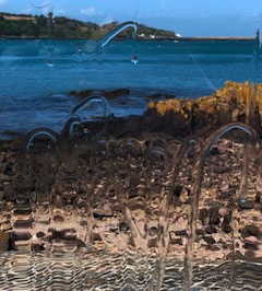
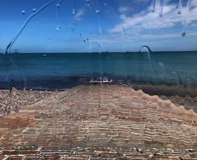
Once I selected my best images from the various techniques, i used various tabs to edit all the photos, supporting an emphasis on the foreground distortion and creating a clearer contrast.
Experimentation
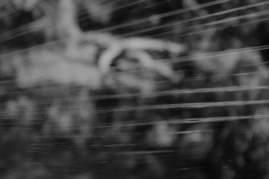
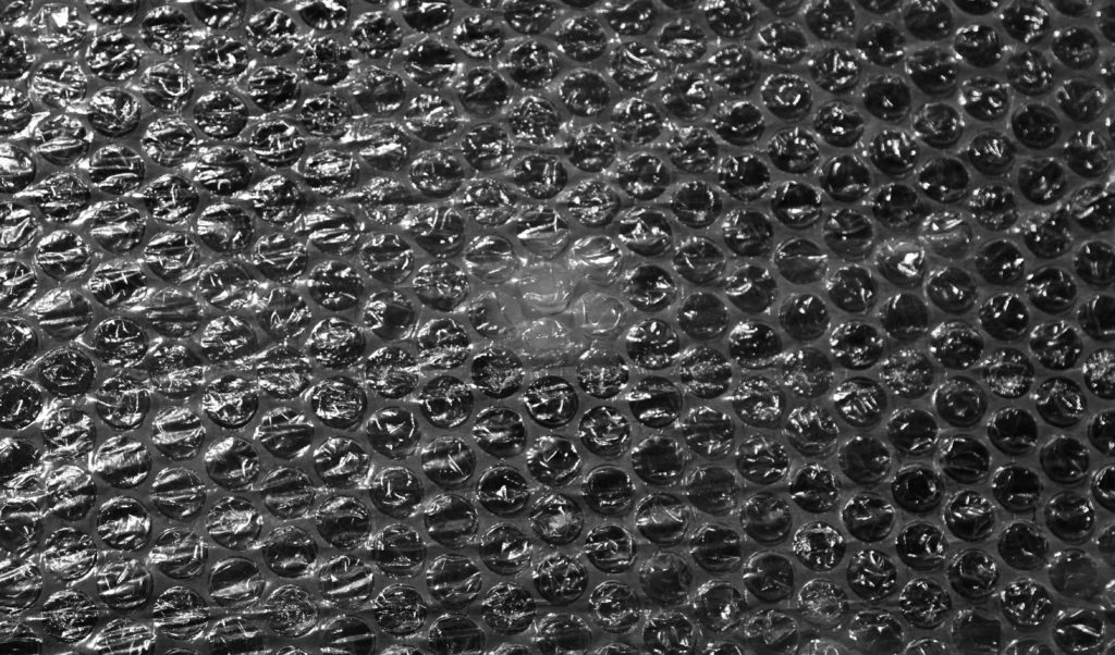
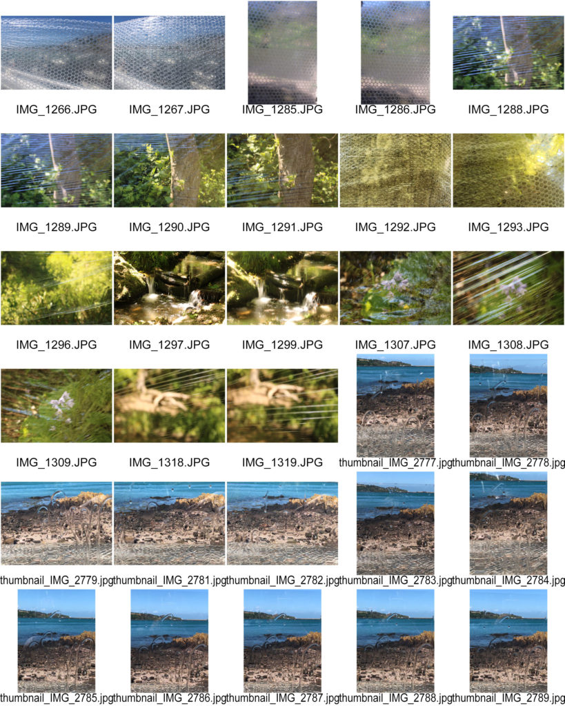
When looking at the photos on the contact sheet, i was afraid that they didn’t go as planned and be really blurry and practically useless, especially with the bubble wrap ones. However, i feel like i did a good job in editing to bring them out more, which i am very happy with. I think my favorite technique is the oil running down glass. I feel that this looks the most
I chose to keep the photos in colour as i find that in black and white, its harder to see the background and it seems too difficult to make out the message i wanted to send with these photo. i also feel like the coloured photos are better as they create a more eye catching and appealing background. However, the black and white photos have more emphasis on the materials in the foreground, making them look more clear and crisp and therefore more effective when coming to presenting how plastics harm and cover the planet.

