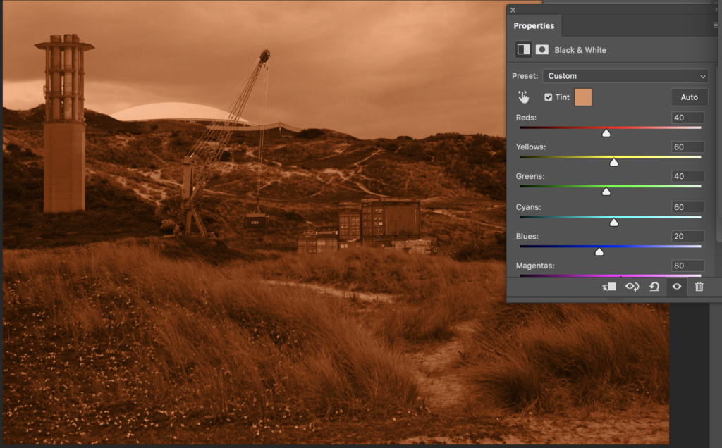
Here I have Started to experiment with the editing process, in which I will use to create a piece similar to Felicity Hammond’s, by creating a rough edit of industrialism in the natural landscape. Below is the initial collage that I will use to try out different methods of editing, with my aim to create work similar to Hammond’s ‘In Defence of Industry’ series.

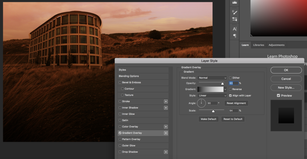
After putting a together a quick example of what my final piece may look like, I then attempted a few different ways of creating an orange tint over the photograph, again replicating Hammond’s work. Firstly, I edited the image first into black and white, to allow for a sepia style tint to be applied over the top of the image. I also attempted to achieve this orange hue by placing a solid colour as a layer over the edit, and then selecting overlay as a blending option. This style allowed for some of the colours in the image to show through as well, without it being all one tone. Finally, I tried including a light gradient overlay, to darken the bottom half of the image, which I believe could allow the viewers eyes to be eased into the altered landscape.
In addition to this, I also tried to experiment with editing in the style of Tanja Deman’s work, focusing on one single urban structure. I put together this rough edit to try to replicate her style, in which the urban structure largely contrasts with the surrounding nature. By doing this I am also allowing myself to have a clear idea of how I will produce my final products within the controlled conditions.

Initially, I started off by converting my altered landscape into black and white, adjusted the levels of the tones of colour, due to the fact that all of Deman’s work are presented in black and white. However, I then added an orange tint and gradient overlay, trying to see what it would look like if I were to combine the two photographer’s styles of altered landscapes. This produced what appeared to look like a slightly apocalyptic landscape. However, In my controlled conditions I will keep these type of edits in black and white, as it links more closely to the photographer.


