comparative analysis

Key PhotographerYves Marchand & Romain Meffre

Their Image

My Image
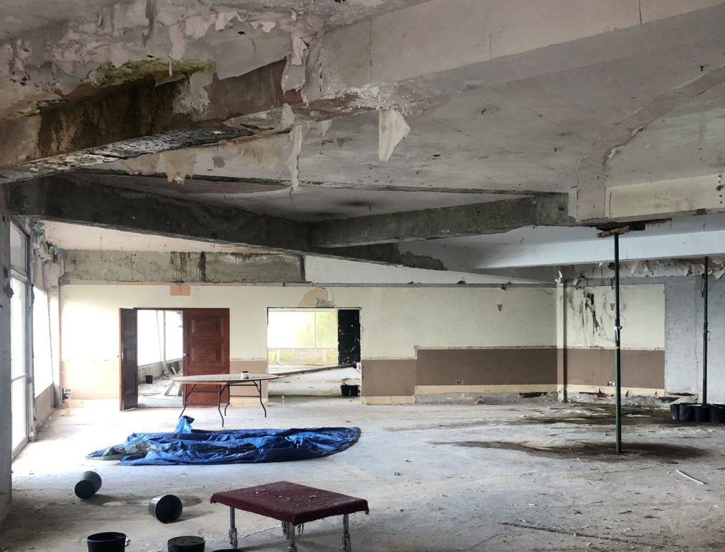
For this photoshoot I took a lot of inspiration from Yves Marchand and Romain Meffre. A key similarity within these images are that they are both taken horizontally, they also are both mostly empty rooms. Another similarity between these images is that they are both very tonal dull images with the only colour being the tarpaulin on the floor in my image. Both images are taken in natural lighting which can be seen coming through the windows in both images. The interior of the buildings in both images are also very clearly abandoned as an extreme amount of ceiling tiles have fell out of the ceiling in the first image and the ceiling is decaying and dripping water in the image that I took. A difference with these images is that the first image has been taken straight on of a rectangular room and my image is taken at an angle of a more geometric room. In the first image the room is also less bright as it is a bigger room with smaller windows. In my image the room is well lit and bright as the whole unseen wall is full of large windows. In both images there are abandoned items, as seen in the bottom right corner of the first image and the left side of my image. I believe that with the inspiration I got from Yves Marchand and Romain Meffre I took a lot of images that well represent Anthropocene.

Shoot 2 Comparrisons

For this photo shoot I took inspiration from both Lilli Waters and Jeremy Carroll. I used this to create Anthropocene themed images with features from Jeremy Carroll with a colour scheme and overall feel of Lilli Waters work.

The 'primal' photography of Lilli Waters is defiantly repairing her past —  art thy neighbour
Lilli Waters
Jeremy Carroll
My Image

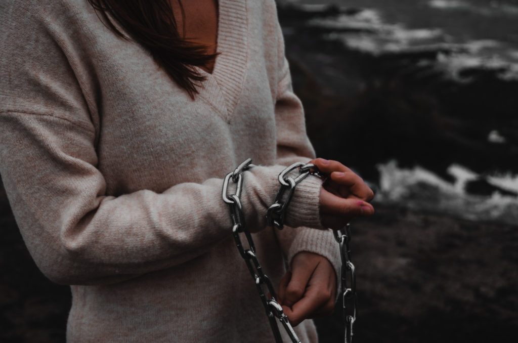
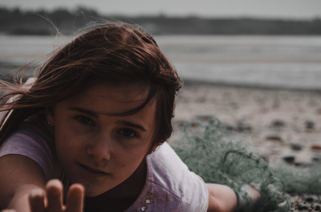
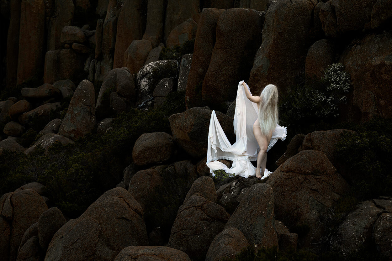
My image, as well as Lilli Waters image was lit with natural lighting on an overcast day. My image is framed closer up than Waters image and us using an aperture of about f.4, Where Waters image was taken from further away with a wider view of the background, also using a more narrow aperture to keep everything in the frame sharp and in focus. Like the first photo shoot, the shutter speed was fairly fast because of the bright natural light and movement of the subject in both images.

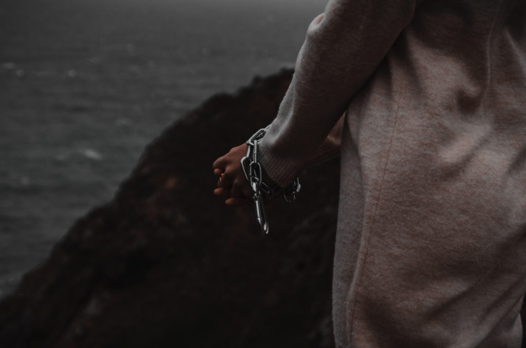
I used a similar colour palette as Lilli Waters by having the subject wear light coloured clothes to contrast to the dark earthy coloured background. I used the concept of the subjects hands being trapped from Jeremy Carroll, but used chains instead of bright coloured plastics to match with the colour and feel of Lilli Waters work.

This image represents how humans are endangering marine animals because of the chains restricting the subjects hands. The ‘marine’ aspect is displayed through the location of the photo shoot seen in the background of the image.

CC – Experimentation and Final Images

Idris Khan Inspired Experimentation

Idris Khan (b. 1978)

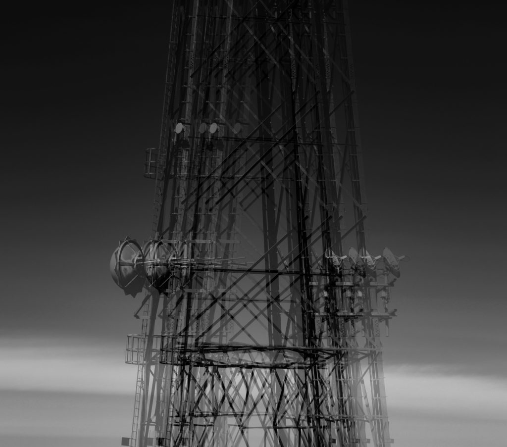
Idris Khan is a British artist based in London who takes different social and political constructed and creates densely layered images from them. I like the way he does this because it resembles a ghostly image or a piece of art that has many construction lines.

My First Interpretation

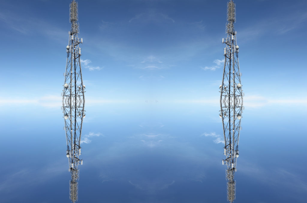
For my first interpretation, I duplicated the tower and copied it. The outcome of the first interpretation was good however it was quite simple and did not resemble Idris Khan as much as I wanted to.

Second Interpretation

The second interpretation was much more successful than the first one, however it is still in colour and some parts are more detailed. It looks similar to Khan’s work but I need to make it black and white and try to make it resemble the ghostly feel of Khans.

Final Interpretation

The final interpretation is above and I believe is successful in resembling Khan’s work. The image is black and white and has a good tonal contrast between the lighter layers and darker layers. It resembles the ‘ghostly’ feel of Khans work and I am interested in the way his work is done. I would like to do it again in the future.

Photoshop Experimentation

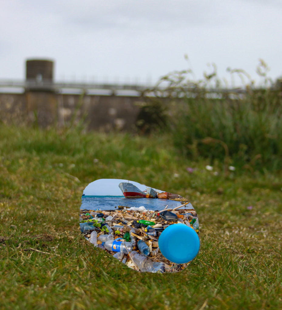
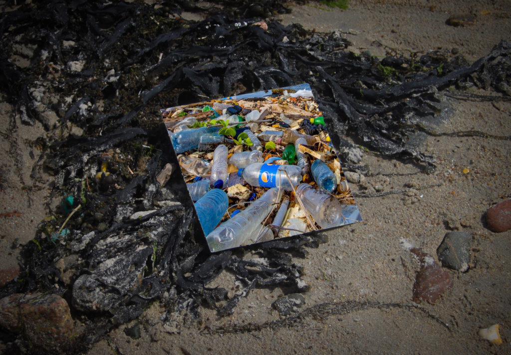
I attempted to experiment with Photoshop and photo montage in relation to my images inspired by Andy Hughes.

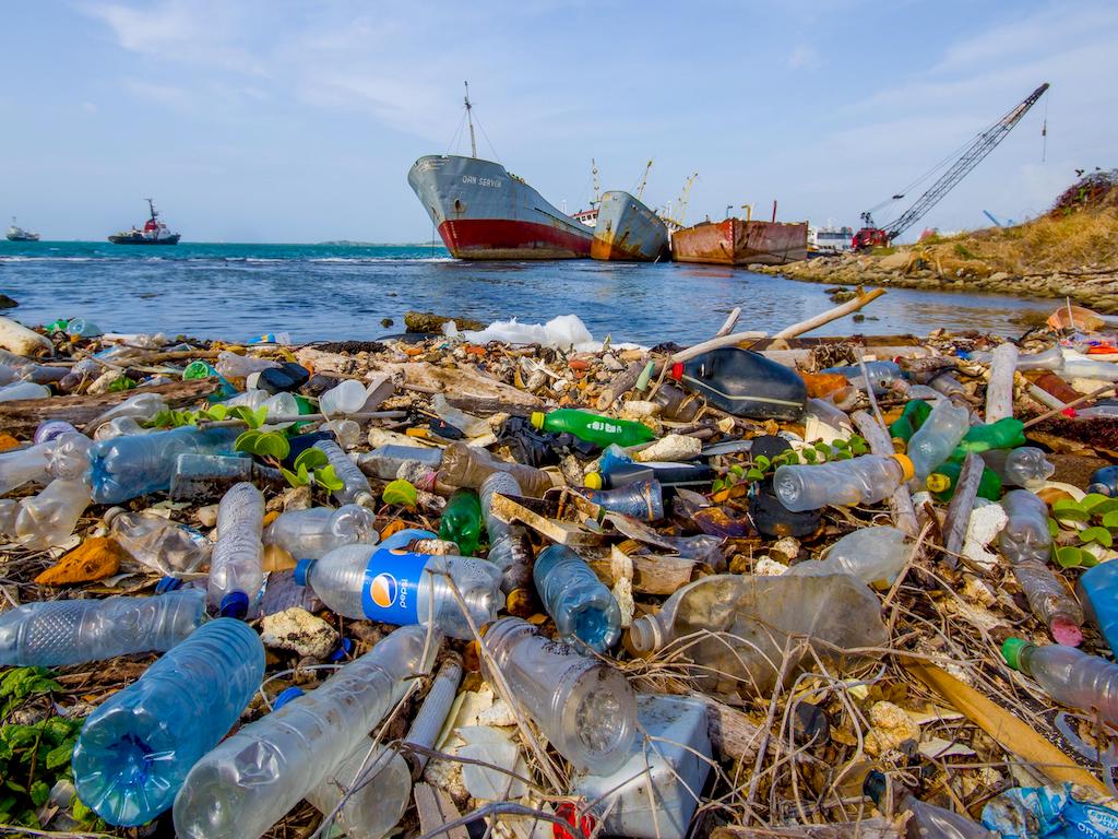
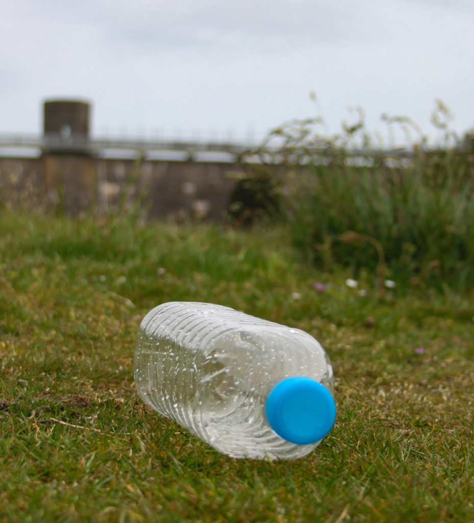
I made the photo montages above on Photoshop. I took the original image below and took my original image. I did the same process for both images. Firstly, I took the image of plastic pollution and dragged it onto my image of the plastic bottle. I then put the plastic image behind other image and removed the section that is replaced with the plastic using the quick selection tool. I then arranged the pollution image so that the background was clearly visible and all in frame.

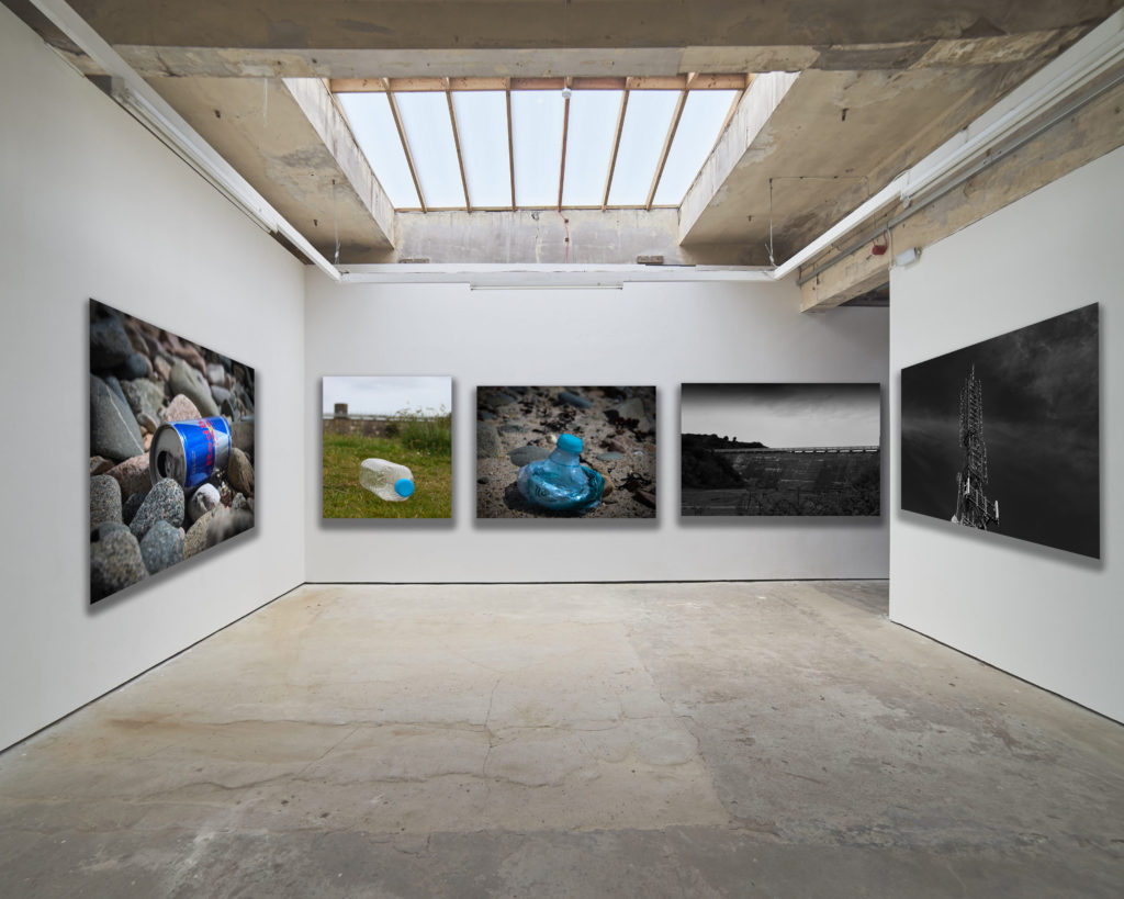
Gallery

Final Outcome

Evaluation

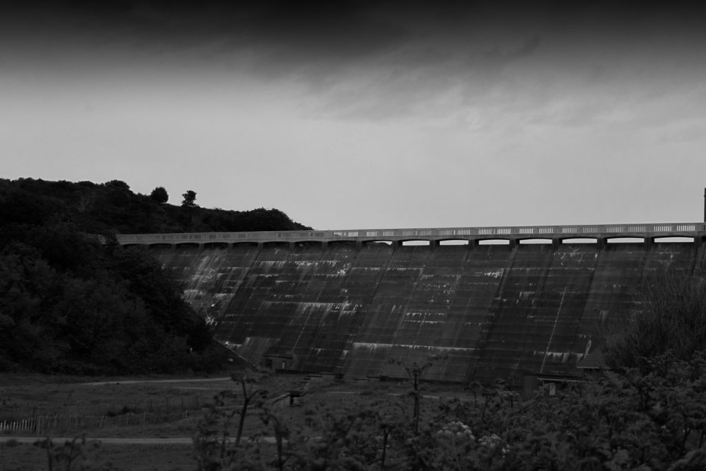
What did I set out to do? – I set out to take photos in black and white of human impact on landscapes. I wanted the images to be quite simple and have a dramatic tonal contrast.

How did the outcome turn out? – My outcome turned out well and has the features I aimed to include before taking photos.

Was it successful? – I believe comparing my outcome with an example of Gerry Johansson’s photography, it resembles it but also has some features from other photographers.

Shoot 2

Plan

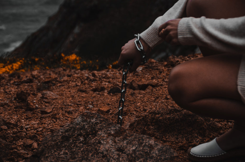
My plan for this photo shoot was to combine the work of Lilli Waters by going to a natural open landscape on a cliff near the coast, and Jeremy Carroll by using a chain to represent how animals have been trapped by the pollution in the ocean

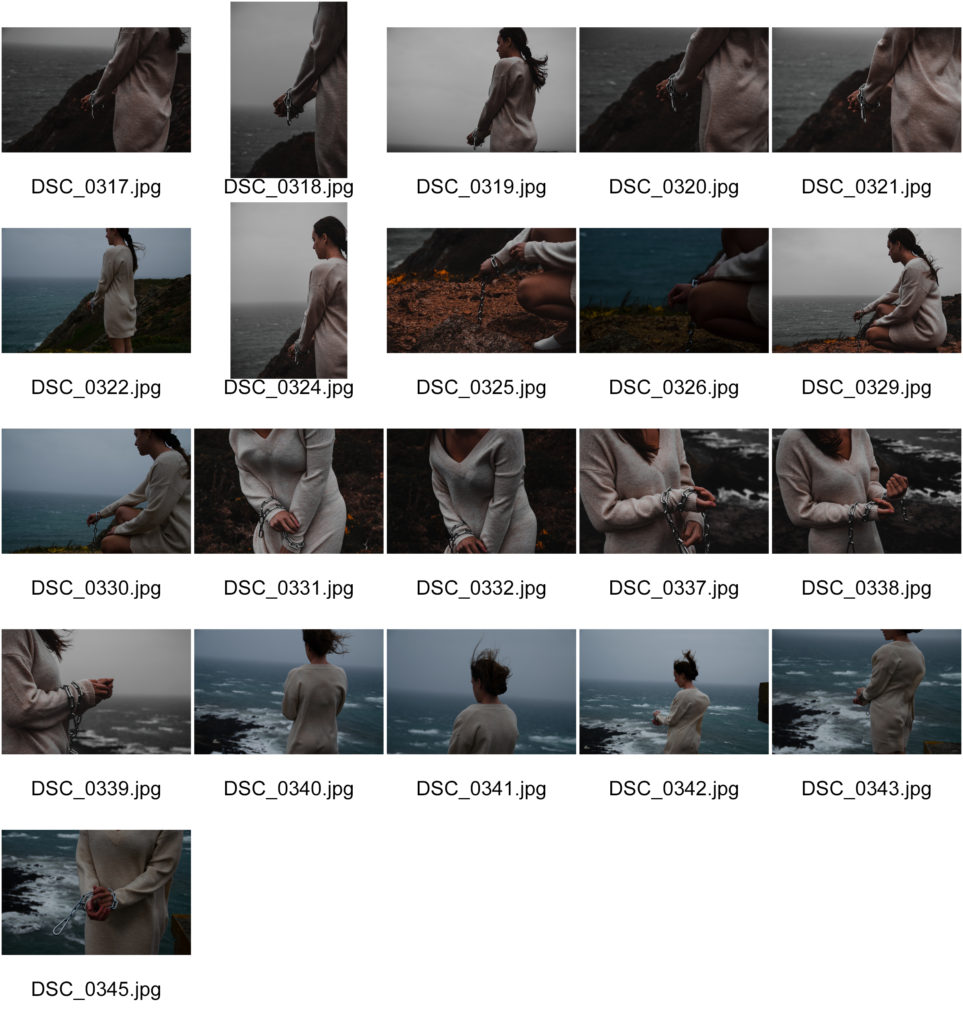
Contact Sheet

Editing Process

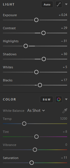
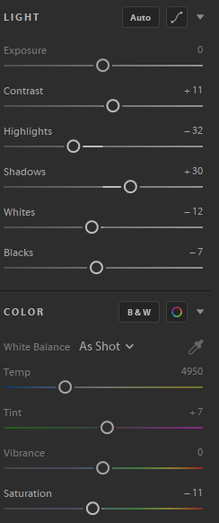
I edited these images similarly to my first photoshoot, with decreased highlights and increased shadows to create a more moody image. With these images I also increased the contrast to match the a similar overall look, lighting and colour scheme to Lilli Waters images.

Best Images

Lilli Waters

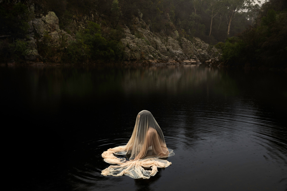
‘Lilli Waters (born 1983, Armidale, NSW) is a fine arts photographer whose work explores the human condition through dramatic images of the female form in haunting, windswept landscapes. A Lilli Waters image has a painterly quality, evoking the Pre-Raphaelites with macabre, foreboding elements, a jewel-like palette and a sensitive use of light. Waters makes use of translucent fabrics and long hair to obscure the identities of her subjects, suggesting that the image might be just as much a mirror for the viewer, as it is a portrait.’ – curatorialandco.com

I thought Lilli Waters work could be interpreted as linking to Anthropocene because the subject of the image is seen to be covered in a plastic like material, which links to Jeremy Carrols images of being trapped in fish netting. This combined with the location of the images being in natural landscapes further displays the anthropocentric nature of the images, humans effect (the subject) on nature (the background).

Inspiration Images

The 'primal' photography of Lilli Waters is defiantly repairing her past —  art thy neighbour
lilliwatersphoto
Lilli Waters - Underworld - Photography - Curatorial+Co.

Shoot 1 Comparrisons

My first photoshoot was inspired in the style of Jeremy Carroll and tried to create the same effect that he did on the viewer.

Jeremy Carroll
My Image

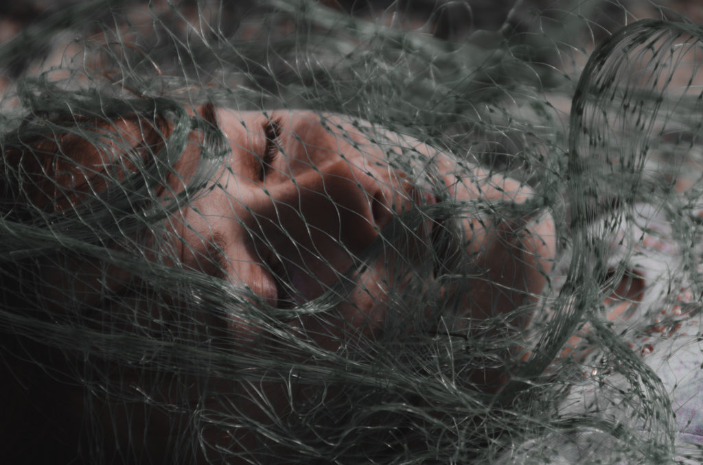
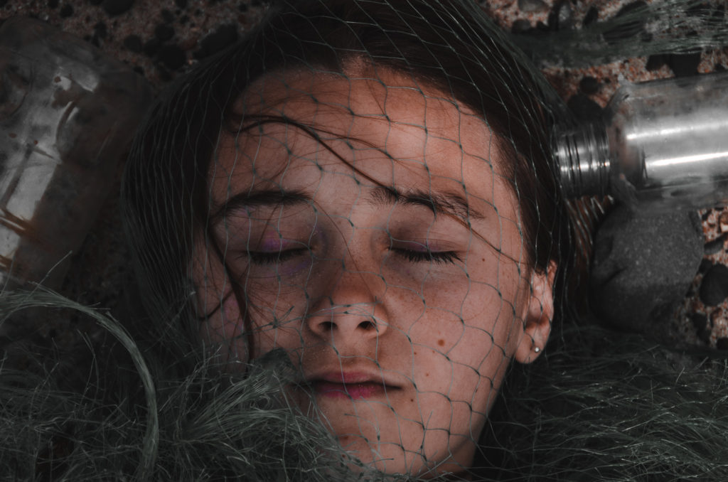
Jeremy’s image was taken with studio lighting, where my image was taken outside under natural lighting on an overcast day. The aperture of his image appears to be moderately high because everything in the shot is crisp and in focus. The aperture of my image was around f.4 because I wanted the front of the face to be in focus but the sand and surrounding bottles to be blurry. Jeremy most likely used a fast shutter speed because of the bright studio lights, I also used a fast shutter speed in my image because of he bright natural light and to compensate for the slight movements of the camera while I took the image. Both images have low ISO as they are crisp and not grainy.

Jeremys image has bright saturated colours with minimal shadows. My image has a darker more moody colour palette with lots of shadows to create a bigger impact on the viewer.

Both images show a person being trapped by netting and other marine pollution. Both symbolise how fish and other animals are affected negatively by the way humans pollute the oceans.

Shoot 1

Plan

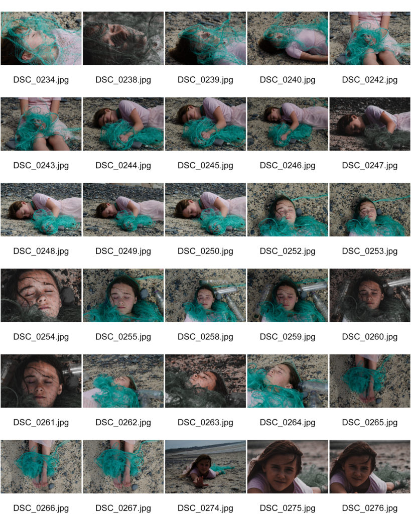
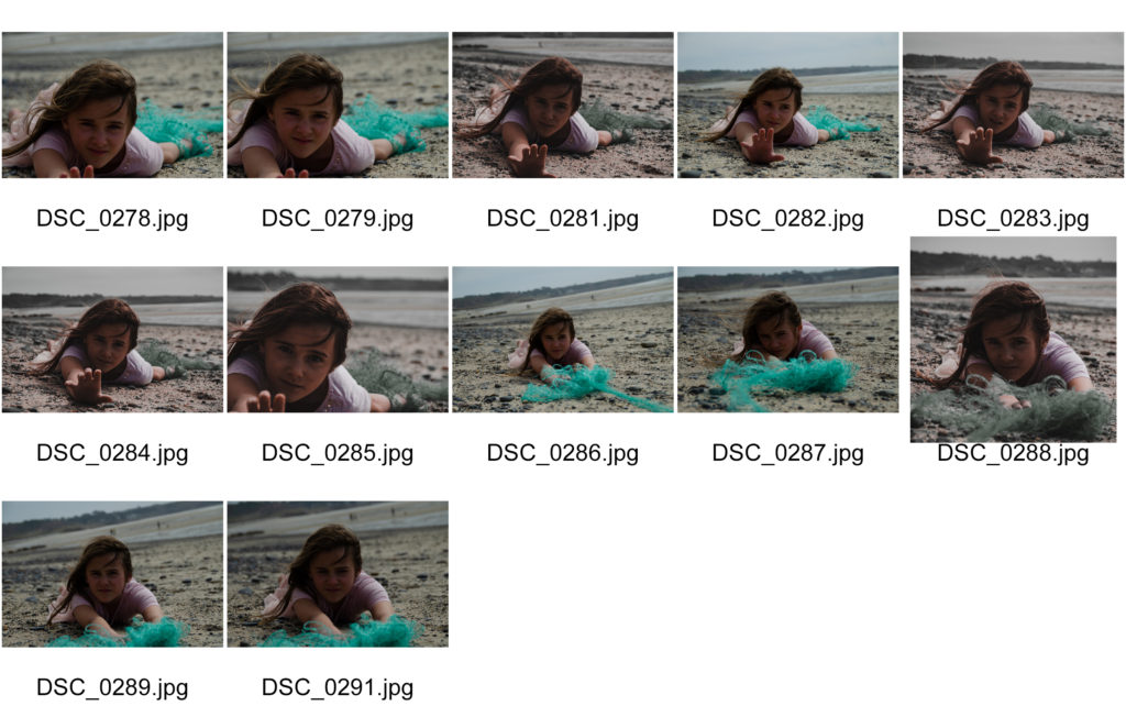
The plan for this photo shoot was to create a feeling of being trapped and effected by marine pollution. This would be done by using the beach as the photoshoot location and using plastics that can often be found floating in the sea of on the beach as litter.

contact Sheet

Editing Process

Here you can see that when editing this set of images, I made them more moody to create more of an impact on the viewer. I did this by decreasing the highlights and increasing the shadows. I also changed the temperature of the image to appear cooler with more blues and less orange and reds, along with this I decreased the saturation of the image. This gives the image less colour, again creatine a more impactful image.

Best Images