
Idris Khan Inspired Experimentation
.jpg?mode=max)
Idris Khan is a British artist based in London who takes different social and political constructed and creates densely layered images from them. I like the way he does this because it resembles a ghostly image or a piece of art that has many construction lines.
My First Interpretation
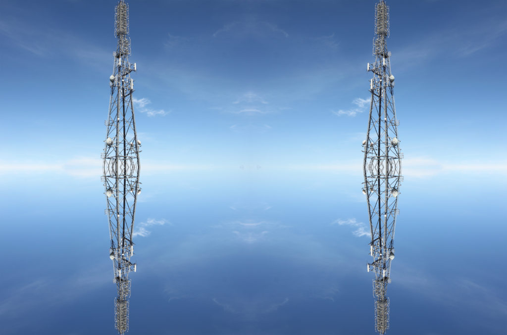
For my first interpretation, I duplicated the tower and copied it. The outcome of the first interpretation was good however it was quite simple and did not resemble Idris Khan as much as I wanted to.
Second Interpretation
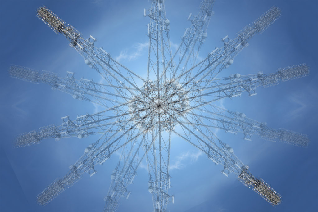
The second interpretation was much more successful than the first one, however it is still in colour and some parts are more detailed. It looks similar to Khan’s work but I need to make it black and white and try to make it resemble the ghostly feel of Khans.
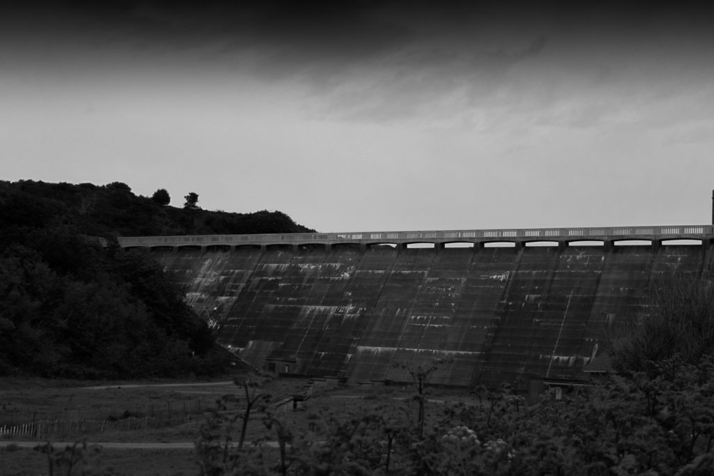
Final Interpretation
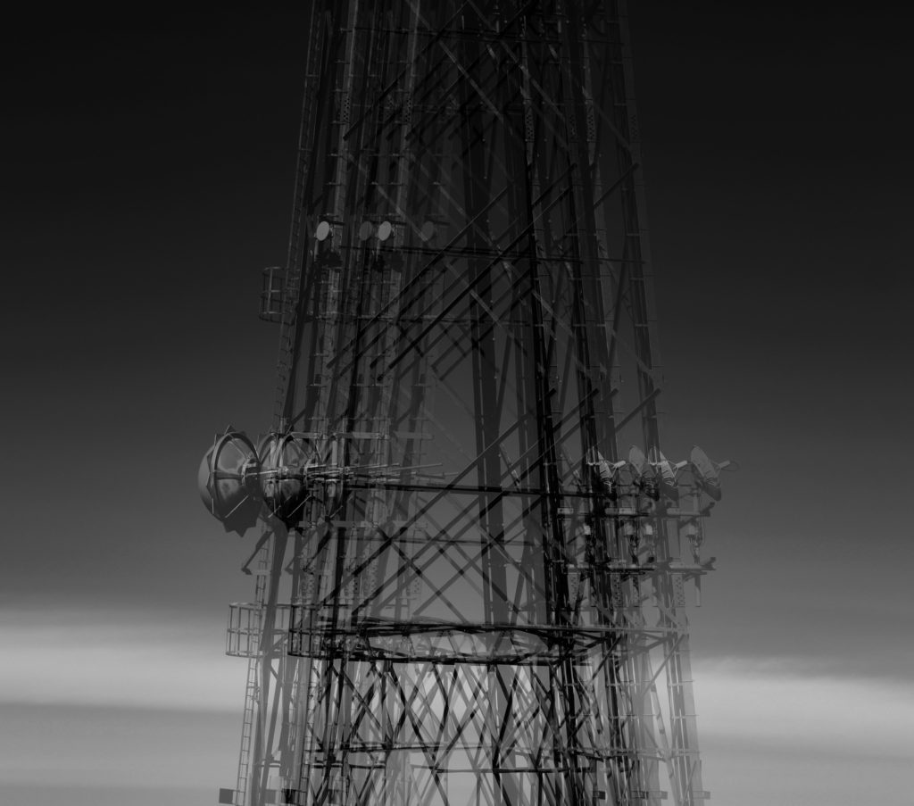
The final interpretation is above and I believe is successful in resembling Khan’s work. The image is black and white and has a good tonal contrast between the lighter layers and darker layers. It resembles the ‘ghostly’ feel of Khans work and I am interested in the way his work is done. I would like to do it again in the future.
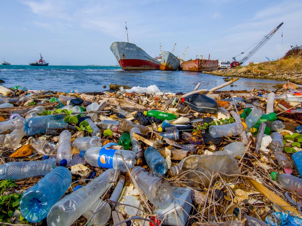
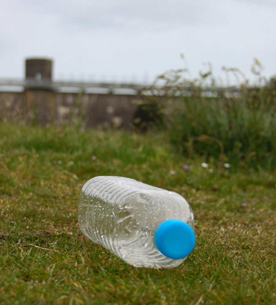
Photoshop Experimentation
I attempted to experiment with Photoshop and photo montage in relation to my images inspired by Andy Hughes.
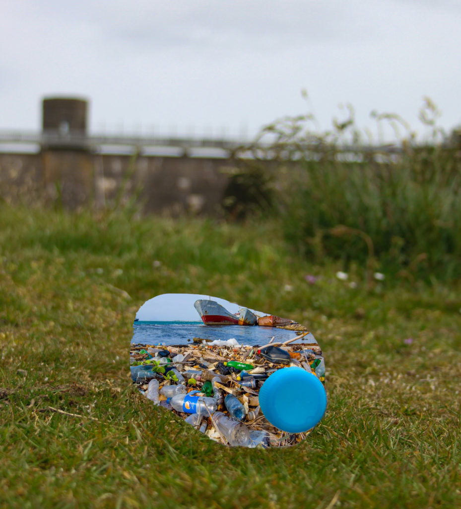
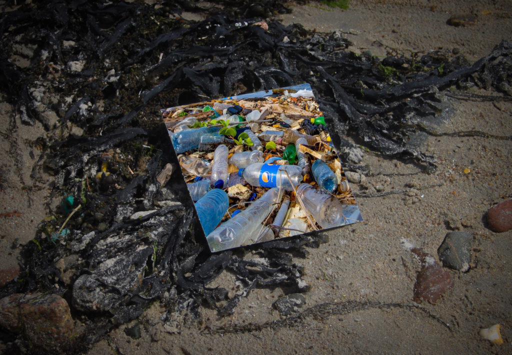
I made the photo montages above on Photoshop. I took the original image below and took my original image. I did the same process for both images. Firstly, I took the image of plastic pollution and dragged it onto my image of the plastic bottle. I then put the plastic image behind other image and removed the section that is replaced with the plastic using the quick selection tool. I then arranged the pollution image so that the background was clearly visible and all in frame.
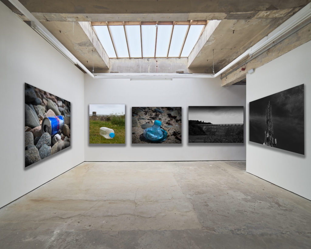
Gallery
Final Outcome
Evaluation
What did I set out to do? – I set out to take photos in black and white of human impact on landscapes. I wanted the images to be quite simple and have a dramatic tonal contrast.
How did the outcome turn out? – My outcome turned out well and has the features I aimed to include before taking photos.
Was it successful? – I believe comparing my outcome with an example of Gerry Johansson’s photography, it resembles it but also has some features from other photographers.