Anthropocene – Editing And Experimentation

Edward Burtynsky Photoshoot

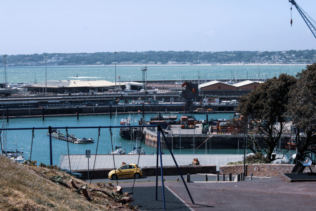
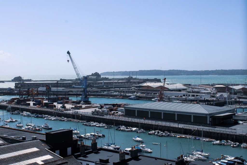
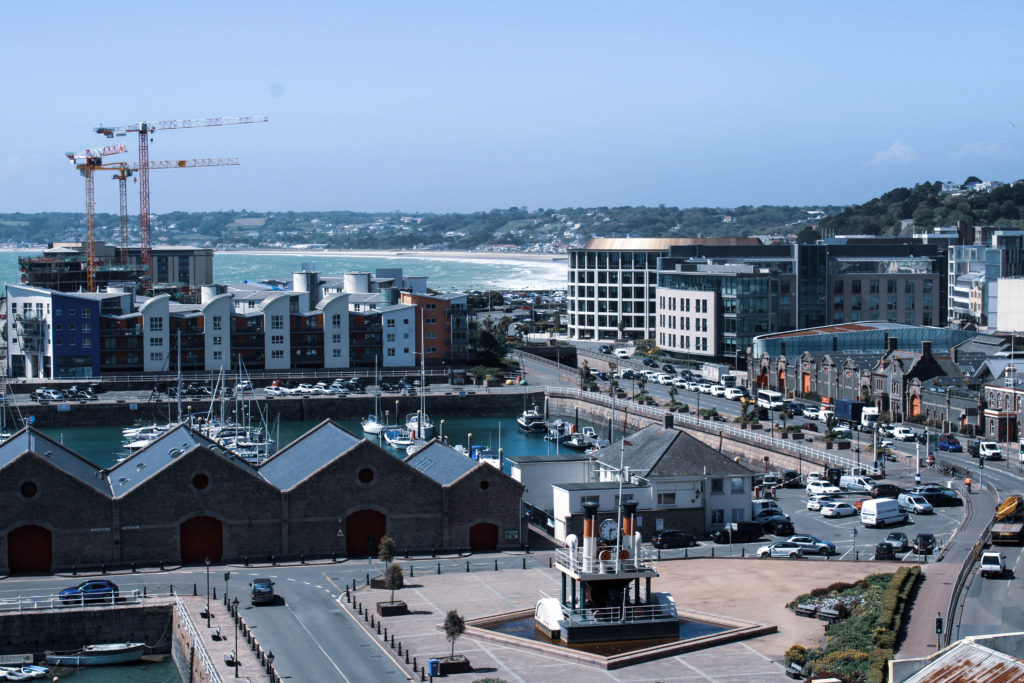
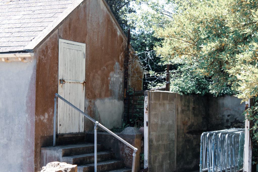
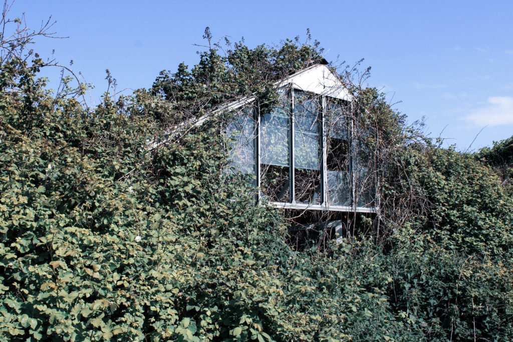
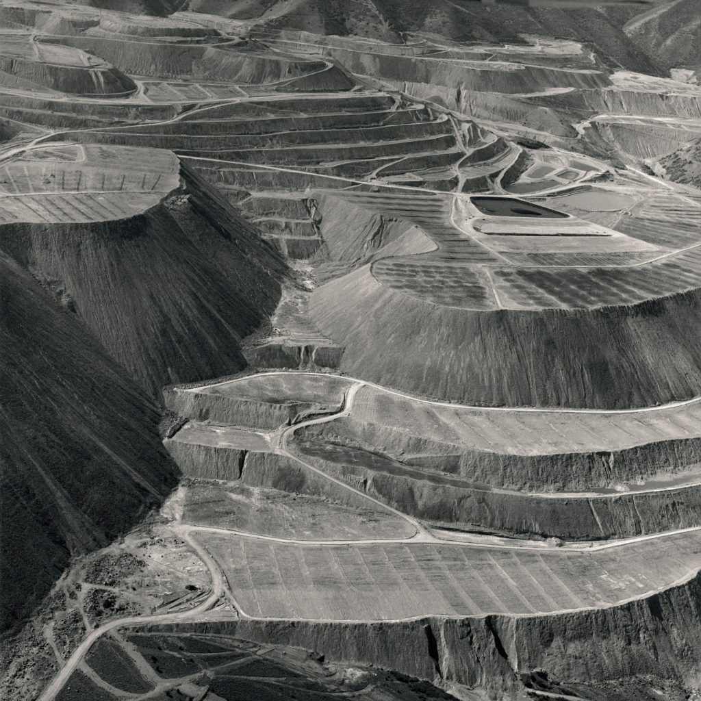
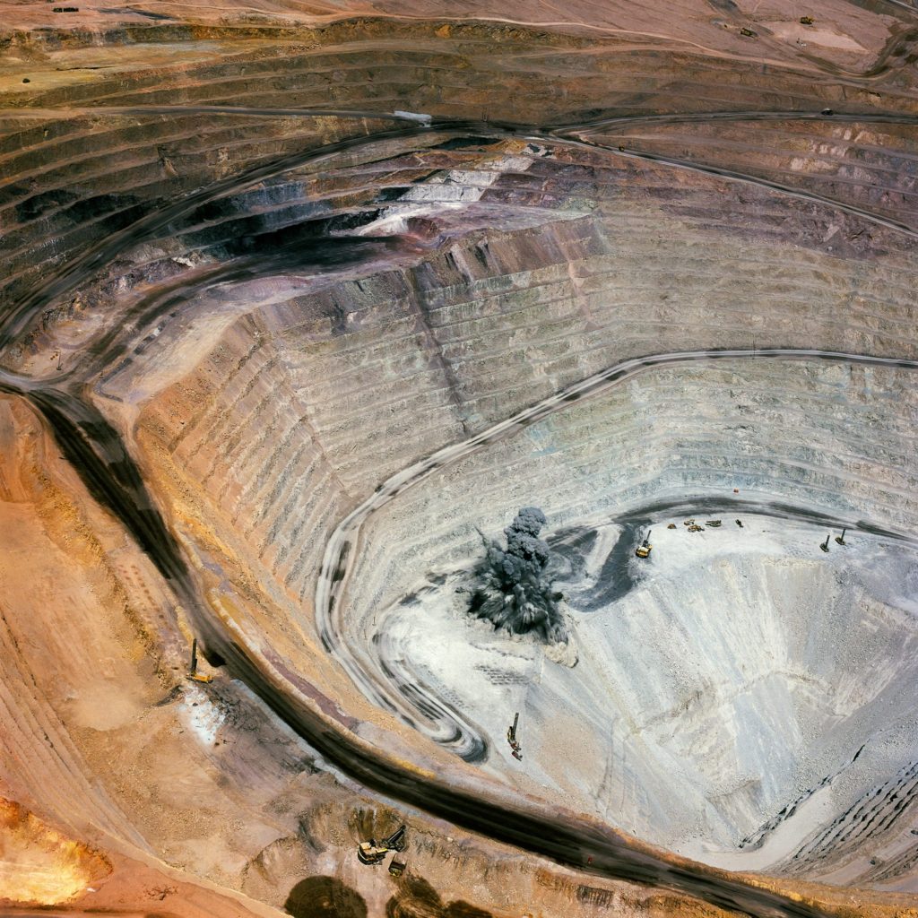
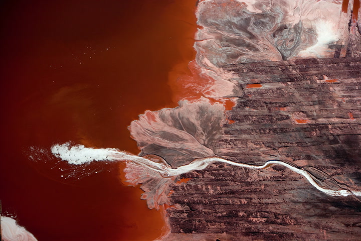
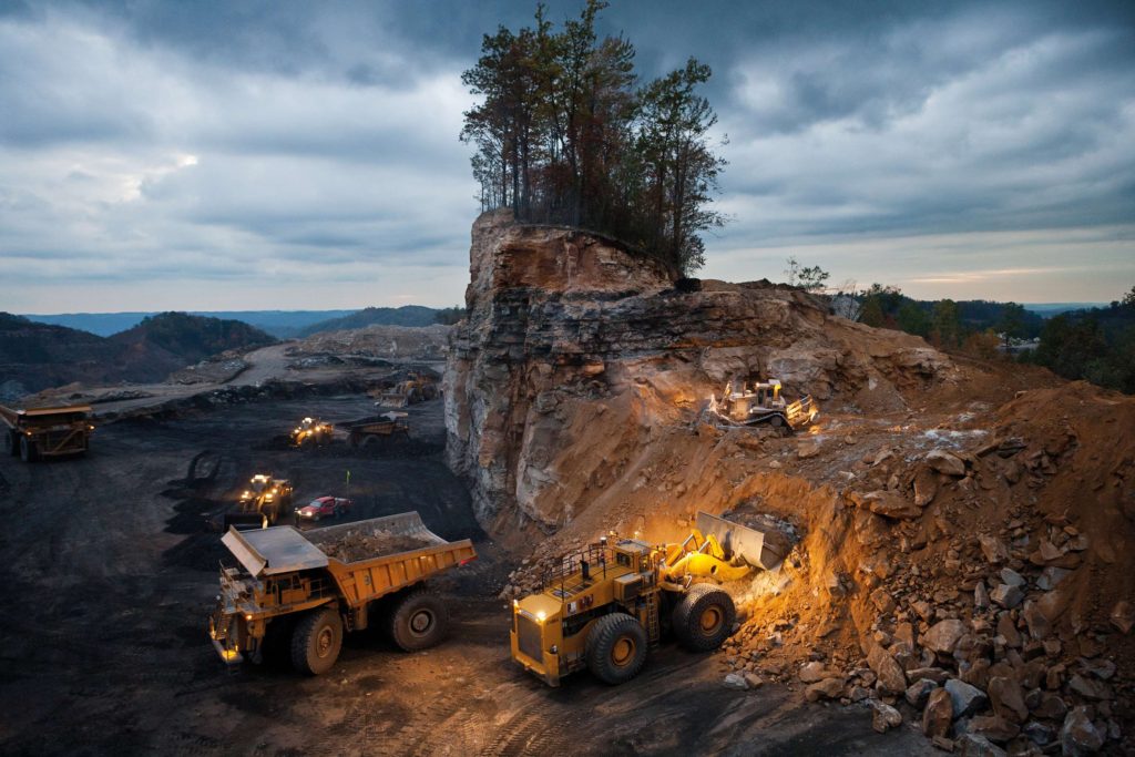
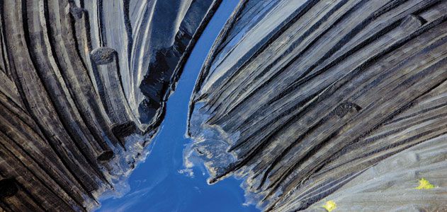
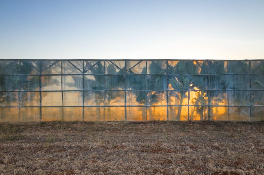
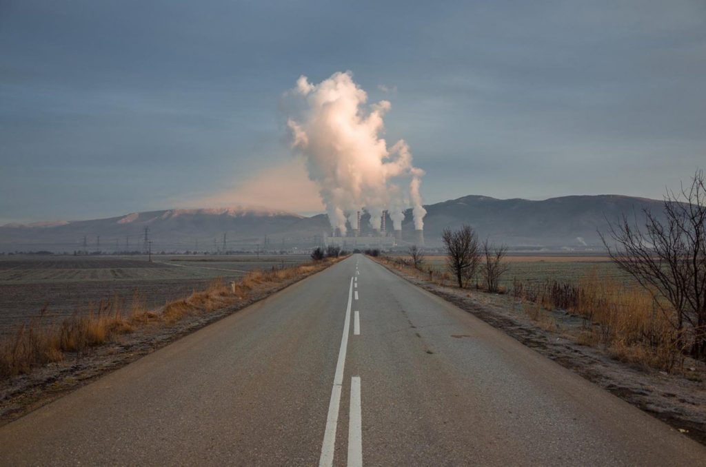
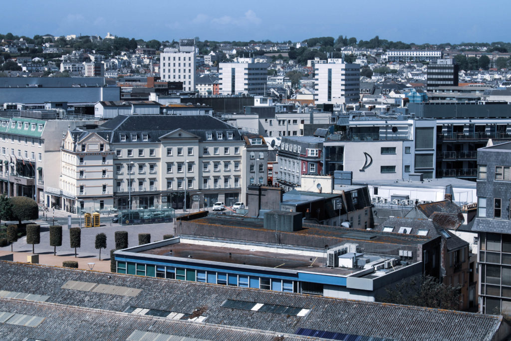
During my editing process for this photoshoot I decided to demonstrate how cold and senseless our world is becoming as a result of mass industrialization – I heightened the whiteness of each image using Adobe Lightroom to reflect Burtynsky’s dystopian and modernized landscapes, symbolizing how human impact may fulfil modern aesthetics, however it also destroys natural habitats. When editing I found it important to keep the cold tones and blue hue across the images in order to suggest how the industrialization of natural landscapes is cold-blooded and eradicates the feeling and warm atmosphere that is produced by unrefined and rural areas of civilization. In Lightroom I turned down the temperature of these images and slightly decreased the vibrancy to further the idea of an unconcerned damaged world. In addition, I wanted to refrain from cropping any of my Edward Burtynsky inspired images as I believe the plain clear skyline in each of the photograph’s backgrounds gives the impression of there being a clear solution to the global problems in this day and age, allowing nature to thrive without destroying it for commercial/industrial purposes – linking with the Anthropocene idea that humans are the single most defining force on the planet as a result of mass industrialization.

Black & White Experimentation

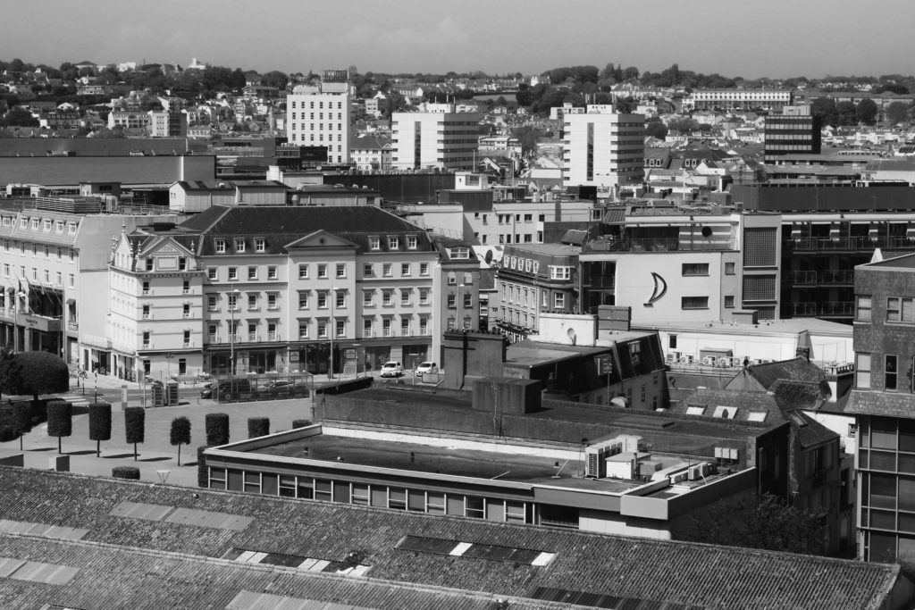
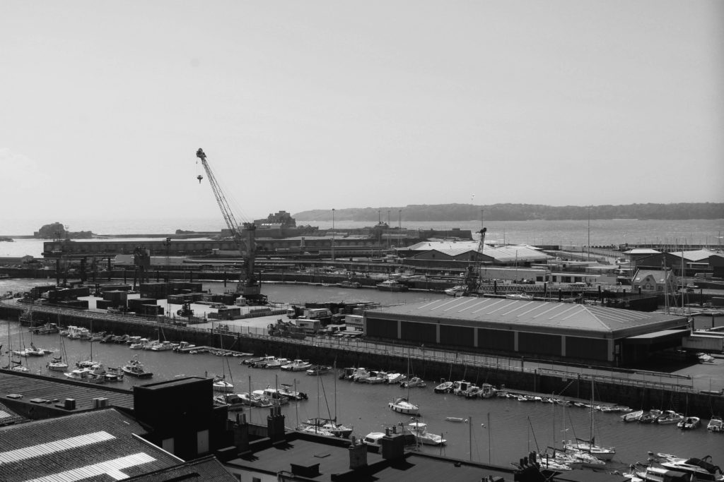
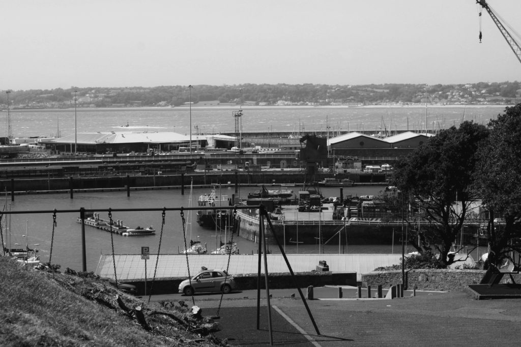
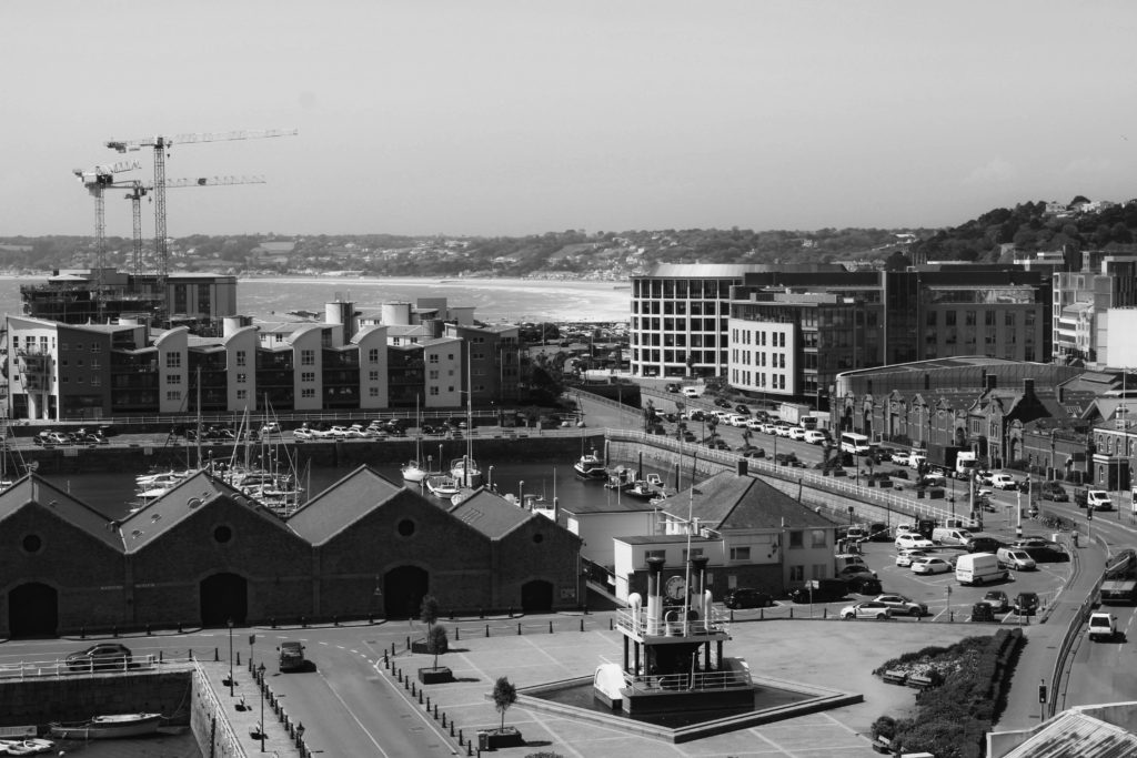
I chose to edit these specific same four photographs in black and white to experiment further with how colour can effect the atmosphere of an image. I edited the photos in Adobe Lightroom by turning down the saturation and vibrancy fully, heightening the contrast slightly to create darker tones. This wide range of light and shade in my images creates a more sombre atmosphere for the observer, the monochrome filter adds drama and creates a vintage feel linking to black and white photographs from the past. I believe this editing choice gives the impression and idea that Jersey’s landscapes hold so many memories for those that have lived here their whole lives, grandparents may have once had a home, or went to school here when the landscape was not industrialized – the black and white nostalgic atmosphere created juxtaposes with that which has been captured; a modern land with age-old memories. Furthermore, I believe that editing these images greyscale has emphasized the sheer amount of repetition within them, for example as the contrast is heightened it draws the observers attention to the darkest areas of the images. As these more shaded areas fall on the windows and doors photographed, it creates a grainier texture due to the high amount of times these subjects are echoed throughout. I think that editing these images with a black and white filter has added a dramatic yet nostalgic effect, juxtaposing with how these Jersey landscapes have been modernized over time. However, the monochrome effect does not provide as much of a cold atmosphere and doesn’t show the observer how man-kind is apathetic towards nature, I believe the cold temperature/coloured editing displays how society views their creations as inventive without seeing the danger behind how mass industrialization effects our planet – when deciding final compositions I will need to consider which editing choice works best.

Andrew Moore Photoshoot

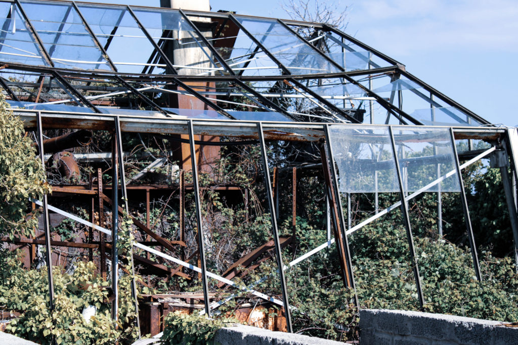
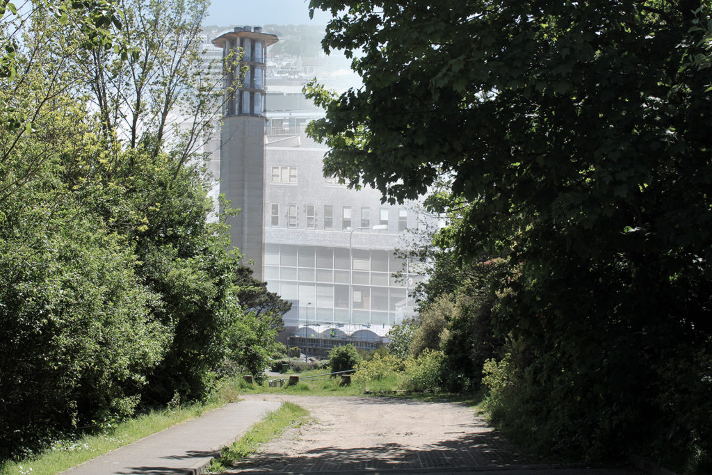
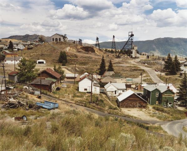
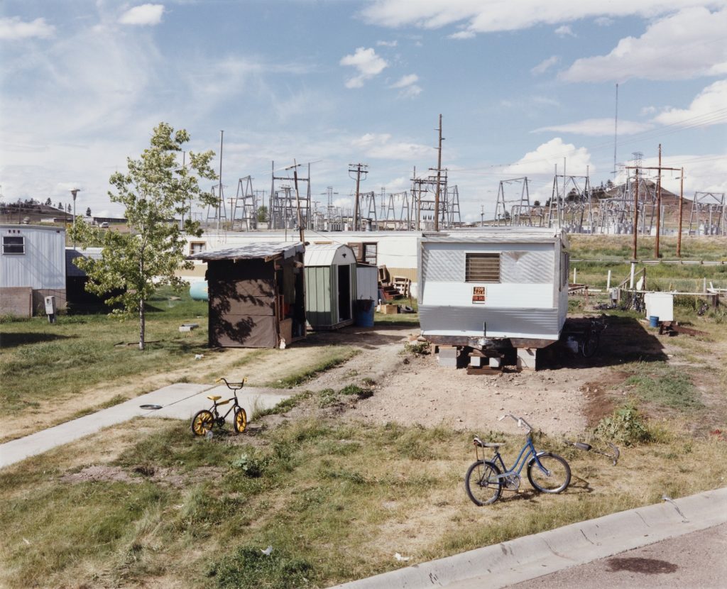
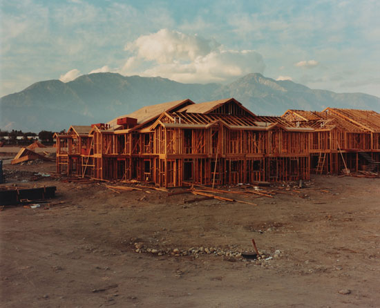
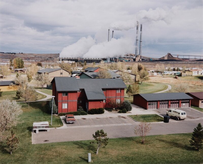
I chose to edit these three images from my Andrew Moore inspired photoshoot to demonstrate how human impact on the natural environment makes its beauty deteriorate, even with nature trying to fight back. During my editing process I made the decision to turn down the saturation and vibrancy of these images in order to reflect the dismal atmosphere that is present in these locations, the muted colours mirror how man-kind’s creations try to silence nature by destroying it. Additionally, I decreased the temperature of the original blue hue that fell across the image’s skylines as I believe they added too much of a bright happy atmosphere which is not what I wanted to portray. I also slightly decreased the exposure to produce a more gloomy and abandoned mood around these photographs to symbolize how these neglected landscapes had been left to ruin. I believe that making the choice to carry out more harsh editing on these images links to the idea of Anthropocene strongly, connoting the idea that man-kind’s ‘editing’ of landscapes is wrecking the unrefined blessing of nature – I plan on setting out my final images in a sequence which shows the growing industrialization of our world, which with this editing choice will be furthered seeing the absence of colour increase as man-kind’s effects take their toll.

Multi-Exposure Experimentation

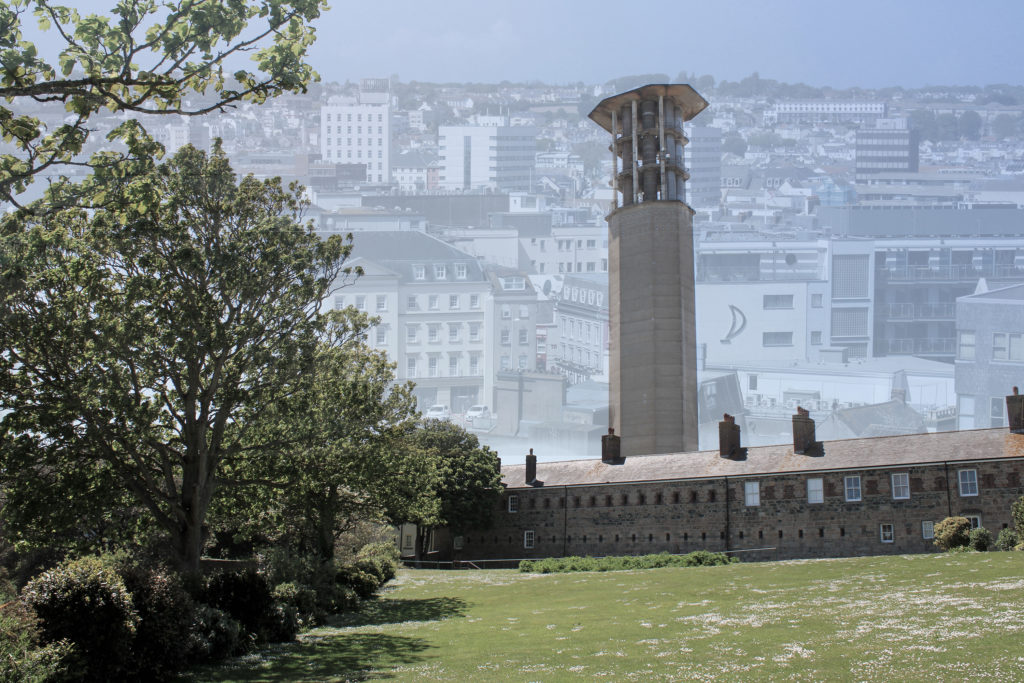
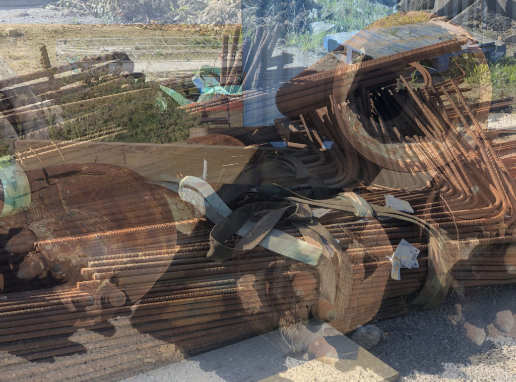
I decided to experiment by creating two multi-exposure images on Adobe Photoshop by merging four different photographs, two from my Andrew Moore inspired shoot and two from my Edward Burtynsky shoot. In Photoshop, I lowered the opacity of the two Burtynsky inspired images and placed them over the other’s skyline. My idea when creating these multi-exposures was to reflect how the future of our planet may look if mass industrialization continues. In the background, the faint St Helier skyline I have edited on really effects the texture of the images as the repetition of buildings and windows creates a more cluttered and artificial feeling. As the modernized setting continues on and disappears into the background it connotes the idea that Anthropocene will proceed into our world’s future, as a wider depth of field is formed. In terms of shape in these images, the geometric patterns from the modern buildings juxtapose greatly with the organic shapes of the trees captured in the foreground. This gives the impression that mass industrialization will not only destroy the natural landscapes of our planet, but also the way society views themselves; the blocky/structural architecture symbolizes how man-kind are becoming robotic homogeneous beings that have no care for the environment around them. The composition of these images also links to Anthropocene ideas, for example the second multi-exposure edit uses the rule of thirds to show the stages of industrialization without needing a sequence of lined up images. The foreground demonstrates nature untouched by man, the mid-ground hints at man’s slight interference with the environment and the background clearly shows mass industrialization. While this technique has its pros, there are also cons surrounding how the ‘stop urbanization’ message could be understood and possibly lost in translation due to the cramped texture and dull vibrancy throughout, as I wanted to reflect the beauty of nature compared to the banal devastation formed by industrial landscapes.

Photoshoot 1 – inspired by Jerremy Carroll

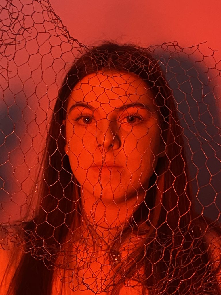
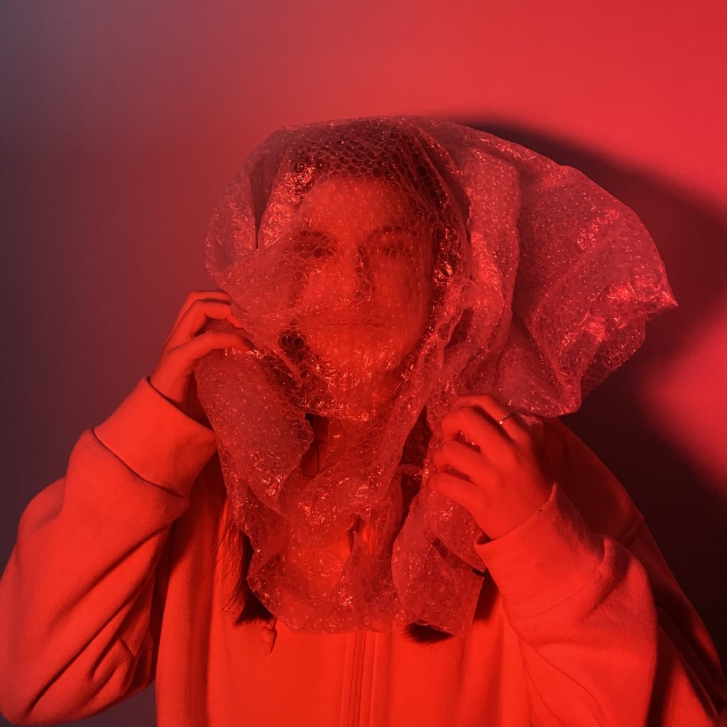
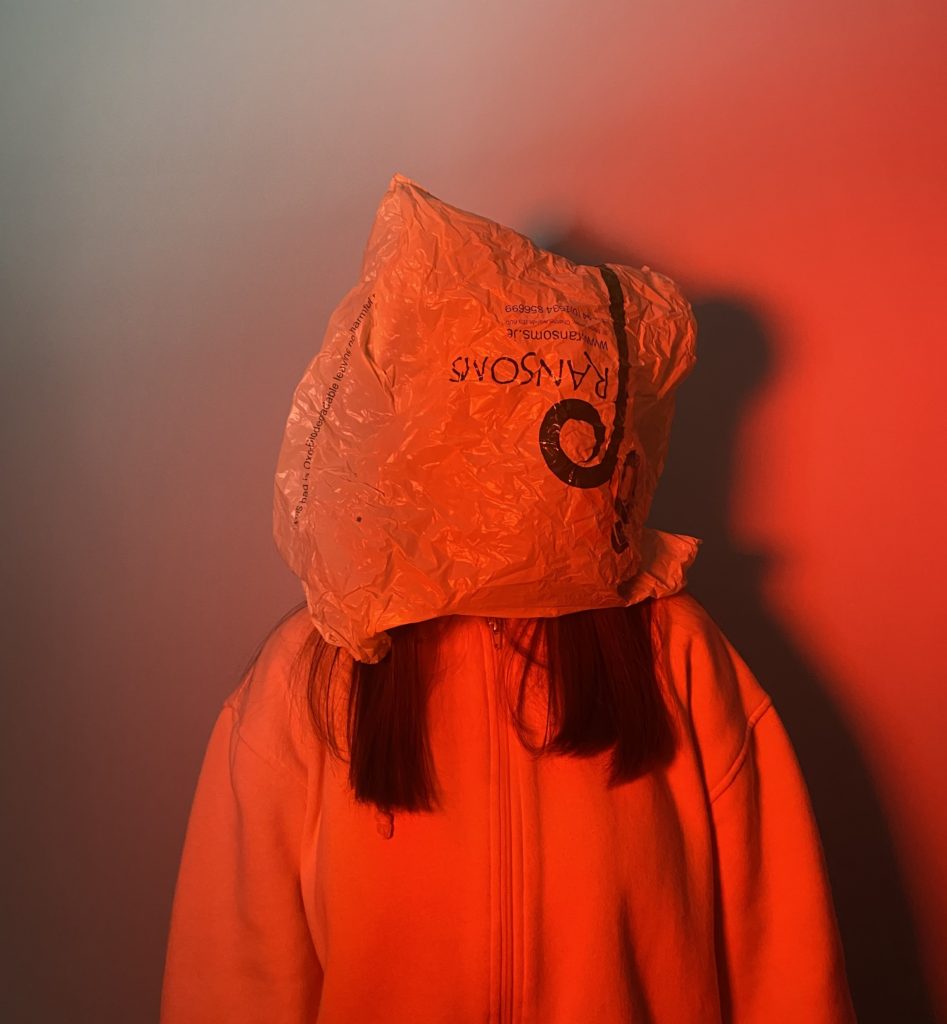
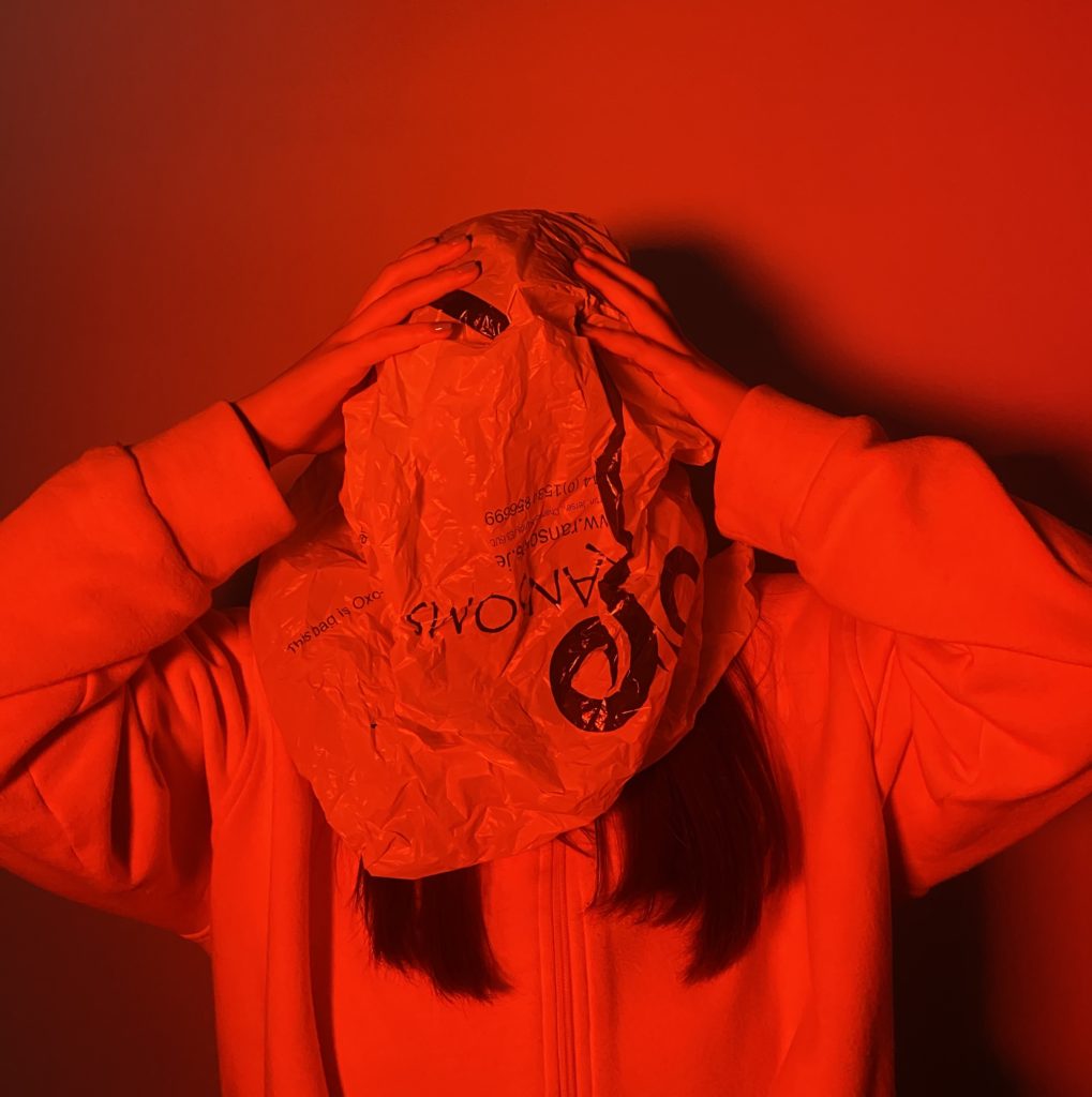
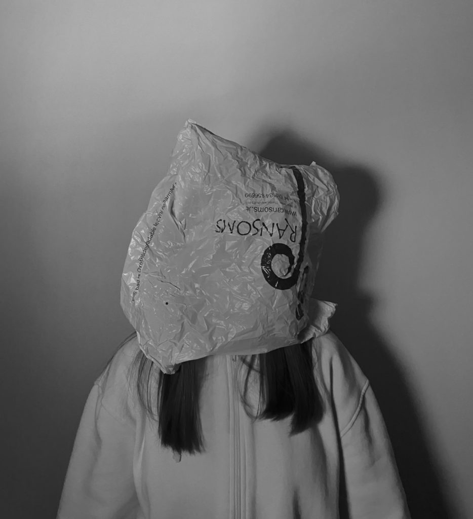
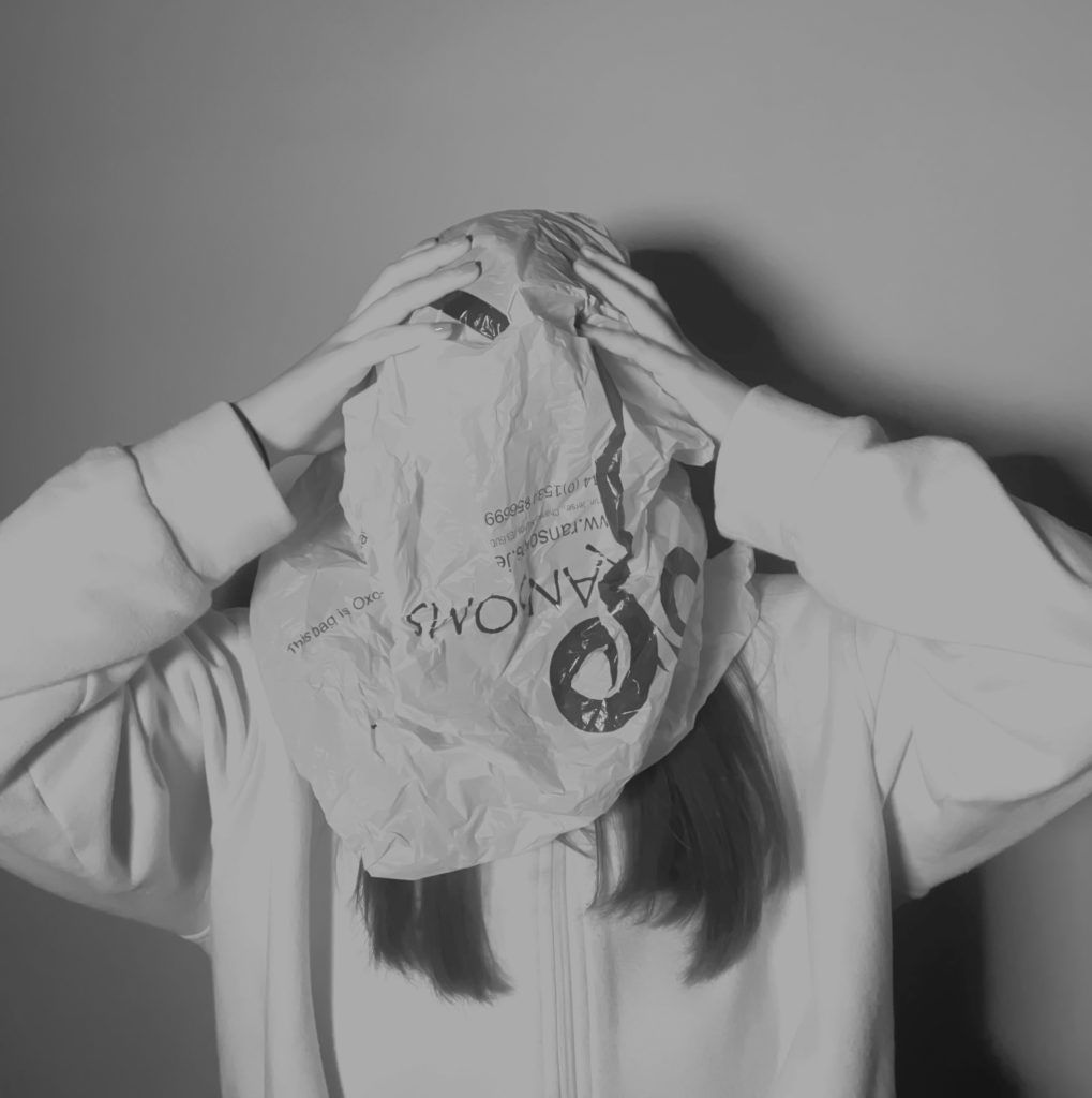
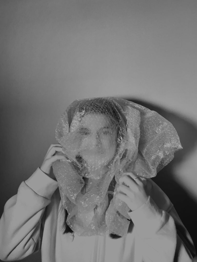
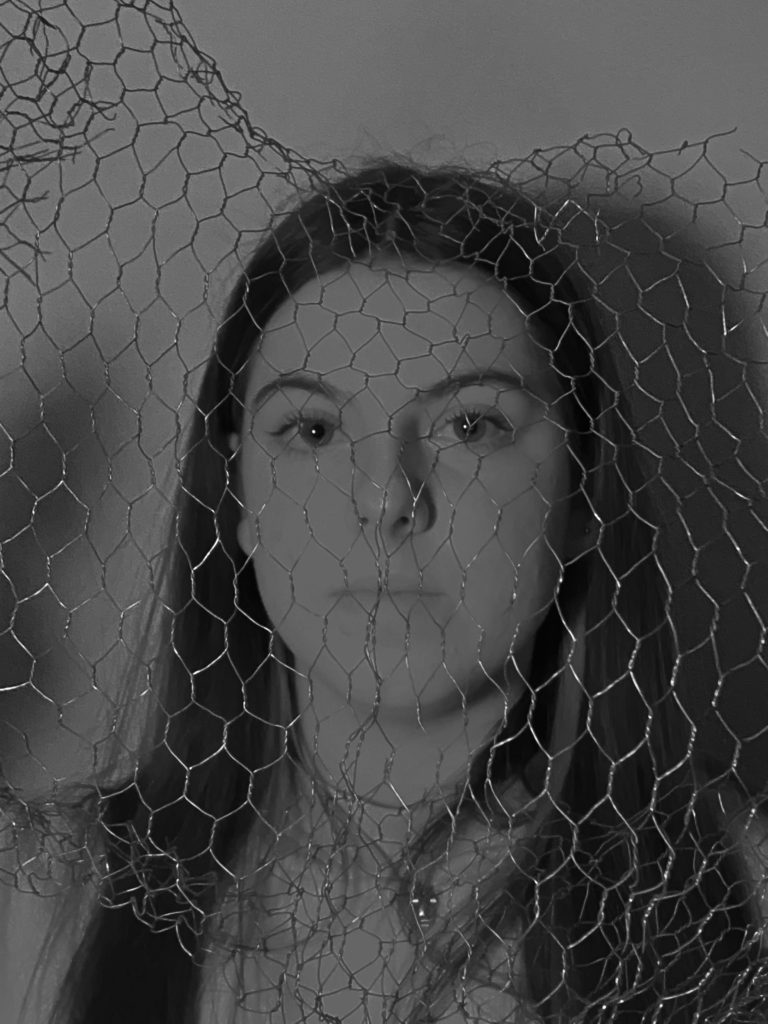
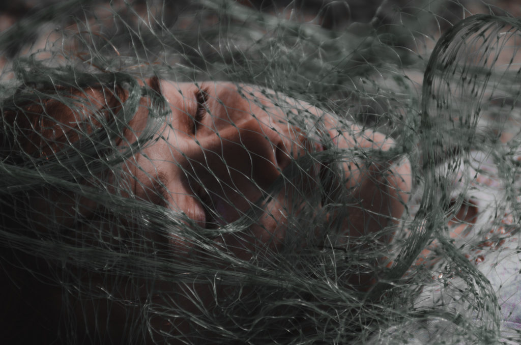
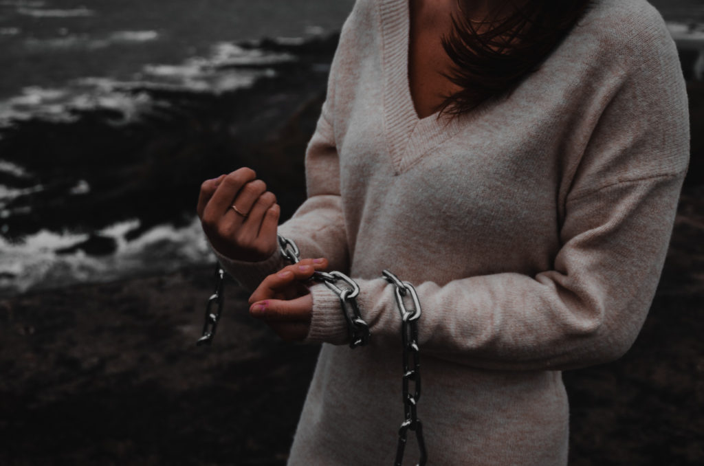
For this photoshoot I have been inspired by Jerremy Carroll for using man made items in his photographs that are used on a daily basis. These items in which he used are usually found in the ocean. Furthermore I am going to conduct a photo shoot using everyday items such as plastic bags as well as use different colour of gels over the studio lights to add dark tones to the photographs.

My Best Images:

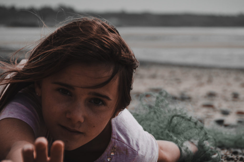
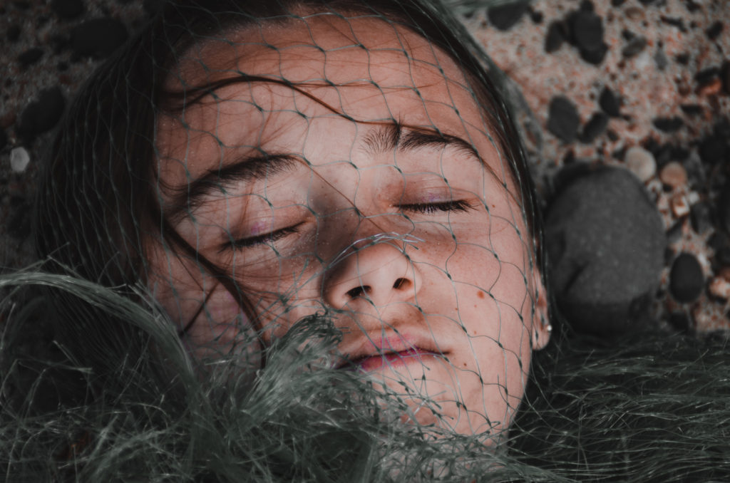
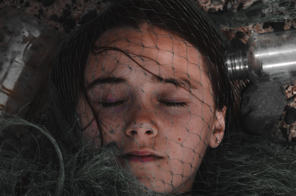
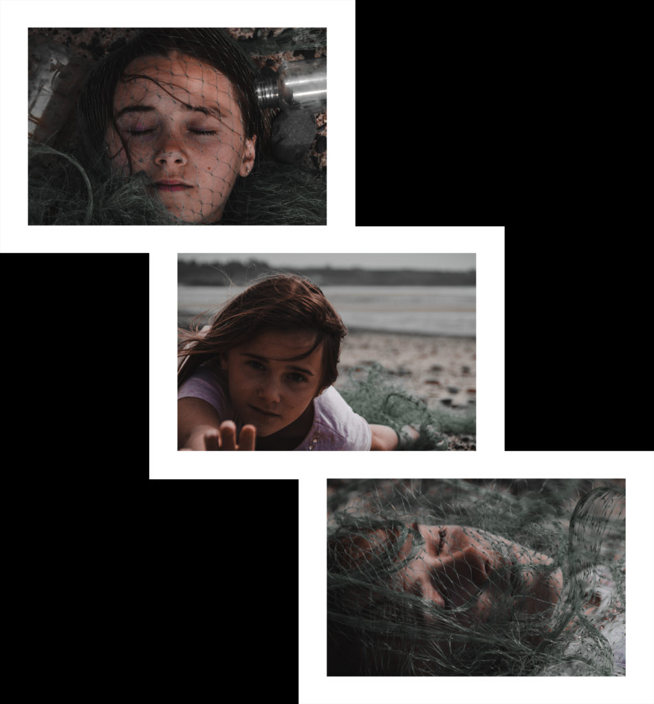
Overall I feel as these images in which I have selected are my best as they are mainly focused on the face which may have the meaning behind them of someone suffocating. Whereas in Jerremy Carroll series of photographs called ‘marine pollution’ he has used items such as fishing nets and strings to make the model in which he used look trapped and she couldn’t escape it furthermore I have taken this idea but I have interpreted it in a different way. I feel as these photos are good however I could have used more of Jerremy Carroll ideas to improve my own. I believe that the black and white photographs add more specific details as the blacks and whites add to the overall tone used as well as the overall darkening affect they have.

Anthropocene Artist Comparison

Camilo Jose Vergara
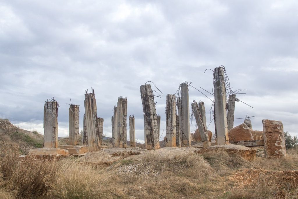
George Marazakis

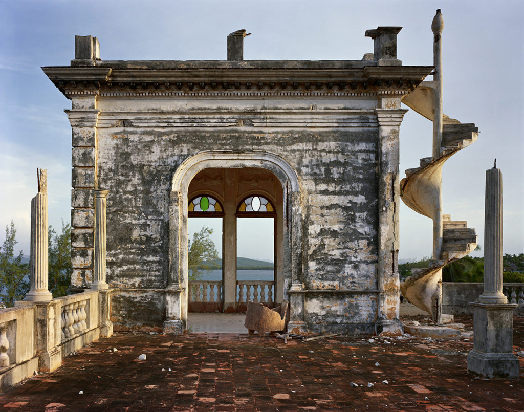
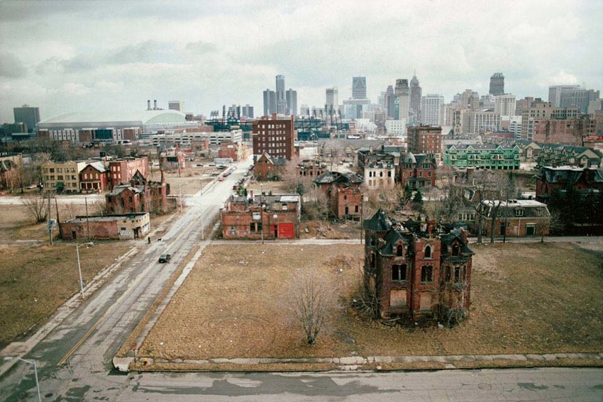
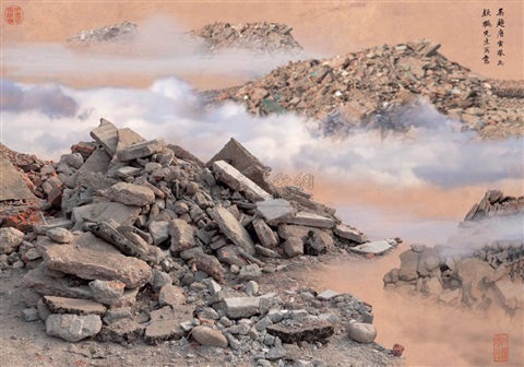
Both images feature a reaction to the Anthropocene. They do this by capturing the essence of mans reckless footprint on the natural environment and man’s greed and carelessness of having to constantly industrialise and destroy the natural environment and then move on swiftly without care. This is seen in these images where the focal point is placed on the derelict structures by framing them in the centre of the composition in a symmetrical fashion.

Both images have similar structural features, they both contain many vertical leading lines created by the structures and the neutral perspective at which they are shot. Both images also contain a deep depth of field with the structures in the foreground and the clouds and various other elements stretching far into the background.

These images differ in their colour schemes as Camilo’s image features a more saturated look with a wider tonal range which creates a deep contrast in the image. The image also contains a wider range of colours whereas George’s image contains a monotone, warmer colour scheme with shallow range of colours. Georges image is also flatter in terms of contrast, it has a narrower tonal range.

Anthropocene – Camilo Jose Vergara

Camilo Jose Vergara is a Chilean Photographer based in New York City.

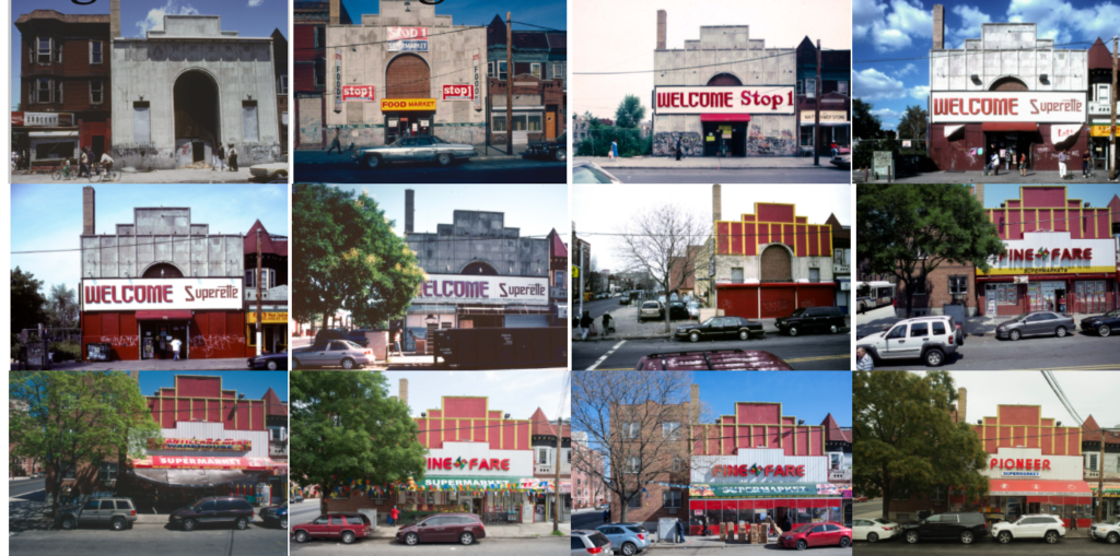
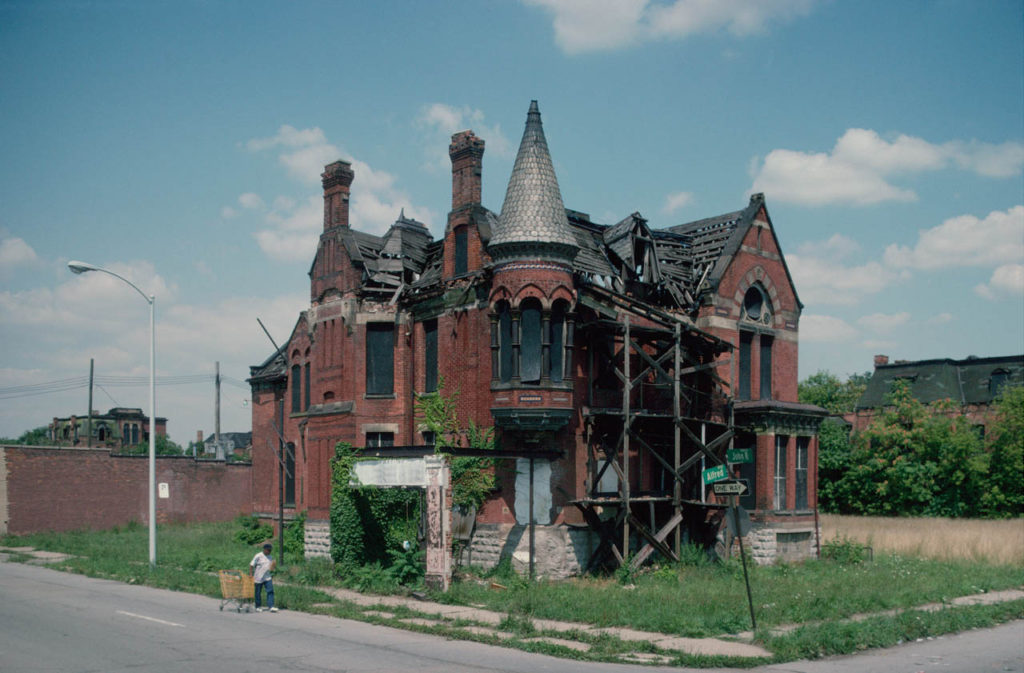
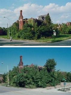
He trained as a sociologist with a specialty in urbanism and this is exactly what his photography emulates. He focuses on ‘rephotography’ in series with urbanisation and the Anthropocene. This means he shot the same buildings over a span of time to document change. This is a method of documenting urbanisation and how man is constantly tweaking the environment around them.

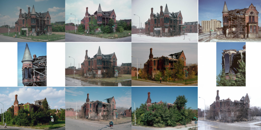
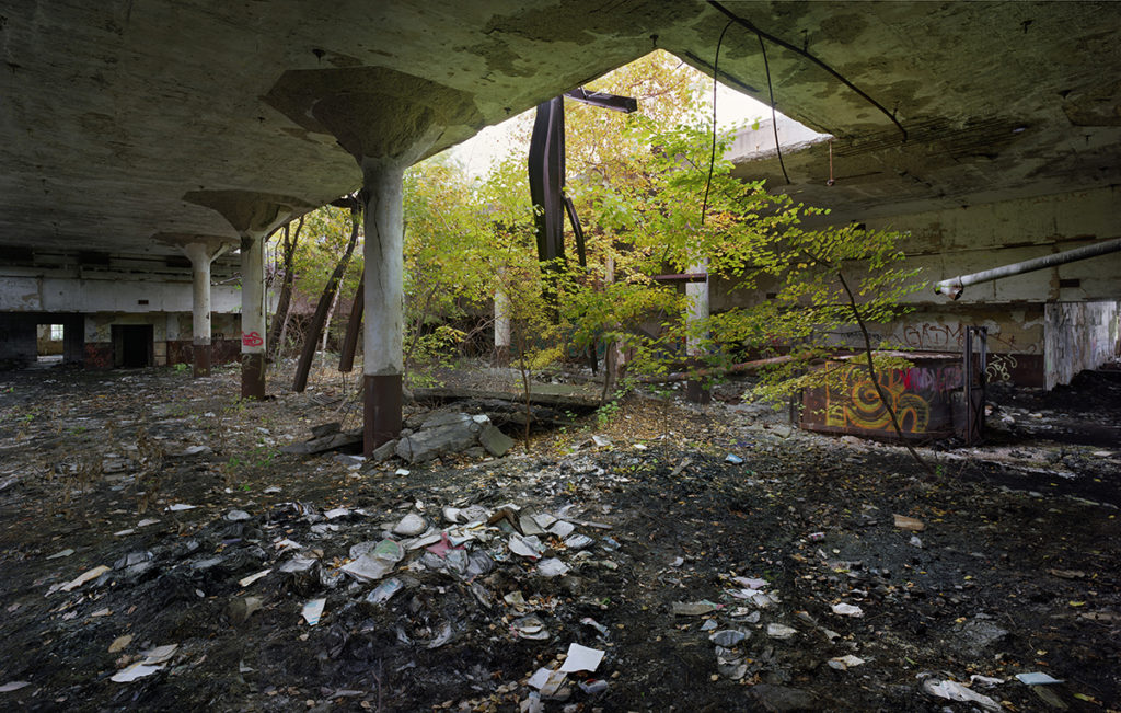
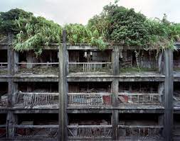
I am most interested in his work where he captures the essence of nature fighting back against urbanisation. He shoots these abandoned, derelict buildings in the fashion of rephotography to document an argument between nature and man. This can be seen through the houses slowly degrading and the earth and plants growing around them. This captures the power of nature and its ambition to flourish juxtaposing to mans greediness and carelessness of leaving ruins to rot in, what was, a beautiful natural climate. Below is an image of the Ransom Gillis House where Camilo has captured this argument and the power of nature.

I believe the way Camilo captures these buildings is an impactful way of looking a Anthropocene. It captures humanities carelessness and the determination of nature in an impactful manner by giving it an aesthetic. The aesthetic being the series of photos where the perspective is exactly them same but there is noticeable change in the environment in every photo. This forces the thought to be made about how quickly our environment changes.
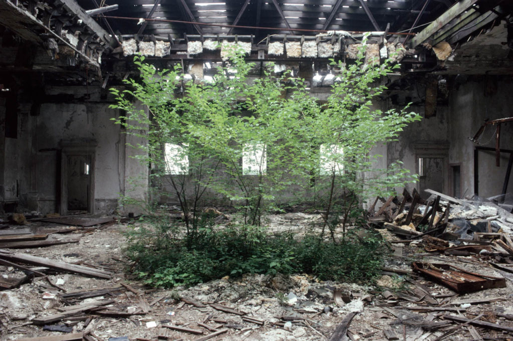
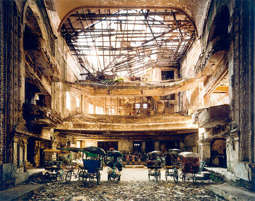
The above image is of the former Camden Library which became abandoned. There are trees growing in the former reading room of the library. Camilo framed these trees in the centre of the image with the library collapsing around them. This creates a stadium around the trees which creates tension and supports the idea of natures determination to grown through humans destruction.
Camilo used natural lighting which is coming through as streaks through the destroyed ceiling. This creates a holy like spotlight on the trees which could imply the idea of the glimpse of hope that nature holds.

The image contains high saturation on the foreground which makes the trees pop with colour but a low saturation and high contrast on the background which creates a gloomy look on the destroyed building, enforcing the juxtaposition between nature and man.

initial ideas

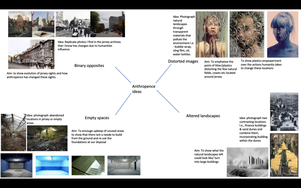
Photo shoot 1- for my first photo shoot, I will elaborate on my distorted image idea, using cling film, bubble wrap and oil to create distortion. I will use these materials as they are all transparent so the background will be clearer, making the distortion more effective. My artist study will be Nick Fancher as he displays an array of images, using both the oil and bubble wrap technique.

Photoshoot 2 – in my second photoshoot, I will develop the approach of comparing the same locations around jersey from now to over 50 years ago, using photos from Jersey’s photo archives. A perfect example of how I want to approach the idea is the rephotographing Atget project done by Christopher Rauschenberg.
evaluation

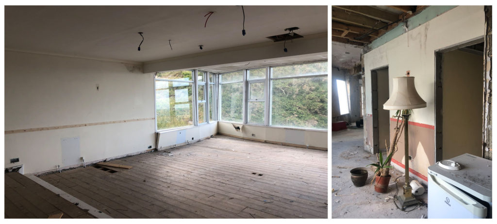
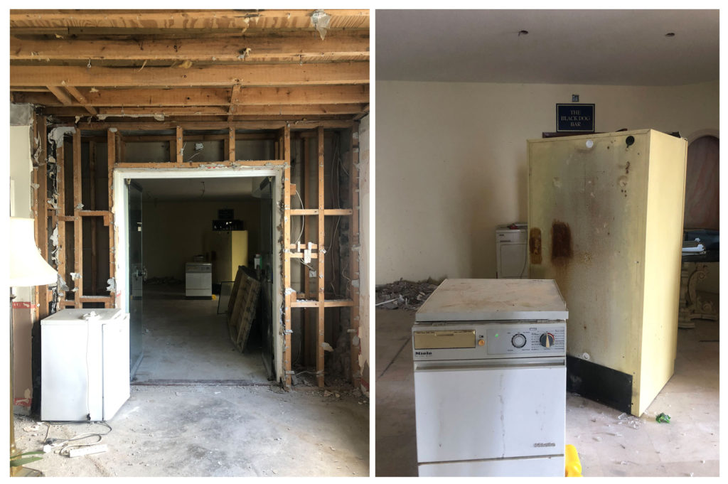
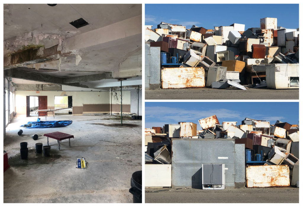
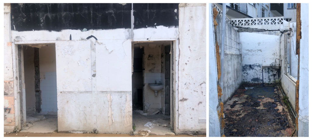
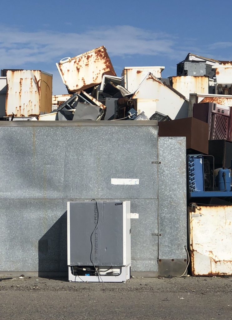
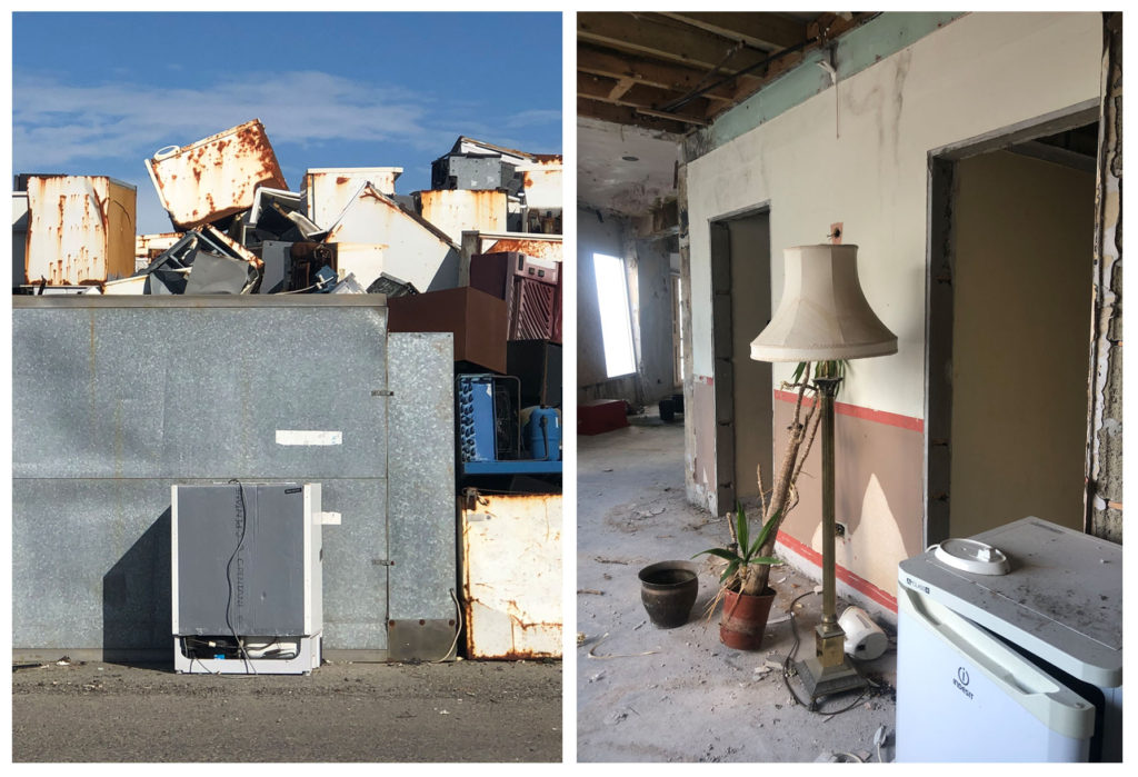
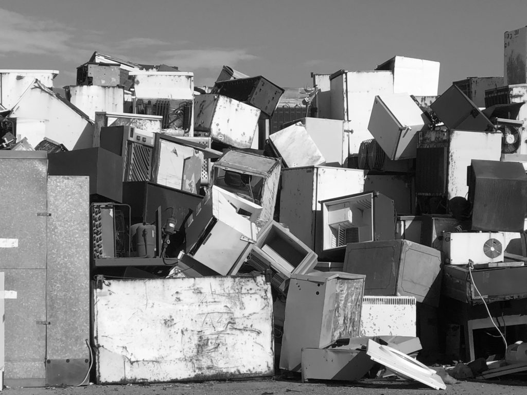
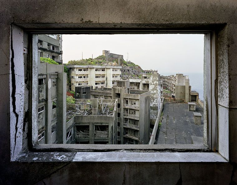
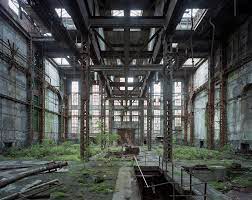
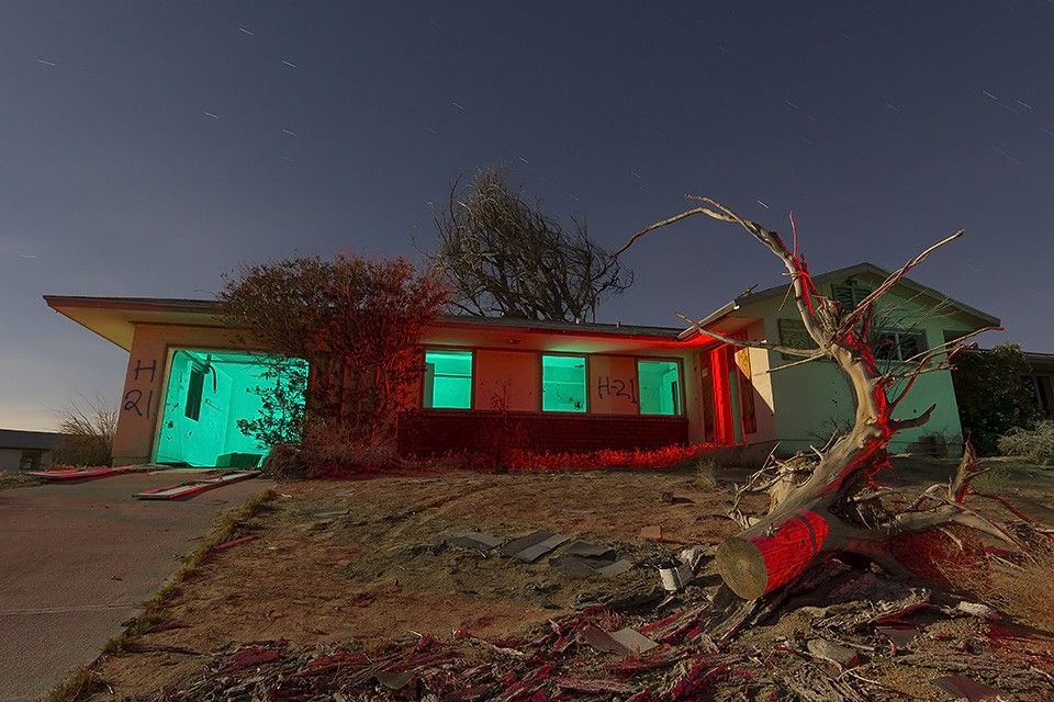
To start off this Anthropocene project I originally believed that with the Landscape objective I took I was going to be photographing things such as cliff paths and more nature based things due to choosing George Marazkis as one of my chosen photographers to do a case study on, however after researching different photographers I found Yves Marchand and Romain Meffre and really liked their images and take on Anthropocene. After looking into their projects I decided to take inspiration from them and take images of vacant buildings. Doing this project in their style proved to be more difficult than I originally anticipated, as they travelled around the whole of America which has approximately 19 million vacant homes and buildings while Jersey’s statistics are significantly lower with only 1397 vacant homes and buildings; most of which are boarded up or still in there original state and just temporarily empty rather than abandoned and decaying like the buildings in Yves Marchand and Romain Meffre’s projects like ‘The Ruins of Detroit’ which is mainly large abandoned theatres and such. My original intentions with this project were to take images of St. Saviour’s hospital as it is one of the largest if not the largest abandoned buildings on the island. However when I got to the hospital to take pictures the whole building was boarded up so I had to change my plan. I then researched vacant buildings in Jersey and came across The Waters Edge Hotel in Bouley Bay which first closed for guests in 2008 but continued to run the bar and poolside restaurant up until 2015. When I arrived at the hotel it wasn’t boarded up and the doors were unlocked and most windows were open. The hotel has 50 bedrooms however I only took images of the first and second floor as most of the stairs and floors were decaying and unsafe. I believe this photoshoot was one of the most successful parts of this project. Another photoshoot that I believed went well and produced successful images is the one at La Collette recycling centre where they have towers of rusted fridges and freezers. Although the photoshoot at the hotel went well and produced some successful images I do think that because most images are of plain abandoned rooms they are difficult to use to develop and experiment with on photoshop.
Final Image Displays

Anthropocene – George Marazakis

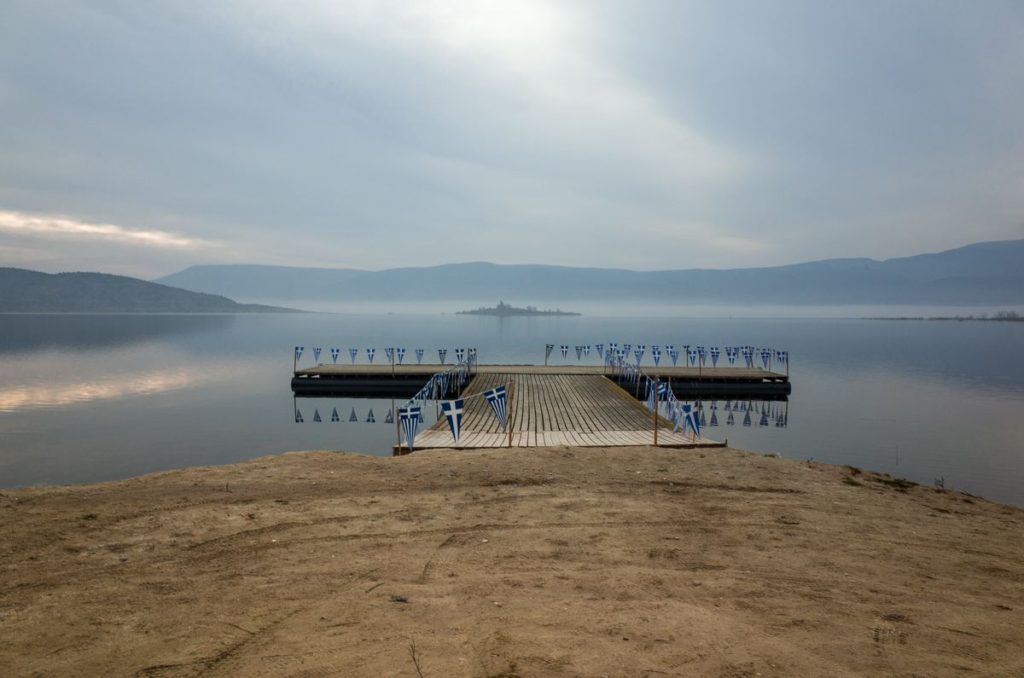
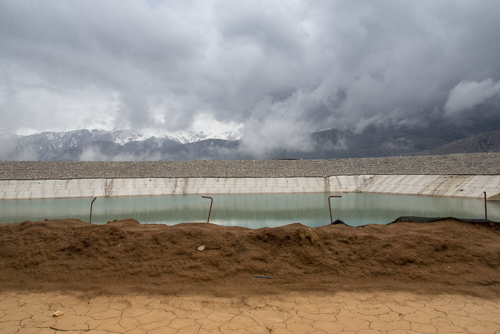
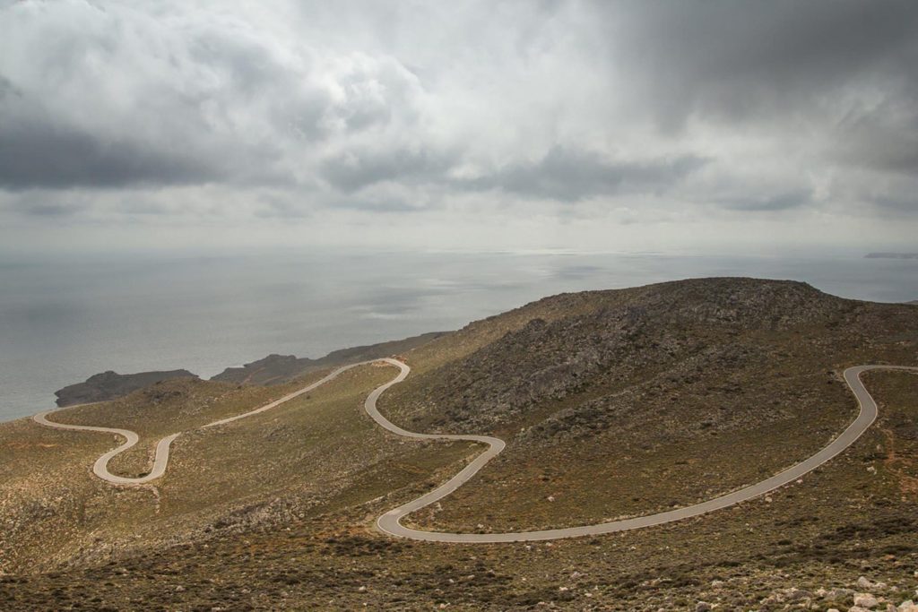
George Marazakis is a Greek photographer who has made a significant contribution to the visual enlightenment related to the Anthropocene with his photographic series, “A Cure for Anthropocene”

His work encapsulates the degradation of the environment in a subtle manner rather than a brash, “in your face” approach. His method does not concentrate on shooting the obvious, mainstream aesthetic themes such as animals entangled in plastics and inept images of geological agony that the media force feed society as a way of sort of ‘guilt-tripping’. Instead George shoots natural landscapes where subtle gestures of man’s ramifications can be seen. He seems to weave the elements of industrialism and climate change into his the landscapes rather than making them the vocal point. I feel this is a far superior way of creating awareness to the issue. It focuses on giving a neutral aesthetic to the Anthropocene. This forces the comparison process of making contrasts between the peaceful natural utopia and the traumatic dystopia that humans are inflicting on the planet. This forces audiences to use their cognition which leads to them caring about the issue more.

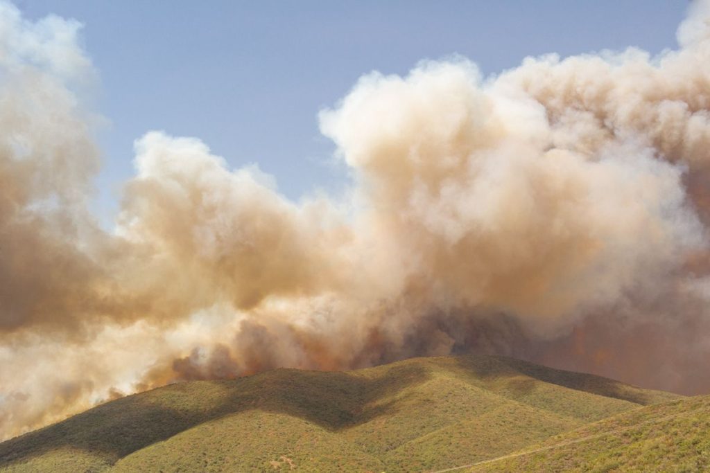
Another distinct element to his photography is the warm, hazy, monotone hue his images have. It almost implies the idea of the earth heating up and global warming. It also creates a slight sense of panic almost like a fire has started and orangey smoke is pouring out of his images. It develops an apocalyptic aesthetic for Anthropocene.

This subtle approach of integrating slight man made interruptions into his landscapes came about as George began to think of the Anthropocene as a disease. “While I was photographing the landscapes affected by human interactions in the middle of natural spaces, the topography started looking like a body to me – like something with the early stages of psoriasis on its skin,” he explains. “If humans are a product of nature, then we can say that we are a disease attacking our own organism, just like an immune system can attack its own body – like autoimmune diseases.” His work takes this idea of disease and spins it around to create a sense of hope by reinforcing the idea that diseases can be cured, this is imbedded in the name of his project ‘A CURE for Anthropocene’

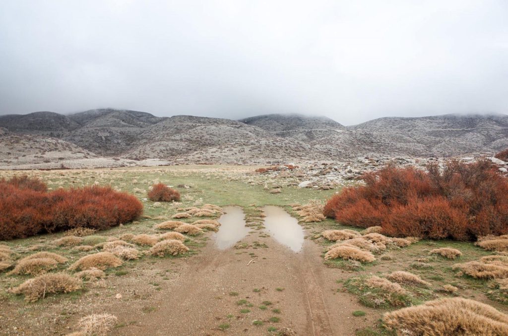
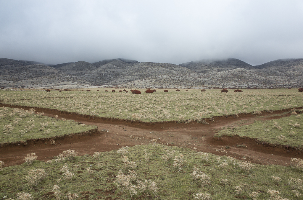
The above image features a natural landscape with a juxtaposition of a subtle hint to mans presence in the foreground with the carved out paths almost like scars on the earth.

George uses natural lighting and he creates a narrow image in terms of colour and contrast in the foreground while romanticising the background with higher contrast and tonal depth. This creates an almost boring foreground which insinuates the mundane and banal nature of man’s degradation on the earth while contrasting this with the dramatic powerful nature of the sublime in the background.

The image is also framed very symmetrically with the paths in the foreground forming an ‘X’ which creates a satisfying aesthetic.

Final Outcomes and Framing

Final Outcome Intentions

Anthropocene – ‘relating to or denoting the current geological age, viewed as the period during which human activity has been the dominant influence on climate and the environment.’

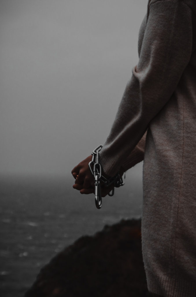
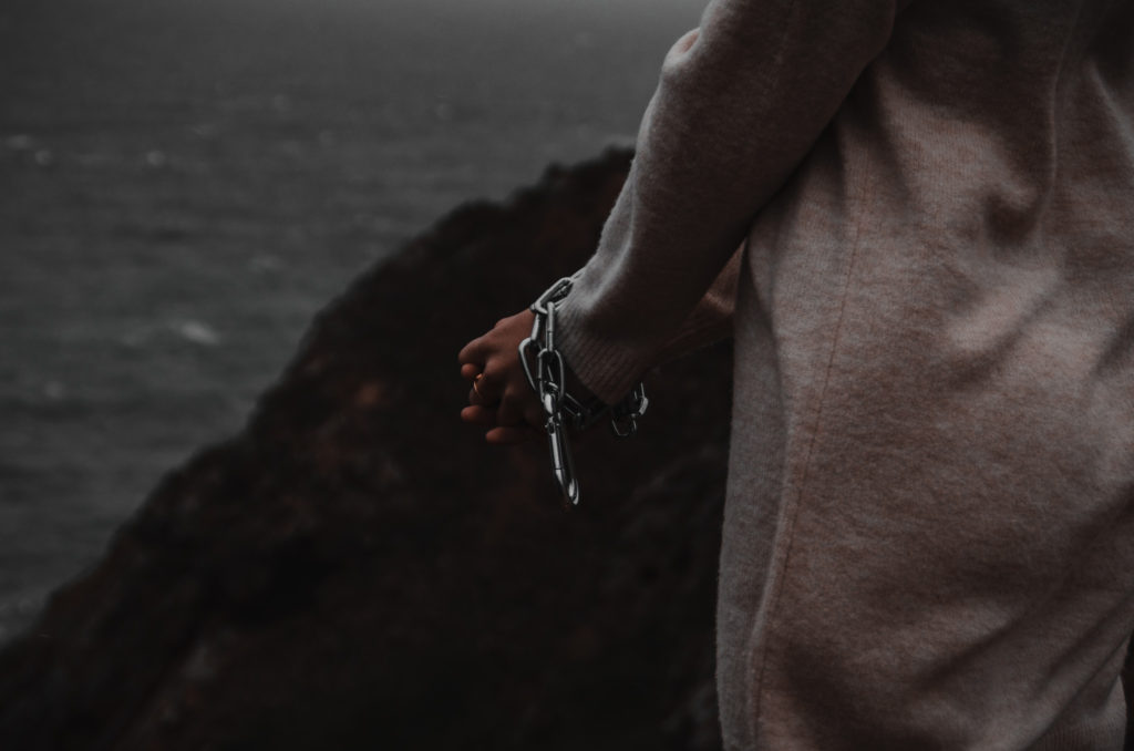
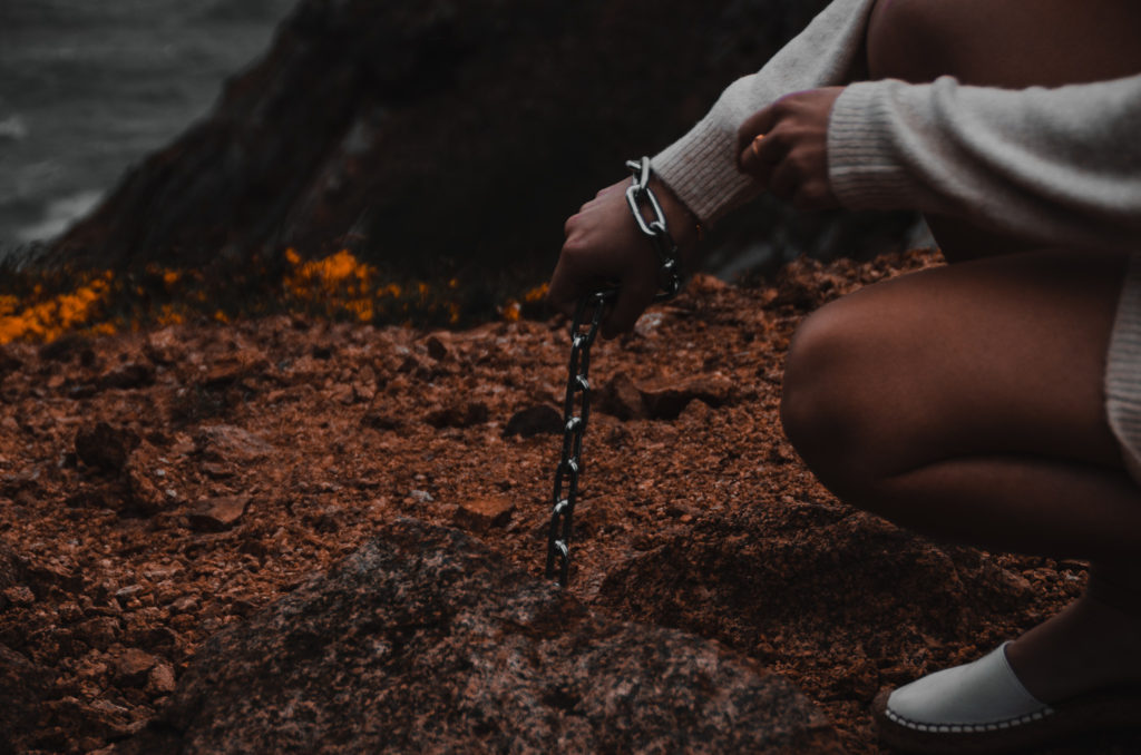
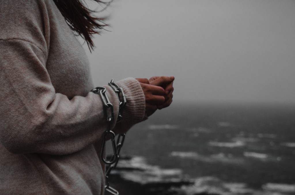
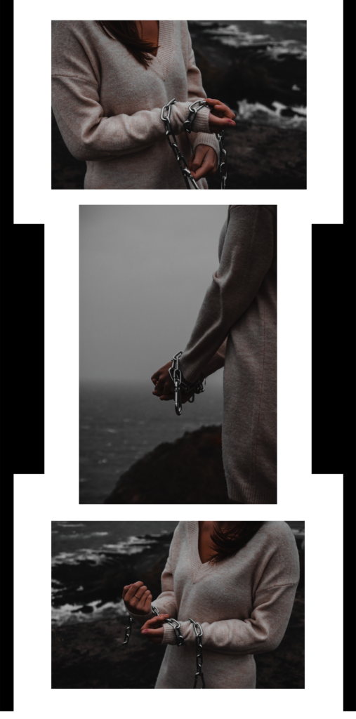
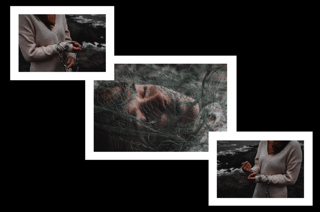
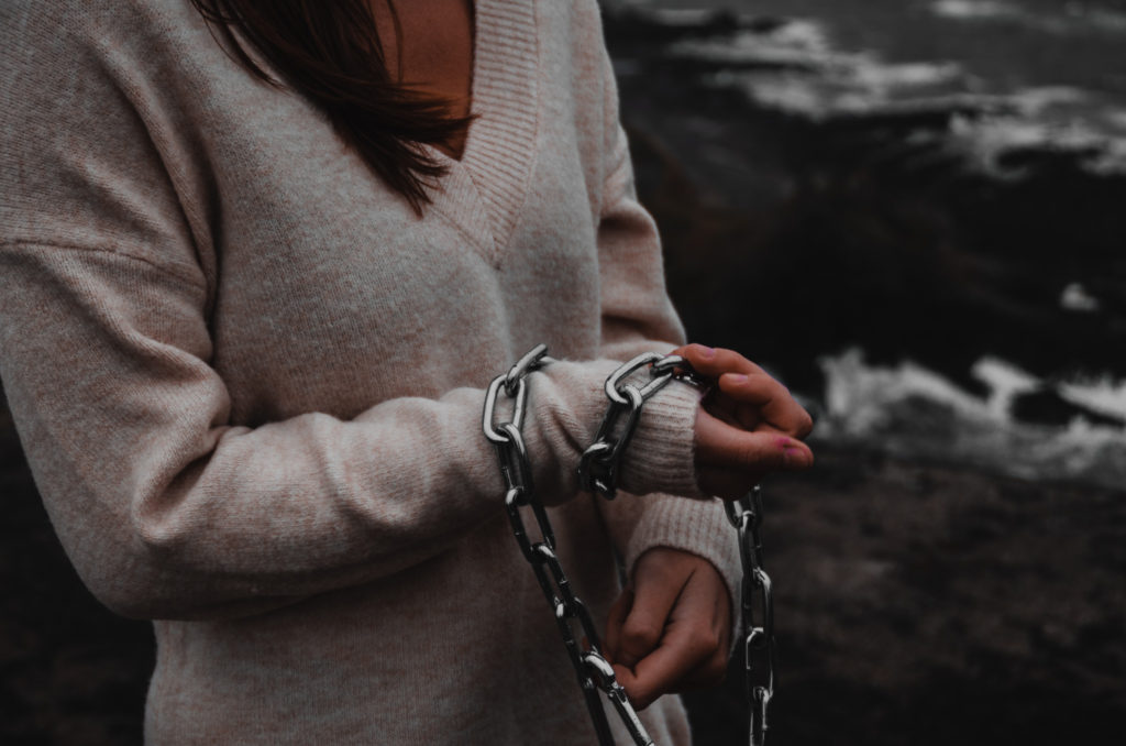
This whole project links to Anthropocene through how humans have affected the ocean wildlife. This is shown through the location and contents of my images. The abstract images induce the viewer to think more deeply then exactly what they can see, and to think about what parts of the image can symbolise. The chain and netting show how fish and other marine life is being trapped and killed through Anthropocene and humans actions.

The intention of these images is to (much like Jeremy Carroll) raise awareness and make people think more about Anthropocene as a whole.

Framing Ideas

vertical
triple – same size
triple – alternate sizes

Image Manipulation

image mirroring
image mirroring + layering

Final Outcomes

A5
A4
A5

I chose these images and this framing pattern because the images compliment each other giving symmetry to the overall display. The outer images are from my second photoshoot, providing earth colours and moody tones. They also are orientated so that the subject of the image faces the centre, large image in the display, this creates even looking outer edges to the display. The centre image is from my first photoshoot and provides colour and texture, while keeping the earth and moody tones.

idea development & experimentation

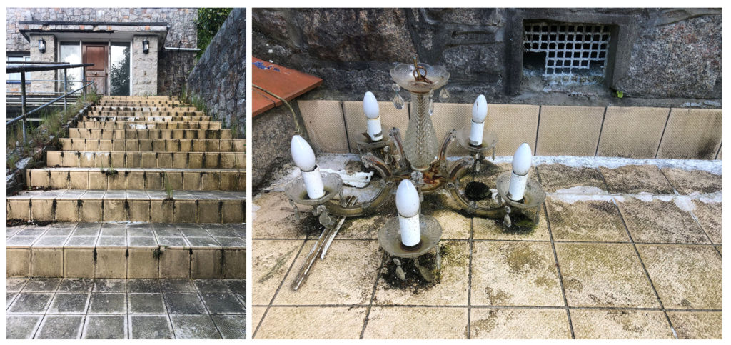
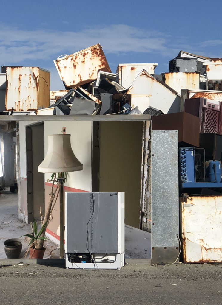
For this idea I decided to take the two images below and put them together somehow. I decided on using the polygonal lasso tool to cut out the large silver item in this image and placed the image with the lamp behind.

For my next idea I decided to make it more simple and just change this image to black and white to replicate an image in my one of my blog posts by an unknown photographer.

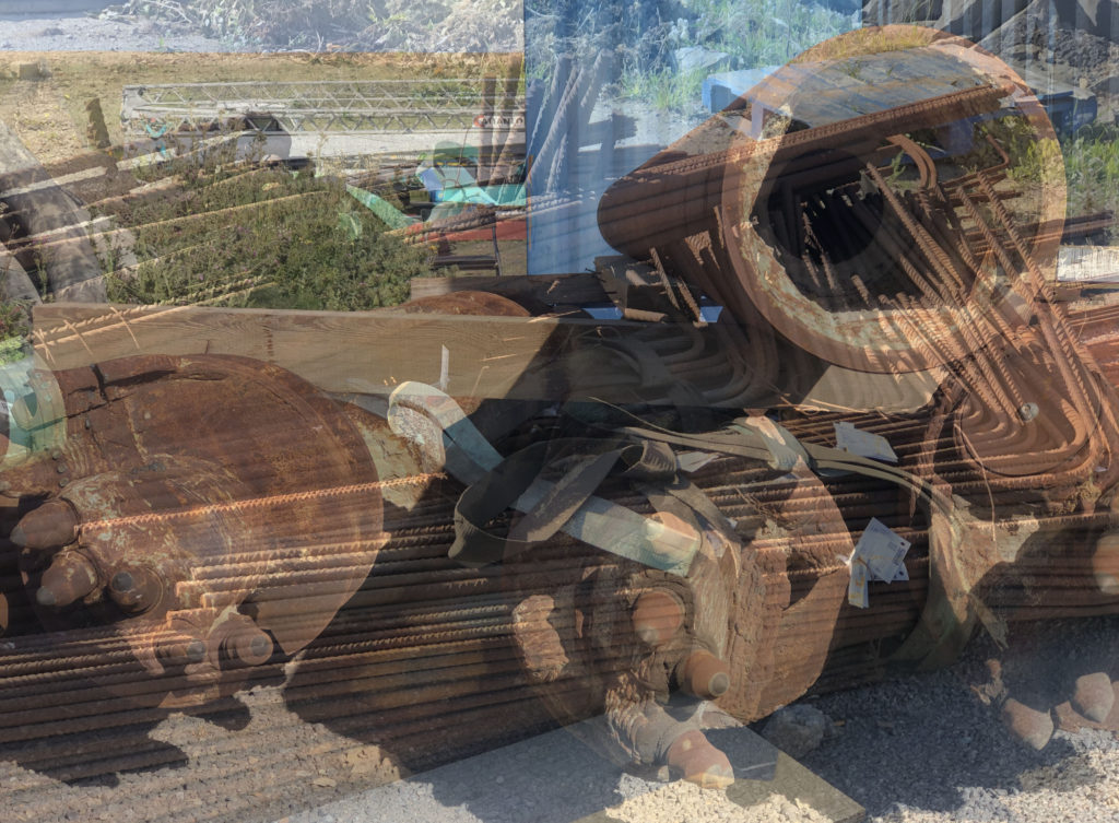
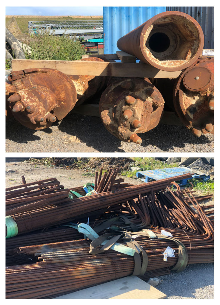
With these ideas I used the same images for both but changed the opacity of the images and switched them around.

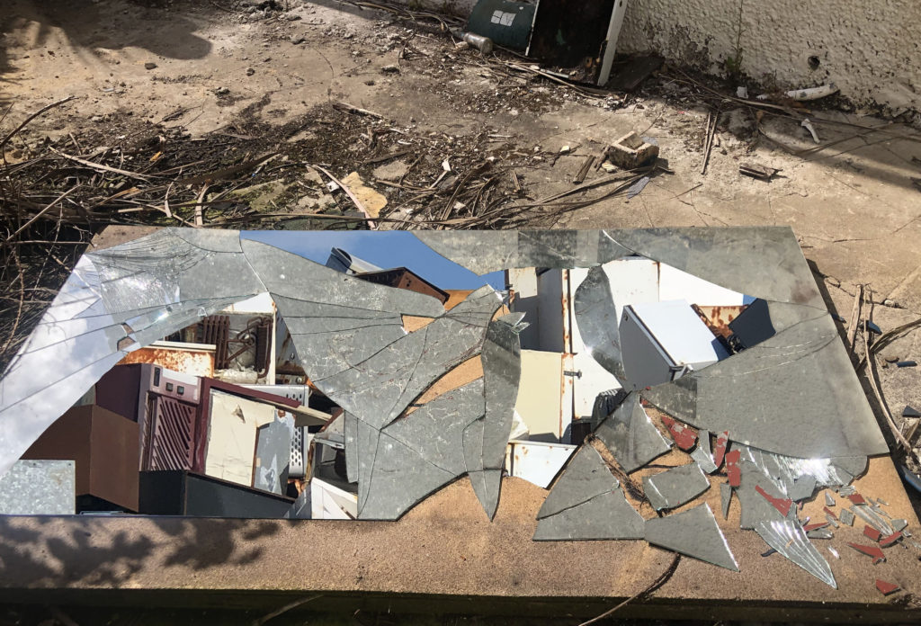
For this idea I took an image of a broken mirror and used the magnetic lasso tool to cut out sections of it. I then added a picture of fridges behind it.

Anthroposcene Ideas

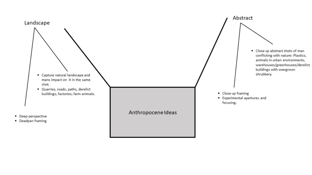
I have chosen to explore the concept of Anthropocene through the genre of landscape photography. I plan to react to ideas of nature being transformed through industry and venture into ideas of altered landscapes through my images. I will do this by shooting landscapes in a wider and vast perspective, of which supplies a view of the full picture. This allows a juxtaposition to be made between the natural environment and what man has interrupted it with.

I also plan to express the conflict between urbanisation and the environment by shooting derelict buildings and portraying nature fighting back against man. I plan to incorporate some abstract methods of photographing these buildings, with a more zoomed in perspective.

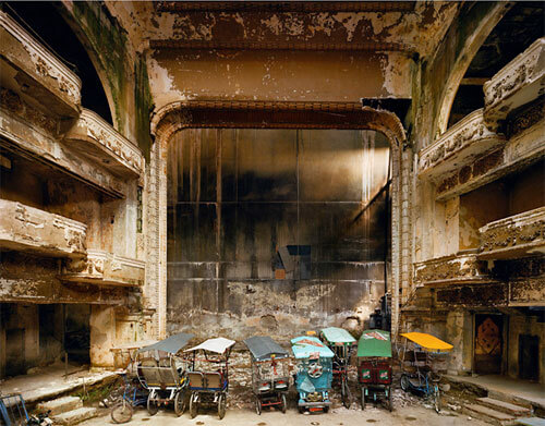
Below is some inspiration for my Anthropocene project: