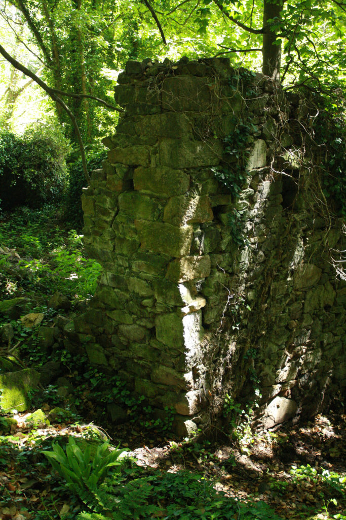
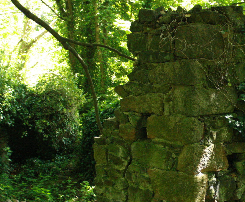
Final images
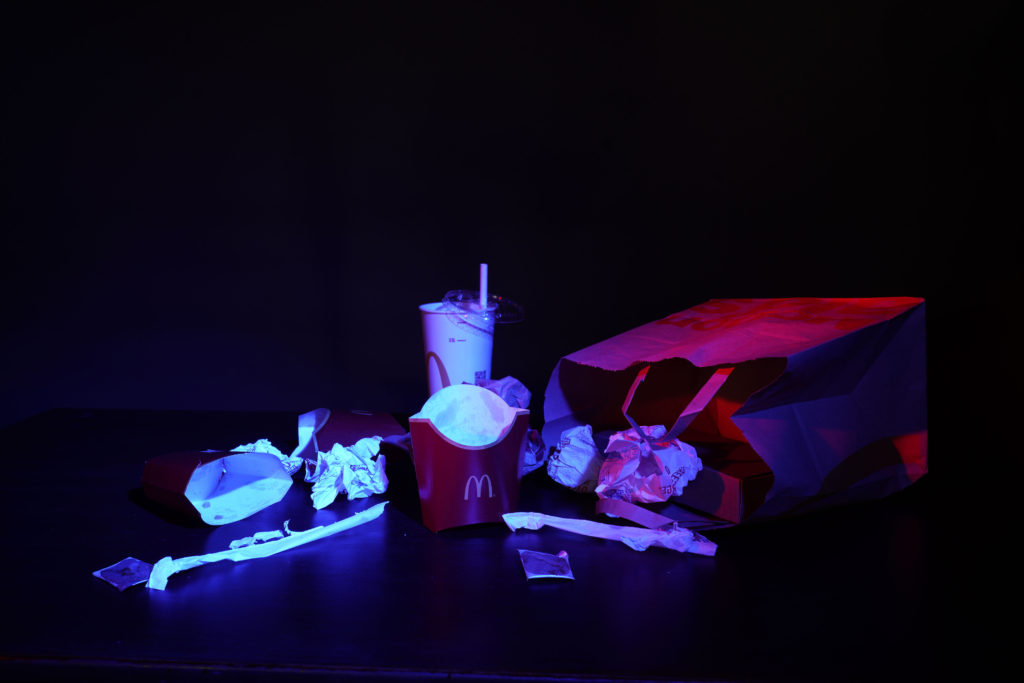
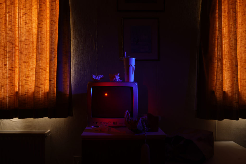
To recreate Troy Paiva’s style I used two continuous lights and added a grid and coloured gels to them. The grid allowed me to narrow the light so that it only lights specific part of the objects I wanted. The colours gels allowed me to add contrasting warm and cool colours just like Troy Paiva does. The camera was set to a very slow shutter speed of between 30 seconds and 8 seconds of exposure time. Since we where shooting in the dark this permitted some ambient light to get sucked in to the exposure. As I moved from the location to location, I had to change the shutter speed to adapt to the ambient environment and in some shots I decided to use flash light rather than continuous light. This helped to isolate the subjects. Off course the camera was always on a tripod. This is very important for slow exposures.
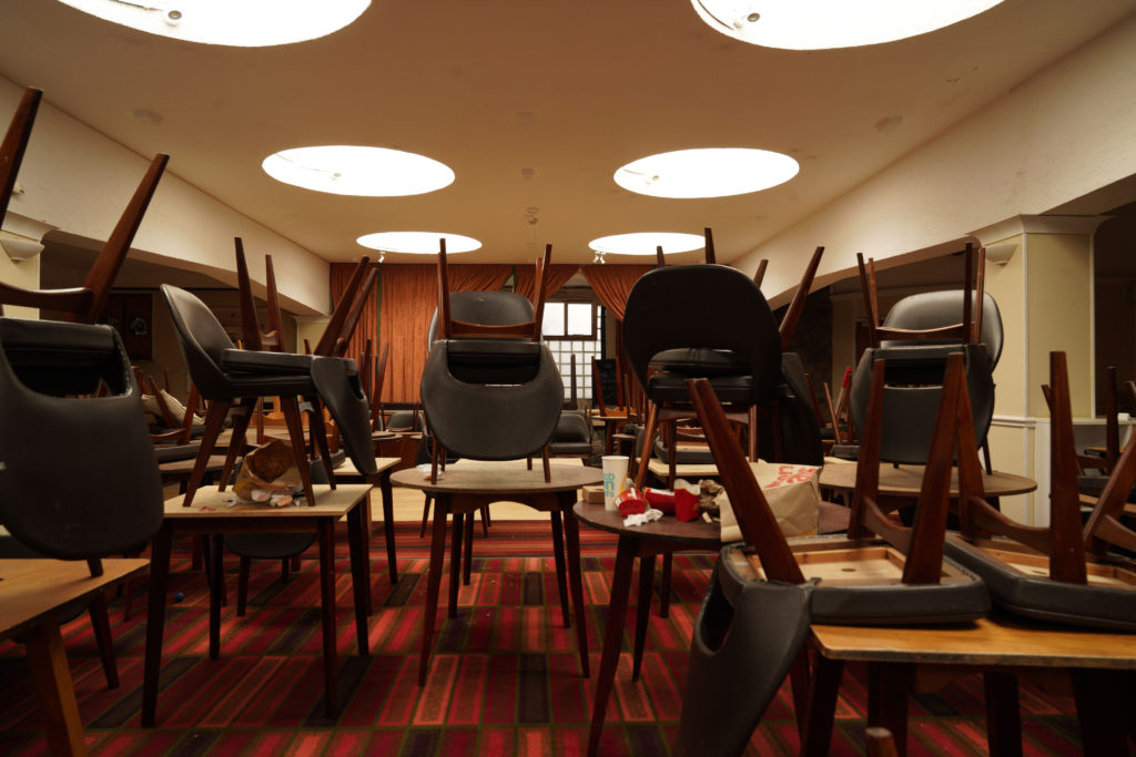
photo that I chose:
The three first pictures are from the same shoot ”Domestic waste”. Each of those three pictures presents different waste. The image I especially like is the first one the ”McDonalds rubbish” because it makes you question how something that is loved by young, old people can be very bad for the environment and pollutes our planet. Those packaging can be found everywhere like on street floors or the beach … But what if we took the packaging of our favourite fast food and turned it into an inspiration from a 17th century painting. Is like what Mat Collishaw or Krista van der Niet does. Let’s convert our waste into art!
The second picture I especially like is the third one since
we can see a place that use to be used, now completely abandoned. The colours and patterns of the floors let us guess from what period the hotel was. We can see the unused chairs left on the tables, rubbish everywhere the carpet is dirty… and all this makes me think about what this room was for before, why is it no longer used. The only thing left now are the memories. The last two photos are from my second shoot ”Ingrained in nature”. This shoot had a different meaning for me since I wanted to represent the fight that nature must wage against an anthropogenic element, in the end nature tries to adapt to it and grows up despite everything. The building is hidden in nature,
and its colours are the same as the forest: brown, green, yellow, blue
Review and Reflection
I like the finals results of my photos I think I managed to interpret what I wanted to show. In the first controlled conditions I did, I was a bit disappointed because I didn’t focus on little details because I was not well organized in terms of time. But in this controlled conditions I got better organized and I managed to put the details I wanted like well place the objects, change them, transform them and I also explored more in my idea than the last time. Another thing I had to improve in my last controlled conditions was lighting and sincerely I think it’s something that I handled well in this theme.

