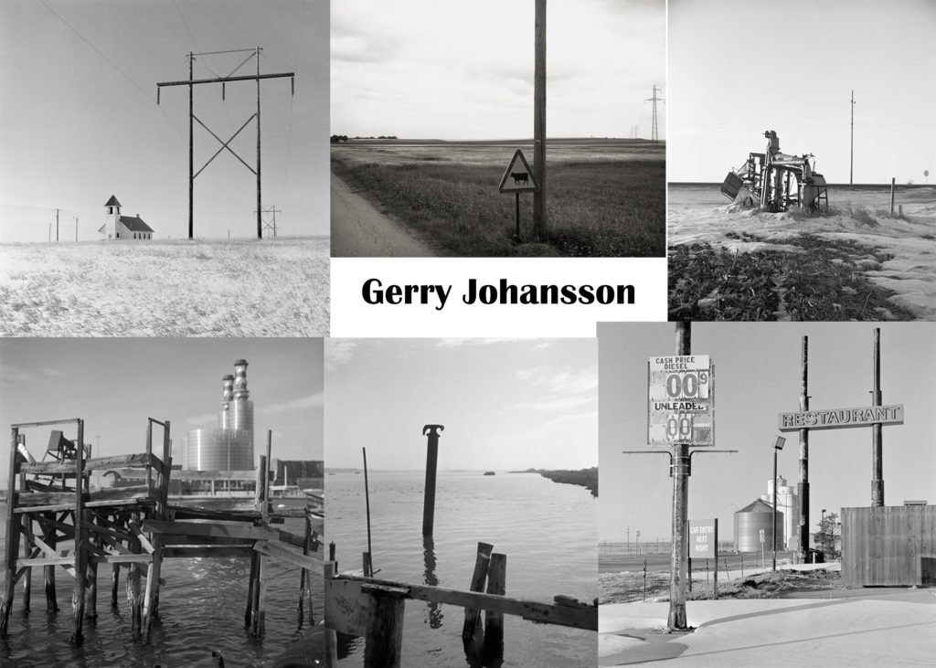
Gerry Johansson
Gerry Johansson is a Swedish photographer who photographs simple areas with straight lines. He was born in 1945 in Sweden and spent his life travelling around the globe taking photos. He photographs in black and white and his photos link to historical and social issues. Over his lifetime, he has published 30 books and at age 71, is still taking photos to this day.

Gerry Johansson’s style is taking photos of natural landscapes that have been corrupted by man made structures. His images are black and white and include open landscapes with buildings or structures.
Why did I choose Gerry Johansson?
I chose to use Gerry Johansson as one of my anthropocene inspired photographers. I chose to use him because his photos have simple subjects but complicated tonal values. The images have a lot of drama between tonal contrast, humanity and nature and old vs new. I also like the idea of taking photos in black and white so that the tonal values are very dramatic and I will recreate this with my own photo shoot.
Photo Analysis

Contextual
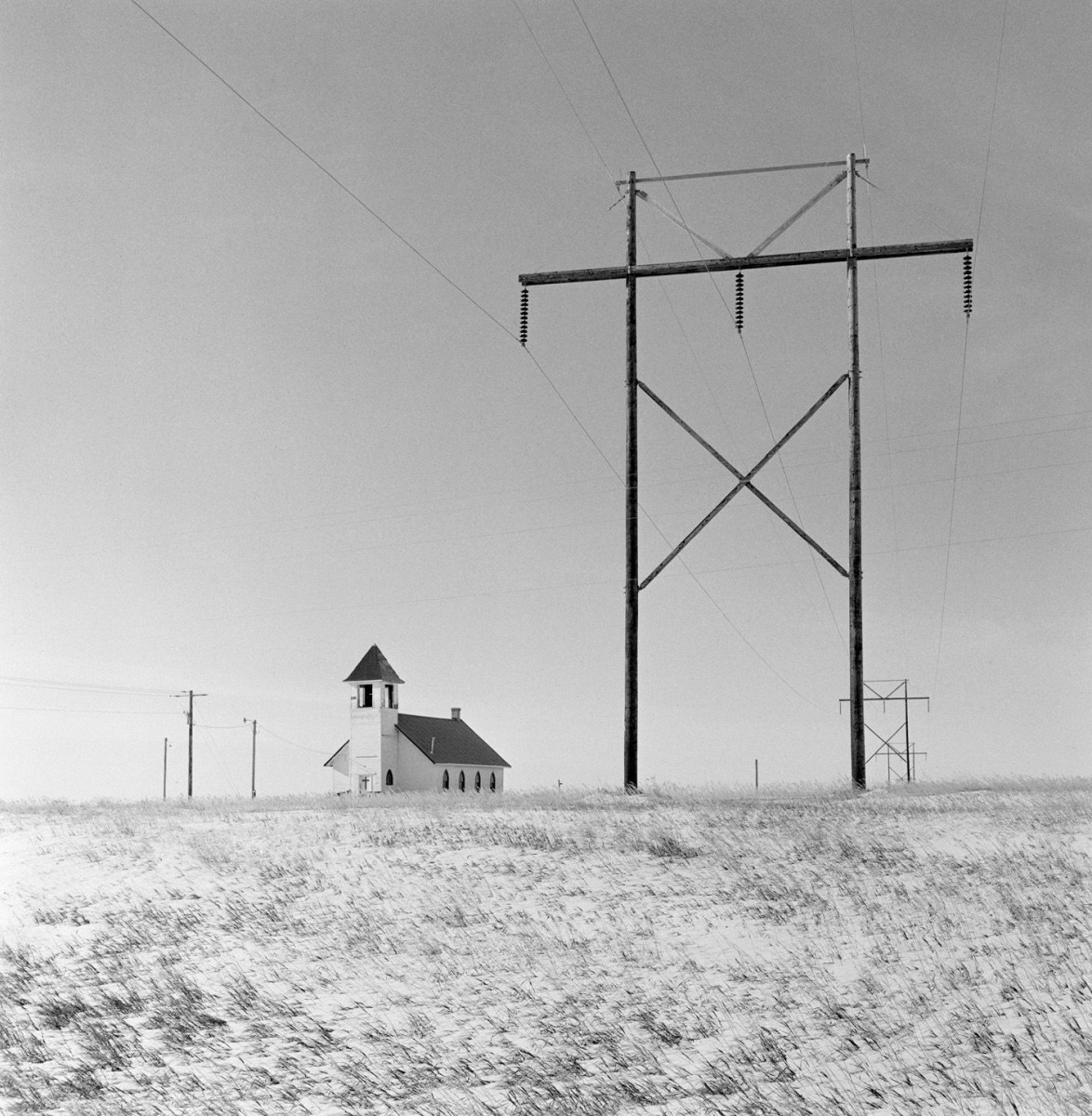
The image above was taken in Froid, Montana in 2017 and shows a church in the middle of fields of small grass. There are also many wooden electrical pylons either side of the church. The pylons appear to be stretching for miles through the Montana Desert. The image is in black and white and even though it was taken in 2017, Johansson has used an old camera to give the image a grainy feel.
Technical
The light in the image is clearly natural from the sun, however the light is very intense. We can assume it was taken on a clear day when the sun was high in the sky probably around midday. The tonal range in the image is very vast and the contrast is high. The image has a low ISO as the image is not dark.
Visual
The image has a good tonal contrast between the light building, grass and sky and the dark wires and pylons. The sun is coming from the left of the image as we can see a shadow on the church. There are also lighter parts of the pylons to the left and darker shadowed parts to the right. The large pylons provide a sense of repetition in the image and there are 8 pylons in sight in the image. The human impact on the empty desert displays the opposing forces of humanity vs nature. The electrical pylons are leading the eye from the main focal point and into the desert referencing the expanse of space still affected by the impact of humans.
Conceptual
I believe Johansson took the photo above to show beauty within the chaos of human nature. I believe he is also showing the effect humans are having on the planet in a positive and negative way. I believe the electrical pylons are meant to lead the eye of the viewer further and further away into the desert showing how was human impact is on the planet.
Where am I going to take photos?
As I mentioned on the post about antropocene in general, I want to go to places such as cell towers and reservoirs. I will take black and white photos with a high tonal value, using lines and shadows to create drama in my images. The images will show how nature is being affected by humans and how structures are present in landscapes.
Andy Hughes

Andy Hughes is an British photographer who works with plastic and how it affects the environment. He was born in Cardiff in 1966 and has mainly exhibited his work in the UK and US. He has also had his work used in the BBC and National Geographic. His photographs directly link with the idea of plastic pollution and the negative impact humanity is creating. He uses his photographs to bring information about pollution to light of the public and has spoken on television about the problem.
Dominant Wave Theory
Andrew Hughes’s work explores the rubbish washed up on the beach where he surfs. Despite their bad presence, these mass-produced items become aesthetic forms within the overall . By photographing everyday products in such an environment, Hughes attempts to draw attention to the unseen ,small scale pollutants of modern industrial consumerist society.
Image Analysis

Contextual
The photo is of a red lighter half buried in the sand on a beach. The photo is an example of Dominant Wave Theory as it shows an small mass produced item that would not usually be classed as having an aesthetic value. It was taken on a beach in Los Angeles in California and shows a sunset behind the lighter.
Technical
The lighting in the image is very natural and very soft and distant as the light is coming from the sunset. There is a good contrast between the brightest and darkest tones of the shadowed sand and the light sky. There is a good combination of colours with the red of the lighter mixing with the yellow of the sun. We can assume that the image was taken at sunset. The images has quite a warm tone and the lighter is in focus with the sand and sunset behind slightly blurred.
Visual
The image has a good contrast between the dark sand and the light sky creating tension between the sky and the ground. There is also contrast between the red lighter and blue/ grey sky. The sun is in the center of the image and the sunlight is being refracted and distorted by the scratched and damaged lighter surface. The red lighter combined with the yellow sunset creates a golden colour through the lighter. Behind the lighter, there are many small sand hills that bring a sense of repetition and randomness that link to nature. The lighter is in the middle of the image and is positioned at an angle that links to the idea of the sea washing it up randomly.
Conceptual
The image above links to the idea of Hughes’ Dominant Wave Theory and brings to light the detrimental effects of plastic on the planet. The surface of the lighter is also slightly damages linking to the idea that by putting plastic into the sea it is in turn damaging us. The scratches and dented surface resembles humanity being damages by pollution.
Where am I going to take photos?
I will take photos of plastic that has been washed up on a beach. I will take the photos so that the colours are contrasting and the background is slightly blurred resembling Andy Hughes and his method of taking photos.
Comparison
Gerry Johansson takes photos in black and white and his photos have a high tonal contrast which bring drama to his images. He also uses very natural lighting when taking photos. His message in his photos is that anything can have aesthetic value even the most unlikely subject.
Andy Hughes takes photos in colour and his photos have tonal contrast between dark and light but also warm and cold colours. He also uses natural lighting when taking his images. His message is similar to Johansson and it is that even small, mass produced things can have an aesthetic value.
