Mood board

Mind Map

Mood board

Mind Map

Mood Board
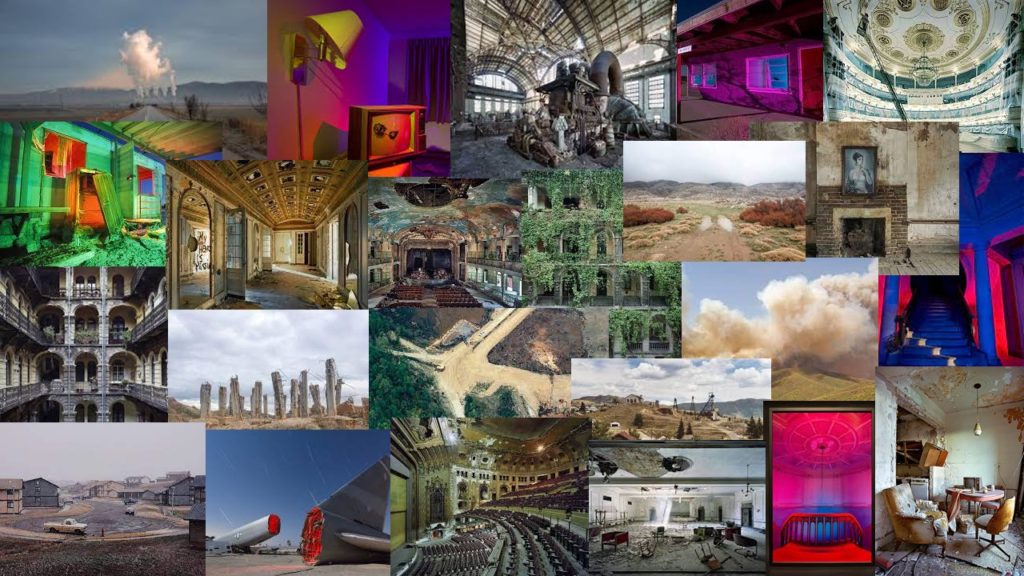
Photographers inspiration :
My project:
What I want to do for my Anthropocene photography project is to take pictures of a place abandoned by humans and which is being destroyed by itself little by little. I will be inspired by these photographs Yves Marchand & Romain Meffre, Troy Paiva, andrew moore, George Marazaki, David T. Hanson. My plan is made up of two shoots. The first shoot I want to do is the interior of an abandoned building for that I will be inspired by Yves Marchand & Romain Meffre, Troy Paiva and Andrew Moore. For the second plan my idea and to air the point of view outside the buildings how they destroy a little more each year I will be inspired by George Marazaki and David T. Hanson.
Anthropocene
What is Anthropocene?
The name Anthropocene is gotten from Greek and means the “late time of man.” Anthropocene Age, informal timespan time, making up the third overall division of the Quaternary Time frame , described as the time in which the aggregate exercises of people started to considerably adjust Earth’s surface, air, seas, and frameworks of supplement cycling. A developing gathering of researchers contend that the Anthropocene Age ought to follow the Holocene Age and start in the year 1950.
Anthropocene photographers:
Why should we tackle this topic through photography?
We are living in the age of humans, a time referred to by many as the Anthropocene.We caused gigantic changes on our planet, including a dangerous atmospheric deviation, sea pollution, and territory annihilation. Is important to show the damage that we caused, it helps us to reflect in our mistakes and change for the better for our future.

I am going to present the theme Anthropocene through portrait photography. My initial ideas are to use lots of plastic waste items (straws , bin bags , plastic bags). The reason i’m doing this is to represent humans and the damage they have caused. I am also going to be using these plastic items to alter the models face and cover parts of their face to show a distorted vision and view and ‘destroy’ the models face to present the way they destroyed the planet. I will also use photoshop and use multi exposure on some of my images to create a blurred affect and ‘damage’ the image.
What – Portrait photography using plastic waste. I will use studio lighting and do headshot based photos.
When – I can take my photos whenever as I will be using studio lighting so I don’t need to think about the natural lighting
Where – School studio using a mix black and white backgrounds
Why – I want to show a distorted image and alter the models face using the items that have altered the planet.
How – I will take my images using strong 2 point studio lighting and use recycled plastic waste to create the images. I will also use photoshop on some of my images to create a multi exposure image.
My main focus when using the plastic wastage is to show the impact on the environment by mankind. I also used the waste to distort the models face to represent a distorted vision similar to how my photographers shoot. This is to show that something normal to us looks different which is what has happened to the earth due to the plastic waste created by humans.
I also used water to represent water waste and the difference of access to water based on peoples wealth and location.
What is the “Anthropocene”
The Anthropocene is a proposed geological epoch dating from the start of significant human impact on Earth and its geology and ecosystems, including climate change.
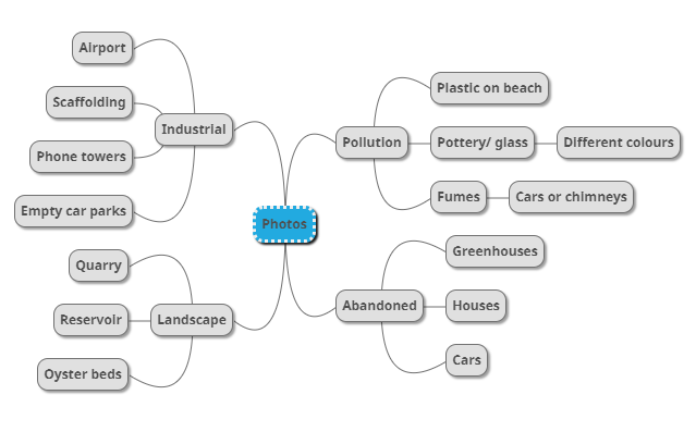

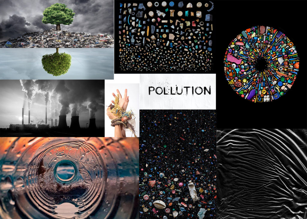
Above, I made two mood boards. One for Anthropocene in general including industrial, landscape and abandoned images which interest me and might inspire my final outcome. Then I made a second mood board just for pollution photography. I did this because the negative impact humans are having on the planet is seen by the influx of rubbish that washes up on our beaches and kills marine wildlife.
My two photographers that I will follow and take influence from are Gerry Johansson and Andy Hughes. Johansson takes photos in black and white of urban impact on nature and Hughes takes photos of pollution on beaches and creates the idea of the pollution being natural.
Anthropocene
Anthropocene can eventually be regarded as an era in which people have had an enormous influence on the earth. Climate change, for example; atmospheric, air and ocean warming from fossil fuels. But human age is not just a change in the climate. It involves plastic pollution that has hit whole ecosystems.
In 2019, Climate activist Greta Thunberg (16) addresses the United Nations Climate Change Action Summit in New York City by saying:
“You have stolen my dreams and my childhood with your empty words. And yet I’m one of the lucky ones. People are suffering. People are dying. Entire ecosystems are collapsing. We are in the beginning of a mass extinction, and all you can talk about is money and fairy tales of eternal economic growth. How dare you!”
You could think, “How did we get there?” Greta tackled the key problem vigorously; covetousness. Man is greedy and seeks for his own want ever since the beginning of the time. Whether it’s land, money, oil, religion, revenge or more, our world’s selfish and clever race, man, is likely to be destroyed. Having said this, experts have indicated that, because of global warming, we have now seen 75% of species disappear, and that the level of sea has increased, leading to many deaths.
The elder generation is dying with our world, so that the damage inflicted by our predecessors might be resolved for our younger generation. Greta says, “
“This is all wrong. I shouldn’t be up here. I should be back in school on the other side of the ocean. Yet you all come to us young people for hope..”
This quote shows how unfair this is to all of the young people. Another important point she raises is:
“You say you hear us and that you understand the urgency. But no matter how sad and angry I am, I do not want to believe that. Because if you really understood the situation and still kept on failing to act, then you would be evil. And that I refuse to believe.”
This depicts successfully how powerful people do nothing. The Supreme Macists have used it as their attempt to populate Mars instead of using the billions (or possibly trillions of dollars) of renewable energy to resolve climate change or increase our defence against asteroids. The rich first go, because the rich most likely do. This already shows human egotism.
I hope you can see our initiative open-mindedly, grasp the risk and help us do something. What am I doing? What are you doing? I’m spreading awareness.
Planning and ideas
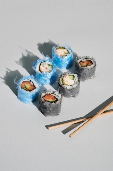
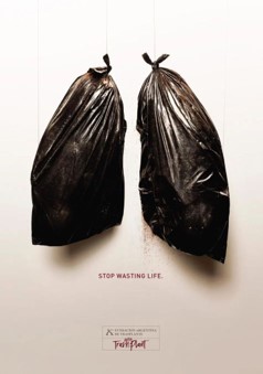

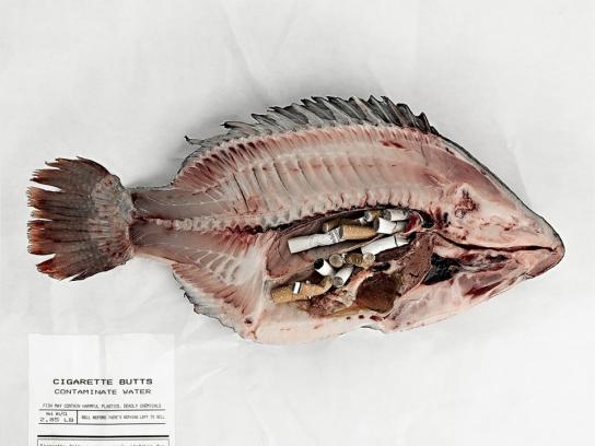

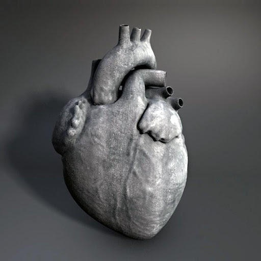
My purpose is to give my photographs with a message of danger and terror so that I become more conscious of climate change, Anthropocene, pollution and much more.
In order to accomplish so, I want to take photographs of dead fish, similar to the one above, with some plastic in them. I’ll do this to illustrate how our garbage, which we toss away, is “fine,” hurts and kills other species. I’m going to require a white and black backdrop to make Scott Laserow’s image of a fish with plastic on it, which is in black and white.
I will also try to reproduce the plastic sushi photos to represent how plastics has entered the food chain, leading to plastic consumption.
I have also thought about making a double exposure with my polaroid camera. This picture would show a twofold fire- and land exposure combined to raise awareness of climate change and how the fire danger in some kind of a natural environment has grown.
One of my thoughts was to take a cardiovascular picture. I plan from the market to acquire this heart. The photo would look like it was floating in a cow’s heart with a black or blank background. I aim to snap a shot with my heart and then add garbage slowly, plastic, paper, straws, etc. This is to attempt to send out the idea that if you or anybody wouldn’t let it to your heart, why would you? I can also make this heart a heart-fashioned earth by double exposure; double exposure enables me to keep the form and texture of the heart while the earth is overlaid.
My final plan is, for now, to photograph my 1930 box Brownie Junior n.2 and try to spoil the fire-fighting pic. Not everything, only enough to shoot a blazing image. This will generate a sense of worry as I damage the picture… But they might also assume that we do the same, not literally, for our world, but we think that it’s worth collecting our waste as someone takes it up, but who knows where that trash ends?
Location: The location for this photoshoot will most likely be at home due to easy accessibility. Since I’m doing a double exposure of land vs fire I will be clearly be shooting outside too.
Lighting: The lighting for this project will obviously be some parts natural and some artificial since I’m shooting both inside and outside.
I will choose to shoot during bright hours so that the Box Brownie can capture the scene in a successful way. Otherwise, I’ll try shooting with a slower shutter speed.
For the inside shooting, I will have to use my room lights, table light, phone light and natural lighting from the windows to powerfully capture the texture and structure of my objects while also creating some strong shadows.
Camera Setting: I plan to use Automatic mode for this shoot, since it’s faster, automatically chooses the best ISO, shutter-speed, and aperture which means my images will come out as clear as possible.
I may also try using other shooting modes like manual in order to demonstrate greater understanding and manoeuvre of the cameras.
For the polaroid camera I will attempt to use the double exposure mode to bring my ideas into reality.
Displaying my final ideas: My main plan to display my final ideas is to create a video with music, if this fails, I’ll try doing a virtual gallery through photoshop or create a VR gallery as usual. Although, I have done this enough times.
Artists
Scott Laserow
Scott Laserow has worked for over 30 years in the media sector and showcases his distinct and creative style in print media, online designs and animations. He won 75 significant national and international honours and was included in 60 publications in 48 shows covering 16 countries.
He has been a full-time professor of graphics and interactive design from foundation through graduate classes at the Tyler School of Art at Temple University in Philadelphia. Scott was the one responsible at school for introducing new technology and set up his own interactive curriculum, teaching identities and branding, animation, web design, digital apps and tablets and more.
He states that,
“In 2004, I discovered the power of the poster and how it could help support humanitarian causes throughout the world,”
That’s right because he has taken part in several causes. In many international magazines, for example, his posters were published in the cover of GRAPHIS posters in 2015. Now he is a judge for a large number of poster races.
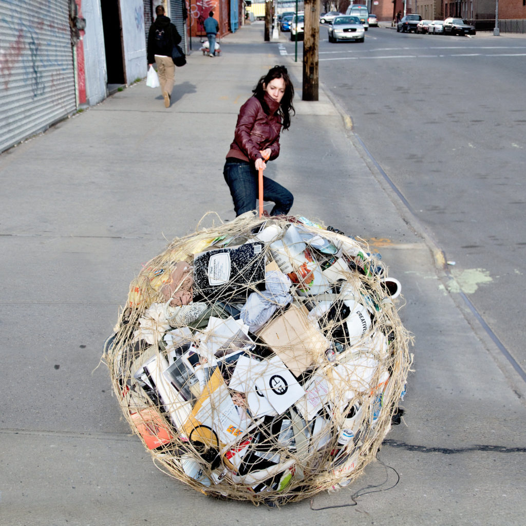
Mary Mattingly
Mary Mattingly is an activist of climate change and utilizes photography to communicate a message about topics such as sustainability and climate change and displacement via her work on portable building and sculptural ecosystems. An example of this is given in the above picture; the following answers are provided on your website:

We can clearly see here her efforts to encourage people not just to warn against environmental degradation, but to take care of the environment.
In her other projects, however, we are witnessing the vast majority of their labour under the weight of their possessions, refugees of a tainted past seeking a better future in the natural environment, we see how they try to build a better existence, and make easy and useful survival strategies.
Image Analysis

Scott Laserow
Substance:
We can assume that this image was originally in a digital format for the reason that it’s of higher quality than film.
The image was taken inside of a studio with a black background (which could be easily edited in).
This image was most likely a poster since Scott has worked in posters since 2004. This being said, the aim of this image was probably to tell a message about plastic pollution in the oceans. This can also be seen as protest art since it’s trying to bring our attention to how our own actions are impacting other beings, slowly destroying and suffocating them.
Composition:
The main focal point of this image is in fact the fish with plastic wrapped around it.
Author has powerfully used the rule of thirds to compose this image as the fish is positioned in the centre.
The main colours of this image are black and white tones. He purposely used the black and white technique to create this image to portray a sense of light vs dark and may also have used it to show the type of darkness our sea life are starting to live in, but the lighter tones may suggest a better future for our ecosystems if we take action now.
Lighting:
The light in this black and white image seems to be coming from the front as there are some shadows behind their head which could suggest that the light is indeed coming from the front. Evidently, the light seems to be artificial as the background is black and
There are soft shadows and dark tones throughout the image. For example, the bottom of the picture is darker than the top. The image is artificial, but the camera seems to have focused on the bright sides first as the image seems to be a bit naturally underexposed as there are soft lights and soft shadows throughout the image.
Techniques and editing: (evidently black and white filter or camera were used)
A fast shutter speed was powerfully used to produce this image as the subject (fish) has been shot to a razor-sharp focus.
The depth of field for this image appears to be quite large as most of the image is fixed. This was used to capture as most of the setting as possible while keeping a crisp detail to the image.
The artist may have purposely artificially underexposed the image to keep it in focus and so it isn’t too bright or too dark just the perfect tone.
The camera is still as this is a shot of a subject and all the details are in focus suggesting that the camera was stationary; a tripod was likely used.
Atmosphere:
The photograph makes me feel shocked at knowing that fish live and grow in this type of environment, all because of us and our toxic waste.
The photograph seems to be communicating a message of plastic pollution since the fish is half made of / covered with plastic. And, at the bottom it reads, “2/3 of the worlds fish suffer from plastic ingestion.”
My response to this image is shock and disgust due to the thought of, “how have we come to this?”
Response:
I will attempt to use the same black and white techniques to capture my shots to make it alike the original artist.
In order to incorporate elements into my own work I will need to make sure most or some of my subjects are of fish and there are elements of plastic throughout the images.
Similarly, Scott has influenced my shots by following his key theme which is the theme of Anthropocene. The alignment of subjects and set-up have also influenced my own future set of images.
I like this photograph since it portrays just exactly how dangerous plastic indigestion can be for our ecosystems and us since we have, at some point, eaten microplastics.

Mary Mattingly
Substance:
We may presume that this image was initially captured in digital format since it is higher quality than film, has a higher ISO, and is cleaner because film contains more dust particles than digital.
The image was taken outside with a street view.
According to Mary, the objective of this image is to assist her “avoid superfluous product purchases and use things for their entire useful life” as well as “measure my Ecological Footprint and identify ways to lessen it.”
Composition:
The key focus of this image is the woman carrying her own plastic waste around.
The author has effectively employed the rule of thirds to design this image, with the woman and the mound of garbage in the center.
The dominant colors in this image are grey and white; there are many other colors, such as green and blue, but the major ones are grey and white. This was most likely done to demonstrate how gloomy and dreary our planet has become as a result of our own garbage.
Similar to Scott’s image, the white could represent a hopeful future.
Lighting:
In this shot, the light is coming from above, effectively lighting the whole landscape. This allows the camera to focus more easily.
There are a variety of lighter tones across the image, which provides better illumination for the camera to concentrate on, resulting in a higher quality image that is precisely exposed.
Techniques and editing: (evidently black and white filter or camera were used)
A fast shutter speed was powerfully used to produce this image as the subject (fish) has been shot to a razor-sharp focus.
The depth of field for this image appears to be quite large as most of the image is fixed and there is a wide show of scene. This was used to capture as most of the setting as possible while keeping a crisp detail to the image.
The artist may have strongly used editing technology like Lightroom to energetically adjust the photograph to its perfect brilliance
A tripod was visibly used since there is 0 to no shake in the image which would be difficult to do with just holding the camera, unless a fast enough shutter-speed was used.
Atmosphere:
This image makes me wonder how much litter a single person is capable of making in a couple of months. Also, I feel fairly forewarned and motivated to take better care of our environment and, most likely, to begin recycling more, since there are several objects that might be turned into something new while effectively decreasing hazardous waste.
Response:
I plan to employ a similar strategy to Mary in order to educate people about the corruption and degeneration of our ecosystems, as well as to propose easy solutions that will motivate them to alter little behaviors that will have a big influence one day.
I will incorporate elements of plastic in my images so that it makes it easier to show how this artist has inspired me.
I appreciate this shot because it enlightens us on how much people have changed the environment in order to make our lives simpler, but in doing so, we have made it more difficult for ourselves.
Comparing Scott and Mary’s images
Scott:
What their work have in common:
Mary:
Additional artists

Man ray
Man ray was a famous photographer who explored surrealism and had a huge impact on the DADA and surrealist movement.
He was most known for, as stated above, surrealistic photographs to which he called “rayographs”, which makes reference to his name.
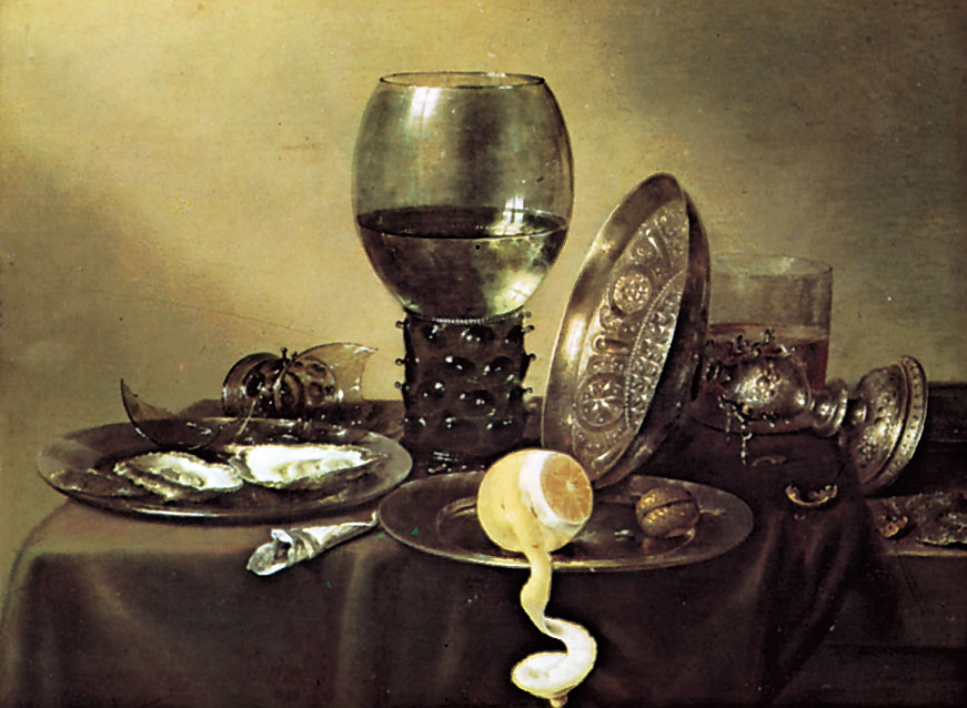
Willem Claesz Heda
Willem Claesz Heda was a Dutch, golden age artist who explored still life art / vanitas.
Vanitas used to be quite dull, as they were usually monochrome.
Through Vanitas, artists would represent great power and wealth, as the art would contain only a few objects like a skull, fruit, books. However, as time went by, Vanitas began to lighten the mood, the palettes became more diverse. Objects were often tumbled together, suggesting the conditional overthrow of the achievements they represent.
Contact sheets


Final Outcomes
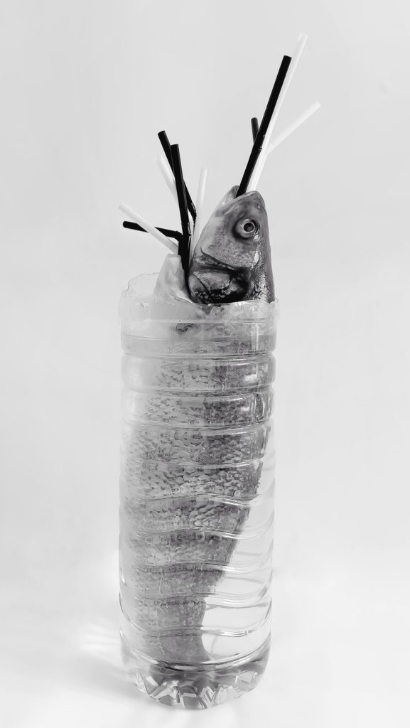
Fish plant
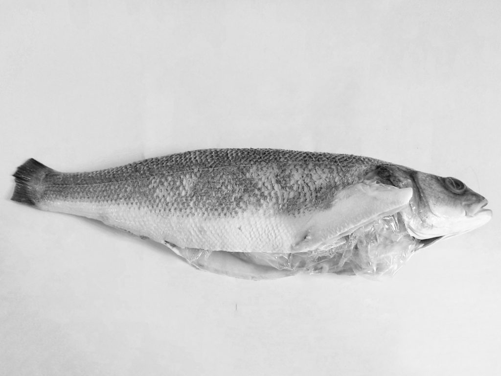
Fish’s diet
These are my favourite outcomes as they strongly matched my imagination of what I wanted these images to look like.
The first is an image of a fish, with plastic straws, in a plastic bottle filled with water. This was done to look like some sort of surrealistic plant; the bottle is the vase, the fish is the plant and the straws are the flowers, hence the name, “Fish plant”.
In a similar manner, the second image is of a fish with plastic coming out of its stomach. To which I gave the name of “Fish’s diet”.
These were done to indicate to the viewer that the plastic we throw away starts becoming part of sea life’s diet which ultimately kills them as they can’t digest plastic.
Furthermore, these photographs were shot to depict the concept of the Anthropocene; human effect on the environment. This is intimately related to the Anthropocene since it demonstrates human effect on other eco-systems.
Props, models, and composition are clearly used in these image sets. For example, I’ve placed the topics in the centre to direct the viewer’s attention to the problem first.
I’m hoping that by sharing these photographs, others may be inspired to take better care of their plastic waste.
Relation to my key artists:
Similarity / Relations:
Difference / own adaptation:

Plastic diet
This image was created to show how microplastics are starting to become part of our food chain since “2/3 of the worlds fish suffer from plastic ingestion.”
You may notice this image is one of the only ones with colour, this was purposely done to show an example of the different types of plastic that we could be eating without knowing. It was also done to differentiate from the monochromatic theme inspired by Scott Laserow and have some relation to Mary since she uses colour in most of her projects.
Relation to my key artists:
Similarity / Relations:
Difference / own adaptation:
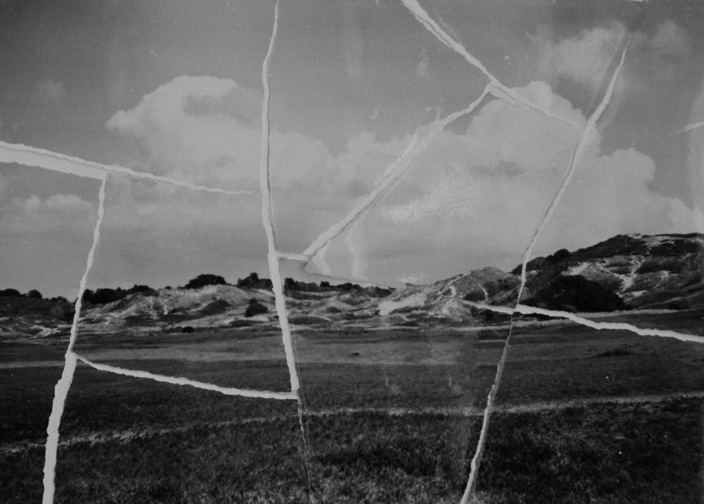
Irreversible

Never the same
These images were actually taken with a Box brownie jr. 2 (1930).
These 2 images above were created to show 2 things:
Relation to my key artists:
Similarity / Relations:
Difference / own adaptation:
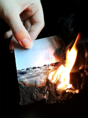
End of an era…
I chose the title “End of an era…” since people are, in a sense, putting an end to our planet. With sea levels and greenhouse gas emissions growing, only God knows how long we will be on this planet. This is also evident in the image, which depicts a gorgeous landscape photograph being torched by a person, reinforcing the idea that people are ruining the environment.
In some ways, the repercussions of global warming can be seen in this image, as the fire is burning the photograph and, as a result of global warming, we are seeing more fire breakouts worldwide. Here is an example of the harm done in Australia 2020:
“As of 14 January 2020, 18.626 million hectares (46.03 million acres) was burnt or is burning across all Australian states and territories. … In New South Wales, the fires burnt through more land than any other blazes in the past 25 years, in addition to being the state’s worst bushfire season on record.”
Wikipedia
The image also features an individual clutching the burning picture, which was done to communicate a sense of concern to the spectator; not only because the picture is burning (since developing the film and printing the image is extremely expensive and time consuming), but also because the viewer can see the flames moving closer to the human’s fingers, which may burn them. This might imply that humans are the ones causing damage to the planet but they will one day suffer because of it.
However, the use of ellipsis was used to demonstrate that THIS DOES NOT HAVE TO BE THE END; there is still hope for humankind by doing simple things like not driving as much to cut pollution.
Relation to my key artists:
Similarity / Relations:
Difference / own adaptation:
Editing



The editing for these photographs was primarily done by hand. The fish with plastic, for example, were all made by hand. My photographs were captured with my Samsung A80 48 megapixel 3D camera (better at increasing depth of images). And, owing to Samsung’s innovative image processing software, the camera was able to take a single image and alter it with several filters all on its own. As a result, I picked the black and white photograph as the best. It also fits with the Anthropocene idea.
I’ve also used editing software like Snapseed to remove some dirt and lines from the backgrounds of my photographs to make them seem clearer, and I’ve used the perspective tool to modify the angle of my products and subjects to centre them, which could be done to implement the rule of thirds. I’ve used Photoshop to resize my photographs, and I’ve used the healing + duplicating tool to smooth out the background on my photographs. I utilized Samsung Gallery’s editing tools to convert my photographs to monochrome since it has a stronger monochrome filter than other applications, which makes them seem fairly grey and high in contrast.
Furthermore, another man-made image alteration was attempted with the “End of an era…” image, but owing to the DSLR’s inability to concentrate on other things other than the fire, I wasn’t able to record a wide range of photographs of one of my photographs of the Sand dunes burning. As a result, I discovered Photofunia, a website that edited the fire for me.
Presentation
Final Evaluation
To be honest, I am really thrilled about sharing with you this initiative and helping to open your eyes to the reality we all claim to conceal or ignore.
My favourite photographs are the “Fish Plant”, the “End of an era…” and “Fish’s diet” since they fit with my imagination, are excellent quality and strongly connected with the topic of Anthropocene/human environmental influence and are pretty weird and artistic.
On the other hand, for different reasons, the further pictures made for this project did not prevail. For example, the contrasts are rather deeper, not so strange as the triumphant results, are really low in quality and, in my opinion, rather difficult to look at. However, they achieve their goal by sending the word of human effect to biodiversity, biophysical habitats and other resources.
The presentation of my images was a remarkable and unusual method to show my pictures in a new and original way. Since I used VR galleries for some time, it has changed. For I used Canva to make this movie, the music was free to use. In addition, I have used the Anthropocene topic in the YouTube video presentation to encourage the public to look after our planet better and therefore make a connection between Mary and I.
Finally, I accept this assignment to some extent and my final results were successful in achieving their major objective.