I used my own style which implements photography (a photo which it took), and 3D modelling in Blender. Then edited it in Photoshop.
I planned to make an image based on climate change, rising temperature, and deforestation.
I planned to use the freedom tree, as was make of metal, therefore it wouldn’t burn in a fire. I chose fire as it was a heat source, which represented rise temperatures. After, there would be no trees, signifying deforestation.
First I took a landscape into Blender, modified it, and changed the land, and scaled up mountains, where I would Photoshop the Freedom tree onto. I added many trees to the landscape. After I added fire to the trees and, put a camera-raw filter the change small details in Photoshop.
This is the final image after all the Photoshop:
It is called, “Freedom Tree 2072”, due to the rapidly increasing changing climate, I created an exaggeration of the future if rising heats is ignored. It is based off of the Freedom Tree in town; my image, which is in the middle of a forest fire. I wanted to show how the man-made, metal tree was not affected by the fire, compared to the burning natural forest around it, with CO2 gasses giving the sky a hazed look, due to the smoke. Hopefully, it can visualise the serious impact of climate change!
I was awarded a prize for this and it is getting featured in an exhibition in, Liberty Wharf on May 13th-15th.
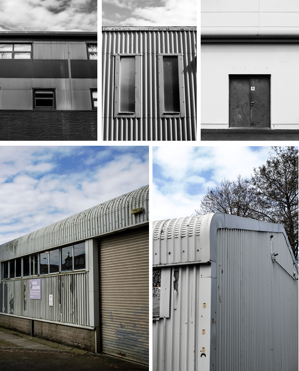
These were the photos that took to represent the “New Topographic’s” on the Highlands/Hautlieu photoshoot.
I mainly took straight-on photos of the buildings and sheds/warehouses around the area.
I used multiple exposure bracketing on some of them to get a more dramatic image.
I edited these images in Photoshop ACR / Camera-Raw.
My favourite is the bottom left image, as there is a contrast between the bright blue sky and the dirty building. And lots of detail in the texture of the metal.
New topographics was a term created by William Jenkins in 1975 to describe a group of American photographers (such as Robert Adams and Lewis Baltz) whose pictures had a similar repeated aesthetic, mostly black and white prints of the urban landscapes, a human-environment with the natural terrain hiding in the background.
Image taken by Robert Adams, Mobile Homes, Jefferson County, Colorado, 1973.
What was the new topographics a reaction to?
It was a reaction to the increasingly suburbanised world around them, and a reaction of idealised landscape photography that raised the natural elemental.
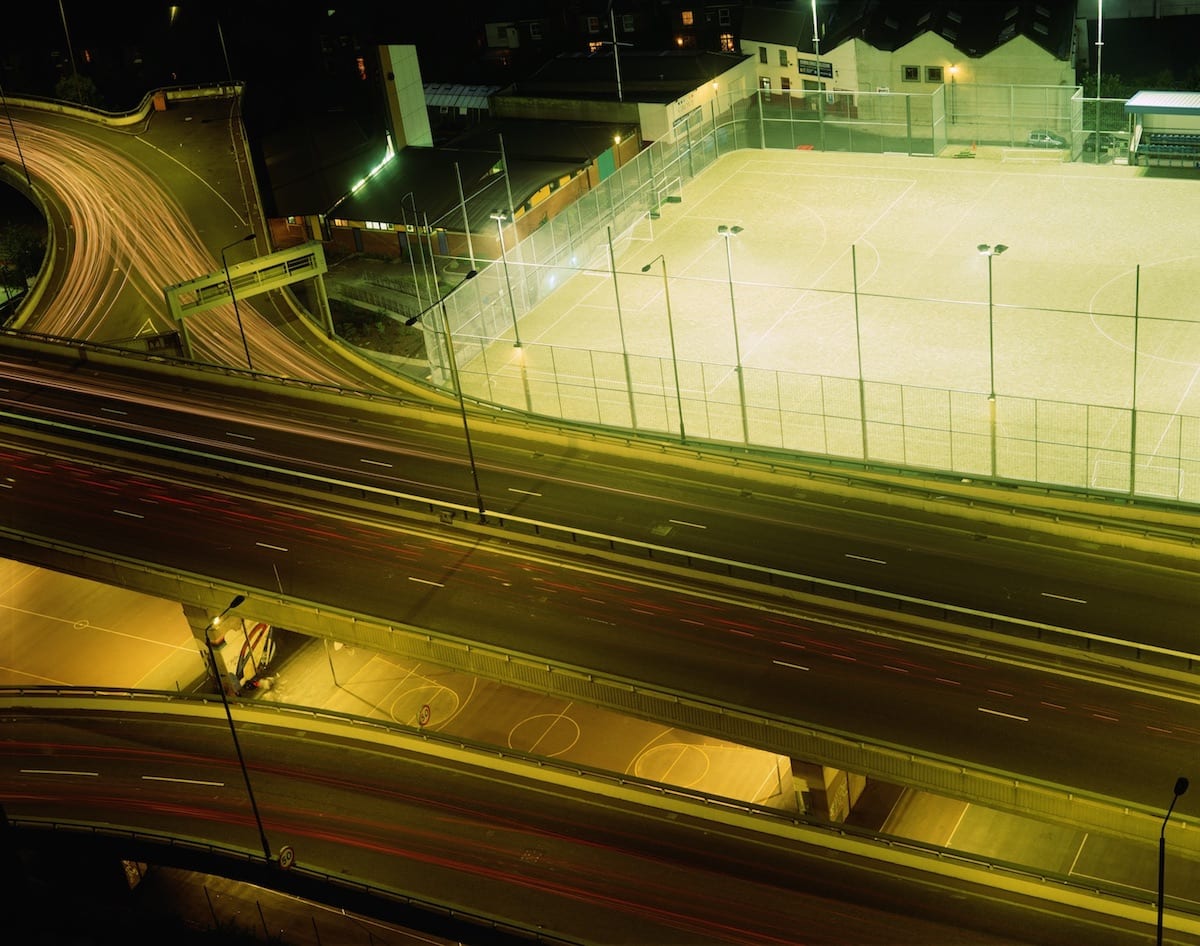
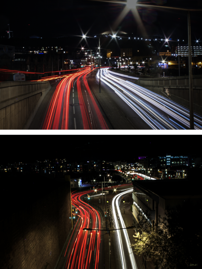
Rut Blees Luxemburg – (Case Study 1 / Night)
Rut Blees Luxemburg was born in 1967 is a German-born photographer. Her technique is to take photographs at night, mostly exploring the urban landscape. She experiments with exposure time and low light conditions to get an image that captures the night life in the city.
As you can see, Luxemburg uses warm colours and reflections in water puddles, which creates a unique view of her scene. Also, experiments which long exposure.
Analyses Of One Of Her Images :
All the lighting in this image is artificial, due to it being night time. It seems that there is a tungsten tone in the lights, as there is a orange/red tint on the surface that the light hits. This means that the image has a warm temperature to it, as the colour red is represented by heat. There is also a washed out green colour to the buildings in the back, most likely caused by the reflection of the flood lights on the football pitch. The colours are muted, which gives off a serene atmosphere as it feels abandoned. Although this isn’t the case as motion is captured by using a long shutter speed, this makes it so the car lights show as a long red or white lines; depending on what way the car is driving. Since, it is night the camera will not overexpose the image, as there is no natural sunlight, therefore she would of been using a high ISO, eg 800-3200. There is a high depth of field as all the image is in focus, and also Rut Blees Luxemburg displays a wide range of tonal values, achieved by including and showing a light source and shadows under the overpass. There are many horizontal lines and geometric shapes in the image. The horizontal lines suggest a feeling of rest, because objects parallel to the earth are at rest. In this landscape, horizontal lines also help give a sense of space and attention to the 3D aspect to help visualise that the image was taken from a high place. As she is a tutor at the Royal Collage of Art, this may mean that she has a higher status position over her students, which is why the image is taken higher up.
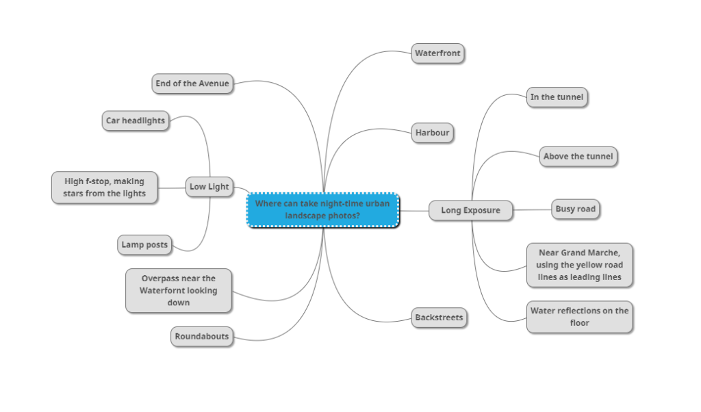
Where Can I Take Night Urban Landscapes?
Mood Board
Photo-shoot Plan
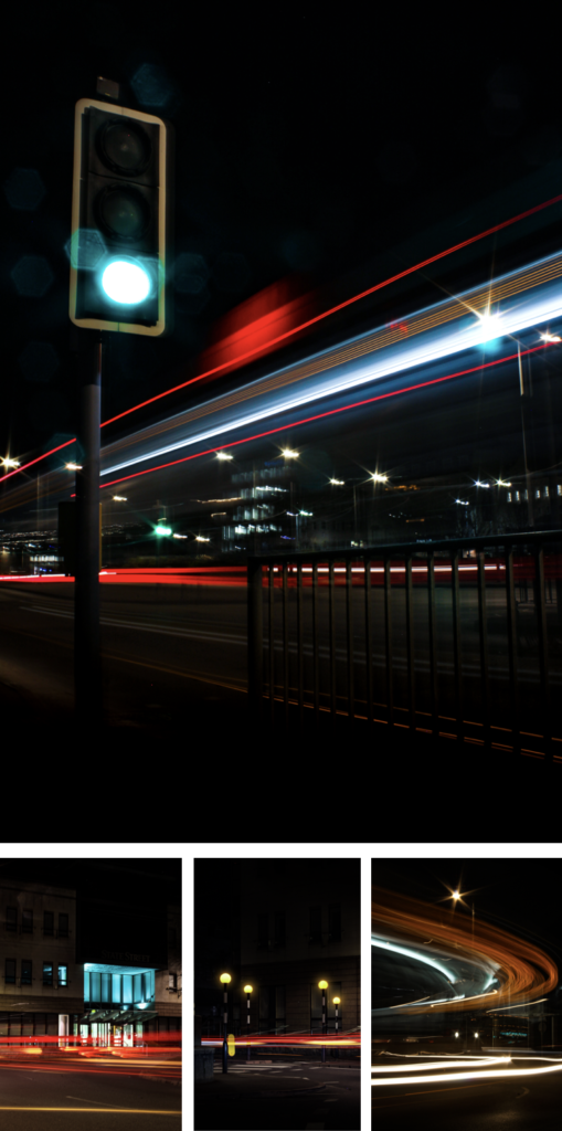
Night photos – (Contact Sheet)
Final Night Photos (Titled)
Go.
Roundabout turn off.
Crossing.
Roundabout.
Overpass.
Above the tunnel light trails.
My Image Comparison To Luxemburgs Image – Venn diagram
Overall, my I really like my image as it captures motion and, I have created a unique pattern with the buses lights. The colours are vibrant and the bus lights are in focus, which is the main focus point in the image. As I used a high aperture the still lights appeared as stars. For composition I go low to the ground the shoot more upwards, the lights from the bus fill up most of the image. The image is balanced and exposed perfectly even thought it was taken at night time.
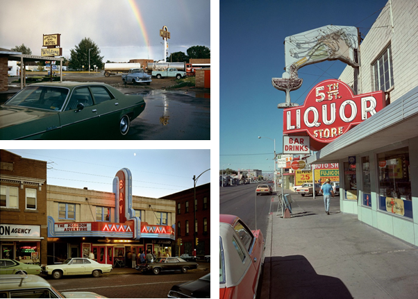
Stephen Shore – (Case Study 2 / Day)
Stephen Shore’s work has been widely published and exhibited for the past forty-five years. He was the first living photographer to have a one-man show at the Metropolitan Museum of Art in New York since Alfred Stieglitz.
He has also had one-man shows, his most rememberable at : Los Angeles; Jeu de Paume, Paris; and Art Institute of Chicago.
In 2017, the Museum of Modern Art opened a major retrospective spanning Stephen Shore’s entire career. He has received fellowships from the Guggenheim Foundation and the National Endowment for the Arts.
When he was in New York; in the early 1970s, he sparked new interest in colour photography, and in the use of the view camera for documentary work.
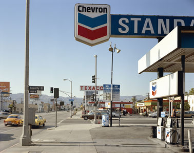
Analyse Of One Of His Images:
This image shows a busy American street in 1975, Shore’s took this image next to a gas station, which had a wide view over the streets. The image is bottom heavy, which means that the viewers eye is directed toward the bottom half of the image, compared to the empty blue skies.
The contrast of a busy, chaotic street and the clam, tranquil mountains in the background, signify the difference between man and mother nature. Even thought the mountains are small they are still present. The fact that the mountains don’t take up a large portion of the image shows that the industrial and urbanising world is taking over natural land.
The main colours in this image are red, blue, and white. That just happens to be a colours in the American flag. It can suggest that Shore’s is proud to be an American citizen, which he displays through his work of photography.
Overall, I think this image mostly basic, with a normal “street photography” composition, that doesn’t use any objects/techniques to grab the viewers eye. The colours are normal, but mostly blues, which gives off a cool feelings, despite being in a desert in Los Angles. Although, I do like how Shore’s has captured the history of America, by including the old cars, and billboards, (not digital).
Where Can I Take Night Urban Landscapes?
Mood Board
Photo-shoot Plan
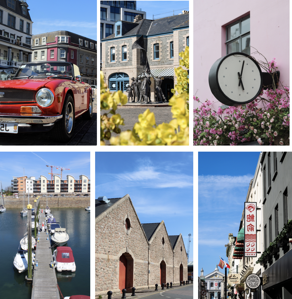
I plan to walk around town and take photos of unique buildings and scenes that I find. I would go to Weighbridge first then maybe, round the back of the tunnel to La Collette then finish off at Millennium park and the small streets round there.
Urban Day Photos – (Contact Sheet)
Final Photos
Analyse–(Shores Vs Mine)
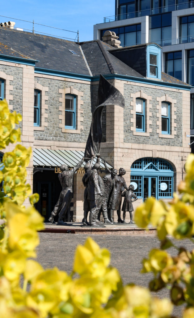
This is my final image I chose, as I feel that it linked to Stephen Shore’s style the best.
Similarly, both the image capture a historical value. My image captures the liberation statue, and Shore’s capturing change over time.
Both, include nature in a build up urban environment. In my image its the flowers in the foreground, and Shore’s its the mountains in the background.
Also, both use vibrant colours, except mine has a more vibrant summer feel. However Shore’s uses a smaller colour range, compared to mine which uses bright yellows and ultra blues.
Overall, I like mine more as there is more of a focus point; being the statue, this is achieved by using a unique composition with the flowers to almost “frame” the statue. To draw more attention to the statue I used a lower aperture to blur the flowers.