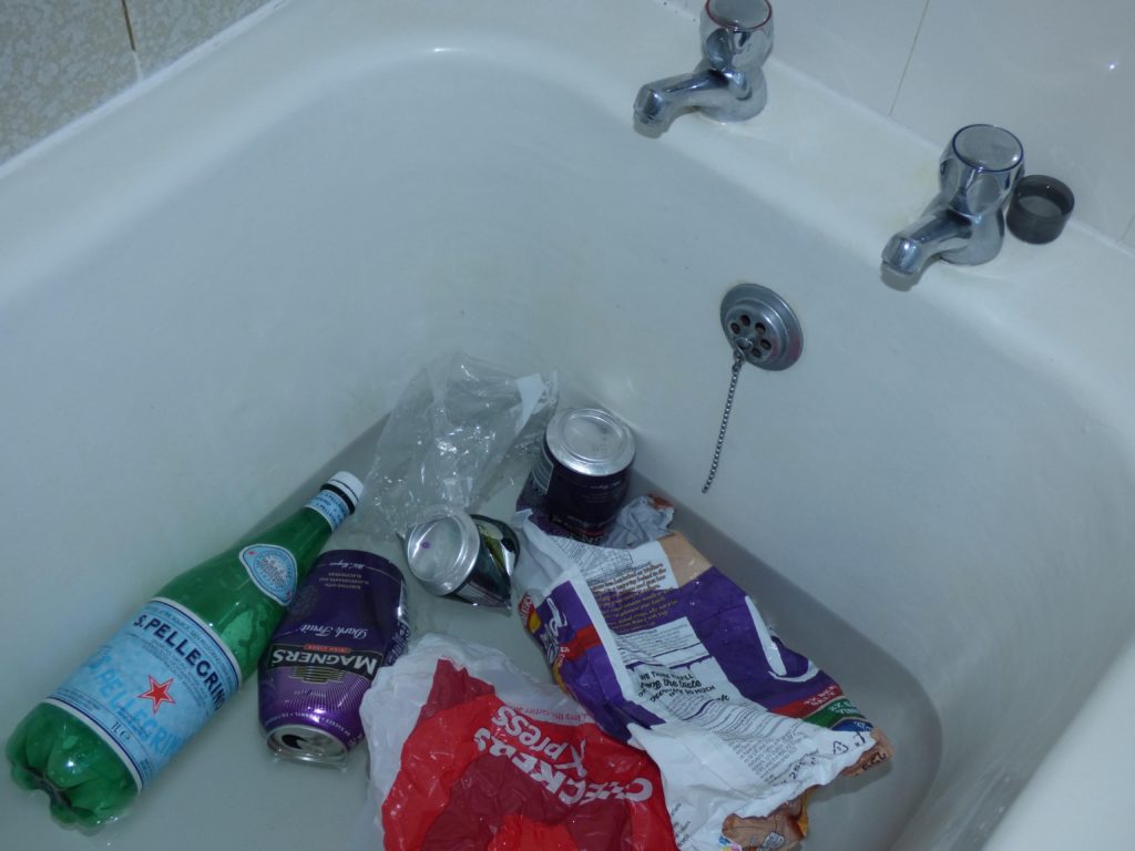
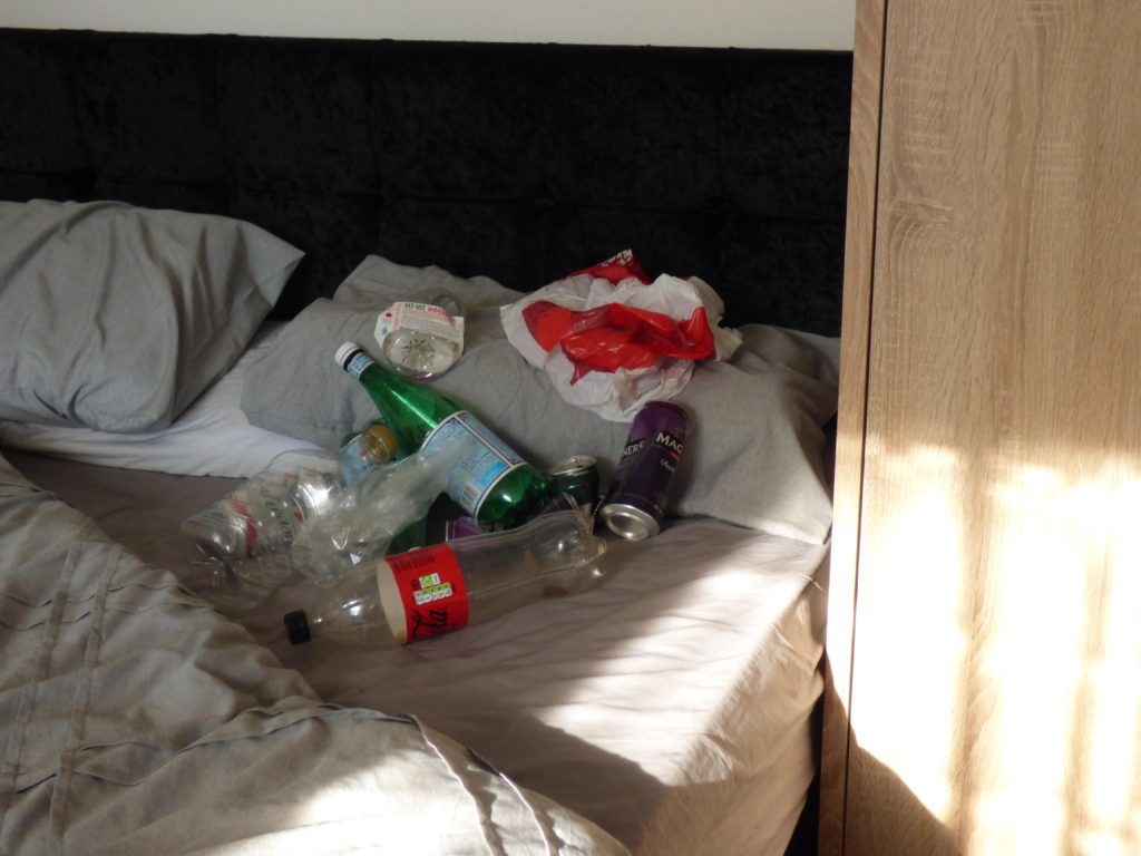
To begin, I chose 3 images from each shoot- the ones I believe were the most successful and the ones I would like to work with.

1 
2 
3
I chose these 3 from my bathtub shoot. Image 1 was originally larger but I chose to crop it down as there was too much unnecessary space, therefore taking the focus away from the message. Image 2 is more of a low view in the tub- the taps aren’t on show and all you can see is the drain. I liked this image due to the simplicity and it may make viewers look and think about what it is- however I did use flash, creating this lit texture in the tub which I personally dont think looks good. Image 3 is my favourite out of the three images. The taps create good contrast and I like the diagonal angle as well as the curve in the tub, creating a modern style and interesting composition.

1 
2 
3
These 3 photographs are all quite similar however I like the angle of image 1 and 3. Like in my bathtub photos, I like how they are taken at an angle. In image 2, the angle is straightforward, there are a few things that look ‘in the way’ such as the plant and wardrobe and it looks uneven. When taken at an angle, you cant tell.

1 
2 
3
My plate images are my favorite ones, I love the lighting and how the plastic reflects it. Image 1 was taken before I added cutlery. I have a glass dining table so when I tried to take images of the plate on the table it looked tacky, so I used my floor- although image one visually meets the aesthetic, viewers may not be able to know what they are looking at- so out of these images I like 3 the most. The cutlery is clear and on the plate as well as the waste. In image 2 the light is a tab bright and the fork is not fully in view.
