Urban Photography

Coastal Images

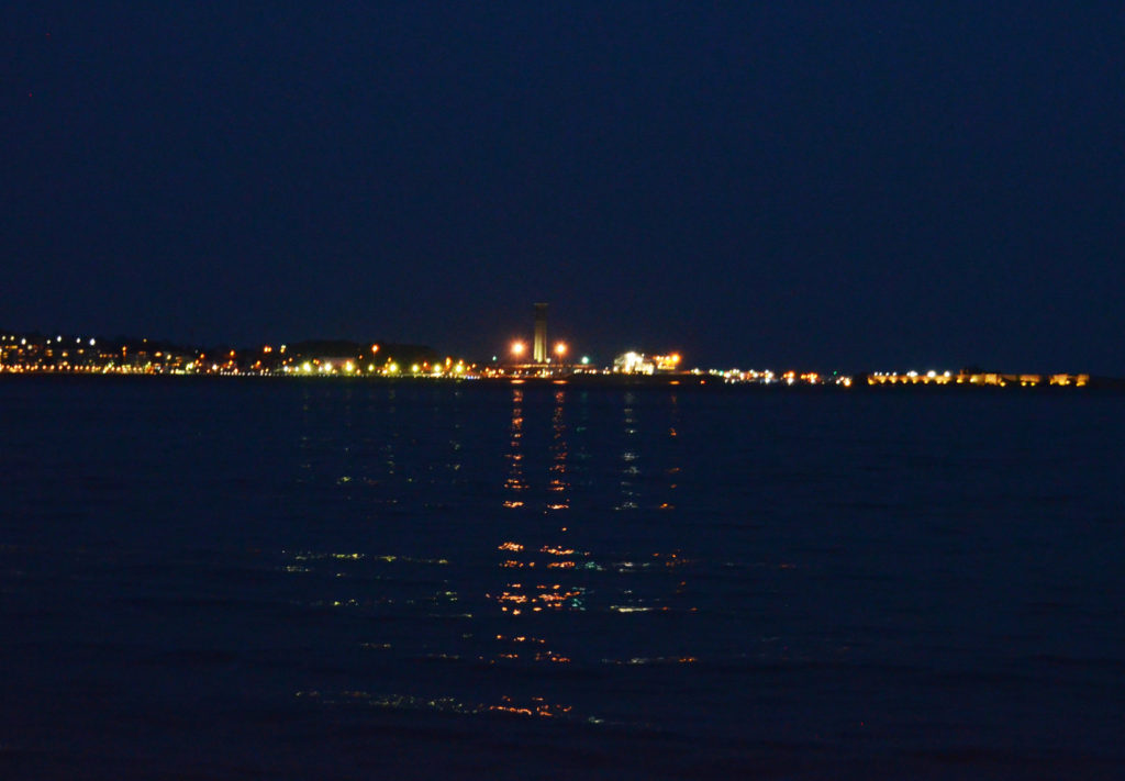
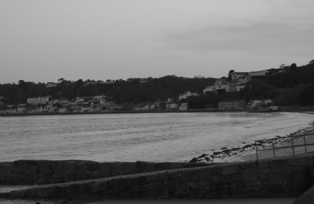
I went onto the front just after sunset. I wanted to show that even on the coast there is signs of man-made products ‘destroying’ our landscapes.

I focused on taking images of the lights from St Helier which reflected on the ocean. Some would argue that it ruins the scenery and is an eyesore to the landscape. I personally believe that it enhances the beauty of the ocean. The lights that reflected on the sea from the city emphasises how calm and peaceful the ocean was at that time. In addition the lights bring a certain warmth to the image as the sea has connotations of being cold and isolated due to the vastness of it. The lights that are visible show the viewer that people live round there and get to witness its beauty everyday. I also believe that the lights create a nice contrast to the images; since I took the images at night without them the viewer would not be able to see where the ocean finishes and where the sky begins.

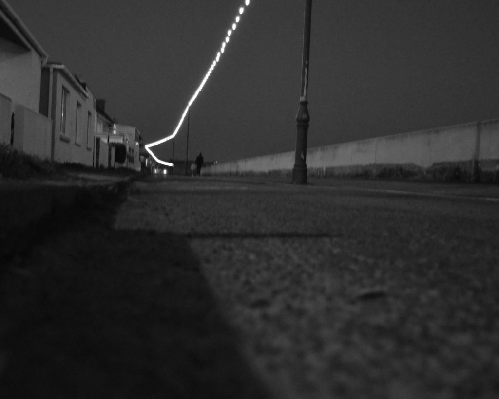
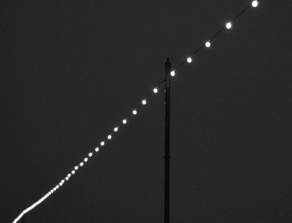
I also focused on the lights that were hung along the walkway on the sea front from St Helier to St Aubin. Although they are wires attached to metal poles, In the evening they bring a beauty to the darkness of night. During the day they may seem pointless, since the sun is beaming down on the island; but in the evening the whole of the front has a whimsical feel to it, as well as providing light for those walking down it in the dark.

I took images facing towards St Aubin and wanted to focus on the walls and piers going onto the beach. Not only are they an easy access to the beach, they carry a lot of historical moments on their shoulders. For example when Germany Occupied Jersey during the second world war, those piers would have been prepared for the Soldiers to leave the island should an attack be attempted. So, even though the concrete structures may look ugly along the sandy beaches, they aren’t necessarily just piers/walls/towers. They can be reminders of history.

Final images

Havre De Pas

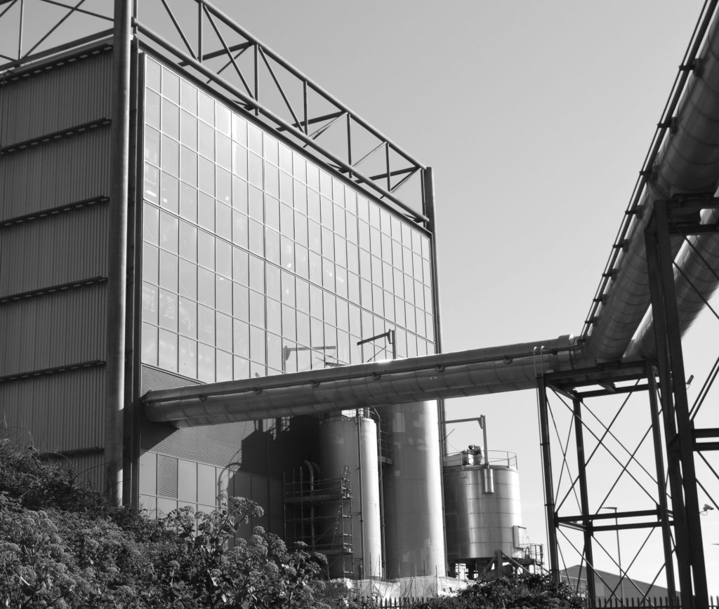
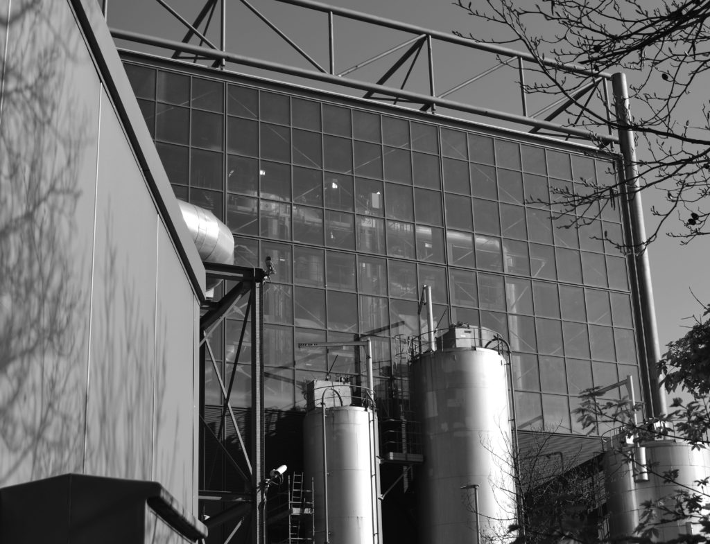
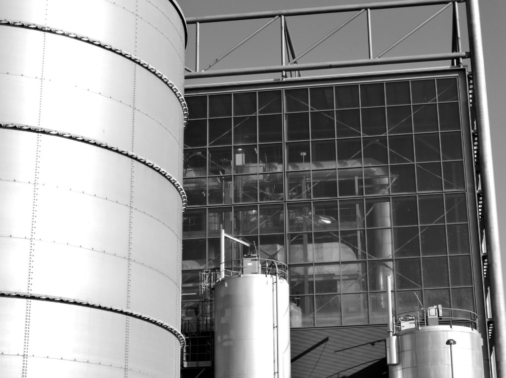
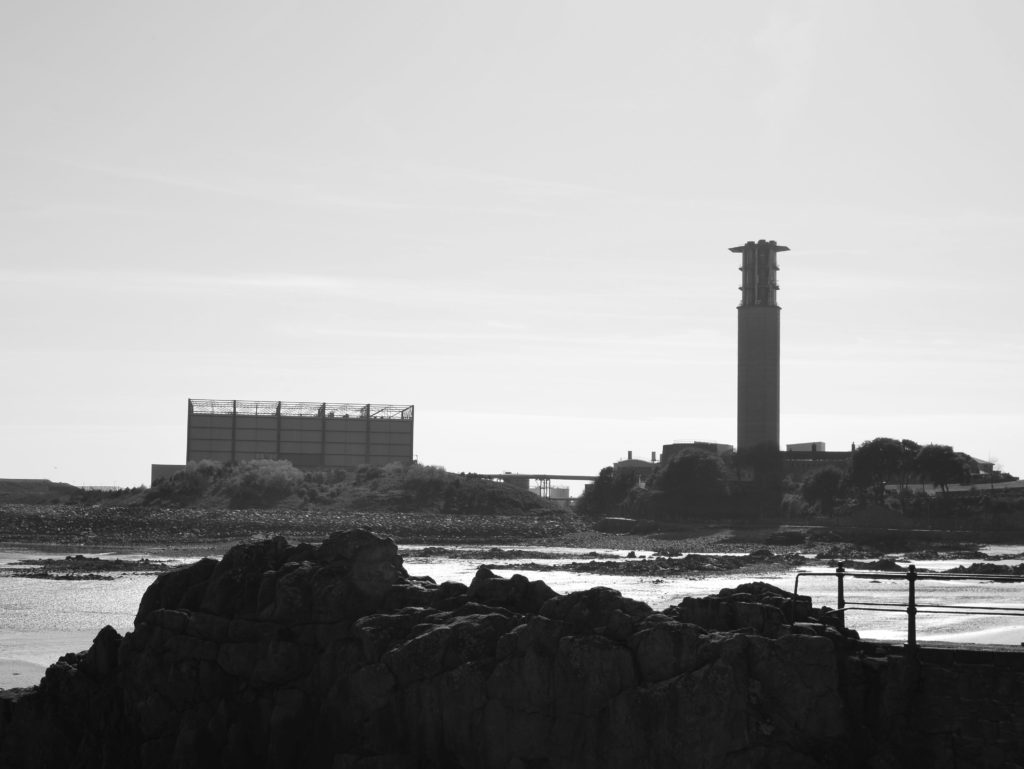
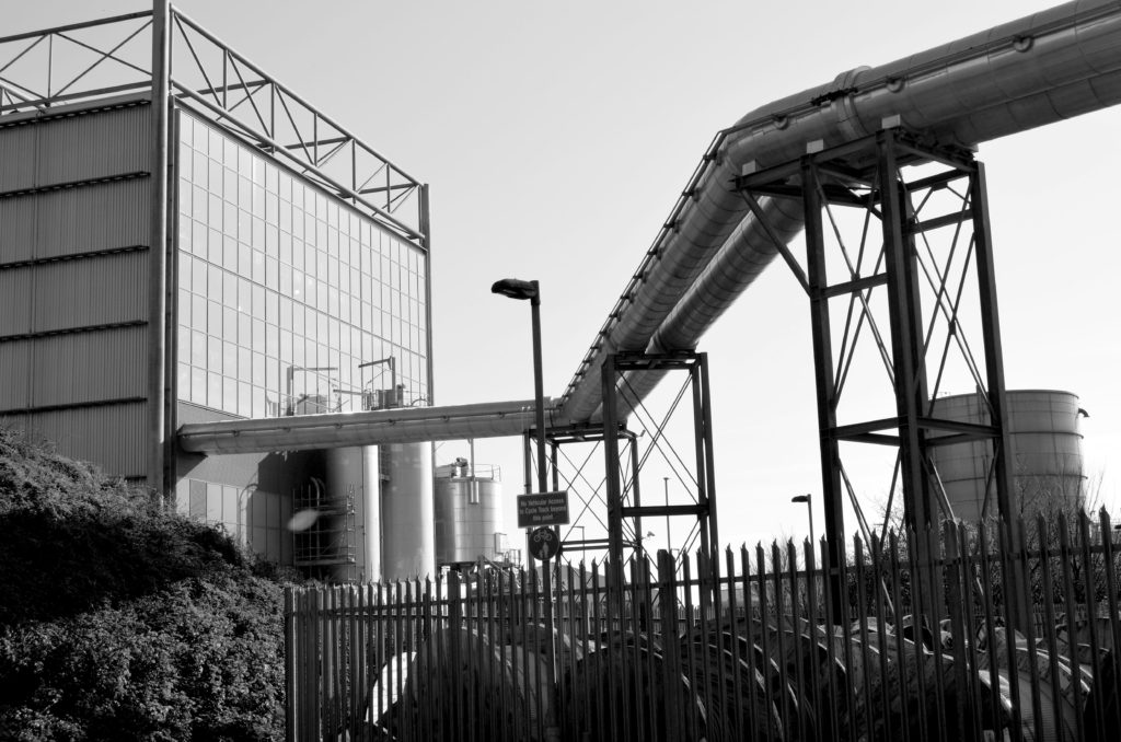
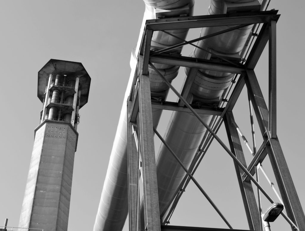
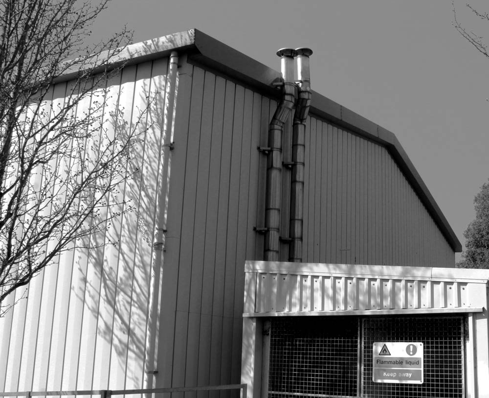
For these images, I went to the incinerator in Havre De Pas. I thought this would be a good place to go because everything is very grey and dark. I also thought that it would go well with the new topographics work that we looked at earlier in the course.

I put the images in black and white to emphasise the monotone colours of the incinerator and to also fit in with the new topographics work which the majority of the time was in black and white due to the time period it became popular. The black and white also emphasises the general view on the building. Many people think that it is an eyesore, however this eyesore is needed for recycling and also helps the world with climate change just by existing.

This emphasises that even though the industrial things in our world can be ugly, we need to appreciate that they are made to make everyone’s life easier. This shows that we need to move with the times and focus on making our planet a safer place to live for all.

Final images

Favourite Images

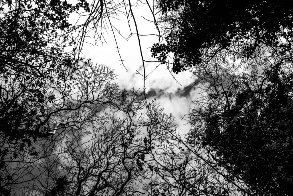
These are my favourite images because I believe that they show the difference that industry has brought to our world. I particularly like the bottom left image because it is at a worm’s eye view; which I believe was a good way of showing off all the manmade things surrounding our coast line.

Final Display

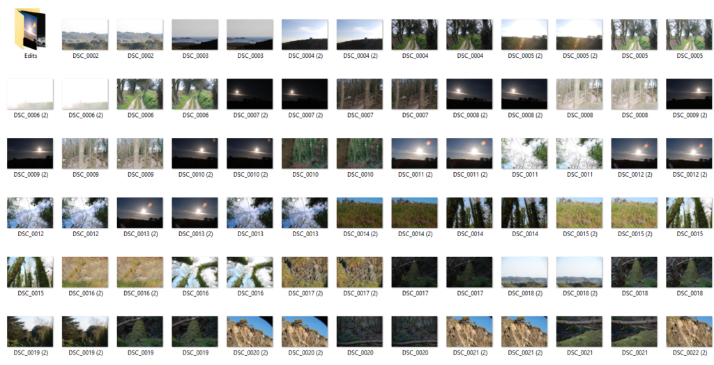
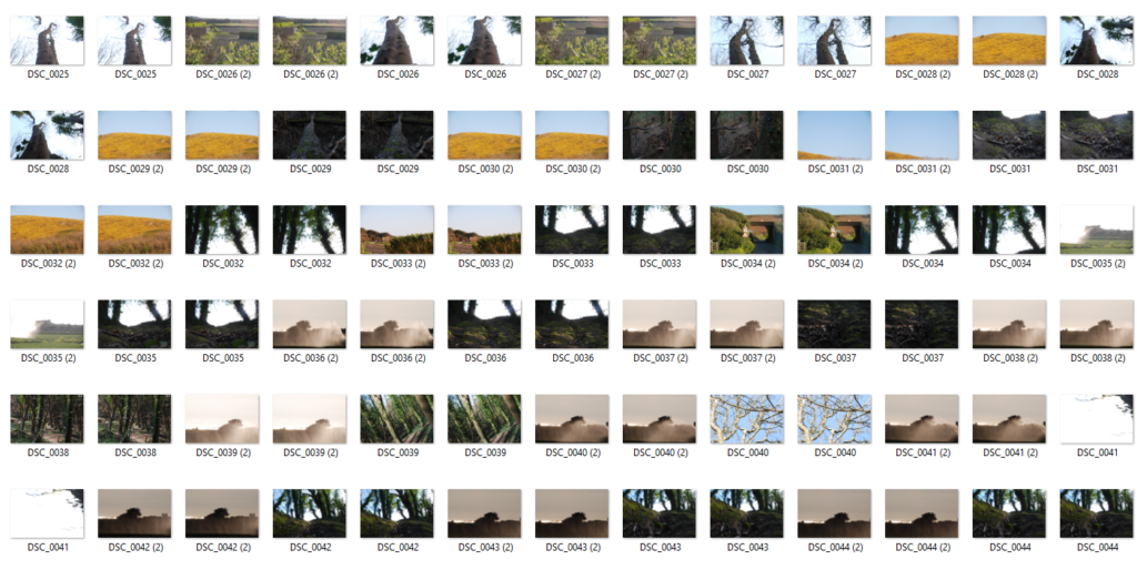
Contact Sheets

Final Edits

Exposure Bracketing Technique

The above is an example of where I used a technique called exposure bracketing.

This is when a triptych or series of photos of the same landscape is taken but each with a different exposure.

I did this by positioning the camera, with a tripod in the exact same place. I then took the tree photos but each time changing the ISO. The first photo was had an ISO of 500 the second of 300 and the third 120. I then sliced and collaged the three images into one.

Urban Photography

For this shoot, we went around the sports block and round highlands.

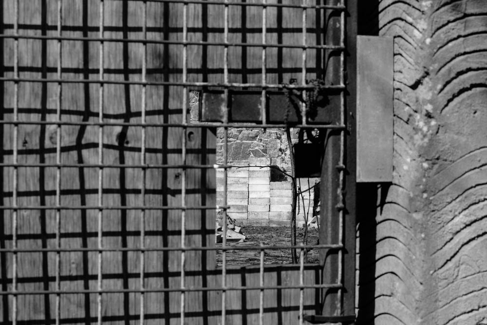
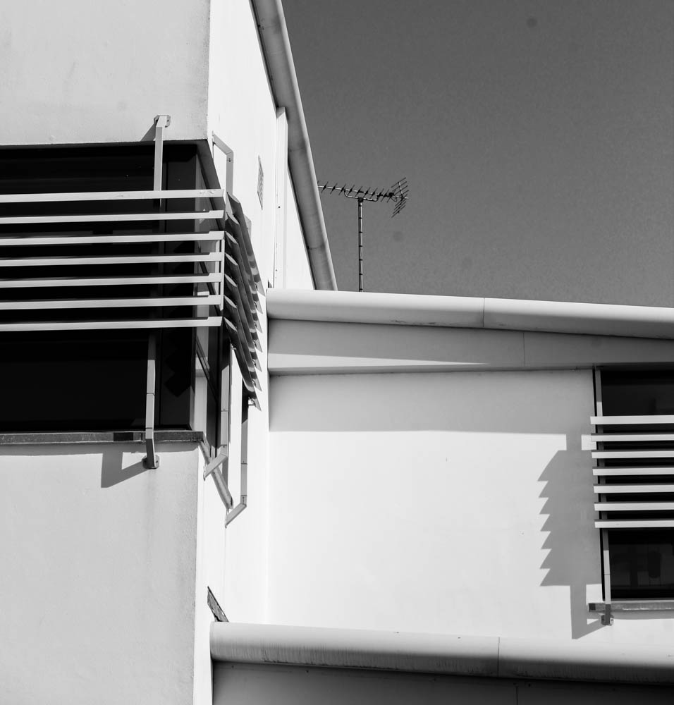
While walking around the sports building I focused on the grids and vents on the side of the building. The sports block is very monotone which relates back to New Topographics, where images were taken with the main subject of man made buildings rather than natural landscapes.

SEE MORE: https://www.tate.org.uk/art/art-terms/n/new-topographics

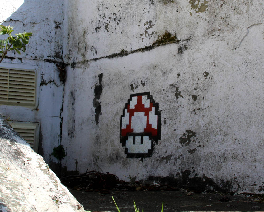
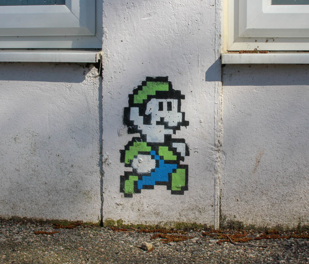
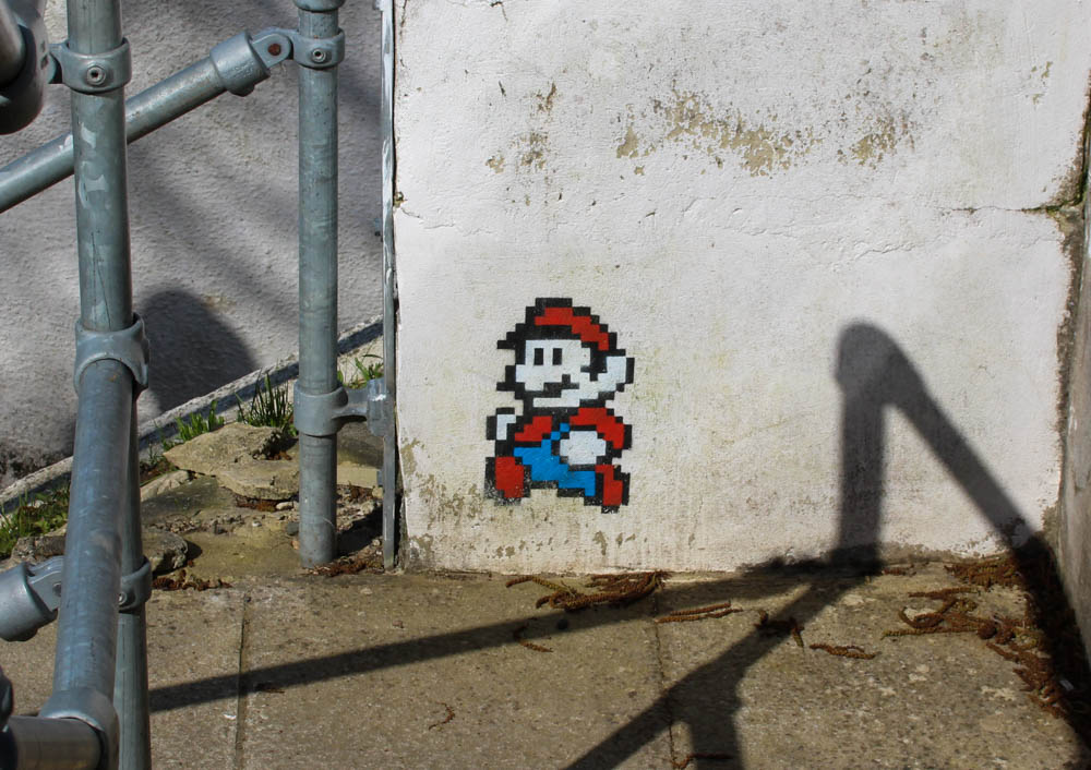
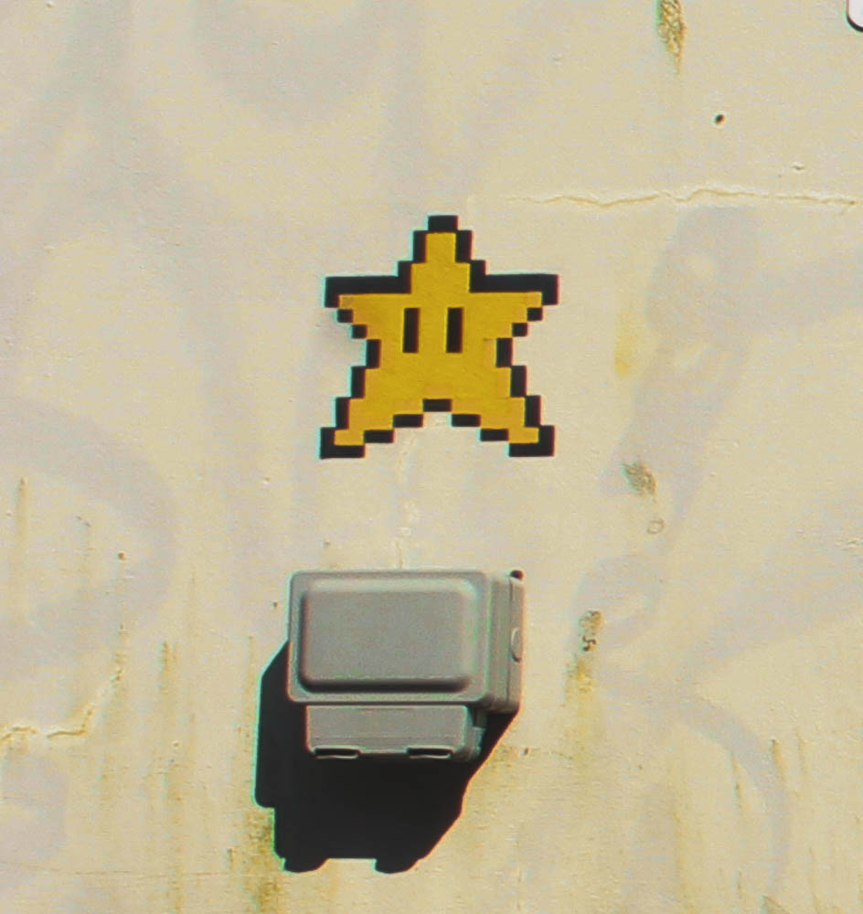
Street Art

Definition: Artwork that is created in a public space, typically without official permission

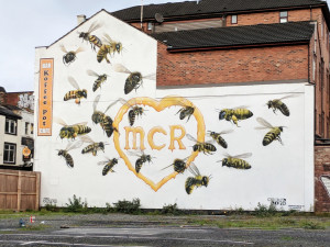
Street art is very common in urban areas. It is also done for multiple reasons;fun, advertising and they can also have a political message behind them.

For example, the image on the left was made as a mural after the Manchester Bombing at the Ariana Grande concert in 2017. The bees around the heart represent the 22 victims of the attack.

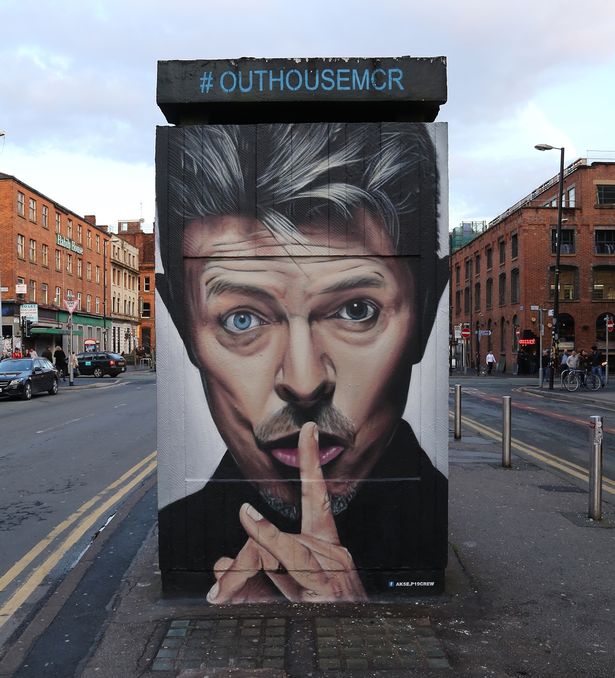
The middle image is an image of David Bowie that was painted onto the side of an abandoned outhouse in the middle of Manchester.

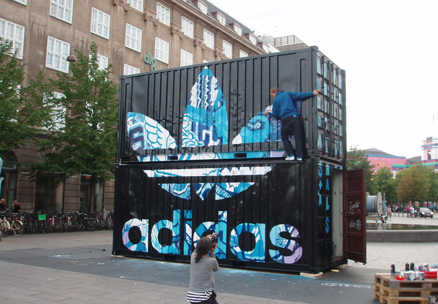
The image on the right is of an advertisement for Adidas painted on the side of two shipping containers.

Images

Architectural Images

Often, industrial photographs show people building and making things – the aim is to capture the manufacturing process and the laborious jobs that are performed by workers.

Contact Sheets

This image has an empty alt attribute; its file name is image-98-1024x161.png

Rated Images

Final Images

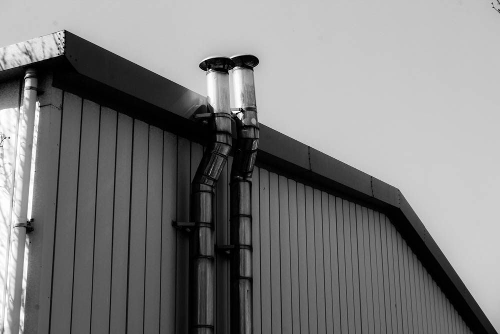
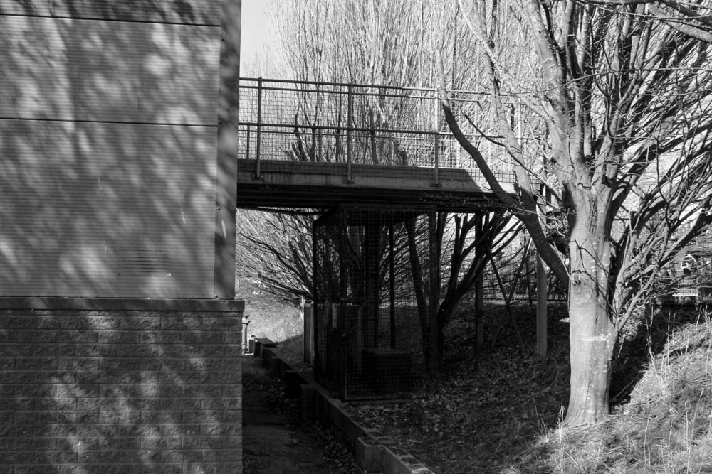
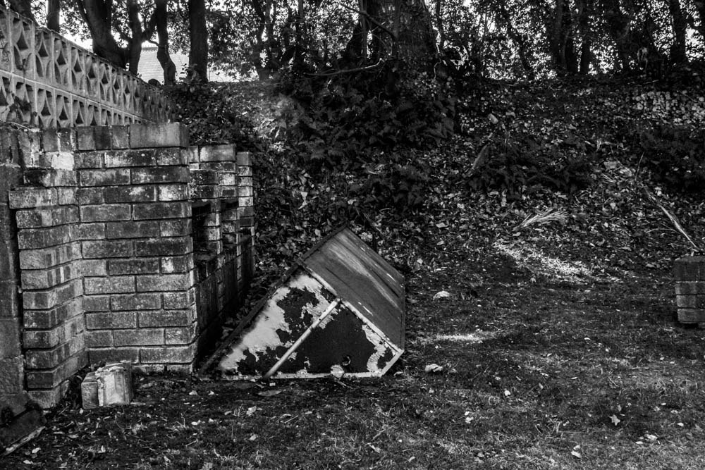
I put all my final images in black and white, I feel like this went well with some of the new topographics work that we looked at before. It also emphasises how all the colours are monotone and dull.

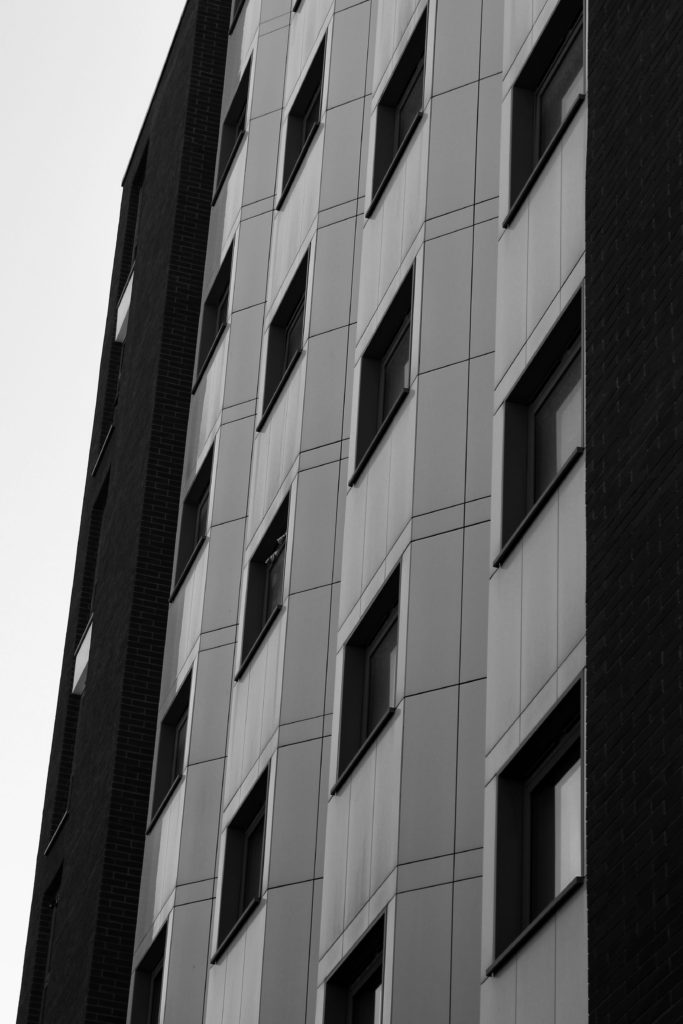
I focused on the man-made aspects of the buildings and the surrounding areas. I took images of things that had repeating patterns and symmetry to emphasise the fact that only man made things have perfect lines. Straight lines do not exist in the natural world.

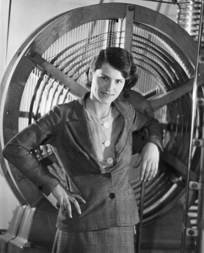
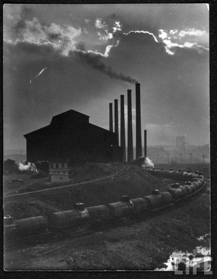
Margaret Bourke-white

Image of Margaret Bourke-White

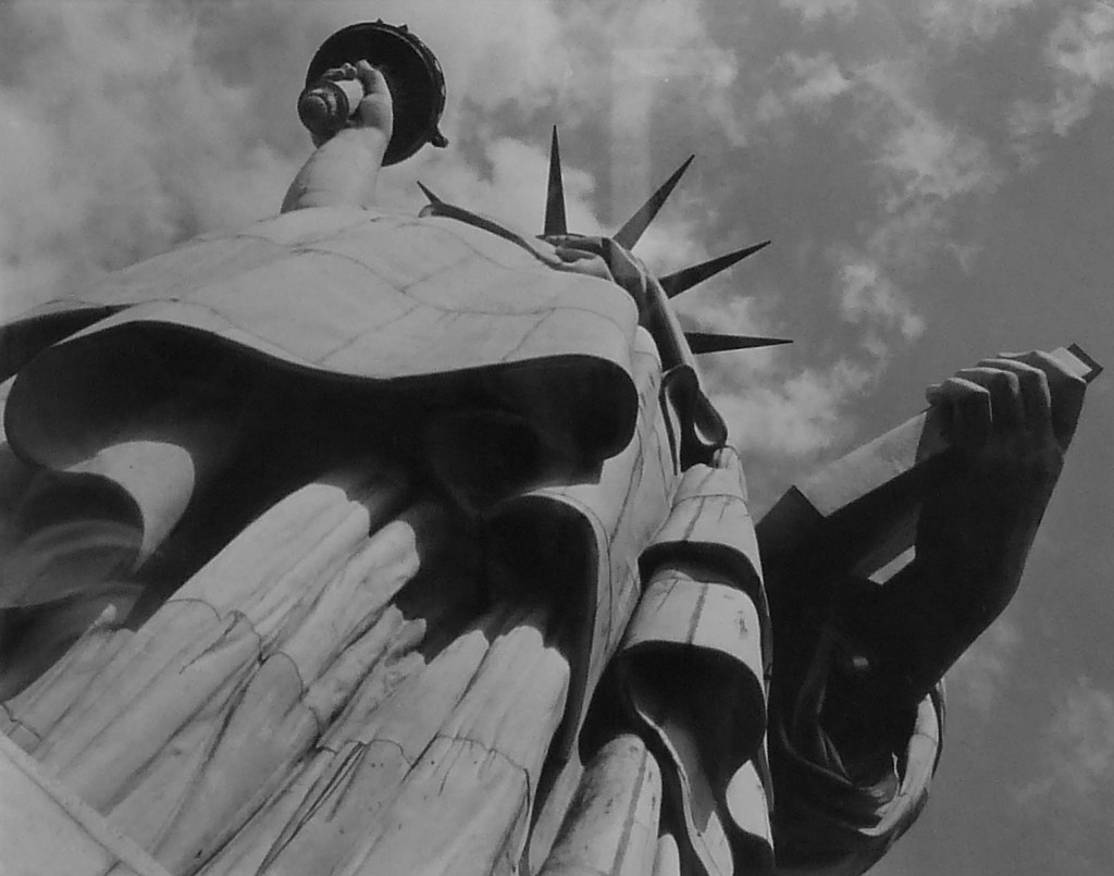
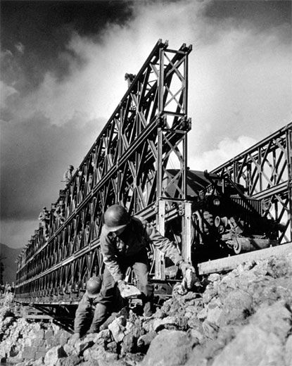
Margaret was born in America in 1904 and died in 1971. She was a photographer and documentary photographer. Being a documentary photographer allowed her to see the changes in the world in terms of technology and industry. She also took pictures during the second world war, meaning she had to witness the horrors and torture that people were put through. Bourke-White was the first known female war correspondent  and the first woman to be allowed to work in combat zones during world war 2.   In 1941, she traveled to the soviet union just as Germany broke its pact of non-aggression. She was the only foreign photographer in Moscow when German forces invaded.

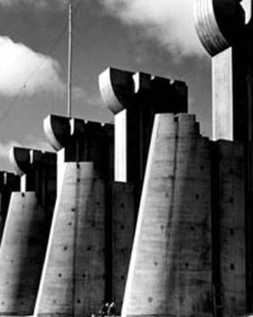
She is best known as the first foreign photographer permitted to take pictures of Soviet industry under the Soviet’s five year plan,the first American female war photojournalist, and having one of her photographs (the construction of Fort Peck Dam) on the cover of the first issue of life magazine.

Margaret Bourke-White lived the life most of us only dream about. Well, maybe only photographers dream about. But to live life as fully as she did, could only inspire the uninspirable.

Image analysis

Margaret Bourke-White

The image is in black and white which could highlight the fact that the air is polluted because of the smoke coming out of all the factories and trains. The fact that there is very little contrast in the whole image emphasises the fact that there is little light visible to those that live in the house in the centre of the image. The lack of contrast also emphasises the lack of change in people’s lives each day. All they did was work, go home and work again. This is what happens now, however, working conditions were much poorer in the 1930s compared to nowadays.

Ansel adams case study

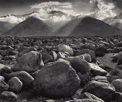
Ansel Adams, born on February 20th, 1902 then later died on April 22nd, 1984, was an American photographer who was well known for his landscape photography due to it being very transparent in the detail that was portrayed in his images form the landscapes being very clear. Ansel began his photography carer not even knowing but at the age of 12 he got his first camera and took pictures of the Yosemite National park which was later used to show off his photography that was first published in 1921. Ansel work was starting to mature and become at its best in 1929 and 1942 and he became more established. The 1930s were a time in which he was experimenting and being more productive with his photography, expanding his photography technically by taking close up pictures of mountains, large forms and even detailed close ups with pictures of mountains to even factories. Moreover, this was when Ansel was getting his best landscape images from landscapes to close up images of leaves and flowers. In 1952, Ansel was one of the founders of the magazine Aperture which was a journal of photography, showing of its best practitioners and newest innovations in which he was also a contributor to Arizona Highways, a photo rich magazine. In June 1955, Ansel began his annual workshop at Yosemite which they continued to 1981, attracting thousands of students. During the final 20 years of his lifetime, the 6×6 cm medium format Hasselblad was his camera of choice.

As you can see from Ansel Adams photography, the landscapes in which he has taken photographs of is very well defined to the point where you can see every single detail of the surroundings in the landscape. Moreover, in his images you can see the clear contrast in the compositions of black and white, which goes to show hoe well Ansel Adams understand the contrast between black and white as you can see from his images, making every detail stand out from textures and surfaces.

Altered Landscapes

Altered Landscapes

“Unexpected Geology #18” – Ellen Jantzen (2018-19)

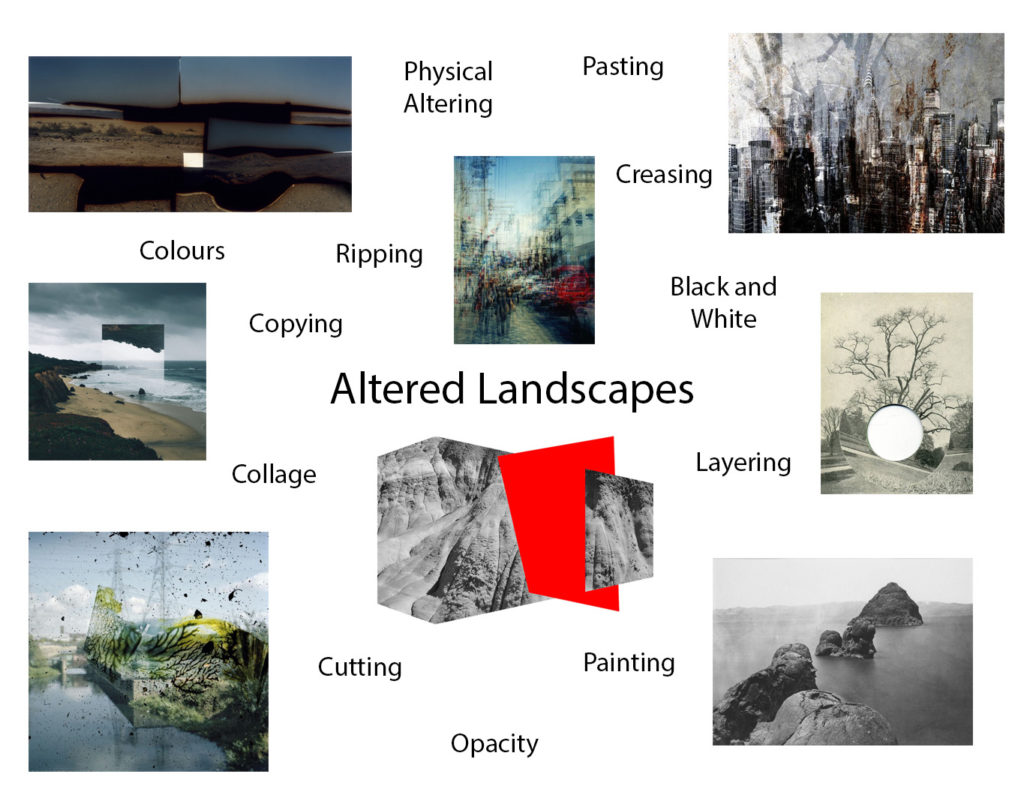
Altered landscapes focus on the process of using photoshop, or physically, in order to change the original composition of a landscape photograph. This may include changing the colours of the image, or in general changing the composition of the photo itself. For example cutting and pasting certain elements or adding forms of repetition or echo to the photograph.

Examples of altered landscapes

“Dust Storm” – Tanja Deman (2010)
Felicity Hammond - Restore to Factory Settings | LensCulture
Part of “Restore to Factory Settings” series – Felicity Hammond (2014)
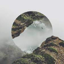
New Reflected Landscapes and Photo Manipulations by Victoria Siemer |  Colossal
Part of “Geometric Reflections” series- Victoria Siemer (2015-16)

Altered landscapes inspired moodboard

Urban Landscapes – Altered Landscapes

Case Study

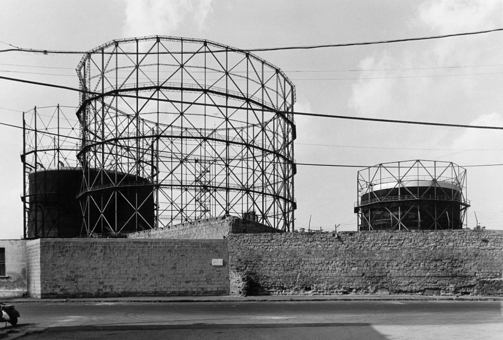
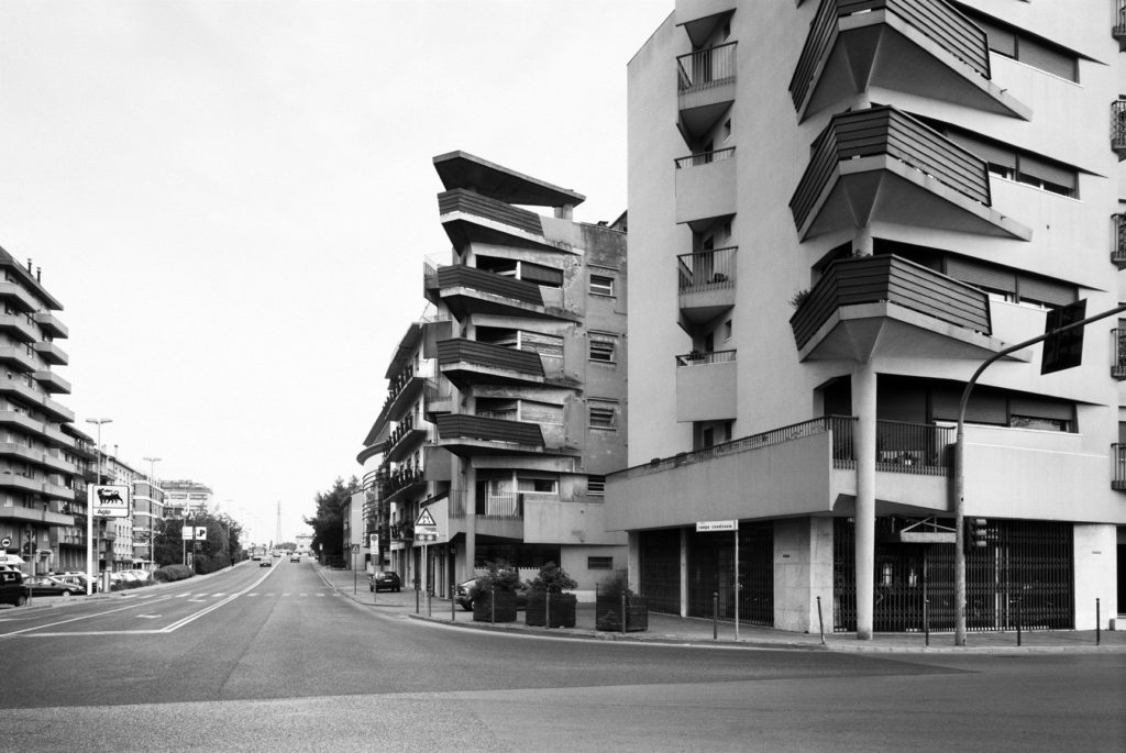
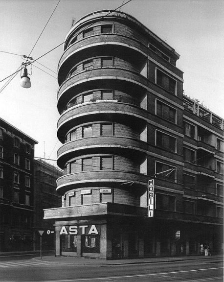
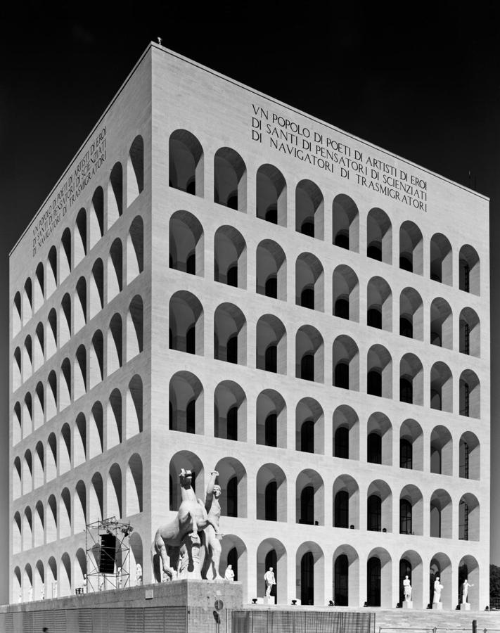
Gabriele Basilico

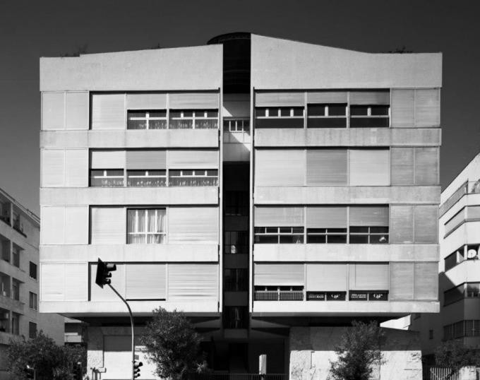
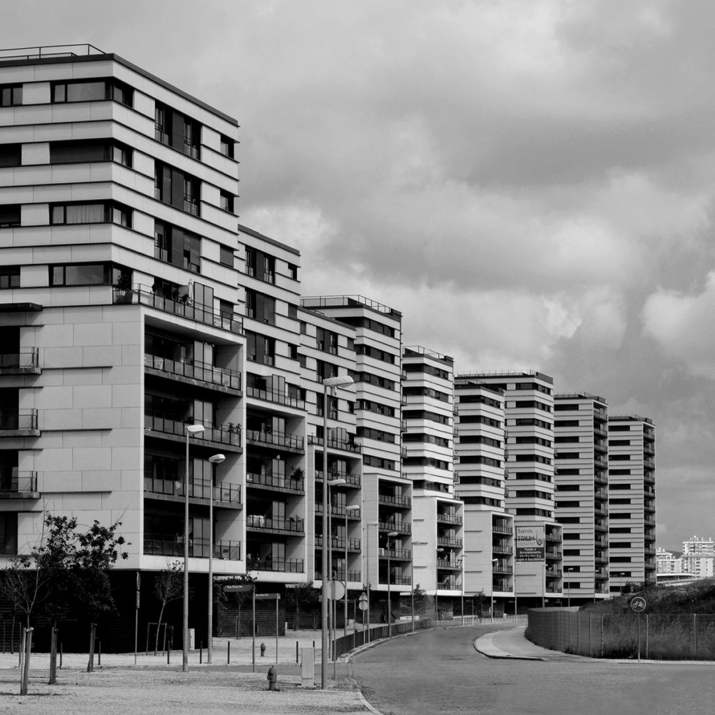
Gabriele Basilico was an Italian landscape photographer, born in 1944, best known for his fascination with the changing landscape that was becoming urbanised. Before taking on photography as a profession, Basilico first studied to be an architect, which may explain his eye for the geometric structures showcased in his work. This striking architectural photography soon caught peoples eyes, including the French Government which commissioned him to record the transformation of the Transalpine landscapes, amongst other photographers in which he was the only Italian. Later Basilico also went on to document the effects of the war in Beirut, the Lebanese capital, which had previously been ongoing for 15 years.

Analysis

Gabriele Basilico

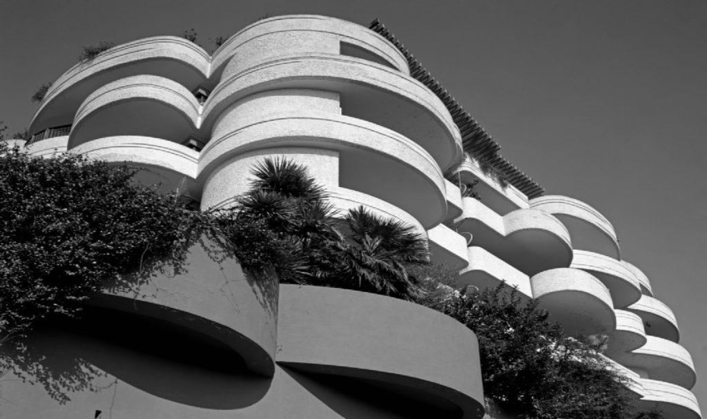
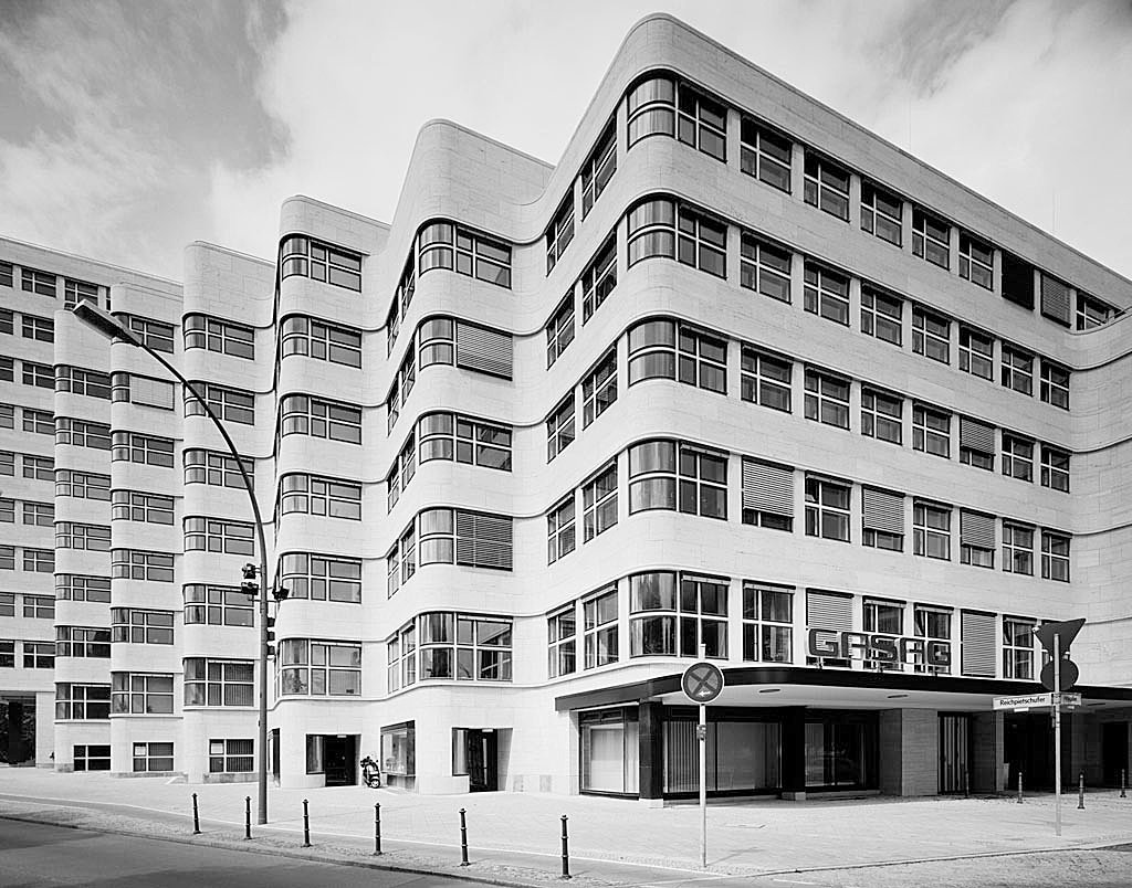
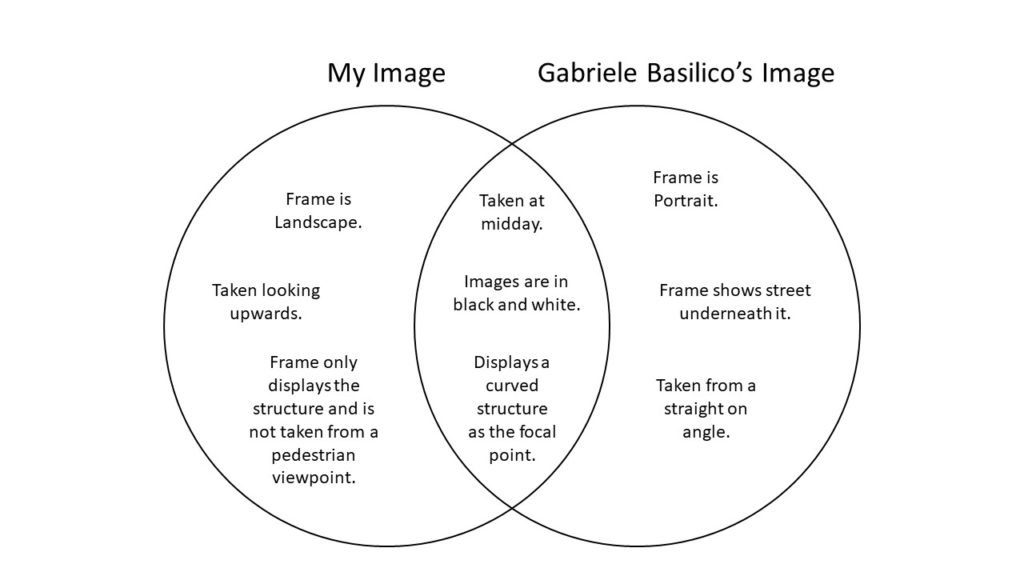
This black and white photograph taken by Gabriele Basilico showcases a curved building, located in the centre of the frame. This structure is framed by empty space both above and below the building, as the street shown appears to be desolate similar to the overcast sky. Here, it can be seen that Basilico took this photograph from a pedestrian viewpoint, looking slightly upwards. The leading lines in this composition are created by the curved, horizontal, white stripes that encompass the building, leading your eye from the right into the centre of the image, which is highlighted by the sun. In addition, these lines strongly contrast with the dark shadows underneath each balcony.
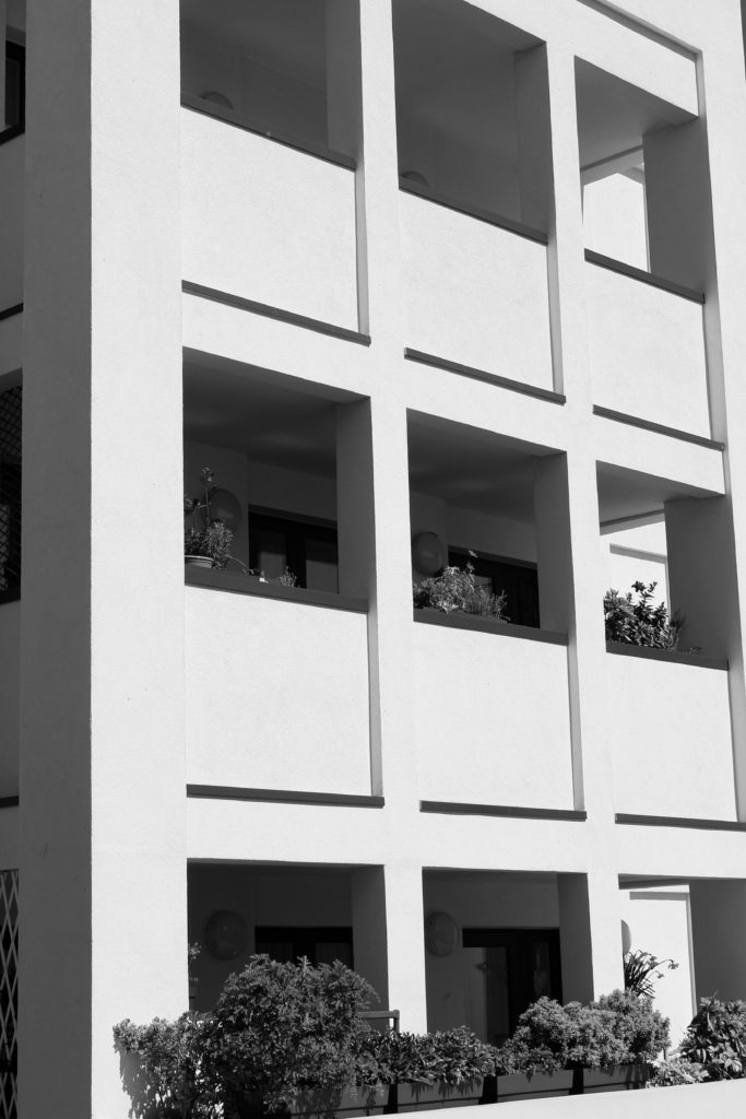
From a technical viewpoint, it can be said that Basilico only used natural lighting in order to capture this landscape, due to the fact it has been taken in a large open space outside, most likely at midday as the few shadows that are visible are going straight down, rather than at an angle. Furthermore, this means that the ISO setting used must have been a medium to low one, due to the large amount of natural light flooding the lens, allowing for a photograph that is not over exposed. This also could mean that Basilico used a fast shutter speed because of this large amount of light, also there are no visible blurs or movements here. It appears that the aperture was on a medium to low setting, as the focal structure is located far away from the photographer and the building in the background also seem to have a similar amount of focus placed on them.

Photo-Shoot

Contact Sheets

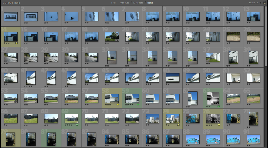
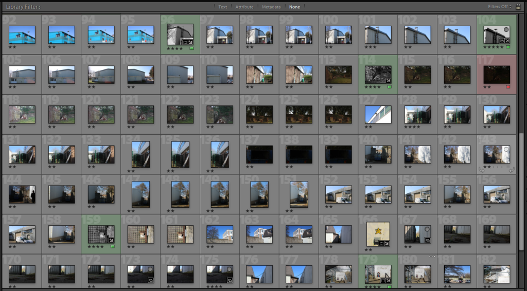
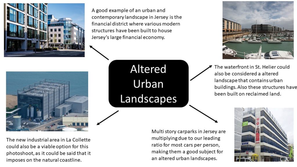
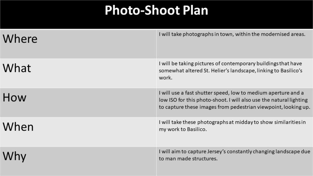
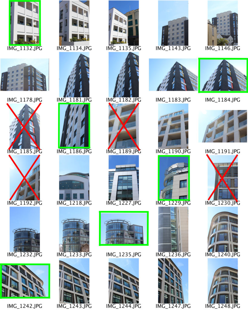
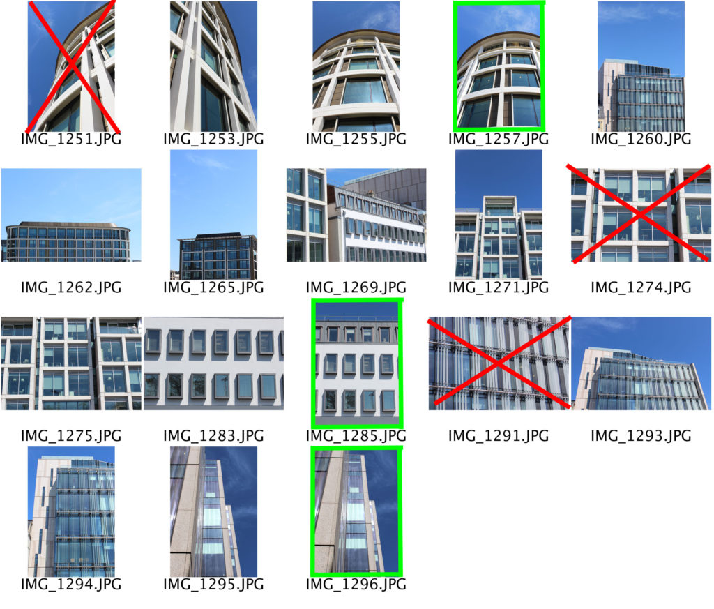
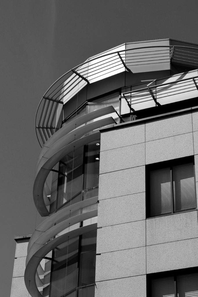
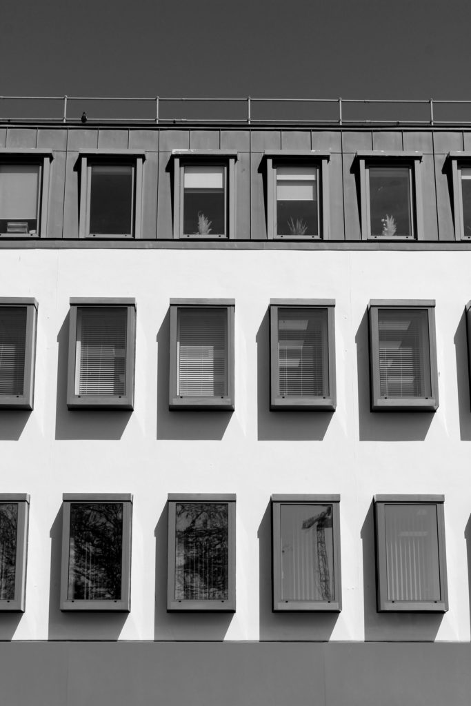
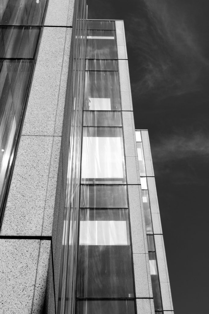
For this photoshoot I took pictures around the modernised areas of St. Helier, such as the finance and banking building along the Esplanade. Here I have highlighted the image I believe are my best, and wish to edit, and crossed out the images that are either over exposed or blurry.

Edited Images

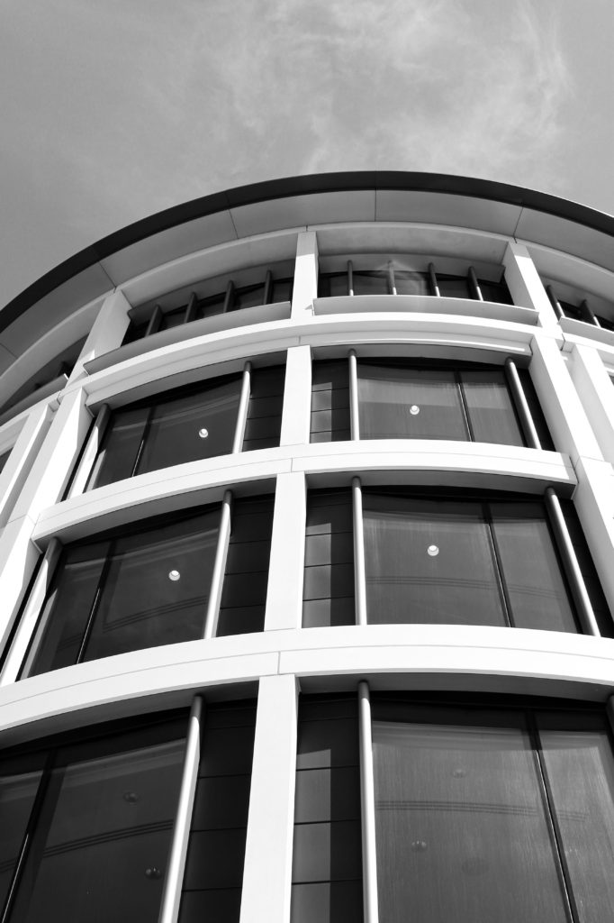
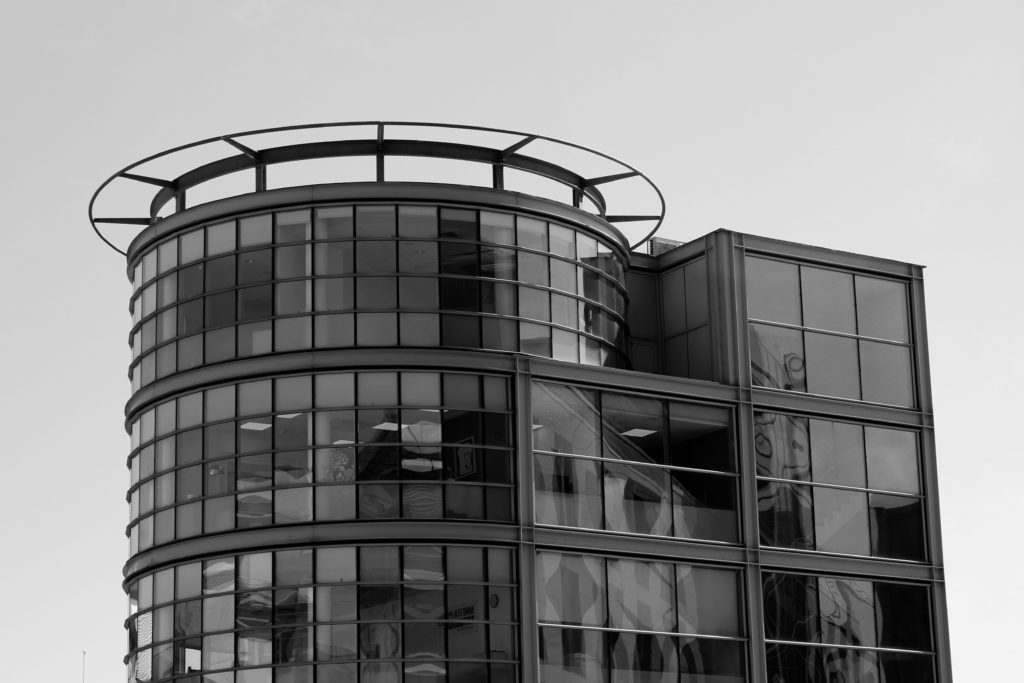
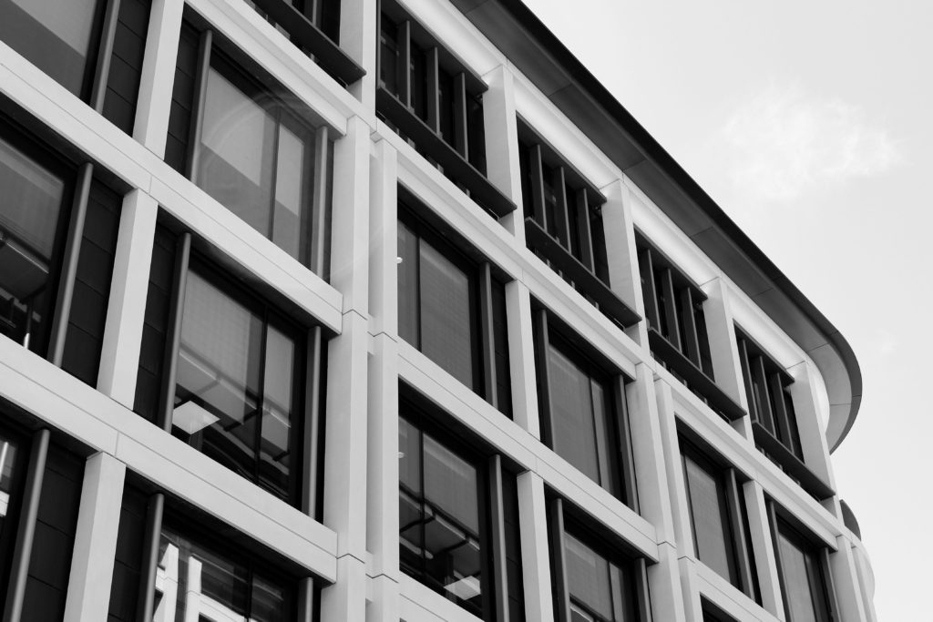
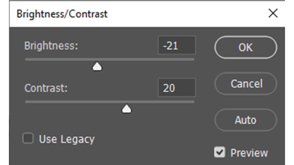
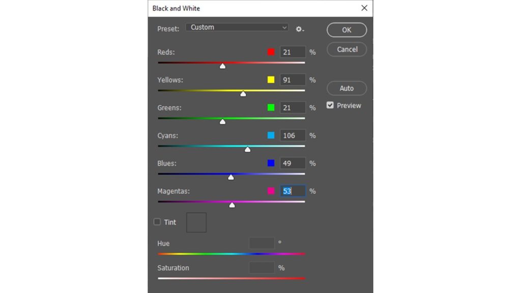
For these photographs taken in the style of Gabriele Basilico, I started off editing them by converting the images into black and white, in order to make them look similar to Basilico’s film photographs. I also adjusted other aspects, such as increasing the contrast to create a juxtaposition between light and dark.

Final Image Comparison