Lewis Baltz Image

My Image

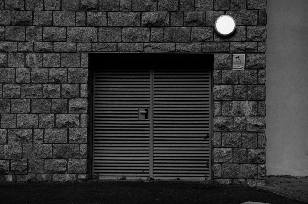
In both images, the lighting used is almost identical, Lewis’s image was lighted by natural light almost directly above the building being photographed. This is shown by the dark shadows being created on the door by the top of the door frame in both images. In my image, I used an aperture of f.9. This is to allow the whole door and texture of the surrounding surfaces to be in focus and sharp. Similarly to this, Lewis’s photograph appears to have been taken at a similar aperture because the door is in focus, as well as the texture on the surrounding surface, showing a moderately high aperture was used. The shutter speed i used was fairly high because if the bright natural light at the time the image was taken. Lewis Baltz may have used a similar shutter speed if the intensity of the light was similar to when i took my image. Also, the ISO is fairly low in both images, creating minimal grain within the image, making them more clear and crisp.
Both images use black and white to emphesise contrast. Lewis’s photograph was taken on a black and white camera with no post editing, where as i took my photo on a coloured DSLR camera, and edited it in post to appear in black and white. Both images have a large tonal range, with bright highlights on the walls and dark shadows at the top of the doors. The framing and shapes within both images are almost identical, the camera is facing directly towards the building at head hight, the floor takes up a very similar amount of space in each image and the right-angled shape of the door is in the direct centre of the frame. In my image, The texture of the surrounding wall is emphasised by being in focus through the use of a high aperture, aswel as increased contrast and shadows. In Lewis Baltz’s image, there is less texture on the building, but it can still be seen because of the large tonal range and high contrast of the image. Lewis’s image is very symetrical because of the plain surfaces and central framing of the doorway. Where as my image is less symetrical because off the added details/objects such as the door handle, circular light and sign.
Alltogether, both images are rather similar, using high contrast and tonal ranges, along with flat angles and geometyric shapes to create a good representation of the urban side of New Topographic Photography.
