Urban Landscapes – Urban decay

Case Study

Alexander Apostol

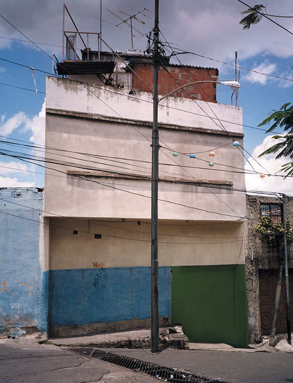
Alexander Apostol is a Venezuelan photographer, born in 1969, known for his fascination with the urban landscapes in the city of Caracas, which originated in the 1950s. Within some of Apostol’s photographs, he has digitally altered the buildings concealing any doors and windows in view, creating an almost lifeless looking structure of the past that would strongly juxtapose any modern day architecture.

Analysis

Alexander Apostol – 2001

This colour photograph taken by Alexander Apostol displays a decaying building placed centrally in the image, in which the doors and windows have been edited out digitally, framed by the two smaller structures on either side. Leading lines in this piece by Apostol, are created by the telephone lines that are scattered around the image, guiding the viewer’s eye horizontally across the image, and the pole that dissects the photograph through the middle. These dark wires and pole also act as a strong contrast to the off white tone of the building. It can be said that Apostol took this photograph from a straight on pedestrian viewpoint, much like many photographers involved in the New Topographic movement.

From a technical viewpoint, it appears that Apostol has depended on the midday natural light to capture this photograph, as very few shadows can be seen here. In addition, this means that the ISO used to take this image would most likely be on a low setting, in order to produce a photograph that is not over exposed. Apostol also most likely used a fast shutter speed for this piece, as there is no visible blur or motion presented in the image. Furthermore, the aperture setting used must have been low as well, due to the clouds in the background being in focus as well as the focal point of the building.

Photo-Shoot

Contact Sheets

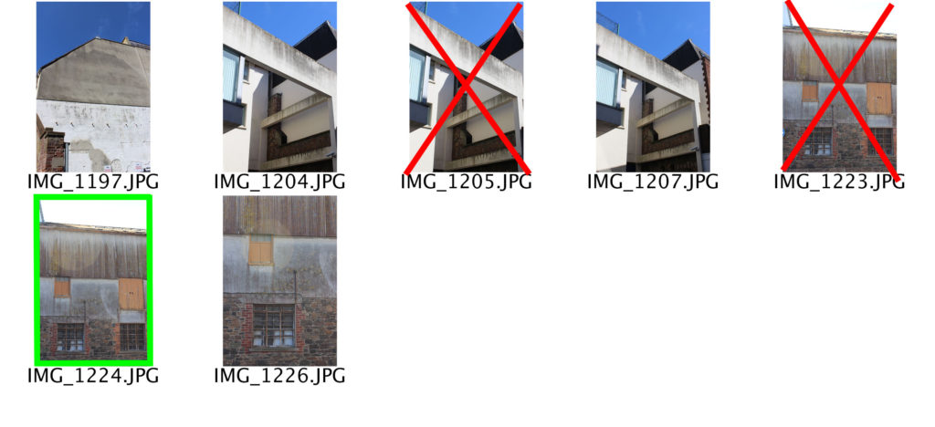
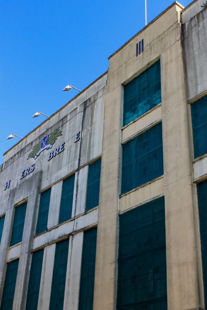
For this photo-shoot I walked around town near the old brewery and behind the post office taking pictures of buildings showing signs of decay or abandonment, such as boarded up windows and doors, mould and rust.

Edited Images

To edit my photographs in the style of Alexander Apostol I used photoshop to increase things such as the contrast, saturation, and texture of the images. I did this to enhance the sense of decay the buildings were undergoing.

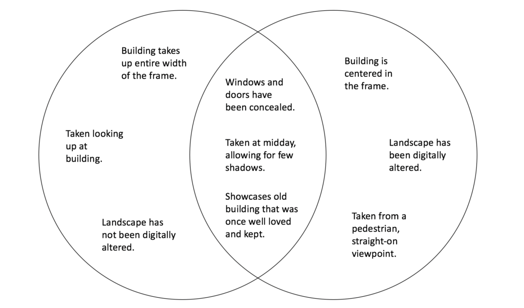
Final Image Comparison
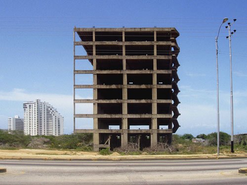
New Topographic photo-shoot

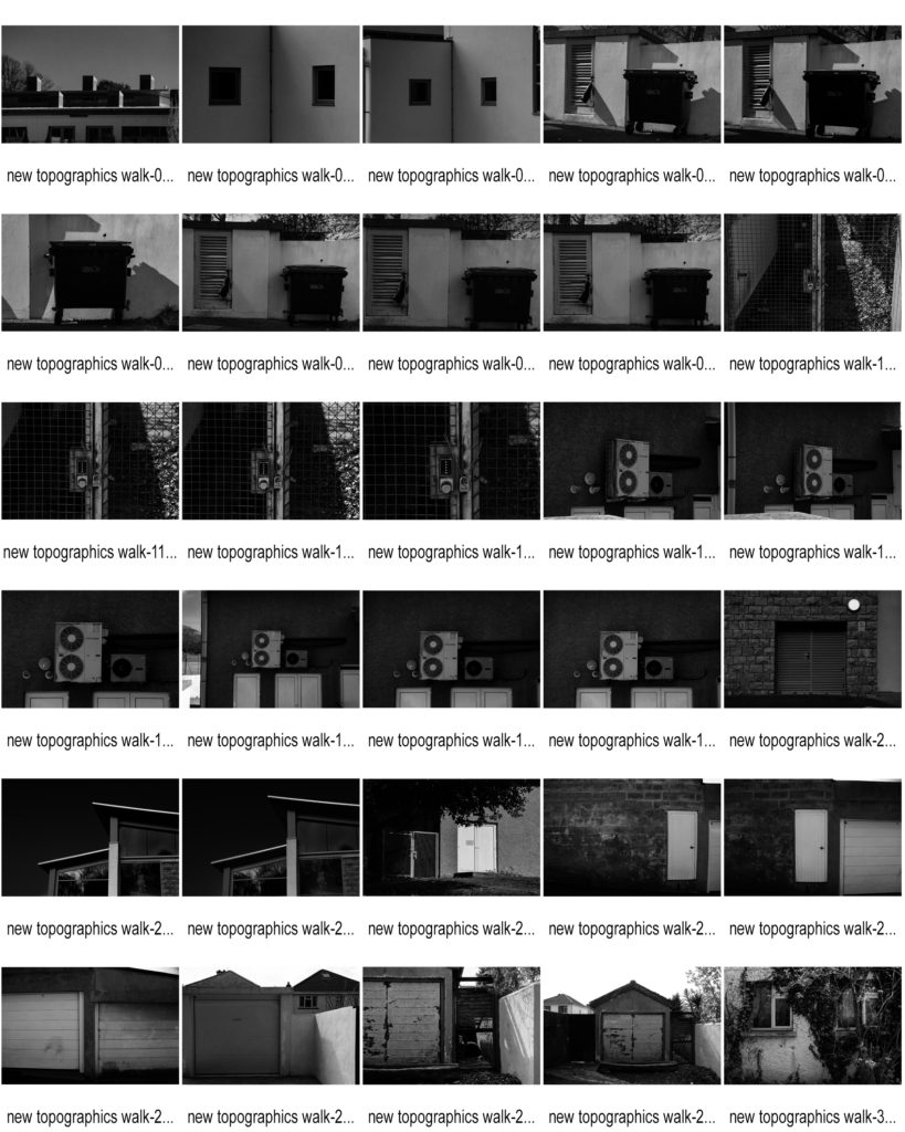
Contact Sheets

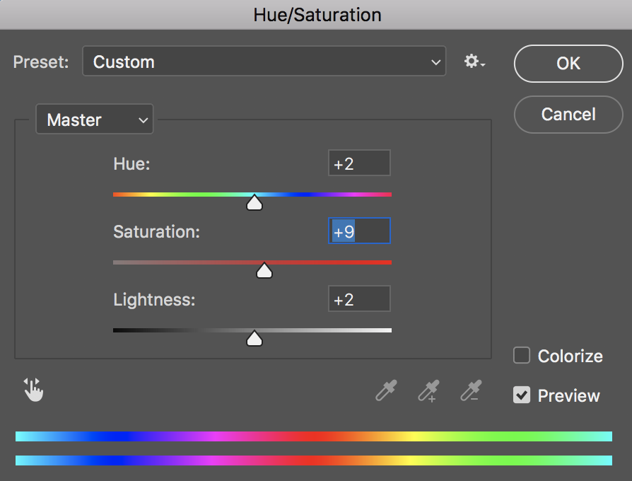
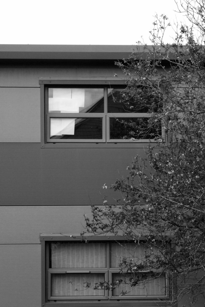
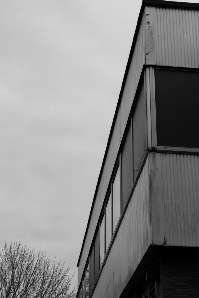
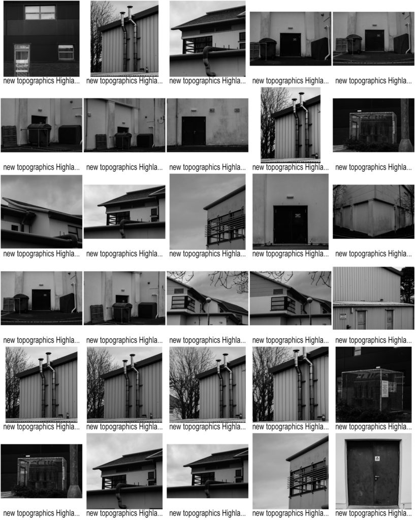
For this photo-shoot we went around the outside of school and Highlands as a class and looked for urban landscapes that could potentially work as a New Topographic image, such as mundane buildings that might intersect with any remaining nature surrounding it. Here I have highlighted the photographs I will edit in green, and crossed out the images that are either too blurry or overexposed to use, in red.

Edited Images

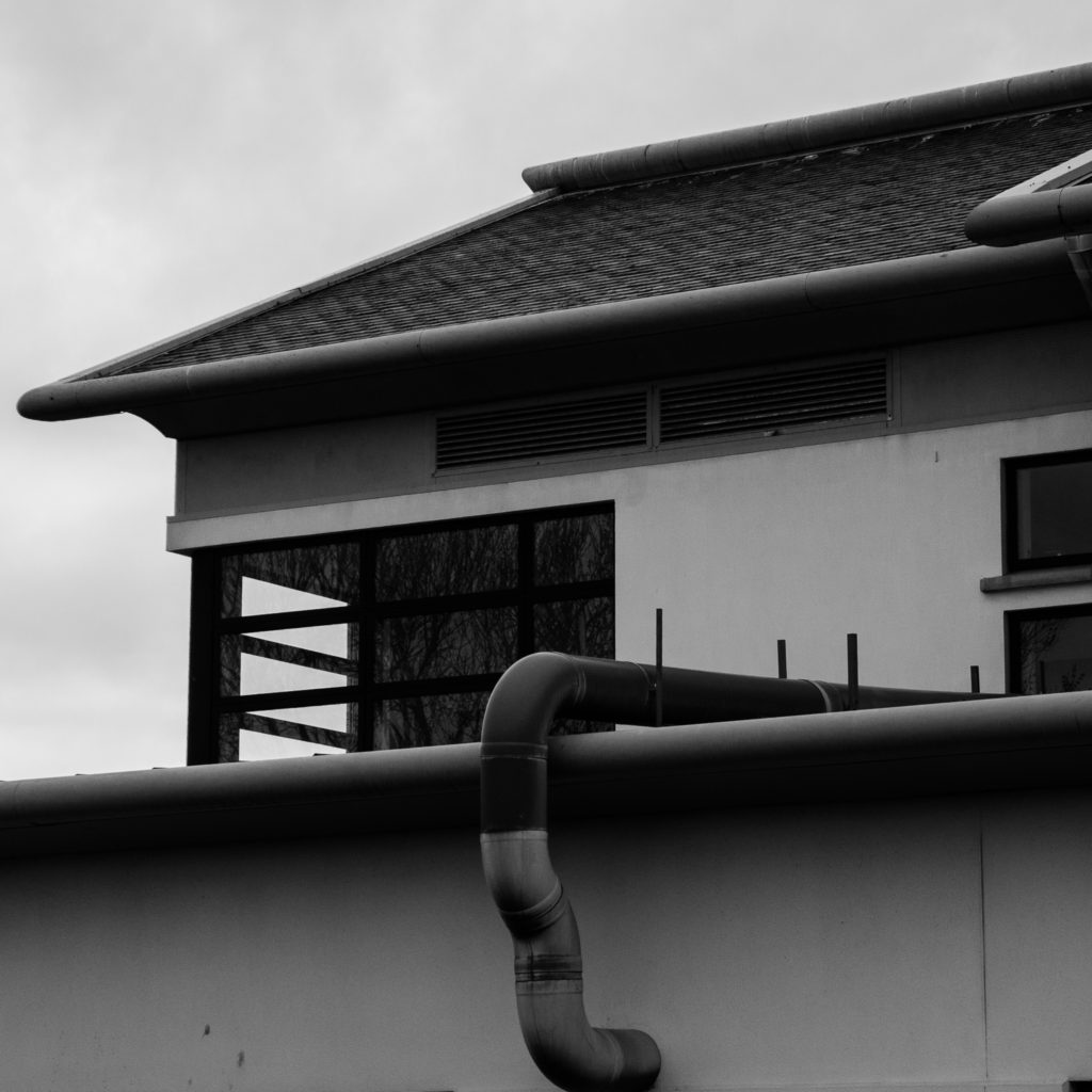
To edit these photographs, I used Lightroom to convert the images into black and white. Then I lowered the exposure and increased the contrast to create a larger juxtaposition between light and dark. I also lowered the highlights and white tones of most of the photographs, making sure the images were not over exposed, due to the large amount of light flooding the lens.

Final Image

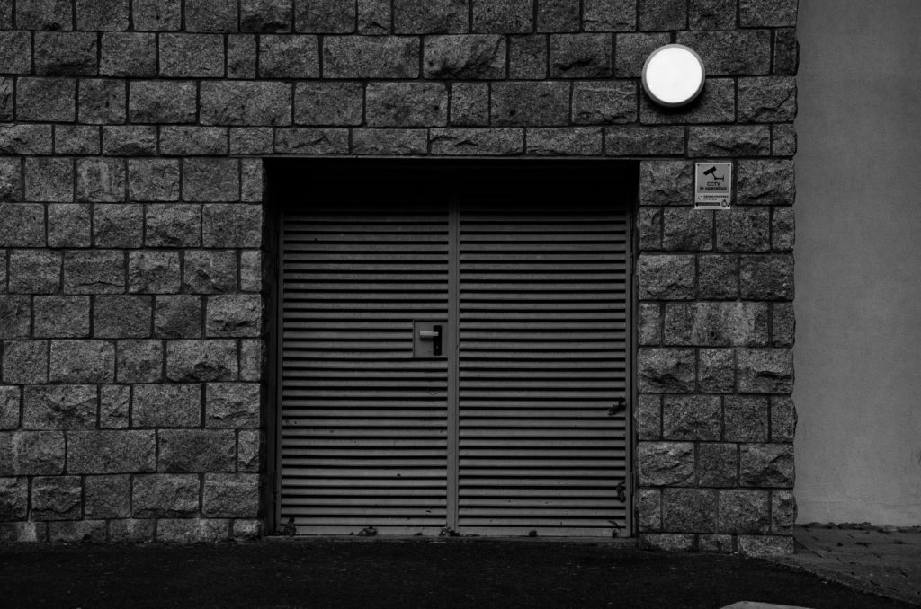
I believe that this is my best edited image, taken in the style of the New Topographic movement, as it displays a mundane man made structure from a front facing, pedestrian perspective. Another way this image links to this style of urban landscape photography, is that it is composed of many leading lines that seem to dissect the image.

COMPARISONS

Lewis Baltz Image

Lewis Baltz | Art, Biography & Art for Sale | Sotheby's

My Image

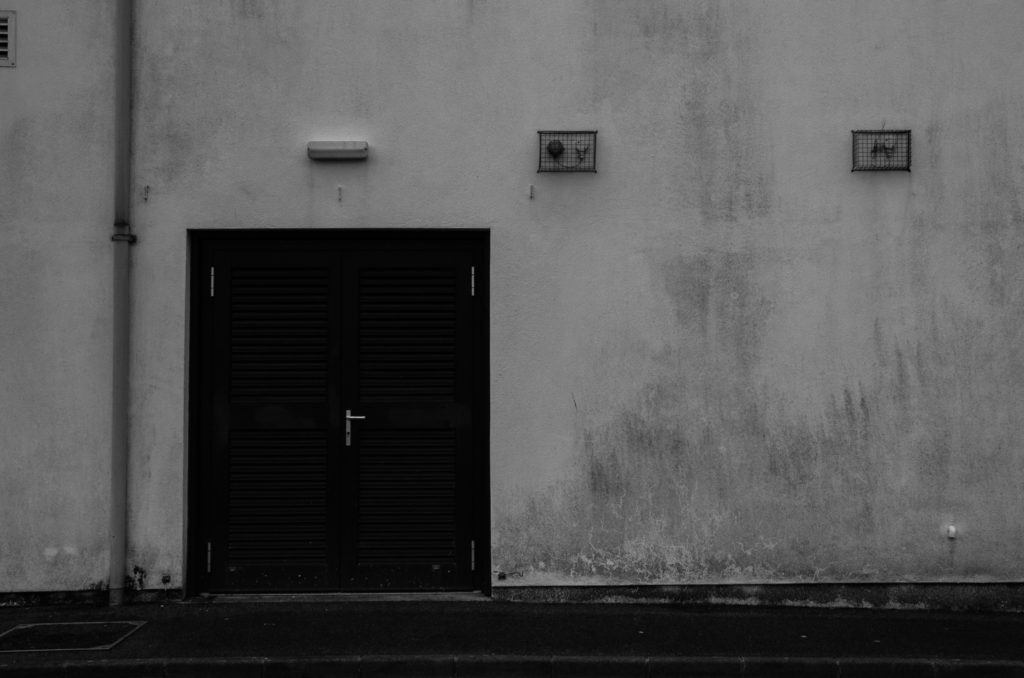
In both images, the lighting used is almost identical, Lewis’s image was lighted by natural light almost directly above the building being photographed. This is shown by the dark shadows being created on the door by the top of the door frame in both images. In my image, I used an aperture of f.9. This is to allow the whole door and texture of the surrounding surfaces to be in focus and sharp. Similarly to this, Lewis’s photograph appears to have been taken at a similar aperture because the door is in focus, as well as the texture on the surrounding surface, showing a moderately high aperture was used. The shutter speed i used was fairly high because if the bright natural light at the time the image was taken. Lewis Baltz may have used a similar shutter speed if the intensity of the light was similar to when i took my image. Also, the ISO is fairly low in both images, creating minimal grain within the image, making them more clear and crisp.

Both images use black and white to emphesise contrast. Lewis’s photograph was taken on a black and white camera with no post editing, where as i took my photo on a coloured DSLR camera, and edited it in post to appear in black and white. Both images have a large tonal range, with bright highlights on the walls and dark shadows at the top of the doors. The framing and shapes within both images are almost identical, the camera is facing directly towards the building at head hight, the floor takes up a very similar amount of space in each image and the right-angled shape of the door is in the direct centre of the frame. In my image, The texture of the surrounding wall is emphasised by being in focus through the use of a high aperture, aswel as increased contrast and shadows. In Lewis Baltz’s image, there is less texture on the building, but it can still be seen because of the large tonal range and high contrast of the image. Lewis’s image is very symetrical because of the plain surfaces and central framing of the doorway. Where as my image is less symetrical because off the added details/objects such as the door handle, circular light and sign.

Alltogether, both images are rather similar, using high contrast and tonal ranges, along with flat angles and geometyric shapes to create a good representation of the urban side of New Topographic Photography.

Shoot 2

Contact Sheets

Favorite Images

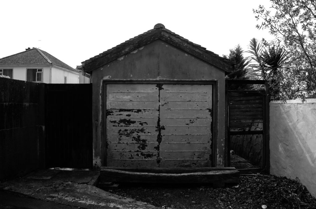
These are my favorite images because i think they best show the New Topographic and urban photography style. This is by framing the photographs directly towards a building/object looking flat towards the surface. As well as this, one of these photos is taken at a slight angle to show the dark shadows being created by the objects in the image, much like some of Lewis Blatz’s images.

Inspirations

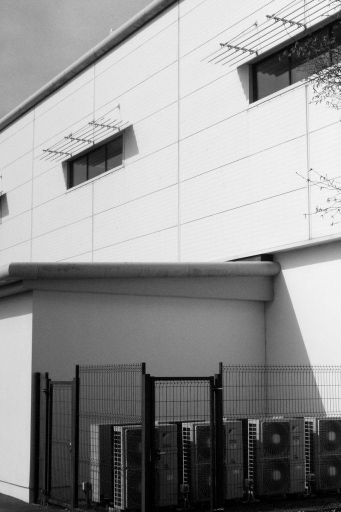
Many of Lewis Baltz’s photography incluse industrial/mechanical objects/buildings, such as pipes, electrical boxes, air conditioning etc. I used this information to respond to one of his images of the side of a building containing lots of el;ectrical appliances and boxes:

Lewis Baltz - 49 Artworks, Bio & Shows on Artsy

My Final Outcome

Here I took a photograph of some air conditioning units and wires on the side of a building. The angle the image is taken at is much like Lewis Baltz because the camera is facing flat towards the wall, showing the shapes and right angles created by the objects in the frame. A difference between my image and Lewis Baltz’s image is that the background of my image (the wall of the building) is darker than the objects in the main focus of the image, whereas in his image the objects in the foreground are darker than the background. Although these light and dark tones are ‘inverted’ in each image, the same effect is achieved, making the focus of the image stand out more through the use of contrast between the tones used.

Shoot 1

Contact Sheets

Favorite Images

These are my favorite images because i think they best display the New Topographic style of photography and urban photography through the strong tonal ranges, along with the ‘dirty’ and ‘raw’ feel to the images created through increased contrast.

Inspirations

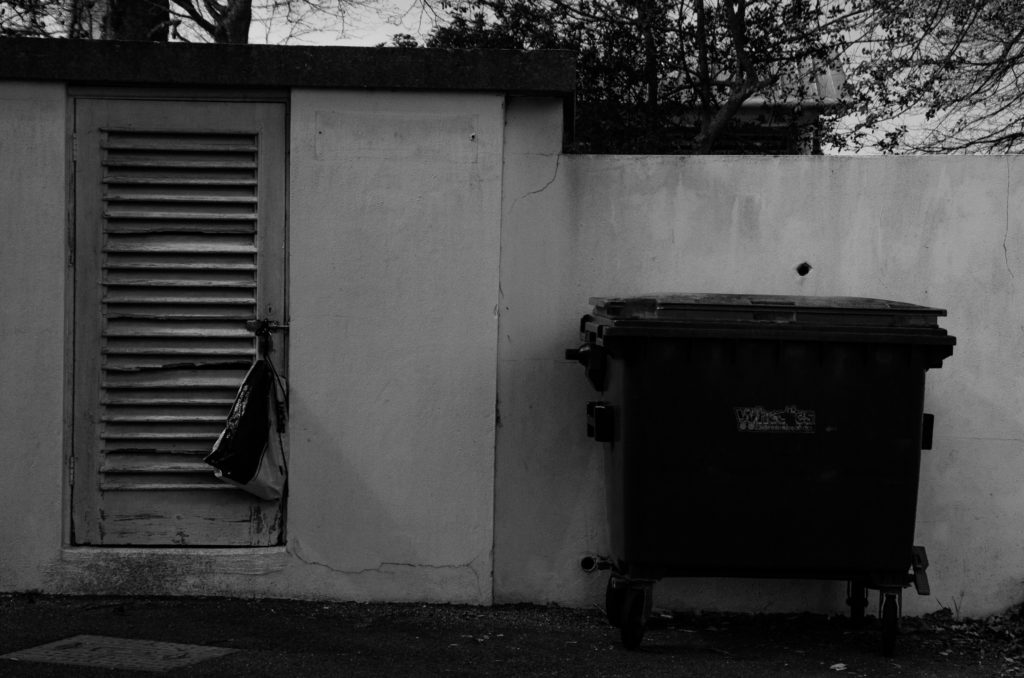
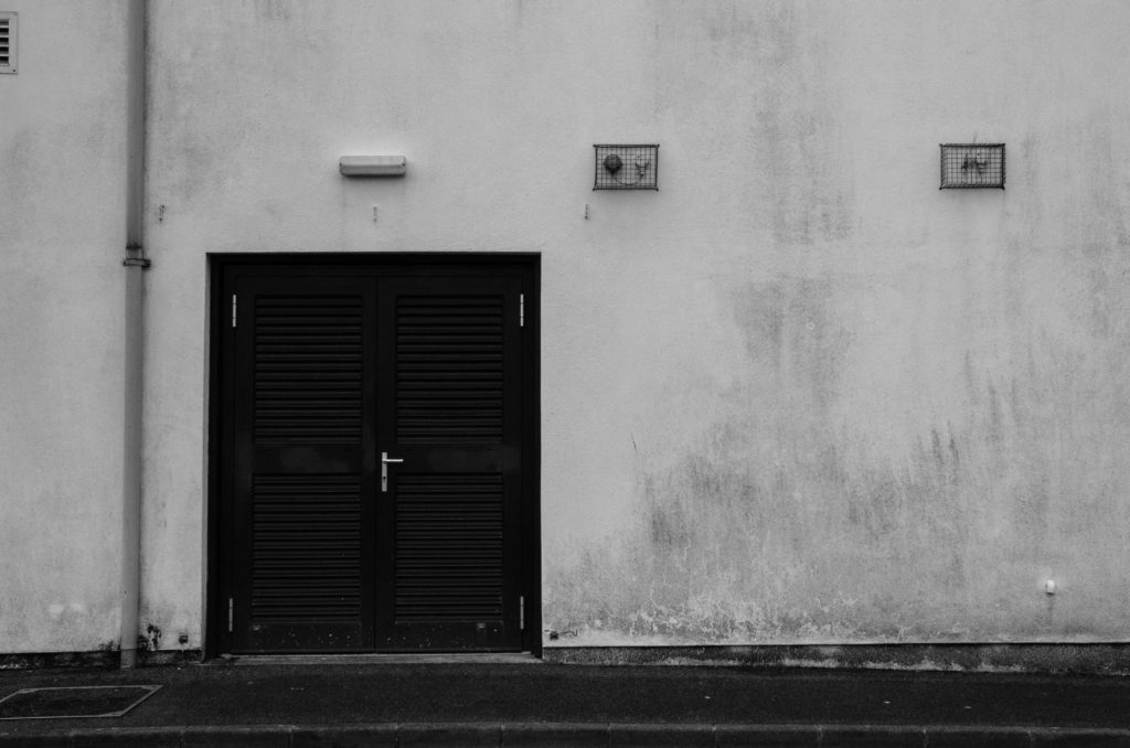
As you can see, Lewis Baltz directly inspired many of these images, for example, the ones I took of the dark double doors against the lighter white all the building.

This is similar to some of Lewis Baltz work such as:

Icon of New Topography movement Lewis Baltz dies at 69 - The Washington Post

My Final Outcome

Here I darkened the darks of the image to create greater contrast between the door and building wall. This also emphasises the dirt and texture on the wall, much like in the top left of Baltz’s image above. My image is less exposed than Baltz’s image because i feel like it gives the image a more ‘real’ feeling as you can see the textures and dirt on the wall more clearly.