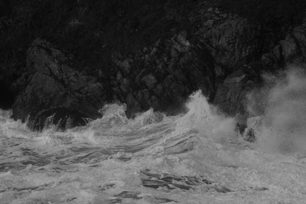
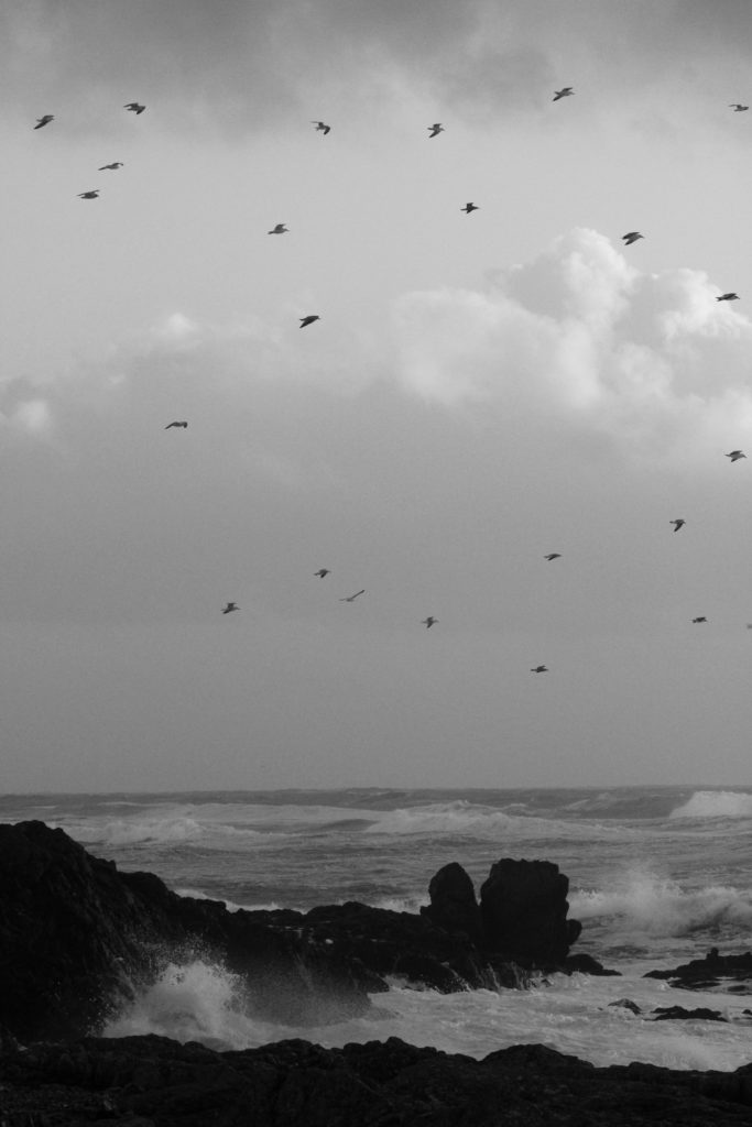
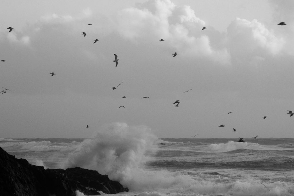
Landscape Photography – Response

Photoshoot Plan

What – My plan is to photograph landscapes around Jersey that link to Romanticism- focusing on the coastline, woodlands and areas with dramatic weather changes. My idea is to capture images from contrasting perspectives, for example through trees, to experiment with how this effects the depth of an image.

Where – I aim to capture these photographs in locations such as Greve De Lecq beach, Noirmont woods, Queens Valley Reservoir and the coastline at Corbiere. I believe these settings will hold romanticized areas that will show the beauty of nature, for example cashing waves, dense forests etc.

When – I plan on conducting these photoshoots over the span of a few days to take advantage of the different weather forecasts. I aim on capturing clouded skies, sunsets, clear skies and dusk to explore how the range of the time of day images are taken effect their quality and the atmosphere they create.

How – To take full advantage of the differing lighting in my images, I plan on experimenting with the ISO on my camera as well as changing the white balance to suit the area I’m photographing. I will also change the image’s perspective by getting lower to the ground for some shots, and then higher looking over the landscape for others.

Why – I am conducting this romanticized rural landscape photoshoot to explore the secluded, natural environment of Jersey, capturing images relating to photographers such as Ansel Adams. I want to create drama and atmosphere in my images which I hope to do through the use of vivid contrasts and wide depths of field.

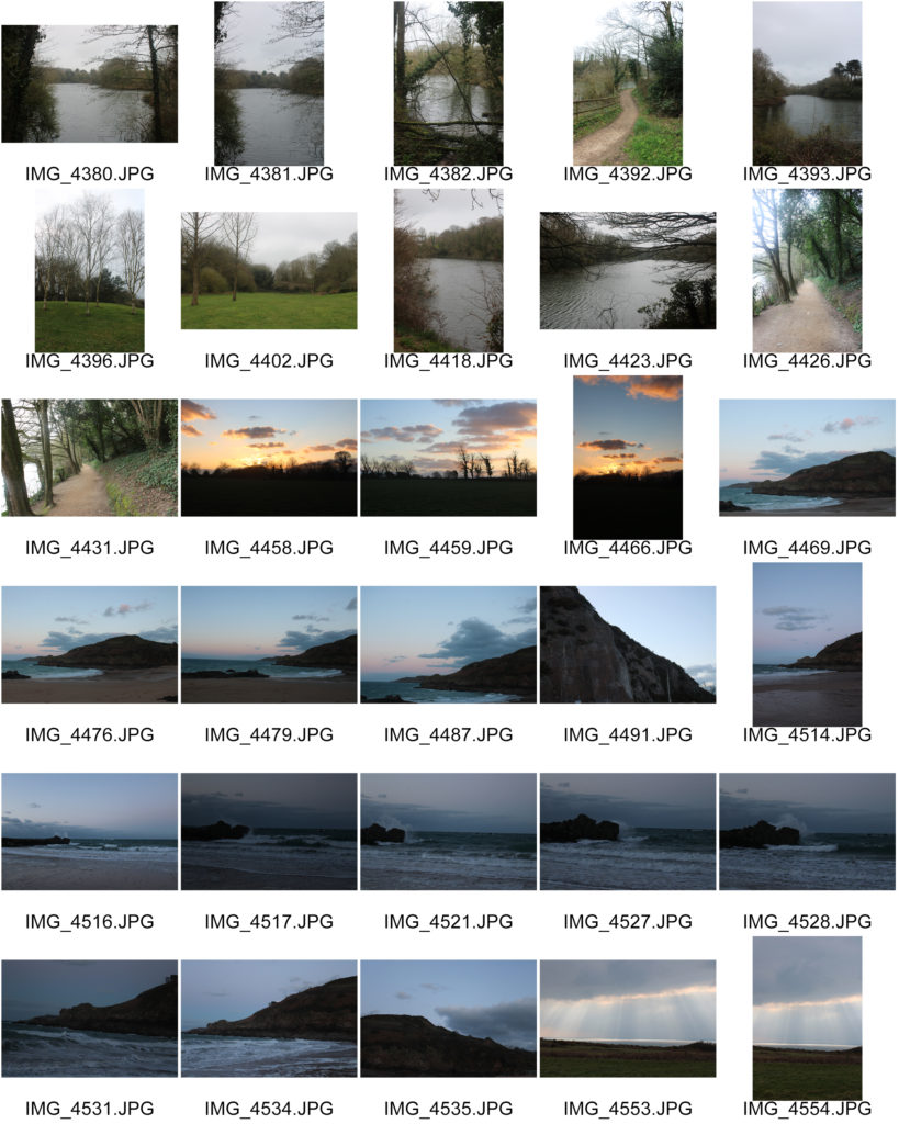
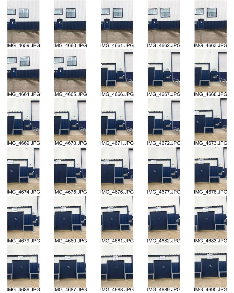
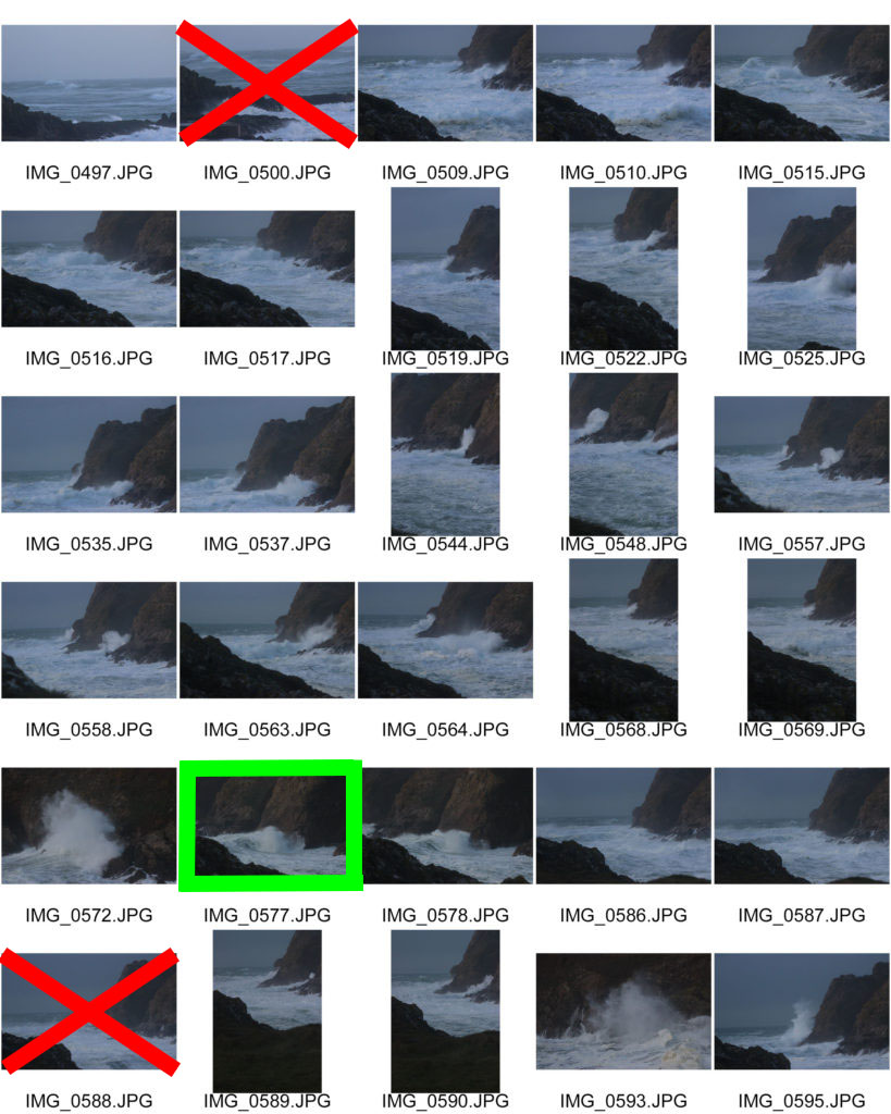
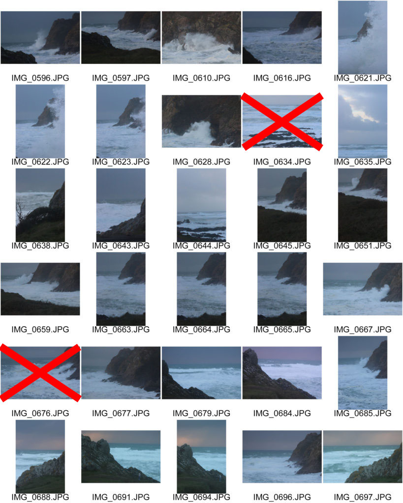
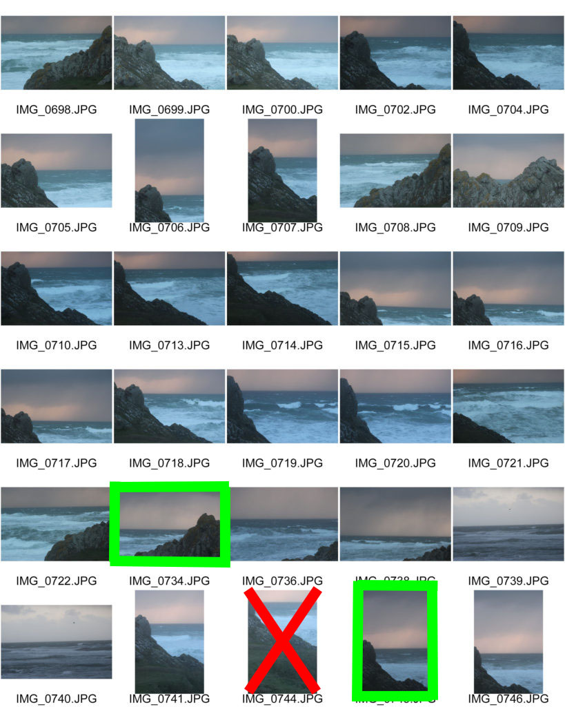
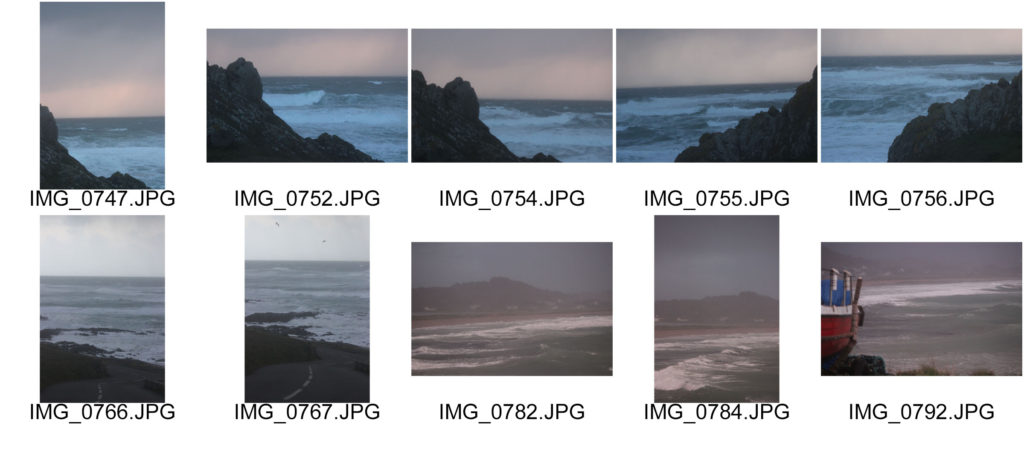
Contact Sheets

Edited Images

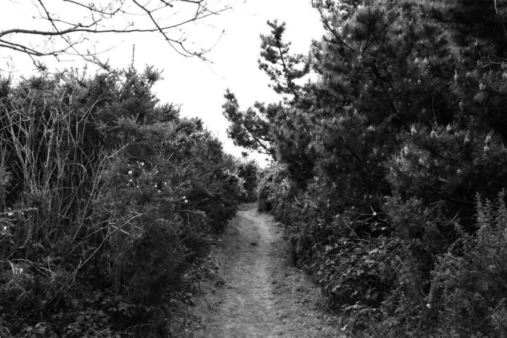
During my editing process, after my first selection of favourite images, I experimented with adding a black and white filter. I did this in order to reflect the work of Ansel Adams, emphasising the dramatic dark and light tones I have captured. I really enjoy how these images look when black and white as I believe that the unsaturated filter adds a mysterious, impactful atmosphere to the images, demonstrating the natural world as a climactic experience for society to view. Additionally, making these images black and white has exaggerated the impression and emotions that these locations have surfaced- similar to the way Adams expressed his feelings on the surroundings of Yosemite National Park.

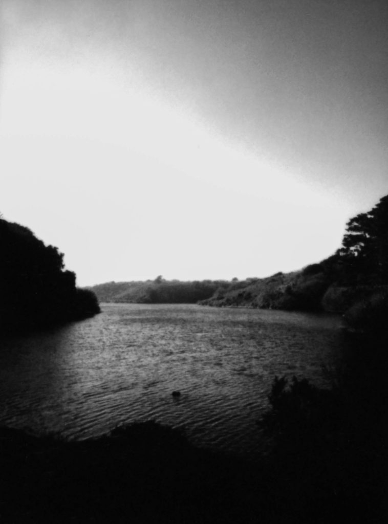
Final Image

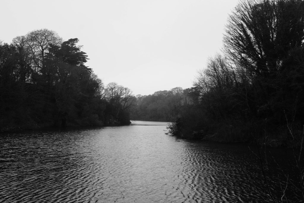
I chose this image, taken at Queen’s Valley Reservoir, due to its wide range of tones, textures and interesting composition. The first element of my image that I really enjoy is the perspective it’s taken at, looking along the reservoir. I believe this composition forms a thick leading line from the foreground to the background of the image, guiding the observers eyeline through the landscape as it disappears into the distance. The wide depth of field that I have captured by experimenting with aperture settings exaggerates the vast scale of the landscape, creating a gripping atmosphere. Furthermore, my composition uses the rule of thirds as the foreground shows the glistening water surface, the middle of the image shows the span of dense trees and in the final third we see the bright sky. This composition technique reflects the landscape photography of Ansel Adams, emphasising the beautiful elements of the natural world in different stages- water, earth and air. Additionally, I really love the way the natural sunlight creates dramatic highlights over the water and shadows across the trees. This contrast in tones shows evidence of Ansel Adams’ Zone System, demonstrating zone 1/2 for the reflection of the trees on the water’s edge (as it is clearly the darkest point of the image however minimal texture can still be seen), and zone 8/9 on the water’s surface. This lighting/range of highlights and shadows creates a rippled texture across the reservoir which contrasts with the spiked texture of the tree tops. I used Adams’ Visualisation technique to imagine how this difference in texture would compliment each other, showing the fascinating patterns nature can make.

Ansel Adams Comparison
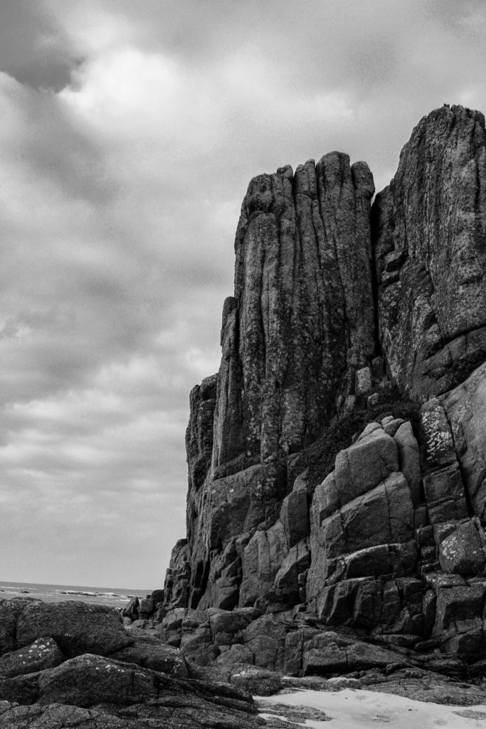
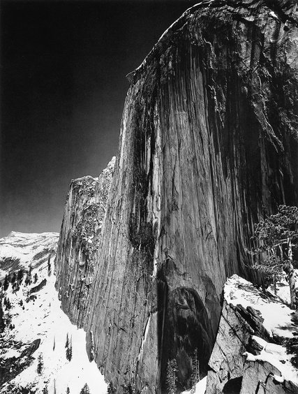
I have chosen to compare this image of mine to Ansel Adams’s “Monolith, the Face of Half Dome, Yosemite National Park,” 1927 due to their similarities in composition, subject and also their differences in texture and depth. I captured this specific image at La Corbiere Beach as it is a special place on the island for me and my family, full of nostalgia and childhood memories. It is clear Yosemite National Park was a special place to Adams as it was the main location for most of his landscape photography. Both images share similarities in composition, but both have independent aspects that make the images unique and contrasting, despite both being of rock-like structures. In my original image I captured the structure from a lower perspective in order to make it appear a lot taller than it was, which is a common technique Adams used in his work. Additionally, there is a similarity in the texture of the rock formations with both holding leading lines that fall down the edge of the cliff face. These irregular lines in Adams’ image, while they don’t reflect physical movement, emphasize the vast height of the mountain and create an effect as if the structure is growing taller and taller. In comparison, my image holds a rougher more jagged texture, as the leading lines have more jolted edges and sides- showing how the power of nature can manipulate the shapes and atmospheres of our surroundings.

Furthermore, there is a contrast within the colour and texture of each image’s sky which create differing moods. In the background of Adams’ photograph, he has captured a dark area of negative space making the sky seem as if it is an empty void, with little to no texture. Whereas in my image, I have captured the soft fluffy texture of clouds that disappear into the background creating a wider depth of field, as well as a brighter tone showing the main highlights in the image compared to Adams’ sky as his darkest part. However, I have taken inspiration from Adams’ Zone System in order to help me visualise the dramatic contrast in dark and light tones that I wanted to capture. For example, I have photographed zone 8/9 in my skyline which stands out behind zone 2/3 seen in the tones of the rocks. To create this effect while conducting my photoshoot I experimented with the ISO and shutter speed settings on my camera, this really helped me when editing my images in photoshop as I already captured quite dramatic differences in tone. Similarly, in Adams’ image we can see zone 0/1 in the dark abyss of the sky which contrasts greatly with zone 9/10 seen in the luminous white snow. These aspects of both images mirror the excitement and awe felt in each location, demonstrating how the beauty of nature comes in several forms, though similar; entirely different.

Double Exposure

Double Exposure

Melissa Bissel

Melissa Bissel (bottom left) is an in-home documentary and lifestyle photographer who lives in Massachusetts. She states in her blog, “I take seriously the privilege of being welcomed into your home as your family documentarian.  Together we will capture the memories of what makes you, your family and the life you have created together, its very own kind of special.”

She has experimented with double exposure as shown on the top right.

Double exposure is the art of immerging two or more images and creating an overlay to create different abstract and creative images. Most artists use Photoshop for this art form as they are able to use blending, opacity and exposure levels to properly adjust each overlay.

Melissa clearly has explored this theme as her project powerfully show evidence that some layers are clearer than the others.

Planning

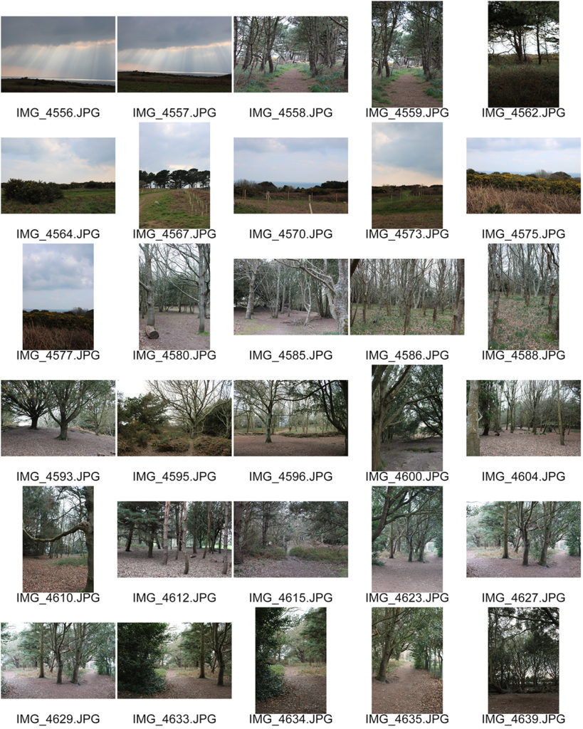
Contact sheets

This is my favourite outcome, I have called it “Madness” as it powerfully depicts different emotions; one is still, calm, the other is laughing and the other one seems to be between laughing and crying, sort of like the Pseudobulbar affect.

I have chosen this image as my final outcomes because it successfully relates to the mood board and Melissa as both our models are female; the image is in black and white and there is at least 3 evidences of multi-exposure.

This image was taken using a Sony Alpha 380 DLSR.

It was taken using 100 ISO and a 1/160 shutter speed.

These images were shot using 2-point lighting; one to the side of the subject and one facing the background in order to clarify, lighten and remove any shadows on the picture.

It has been edited using Snapseed and photoshop in order to:

•Sharpen and increase details so the image is clear.

•Turn the image in to black and white.

•Create the double exposure

Joel Sternfeld Study (New Topographics)

Joel Sternfeld

Kansas City, Kansas, May, 1983
‘Kansas City, Kansas, May’ – Joel Sternfeld (1983)

Born in New York in 1944, Joel Sternfeld is known for his large-format colour photographs of American towns and cities. Sternfeld received his BA in visual art from Dartmouth College in 1965. He then began producing colour photographs in his early career in the 1970’s. Joel Sternfeld’s work documents people and places with a vibrant sense of colour, which can be seen in his series ‘American Prospects’, created in 1987. Sternfeld has had work held in exhibitions such as the J.Paul Getty Museum in Los Angeles, The Museum of Modern Art in New York, the Art Institute of Chicago, and the Fotomuseum Winterthur in Switzerland and many others. Joel Sternfeld currently lives in New York where he has taught at the Sarah Lawrence College since 1985.

Examples of Joel Sternfeld’s work

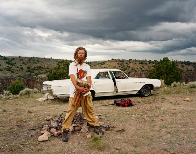
Joel Sternfeld | A Man at His Campsite, El Prado, New Mexico, August 1999  (1999) | Available for Sale | Artsy
‘A man at his campsite, El Prado, New Mexico’ – Joel Sternfeld (1999)
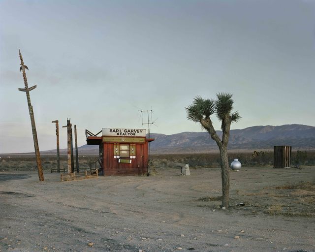
Joel Sternfeld | Earl Garvey Realtor, The Mojave Desert, California, July  1979 (1979) | Available for Sale | Artsy
‘Earl Garvey Realtor, The Mojave Desert, California’ – Joel Sternfeld (1979)
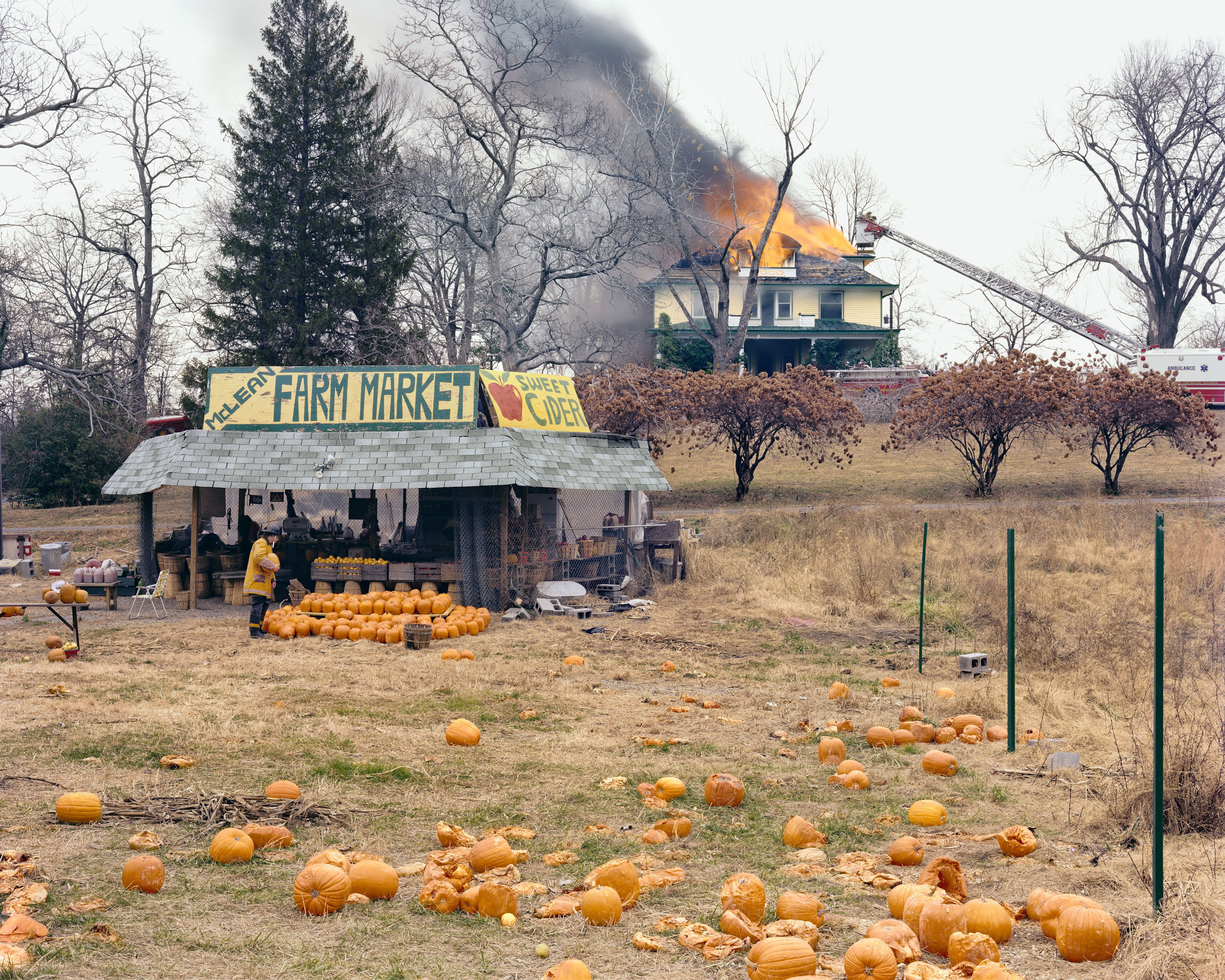
American Prospects
‘McLean, Virginia, December’ – Joel Sternfeld (1978)

Analysis of Joel Sternfeld

American Prospects
‘Sauvies Island, Oregon, June’ – Joel Sternfeld (1979)

This image taken by Joel Sternfeld, titled ‘Sauvies Island, Oregon, June’, depicts what looks to be an isolated campsite floating on the water. At first glance, the colour palette of the photograph is very earthy and muted, with a rather complex composition including a dramatic use of echo and reflection.

The natural, harsh sunlight produces harsh shadows and highlights within the image. I would suggest that this image was taken around midday as the shadows produced by the poles face directly downwards, implying that the sunlight is coming from straight above.

There is a strong use of line within this image, this is shown through both the poles and their reflections. These create the focal point as the earthy-toned wood is juxtaposed against the sombre, black poles. These thick lines direct the viewers eyes upwards, as the poles start from the bottom of the water.

There is a strong sense of echo within this image, this is shown through the poles reflecting in the water. This use of echo could metaphorically symbolise a darker planet with the increased industrialisation, as the reflection almost seems like an alternate universe. The multiple uses of lines can also be shown as a form of repetition, although the repetition isn’t constant.

There is a contrast in shapes within this photograph, as the organic shapes of the leaves and masses of trees are contrasted against the straight-edged lines and the geometrically formed house. There is also a repetition of cross shapes which can be seen in the bridge, this further proves the contradiction between natural and geometric shapes.

There is a slightly shallow depth of field in this image as the background begins to fade in the distance of the photograph. There is two representations of negative, empty space within the photo. This can be seen in both the top and bottom third of the image. This even distribution of empty space produces the illusion of a balanced composition.

The image has a multitude of contrasting textures. For example, the sharp, string-like grass is juxtaposed against the smooth, fluid waters. The water is also contradicted with the straight poles that cut into the water in a knife-like manner.

The darkest areas of the photograph are mainly found in the reflections of the waters, however the dull trees also create a strong contrast between tones against the delicate, light sky.

The colour palette of this image is very earthy- toned and subdued. The dominant colours within this photograph would be green and brown, however there is representation of blues and whites. I believe if the image were in black and white, there would be no distraction from the colours in the image, therefore accentuating the use of reflection and echo. However the use of colour in this image adds a vintage tone to the image, especially with the muted tones.

There is a more complex use of rule of thirds in this image, as the the almost-floating house is located in the middle of the image, with the reflected poles leading the viewers eyes down to the bottom third of the image. The image isn’t particularly balanced as the majority of the positive space can be seen in the bottom and middle third, whereas the top third mainly consists of empty space.

case study -lewis baltz

Lewis Baltz (1945-2014) was a young photographer who soon became a central figure in the new topographic movement. Through his investigan on the crisis of technology as a means of human emancipation, the role of the artist and objectivity, Baltz contributed to the aesthetic shift that the exhibition, (New Topographics: Photographs of a Man-Altered Landscape), began provoking among a young generation of (mostly) European photographers. His body of work focused on the search for beauty in bleakness and devastation, a reflection of human control and power through the depiction of common architecture of factories, parking lots,offices etc.
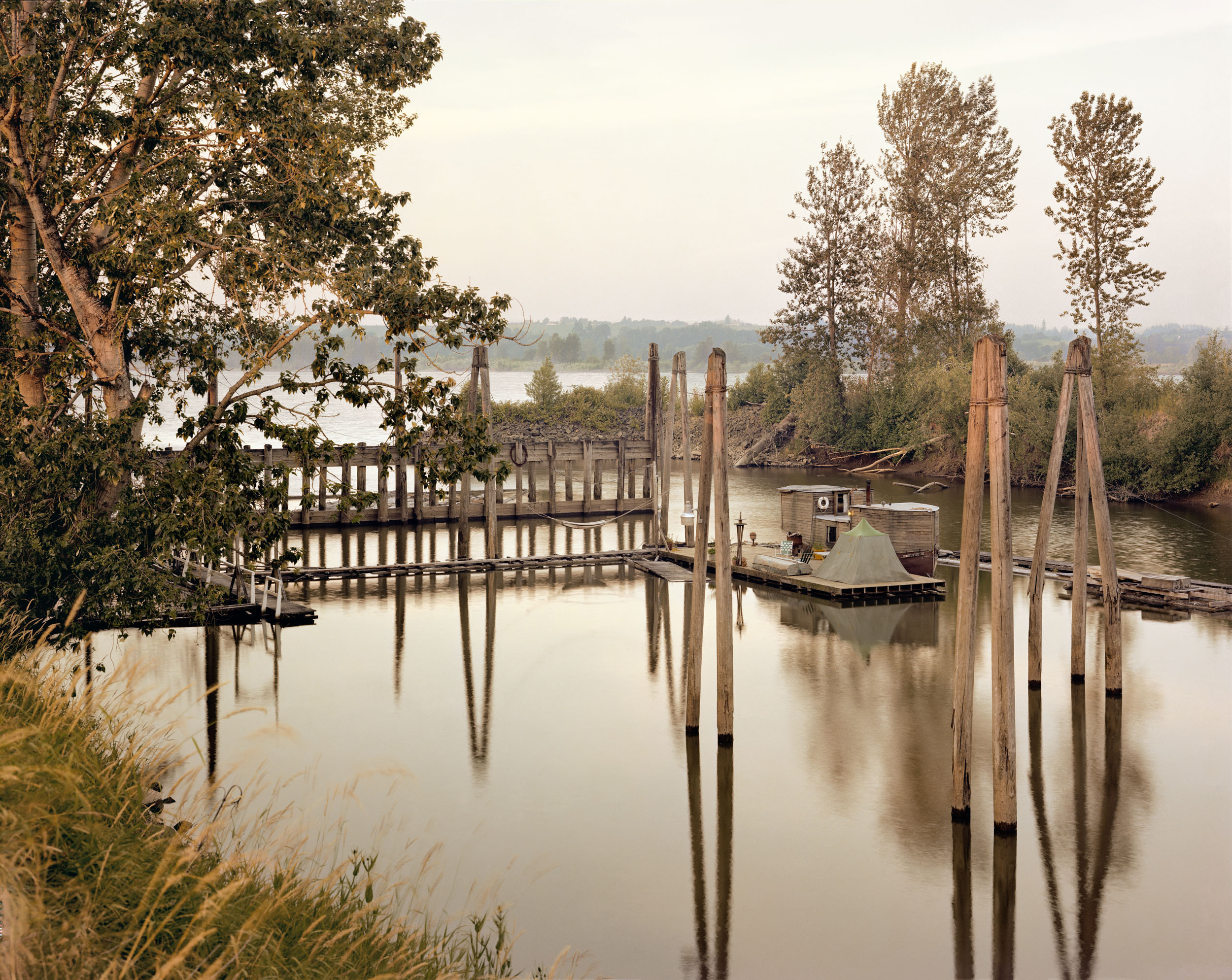
Image Analysis

This image looks to have been taken in natural lighting as the top of the image behind the building is very bright as though there is sunlight behind the building. The contrasting tones in this image imply that it has been edited so that the darker tones contrast the brighter tones even more. This image has also either been taken in black and white or edited after being taken. This image is very sharp, although the image is simple, the way it has been captured brings out all the details; such as the marks on the garage doors and the different tones and marks on the tiles. The floor in this image is the biggest contrast as it is fully black and fully white, where as the rest of the image is just extremely dark grey tones contrasting with lighter grays. I am going to take inspiration from this image as I know a place similar that I can capture images of.

Naturalistic Landscape

Naturalistic Landscape

What is a landscape?

Landscape photography is an art form which focuses on areas of land and how they interact with natural/man-made structures. It includes things like the mountains, hills, rivers, vegetation, architecture, weather like lighting, sunny and rainy, and so much more.

Photographing landscapes is very important since landscapes are prone to evolution; the land we see now may not have looked the same 50 years ago. This can have a relation to memory and enable us to reflect on the past and remember our ancestors or how life used to be back then.

Ansel adams

Ansel Adams was born in the 20th February 1902 and sadly passed away April 22nd, 1984. As a child Adams was always into art; he taught himself how to play the piano at the age of 12. He then started taking lessons and looked to pursue music. Evidently, Adams was always very artistic. In the end, he gave up his love for music and aimed to pursue another passion of his, photography.

Adams grew up in a house in the middle of the sand dunes of the Golden Gate. This seemed to have influenced his love for nature as he started to take photographs with a Kodak no. 1 Box and would go out to hike, explore and climb just to take a photograph that matched his visual mind/imagination. For example, he once hiked with his friends up a stiff dome just to take this amazing photograph in 1927:

Monolith, The Face of Half Dome, 1927

After this picture was taken in Adam’s first High Trip, he met Albert M. Bender who influenced Ansel a lot and began the preparation and publication of Adam’s first portfolio; Parmelian Prints of the High Sierras.


Image analysis

Light:

The brightest part of the image is obviously the snow since it is white.

The background is dark black since the artist has experimented with different exposures to match what he wanted the image to look like.

This photograph contains natural lighting and seems to be coming from behind since it is successfully lighting the whole scene.

Space:

There is a perfect illusion of 3D space in this 2D image due to the monocular depth-cues used and captured by the photographer.

Texture:

The surface of this mountain is rocky, hard and cold. The rocky parts of the mountain may be used for climbing. The smooth surface of the snow reflects light, adding sparkle and making the photograph more appealing.

Lines:

There is a common repetition of vertical lines in this natural image communicating a sense of height since they extend upwards towards the sky. In this photograph, vertical lines may suggest danger and adventure since Adams did have to hike up this mountain to capture this image. For religious people the vertical lines could be linked with spirituality, our soul rising towards the heavens once we die which relates to Ansel Adam’s work since the image is black and white which is commonly linked to death.

There is a slight curve by the left side of the mountain (<) successfully leading the eye to the top of the mountain making it the main focal point.

Shape and form:

This image has an organic shape since it’s an image taken in nature and also it is irregular and asymmetrical.

There are various shapes you can see in this image such as: a cuboid which makes the mountain making it seem like an old book and triangles making the points.

There is also depth in this image as well as height and width adding to the 3D form in this 2D image. For example, relative size, occlusion, cast shadows and interposition all play a role in helping us perceive this image to be 3D.

Colour:

The brightness of the colours found in this image are dark which suggests a lack or use of dim natural lighting, as in afternoon. The dark colours may also convey a sense of cold and mystery.

The intensity of the colours are pretty dull creating a serious atmosphere. In this image the artist has captured the seriousness of the scene with dull, grey imagery.

Planning

Contents:

I will attempt to capture natural areas of Jersey such as Queen’s valley.

Location:

As mentioned above, the location will be primarily around Queen’s valley
since its a large environment with different kinds of views and aesthetic.

Lighting:

For this shoot, I will clearly use natural lighting since it’s an outside
shoot plus, it allows my images to look natural and allows me to capture the
natural scene of the land.

Camera settings:

For this project I may set the
ISO to 100 since the weather appears to be sunny with the shutter speed at
1/500 in order to let enough light in.

I may also set the camera to
automatic mode so that the camera determines all aspects of exposure, selecting
exposure parameters consistent with the appliance at intervals the constraints
of correct exposure, together with exposure, aperture, focusing, light-weight
metering, white balance, and equivalent sensitivity.

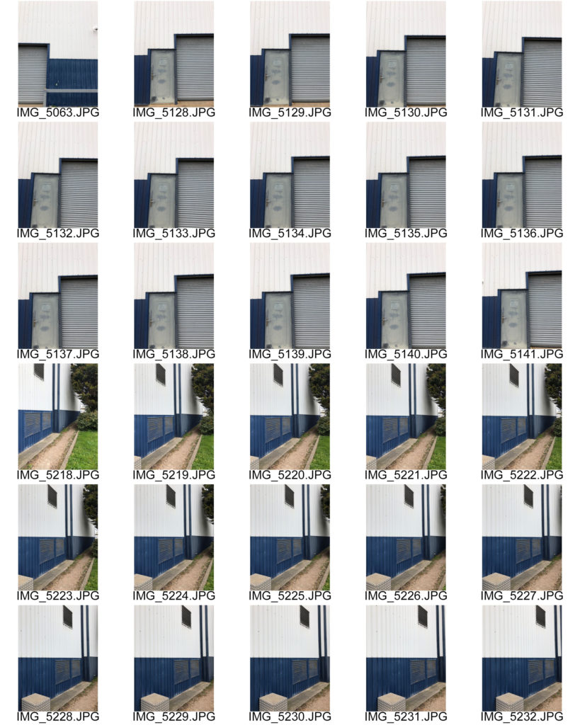
Contact sheets

Tree Blend

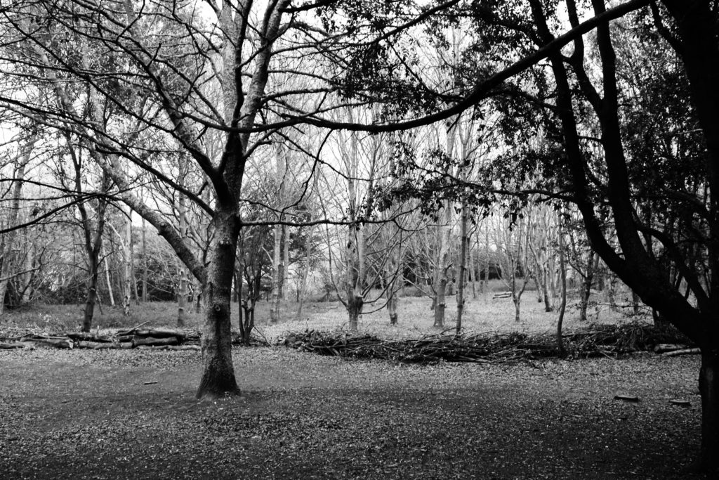
This is one of my final outcomes and it’s called Tree Blend because there is a branch in the middle of this photograph which blends with the reservoir.

It was taken using a Fujifilm instax mini 90 NEO CLASSIC with a coloured polaroid.

In order to put the polaroid on the blog, I had to “scan” it with my Sony Alpha 380, clearly edited the “scanned” polaroid with Lightroom and photoshop in order to make it monochrome and look quite old so that it is easier to relate to the key artist.

In comparison to Ansel Adams, both our shots are in black and white, there is a strong balance between the black and white tones and both our images are both of natural landscapes.

However, Ansel Adams used a film camera whereas I used a polaroid and DSLR camera. In addition, his photographs are sharper than mine as his film was most likely professionally scanned.

This outcome was taken employing a Fujifilm instax mini ninety modern CLASSIC with a coloured film.

In order to place the film on the web log, I had to “scan” it with my Sony Alpha 380, clearly altered the “scanned” film with Lightroom and photoshop so as to form it monochrome and appearance quite recent in order that it’s easier to relate to the key creator.

In comparison to Ansel Adams, each our shots are in black and white, there’s a robust balance between the black and white tones and each our pictures are each of natural landscapes.

However, Ansel Adams used a film camera whereas I used a polaroid and DSLR camera. Additionally, his images are swindler than mine as his film was possibly professionally scanned.

The world is round

This shot was used a DSLR. In contrast to Ansel Adams, our images is are black and white, with a strong balance between the black and white tones, and each of our images is of natural landscapes.

However, my shot is evidently framed differently as it is circular to represent the earth. Apart from that I think this image is a successful outcome inspired by Ansel Adams.

Lastly, I agree to a large extent that I have powerfully managed to create my own photographs inspired by Ansel Adams.

To capture a greater essence of the time period and kind of camera Adam’s has used, I decided to take 2 photographs in film (polaroid) format. Although it isn’t the same type of film Ansel used it served and gave my outcomes this vintage look which matched my inner view of the outcomes (what I have imagined the photographs to look like). In addition, as explained above: images are in black and white, with a powerful balance between the black and white tones, and every of our pictures is of natural landscapes.

Nevertheless, my images are evidently of different types of landscape; Ansel Adams looked at the mountainous kind of landscapes whereas I had to adapt to my own environment but still managed to create a few mountainous illusions as shown in outcome 1. Again, as mentioned above, the main differences are that However, some of my shots are manifestly framed otherwise because it is circular to represent the world and “Ansel Adams used a film camera whereas I used a polaroid and DSLR camera. Additionally, his images are swindler than mine as his film was possibly professionally scanned.”

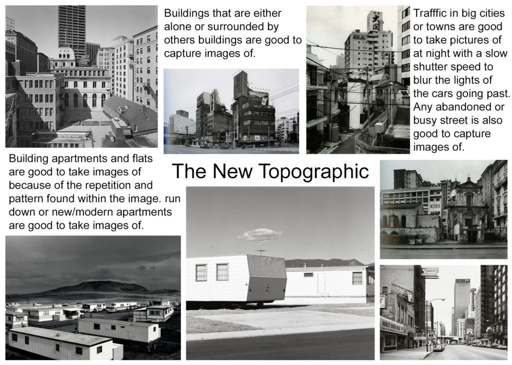
the new topographics

New topographics was a term coined by William Jenkins in 1975 to describe a group of American photographers (such as Robert Adams and Lewis Baltz) whose pictures had a similar banal aesthetic, in that they were formal, mostly black and white prints of the urban landscape. Many of the photographers associated with new topographics including Robert Adams, Lewis Baltz, Nicholas Nixon and Bernd and Hiller Becher, were inspired by the man-made, selecting subject matter that was matter-of-fact. Parking lots, suburban housing and warehouses were all depicted with a beautiful stark austerity, almost in the way early photographers documented the natural landscape.

Mood Board

What was the new topographics a reaction to?

Their stark, beautifully printed images of this mundane but oddly fascinating topography was both a reflection of the increasingly suburbanised world around them, and a reaction to the tyranny of idealized landscape photography that elevated the natural and the elemental. The new topographics was a reaction to the urbanization of natural landscapes.

Urban & Industrial Landscape photography -introduction

Industrial landscapes are all over the place. In fact, they’re so common, we often forget these construction sites, power plants, chimneys, and factories. can be extremely interesting photography subjects. Truth be told, industrial landscapes are rising in natural habitats and urban areas, changing the face of the Earth. They have intriguing materials, textures, and colours, and unique geometrical shapes. All photographers should practice seeing art in the common and mundane.

Mood Board

Mind Map

Task 4 ~ Isolation Photoshoot

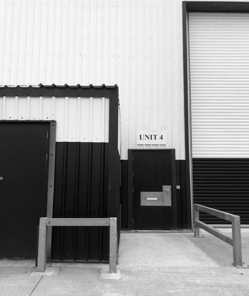
Lewis Baltz

Editing process

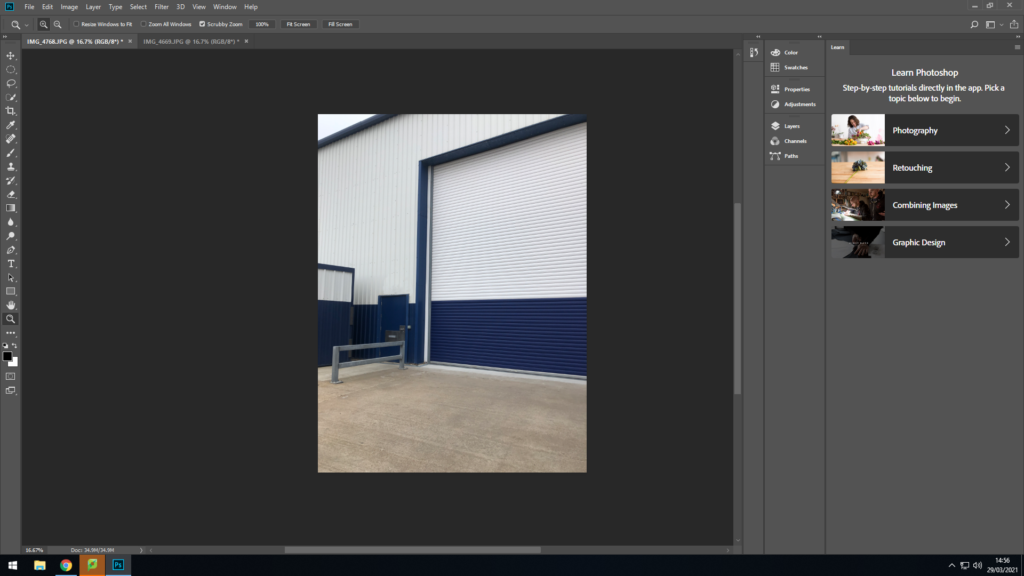
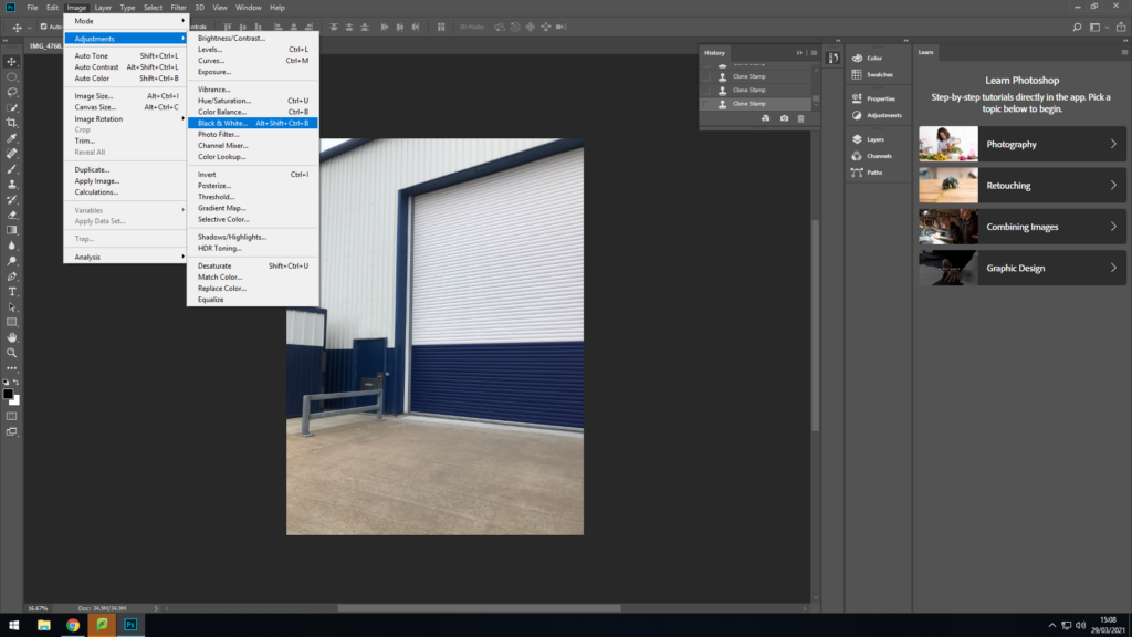
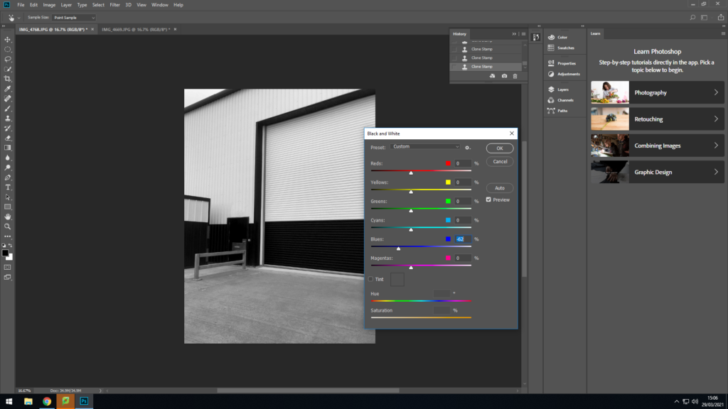
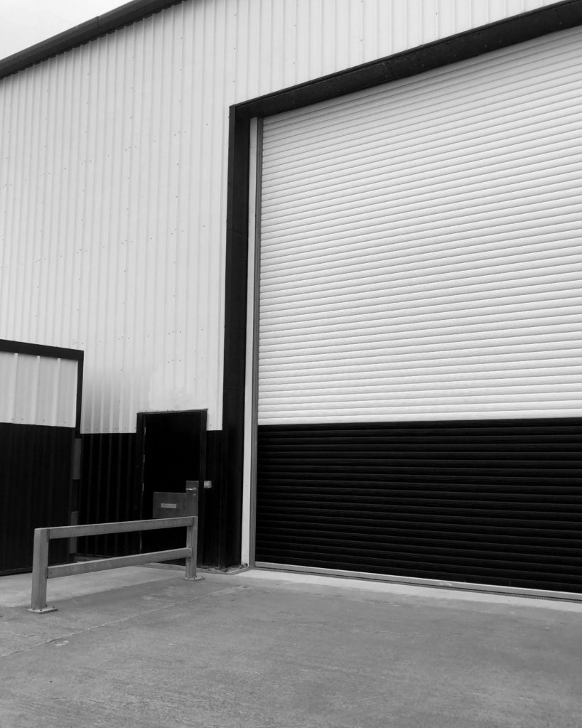
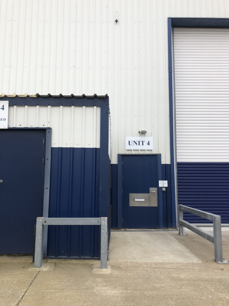
First I used the spot healing tool to delete the two signs above the door and next to it so image would be focused more on the whit and blue colour block. I then used the clone stamp tool to cover up the messy spots that were made when deleting the signs.

To made the image similar to Lewis Baltz I decided to change the image to black and white. then to finish odd I changed the canvas size to 40 inches by 50 inches.

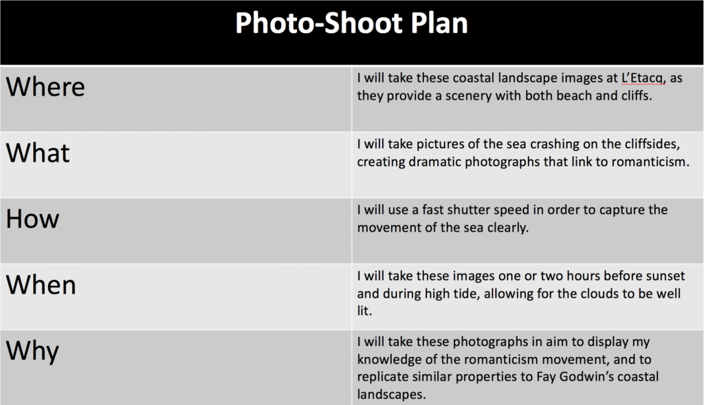
Coastal Landscape Photo-Shoot

Plan

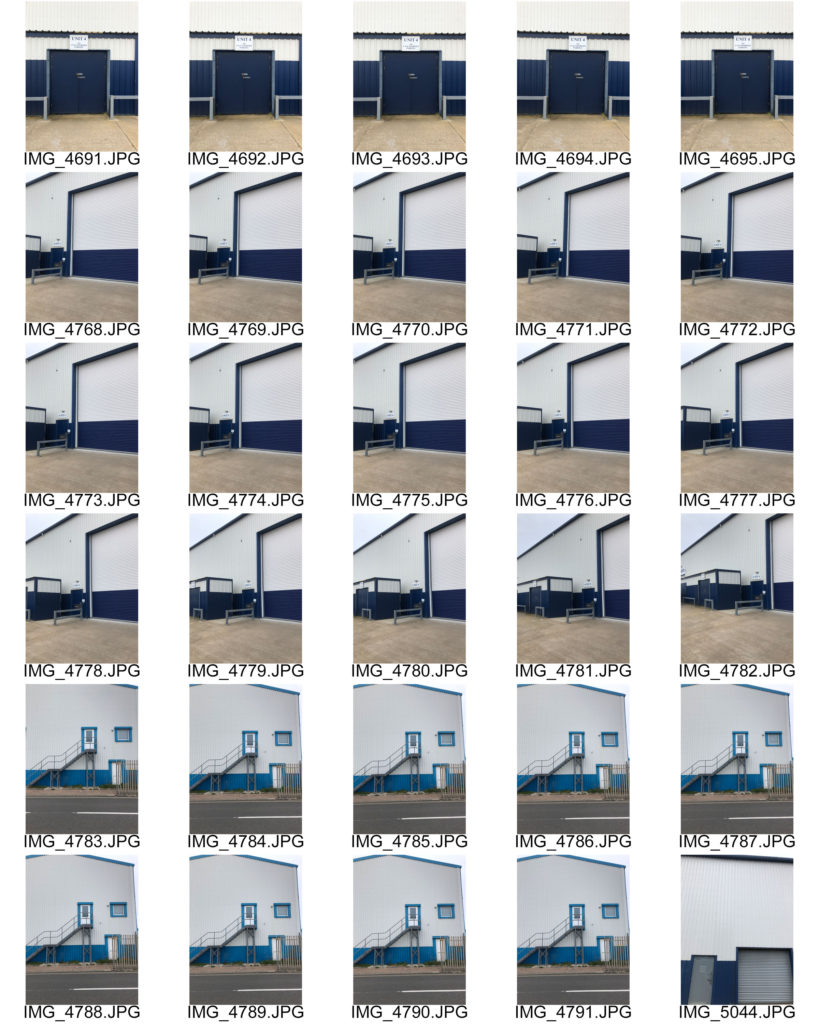
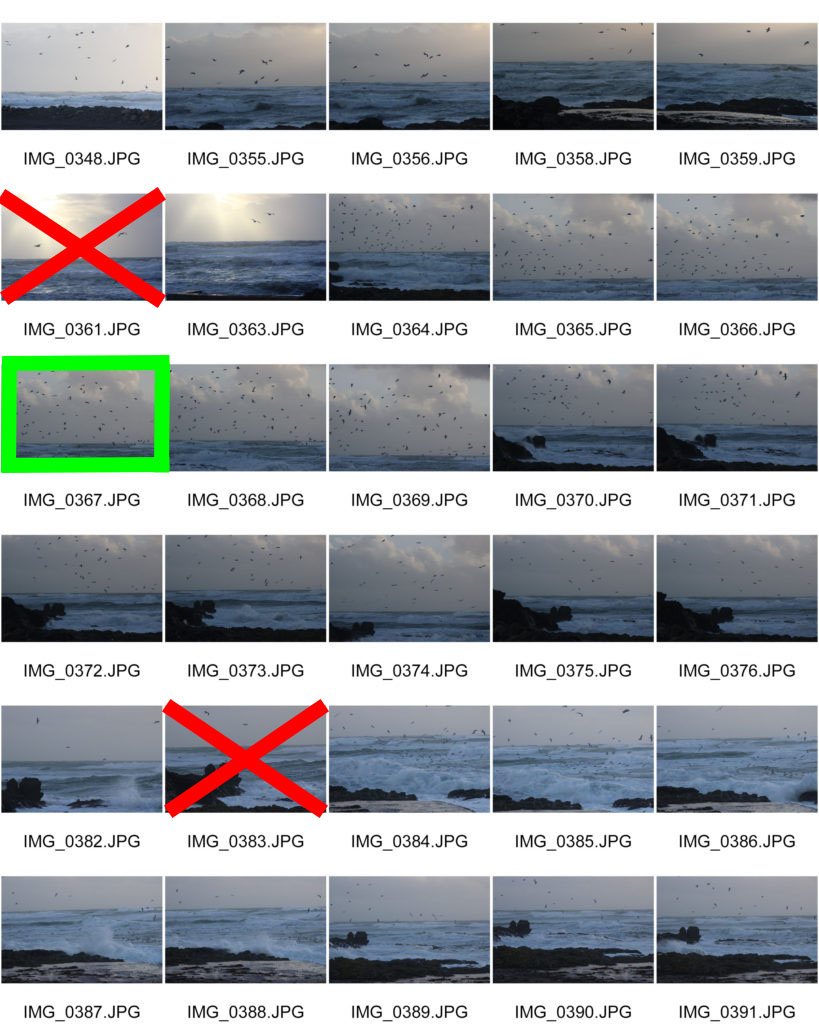
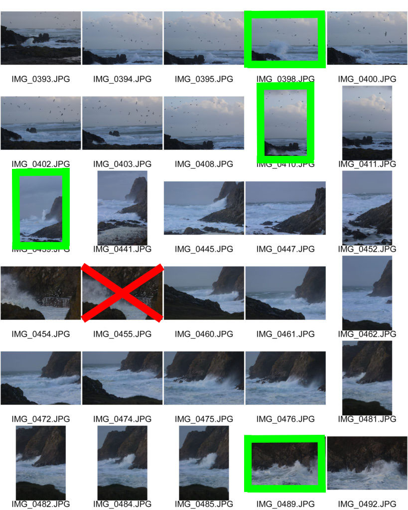
Contact Sheets


Edited Images

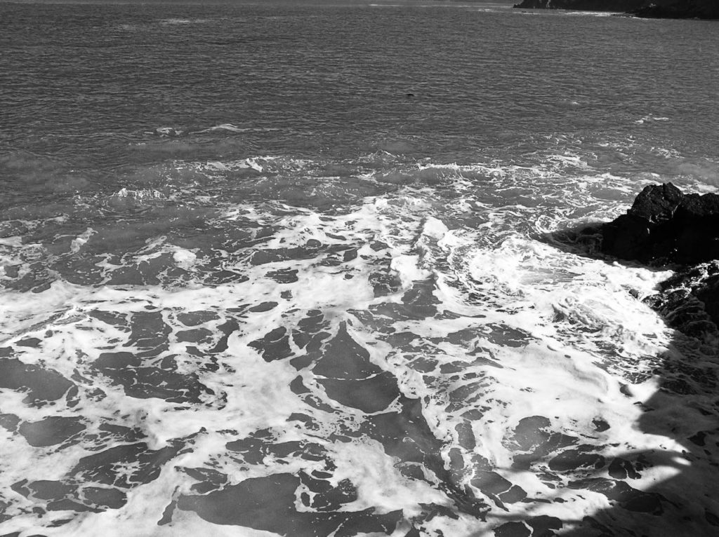
When editing these coastal photographs, I used Photoshop to convert them first into black and white, then increasing the contrast, highlights and shadows for each image. In addition, I also adjusted the curves and levels on Lightroom.

Final Image

I believe that this is my best edited photograph, as it displays elements of romanticism through the harsh weather and the dramatic clouds, therefore replicating aspects of the sublime. Furthermore, this image also coincides with the rule of thirds as the horizon line is located in the lower third of the photograph.