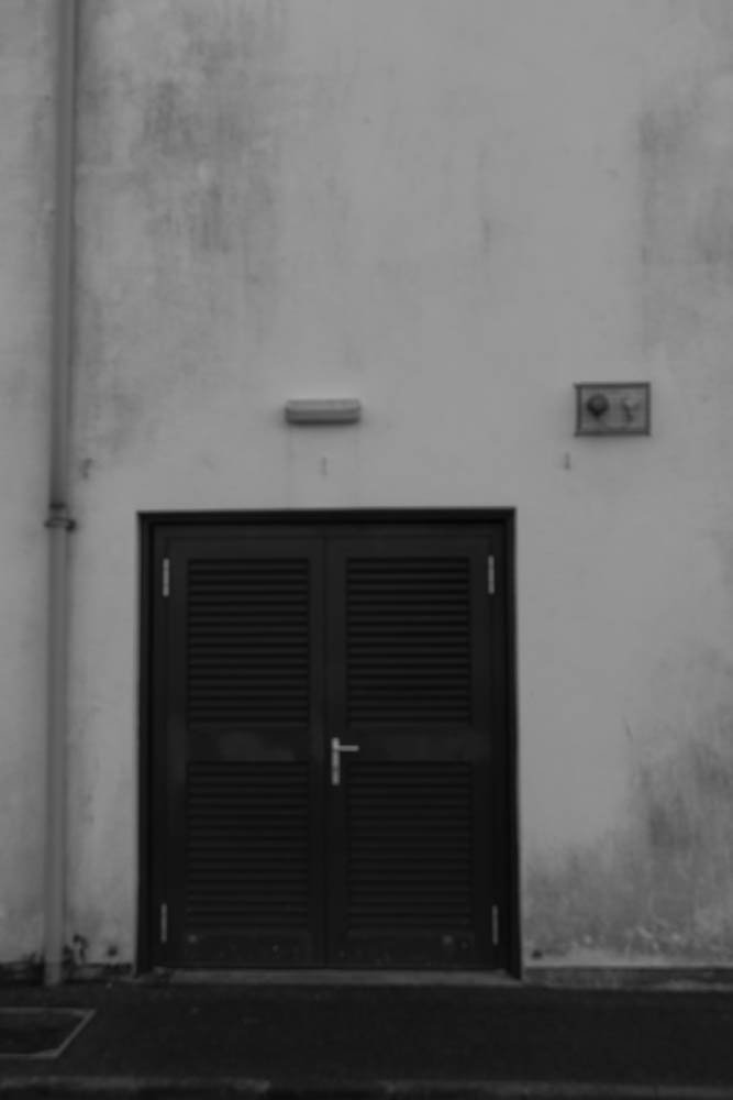
I took photos around the school area and around Highlands. I tried to find the best buildings that would fit in the new topographics photography area. This includes trying to find buildings that have loads of simple lines and outlines on them, mainly a boxy shape and a range of dark and light colours on them to show sharp contrast.
contact sheets;


my favourite images edited-


I really like how my images turned out. I tried to photograph simple sides of buildings that have many square shapes and simple outline to make the buildings fit perfectly into the new topographics theme. When I started to edit my images on light room I was inspired by Ansel Adams contrast pallet. His urban photography is filled with a variety of different black and white shades that make the contrast between white,grey and black extremely sharp. I wanted my images to contain all the different shades from loads of grey areas to very sharp areas of white and black around the images. I think I achieved this well by changing up the shadows and highlights until they matched perfectly together.
When it came to selecting my images I wanted them all to fit into one group therefore I picked the ones I thought worked the best together when presented one by one next to eachother.
