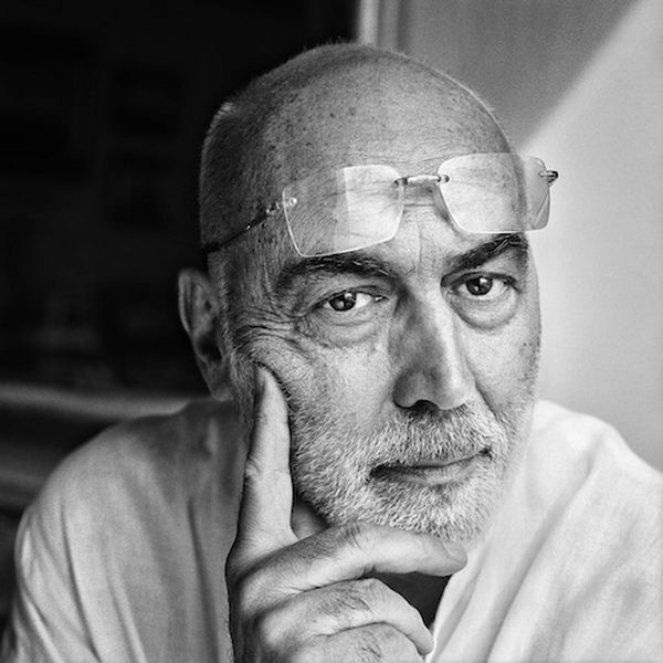
Gabriele Basilico Study (New Topographics)

Gabriele Basilico

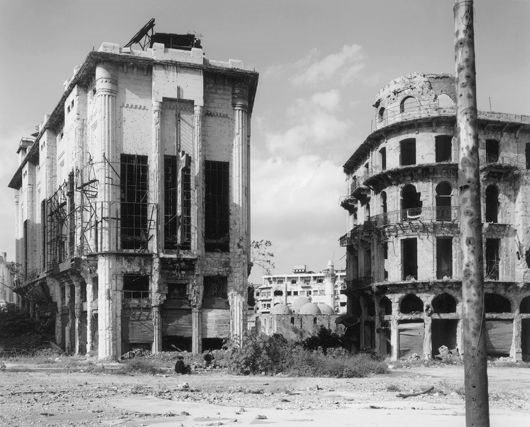
Gabriele Basilico, born in 1944, was an Italian photographer who contributed to the New Topographics movement with his contrasting industrial landscape photographs. Basilico orginally studied architecture before beginning his career in photography, where he started of taking images of traditional landscapes before transitioning to industrial landscapes which was influenced by his previous studies. Gabriele Basilico first became recognised for his photographic study on the buildings of Milan in 1982, with his series “Ritratti di Fabbriche, Sugarco”. This recognition led Basilico to be commisioned by the French Government to document the transformation of the Transalpine landscape, as well as helping to document the effects of war on the Lebanese capital of Beirut. The majority of Basilico’s work was captured using a traditional viewfinder camera with iconic black and white film, before he died in 2013.

Examples of Gabriele Basilico’s work
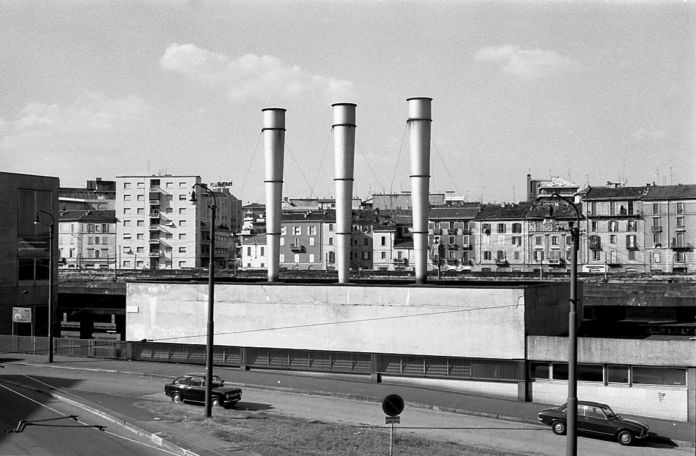
‘Milano, Quartiere Isola’ – Gabriele Basilico (1978)
Beirut by Gabriele Basilico on artnet
Beirut, 1991′ – Gabriele Basilico (1991)
‘Milano 2012’ – Gabriele Basilico (2012)

Analysis of Gabriele Basilico’s work

‘Ritratti di fabbriche di Milano’ – Gabriele Basilico (1978)

This photograph titled ‘Ritratti di fabbriche di Milano’, taken in 1978, translates to ‘Milan Portraits of Factories’, removing any ambiguity to the context of the image. At first glace, there is a lack of a colour palette, however there is an extreme contrast in tones. There is a rather simple, repetitive composition to the photograph.

The lighting in this image seems to be natural yet harsh. The lighting is being directed from the top right of the image, meaning shadows are casted from the same direction. I would imply that this photograph was taken later in the afternoon, as the sun is beginning to set. The brightest sections of the image can be seen in the almost-blinding white painted houses, which are contrasted against the darker tones, as well as the shadows in the image.

There is a strong sense of line in this photograph, due to the geometric shaping of the houses. The lines created by the draining pipes in between each house act as leading lines that direct the viewers eyes upwards, and towards the horizontal, jagged lines created by the roofing.

There is a clear use of repetition within this image, found in the repeated structure of the houses. The use of line is also repeated in this image, although the lines differ in size. However, there is no representation of echo or reflection in this photograph.

The majority of the represented shapes in the photo are geometric, for example, the repetition of lines and squares in the houses. On the other hand, there is little representation of organic shapes such as the tree branches in the middle third of the image. This creates a juxtaposition between organic and artificial shapes.

It is difficult to tell the depth of field within this image as the majority of the image is positive space, with the background being negative space there is no way of comparing the focal lens of the photograph. Nearly all of the foreground is taken up by the houses, which creates positive space.

There is contrasting textures within this image, as the houses provide a smoother texture in comparison to the leaves and tree branches that create a more jagged texture.

There is a range of tones that contradict each within the photograph, due to the use of shadows and highlights. The darkest area of the image can be seen in both the lining of the houses and the shadow that is casted in the bottom-right corner. This is contrasted with the lighter areas of the image, especially the white houses. Overall, I think the the image’s tones are rather balanced and the image doesn’t tend towards darkness or lightness.

There is a lack of colour in this image, as Gabriele Basilico’s iconic images are taken using black and white film. I believe the lack of a colour palette allows for the tones to be accentuated within the image, and create a more intense contrast between highlights and shadows. The lack of colour also allows for other aspects to be exaggerated, such as the use of line or repetition.

The composition of the image is rather simple, as repetition is used to a larger scale and the image is taken in black and white. The positive space that fills the majority of the image isn’t complexly formed and the other sections of the image are purely empty space. However the photograph does not follow the use of thirds as the image is not separated into three clear sections and the there is multiple focal points.

Urban Landscapes: Eugène Atget

Eugène Atget

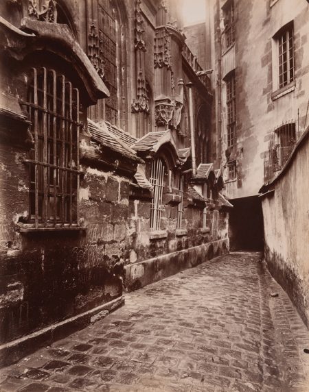
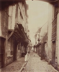
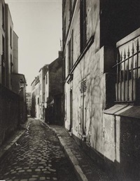
Eugène Atget was an French photographer who took images of the rapid disappearing and elements changing of Paris during the 19th century, best known for his photographs of the architecture and streets of Paris.

He began his career as a commercial photographer. Atget’s clients were primarily painters and sculptors which he produced images of architectural details, doorways, and antiques. He searched for abandoned gardens or empty courtyards for his subject matter.

http://www.artnet.com/artists/eug%C3%A8ne-atget/2

Examples Of His Work:

Paris to New York: Photographs by Eugène Atget and Berenice Abbott,” Taft  Museum of Art, through January 20, 2019 :: AEQAI
Courtyard St. Gervais and Protais 1899-1900
Beauvais, Impasse Beauregard, 1910
Eugène Atget | Artnet
Street Scene, Paris, ca. 1900

Photo Shoot Plan

Who I will be taking the photos and do not need any models as I will be focusing on the landscape.
WhatCoble streets and old buildings.
WhyEugène Atget photos are of the old paris streets and these photos will look similar to them.
WhereLocation 1: Old street behind the Museum.
Location 2: Old street in St Aubins.
WhenI’ll go during the day so that there natural lighting because I want my photos to show the streets in detail. 
HowI will be taking them from eye-level.

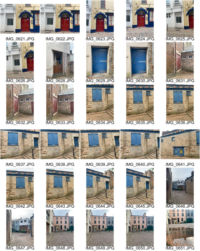
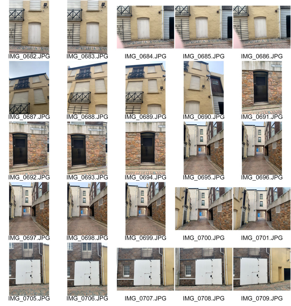
Contact Sheet

When taking these photos I was focusing on the shapes created with the buildings, doors and walls in the photo and tried to make the subject (mainly the big doors) the focal point. To develop these further I will be adjusting the images to make them look older and more part of the 19th century like Eugène Atget photos.

the new topographics

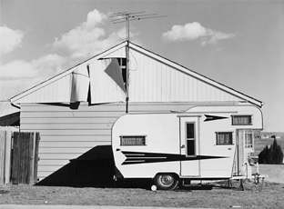
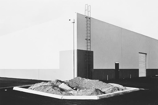
“New Topographics: Photographs of a Man-Altered Landscape” was an exhibition that epitomised a key moment in American landscape photography. Many of the photographers associated with new topographics including Robert Adams, Lewis Baltz, Nicholas Nixon and Bernd and Hiller Becher, were inspired by man-made subjects. Their aim was to find the beauty in the plain and ‘ugly’ streets of America. It was a reaction to the conflict which took place over the late twentieth century, which saw outrage that natural landscapes were being replaced with large, industrial buildings.

FRANK GOHLKE

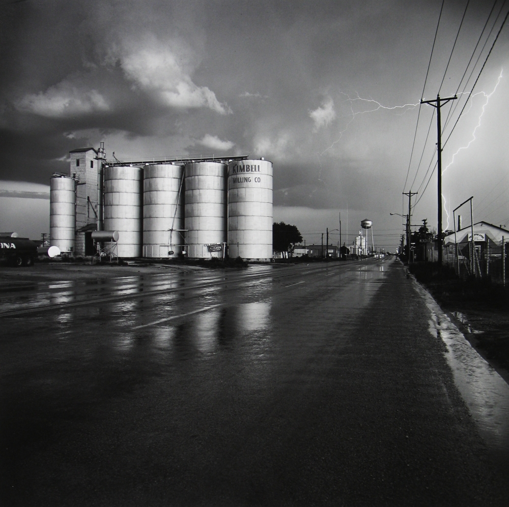
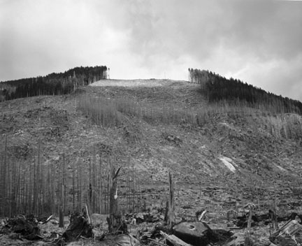
Frank Gohlke ( 1942 – ) is an American landscape photographer. Gohlke was one of ten photographers selected to be part of “New Topographics: Photographs of a Man-Altered Landscape”, the landmark 1975 exhibition at the International Museum of Photography at George Eastman House. During a career spanning nearly five decades, Gohlke has photographed grain elevators in the American midwest; the aftermath of a 1979 tornado in his hometown of Wichita Falls, Texas; changes in the land around Mount St. Helens during the decade following its 1980 eruption; agriculture in central France; and the wild apple forests of Kazakhstan. Gohlke′s photographs have been exhibited at the Museum of Modern Art; the Art Institute of Chicago; the Cleveland Museum of Art; the Minneapolis Institute of Arts; the Amon Carter Museum; and the Museum of Fine Arts, Houston.

IMAGE ANALYSIS

Grain elevator under repair – Minneapolis, Minnesota, 1974

This photograph by Gohlke is entitled ‘Grain elevator under repair‘, which avoids any confusion about what the photograph is of. The lighting used in this image is natural and appears to be coming from the left hand side due to the way the various shadows are falling across the image. The brightest parts of the photograph are the white portions of the cars, which directly contrasts with the dark tones of the road and the shadows. There is a lot of repetition present in this photograph, which can be seen in the vertical lines in the background of the image, as well as the horizontal lines of the car tops, the workmen in the background and the pavement and road. The contrast between both the vertical and horizontal lines creates an interesting composition for the viewer, with each one seemingly juxtaposing each other. The shapes in this photograph are mostly geometric, for example the cement slabs on the pavement split up by straight lines and the large cylinder – like shapes in the background of the image. There is hardly any negative space in this photograph, as the whole frame is taken up by either the building in the background or the cars in the foreground. The smooth and slick texture of the cars directly contrasts with the rough and harsh texture of the pavement as well as the building in the background. Gohlke has captured this image in black and white which allows for certain features of the image, such as the contrasting tones and small details like the cracks in the building to be accentuated and exaggerated.