
Joel Sternfeld

Born in New York in 1944, Joel Sternfeld is known for his large-format colour photographs of American towns and cities. Sternfeld received his BA in visual art from Dartmouth College in 1965. He then began producing colour photographs in his early career in the 1970’s. Joel Sternfeld’s work documents people and places with a vibrant sense of colour, which can be seen in his series ‘American Prospects’, created in 1987. Sternfeld has had work held in exhibitions such as the J.Paul Getty Museum in Los Angeles, The Museum of Modern Art in New York, the Art Institute of Chicago, and the Fotomuseum Winterthur in Switzerland and many others. Joel Sternfeld currently lives in New York where he has taught at the Sarah Lawrence College since 1985.
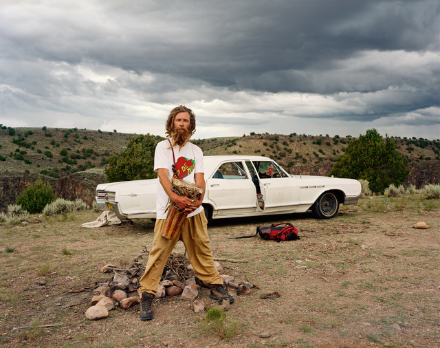
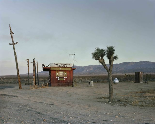
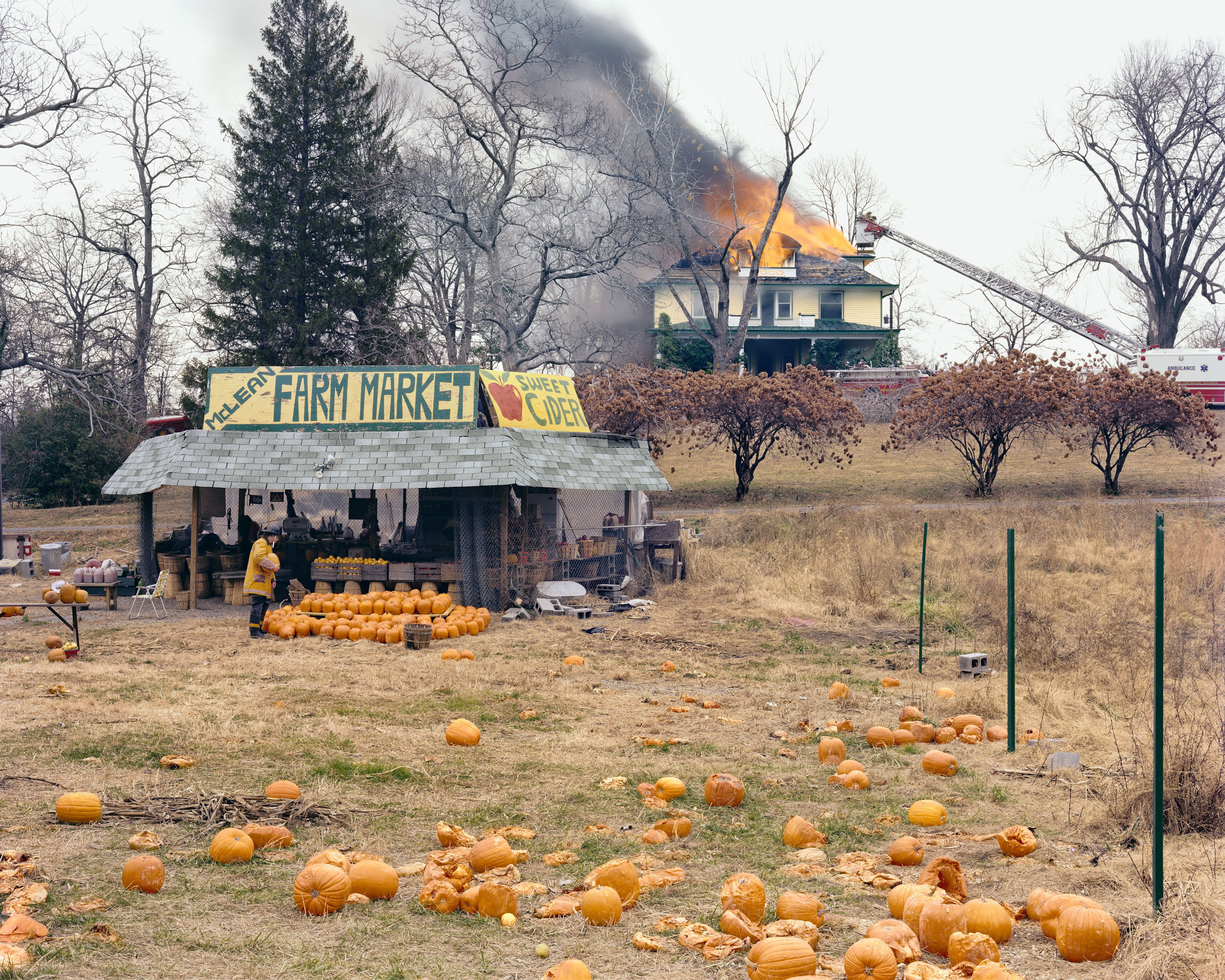
Examples of Joel Sternfeld’s work
Analysis of Joel Sternfeld
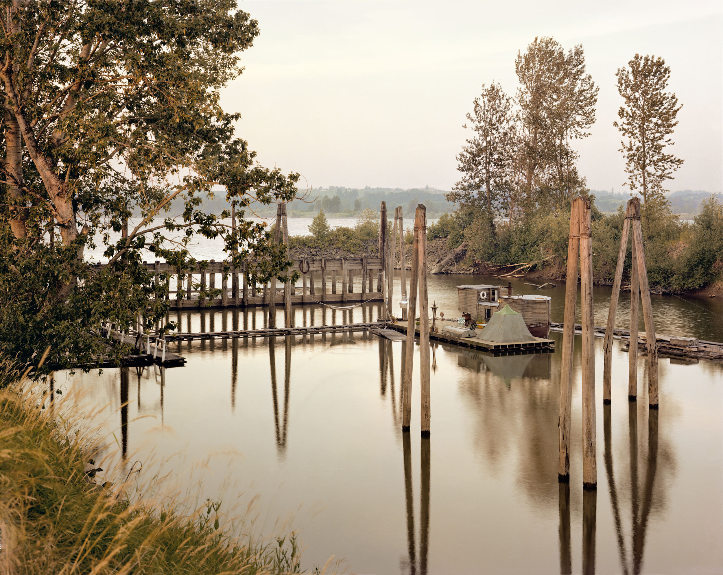
This image taken by Joel Sternfeld, titled ‘Sauvies Island, Oregon, June’, depicts what looks to be an isolated campsite floating on the water. At first glance, the colour palette of the photograph is very earthy and muted, with a rather complex composition including a dramatic use of echo and reflection.
The natural, harsh sunlight produces harsh shadows and highlights within the image. I would suggest that this image was taken around midday as the shadows produced by the poles face directly downwards, implying that the sunlight is coming from straight above.
There is a strong use of line within this image, this is shown through both the poles and their reflections. These create the focal point as the earthy-toned wood is juxtaposed against the sombre, black poles. These thick lines direct the viewers eyes upwards, as the poles start from the bottom of the water.
There is a strong sense of echo within this image, this is shown through the poles reflecting in the water. This use of echo could metaphorically symbolise a darker planet with the increased industrialisation, as the reflection almost seems like an alternate universe. The multiple uses of lines can also be shown as a form of repetition, although the repetition isn’t constant.
There is a contrast in shapes within this photograph, as the organic shapes of the leaves and masses of trees are contrasted against the straight-edged lines and the geometrically formed house. There is also a repetition of cross shapes which can be seen in the bridge, this further proves the contradiction between natural and geometric shapes.
There is a slightly shallow depth of field in this image as the background begins to fade in the distance of the photograph. There is two representations of negative, empty space within the photo. This can be seen in both the top and bottom third of the image. This even distribution of empty space produces the illusion of a balanced composition.
The image has a multitude of contrasting textures. For example, the sharp, string-like grass is juxtaposed against the smooth, fluid waters. The water is also contradicted with the straight poles that cut into the water in a knife-like manner.
The darkest areas of the photograph are mainly found in the reflections of the waters, however the dull trees also create a strong contrast between tones against the delicate, light sky.
The colour palette of this image is very earthy- toned and subdued. The dominant colours within this photograph would be green and brown, however there is representation of blues and whites. I believe if the image were in black and white, there would be no distraction from the colours in the image, therefore accentuating the use of reflection and echo. However the use of colour in this image adds a vintage tone to the image, especially with the muted tones.
There is a more complex use of rule of thirds in this image, as the the almost-floating house is located in the middle of the image, with the reflected poles leading the viewers eyes down to the bottom third of the image. The image isn’t particularly balanced as the majority of the positive space can be seen in the bottom and middle third, whereas the top third mainly consists of empty space.