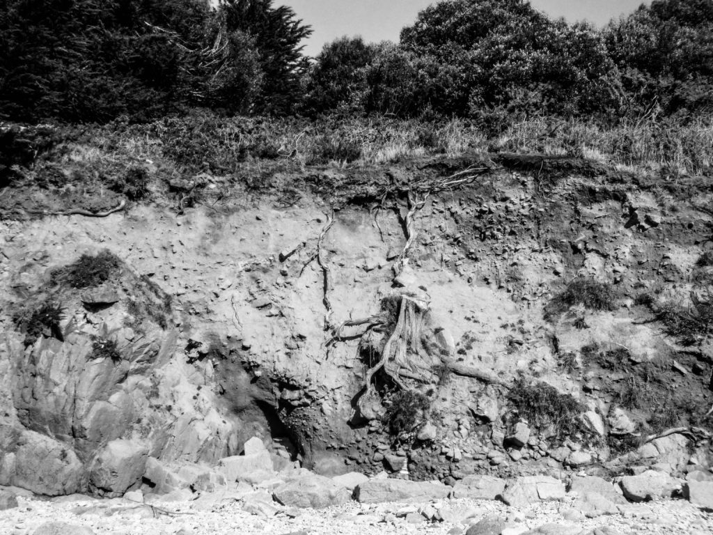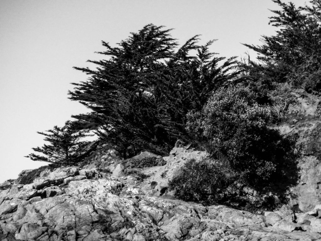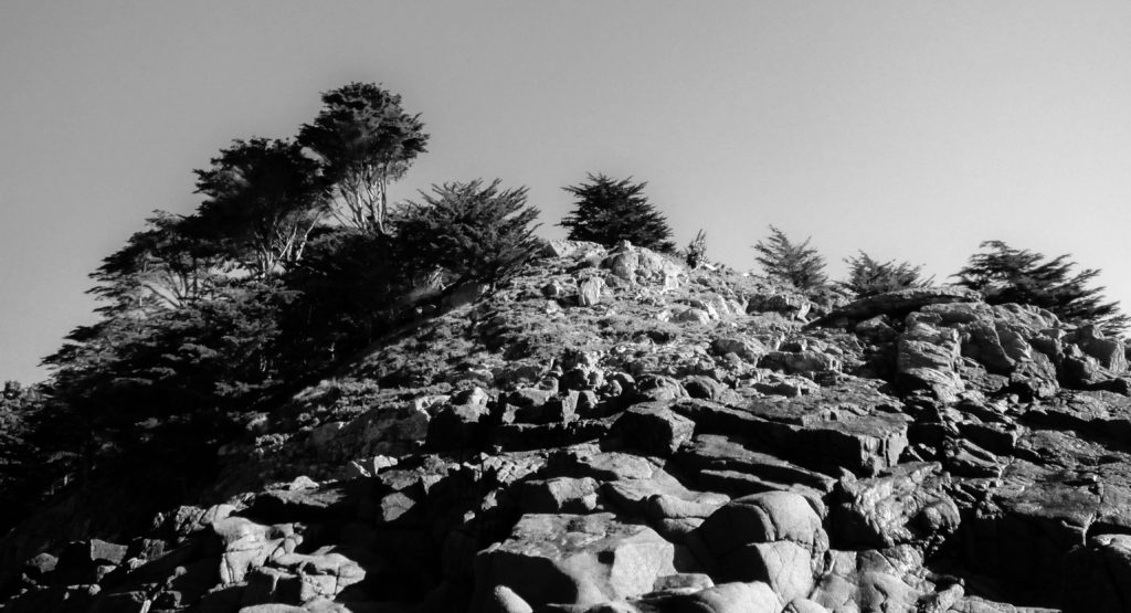


Over the whole of the Rural Landscape task, I believe these 3 images were my most successful. Image 1 is of a wall down at Ouasne, which I found very interesting- It looks as though it has just been cut directly in half, creating a 2d effect. The composition of the photograph is very level, as though somebody placed straight vertical lines across it as well as an almost gradient of light to dark from the bottom up. There are many small details within the photograph that make it more interesting than just that, for example the tree stump with roots that looks unusual. Originally, the image was very bright and saturated as this natural wall is actually orange, it was a good image that way and was very lively but to create the man reference to Wynn’s work, I changed it to black and white along with image 2 and 3. However I really loved the way it turned out. As mentioned in previous blogs, it really made the different tones pop out and created contrast within the image. Image 2 is a close up of a pile of rocks on the coast. It has a diagonal composition, and almost straight cut, with a few trees in the centre. I like the contrast of the rocks and trees; the trees being dark in tone and the rocks and sky being quite light. There are also a range of textures with the smooth sky and the rough rocks and trees. Image 3 was an instant final selection. I like the illusion of a fish eye view, whereas it was actually just the natural shape of the small hill- this links to Wynn’s idea of perception and how what I saw in his image was actually something completely different (although my image does not go to that extent). There are also some very light spots as well as dark spots, creating good contrast within the image.
