What is Landscape Photography ?
Landscape photography shows spaces within the world, sometimes vast and unending, but other times microscopic. Landscape photographs typically capture the presence of nature but can also focus on man-made features or disturbances of landscapes.
Examples of Landscape Photography :
Shoots Plan:
Where: St Ouen, Plemont, forests
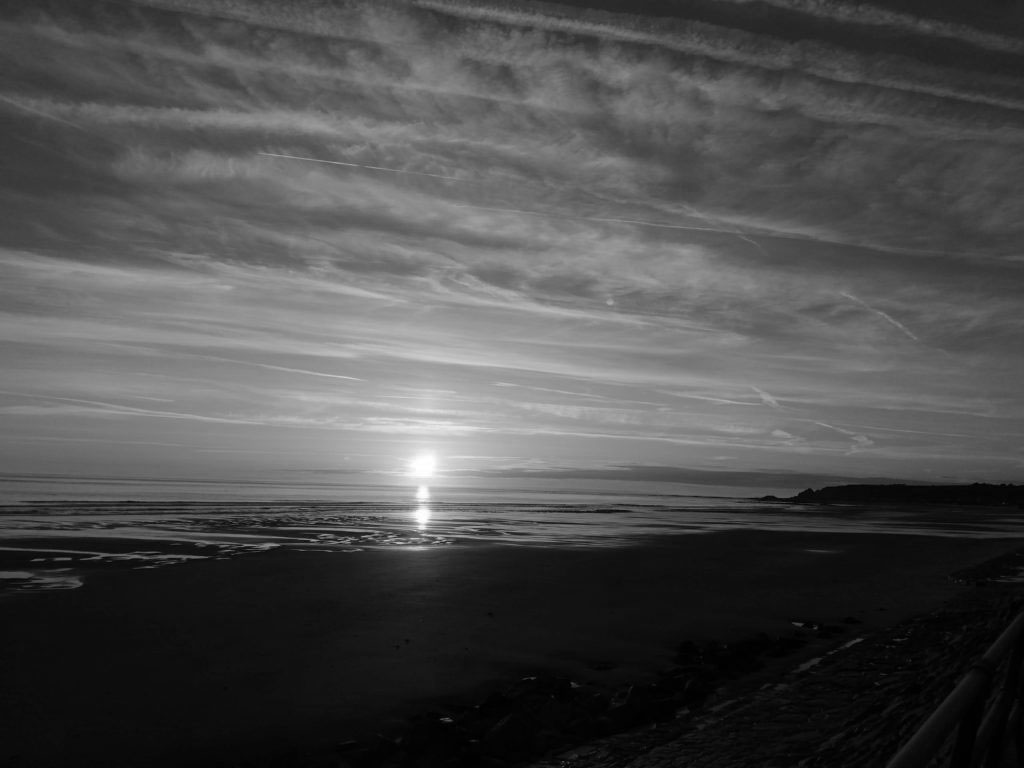
What: Sunset, Horizons, Cliff faces
When: Sunny Day, Sunset, Sunrise, Windy Days
Inspiration: Minor White
https://collections.artsmia.org/search/artist:%22Minor%20White%22
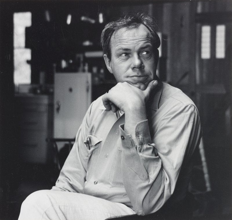
Minor White was an American photographer known for his meticulous black-and-white prints of landscapes, architecture, and men. White’s interest in Zen philosophy and mysticism permeated both his subject matter and formal technique.
“At first glance a photograph can inform us. At second glance it can reach us,” -Minor White.
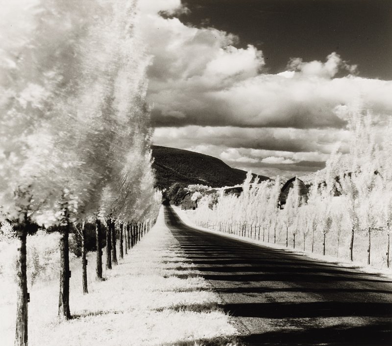
Road and Poplar Trees, Vicinity of Naples, New York, from “Sequence 10: Rural Chapels 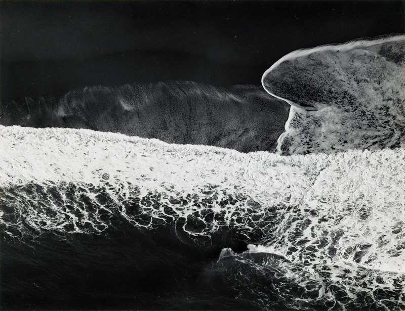
San Mateo County Coast, California 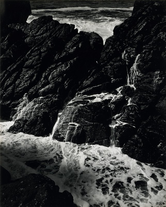
Point Lobos (Vicinity “North Wall”), California 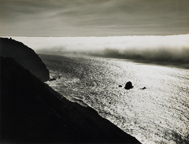
Devil’s Slide, San Mateo County, California
Rural Photography
Contact Sheet 1 :
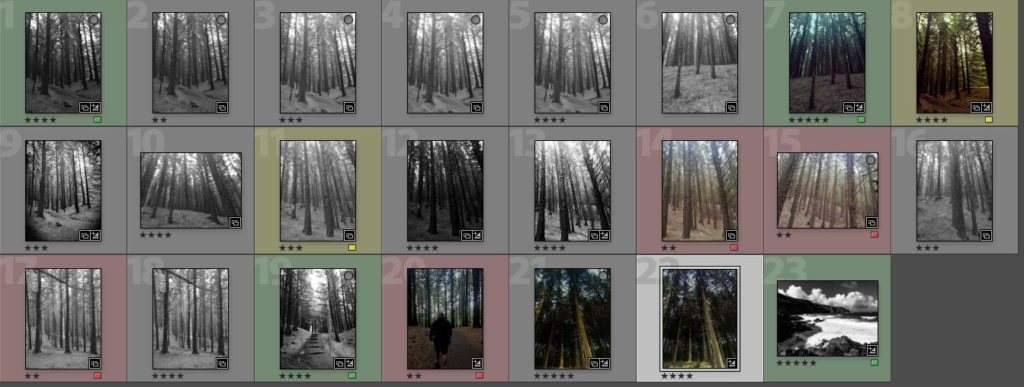
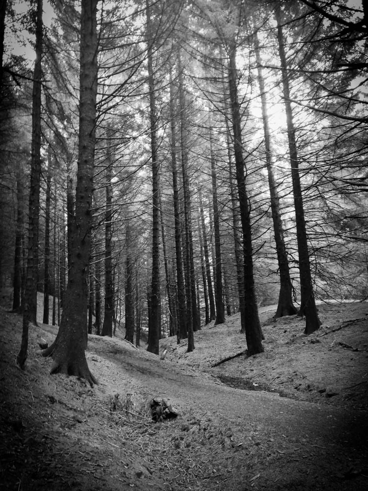
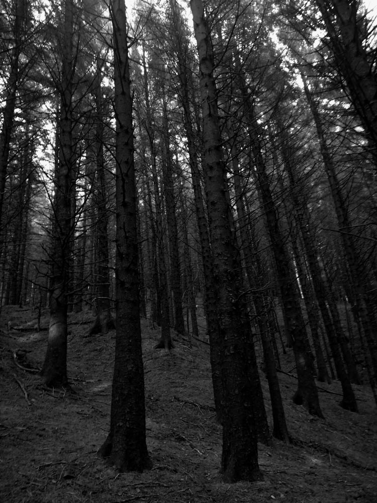
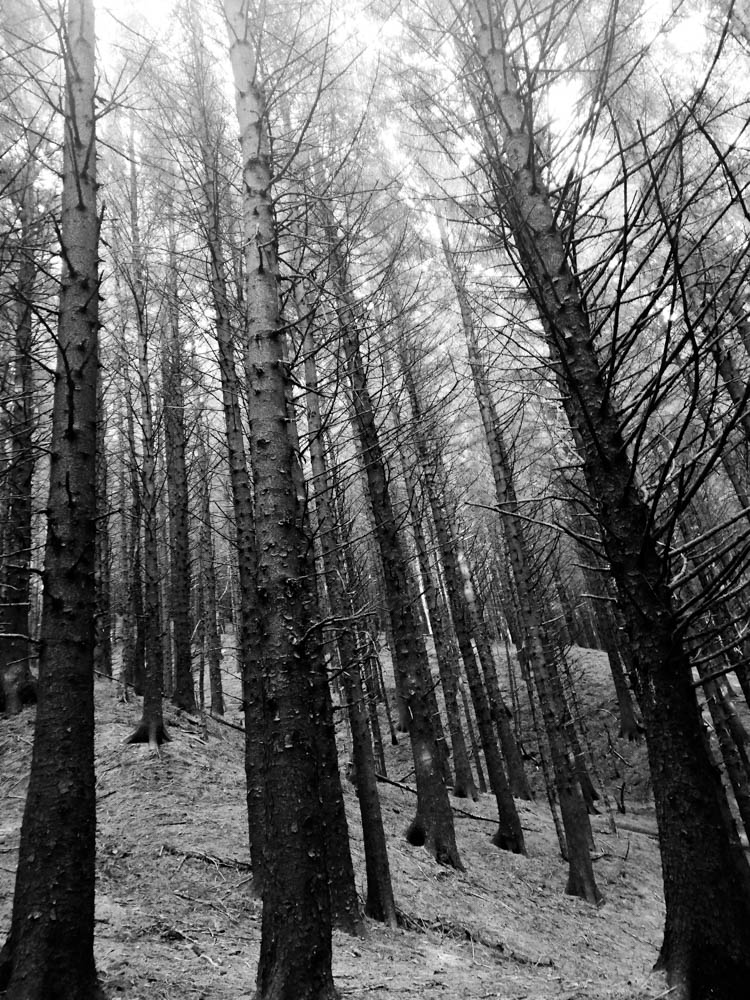
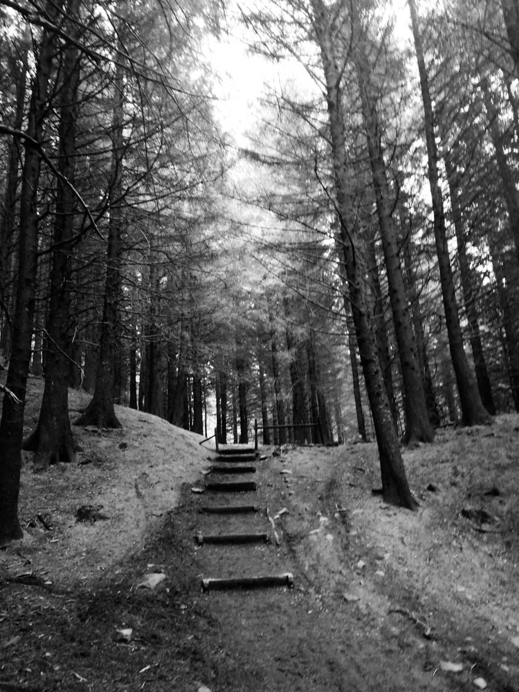
Shoot 1: High Contrast Black and white
For these images I went into a forest that had very little light coming in through the trees. This allowed my images, when put into black and white, to have a high contrast with the shadows being very dark and the lighter areas then look a lot brighter than they were.
I think these images look better in White’s style. This is because the high clarity allows the viewer to see the details in the bark. The chips in the bark could emphasise the fact that as you get older you get scars but nothing changes who you truly are.
Coloured Images
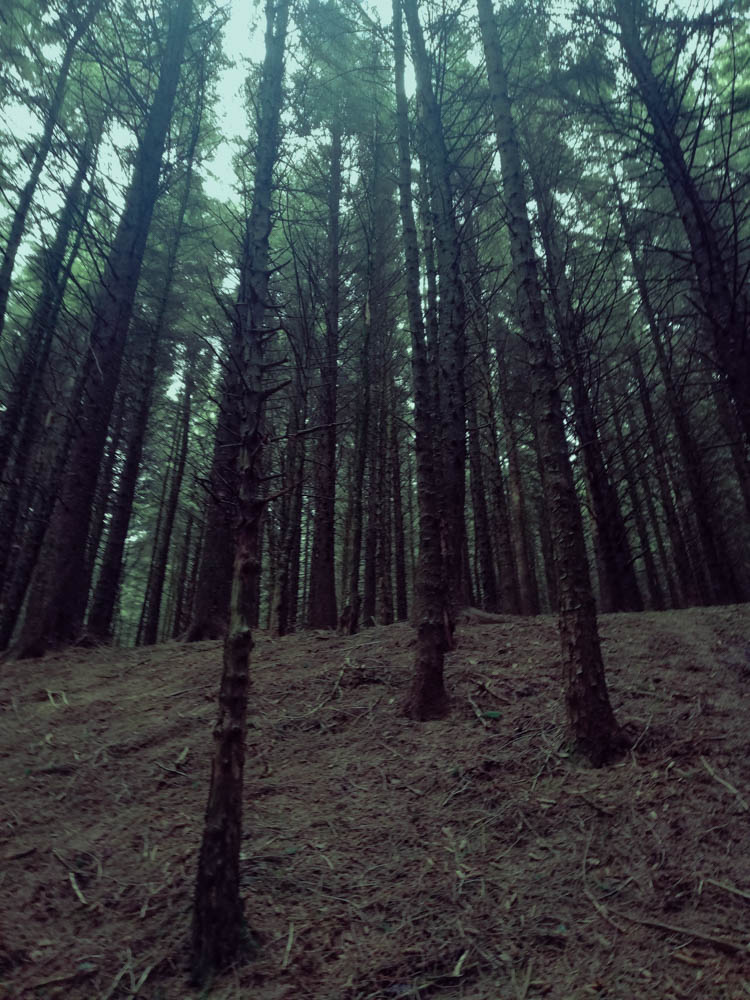
I took this images at an angle looking up at the trees to emphasise the height of them. I also went into Lightroom and edited them in there. For the first image, I used a cool temperature filter to highlight the fact that the forest was dark and cold. The dark green/blue hue emphasises this further. The ground looks bare and there are no leaves on the trees till you get to a certain height. This could mean that nothing survives without light. We need to focus on the positives in life otherwise life will be boring and pointless.
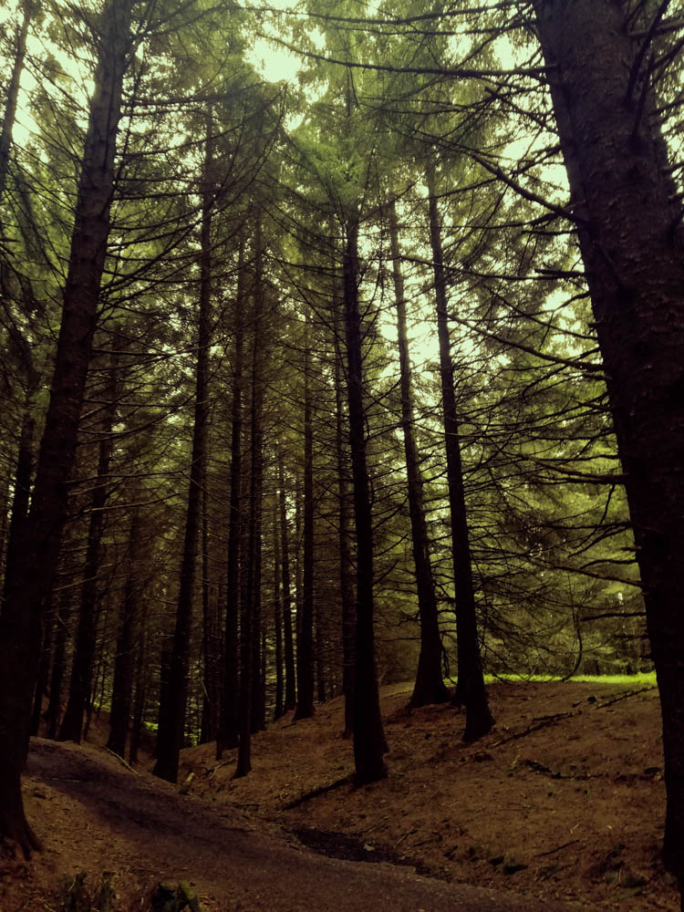
The second image however has very warm tones. There is also a path in the centre of the image leading upwards. These leading lines can be used as a metaphor of life showing that what has been down must go back up .
Contact Sheet 2:

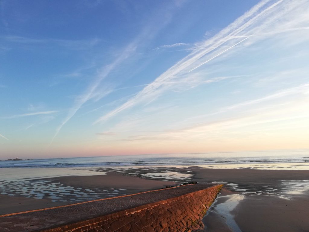
Shoot 2- Coastal Images (final images)
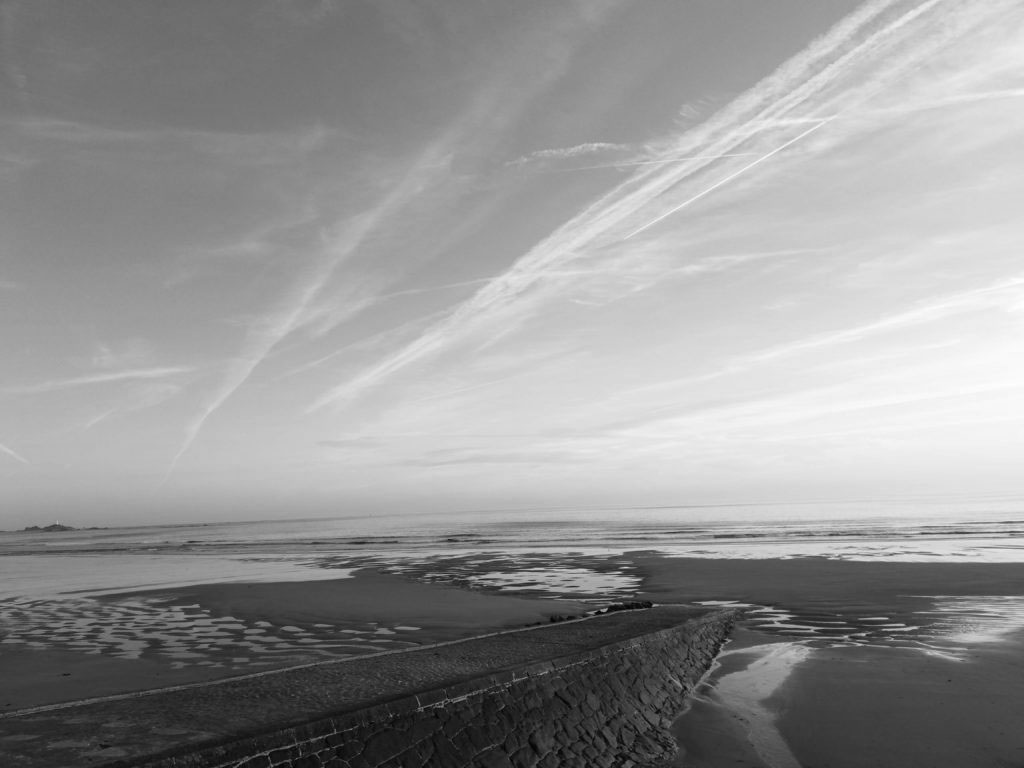
Black and White Coastal
Before and after editing:
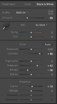
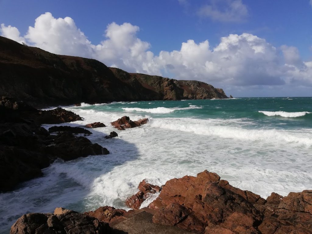
I edited this image in light room and focused on making the texture of the rocks at the front of the image more prominent. I did this by increasing the contrast and reducing the ‘whites’ in the image. I also reduced the shadows in the image to further enhance all the cracks and crevices of the rocks. Doing this also enhanced the cliff face in the background. The sun has shone on half of the cliff face which highlights the rough texture of the rocky cliff face. The other half of the rock however is covered by shade which makes it look black and gloomy. This could be an interpretation of the dangers of walking near a rocky cliff face and that the dark shades of the rock represents death and sadness.
The coloured image has a very positive and summery feel to it. This allows the viewer to see that the image was taken on a clear day. However the black and white image has a more sinister mood. The darkness of the ocean and clouds could make the viewer feel intimidated and think that the beach was a dangerous place to be. Whereas in the coloured image it looks like the beach in the image is a lovely place with a gorgeous blue sea to swim in. The black and white image makes the sea look rough because you can see that in the distance, as the sea hit the rocks under the water, the white foam that is created. This makes the ocean look choppier than it actually is.
Image Comparison:
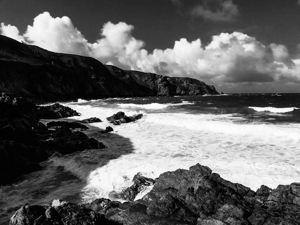
My image 
Minor White 
editing tools used:
I chose this image for a comparison because it was similar to White’s. My image however focuses more on the landscape as a whole, whereas White’s image focuses on the rock and tide.
This is shown through the contrast in his image. White often used infrared lenses which allowed the image to look very sharp in terms of shadow and light. You can tell that he used an infrared lens for this image; if you look at the ocean and the foam it created due to the impact of it hitting the rock and the shoreline you can see the individual bubbles that had formed.
I used Lightroom to edit my image. I increased the contrast to make the highlights that were on the rocks stand out more. I also increased the clarity to make the whole image sharper and more refined.
To improve this image, I would crop it to make it more condensed like Minor White’s images and focus more on the rocks and the patterns they have.



Great start…remember to keep referring to your influences and include the rationale / reasoning for the work along the way…