Romanticism in art

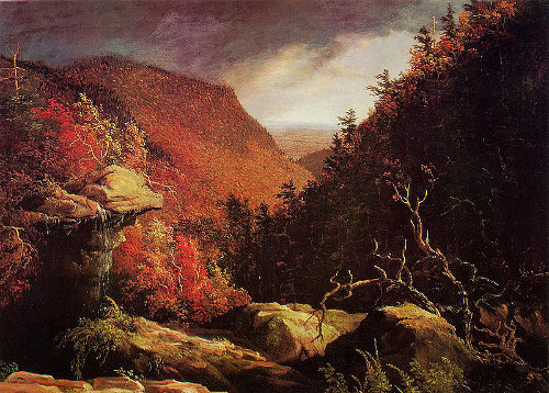
Romanticism in art became a poplar movement at the start of the 1800’s. Romantic art often saw links between the artists view of the ‘ sublime’, or expression of personal feeling and interest in the natural world. Romanticism emerged as a hopeful source on nature after the French Revolution in 1789, and shows the artist’s often exaggerated view on nature in order to create beauty out of the nature that was destroyed in war. Romanticism was shaped largely by artists trained in Jacques Louis David’s studio, including Baron Antoine Jean Gros, Anne Louis Girodet-Trioson, and Jean Auguste Dominique Ingres.
Examples of Romanticism in art


Romanticism in photography

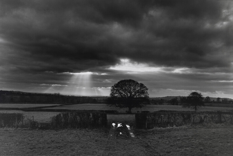
Romanticism has converted into a form of photography with the same aim as romantic art, to create an idealistic view of the world. Romantic photography depicts an exaggerated view on nature by which the features are dramatically and positively represented. This is done by editing a landscape image to create extreme contrasts between colour, tone and lighting. Ansel Adams is a perfect representation of romantic photography as his images display an almost magical view on the world’s natural state.
Examples of romanticism in photography


Ansel Adams

Ansel Adams, born in 1902 and died in 1984, was an American photographer and environmentalist who was passionate about capturing nature in it most beautiful and powerful form. Adams was given his first camera at age 12 on a family holiday to Yosemite National Park, and therefore discovered his love for both photography and nature through this. Adams help found group “f/64” which focused on embracing ‘pure’ photography and capturing a photo with it’s complete tonal capacity. Ansel Adam’s is an ideal representation of a romantic photographer as he dramatizes the natural world into an idealistic view.
Analysis of Ansel Adam’s work

This photograph taken by Ansel Adams in 1960, depicts the Northern California Coast Redwoods. This image ideally displays romanticism in photography with the use of extreme contrasting tones and juxtaposing levels of dark and light.
The harsh, natural lighting in this photograph both illuminates and darkens sectors of the image in an exaggerated manner. The lightest sections of the image can be seen in the trees in the foreground of the image, these are seen as an almost pure white against the contrasting darkness within the background of the image, as well as in the leaves and bushes of the photograph. As the shadows in the scene don’t fall in a particular direction, it is difficult to tell the time of day or the direction of which the lighting appears.
The white, thick lining of the trees act as leading lines for the viewer, as they direct the eyes to follow from the bottom of the image to the top. These lines create multiple focal points as they stand out amongst the darkness and create an upwards direction to the image.
The use of repetition can be seen within the trees of the photograph as these thick, leading lines are repeated throughout the image. However these repeated lines are contrasting as they vary in thickness and tone. The trees can also be seen as a form of echo as they almost duplicate each other.
There is a variety of both geometric and and organic shapes within this photograph. For example, geometric shapes can be seen in the straight-edged trees, which are juxtaposed against the more natural shapes seen in the leaves and bushes.
The depth of field is difficult to describe as the background consists of mainly negative, empty space. However I can guess that the depth of field is small as the foreground is in distinctively in focus, and the background is rather vague.
There is contrasting textures within the image. This can be seen in the leaves, which have a rougher and more jagged texture when compared to the trees which have a much smoother surface, therefor these are juxtaposed against each other.
There is an extreme contrast between light and dark tones within this image as Adams focuses on the extended use of tonal values in order to achieve a powerful juxtaposition between highlights and shadows. Ansel Adam’s goal in his work is to capture what is seen in the moment by the human eye, therefore this image is an accurate representation of the natural world. The darkest areas of the image can be seen in the shadows of the ominous forest within the background of the image. The lightest section of the image can be found in both in the off-white tree trunks and in sections of the leaves that cling onto the trees. Overall the image tends towards darkness, as the majority of the photograph contains darker tones, and these tones are more intense.
There is a lack of colour in this photograph due to the use of black and white film. The lack of colour allows for the tones in the image to be accentuated, creating a rather intense juxtaposition. If the image were taken in colour, the depth of field would probably be easier to work out as the background wouldn’t be in complete darkness. The contrast of colour would also be highlighted rather than the contrast in tones.
The composition of this image focuses on the use of lines rather than the use of thirds. There is no true focal point as the bright trees contain the viewers focus. I believe the photograph is balanced overall, as the contrasting tones are evenly distributed. The image produces an upwards direction for the viewer, directing their eyes from the bottom of the image to the top of the image.
