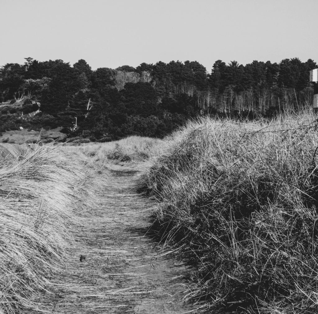
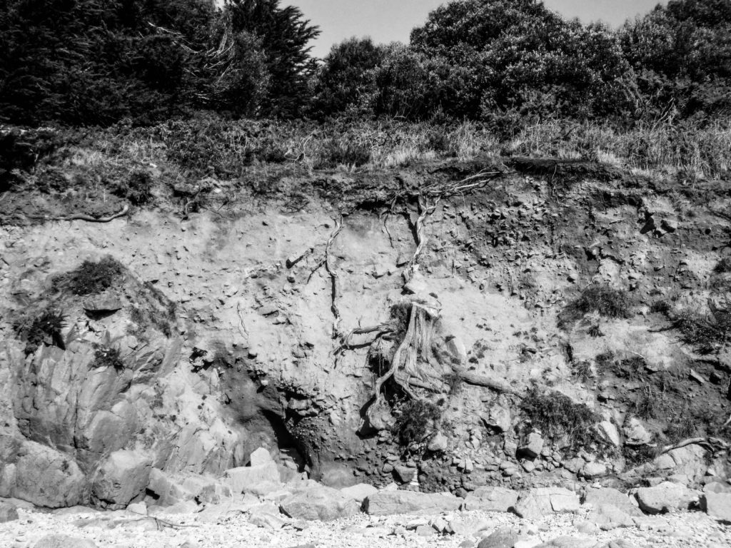
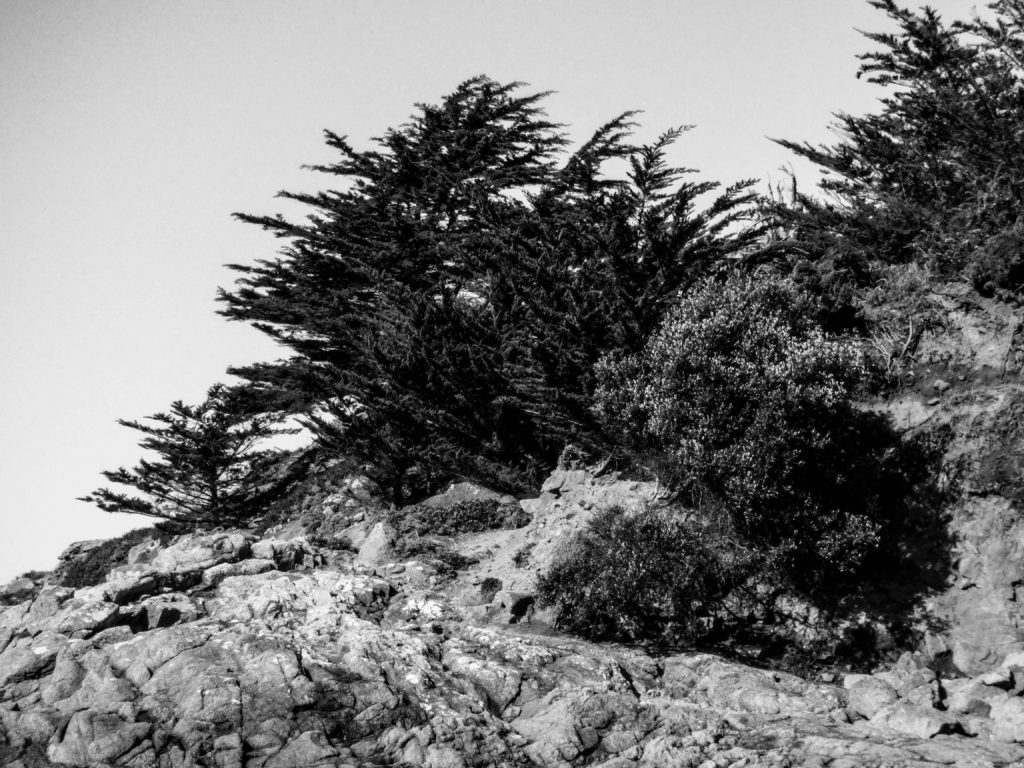
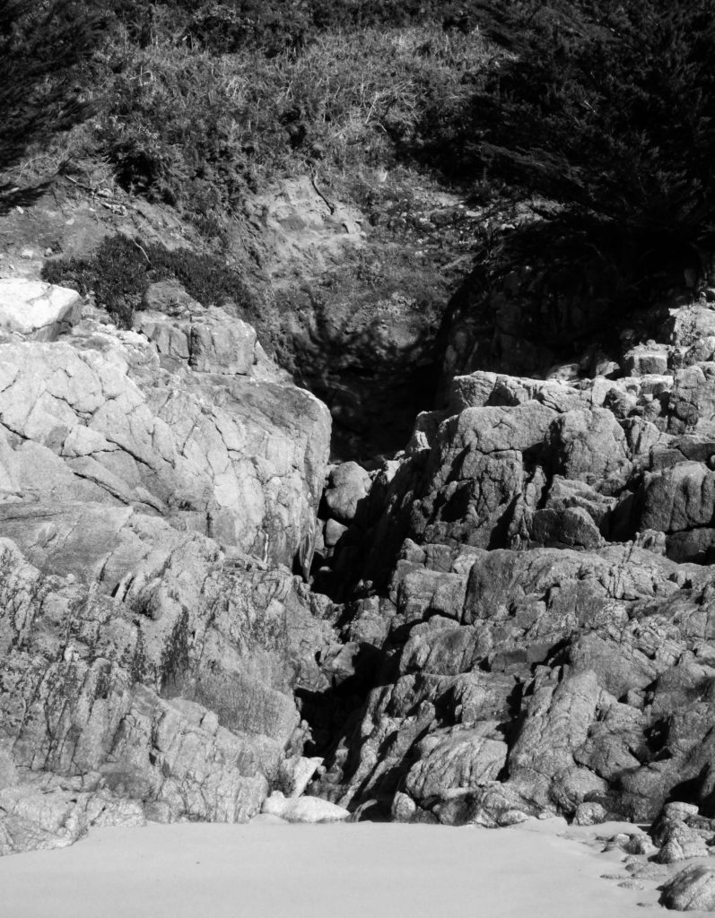
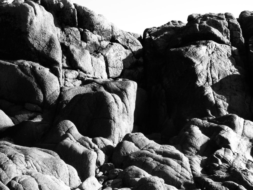
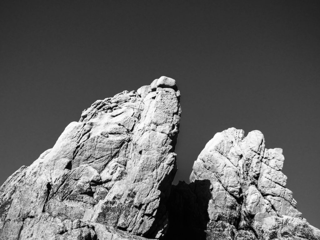
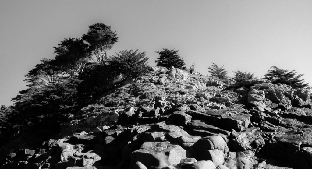
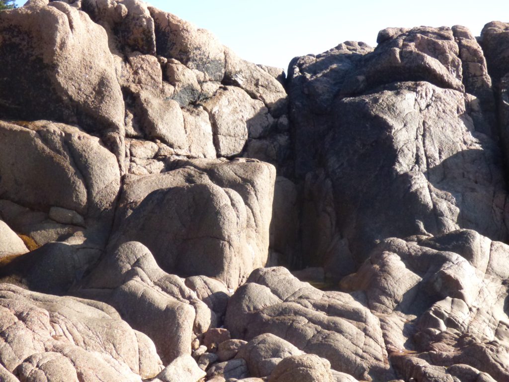
I chose a few images from my first selection and converted them to black and white, I also adjusted the contrast slightly to create a variety of tones, referring to Ansel Adams zone system of 0-10.
As you can see in the comparison above, the shadows are much darker and the brighter tones stand out much more. I also like the way that making and image black and white can trick the viewer, maybe making them question what exactly the image is and how close up they are to the focal point.


Excellent development, and well-structured!
Great to see strong responses to key artists at this point…
Keep up the hard work!