Candid portraiture
By: Lexandr
About candid
Candid portraiture is a fun, anonymous topic as it gets the photographer to shoot various shots without the model being aware that they have been photographed. This may have ethical issues like consent but this issue can be overcome by asking the models if it’s alright to take a photograph. This may cause photographer bias as subjects may start acting out of their normal behaviour.
On the other hand, taking photographs without the subjects awareness can be called secret photography which is one of the main themes of candid photography.
Others may argue that “a great candid portrait is often made with the subject aware they’re being photographed.”
In conclusion, candid photography appears to be a type of art that allows the photographer to capture real-time events and turn that photograph into a sort of memory because in the due course the artist will look back and remember where and when that shot was taken, and for the subjects, if they ever get to see the photograph, it will open an unaware memory of what they were doing, with who and help them look back and reflect in life.
The fact candid photography might open up a memory that the subject might not even realise they had is very ironic since the theme around candid portraiture centres around the idea that people aren’t aware that they are being photographed.
Richard Billingham
Richard Billingham is an English photographer, film maker and art teacher born on the 25th September 1970 (50).
According to The Guardian, “The photographer made his name with a series showing his dysfunctional parents, Ray and Liz, in their squalid Black Country flat. Now he’s turned their story into an award-winning film.” This clearly shows that his worked has centered mostly on his family, but he’s also focused on other aspects of photography like landscapes and candid. For example:
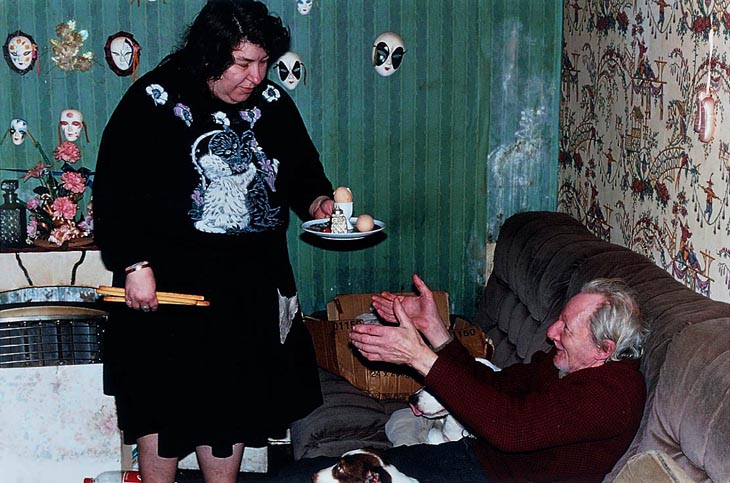
This image is part of his project where he turns something that has affected him into art and gets noticed for it. This project, Ray’s A Laugh (1996) documents his life with an alcoholic father, Ray, and overweight, tattooed, Liz who’s his mum.
He won the 1997 Citibank non-public Bank Photography Prize presently known as the Deutsche Börse Photography Prize and was shortlisted for the 2001 Turner Prize. His work is control inside the perpetual assortments of Allen Tate, the Victoria and Albert gallery, and Government Art Collection in London.
Noticeably, we can see that Richard was a very famous photographer from the 20th century.

Image analysis
Substance:
This image was taken while Billingham was still working on his Ray’s A Laugh during the 1996.
Obviously it was taken to document his life and environment around his parents . Knowing this, some appreciators may argue that this project may bring comfort to some people who identify with this project.
Composition:
This image’s focal point appears to be the parents / models. This could indicate that the author wants the audience to focus their attention to the parents before anything else.
The rule of thirds has been powerfully use to arrange the models to the center and the props like masks to the left hand side of the image. It may be argued the Golden Rule was also used seeing as the audience focus their attention firstly on the subjects then the props around them.
The subjects appear to be Liz and Ray themselves. The artist has purposely used them for Ray’s A Laugh project since it is about them.
The artist has used dark colours to compose this image. For example, he has used the green wall in this image which is a sign for life, greed and jealousy. The wall is obviously behind Liz which could indicate that she gets jealous of Ray or suspects he could be cheating on her with other women.
Mise En Scène:
Liz is holding bread sticks on her right hand and a plate with an egg with her other hand. This may show to the reader how fragile and emotional Liz (Richard’s mum) can get at times. The fact she’s holding food in her hand enforces the idea that she’s overweight as Richard stated in The Guardian.
Ray on the other hand has a red face strengthening the idea of an alcoholic father. Ray is sitting on a dark, brown sofa signifying his dark past and his unwillingness to do anything as Ray has his hands towards the food Liz seems to have made for him.
There are also mini masks across the green wall signifying the various facades Liz and Richard may use for the public.
There’s a plant in the background growing from a mistreated environment suggesting that Richard blossomed in an environment like this; giving hope for the audience.
Techniques and editing:
It appears that a fast shutter speed of 100/120 was used as details are fixed and sharp in detail.
The depth of field for this picture has all the earmarks of being very huge as a large portion of the picture is fixed. This was utilized to catch as much of the setting as could be expected while holding a fresh detail to the picture. This being said, we can also guess that a tripod was used to keep the camera used.
The shot appears to be in digital format as it’s a recent photograph. Also there are no debris which could suggest that it’s not a Lomography.
Atmosphere:
This image makes me feel somewhat calm and relaxed as it’s a semi-familiar environment; it gives me nostalgia to my grandparents and great-nan’s houses as they looked similar to this. The use of models and props also influence this effect.
Lighting:
The light in this shot appears to be coming from the back to the front successfully illuminating the subjects and props.
It appears a flash may have been used as there are bits of reflection around the image.
There are bright and dark tones throughout this photograph, specifically Liz’s dress suggesting that she could be going through a hard time in her life.
Response:
For this project I will attempt to create a sense of nostalgia to the viewer and create something the viewer may relate to.
Since the theme is candid I will have to plan out how to take secretive photographs without the participants being aware of it.
Richard attempted to story-tell a bit about his life through this photograph so I will see how I can achieve a similar outcome.
In my opinion, the photograph is very interesting due to its naturalistic, candid approach leaving the audience wondering what is happening and why was this image taken in the first place.
Planning
Location: Seeing as this a candid project I will shoot in various location such as home, work place (school) and public. I will do this to get a wide variety of images showing different types of people.
Content: I will capture images of my subjects in their natural environment capturing whatever it is they will be doing in real time, making sure they have no time to change their behaviour as this
Lighting:
I will be mostly using ambient lighting in order to make my photos as natural as possible.
My photos may include natural lighting since some of my photographs will be taken outside. Some may have artificial light due to them being taken inside.
Camera / settings:
I will be using 2 different cameras for this project:
- Polaroid Camera
- This increase creativity for this project and to have a physical image to keep as a memory.
- So that the camera automatically adjusts the ISO, aperture and shutter speed.
- DSLR
- This camera is best to get much better quality shots.
- It’s also less costly compared to the polaroid camera as I won’t have to buy any film.
- The settings will be shutter speed at 120/150 in order to capture subjects in case they move and allow enough light to get in to the sensor.
Contact sheets
Outcome 1
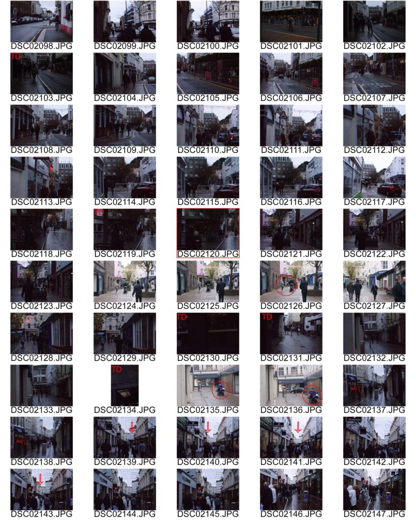
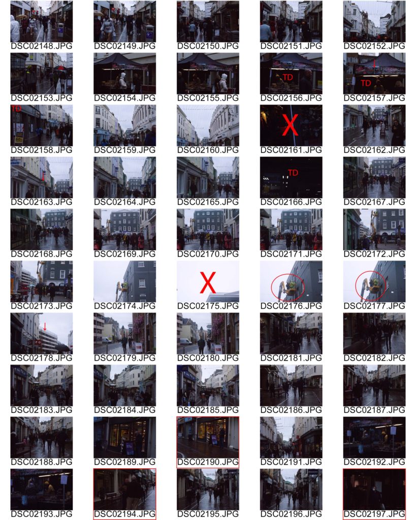
These series of images were intentionally grainy to relate to film photography and the context Ralph was in; film was mainly used.
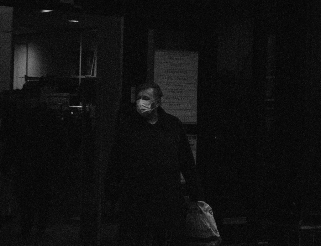
This image contain an individual with a mask on (due to Covid-19 pandemic). It is in black and white to relate to the 70s and also it makes it easier to edit. Also, due to my experimentation with ISO most images contain grain hence the inspiration to give a Lomography feeling.
The man is at the centre of the image therefore making him the focal point of this image. The individual appears to be looking to the side as if he’s thinking or looking for the next shop to go to as he’s holding a plastic bag suggesting the idea he went shopping.
The rule of thirds and centered composition have been used in this image to powerfully place the model to help make them the main focal point.
In relation to Richard, I took the inspiration of his birth year (1970) and made my photograph black and white as coloured film was expensive to produce. It is also a photograph taken without the model knowing making it candid.

Outcome 2
In this outcome, an adult lady is talking to what appears her friend. The lighting for this image is natural as it was taken outside with a harsh use of ISO.
The image is in black and white to relate to Richard and some of his black and white work.
I have used photoshop to reduce the colour noise and grain from this image but it has decreased the quality of the image along with it. However, the grain kind of works well with the idea of lomography.
There is a constant use of the rule of thirds in this photograph as the face of the model is centered close to the middle making her the main focus of the image and having the background behind her.
This photo and candid photography just come to show how un-attentive we humans can be not noticing someone is taking a photo of us.
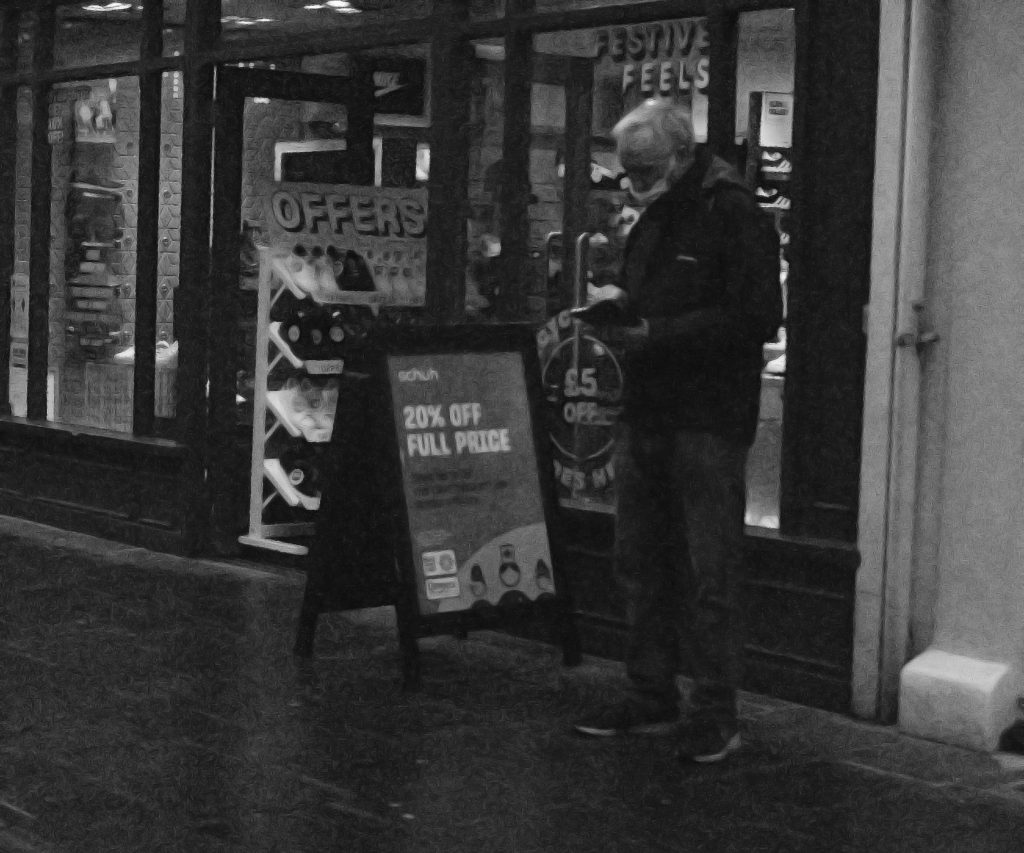
Outcome 3
In this outcome the lighting is natural and quite dim due to the wheather (cloudy) and the low ISO used to try and freeze individuals in a way on a frame without them noticing and/or have the image with blurry movement.
The rule of space has been used to compose this image showing that the model has enough space to move to but is more entrigued by his phone.
This image can show how content we are with simple, minimalistic entertainment than what’s actually around us. For example, behind the man there is a show sale happening with a sign saying “20% off” but the model is too busy on his phone to appreciate the environment around him.

Outcome 4
In this outcome we can clearly see another example of an individual talking to their friend.
I have purposely used the centered composition to compose this image as the man is clearly centered.
It’s in black and white to relate to the other black and white images with naturalistic edited lighting.
In my opinion I have successfully achieved the purpose of this project which was to take portraits of people anywhere without their realisation so that we can capture their naturalistic form without photographer bias intervening.
This is powerfully shown by my 4 final outcomes where I have captured models talking to their friends, busy on their phones and not acknowledging a sale on a shop and much more. This energetically demonstrates and is an example of candid / covert photography.
I love how the images turned out as it gives this vintage look which was very common in 1970s (Richard’s birth year). On the other hand however, the photographs had noise grain and colour which was due to the low ISO being used along with a fast shutter speed. It may be argued that it adds to the vintage theme but with the amount of editing used to restore the images, the shots lost their sparkle by a lot.
Therefore, I will learn to use ISO and Shutter speed on manual mode in an efficient and clear way in order for the photographs to be as high quality as possible.

