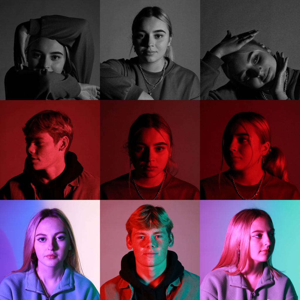
To create this grid of headshots, I used previous images I had taken and imported them onto a grid in photoshop, aligned them correctly so all images had the same length and width to create this final outcome. I used a range of coloured images but also incorporated a few black and white images. Each row of images complement each other, the top layer being greyscale, the middle having strong tones of red and the bottom row having a range of colours and saturation. Bright or dull lighting was created through artificial lighting and the colours were made with transparent coloured sheets over the studio lights.

Excellent development, lots of creativity and well-structured!
Keep up the hard work!