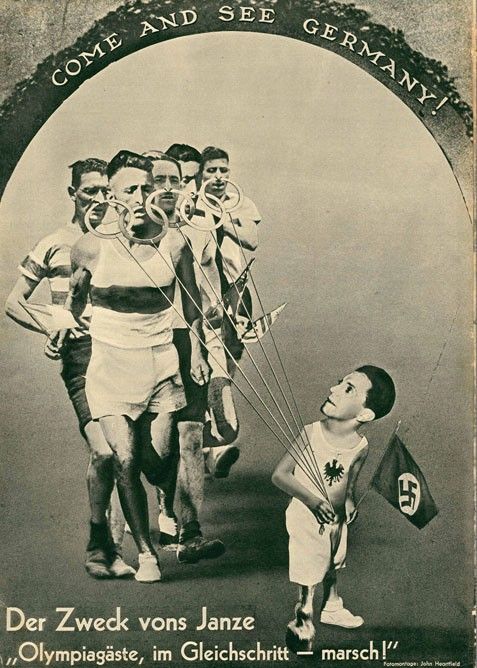
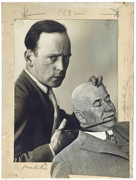
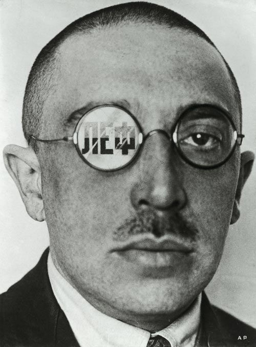
Photomontage is the process and the result of making a composite photograph by cutting, gluing, rearranging and overlapping two or more photographs into a new image. The highest point of it’s popularity came in World War I. In 1916, John Heartfield and George Grosz experimented with pasting pictures together, a form of art later named “Photomontage.” Heartfield was the first to use photomontage to tell a “story” from the front cover of the book to the back cover.
Images by Heartfield 1930’s
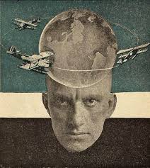
Alexander Rodchenko
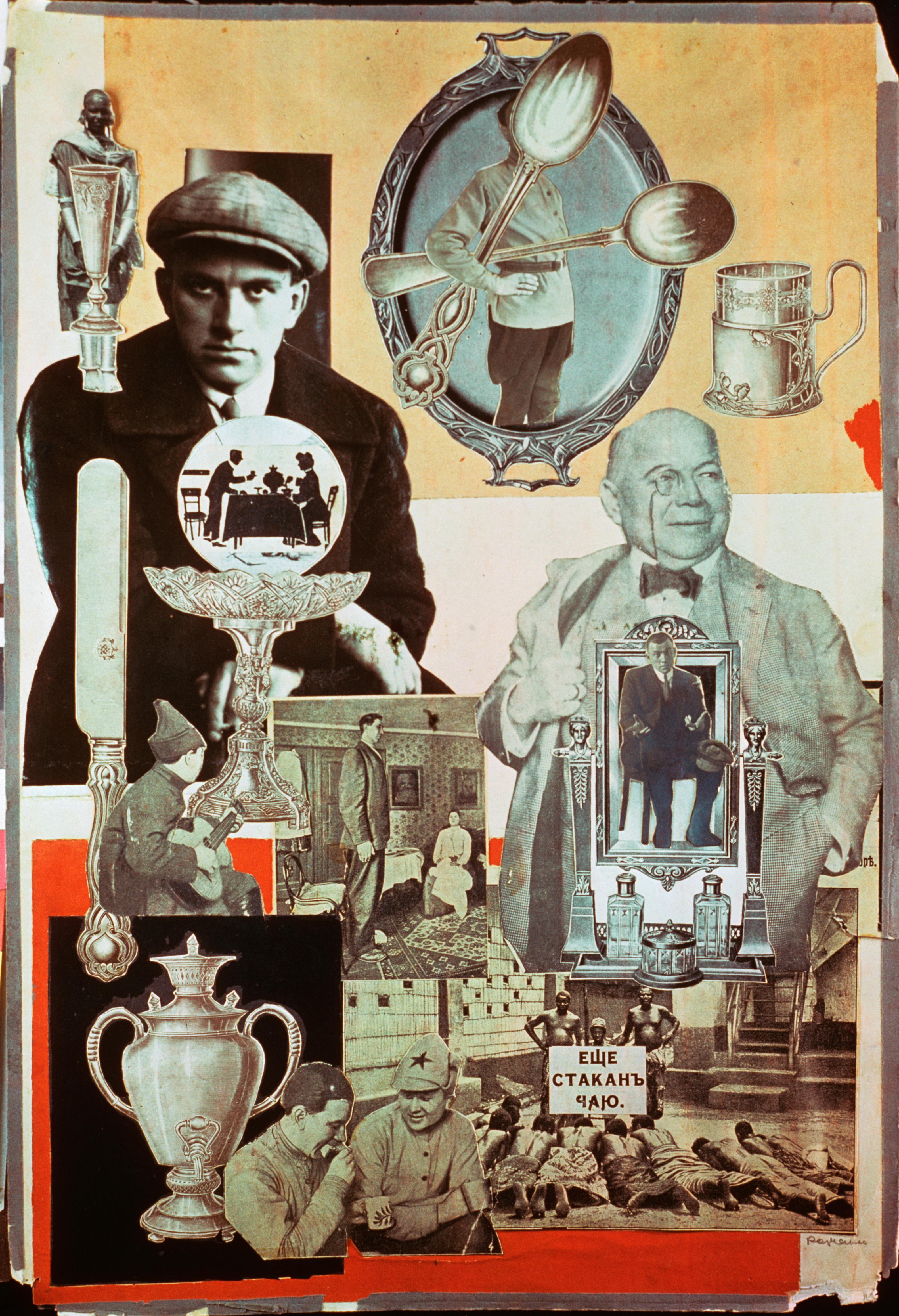
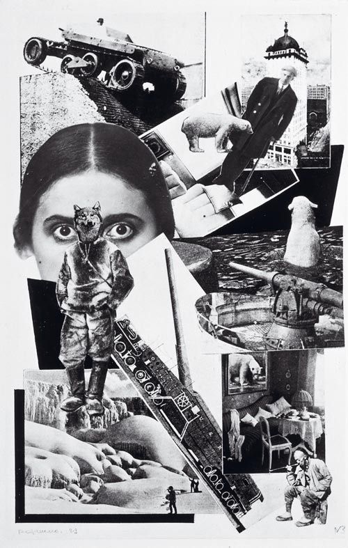
Rodchenko discovered new ways to condense space, time, and information into single images, where realism and abstraction, high and low culture, and multiple narratives were mixed and layered as never before. Innovations in graphic art developed hand-in-hand with the rise of the film industry, for which artists found new work designing posters and advertising material, and with the use of montage in film editing. This revolution in style and aesthetics was helped along by the advancement of mechanical means of reproduction, such as photographic printing and lithography, and by the increasingly vast circulation and distribution of mass-media publications.
Rodchenko works with both colour and black and white, his outlines of his cut-outs are harsh and he has multiple layers to one image.
My Photomontage Edits
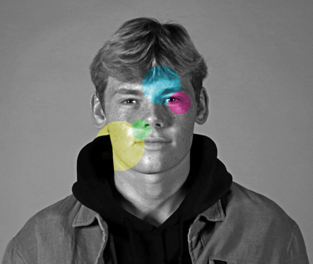
For this image I started with a black and white background and copied the layer for each coloured circle i made, to create the circles i used the elliptical marquee tool and created a range of sized circles on each layer whilst changing the hue to get different colours and changing the saturation to have stronger, more vibrant colours.
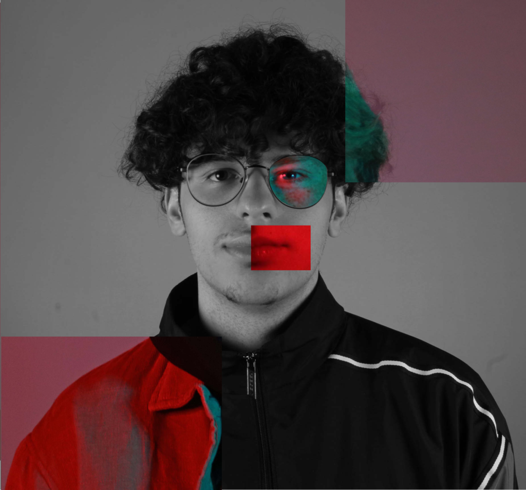
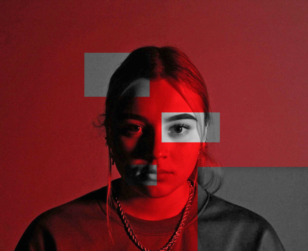
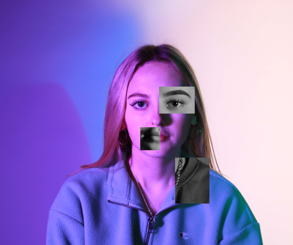
For these images I started with a background then cut and pasted another image on top and used the rectangular marquee tool to section the areas i wanted the second image to overlap. I selected my area, inverse and deleted it to leave the shape I originally selected. My images were already colourful as I used transparent sheets over the lights when i took the pictures. I contrasted colour with black and white to make my shapes stand out and have a sharp outline and contrast to the image behind it.

