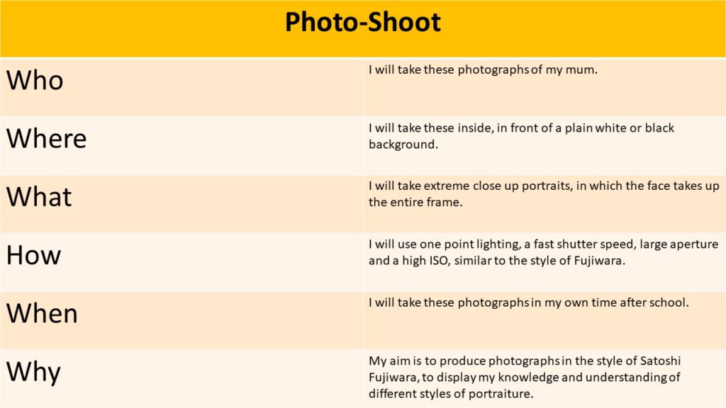
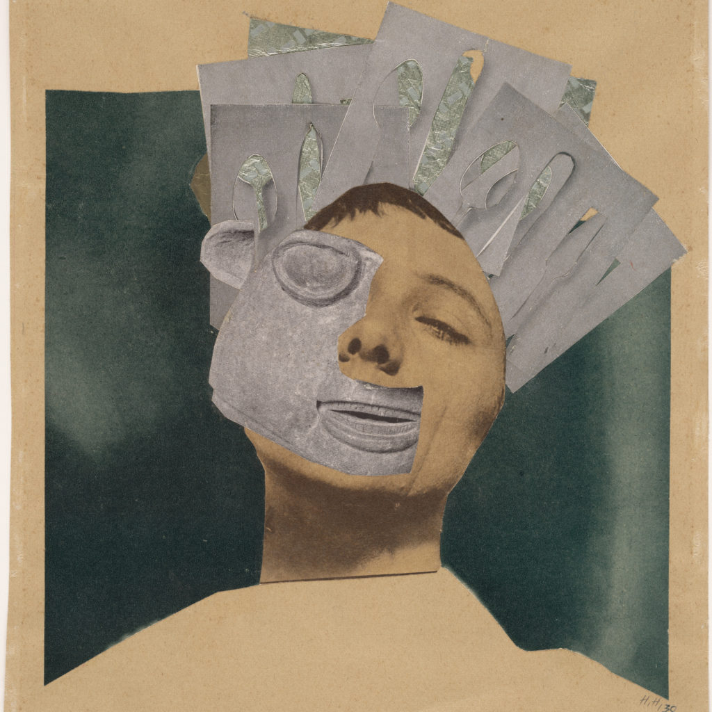
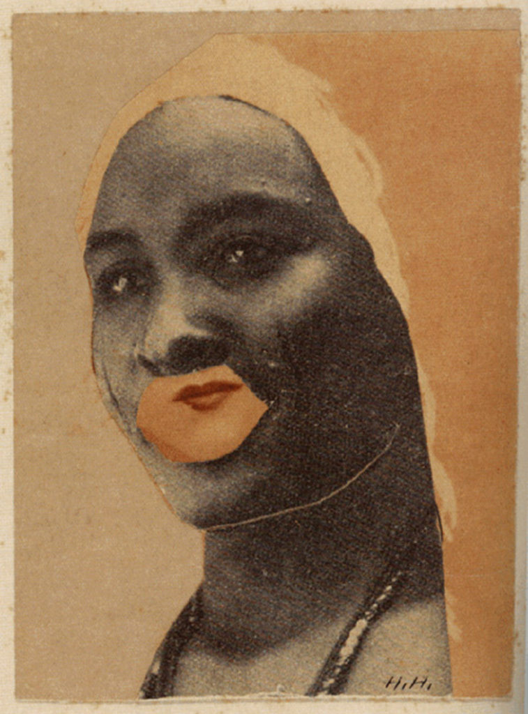
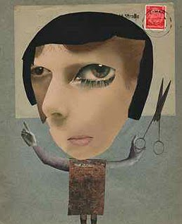
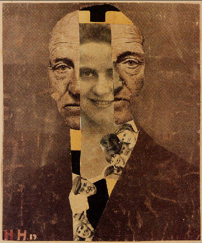
Photo-montage is a medium that can be traced back to the Dadaists in 1915, a Zurich artist movement, who used this technique to make political statements, which can be seen in their protest against the First World War. Dada artist Raoul Hausmann, John Heartfield and Hannah Hoch, used this medium in order to create propaganda for this opposing statement of the war. This propaganda often showcased what can be called the cut-n-paste technique, which consisted of section of cut out images layered over one another, creating a final piece. This Dadaist movement can be said to be a style of surrealism, in which conventional art is challenged with these distorted forms of reality, using the increasingly popular media of photography.
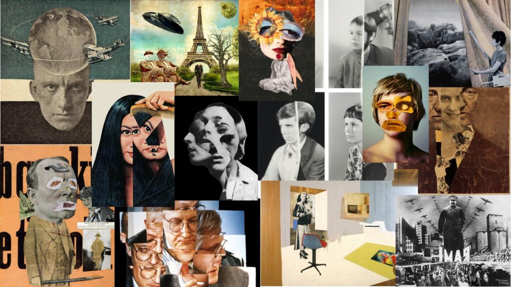
Mood Board
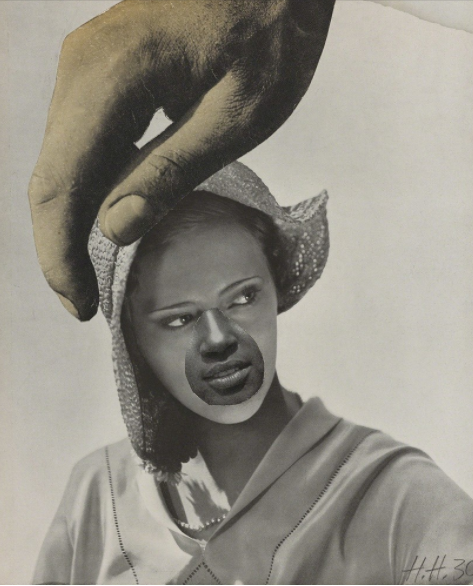
Grete Stern 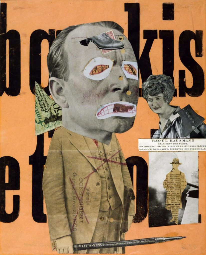
Raoul Haussman 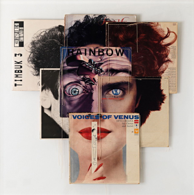
Christian Marclay-Album Covers 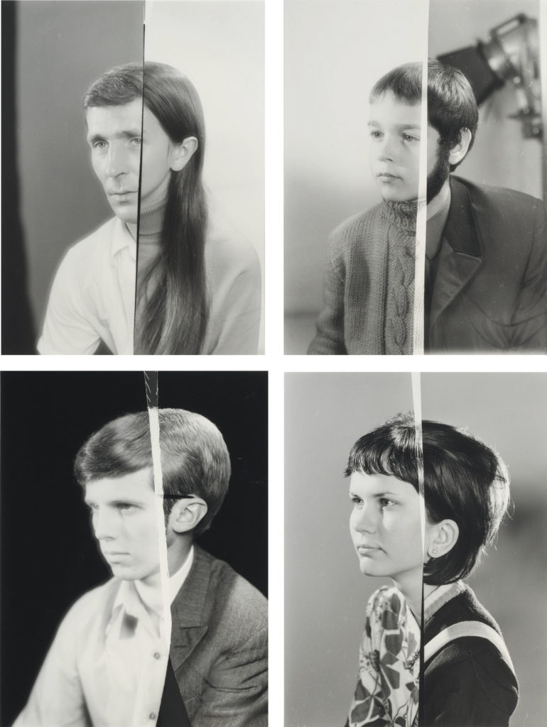
Joachim Schmid 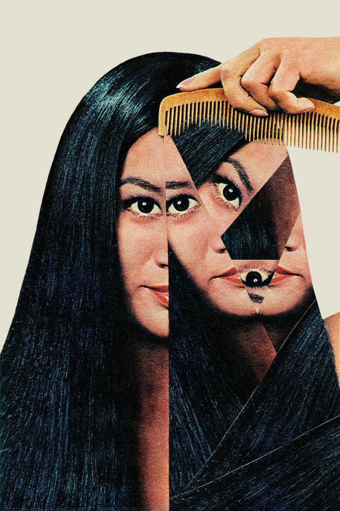
Eugenia Loli 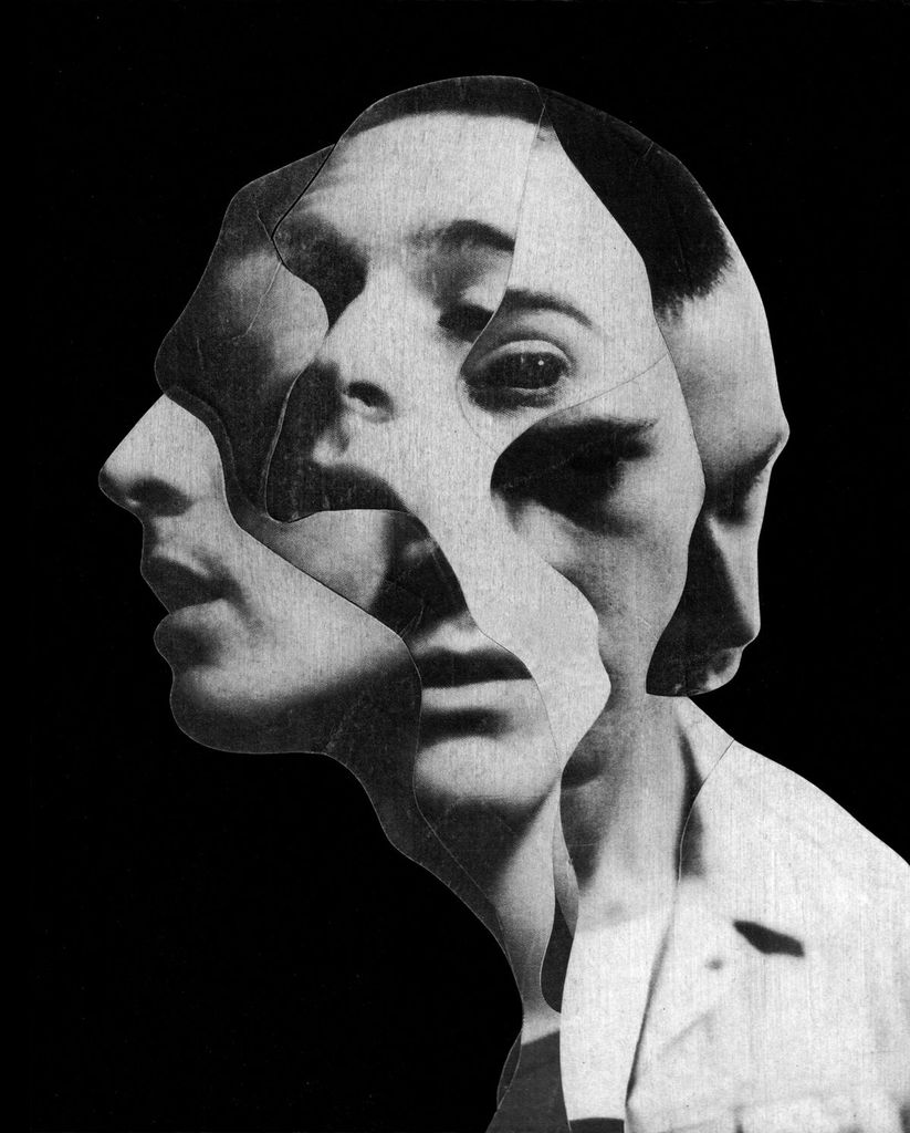
Jesse Draxler 
Martha Rosler 
Soviet war art and propaganda 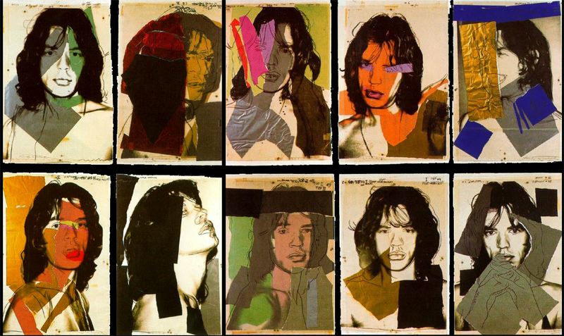
Andy Warhol
John Stezaker
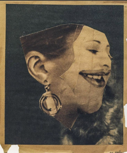
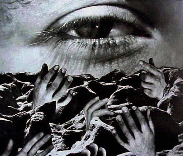
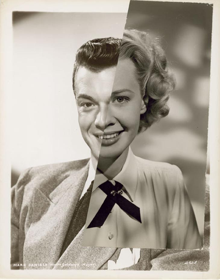
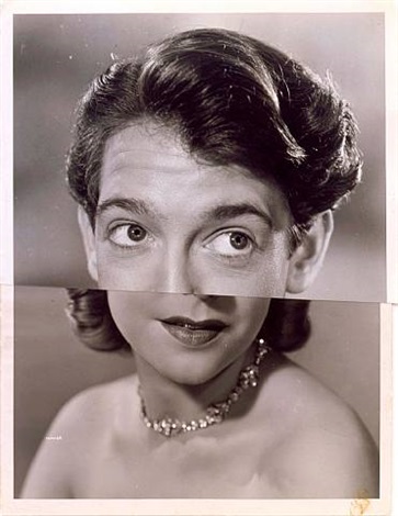
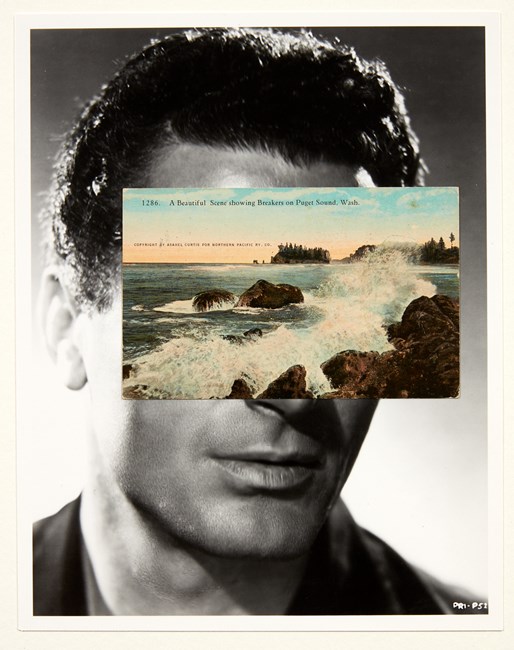
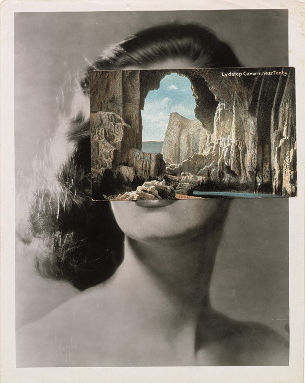
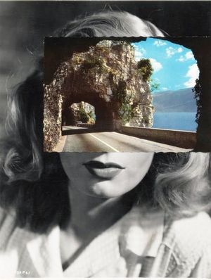
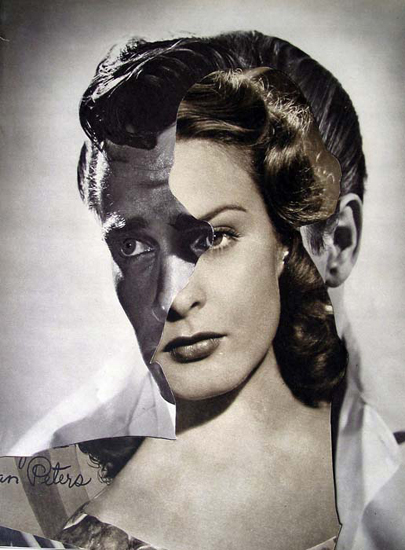
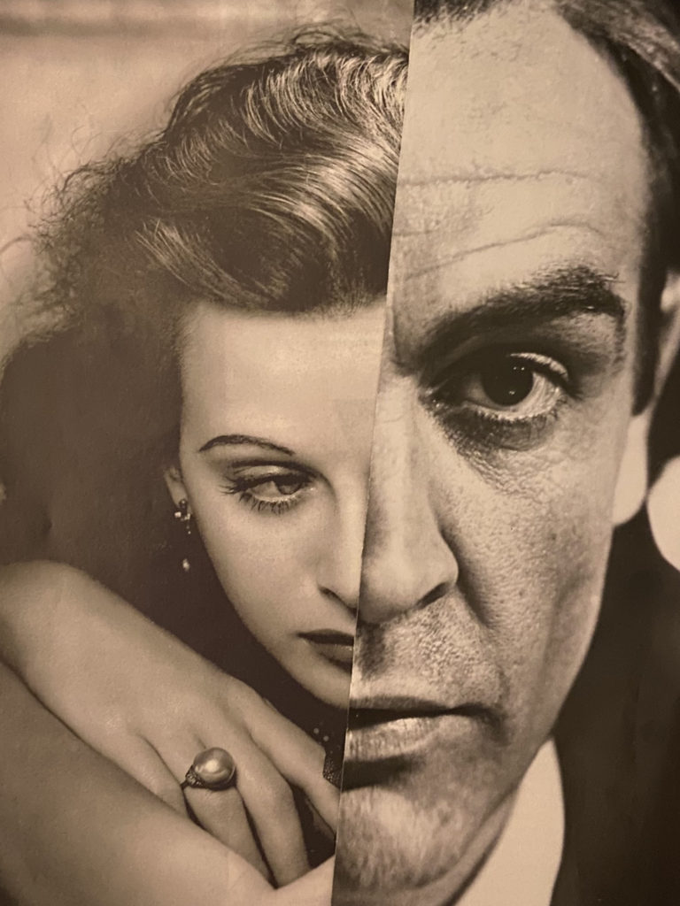
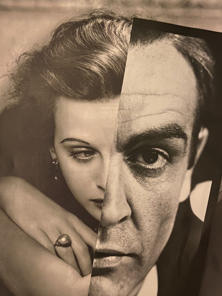
John Stezaker, born in 1949, is an English artist best known for his conceptual photomontages, in which usually display either two portraits, or a portrait and a landscape layered over one another creating a collage like result. The images that Stezaker uses for these pieces are found photographs, ranging from film stills, postcards, magazines, books or commercial photographs. It has been said that this style of photomontage takes a similar form as the work of early pioneers such as Hannah Hoch and Man Ray, showcases the features of Dadaism and surrealism. John Stezaker’s series named ‘Marriage’ appears to focus on portraiture, displaying two juxtaposing images of film stars overlapping creating one fragmented form. However, within Stezaker’s series named ‘Mask XIII’ the photomontages consist of one celebrity portrait in black and white, with a juxtaposing colour landscape, usually taken from a postcard, concealing the face.
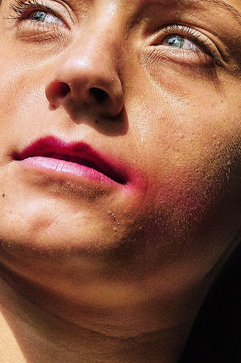
Analysis

This image created by John Stezaker showcases a photomontage of a black and white portrait, in which the upper half of the face is concealed by a colour landscape. The portrait used in this piece presents the subject directly in the centre of the frame, with only their head and shoulders visible, leaving only a small amount of empty space above and to the side of the subject. The landscape chosen by Stezaker showcases what appears to be a cave with two openings, which act as a sort of replacement for the eyes in this collage, with the connecting structure in between them resembling a nose. Furthermore, these outlines of the cave entrances also act as leading lines for this collage, as they not only resemble the facial features missing, but also correspond with the shape of the face, continuing the curve upwards. The overlay of this photograph juxtaposes the background image with its dark and earthy tones, creating a strong contrast with the lightness of the portrait.
From a technical point of view it can be said that chosen portrait was taken with studio soft lighting, due to the consistent light tone throughout the image and lack of harsh shadows behind the subject. In addition, it can also be seen that the lighting used to capture the landscape photograph must have been natural. It appears that the aperture used for both images was low, allowing for a large depth of field, as the focal range seems to be the same within the foreground and backgrounds. For the landscape the ISO would have been set high, as there is only a small amount of light entering the photograph, through the cave, meaning that the camera would need to capture as much light as possible. However, the portrait would only require a low ISO setting due to the studio lighting flooding the image.
This piece taken from John Stezaker’s mask series is said to be inspired by an essay written by Elias Canetti’s on masks and unmasking in his book Crowds and Power. Another form of inspiration was taken from teaching a course in the origins of art, with the mask being the point of origin, Stezaker has stated. This provoked Stezaker to create these collages, with the aim to exhibit the urge for ‘exile from life in the world of images’
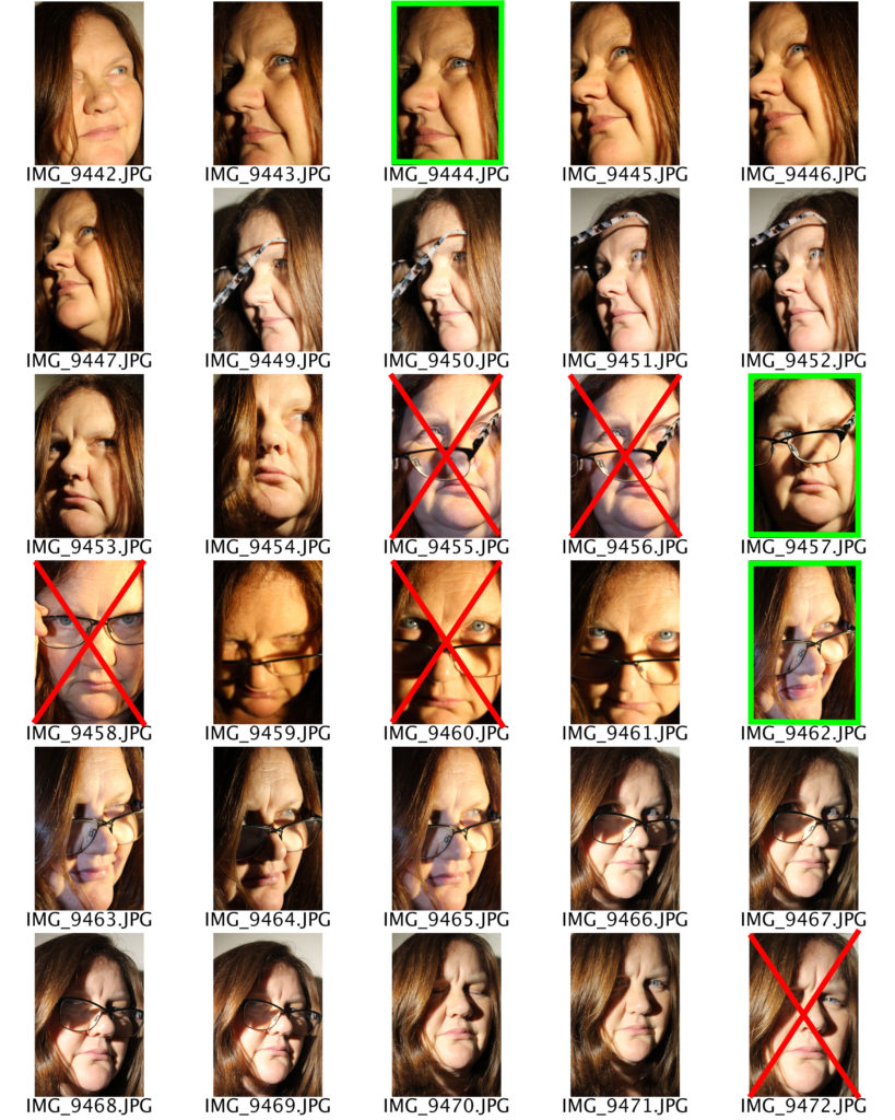
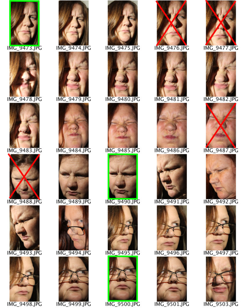
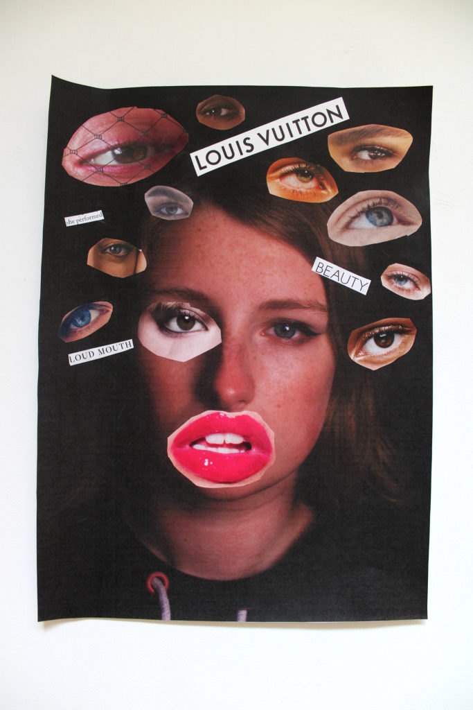
My Photomontages
Magazine Cut Outs
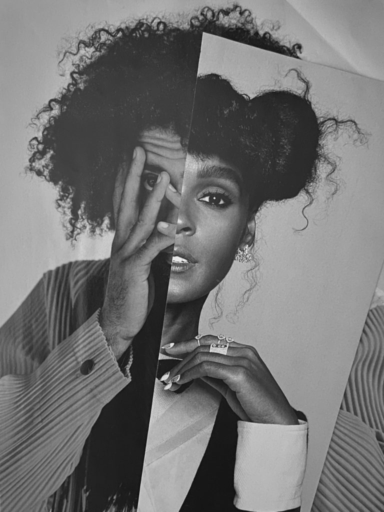

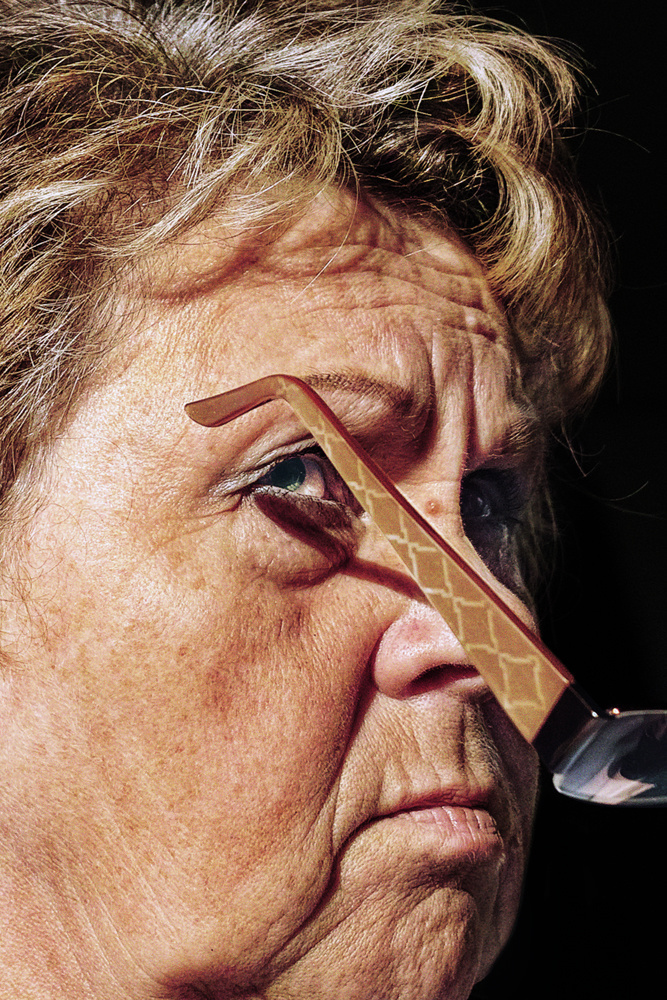
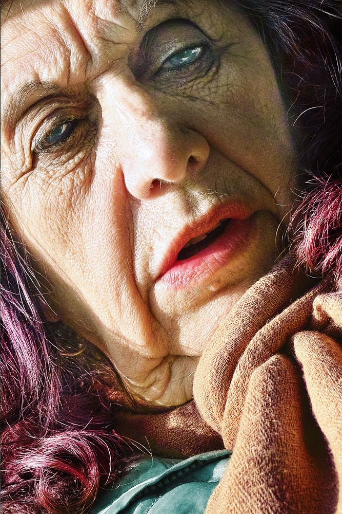
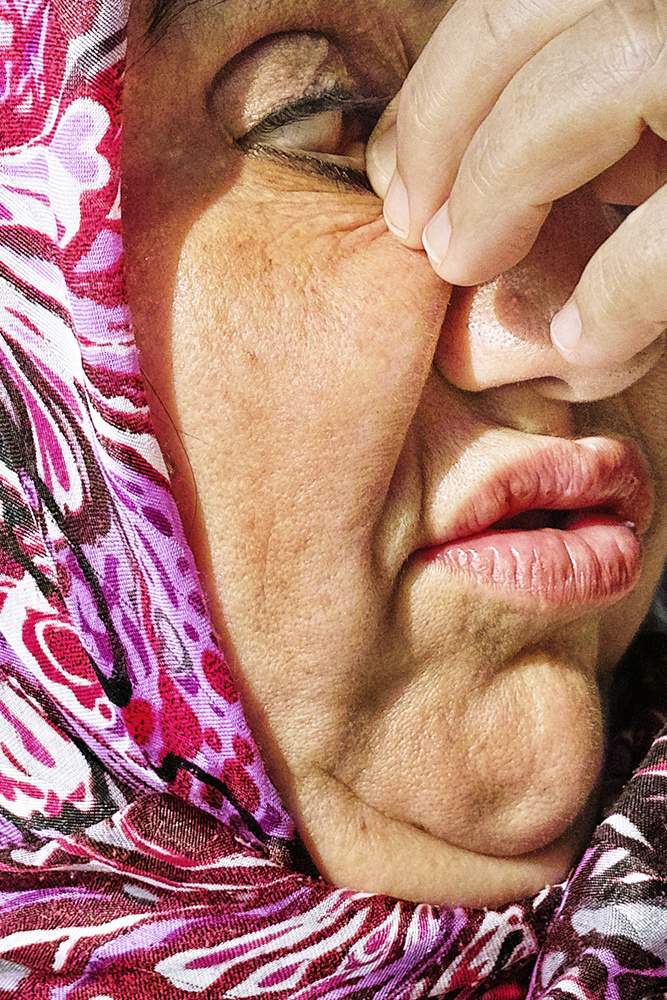
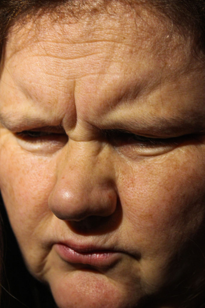
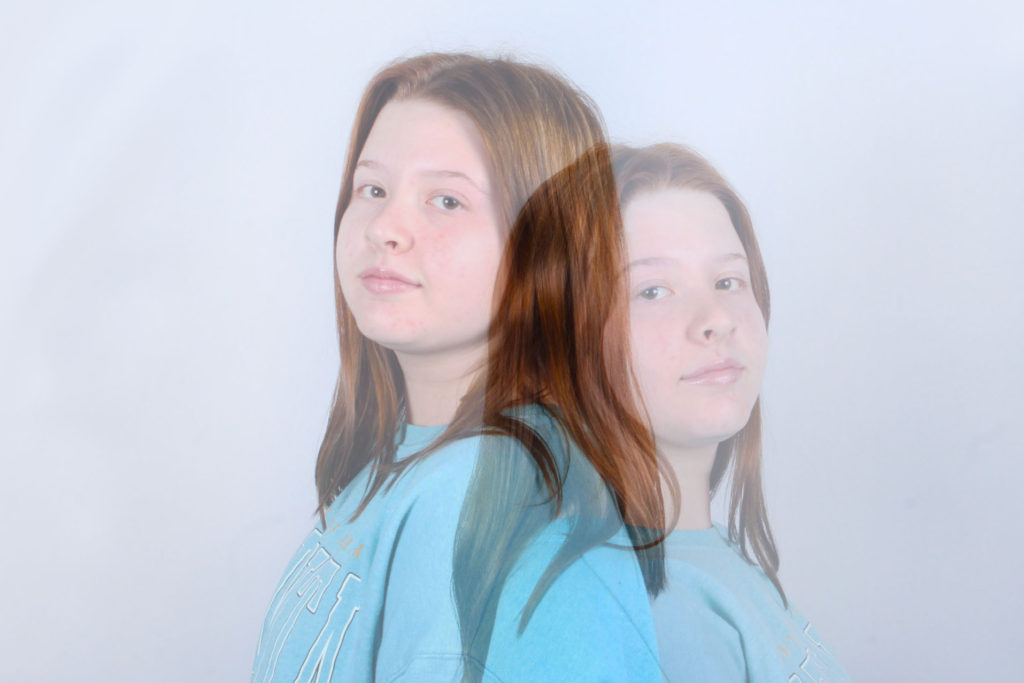
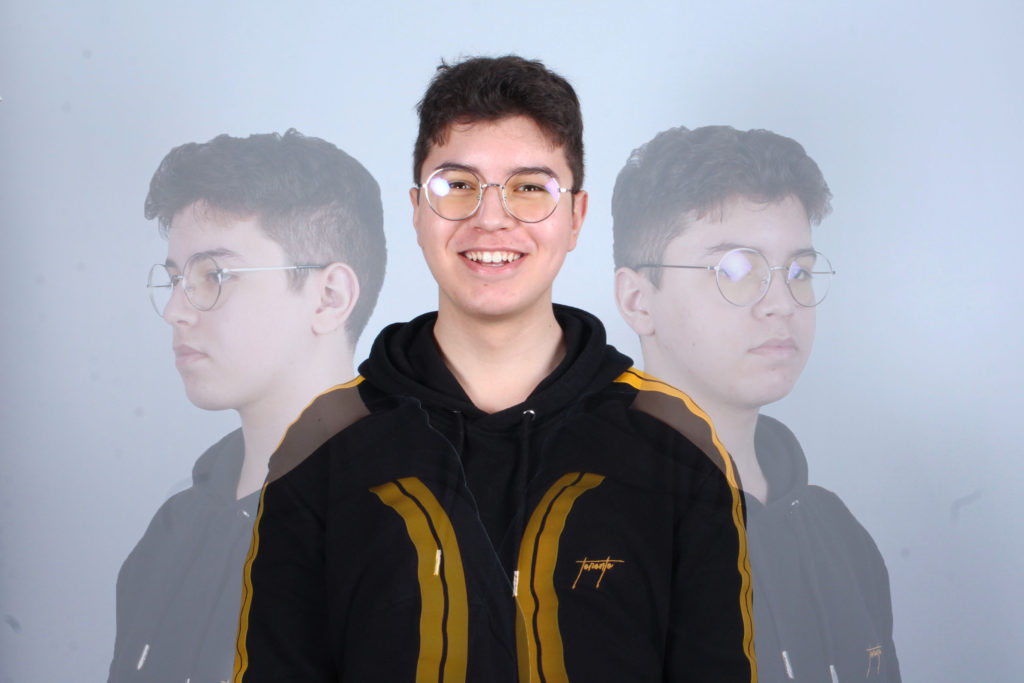
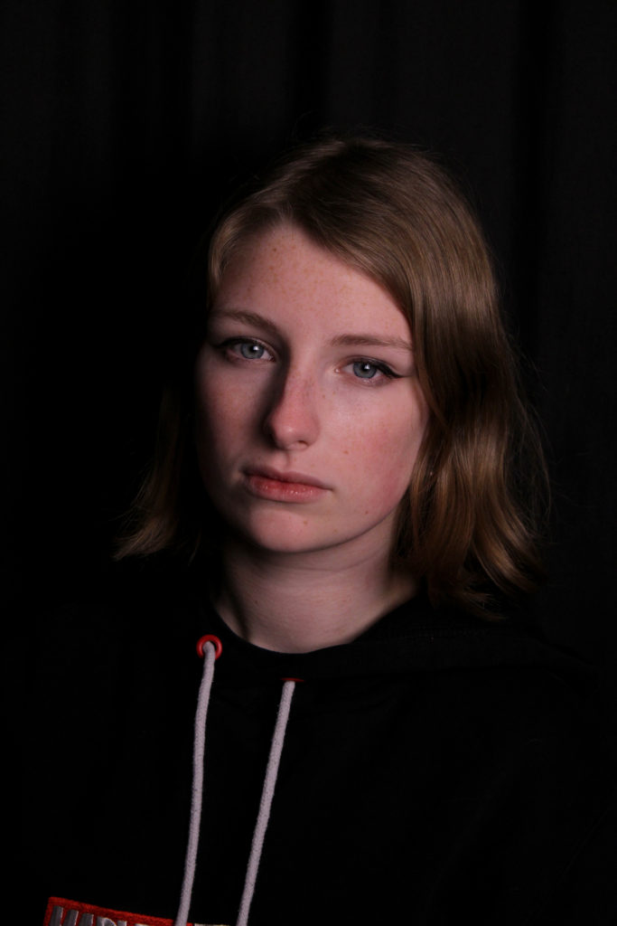
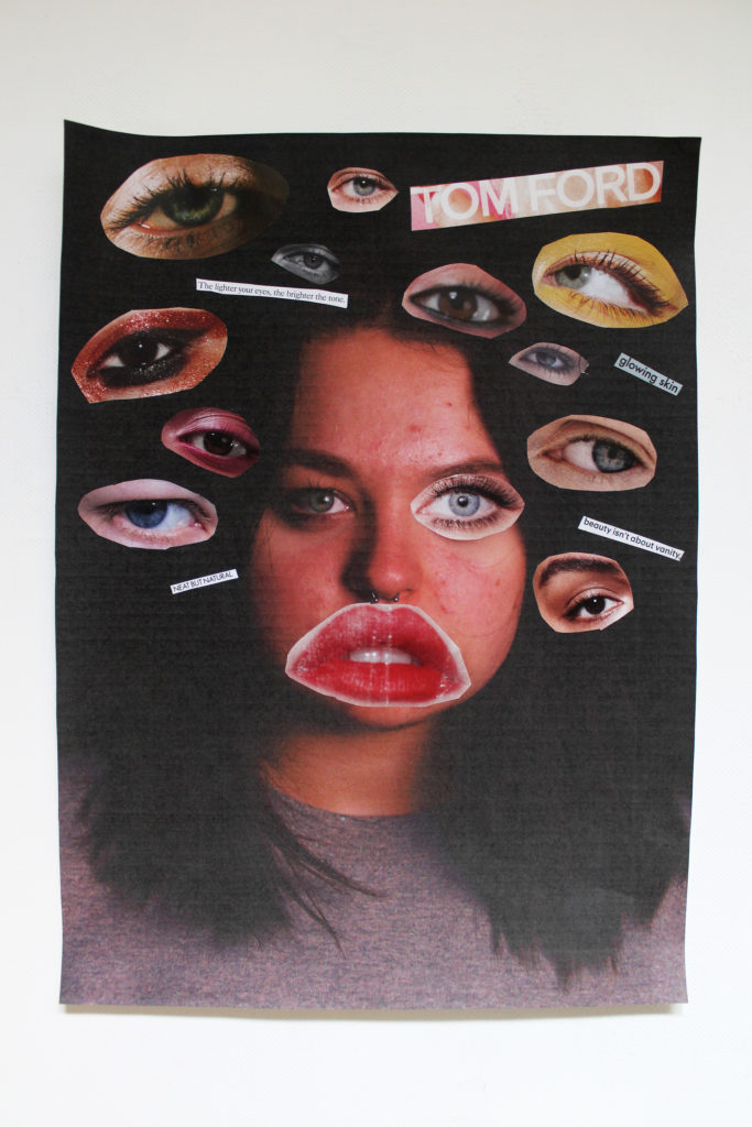
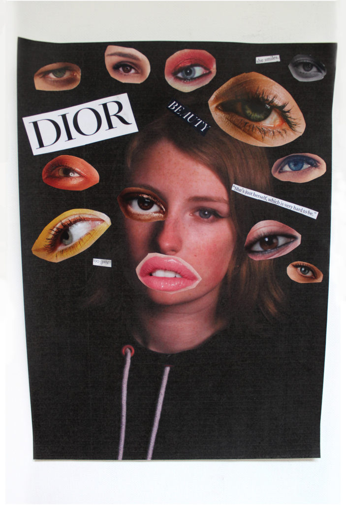
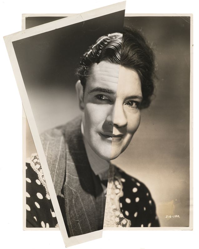
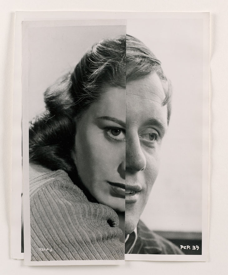
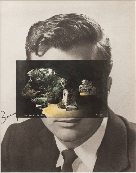
For these portrait photomontages I cut out sections of images from a magazine of film stars aiming to resemble Fujiwara’s ‘Marriage’ series. I cut these sections out using a craft knife, allowing for a precise and neat line. I then experimented with placements of the cutouts.
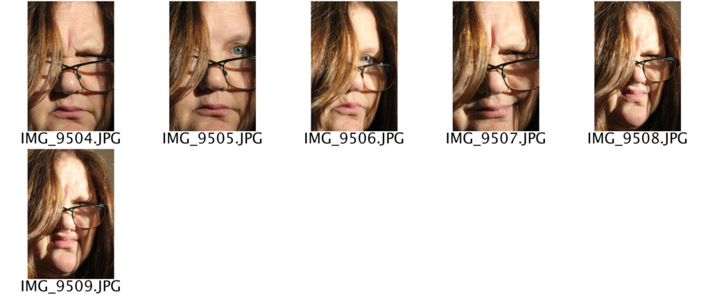
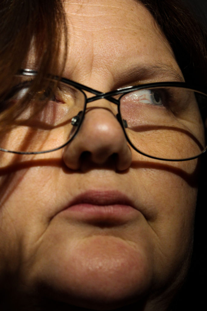
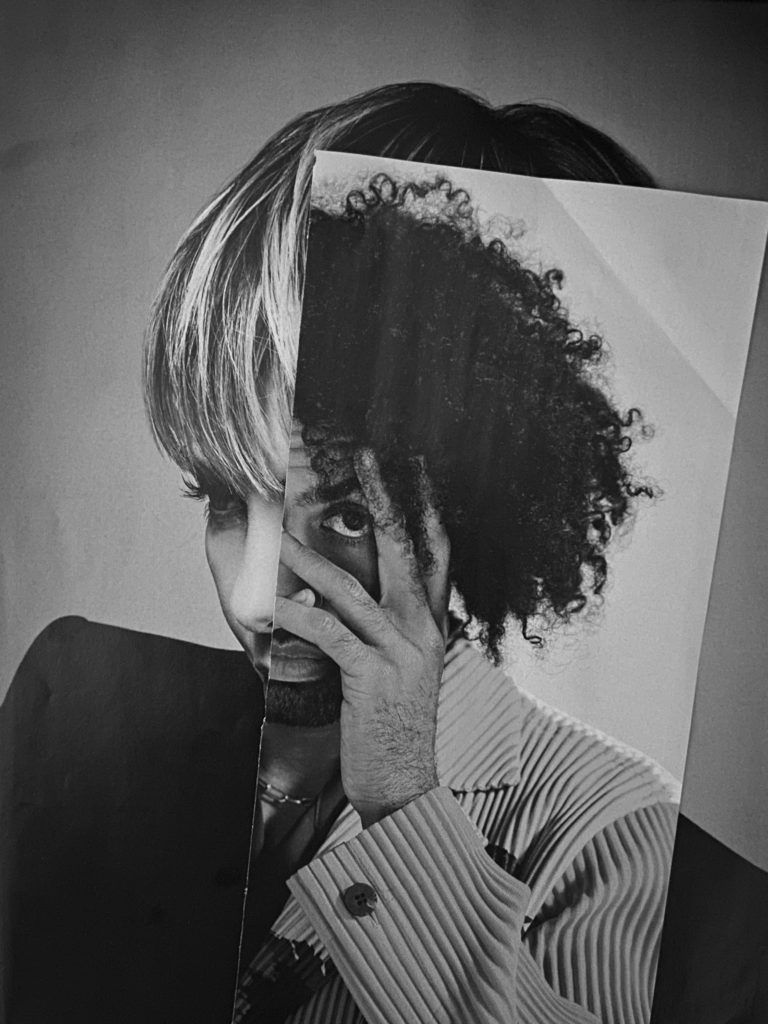
Photoshop Edits
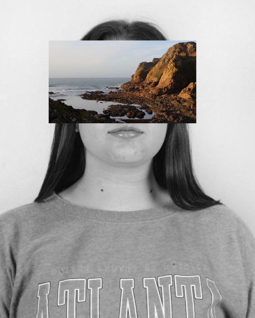
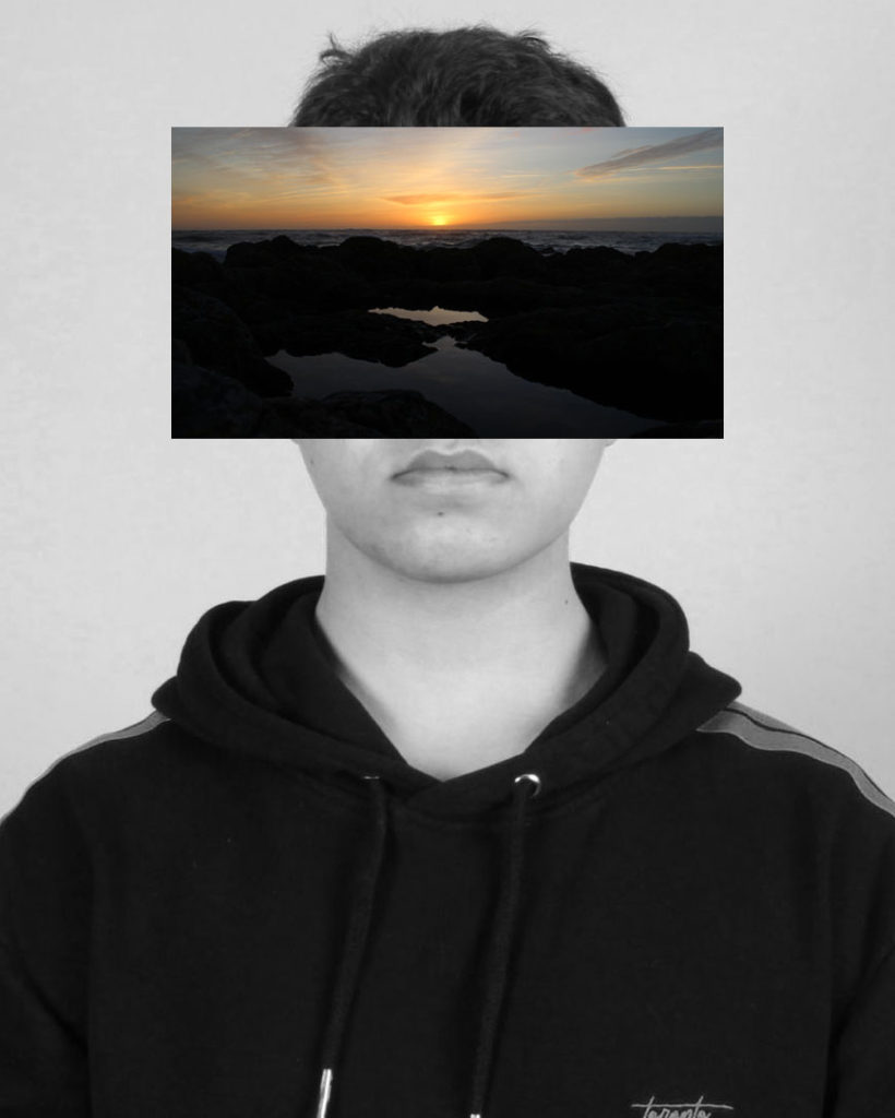
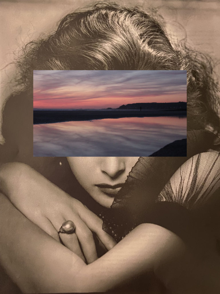
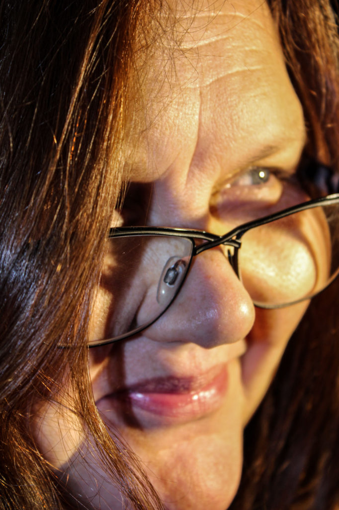
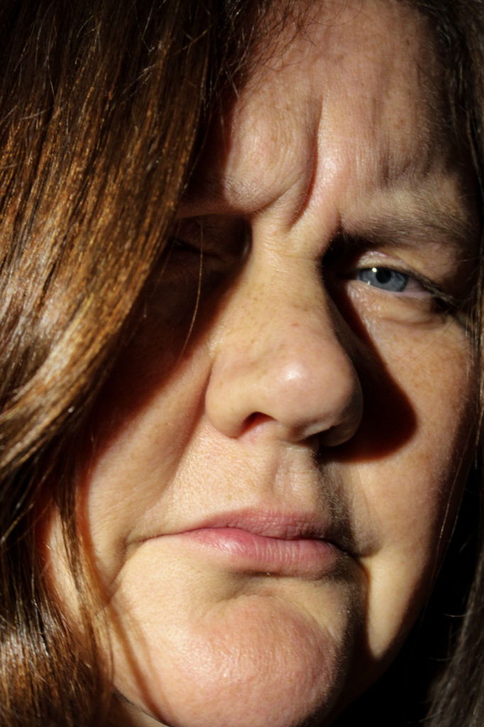
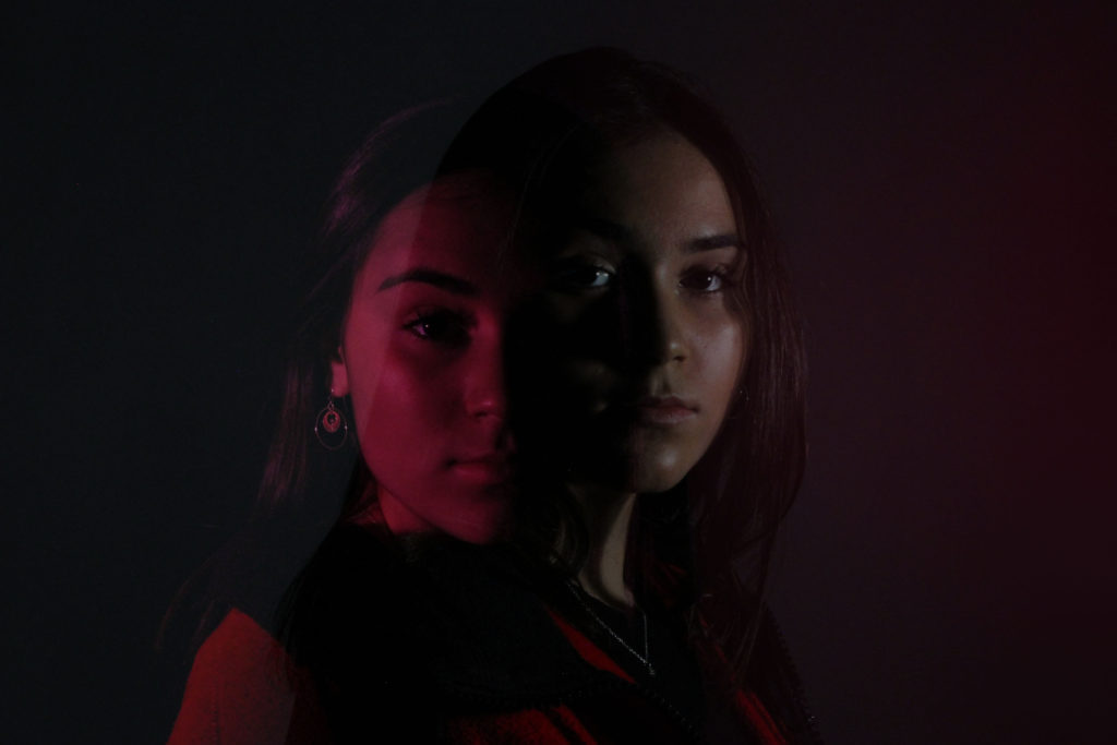
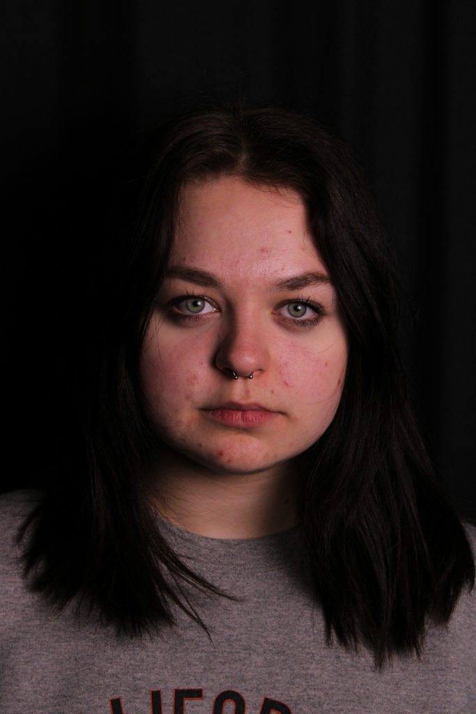
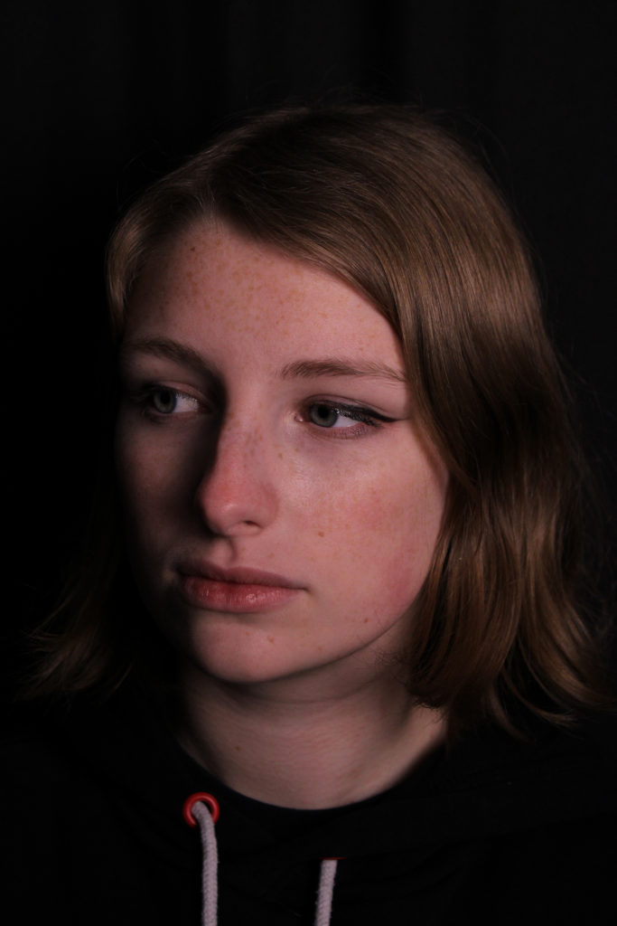
For these portrait and landscape photomontage edits, I aimed to replicate Fujiwara’s ‘Mask XIII’ series by using Photoshop to layer these images. Firstly I edited two of my own images by converting them into black and white for the background layer, then I layered over a landscape image of mine, concealing the upper half of the face. Next, I used two images taken from a magazine as a background layer, then again concealed the upper face with one of my own landscapes.
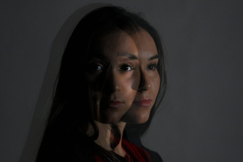
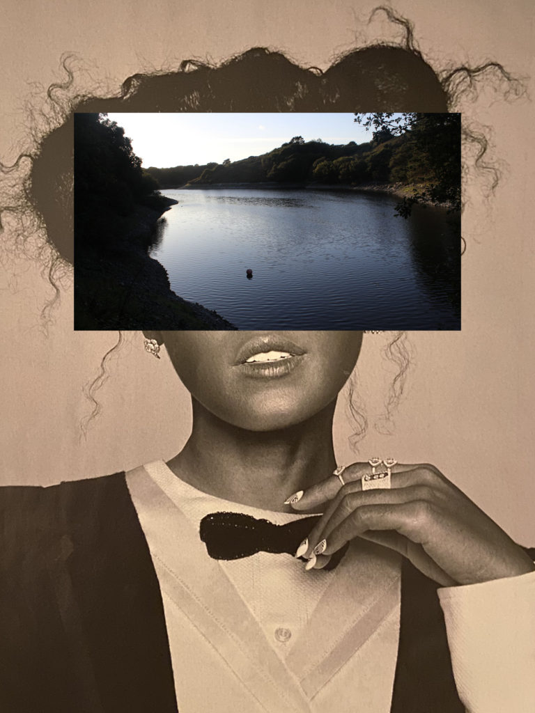
Final Image
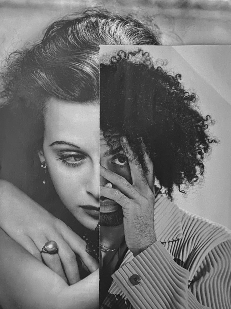
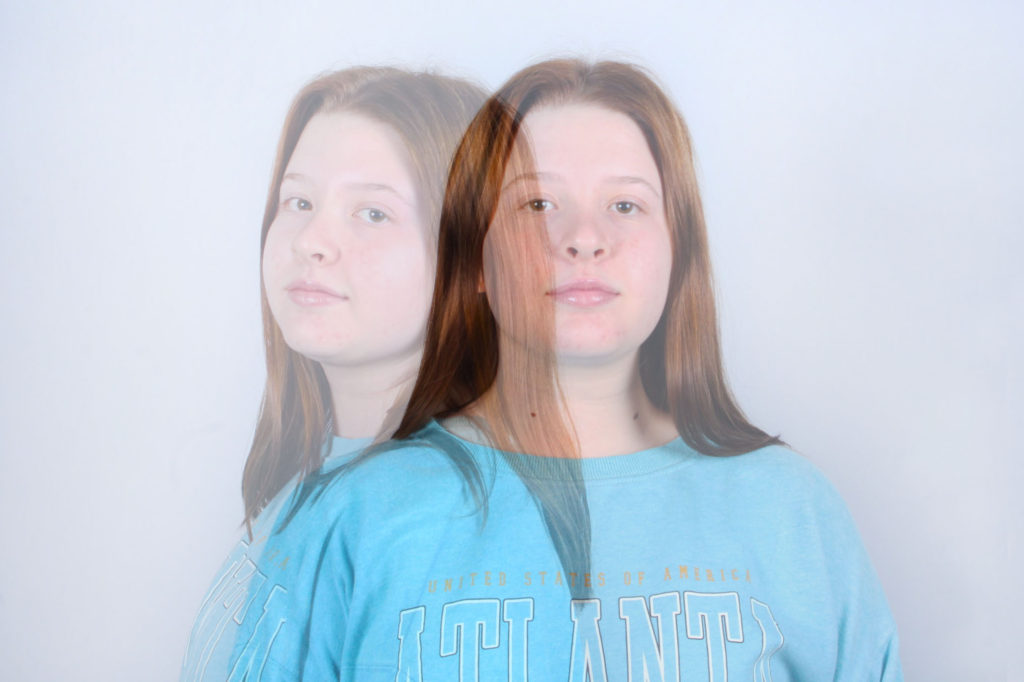
I believe that this photomontage using magazine cut outs is my best image as it best shows resemblance to John Stezaker’s found image pieces. This is as like Stezaker’s, I used found images of film stars of opposite genders, in order to juxtapose each other, to create this final piece. In addition, these portraits used are of the head and shoulders, leaving a small amount of empty space around the subject. However, I also believe that I could produce a better result by taking more of my own images, and combining them with found images.