Identity and Place – David Hilliard Case Study

David Hilliard

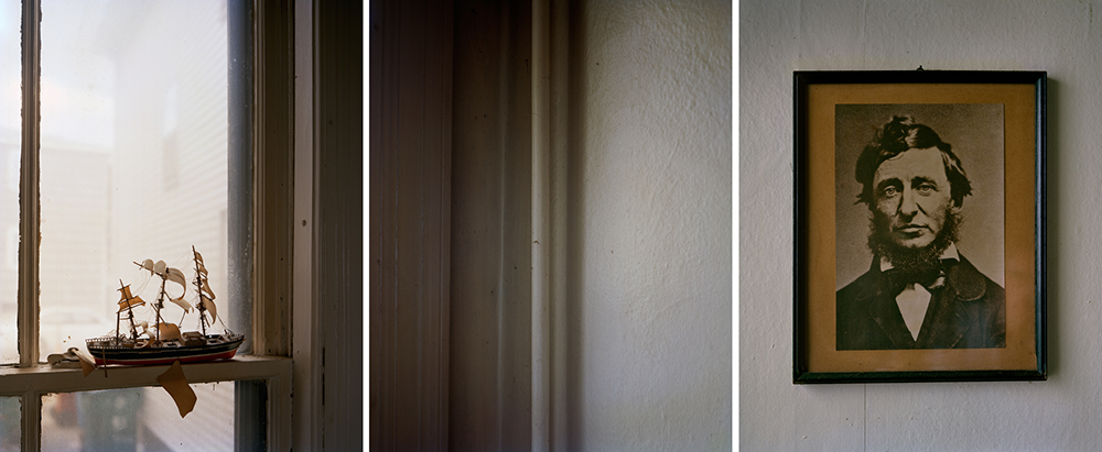
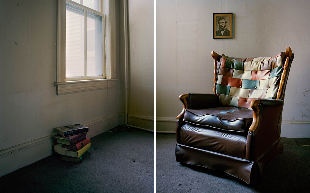
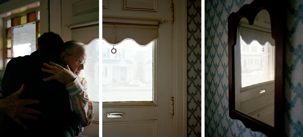
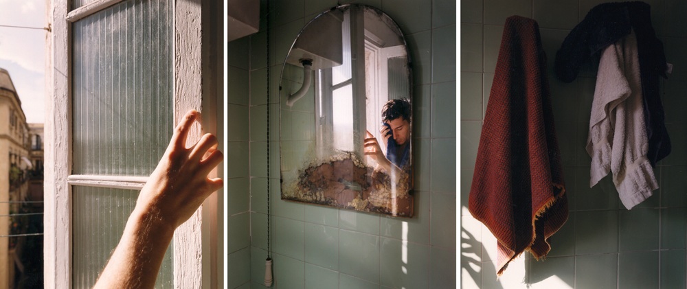
David Hilliard is an American fine arts photographer who studied at the Yale School Of Art in 1994. Hilliard’s work is heavily inspired by the people around him and his personal life, his images document the simple aspects of life and the normality seen everyday inside someone’s home. This successfully links to my interpretation of this identity project as I also plan on photographing my grandparents during their generic day, showing how even the smallest things can make you happy and form who you are. Nevertheless, many of Hilliard’s photographs are staged to seem naturalistic, evoking a performative quality and a middle ground between fact and fiction. His work consists of panoramic style images which he forms out of various single photos, Hilliard explains here http://davidhilliard.com/info_pages/about.html how his images allow him to guide the observer’s focus through each photo, I really love the storytelling created in his work.

From the images above, it is clear Hilliard focuses on capturing very personal photographs that guide the observer through a private moment in his/someone else’s life. He not only photographs scenes dedicated to a specific subject, but also captures areas around their homes in rooms that may hold a special memory, or have a certain link to their lives. In Hilliard’s project ‘The Tale is True’, a series of images unfolding the story of father and son struggling to maintain their relationship, Hilliard wrote ‘it’s my intention that the photographs serve as a testament to perseverance; within even the bleakest of histories there exists threads of enduring hope, reminding us that even in the face of great adversity, we adapt and endure.’ I love the message behind Hilliard’s images and hope to take inspiration when furthering my identity project.

Image Analysis
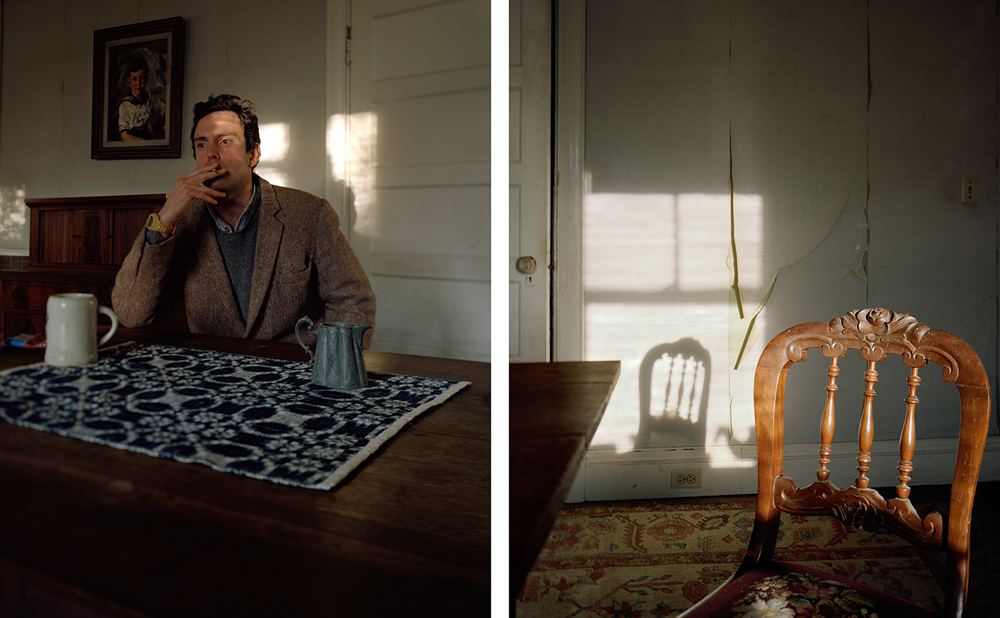
David Hilliard | The Tale Is True | Smoke | 2012

David Hilliard’s project ‘The Tale Is True’ deconstructs issues surrounding familial relationships and the struggle to secure a sense of self and place in a chaotic world. Over 20 years, Hilliard documented images of him and his father, exploring their relationship and the process of aging. Most images in this series were taken at their Cape Cod family home, a place of legacy and tradition, serving as a symbol of identity and history. I love the use of perspective and distance in this image’s composition, alike Hilliard’s iconic work, the use of this panoramic style editing creates a fluidity and link between the images, when put together tells a personal story. In the left image, Hilliard has captured a self portrait sat at his dining room table and in the right he has photographed an empty chair at the end of this table. The distance between himself and this empty chair could symbolise his relationship with his father has deteriorated, possibly showing how he feels more alone as his father ages. Additionally, I really like the use of shadows in this image, especially the one that falls on the wall behind the chair. The shadow clearly shows that the image was taken during daylight, I love how Hilliard uses natural lighting from inside and outside his home to light his images. However, I think this shadow also tells the story of Hilliard’s father’s life- perhaps this was his chair, maybe it still is but as he has aged he may not be comfortable on it anymore? This shadow creates repetition of shape in the image, symbolising echoes of the past, present and future all being the same; it gives the impression that his father’s days may be or seem repetitive as he gets older. Furthermore, Hilliard’s capturing of lines in this image, for example the lines created by the torn plaster on the right wall, connote the idea that him and his father may be trying desperately to get things back to how they used to be. The tearing wall creates jagged lines which may represent his father’s health and the conflict in patterns with the table cloth and carpet may show Hilliard’s overwhelmed mind at a time when his family relationships may be crumbling.

Identity and Place – Julian Germain Shoot

Why Julian Germain?

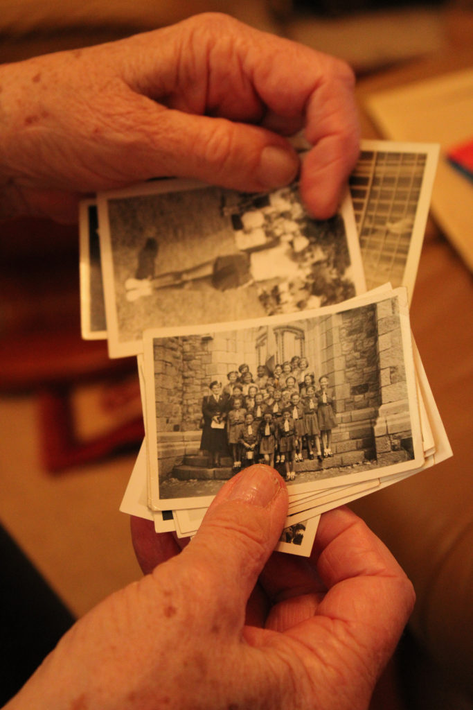
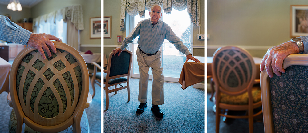
Julian Germain’s project ‘for every minute you are angry you lose sixty seconds of happiness’ has immensely inspired me, I really love the way he takes such naturalistic images in an environment his subject is clearly familiar and comfortable in. Many of the photographs in this project have a candid nature, as if Germain has just asked his subject to carry on with his day like he was not being photographed. I think this adds to the warm atmosphere created in the images as it gives the impression the subject is at ease, letting us look into his life as if we were family or friends. I have also chosen to study this work of Germain’s because of it’s connection to family identity, and identity changing over time. Many of Germain’s images depict his subject as reminiscing through photo albums of his past- I think this really symbolizes the importance of how we’ve grown up with family and how it can mould and form our identity throughout our life. Furthermore, I aim to capture images similarly to Germain in the sense of photographing my subjects in an environment close and personal to them. I think this will successfully show how our identity is connected to the places we feel most like ourselves, places we feel safe and comfortable in.

Photoshoot Plan

Who – I plan on photographing my grandparents throughout this identity project as I strongly associate them with influencing my identity throughout my life. My grandparents are very special to me, my closeness to my family stems a lot from their efforts to bring us together regularly and their constant positive view on life inspires me daily.

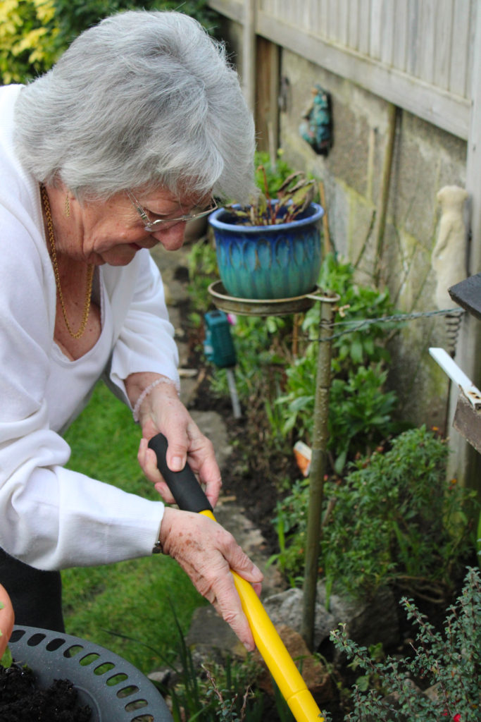
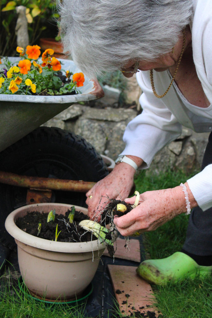
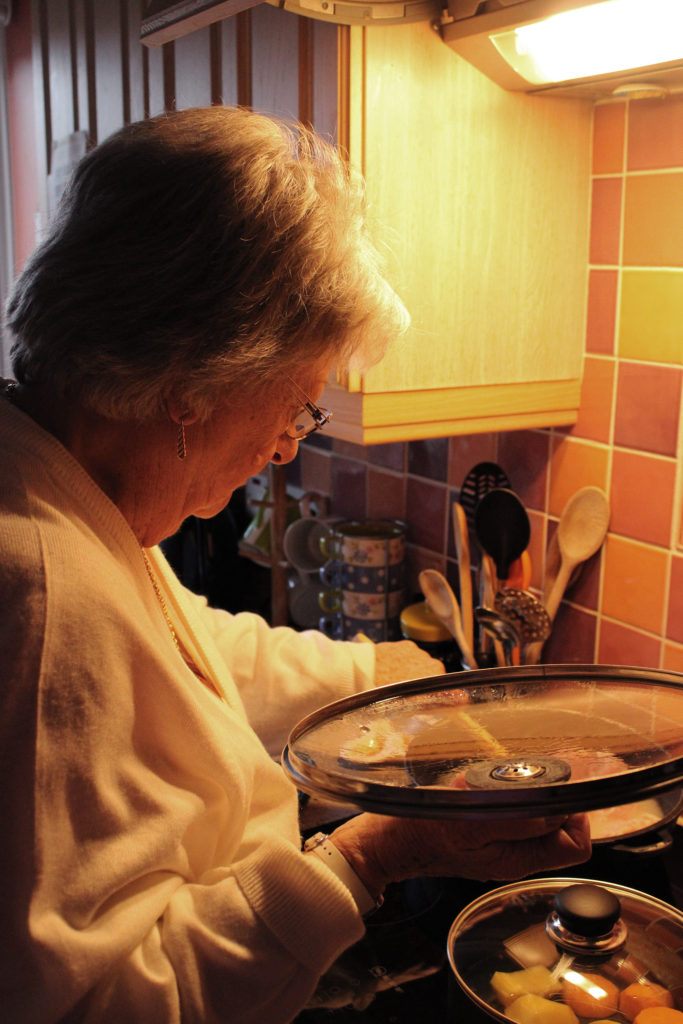
What – I am going to capture images of my grandparents going through their day as normal, looking at the camera when they want to and also capturing candid shots of them around their house. I plan on photographing them doing tasks such as cooking, gardening, reading and doing crosswords.

Where – I will be conducting this photoshoot at my grandparents house in St Brelade because it is the place they feel most comfortable and secure. I will move around the house with them, taking some shots in the garden, kitchen, lounge and any other rooms they go into.

When – I plan on taking these images on Sunday 17th January as the weather is meant to be sunny which will be perfect for any outdoor shots I may take. I aim to spend the day at their house and take photos into the evening to get a different lighting perspective, hopefully reflecting the orange hue seen in Germain’s images.

How – I will attempt to capture images using the natural lighting provided around their home, such as ceiling lamps and sunlight from windows. If any problems occur with lighting being too dim, I plan on bringing my standing light from home to add any more highlights if needed.

Why – My aim in producing this photoshoot is to capture images that reflect the work of Julian Germain, while also providing an insight into me and my family’s personal identity. I want to take images that show the importance of place linking with identity, connoting the idea that a certain home or room can impact our identity over time.

Contact Sheets

Selected Group Images

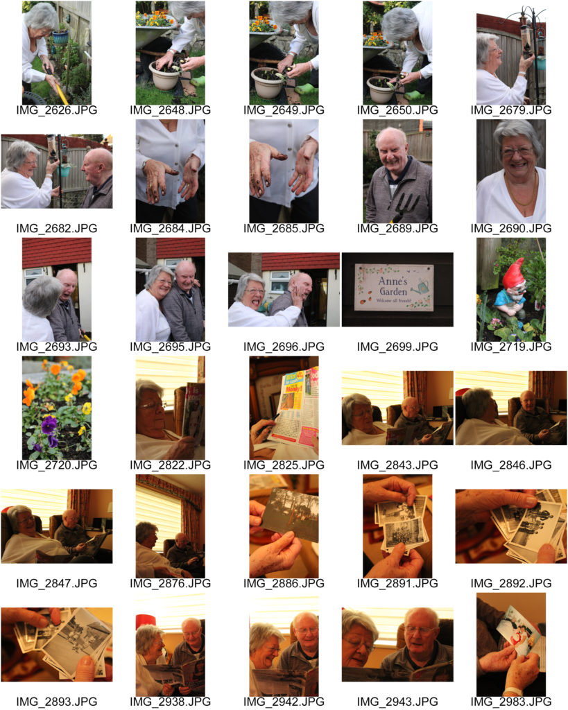
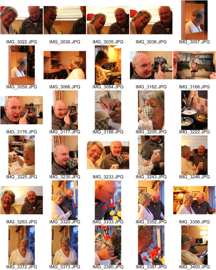
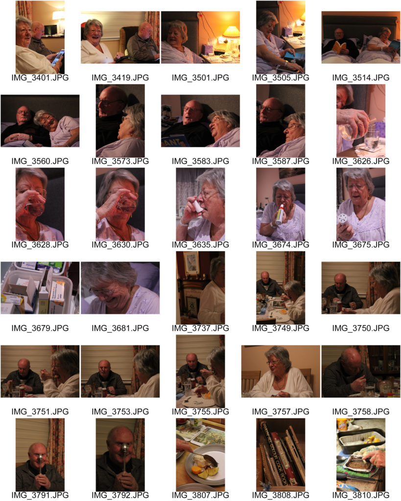
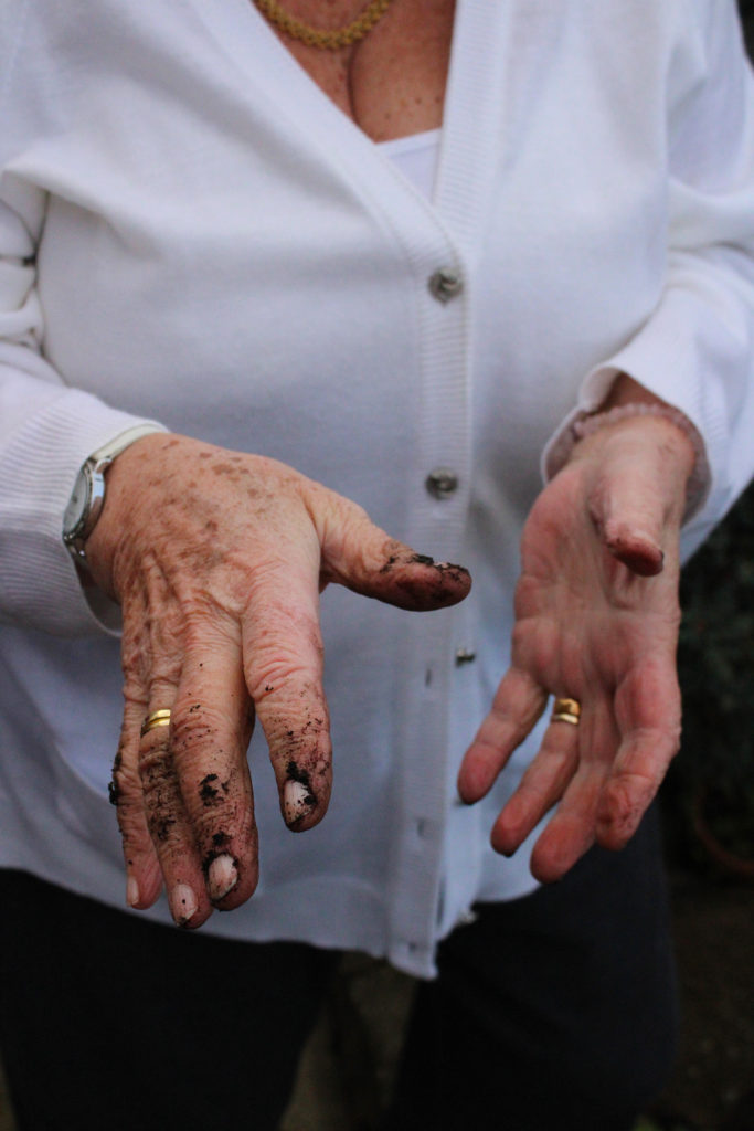
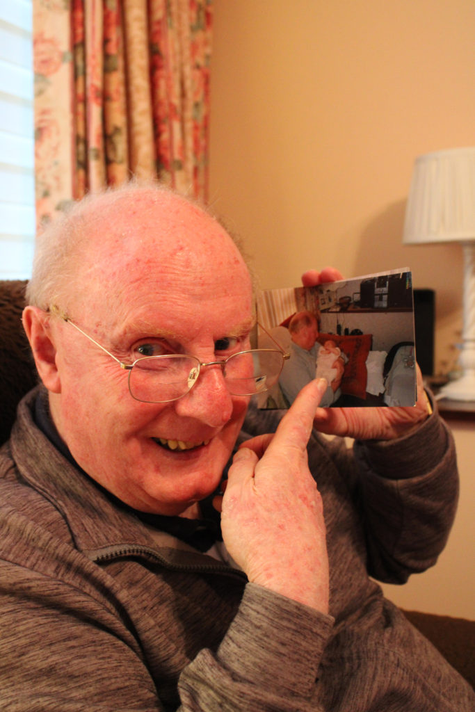
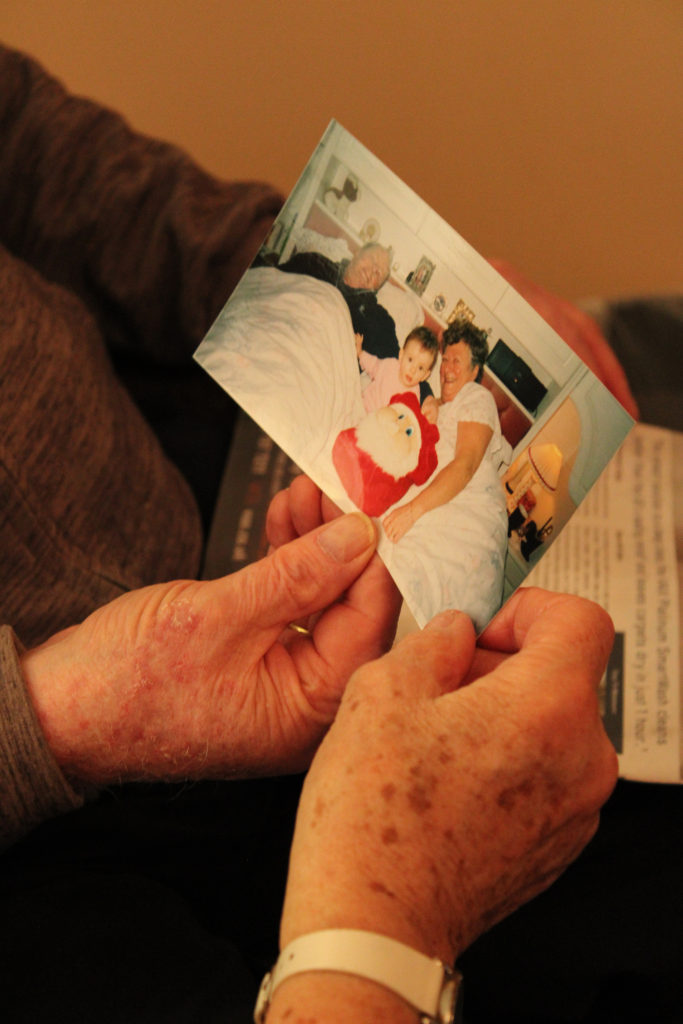
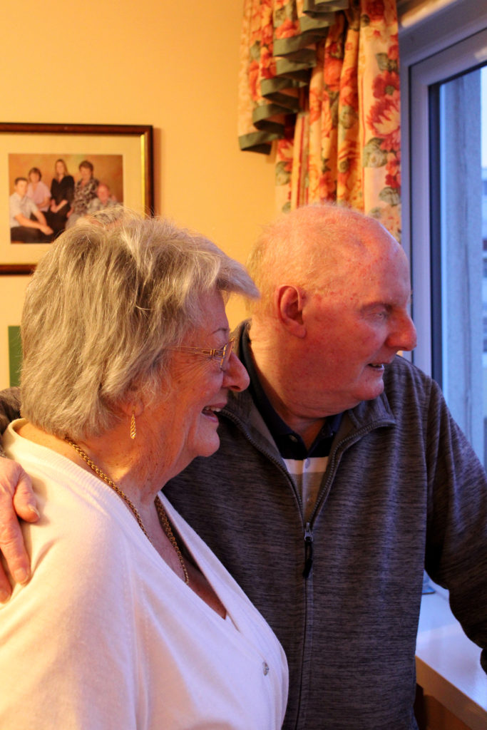
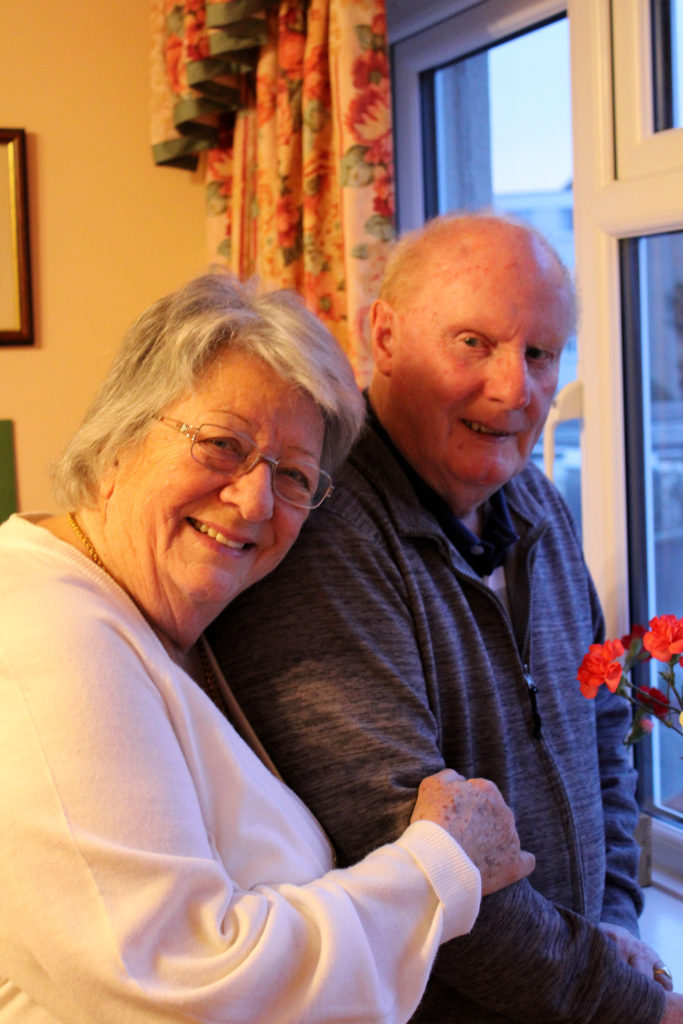
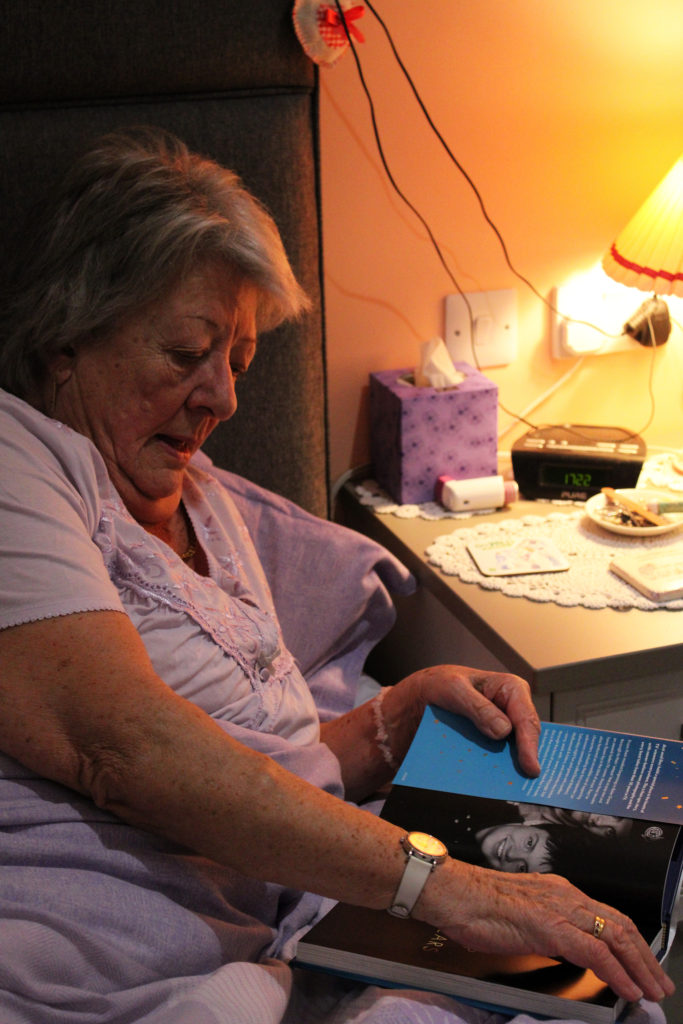
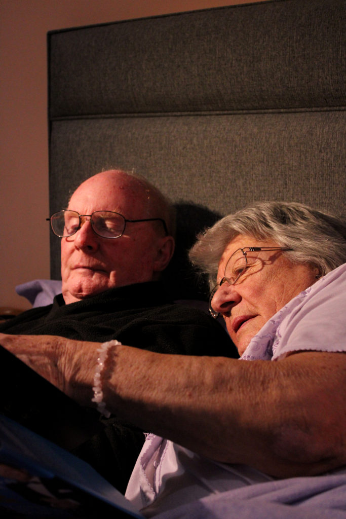
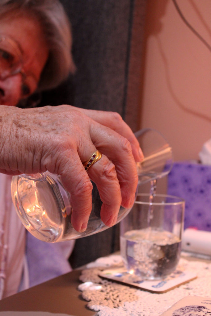
During this photoshoot, I decided to take the approach of capturing images that linked to each other in trios. I wanted to reflect the warm cosy atmosphere created in Germain’s images while also adding a element of my ideas to set out these images in storytelling sequences. I really love how the photographs from this shoot turned out, I did minimal editing on them, only touching up brightness here and there which I believe adds to the naturalistic mood of these pieces. Additionally, I love how each sequence tells a different story about my grandparents and family’s life. The first set of images depicts my grandmother doing what she loves the most, gardening. Whenever I arrive at my grandparents home you can bet my nan will be ‘pottering in the garden’ as she calls it. I like the contrasting compositions of these images as I believe the differing camera angles create an inclusive atmosphere, as if the observer is stood in the garden with her. Furthermore, in my second sequence I really enjoy the way the images tell the story of family and identity over time- similar to Julian Germain’s study. I captured these images of my grandparents reminiscing through old photographs with a focus on their hands, I believe hands are like windows into somebody’s past; they tell a story through marks and lines that can embody someone’s identity entirely. I like how these images have a strong contrast of dark and light tones and a subtle orange hue throughout.
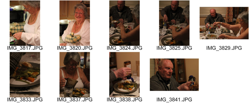
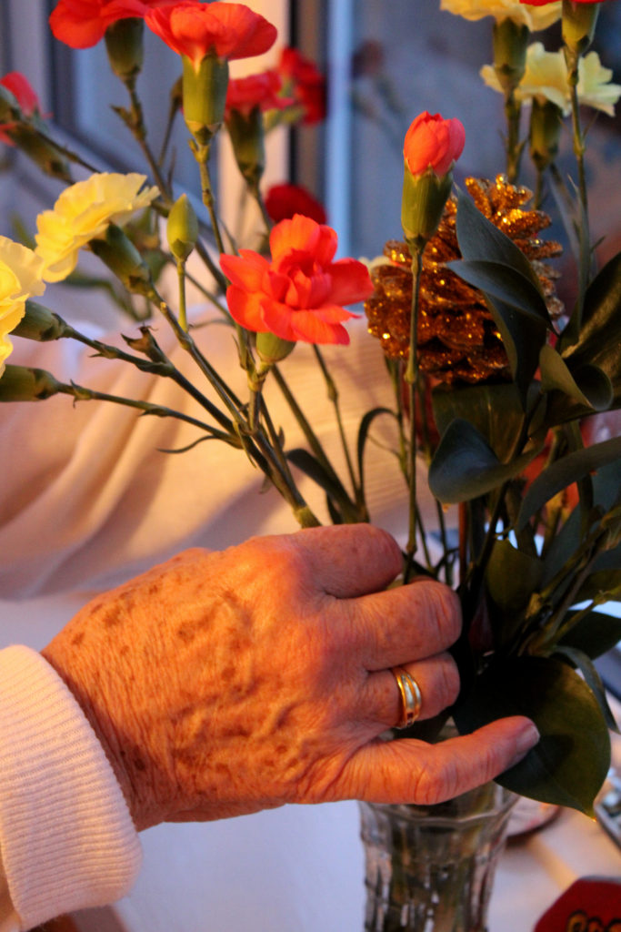
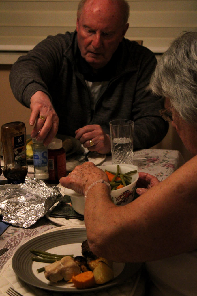
My third sequence shows my grandparents admiring their garden and bringing elements of nature inside their home- my family identify greatly with nature and there are always flowers displayed in my grandparents house. I love the vibrant colours of blue from the window, red from the flowers and peach from the wall which form a fun playful atmosphere, giving the impression my grandparents find joy in the beauty of the environment- furthering Germain’s ideas on finding happiness in the small things. My forth group of images show my grandparents doing what they usually do before bed- they love to read or fill out crosswords together. I really like how the main colours in these images, orange, pink and purple, create a comfortable mood reflecting their love for their home and each other. I also love the strong contrast between highlight and shadow in this sequence and also the repetition of the shade lilac. My final set of photos displays the moments before and during dinner time- it tells the story of my grandmother’s love of cooking and providing for her loved ones. The tangerine hue and high saturation of these images gives a welcoming impression and connotes the feeling of happiness and warmth, I think this really shows how my family identify with our care for each other. I really like the darker tones in these photos, it presents the evening in a calm way and reflects Germain’s naturalistic personal work.

CC – Idenitiy Photo Shoot

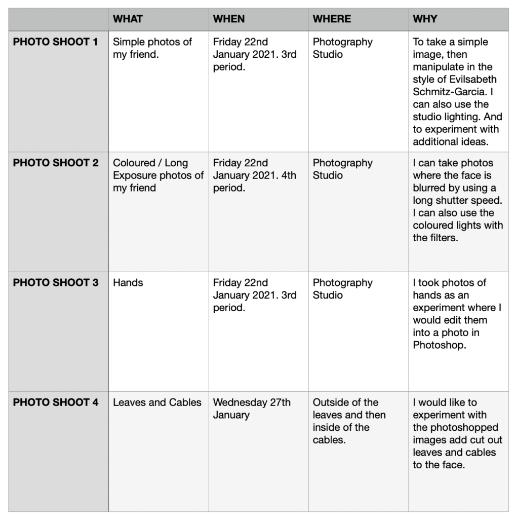
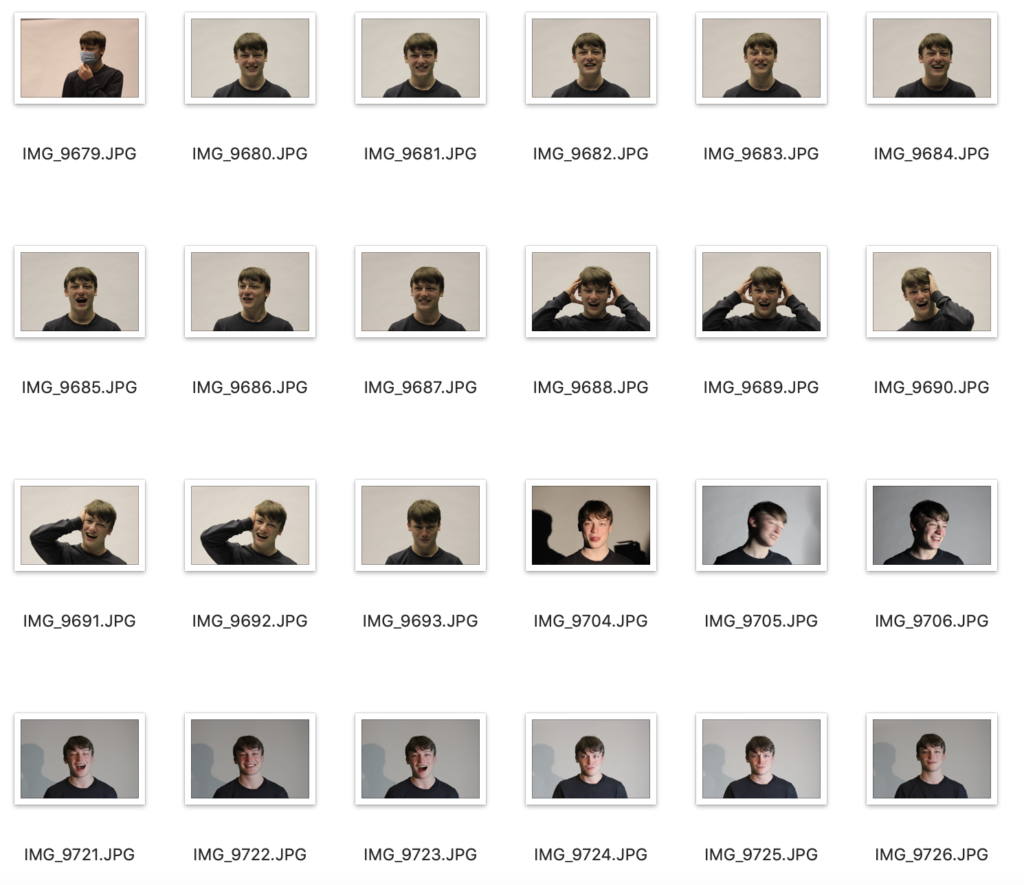
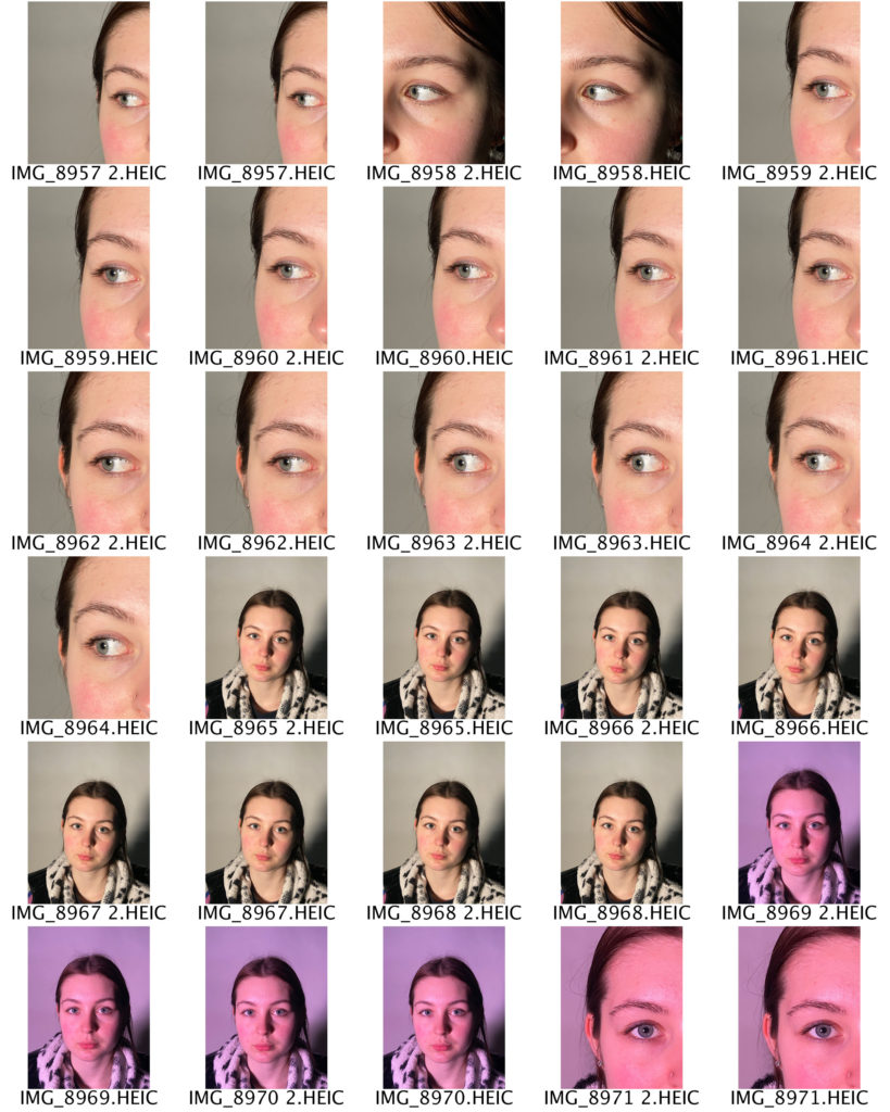
Photo Shoot 1 – Simple Photos

I plan to merge these photos together in Photoshop, create a hole in the head, or use a scanner to disfigure them in the style of Evilsabeth Schmitz-Garcia’s work.

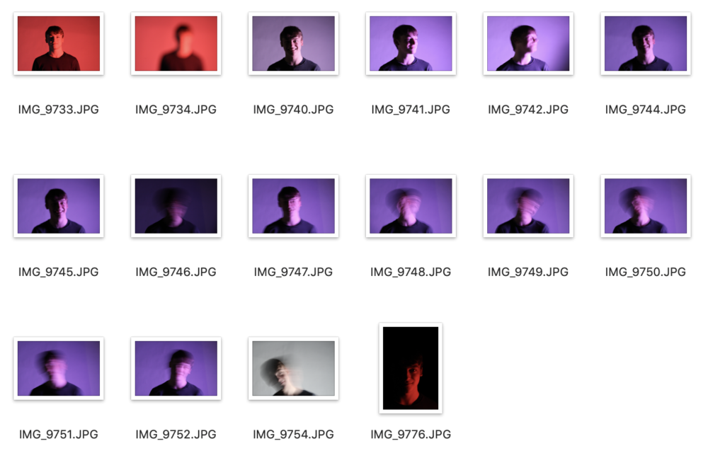
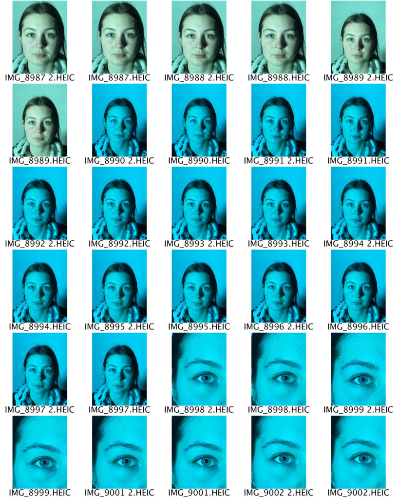
Photo Shoot 2 – Colour / Blur Photos

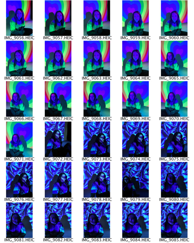
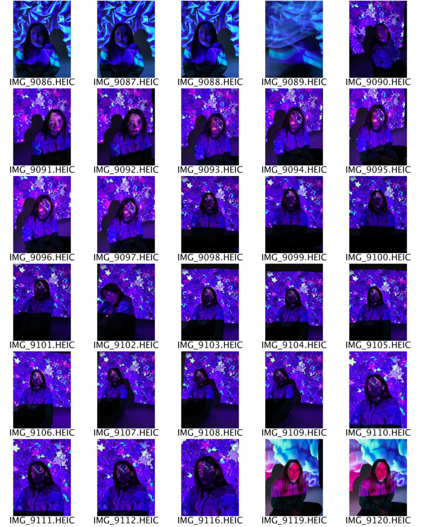
I use different colour lights to experiment which produces better tonal values and highlights.

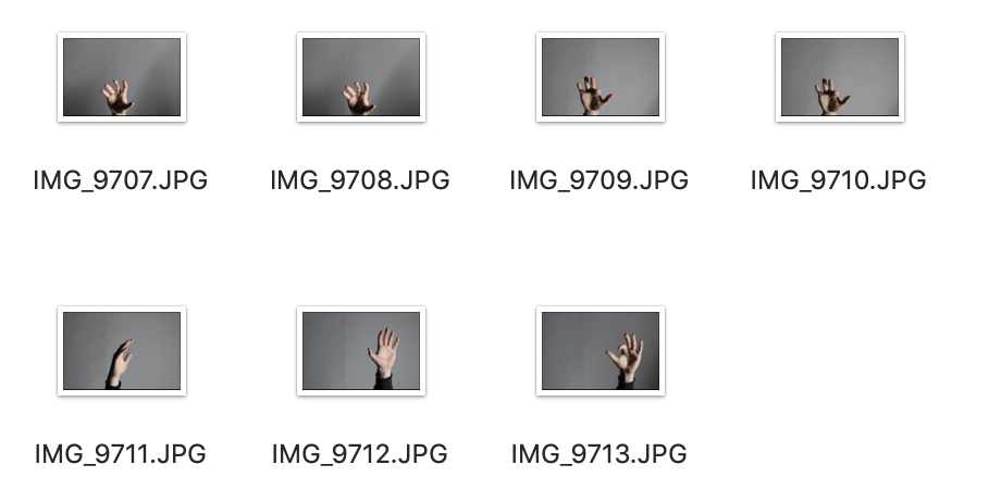
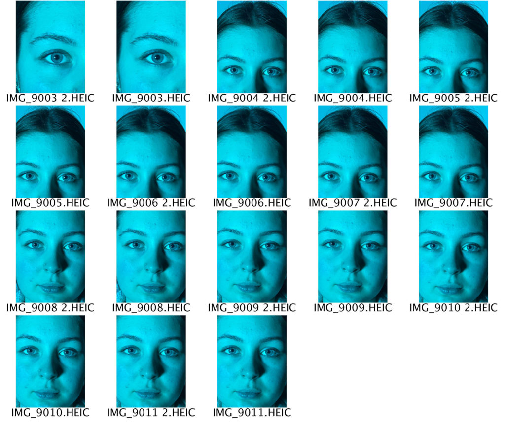
Photo Shoot 3 – Hands

I plan to edit the background out in Photoshop, then add it to another photo.

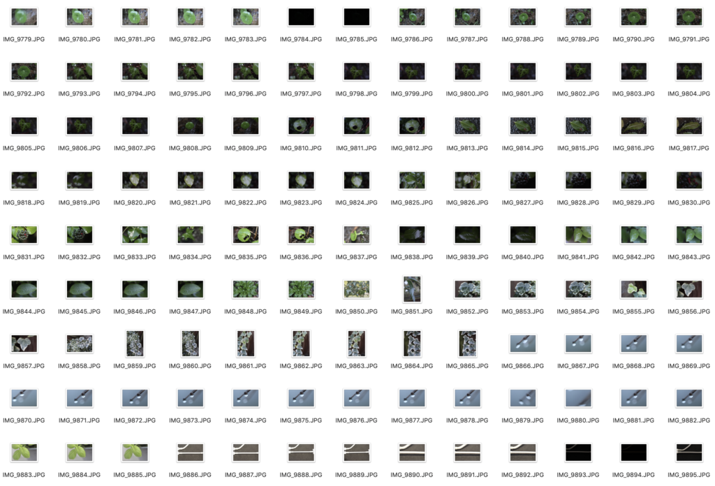
Photo Shoot 4 – Leaves And Cables

I looked for leaves and cables that would be a material to edit coming out of the face when I edit it in Photoshop in the style of Birthe Piontek.

CC – Birthe Piontek- Identity

Birthe Piontek is a Vancouver-based photographer is most widely recognised for her intimate, narrative-driven portraits.

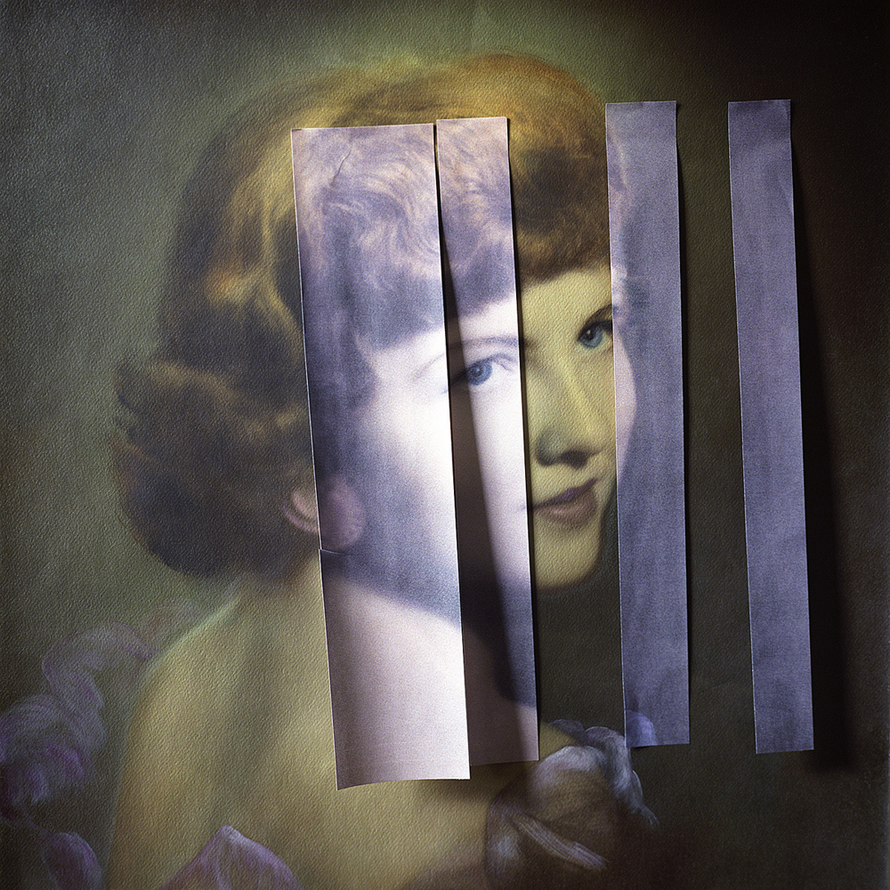
Most of her work has a straightforward approach. In her recent series “Mimesis” she’s uses images that have a meaning and background to create collages which displays her personal portraits with an investigation into the complexity of human identity.

Piontek searches for found images on Ebay, in thrift stores and flea markets. She primarily looks for images like studio portraits and other non-candid scenarios in which the subject has direct eye contact with the camera.

She knows little about the people in the photographs, she uses them as source material to create her own fictions about their identities, she said, “I usually spend quite a bit of time with the image, looking at it and familiarising myself with it.”

Once she likes the outcome of a photograph, Piontek scans it, then reproduces the image, in many cases working from its copy. She begins manipulating the copy, sometimes cutting into it and incorporating other materials like glass, paint, foil and fabric to give the image an entirely new form. 

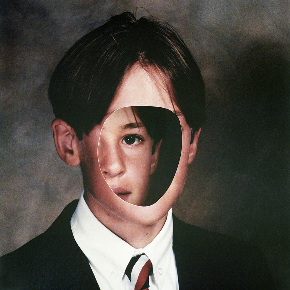
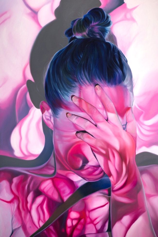
I would like to experiment in Photoshop in the style of Birthe Piontek. I would like my final outcome to be like the first image in this post, where the face out of the head.

Identity and Place – Final IMages and evaluation

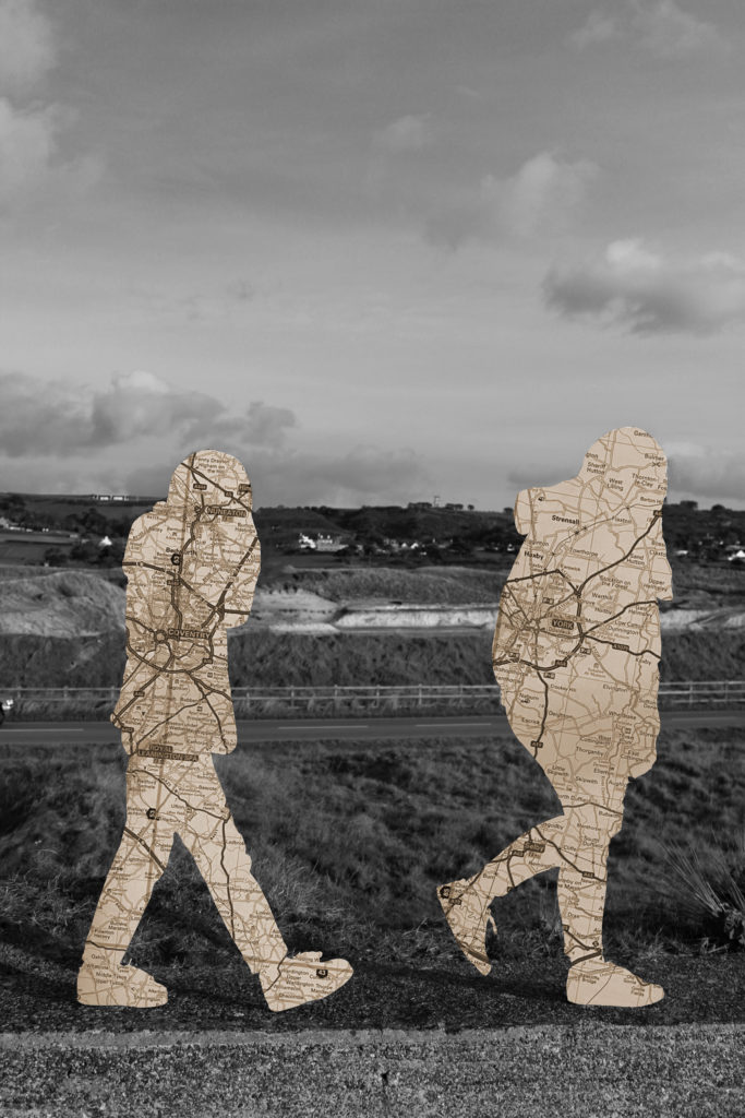
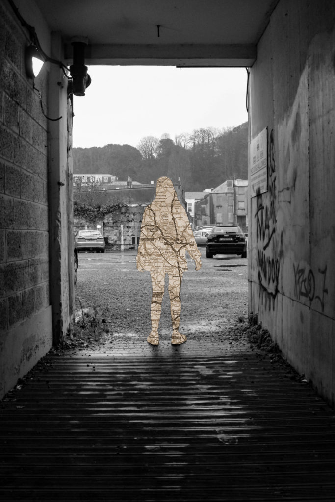
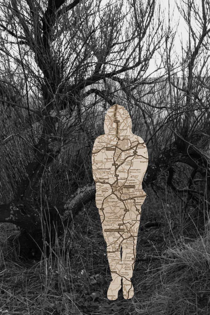
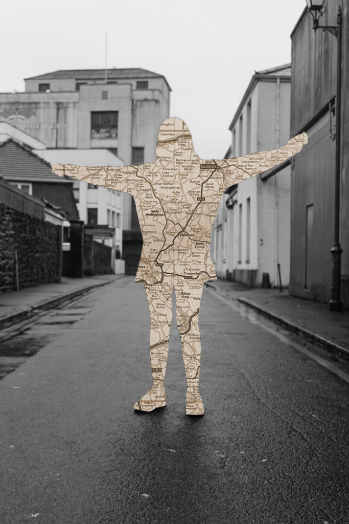
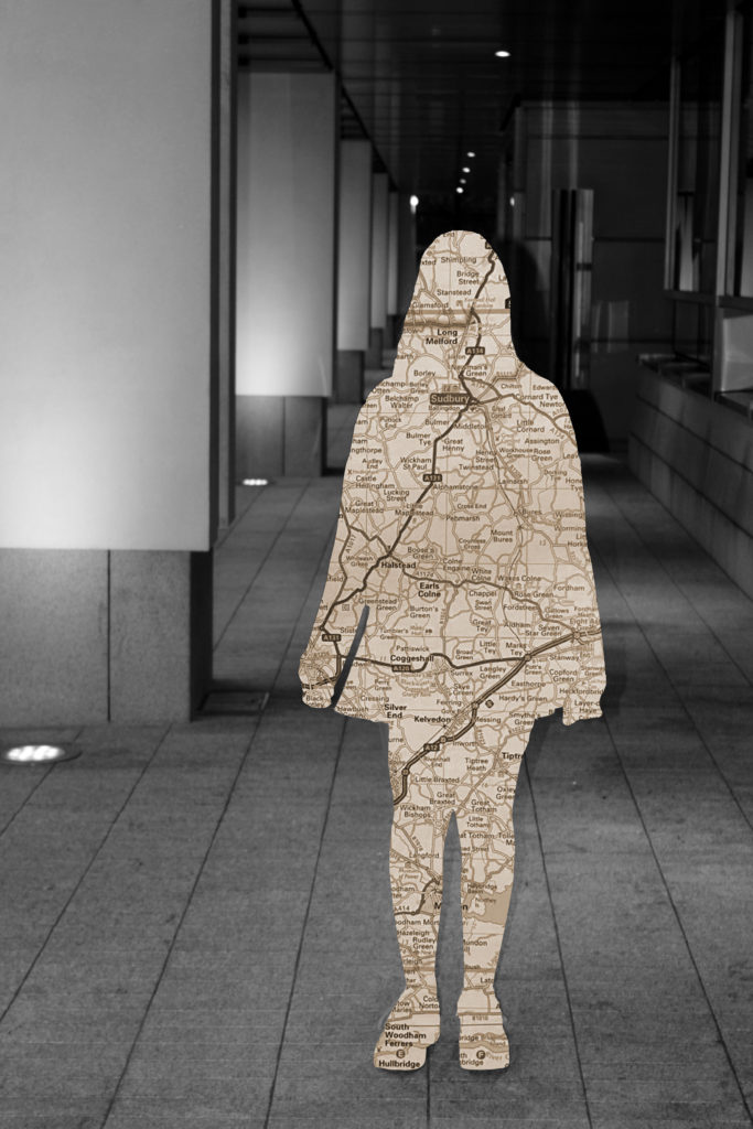
For my final Images I have edited four photographs from each photo-shoot and edited them to resemble Carolle Benitah’s work. Here I am looking at the theme of geographical identity by using photographs of my friends who’s families originated from all over the UK then moved to Jersey. I did this as I wanted to show how our small island is capable of occupying a mass amount of identities that have been shaped and influenced by different types of cultures and economic environments. In addition, I also wanted to signify the way in which Jersey has unified so many people from these drastically changing backgrounds. With this aim in mind, I have used Benitah’s style of edited and cut out the subjects of the photographs and replaced them with map images, edited into a sepia tone, containing the places their families were originally from.

This image displays two of my friends with St. Ouen as the background setting representing the geographical identity of Jersey. The subject on the left, Robyn, has family that before moving to Jersey lived in Coventry, which is displayed within the map replacing her silhouette. Macy, the subject on the left, has family originally from areas in and around York, also presented in the map of her cut out.

This image of my friend India, within the rural setting of St. Ouen, showcases her geographical identity by displaying a map of Birmingham and its outskirts. This is as this was the place in which some of her family lived in before Jersey.

This Image with the background of an unruly tree located in St. Ouen, displays again my friend Robyn as the subject with the area of Coventry as her geographical identity. I believe this setting worked well to display my take on identity as we often refer to our backgrounds as our ‘roots’ and I believe that the roads within the maps best represent this, in both the literal and metaphorical sense.

This image displays three of my friends with St. Ouen as the background setting, showing Jersey’s rural side. On the left again is my friend Macy with a map of the areas surrounding York to showcase her heritage. The subject in the center is my friend Bella with North wales signifying her background.

IDENTITY AND PLACE

Identity to me is the idea of how you present yourself as your own person, shaped by family, past events and simply how you view yourself. Over time, the broadness of how people present their identity has expanded.

Carolle Benitah

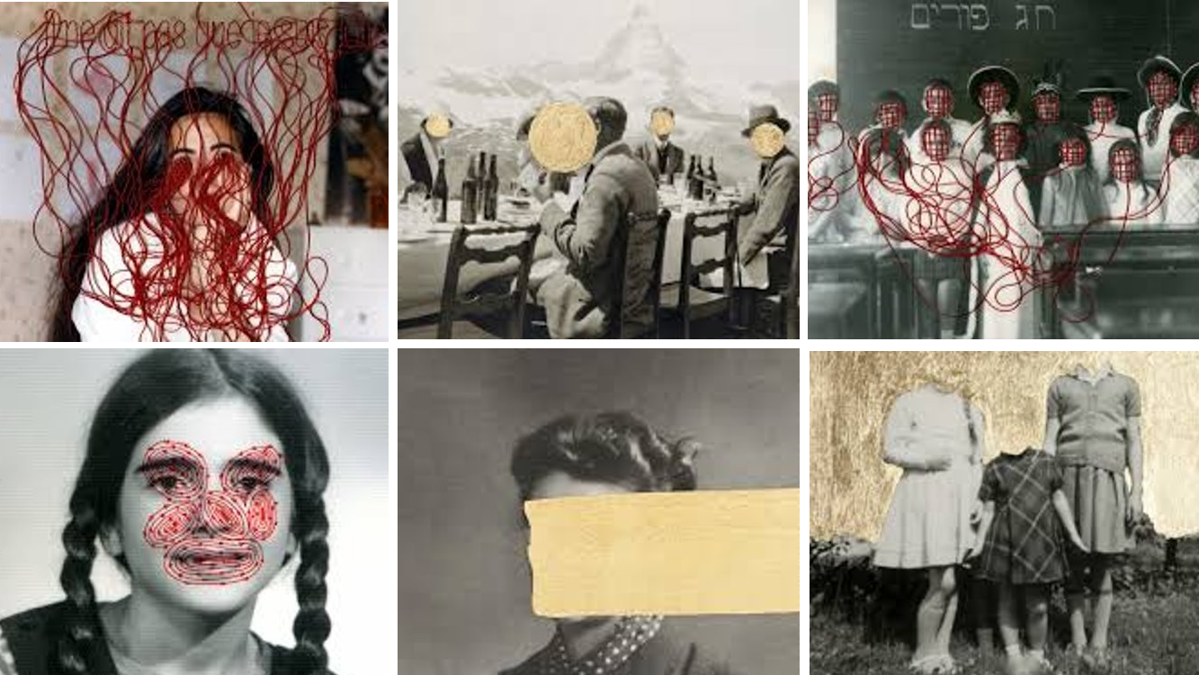
Benitah was a French visual artist who worked for ten years as a fashion designer before turning to photography in 2001, exploring memory, family and the passage of time.  Often pairing old family snapshots with handmade accents, such as embroidery, beading and ink drawings, Benitah seeks to reinterpret her own history as daughter, wife, and mother.

Through covering faces and different features, the people in the photographs have had their identity’s almost stripped from them. I chose to study Benitah as I feel that her art best represents the concept I hope to capture within this project.

all photos by Carolle Benitah

Initial idea

To me, knowing and having your own identity is the most important thing to a person. However, there are some cases where your identity is ignored and covered. I will be exploring a veterans past events within the army and how serving effected the lack of identity he had. To mimic Benitah’s work, I will be editing my photos in with the purpose of concealing his face to convey the concealed identity he had during his war career.

My Response

Photo shoot 1

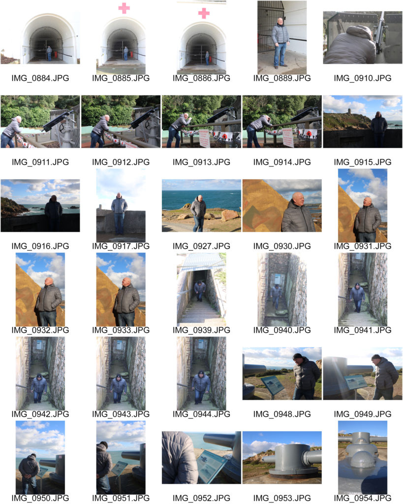
For my first photo shoot, I will incorporate both geographical ideas into one. As the veteran carried out his training in England, there are no staple landmarks at our disposal. Instead we will go to multiple locations which are landmarks for the occupation in WWII. We will visit where the Royal Artillery regiment were located during the war as that is the regiment the model was apart if when fighting in the Falkland war. We will carry out the photo shoot when the weather is clear.

Photo shoot 2

Whilst out completing the first photo shoot, we will also take the opportunity to take portraits of the model with various background. This will hopefully be on the same day so then the weather is consistent over the photo shoots.

Editing and choosing photos

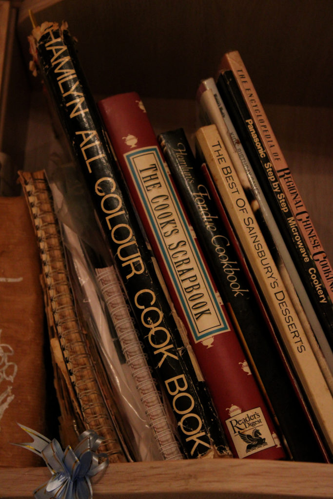
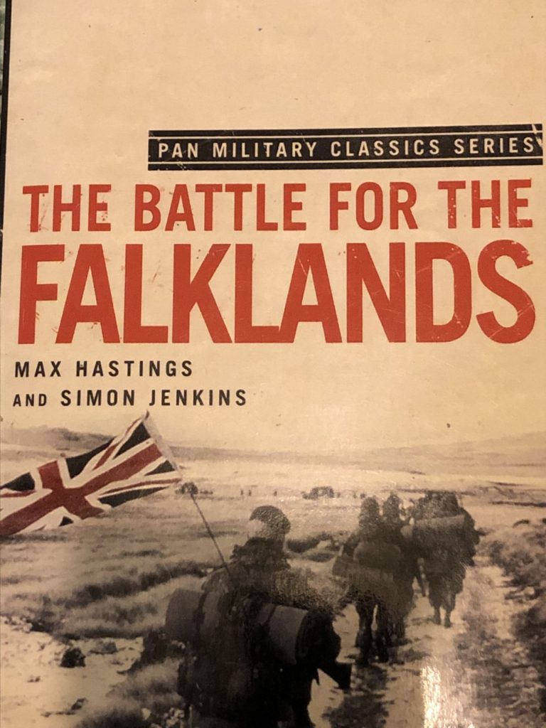
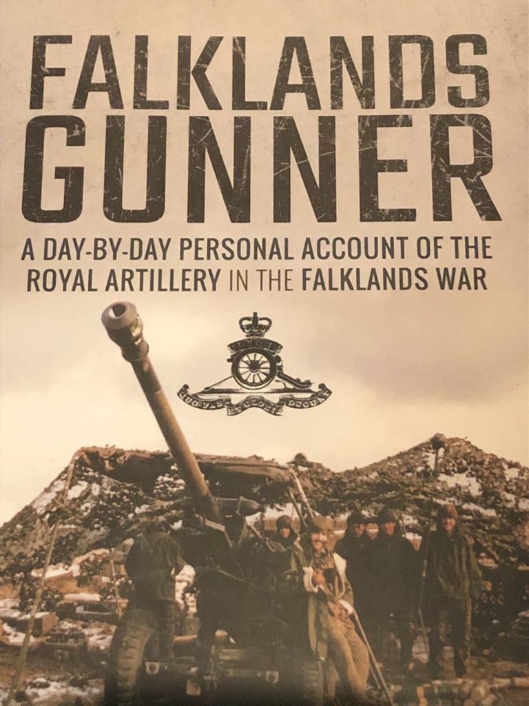
I took photos of book covers to in cooperate with editing my final photos. I also found the newspaper article announcing his leave and thought i could create a comparison concept.

Hand Edits

Photoshop editing

Photo evaluation

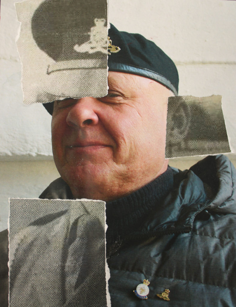
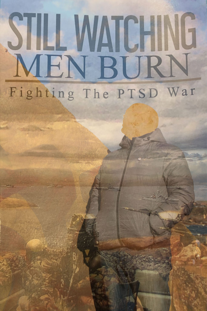
i chose this image as one of my final photos because not only it explores the lack of identity within the model, it ties in with the after effects of war on mental health. I feel like this links in with identity as the ‘PTSD war’ reflects on how veterans are still apart of a constant battle which has been burnt into their perspective of who they are. I used a cutting tool to remove the face in response to Benitah’s work. This works well as the missing face can be seen in many ways. For me, when i see the missing face, i think of the fact that the veteran didn’t have a clear grasp of his identity in the past and it is reflected onto his present self, being in a state of feeling stuck in his past, preventing him to reinvent his new identity.

As a starting photo, i chose a photo of the model looking up. This is because the book cover i used to edit, contains an image from the war at the bottom of the cover. The fact that the veteran is looking away from the past image conveys resistance of him looking back at his old, hidden identity and wanting to look beyond the low point in hopes of reinvention in the future.

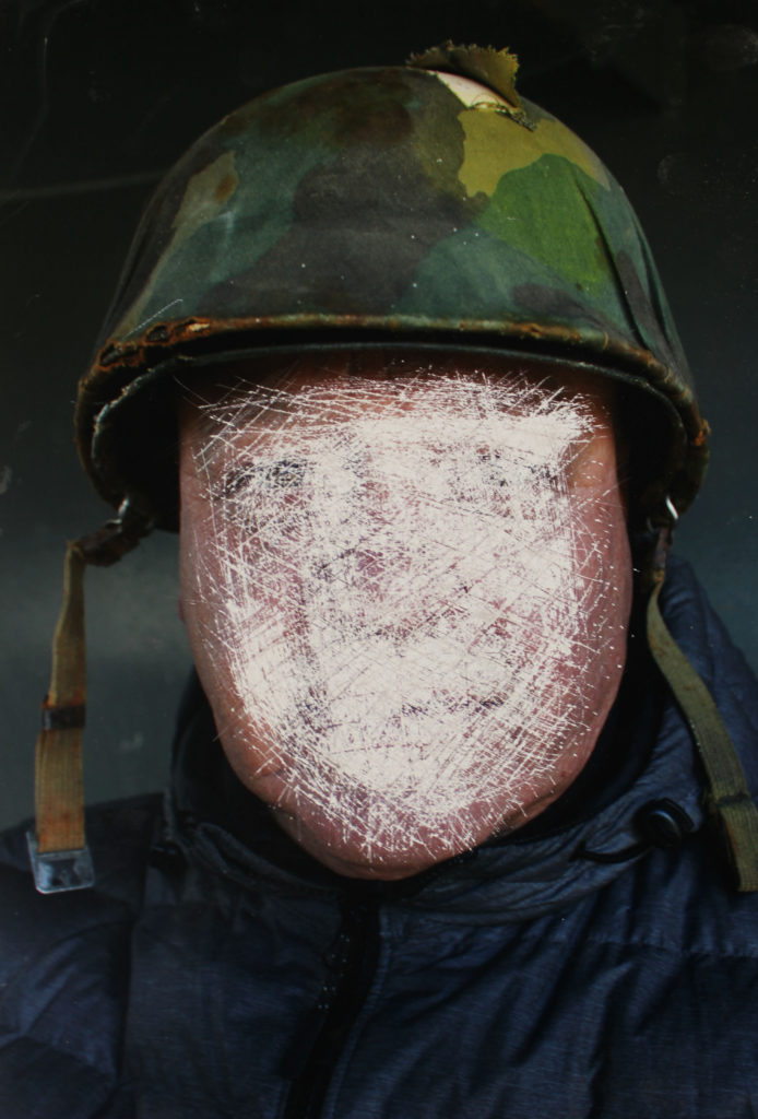
To edit this photo, i started by printing off the original image onto gloss paper as the texture would make it easier to smudge the paints over. This photo was taken at a bunker site at the same place equipment was kept involving the Royal Artillery. This location is important to the purpose of my editing. When smudging the paint, it looked to me like the model we being blended into the location ( that being a site for the RA ). This presents identity in a peculiar way as i tried to present that his identity will always be blended to the RA. The editing style was inspired by the way Benitah hand edited her photos through sewing and painting.
Being apart of the RA was very important to veteran as even though he was struggling with his identity as well as others. He loved the feeling of being apart of something bigger than himself. This is why i kept the image with a bright tone and used white paint to show that even through the hard moments, this particular event also had positive effect of how he reflects on his growth and how far is identity has developed.
IDENTITY AND PLACE – PHOTOSHOOT 2

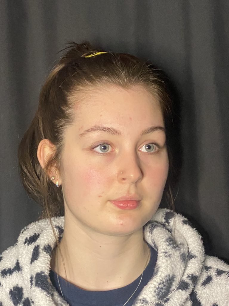
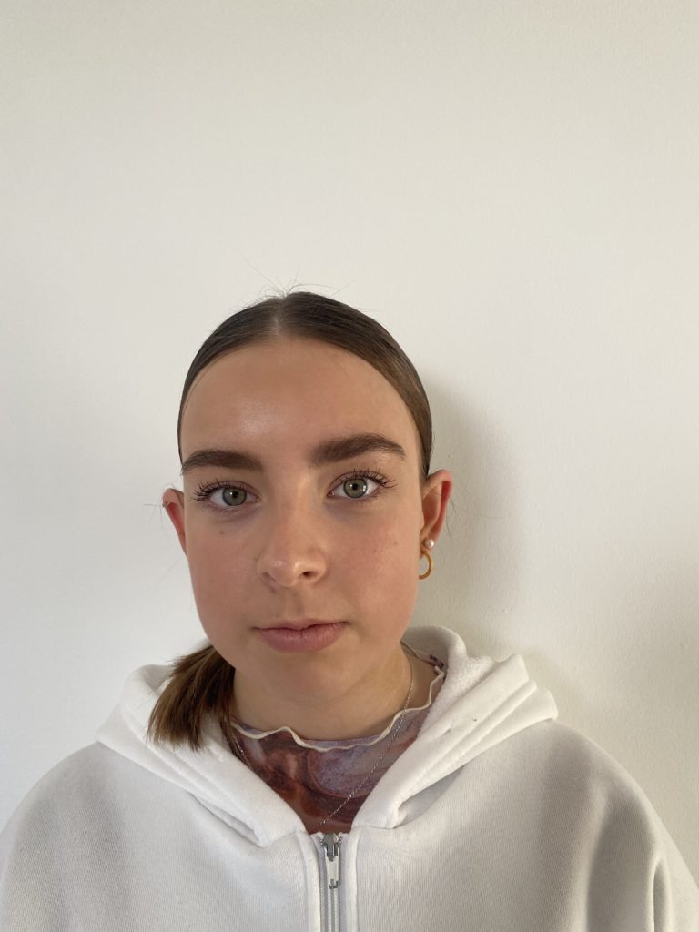
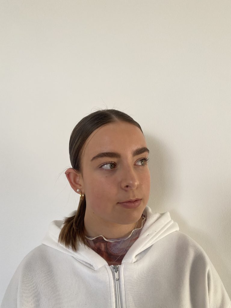
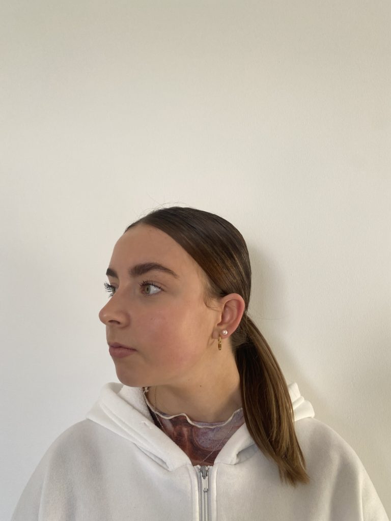
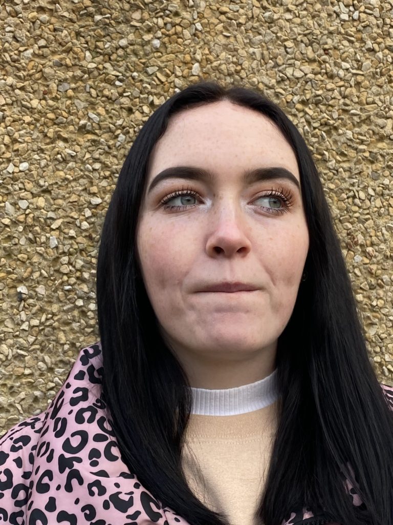
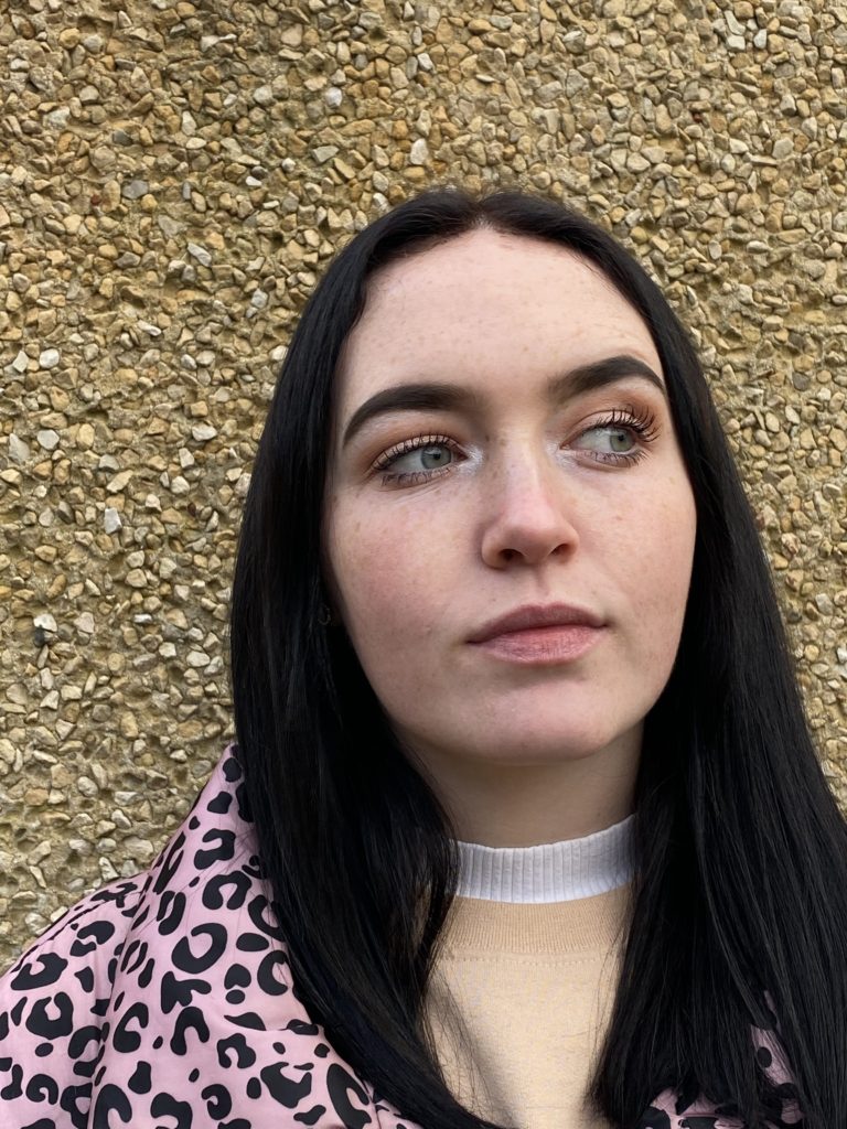
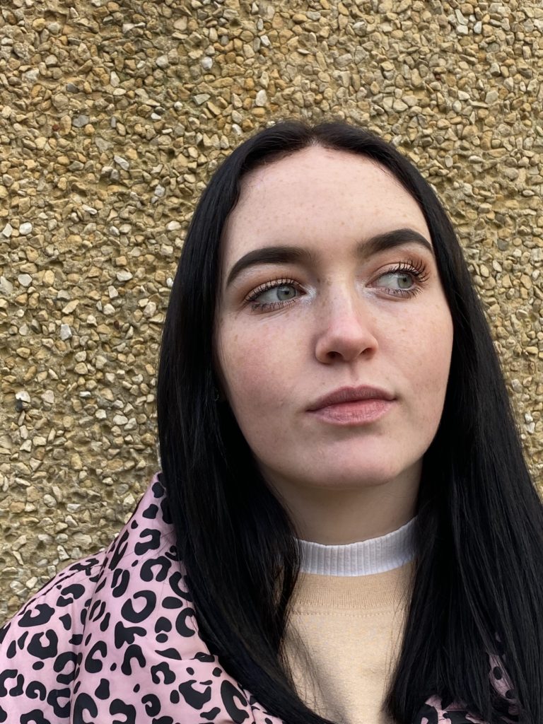
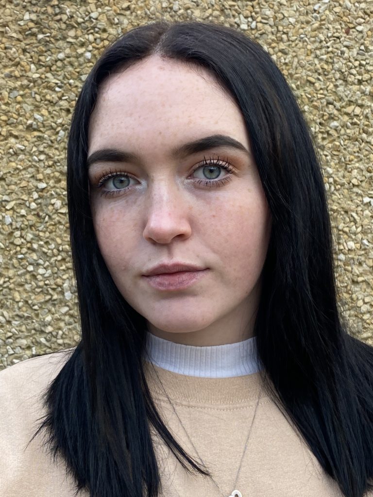
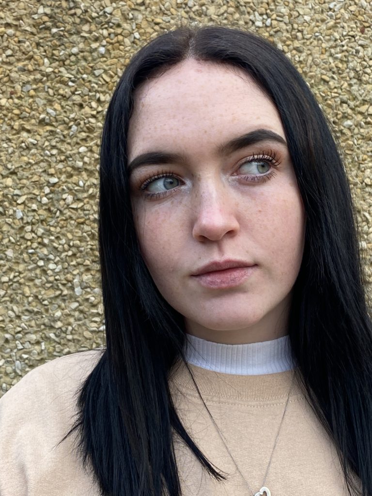
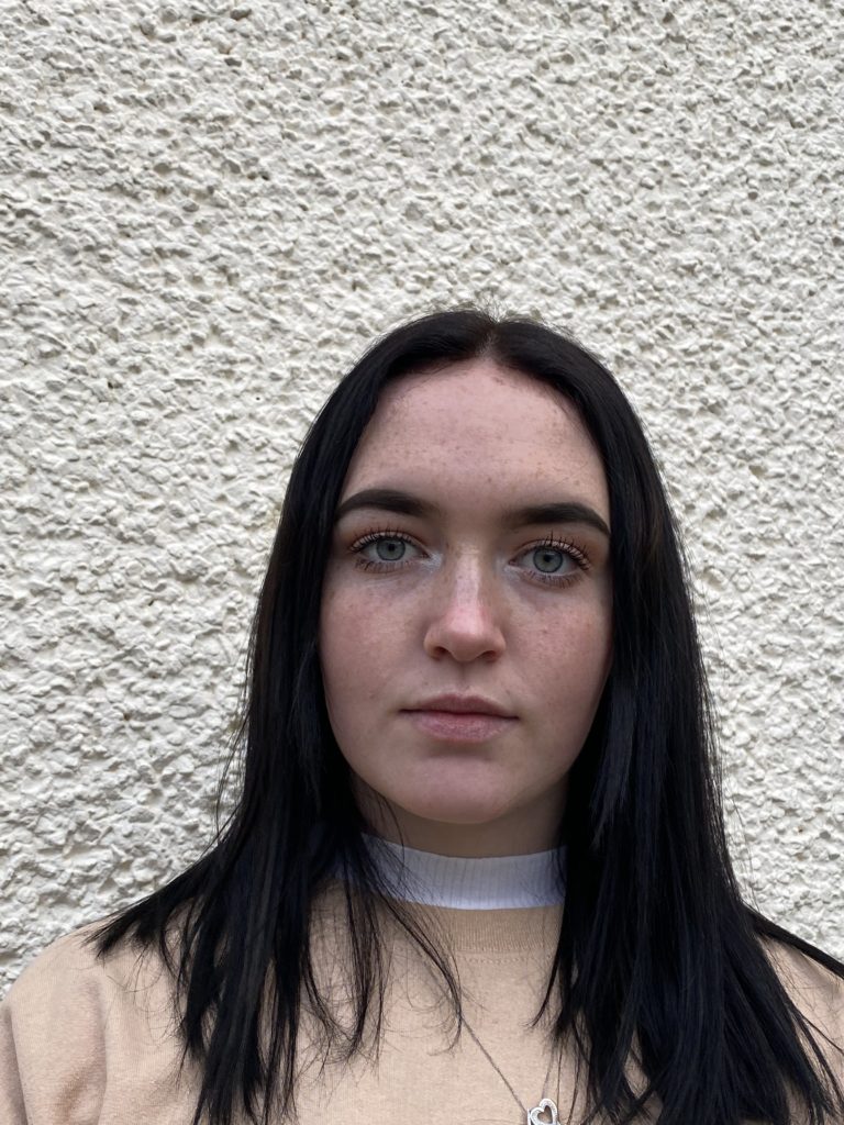
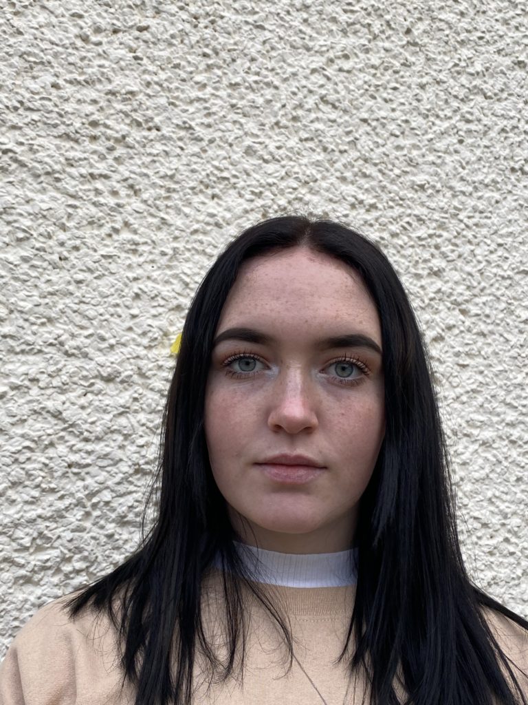
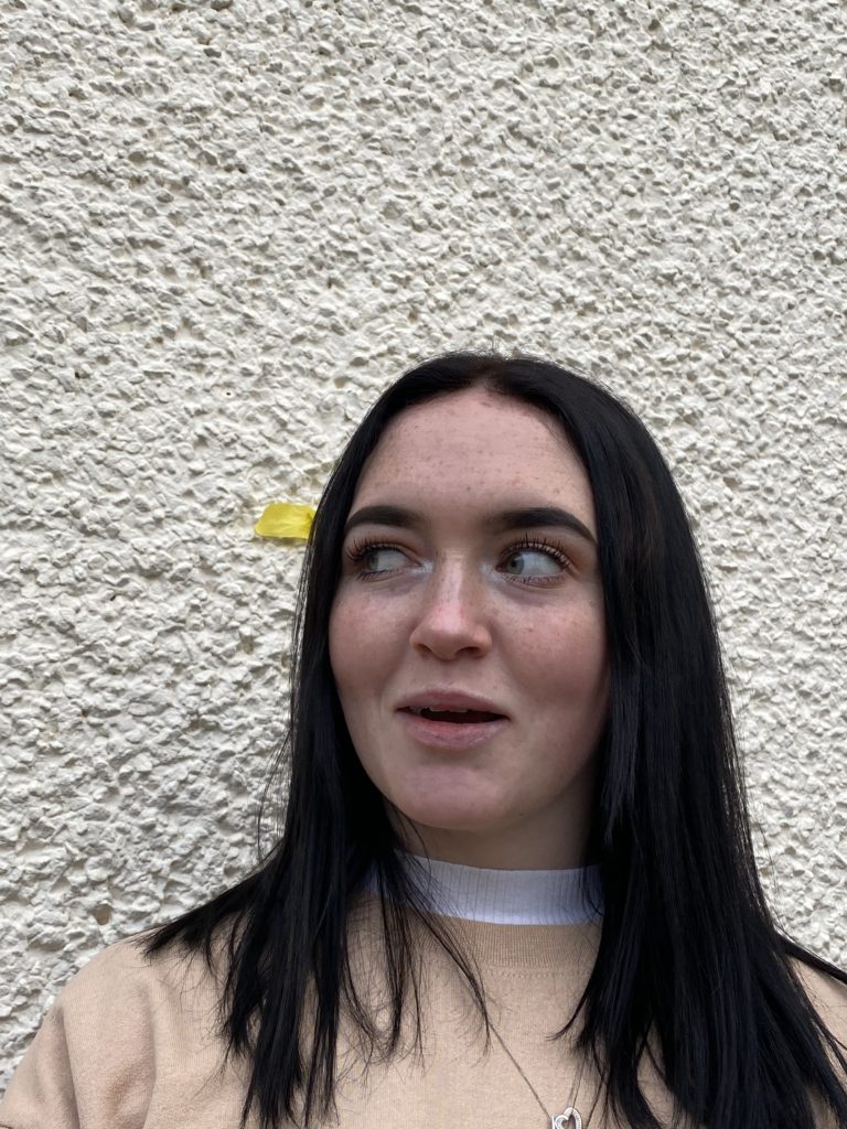
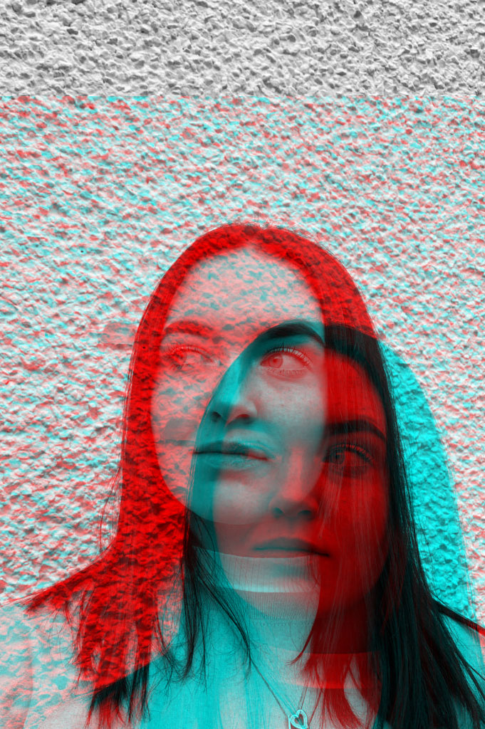
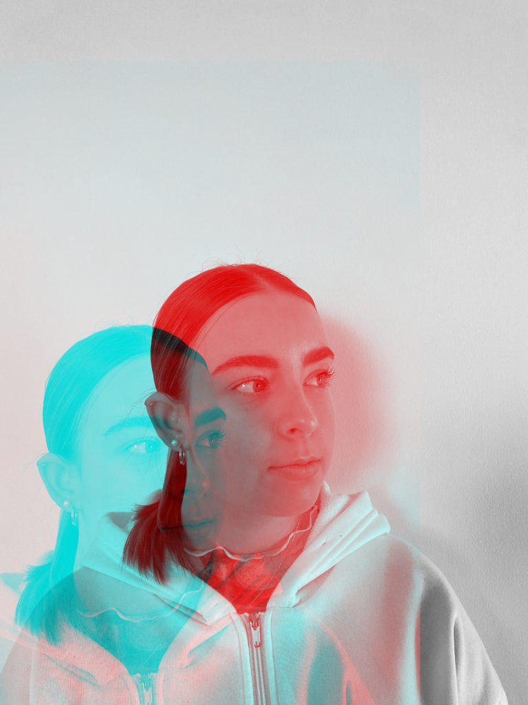
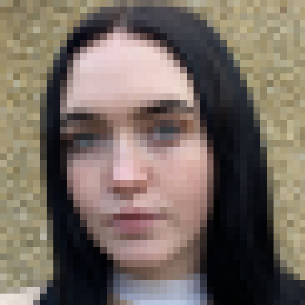
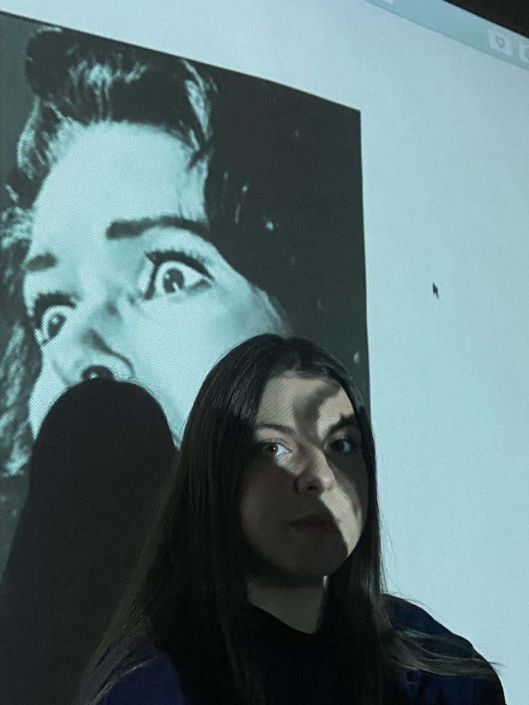
These photos i’m going to take have been self inspired through doing research on several different artist and taking ideas from individual ones. I have decided to take head shot photographs and i’m going to work and edit them in Photoshop to change them and adapt them to the topic of identity. With these images below i’m am going to use Photoshop to disguise the models face to hide their identity.

Idea 1:

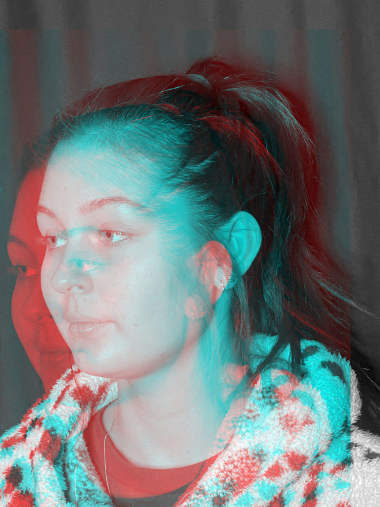
For this idea I decided to open up several of my best images in Photoshop. First of all I started by duplicating the layer then went to the blending options and unticked the green and red colours. Finally I moved one of the layers to a slight angle and it created this effect. I feel that this worked well as it hides the identity of the model as it shows a second picture of the same person creating the thought of mystery

Idea 2:

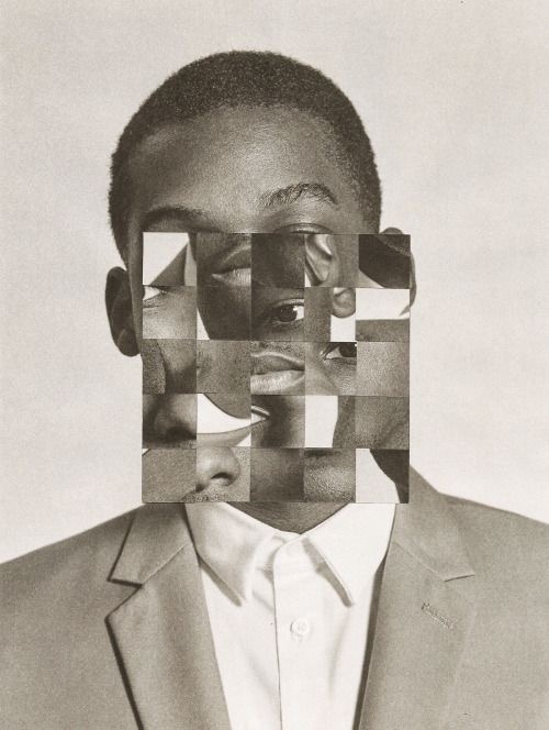
For this idea I decided to use Photoshop to crop the photographs to a square. Then I duplicated the layer and converted it to a smart object this therefor this allowed me to use the filters and develop my photos using the mosaic filter.Overall I feel that this worked well however it may have been better if I changed the photos to black and white by desaturating them in Photoshop first before i started to edit the images.

Idea 3:

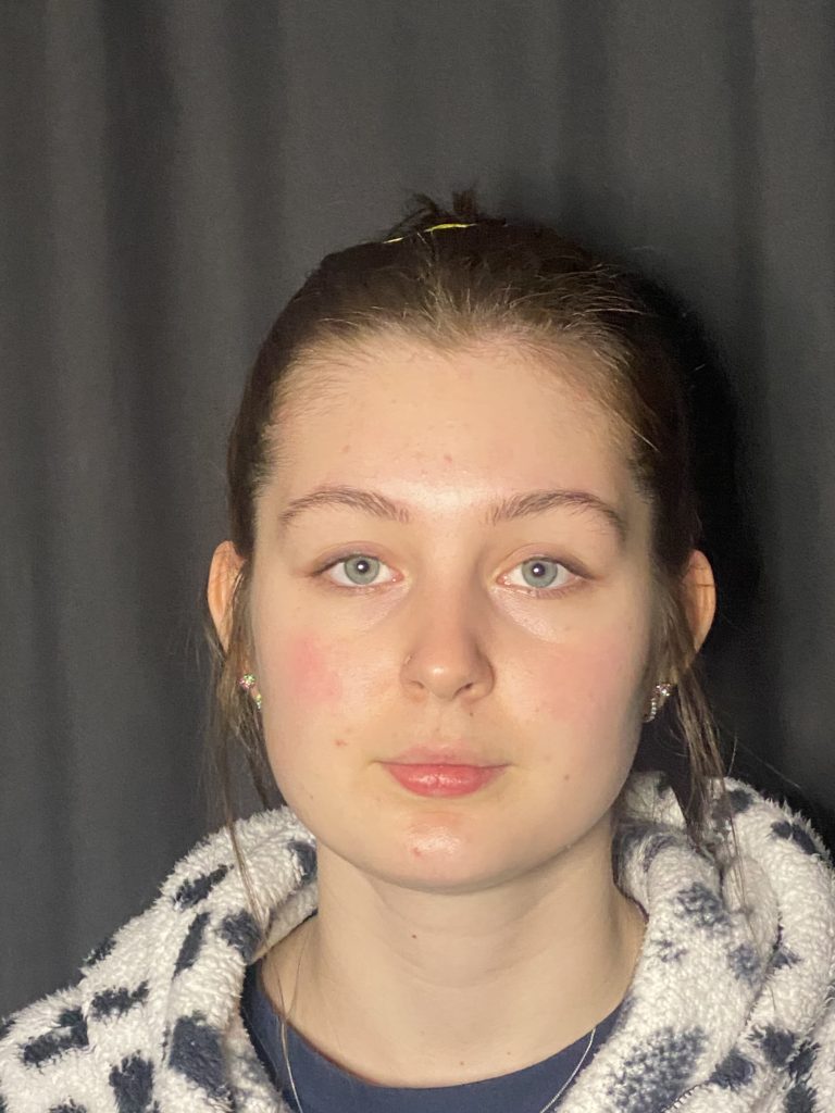
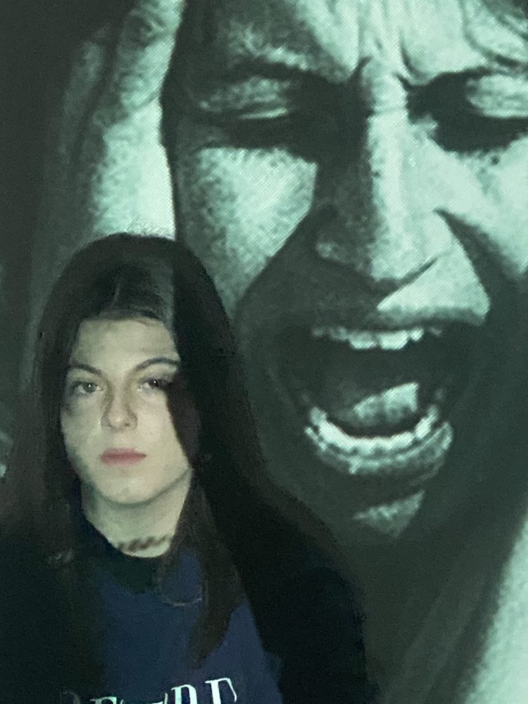
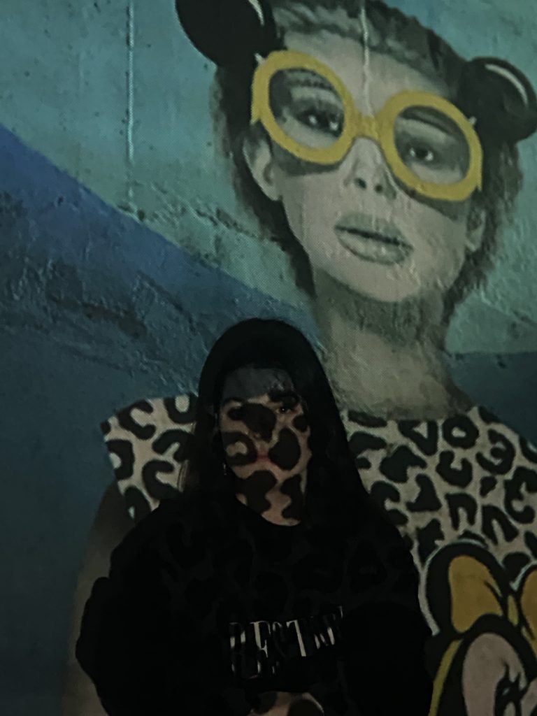
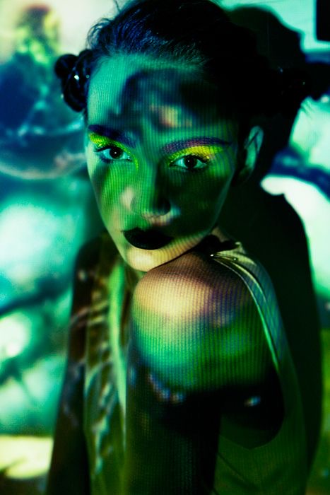
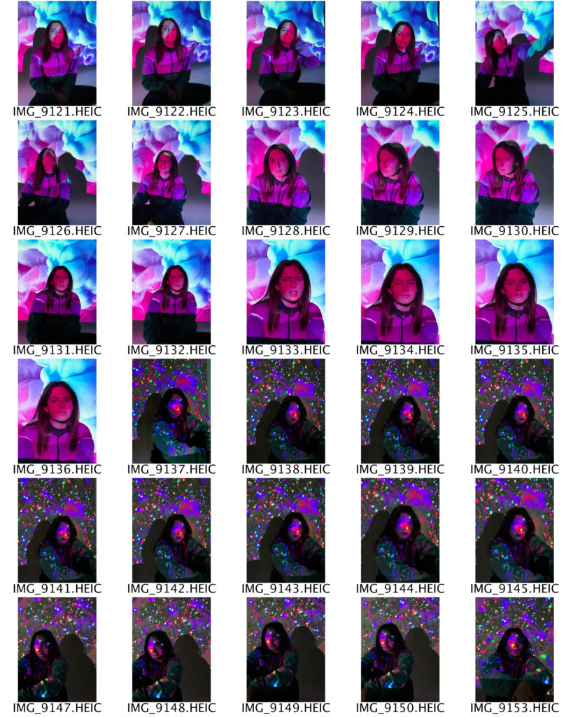
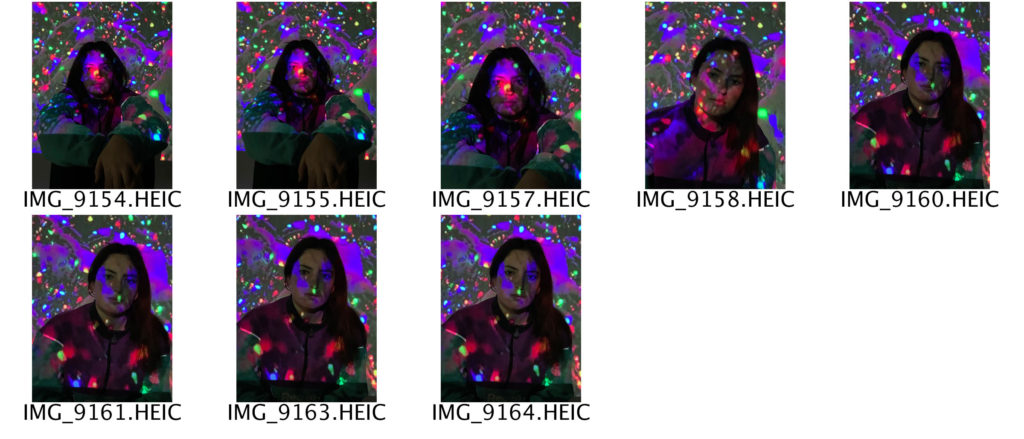
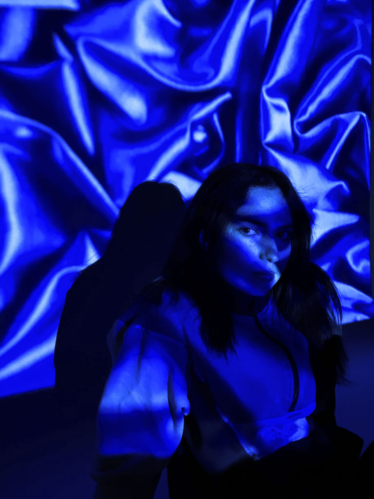
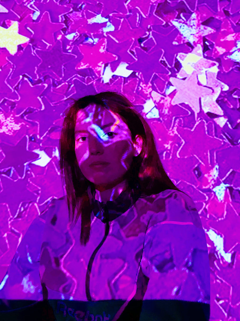
For these images below I tried to experiment by using a hand held projector which I feel worked well to a certain extent as they way in which the projected disguises the models face reflects that it could be hiding her identity. However if I was to do this again I would project different images onto the wall as the ones in which I chose were all quite dark making the tones not stand out as well as they could have been.

identity and place shoot 2

INITIAL IDEAS

My idea for my second shoot is to explore the theme of gender identity. In order to portray this theme effectively, my plan is to use a handheld projector to project different images onto my subject’s face and body. After I have printed these images out, I will use a needle and various colours of thread to sew around different parts of the photograph. I think that this will be a successful way to show the concept of gender identity because I will be able to portray how people can choose to hide behind their presumed ‘identity’ in order to conceal who they really are. Additionally, it will also be able to show how members of society can sometimes project their views and opinions on others.

INSPIRATION

FIRST CONTACT SHEETS

For this shoot I used a handheld projector against a plain white background, which helped to create my desired three dimensional effect. I chose and downloaded different images from the internet to project onto my subject because I wanted a range of dark and light tones. Additionally, the different images create contrasting moods and feelings. In order to ensure that my images are the best quality possible, I will edit and adjust some of the colouring on PhotoShop, as well as the sharpness and shadows.

EDITING PROCESS

PHOTOSHOP EDITING

To start with, I adjusted the brightness and contrast on all of my base images until I got an end result that I was happy with. I did this by selecting the image tab at the top of the screen and clicking adjustments, then brightness/contrast. For my second and fourth images, I brought the brightness most of the way down so that the shadows across my subject’s face would be more noticeable. Next, I decided to adjust the vibrance of my images, by selecting the image tab, then adjustments, then vibrance. I did this because I wanted all the colours in my photographs to be brighter. Then, I adjusted the saturation by selecting the image tab, then adjustments, then hue/saturation. I increased the saturation the most in my fourth image, as I wanted the viewer to be able to see the orange-toned colours more clearly. After that, I wanted to change the colour balance of my images. I did this by selecting the image tab, then adjustments, then colour balance. I slid my mouse across all three of the different colour scales until I was happy with the result, and the right colours had been emphasised.

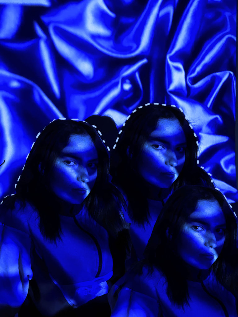
After I had made all the adjustments to my base images, I selected the one which I liked the most to use for my final image. I chose my second image and opened it in PhotoShop. I decided I wanted to duplicate my subject and have three of her all next to one another. To do this I selected the layer on the right hand side of my screen and duplicated it by pressing control c. Now that I had two layers I selected the new one and used the object selection tool to pick out my subject. I then copied the area outlined by the object selection tool and pasted it onto my background layer. I did this once more to get three subjects, and I then moved and adjusted them until I got an end result that I was happy with.

After I had finished duplicating my subject and arranged them into the position I wanted, I decided to add something else to my image so that it wouldn’t just be plain. I selected the brush tool and changed the size and hardness using the corresponding scales at the top of my screen. I then selected the soft round brush from the different options. I used the eyedropper tool to sample one of the colours from my image; I chose a pale blue colour which is as close to white as I could find. I began to trace the outline of my subjects with the brush, making small horizontal dashes which were close together. To finish, I adjusted the sharpness of the photograph by selecting the filter tab, then sharpen.

FINAL IMAGE

identity and place shoot 1

INITIAL IDEAS

My idea for this first shoot is to explore the concept of identity loss. In order to portray this theme effectively, my plan is to create a collage of my subject’s face using different materials such as old photographs, newspaper and magazine clippings, and paint. I think that this will be a successful way of showing identity loss as the end result will be an accumulation of many different factors, but it will also show how confusing identity can sometimes be, and that it is not just made up of one thing. Additionally, it will allow me to present various creative skills and ideas.
INSPIRATION

FIRST CONTACT SHEETS

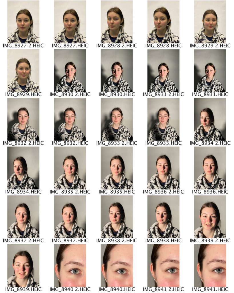
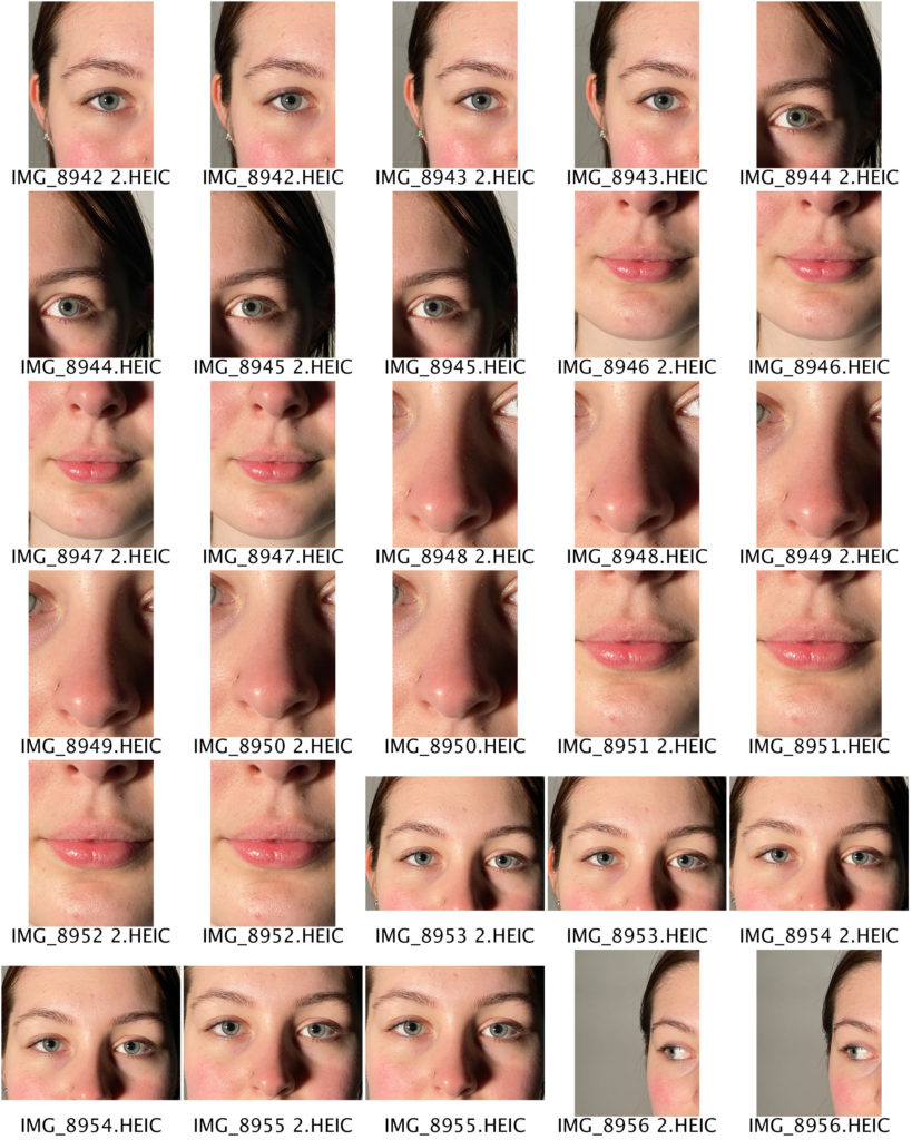
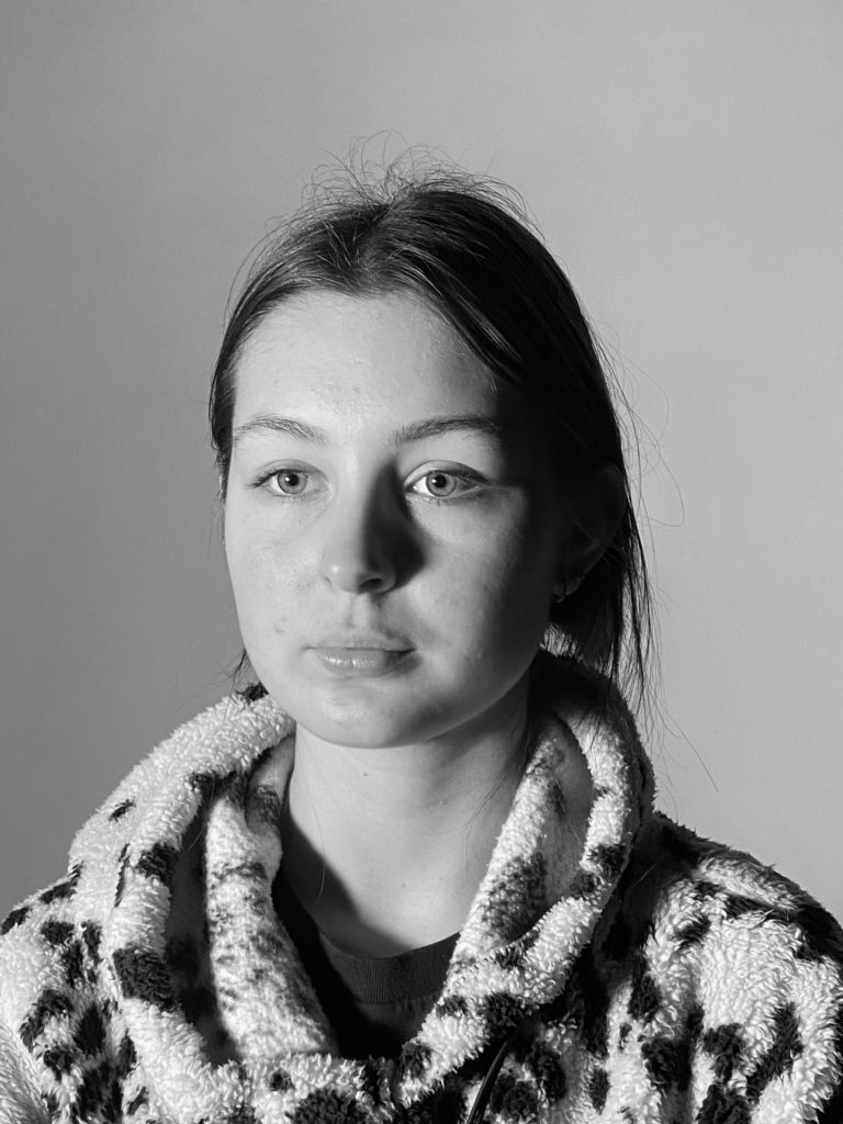
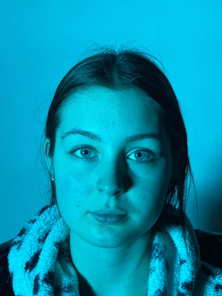
For this shoot I took some normal headshots which I will use as the base / background for my collage. I took these using different colour plastic sheets over an L.E.D light so that I would have a variety of images to work with. I then photographed close up images of my subject’s face, which I will cut out and arrange in different shapes, patterns, and orders over the base to create the look that I am aiming for. I will edit some of the photographs on PhotoShop into a black and white effect so each collage has a unique look and feel.

EDITING PROCESS

COLLAGE MAKING

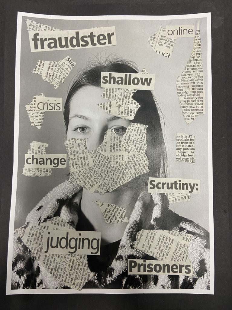
Firstly, I printed out some of the various close-up images I took of my subject’s face, and cut them up into squares and rectangles. I then printed out the pre-selected three black and white base photos. I experimented with placing and layering the close-up images on the bases, using a mixture of black and white, normal, and the two different colour options. I did this for about half an hour before I decided to try another idea, as I didn’t feel that it was going to plan. I looked through different newspapers to try and find different buzzwords which could relate to identity loss. The words that I found were; ‘nightmares, prisoners, shallow, change, madness, crisis, online, oddity, scrutiny, fraudster, images, judging‘. I then ripped out pages of the newspaper which were covered in text to use to mask my subject’s face. I experimented with the placement of the newspaper, originally deciding to cover their whole face, but after trying several different options, I decided to only cover the bottom half and a little bit on the right hand side, leaving their eyes completely exposed. After I had glued down the newspaper, I arranged the cut out words around my subject’s face and tested different angles and placements until I was happy with the final result. I then cut out a piece of plain black card which I used to back my piece.

FINAL PIECE

Identity and Place – editing and experimentations

I will test and try out different methods of editing my photographs, in order to see which best suits my ideas of identity and place, using Carolle Benitah as inspiration.

Photoshop Experimentation

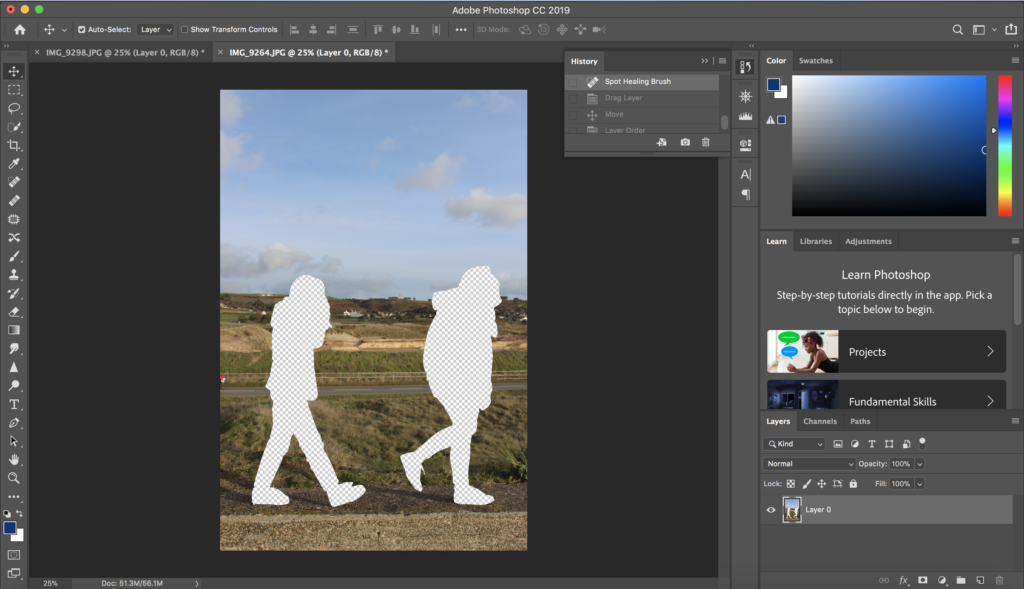
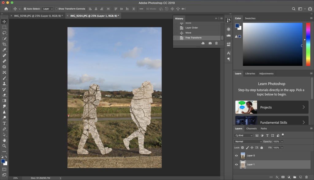
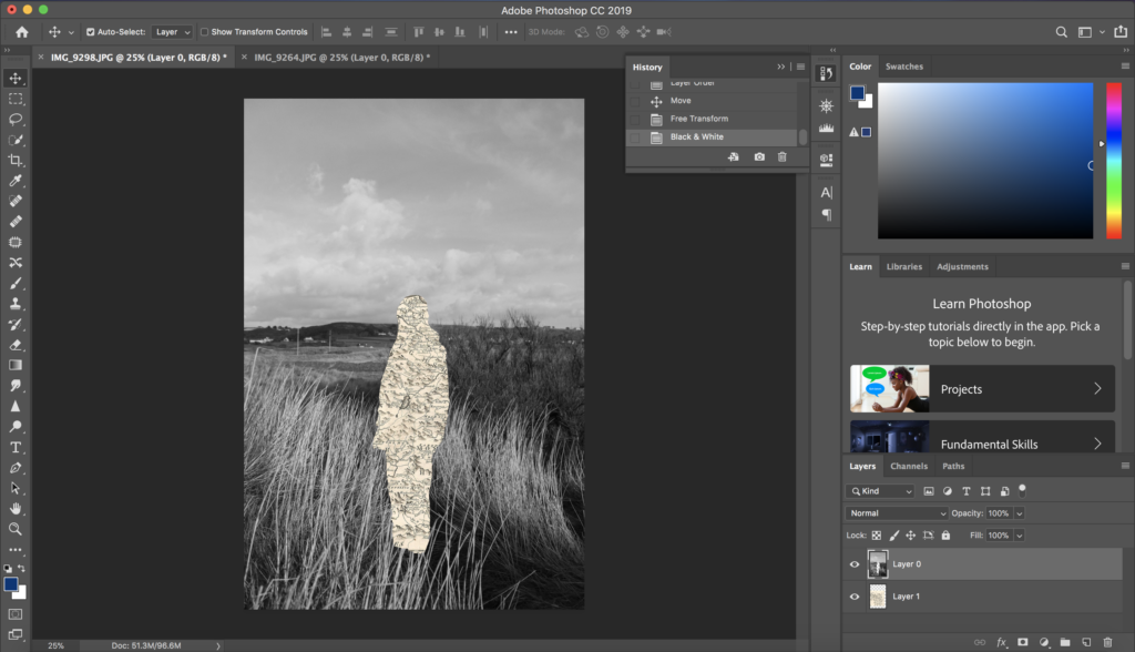
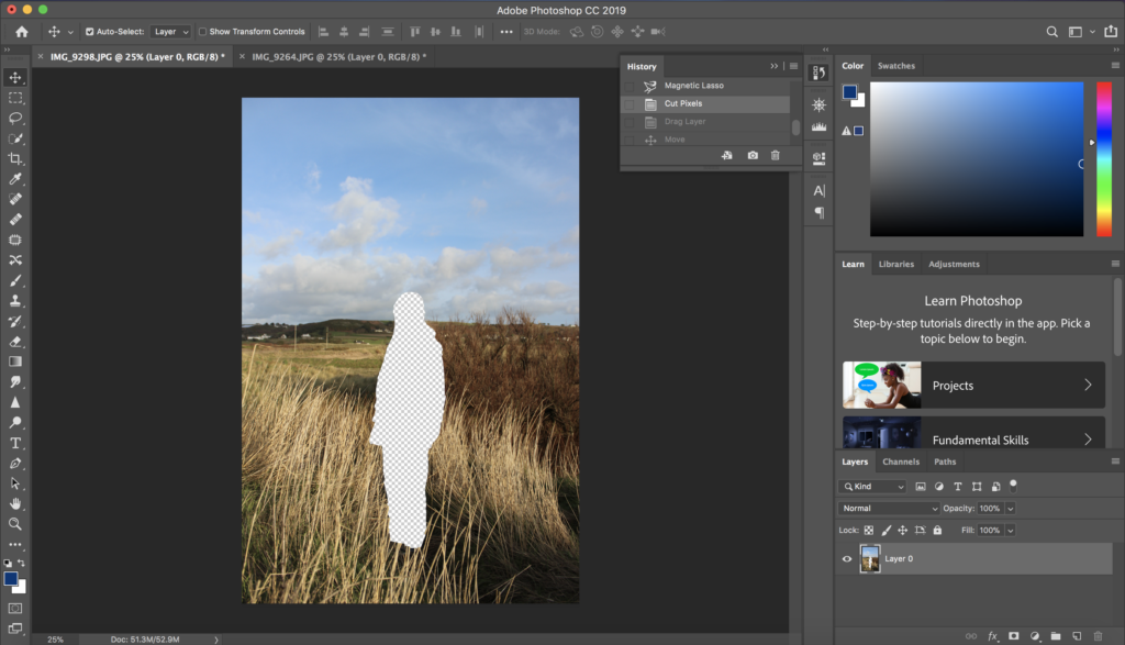
In Photoshop I attempted to practice editing my photographs in the style of Carolle Benitah. I did this by using the magnetic lasso tool to cut out the shape of the subject in the image, and then layering a plain sepia toned piece of paper underneath it, to show a link to her themes of loss of identity. I then also converted the original image into black and white, also similar to Benitah’s work, allowing for a contrast between the image and the cut out section.

Next, I followed the same method of cutting out the subject with the magnetic lasso tool, in the style of Benitah, but instead of layering a plain background underneath I played around with my idea of identity and place and used sepia toned maps instead. These map images used link to the subject in the image, as it displays the place their families came from before Jersey.

Hand Experimentation

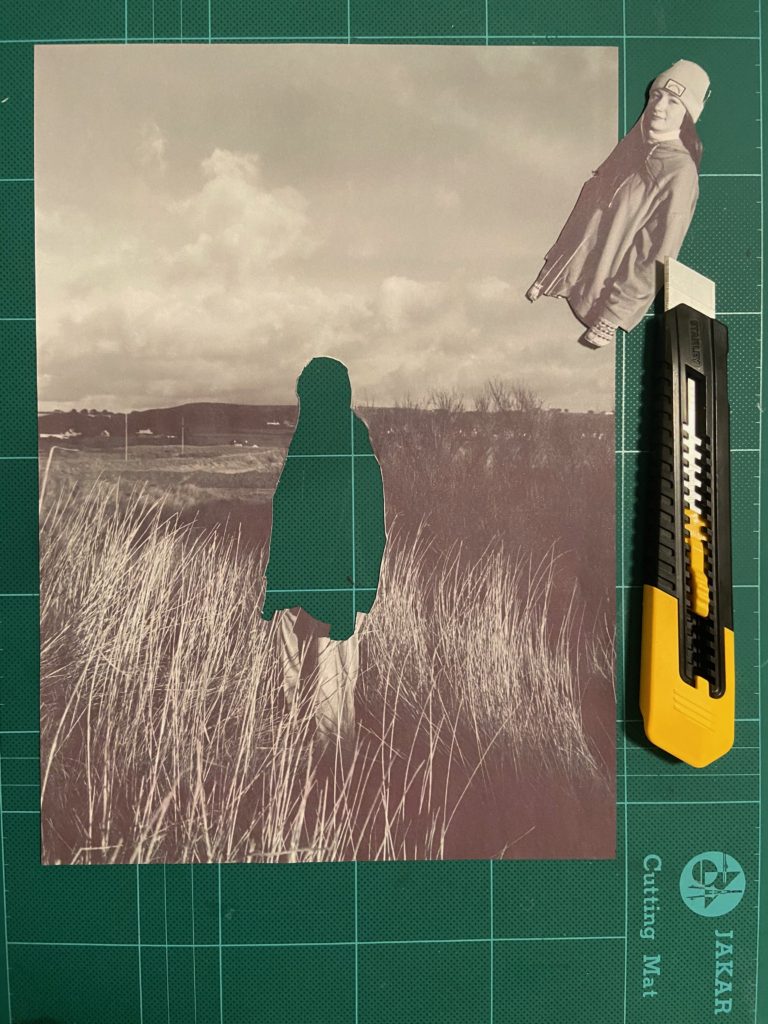
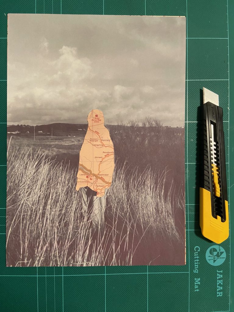
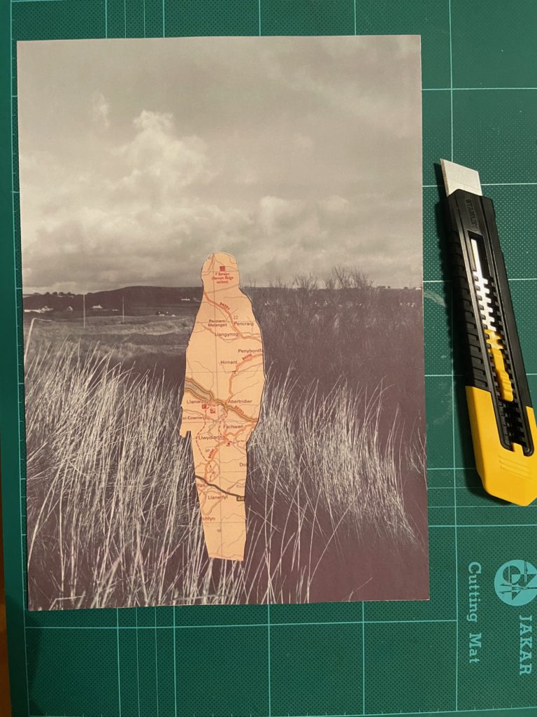
I also tried printing off my photographs in a black and white, then cutting out the subjects by hand using a craft knife, as this is similar to the method Benitah used to create her final pieces. I then printed of my map images that relate to the subjects identity, and layered them underneath the cut out sections.

I think for my final pieces I will use the Photoshop method of editing my images. This is as even though the hand cutting out method links more to Benitah, I will be able to produce a more precise and neater final product with Photoshop.