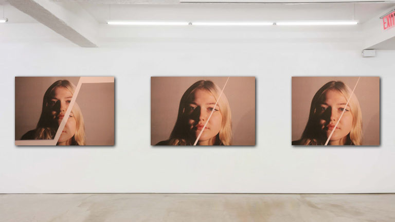
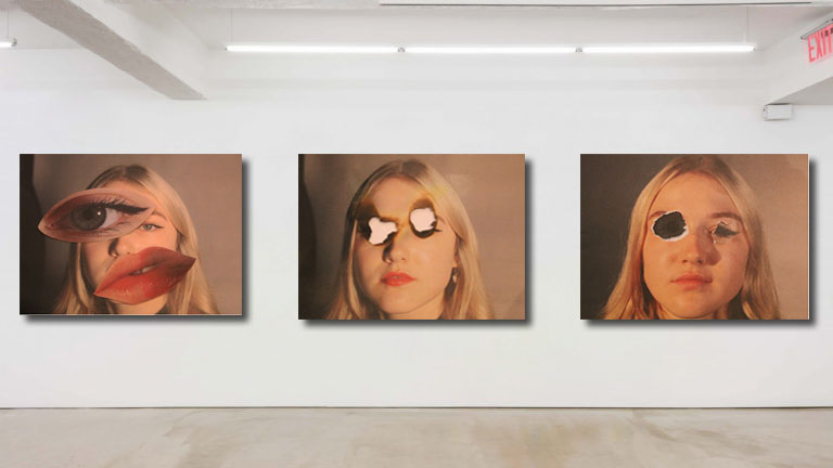
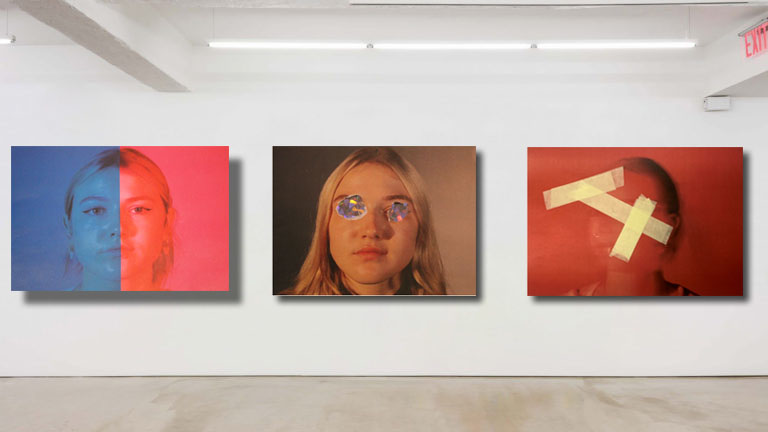
Hobbies

CONTROLLED CONDITIONS

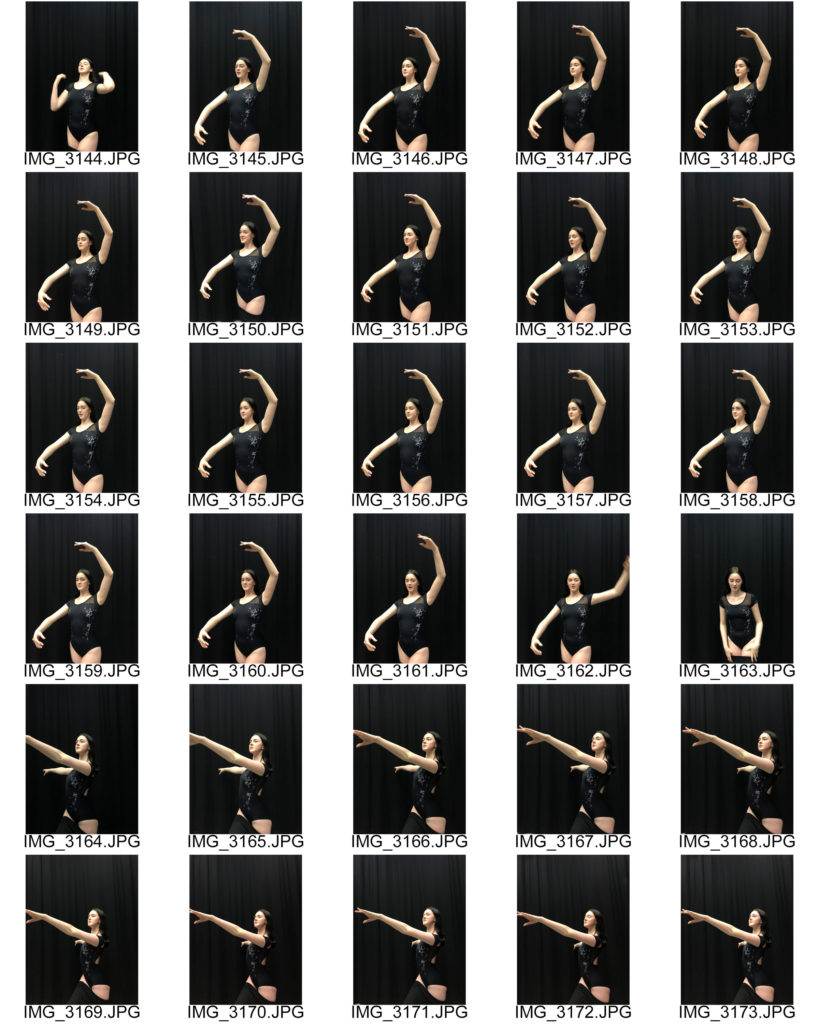
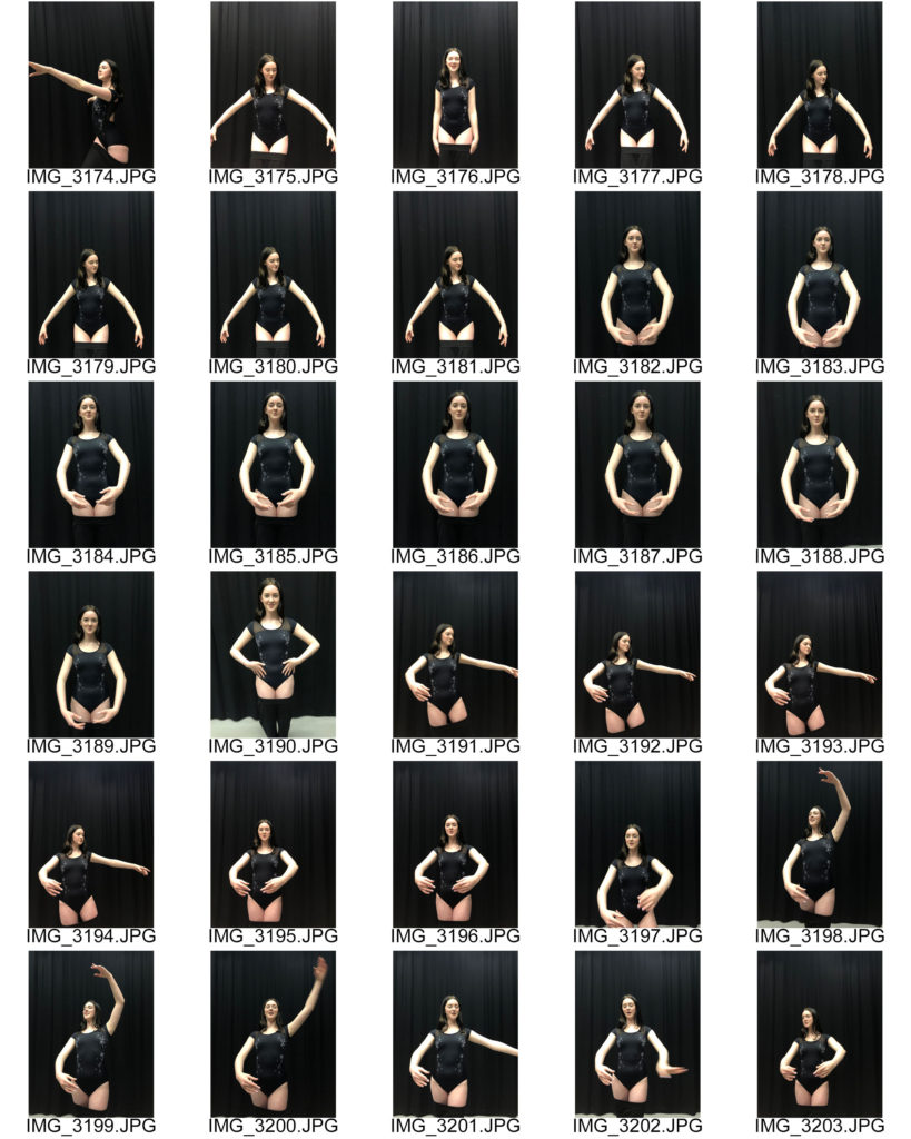
I’ve danced for as long as I remember, it became a part of me, going home after school to then have a snack then into my dance kit ready for dance where my mum would drop me off. When I got older I would walk to the dance studio with my friends after school and sit there stretching and get ready together for our dance lesson as we were so keen and excided to learn a new dance but then I moved away and I lost that connection with my friends, I lost part of my passion when I left.

Mood Board
Mindmap

Case Study

Darian Volkova

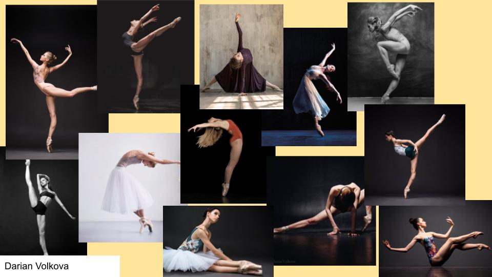
Darian Volkova is know well in the ballet world, she is a a Russian ballet photographer, ex-ballerina and a continuous explorer of the unique field of ballet photography. With her good knowledge of ballet she uses this to this to get the people she takes the photos of to get the dancer to use certain lines of choreography to get excellent photos with beautiful dynamics in the images. She teaches people how to make the best ballet photo and how much work goes into placing ballerina’s body into the proper pose for the best possible ballet photograph. Darian describes herself as a “ballet maniac”, knowing just how to show off a ballerina’s talent through her photos. She followed her childhood dream of becoming a ballerina but also becoming a ballet photographer, and an international ballet spokesperson, bringing her passion to the 160K+ followers of her feed.

As both a photographer and ballet dancer, Darian’s collection gives us an intimate insight into the beautiful art of ballet. Often set in the inspiring atmosphere of Russia’s Saint Petersburg Ballet Theatre, her images capture the stunning movement and graceful lines of her dance troupe. Darian also studies the history of ballet photography, gives lectures, and runs workshops for aspiring ballet photographers.

Photo Shoot
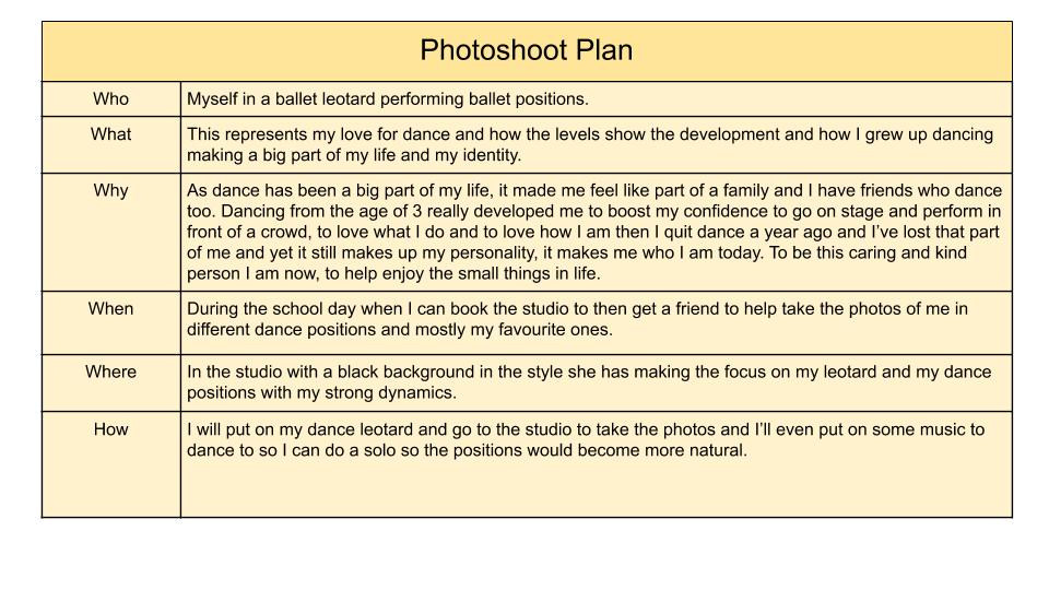
Final outcome
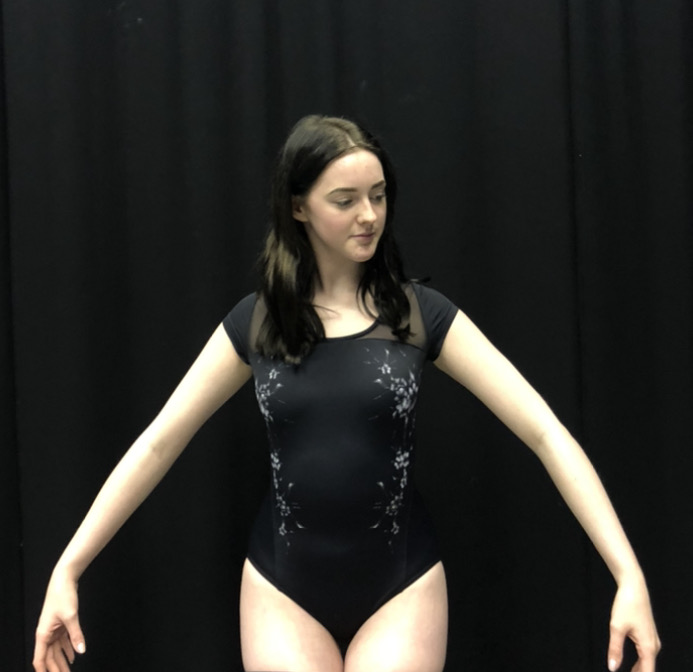
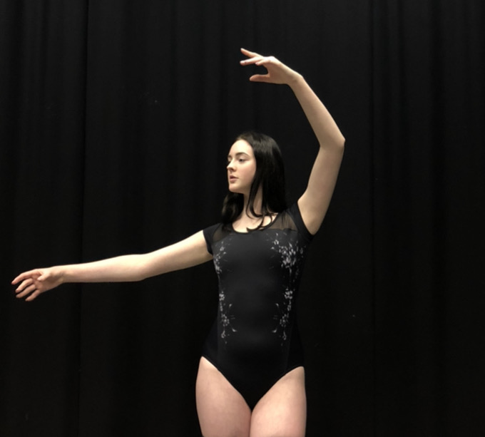
With this image I wanted something that is low and shows how I started small then grew to be a stronger and more improved dancer. I wanted to focus the photos on my arms as they emphasis my dancing ability and I also wanted to use simple dance movements from the photographer as I feel they’re simpler yet more effective in my photos.

In this photo i’m in a more up right position to show the growth in my dance and how I’ve improved so much and how my confidence in my dance has improved so much since when I first started when I was younger. It also emphasises the smaller movements yet it still shows how small things can make a difference which is true to dance.

Friends

CONTROLLED CONDITIONS

Social identity refers to the ways that people’s self-concepts are based on their membership in social groups. Examples include sports teams, religions, nationalities, occupations, sexual orientation, ethnic groups, and gender.

What friends mean to me?

Personally I found it difficult to complete because this part of the jigsaw I feel incomplete on like I haven’t found my group, I’ve been stuck in my own little world to focus on other peoples jigsaws and how they need to complete theirs too. So I have decided not to do anything for this section which just shows that I’m not complete, it will take a while until I do but for now I will except that.

I have lost many friends through my journey and I have made some new ones but when a friend feels like family then you know they are a true friends and someone you should keep in your life. My family had a friend who was like a sister to me but unfortunately she passed away when we she was too young and it tore us all apart, we felt empty and incomplete which is where we have to try fix that gap that she left us yet there was nothing to fill it will so we were all stuck with a hole in our hearts.

Family

CONTROLLED CONDITIONS

The family you were brought up with influences your personality and your identity, the way they bring you up and how they love and support you. With my family they support me on comedy and how my sense of humour should always brighten a room and make the people you care about smile, so throughout my life we use physical comedy to help each other laugh and when someone is feeling down we do something silly to help cheer them up as we hate seeing the people we care about the most in the world be upset.

I chose this photographer because it reflects the happiness my family share and I was inspired on how they use a simple photo and some food to create an effective images which are very comedic.

Mood Board

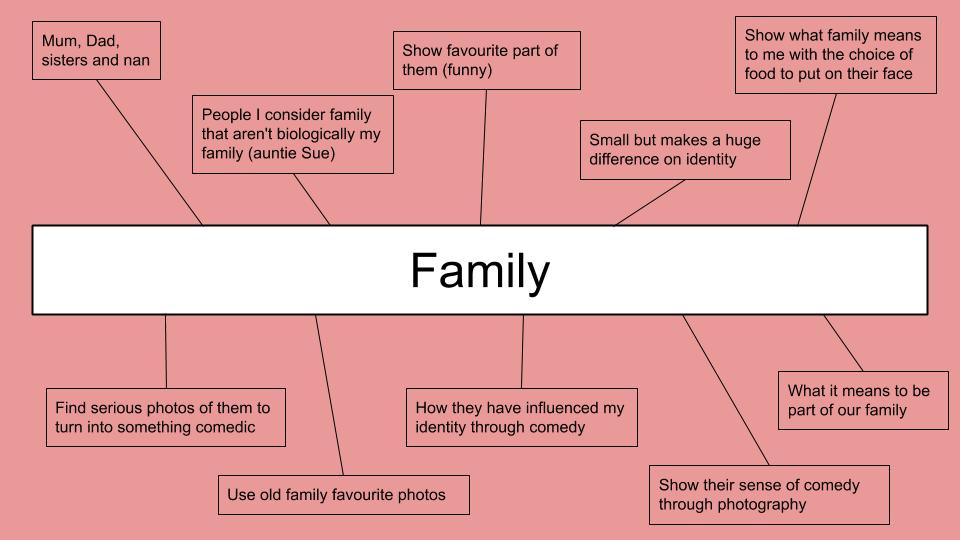
Mindmap

Case Study

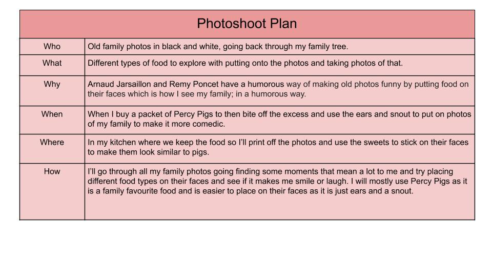
Arnaud Jarsaillon and Remy Poncet

Founded in 2009 and led by Arnaud Jarsaillon a self taught visual artist and musician, Rémy Poncet who graduated from the Fine Arts and also musician and Loris Pernoux who graduated from Gerrit Rietveld Acaedie, the members of Brest Brest Brest collective work exclusively in the fields dedicated to culture and arts. With this they imagined posters bigger than themselves, they were also fond of two-colour printing and direct tone superimpositions. they believe that being aware of what is done in other fields is essential and how they observe that graphic design is becoming more and more a cross-cutting area.

Photo Shoot

Final outcome

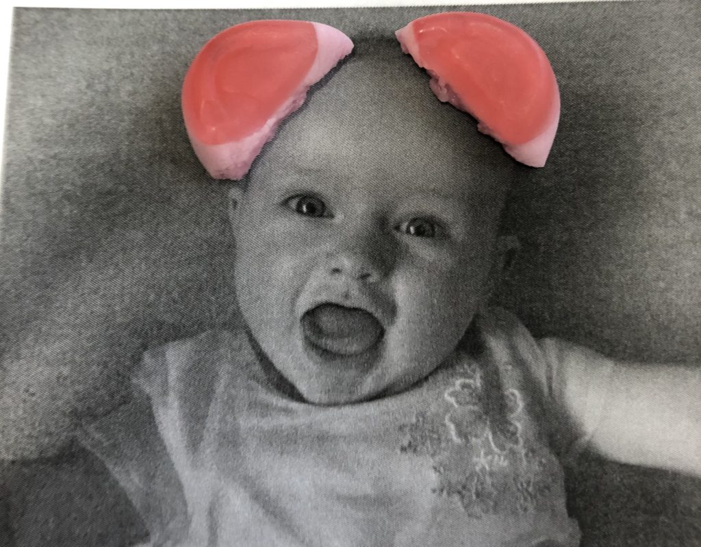
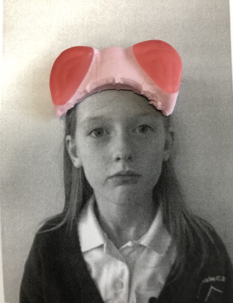
With this image it reflects the comedy in my family and how my sister used to look when she was younger showing how she has grown up and changed so much. Reflecting on the past to simple times but now with mental health issues tearing families apart the effect it can have on just one person can affect the whole family and how they see you and how they act around you changing their opinion on you.

With this image I feel that it links well with the photographer because he uses formal serious photos with food to put on top which is just like this photo because it’s a passport photo with Percy pig ears like how he uses the sweet as glasses on the photo of the man he uses which helped me come up with the idea of using Percy pig ears to stick on my sister this way it also shows our favourite sweets too.

Identity And Place

CONTROLLED CONDITIONS

Everyone’s identity is like a jigsaw puzzle which we start piecing together as we grow older to find out who we truly are yet we’ve all lost the lid so no one knows how it will look at the end. As you would normally do when you do a jigsaw puzzle you start with the corners: family, friends, hobbies and self image. Over time you will realise that some pieces don’t go in places like you change friends, find new hobbies or a family member has passed away so you have to move pieces around to fill the gap they have left in you. 

The centre of the jigsaw is your happiness, what makes you feel complete yet people tend to mistake this for a sole mate so throughout our lives we force people to complete us even though we can clearly see that they don’t fit our jigsaw. We do this because we’ve all grown up with the idea that there is someone for everyone, a prince for every princess which is why there is a 42% divorce rate in the UK and yet we force that person to fit the centre of our jigsaw, making space for them by pushing away family, friends and hobbies, changing our image to what they want us to be.

Throughout the blog posts you will uncover what inspires me and what I find defines me, what makes up my personality and how photographers inspire me to show my identity through photos showing the comedy in my life yet also what I tend to struggle with.

Final 3 images compare and contrast (CC)

Luke Gram

Dreamy Multiple Exposure Photography By Luke Gram - IGNANT
This image has an empty alt attribute; its file name is Lake-mouth-edit-small-1024x683.jpg

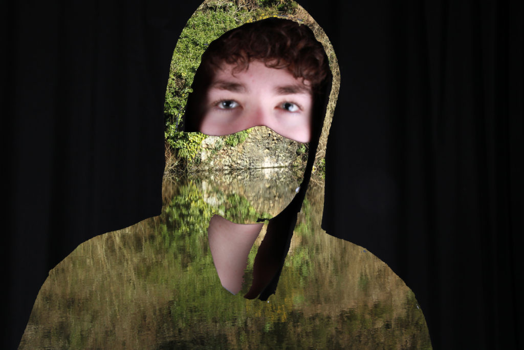
The first image shows a woman whose body is transparent showing a mystical scene of the forest, flowers and the clouds and sky. However the second shows a masked subject whose clothes and mask have been removed and replaced with a beautiful scene of still water on a lake which perfectly reflects the headland made up of stone, bushes and flowers onto the pristine water. Both of the images show a human subject and some of their body has been replaced with images of nature. Both also have plain backgrounds framing the natural images as if to prevent too much being seen and missing out the meaning and link to personal identity. However, the first image shows a forest and sky with a view of mountains in the distance. But the other image has a very short depth compared to the depth of the other image.
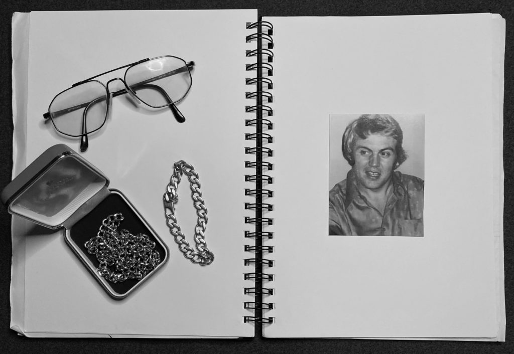
Evaluation of my Outcome

Overall I am happy with how my Luke Gram inspired work came out, and I believe it has both inspiration from my chosen photographer’s work but also some of my own attempt. I like the range of colours and the way all of the edits turned out. If I were to redo this photoshoot and edit I would find a good day with good weather but also with bad weather and take photos of the same things in different weather conditions. I believe this would further be useful to contrast and show personal identity and emotions.

Pablo Picasso

Light Drawings By Pablo Picasso and Gjon Mili
This image has an empty alt attribute; its file name is light-mirror-small-1024x683.jpg

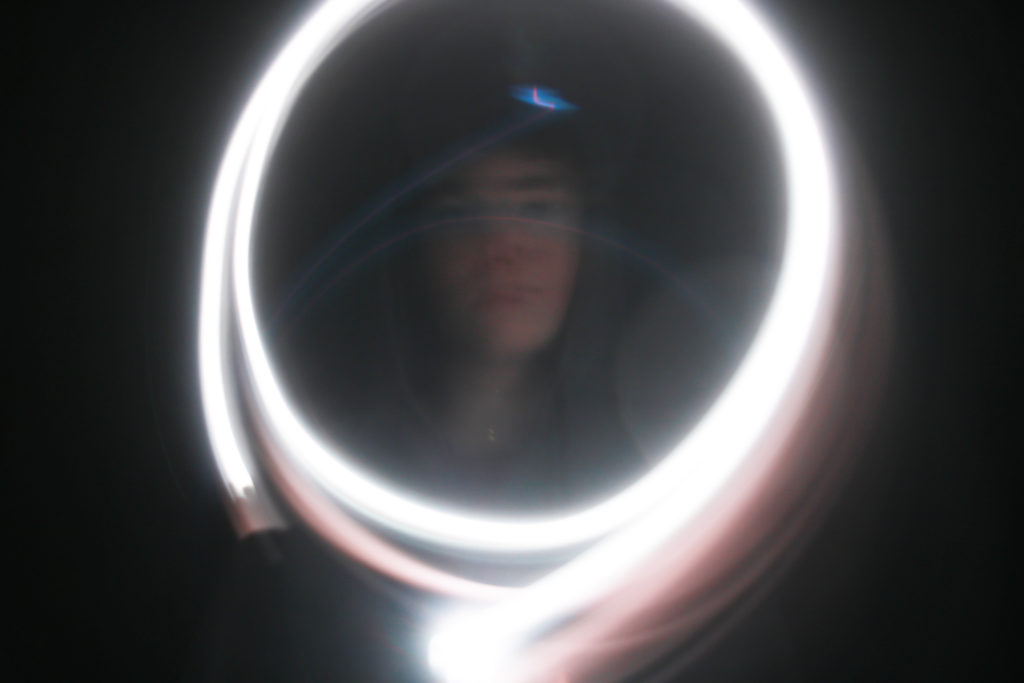
The first image shows Pablo Picasso in a small room with a small window, a drawing of a bull on an easel behind Picasso and a light drawing of the same bull in the air. The second image shows a subjects face that has been partially lit in the middle of a circle of light. Both images use light to draw in the air using a camera on a slow shutter speed. The first image has a longer depth because it was taken in a lit room compared to the second. The second image has been taken in a dark room with the only source of light being the apparatus used to make the drawings with the light.

Evaluation

With my take on Pablo Picasso’s light drawing’s, I am quite happy with the way it turned out but I know how I could improve if a redid the photoshoot. I like how all the photos came out and my favourite was the image that resembles a mirror of light with my face being framed in the centre. This image turned out better than I thought and really captures both Picasso’s way of expressing identity and my personal identity. If I redid the photoshoot I would take a wider variety of photos and drawings and use a different range of colours.

Kensuke Koike

Kensuke Koike: Nothing Added, Nothing Removed - IGNANT
This image has an empty alt attribute; its file name is Slice-3-black-and-white-small-1024x684.jpg

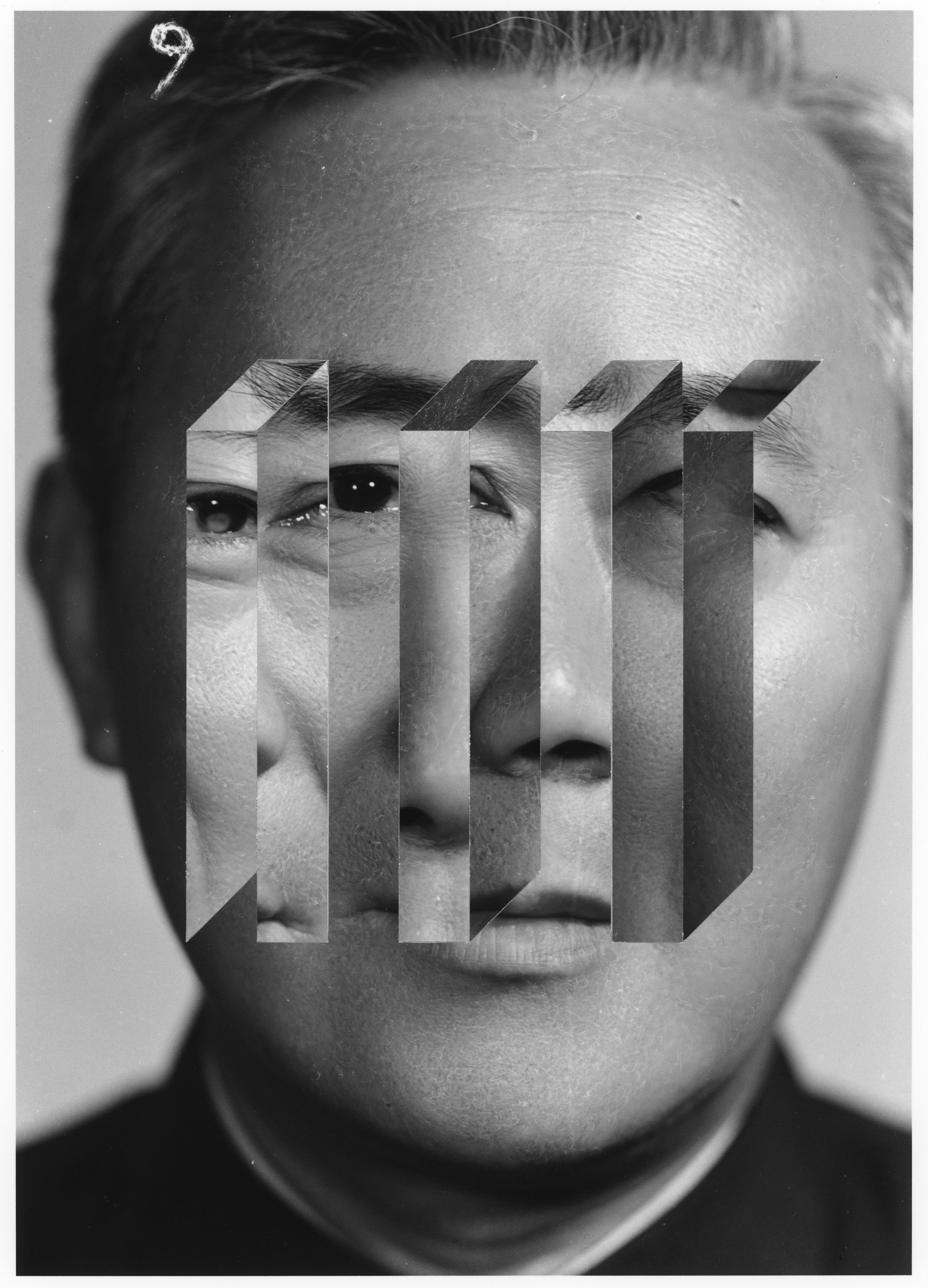
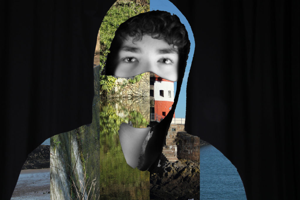
The first image shows a mans face in black and white with sections of another individuals facial features added to the image. The second image shows a subject wearing a mask and jumper that has been replaced with a combination of different images whose face and neck are in black and white. Both have sections of different images on them that shouldn’t be there and don’t match and both images have black and white facial features. Both images have a fairly short depth of field. However the first image is only in black and white compared to both colour and black and white in the second.

Evaluation

Personally, I am happy with the way my take on Kensuke Koike’s representation of identity. I like the image above because it resembles Kensuke’s work and shows many different portions of images that fit together. It captures the general method of slicing portions of different images and putting them together to shows a variety of different settings. If I redid the photoshoot I would go to a wider variety of locations to take photos and use many more photos and rectangles to show different settings.

Editing/Outcomes (CC)

Luke Gram Inspired Edits

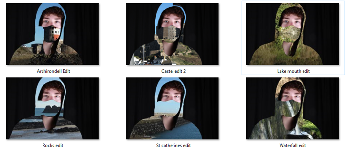
I edited two variations of the inspired image one with the mask visible and the other with only a part of my face visible. Personally I prefer the one with the mask visible as it divides my face and shows my neck which keeps the idea of a person as well as the image behind. I believe the variation without the mask dehumanises the subject and removes humanity from the identity.

How I Edited the Images

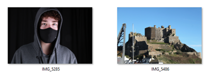
First, I had to open both of the images I needed to create this edit as seen below using photoshop.

I then dragged the image on the left onto the image on the right and adjusted the size of the image on the left to perfectly fit the one on the right whilst assuring to keep the aspect ration of the image. I then used the quick selection and magic wand tool to remove the parts of the image on the left that I wanted to remove for example my jumper and mask and then deleted those selected sections to reveal the other image beneath. Finally, I used the quick selection tool to select any parts of my jumper and hood that were not deleted when I previously deleted the sections i wanted to be replaced with the other photo.

Finalised Edits

This image has an empty alt attribute; its file name is image-98.png

Above are my 6 finalised edits inspired by Luke Gram which I have edited them all the same to create a series of similar images. Out of all of them, my favourite outcome is the Lake Mouth edit because the trees and bushes are being perfectly reflected on the lake from the angle I took the photo from creating a straight line going through the centre of the image. This line creates the illusion of a mouth under the mask.

Pablo Picasso

How I Took the Images

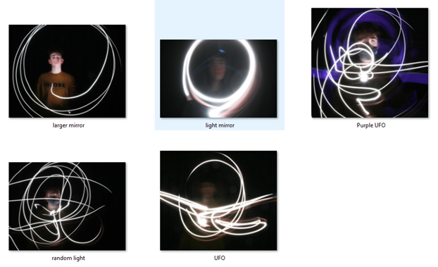
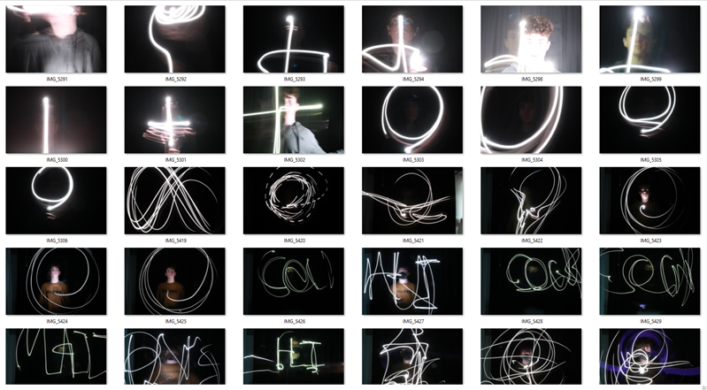
I took the images in the photography studio and I got the Picasso light artwork effect by setting the camera to take photos on a slow shutter speed of about 10-15 seconds. After setting up the shutter speed and pressing the button to take the photo, I first shined my phone light on my face from the bottom, sides and then top to illuminate my face for around 3-5 seconds. I then waved my phone light around for the remainder of the time before the image was taken. I experimented with random movements but also with circles to try and frame my face with a circle of light as well as illuminating my face once at the beginning, twice at the beginning and the end and none at all. I found that the best outcome was by illuminating my face just at the start. For the image that has a purple outline, I had some help from one of my friends Matthew. When I was illuminating my face and drawing he had his phone on a purple image and was moving it slowly to outline my body.

Finalised Edits

To edit the images above I just boosted the brightness slightly to give the light drawing a more vibrant and neon-like look and to illuminate my face slightly more.

Finalised Image

The image below is my favourite outcome from the light painting photoshoot I took because the image below showcases both the bright light artwork but also my face which is being framed perfectly by the circles of light. To me the image resembles a mirror in which I am seeing my identity.

Kensuke Koike

For the Kensuke Koike inspired outcome, I used all of the images I edited for Luke Gram and sliced them and put them together to look similar to the work of Kensuke Koike.

How I Edited the Images

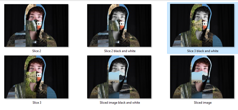
Firstly, I put all of the edited images in the same document perfectly on top of each other. Next I unlocked the background layer meaning I had layers 0,1,2,3,4 and 5. Then I created a new layer (layer 6). Next I worked out the size of the image and divided by the number of images I had which was 6. I then went on layer 6 and created a rectangle from the top left corner of the image sized 792 pixel width and 3168 pixel height. I then duplicated the layer that had the first rectangle on 5 times and after duplicating moved them next to each other covering the whole image. Finally I dragged the images individually above the separate rectangle layers and created clipping masks for all of them.

I created 3 sliced finalised images and made all three of them have a second variation of the original but my face and neck were black and white.

Finalised Image

My finalised image to do with Kensuke Koike is the image below. I chose this image because it has a wide variety of colours and scenes and out of the 5 other ones I believe the combination of the range of colours and the face and neck black and white contrast positively which in my eyes looks the best.

controlled conditions – identity

Rita Puig Serra Da Costa – Where Mimosa Bloom

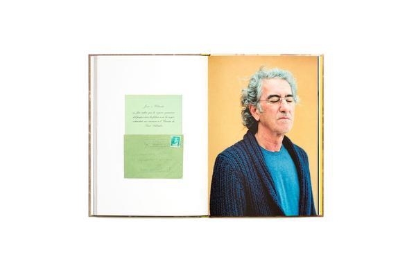
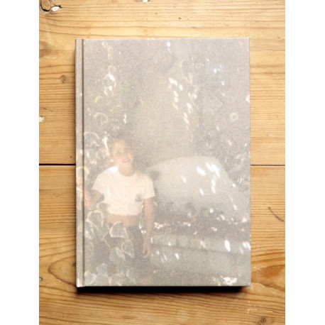
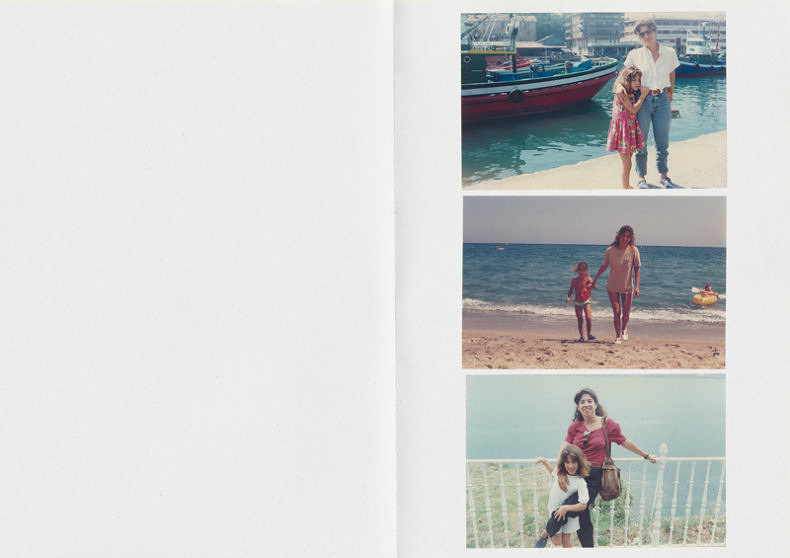
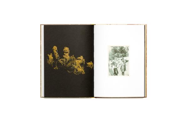
Dealing with the grief that the photographer suffered following the death of her mother, Where Mimosa Bloom by Rita Puig Serra Costatakes the form of an extended farewell letter; with photography skillfully used to present a visual eulogy or panegyric. This grief memory about the loss of her mother is part meditative photo essay, part family biography and part personal message to her mother. These elements combine to form a fascinating and intriguing  discourse on love, loss and sorrow.

“Where Mimosa Bloom” is the result of over two years work spent collecting and curating materials and taking photographs of places, objects and people that played a significant role in her relationship to her mother. Rita Puig Serra Costa skilfully avoids the dangerous lure of grief’s self-pity, isolationism, world-scorn and vanity. The resonance of “Where Mimosa Bloom” comes from all it doesn’t say, as well as all that it does; from the depth of love we infer from the desert of grief.

Final image

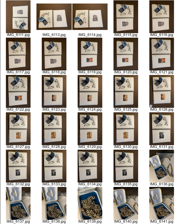
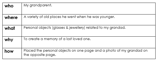
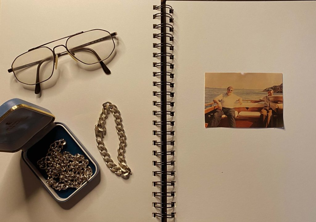
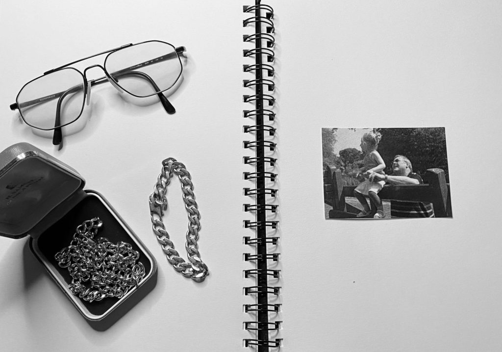
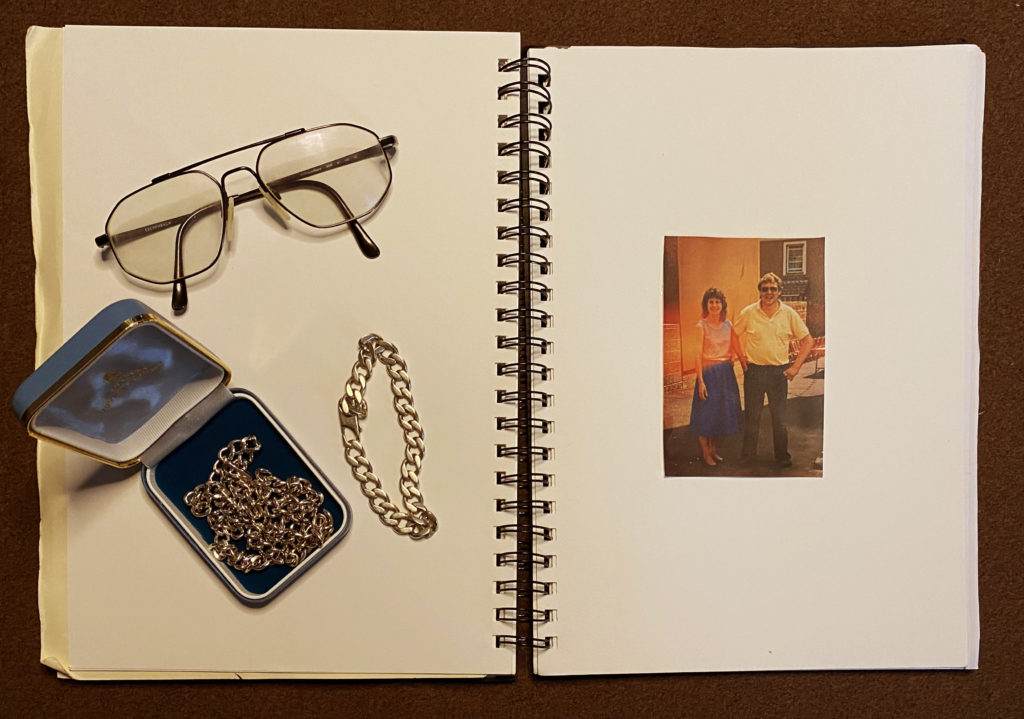
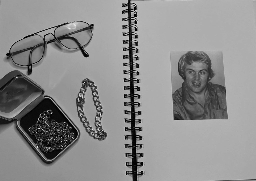
Rita Puig Serra suffered from a death of a loved one, relating to her grief, I was inspired by her work and creativity that goes into her photographs. Serra used the form of an extended farewell letter; with photography skilfully used to present a visual eulogy. My take on her photo included a set up of a book with blank pages and objects that related to someone I had lost; glasses and jewellery. I then got a photograph of the loved one and placed it on the page opposite the memorable objects. I used artificial lighting and made my final touches on photoshop by making my image black and white and upping the brightness and contrast.

Serra’s idea is a creative, moving and heart-warming way of remembering someone in your family that has passed, a way to remember through objects, persons, and moments, which take us directly to that loved person.

I chose to have some of my final images in black and white to express how colour can effect the atmosphere in a negative way. I used greyscale to portray the meaning of my photos. The black and white shades emphasise the dark shadows and contrast of each object places on the blank pages. My final image is balanced between light and dark shadows and highlights.

Rita Puig Serra Da Costa & Carolle Benitah

This edit is a mix between two artists I was inspired by “I Will Never Forget You” and “Where Mimosa Bloom”. The image on the page on the right is inspired by Benitah on top of an image I took inspired by Serra, overlapped on photoshop. The identity of the man in the photo is covered and unknown, however his identity and personality is portrayed through memorable objects that belonged him. Instead of his face and body portraying his identity, his personal objects do. However, they don’t show his identity as well as his face would, creating a sense of mystery for they viewer and forcing then to paint a face in their own mind.

Identity PHOTO SHOOTs (CC)

Photoshoot 1 & 2

I will photomontage these images using both the first photos of me and also the images of nature as well similar to Luke Gram. After I have the finalised outcomes I will attempt to reference Kensuke Koike as well by editing my finalised edits in a way which is similar to his famous work.

Photoshoot 3

I will edit some off these above to reference Picasso and his famous light paintings.

CC – FINAL OUTCOME IN THE STYLE OF Birthe Piontek

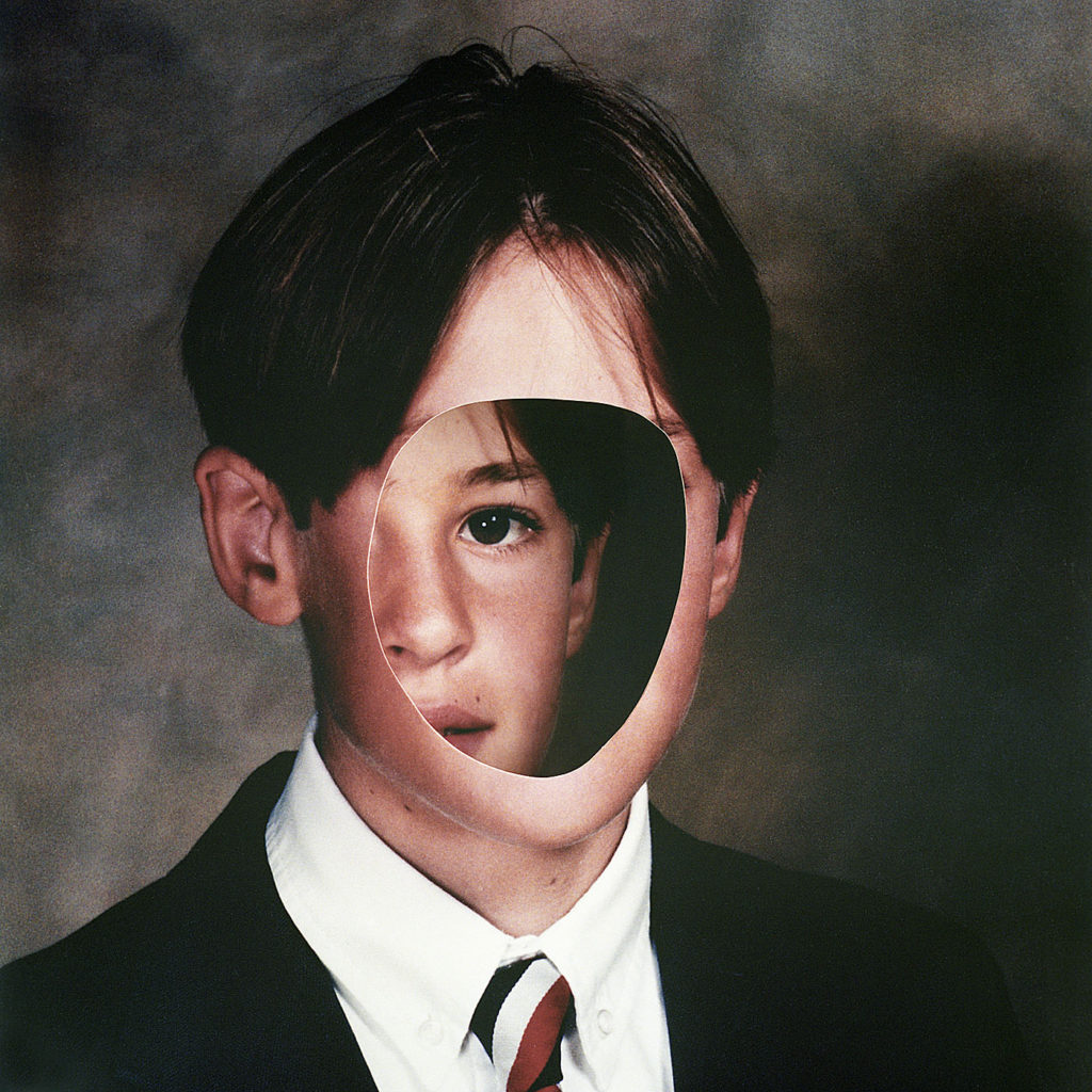
I wanted to create a set of images in the style of Birthe Piontek. This is the image that inspired me.

Firstly, I chose 2images to edit. I would edit 1 with no face, and create the hole in the head effect. And 1 of the face inside and 1 outside the head, as I think it relates to hiding your identity and the opposite showing your identity.

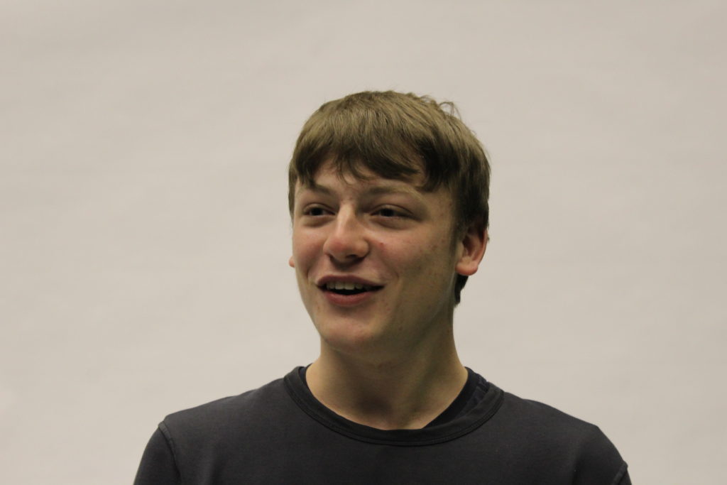
I chose these 2 images to edit :

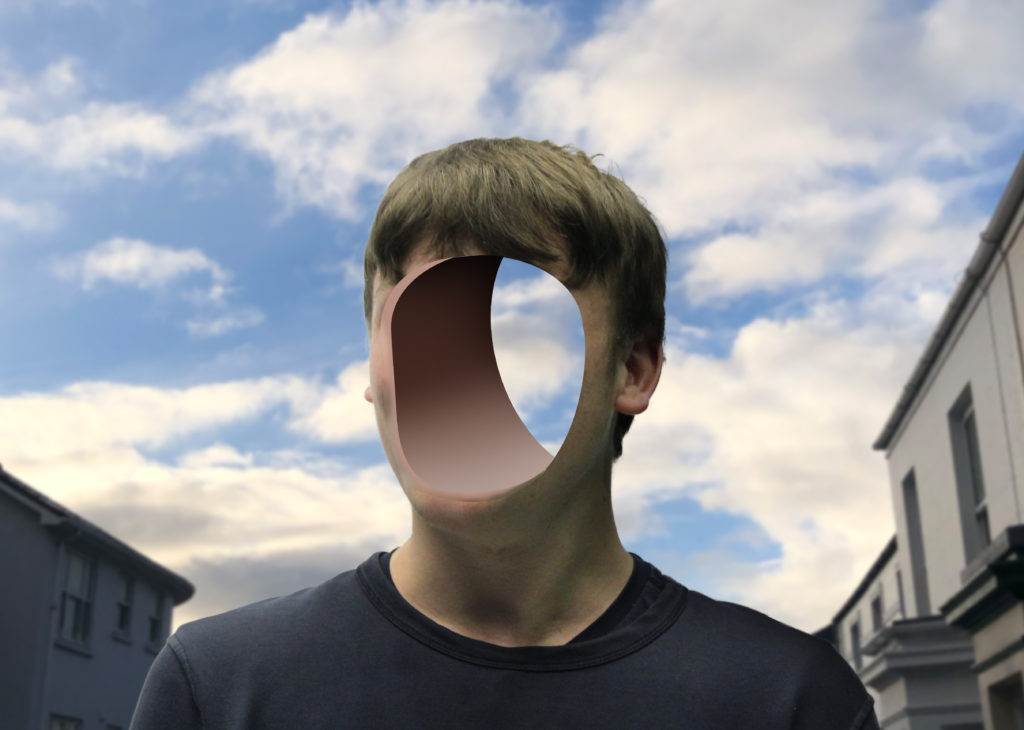
Process of editing the hole in the head.

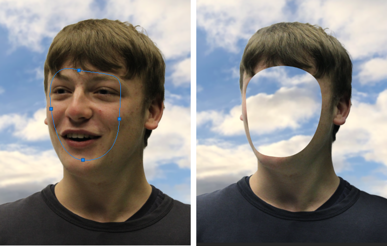
I started off by removing the background. I used the object selection tool then select and mask option then I refined the edges to make it smooth.

I then put the background in, which was a normal cloudy day. The problem was that the subject was a different colour to the background and it didn’t match. I used the curves adjustment and used the dark colour picker to select the darkest colour in the background then put that on the darkest colour on the subject. I did this for the mid-tones and highlights. This made it so both the subject and background matched. I added gaussian blur to the background.

I used the pen tool to create a smooth mask of the face then I deleted the selection, which made the hole in the face effect.

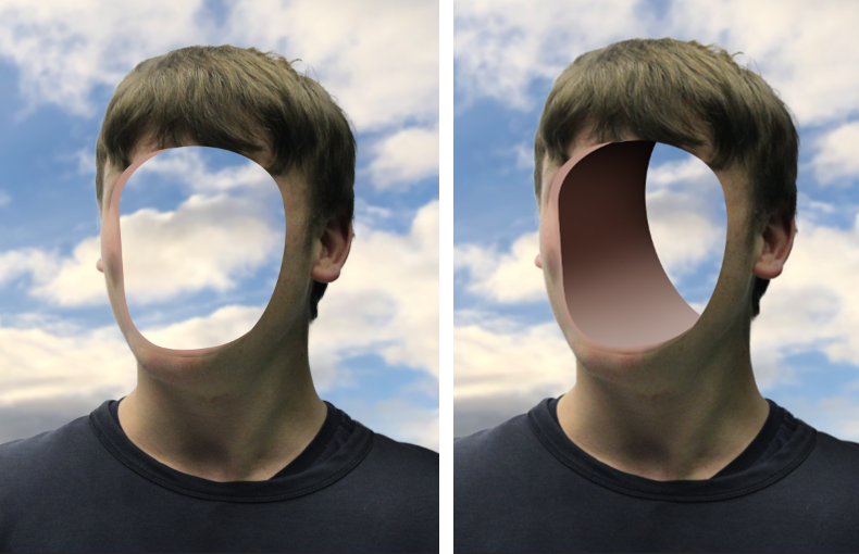
It didn’t look normal, so I used the pen tool again to create an edge, I changed the colour to a skin tone so it looked normal. Although the whole of the image was 3D except from the hole in the face.
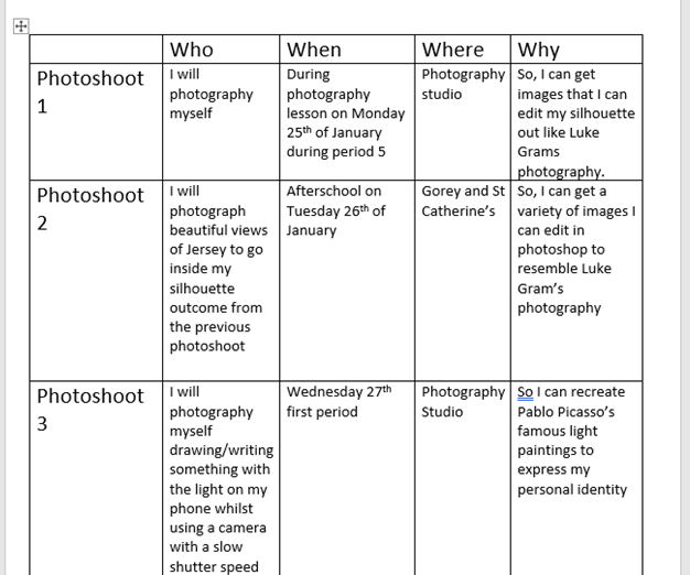
I used the pen tool to create the second layer which signified a 3D aspect. I added a shadow by creating a clipping mask, then using a black brush tool with 0% hardness. To contrast the shadow I added highlights by using a white brush tool with 0% hardness, after I added a soft light blend option, which made it more smooth.

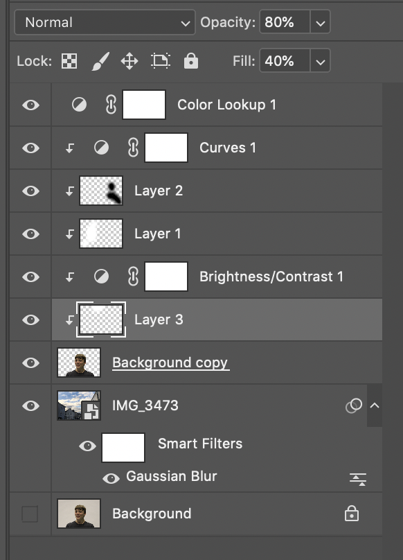
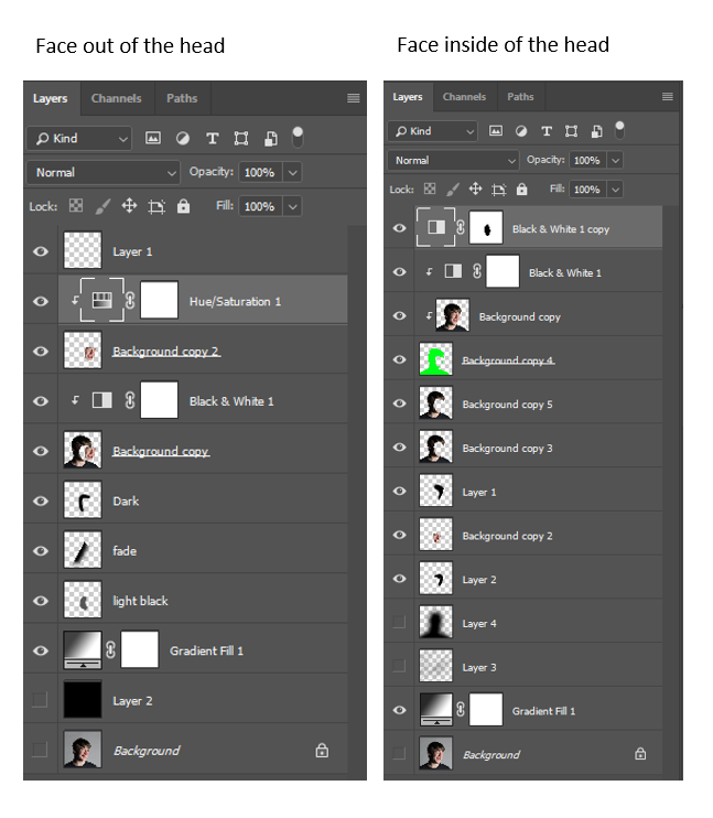
These were all the layers with adjustments, so you can see the structure.

Final Image – 1

Reviewing my image, I really like how it turned out, as it is similar to Birthe Piontek’s image where he removed the face and you can see behind it. The background is clean and fits well.
I feel that the gaussian blur in the background makes you focus on the subject more.
I also like how you can clearly see through the background through the hole.

Critique

I don’t really like how the inside of the hole is fake, maybe I could of taken a sample of the skin off the face and textured the inside to make it realistic.

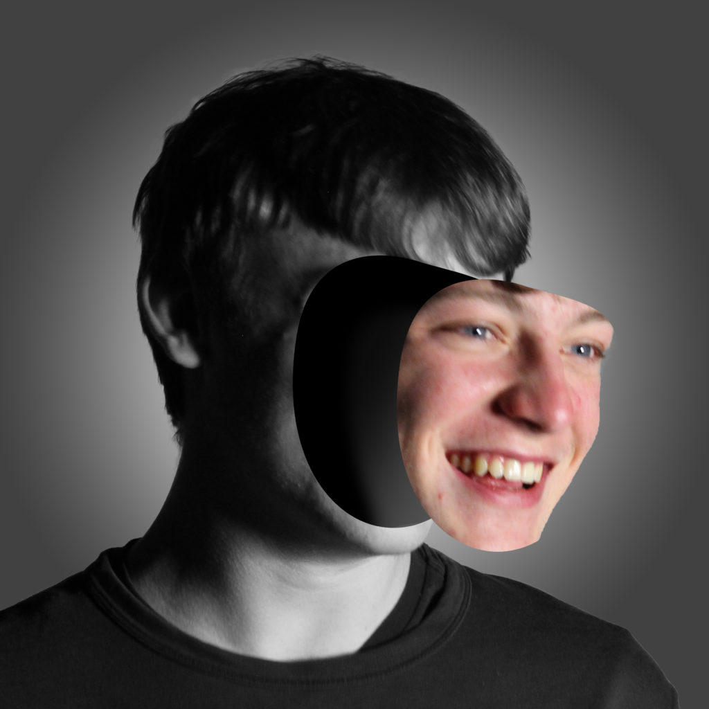
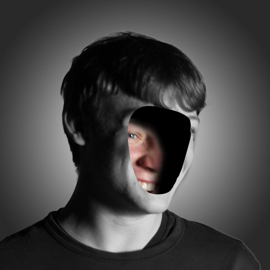
Process of editing face inside the head/off the head.

Firstly, I used the pen tool to create a clean mask selection of the face.
For the face inside I had to make sure that the mask wasn’t touching the edge. For the face outside the head I had to make sure that it was over the edge, to get all the side of the face. I moved the face outside the head to create the effect that it was coming off.

Next I used a black brush tool to create shadows and to blend the face into the shadows, which create a nice blend.

I used a black and white adjustment layer and put it on everything except of the mask of the face, because I think it gave a unique touch.

Final Images – 2

Evaluation

I like how this image turned out, as it unique and in the style of Birthe Piontek. I feel like the black and white filter works well, as the saying “showing your true colours” I think that it represents it as the face is the only coloured part in this image.
I think this image shows someone that is confident, and someone that “puts their face out there.”

Final Image – 3

Evaluation

I think this images composition, is better. Not only is it in the same style as Birthe Piontek, but I think it shows someone that is more shy, therefore hiding their identity. It shows that as the face is hiding behind in the head.

Critique

I think the original mask of the face could be smoother as there is some ridges in the image, such as the pointy chin in the image where the face is coming off.
Also if the photo was a bit more clear, and facing towards the camera, it would be easier to mask out, instead its at an awkward angle, therefore harder to accurately mask a selection of the face.

You can see how similar they are side by side.

FINAL IDENTITY

Final images

To create my final images I took photos of a fellow student. I took photos of looking dead at the camera. To create the lighting in my images I used a mixture of one point and two point lighting. This created shadows on parts of her face to add a contrast of lighting.
Once I had a good amount of images from different angles and different types of lighting, I then selected 20 images that I thought where my strongest images. I decided to merge my 2 shoots together as I felt this would give me the best outcome as I could use my strengths from both shoots.
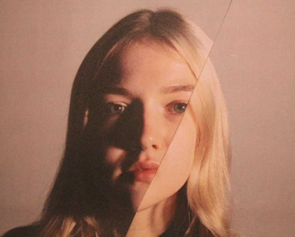
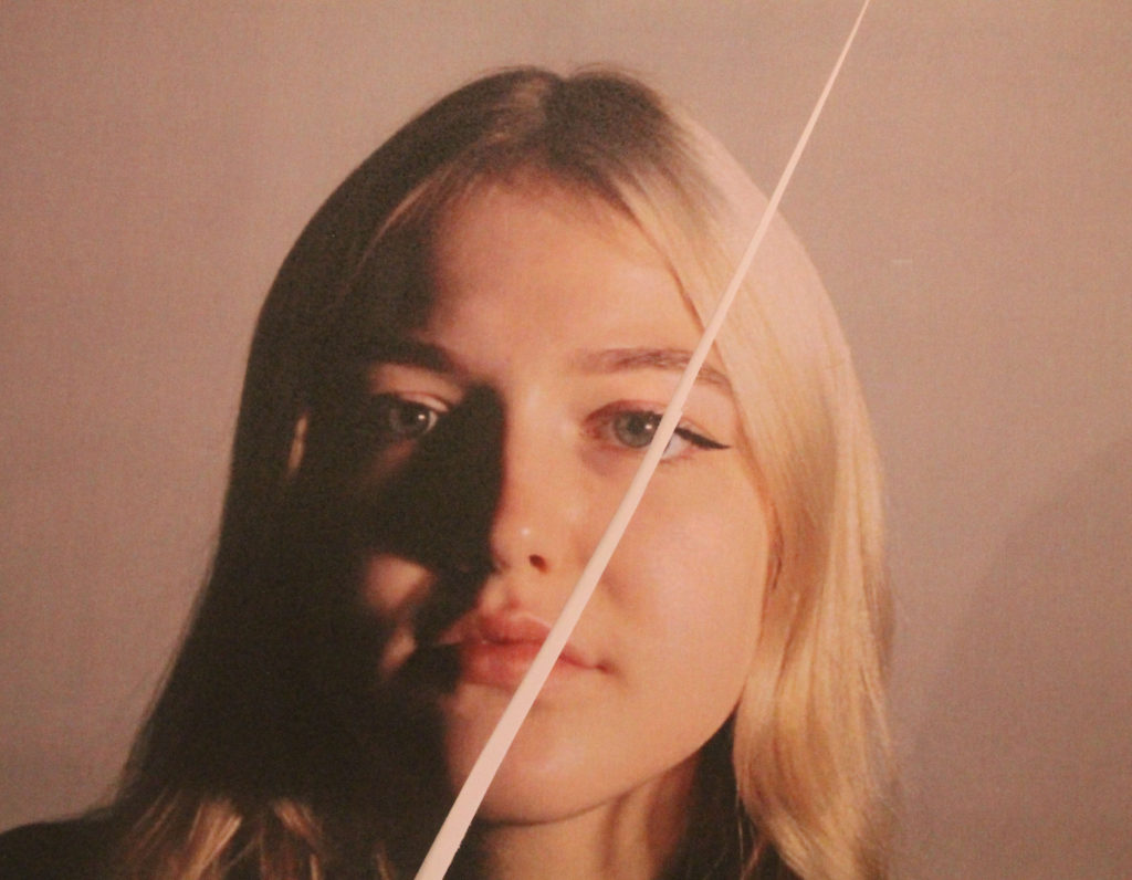
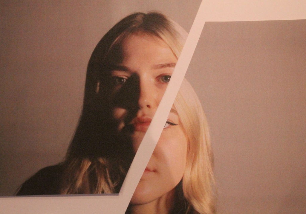
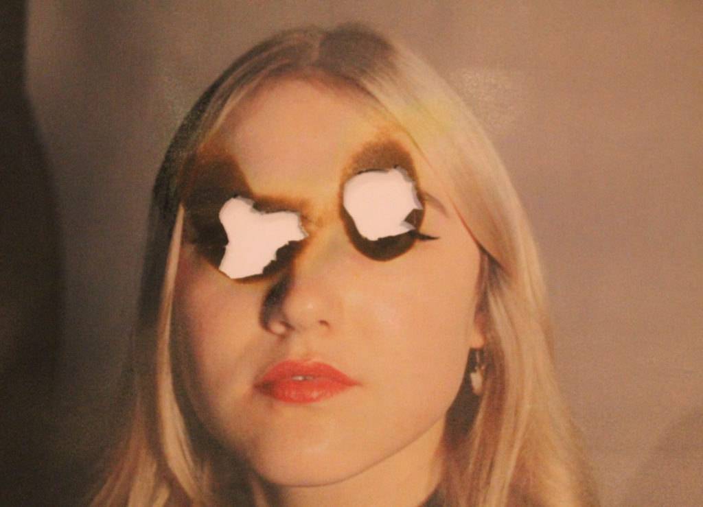
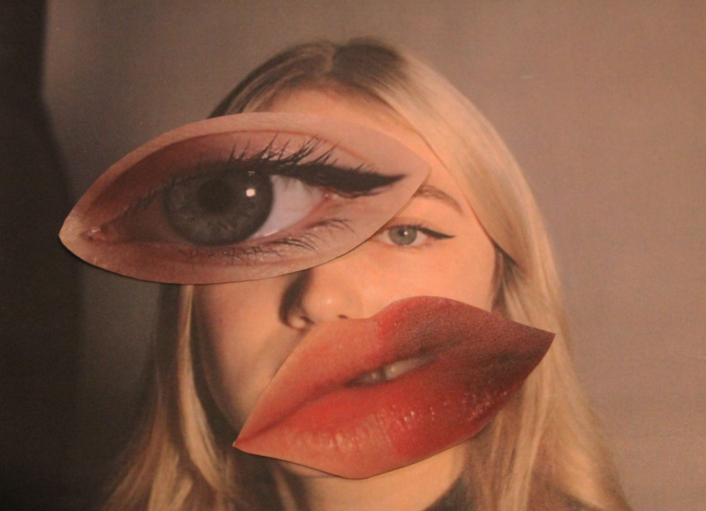
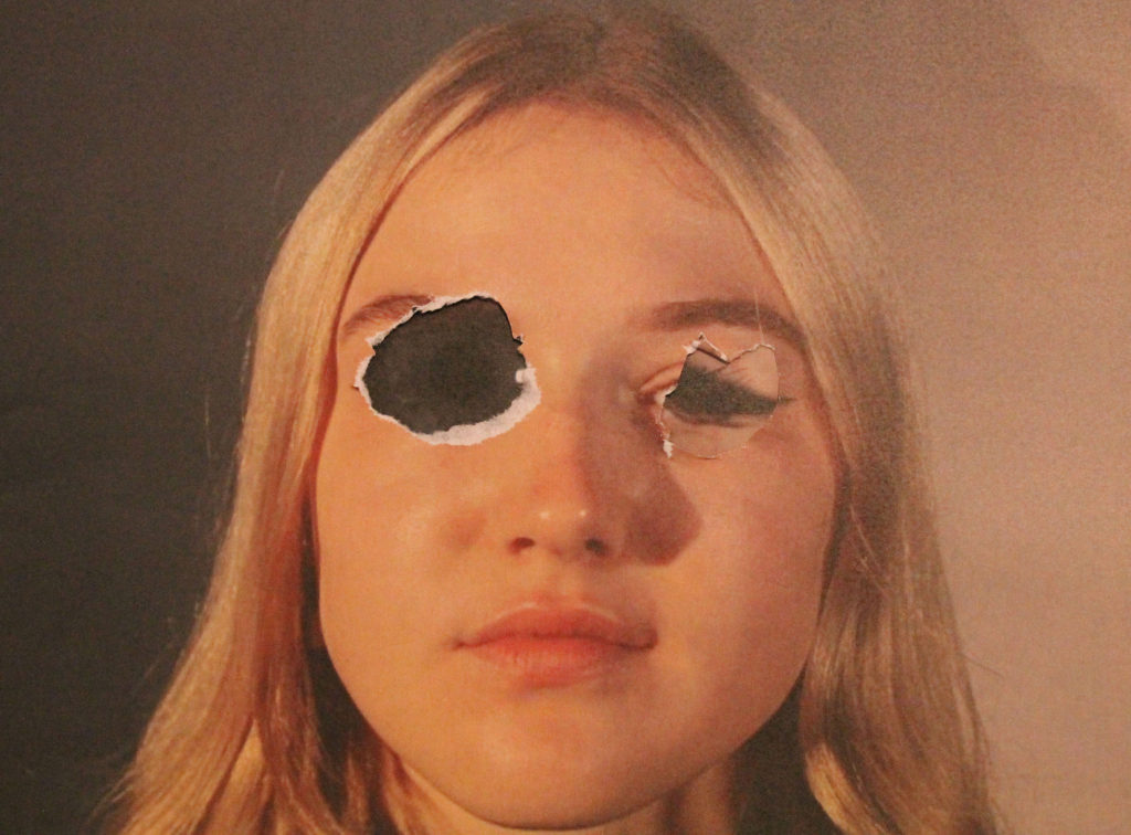
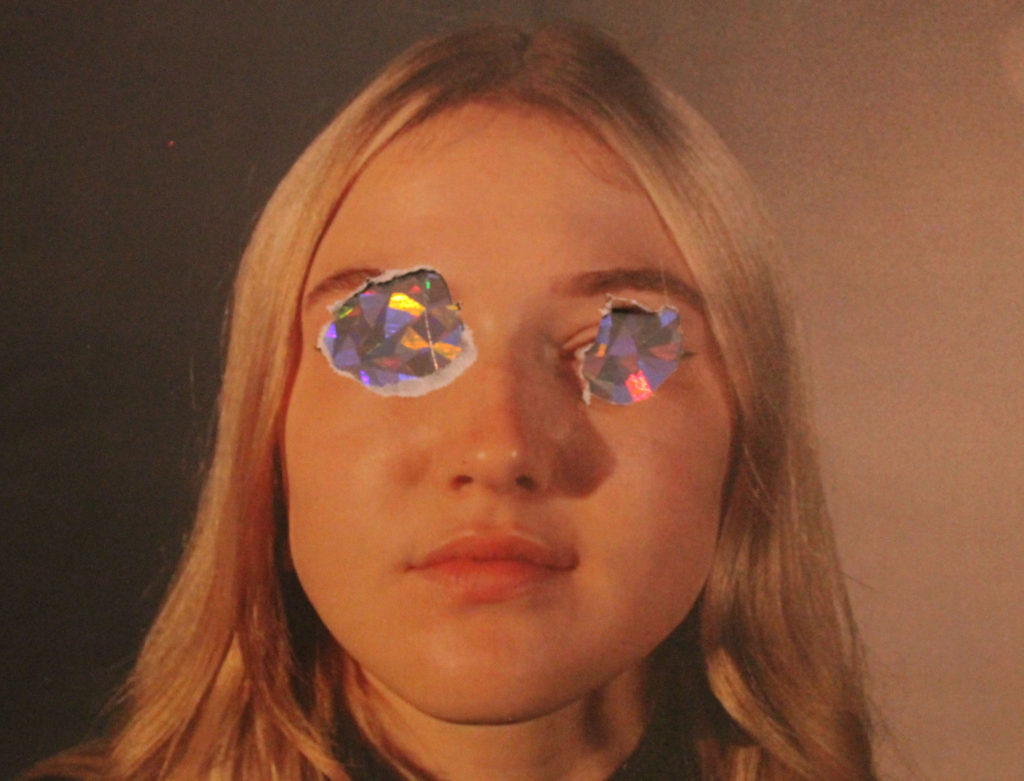
I then printed out these images and started experimenting in ways similar to Rosanna Jones style. I cut out parts of the models face and stuck them on top of an image of her face to create an enlarged effect. This also related to Rosanna’s style of the idea of notions of embodiment. I also experimented with burning the models eyes on a piece of paper, similar to an image from Rosanna’s “Destroy” shoot. Although as my image was printed onto regular paper , not photograph paper, it created a yellow tinge to the area around the eyes.
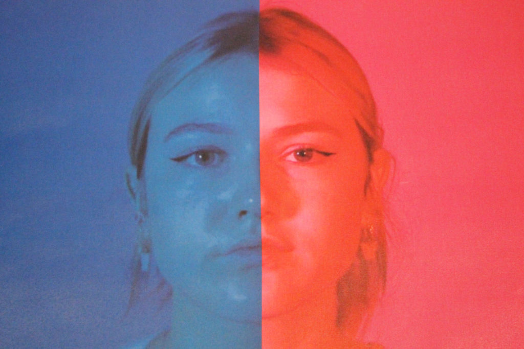
I also decided to experiment with using colour filters and creating a ‘half and half’ visual. Although Rosanna herself did not do this, I still felt it could link to her aims of exploring visual identity as blue is seen as a colour related to boys/men and pink relating to girls/women, so using a comparison of both colours could create that uncertainty of visual identity.
Once my images were taken I adjusted there saturation and cropped them on Adobe Photoshop, but this was the only editing I had to do to my images.

I felt my process went well as I feel I came out with some strong images which relate well to my photographer. I did experiment with some images that did not turn out the way I wanted them too or how I felt they would look so I did not use those images. I tried replicating some of Rosanna’s images but also tried to be creative and come up with some of my own ideas which still relate to Rosanna’s aims.
I am pleased with all my final outcomes and feel that I have picked my strongest images from the ones taken. All my images relate to Rosanna’s

I feel as there is a strong link between my images and Rosanna Jones’ images and ideas, therefore I am confident my images represent my intention of exploring notions of embodiment and visual identity.