First, I cropped my chosen image in order to focus on the focal point and to make the image more central and even.
I then changed the colour of the image to black and white as Woodman’s work is mostly in black and white. This adds the eerie aesthetic of Woodman’s style of photography.
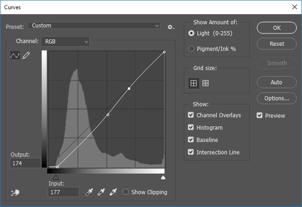
Lastly, I edited the curves adjustments to achieve the sombre darkness contrasting with the lighter areas.
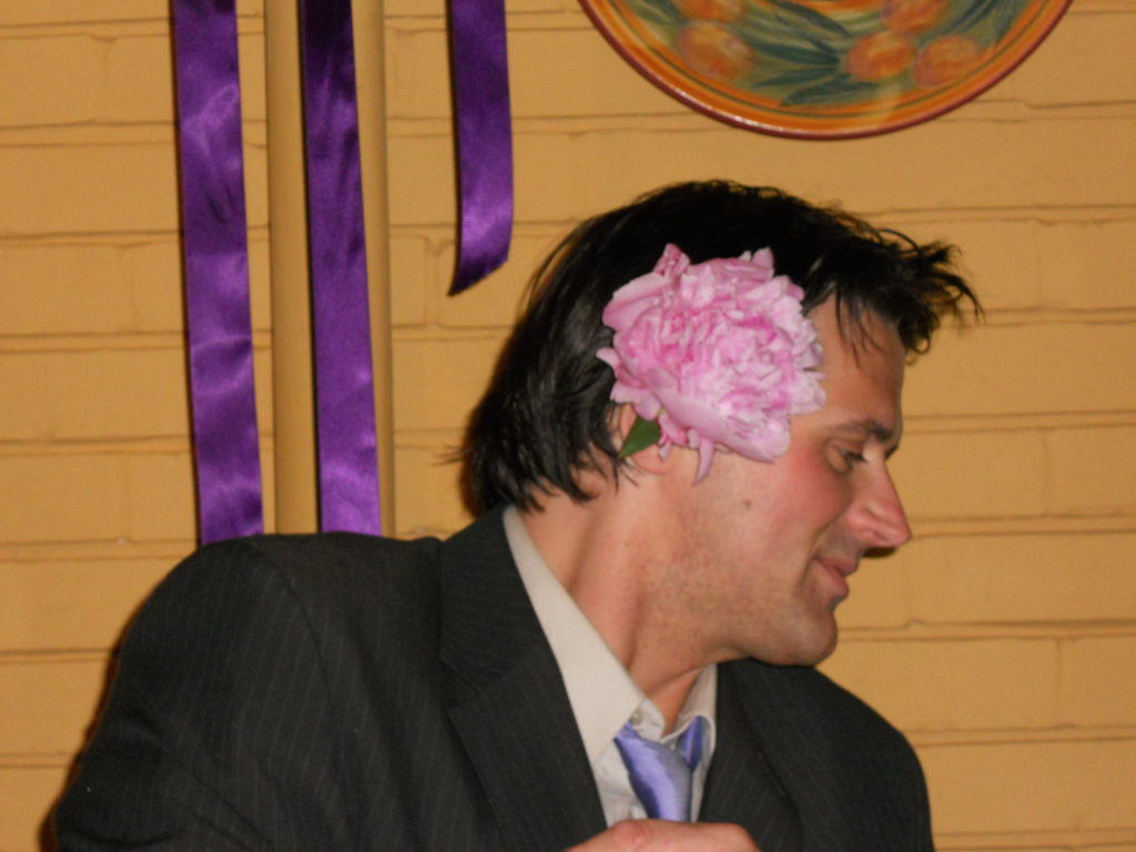
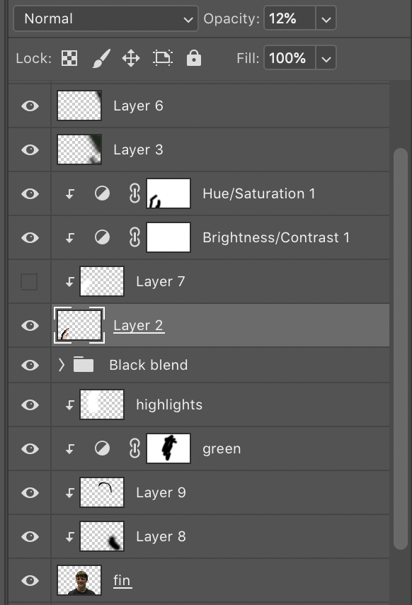
Firstly, I started out to create an image in the style of Evilsabeth Schmitz-Garcia.
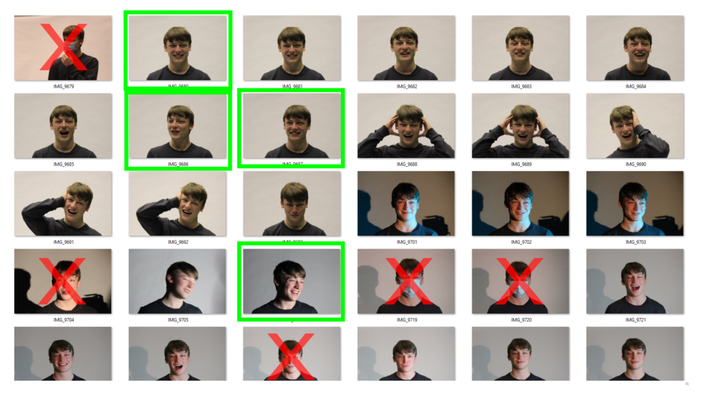
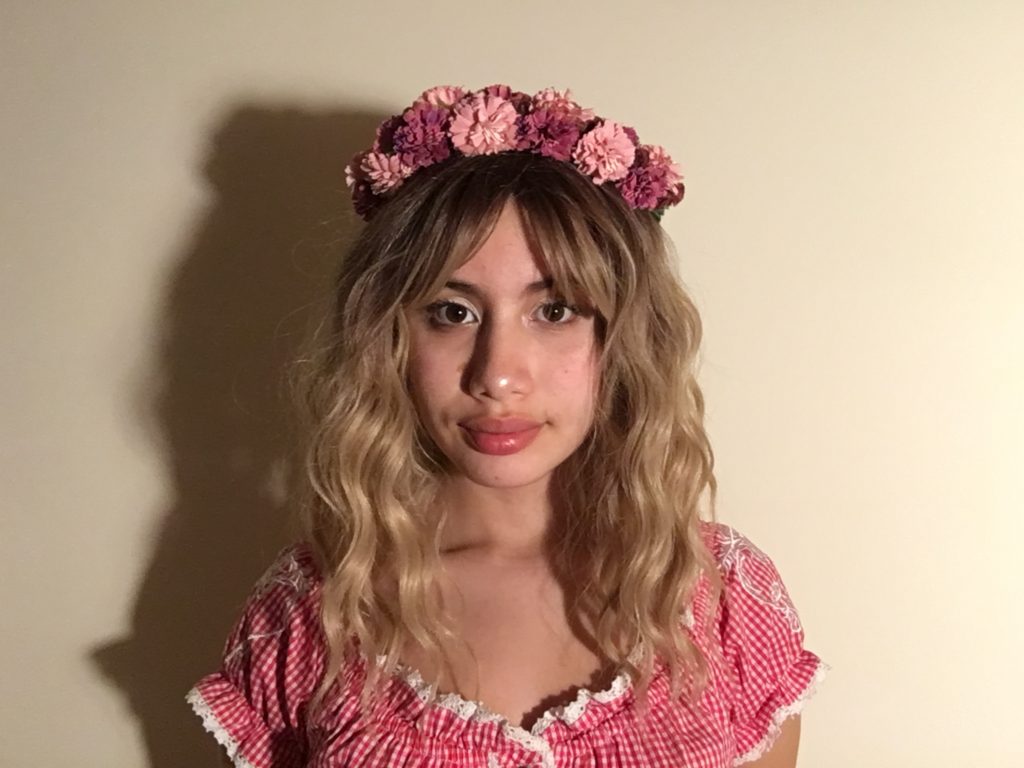
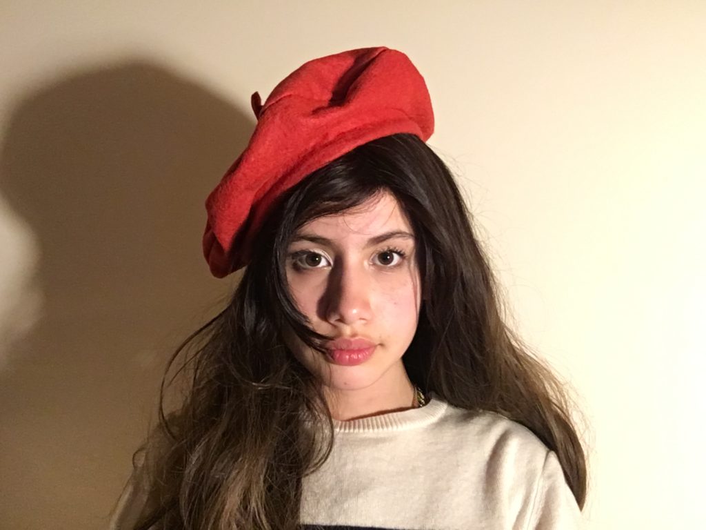
I would use the photographs from Photo Shoot 1. These were the photos that I took that were simplistic, and had a variety of facial expressions. This was because that was one of the key aspects of Evilsabeth Schmitz-Garcia’s work, other than the warped and manipulated effect.
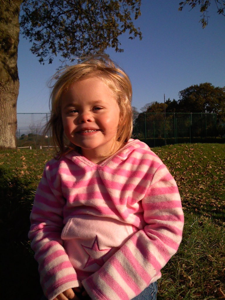
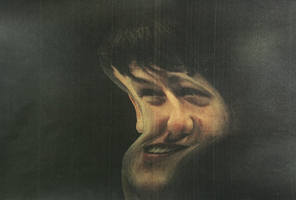
Overall, I chose the photo where the subject was smiling as most of Evilsabeth Schmitz-Garcia’s work has their mouth open or semi-open, as the manipulation effect works better.
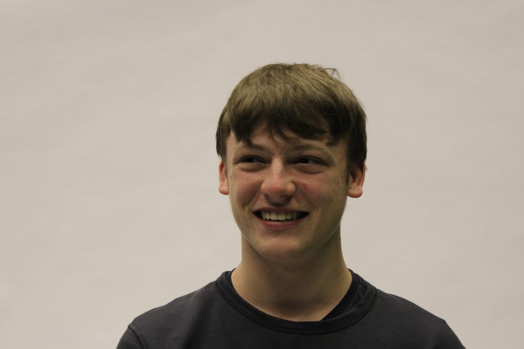
This is the photo I chose to edit :
Process
In Photoshop I would need to : – Edit the background black (as all of Evilsabeth Schmitz-Garcia’s photos have a dark background) – Add some green/yellow particles into the background (In Evilsabeth Schmitz-Garcia’s photos there is always some colouration in the background) – Add grain/noise (to get the scan effect) – Experiment with overlays, such as the hands I took in Photo Shoot 3.
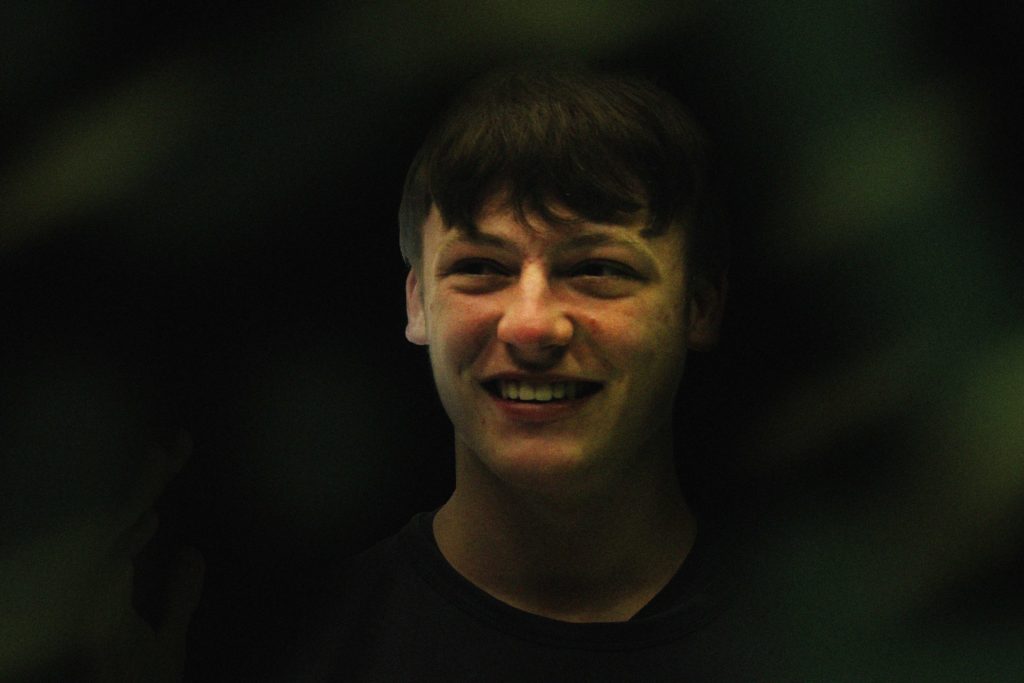
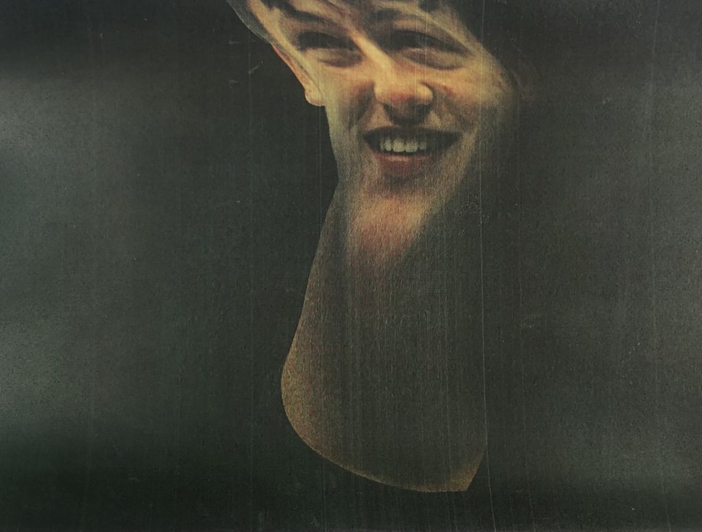
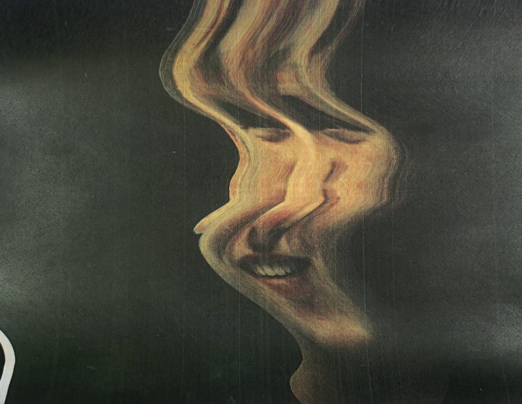
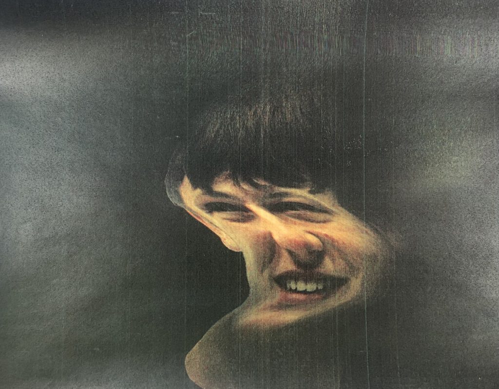
After Photoshop I would print out the image and place it on the scanner. Whilst it is scanning i would move the printed photo along, this is how the manipulation effect occurs.
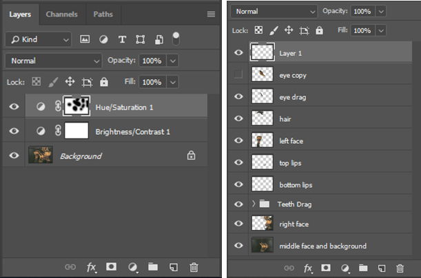
These are all the layers in Photoshop.
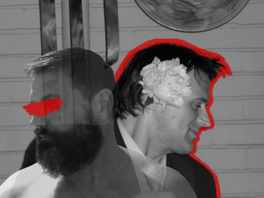
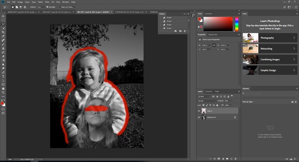
Firstly, I selected the object with the quick selection tool, then clicked the select and mask option. This would remove the white background so I could replace it with a black background. To clean up the edges, I used the refine edge brush in the select and maskscreen. This blurs the edges so any white space; cause by the lights, in the hair would get removed. This gave the cut out a clean look. After I outputted it onto a new layer then renamed it “fin”.
I created a black background layer under the “fin” layer, this made the edges of the face stand out too much and created a sharp line, which I didn’t want. To fix this I created a Clipping Mask then used the brush tool (black) with a hardness of 0% and smoothing of 0%. This made it so the brush wasn’t harsh and gave it a “gradient” effect, so it faded into the background. On the left side of his face I added some “highlights” using the brush tool (white) at 0% hardness, I used a clipping mask then used the brush to create the shine effect, where the light was coming from. I had to turn down the opacity to 65%, otherwise the white was too overpowering. I added a green tint to a part of the face, the layer named “green”. I used an adjustment layer then changed the hue to green. This made the whole face green, so I used the eraser tool with a hardness of 0% to remove the green from 70% of the face.
To add the background colours I used the brush tool with 0% hardness, the colours I used were green and yellow. I added motion blur to the colours, so they weren’t just block of colour in the background. I also turned down the opacity so the colours weren’t as bright to match the tones Evilsabeth Schmitz-Garcia used.
I experimented by adding a hand into the photo. I started by removing the background with quick selection and select and mask, which is the same process as the face cut-out. First of all, it seemed out of place as it was really bright, so I added an adjustment layer for brightness and contrast, which I turned down the brightness and turned up the contrast. After I turned down the opacity to make it so that was almost hidden, therefore not contrasting the main focus point.
I printed the image, although it was a bit dark so the increased the brightness and reprinted it. After, I placed the image on the scanner. As it started to scan I moved the image to manipulate the outcome. I did this about 20 times. I photographed the best 4 so I can take them into photoshop, and refine them. these were the 4 scanner outcomes:
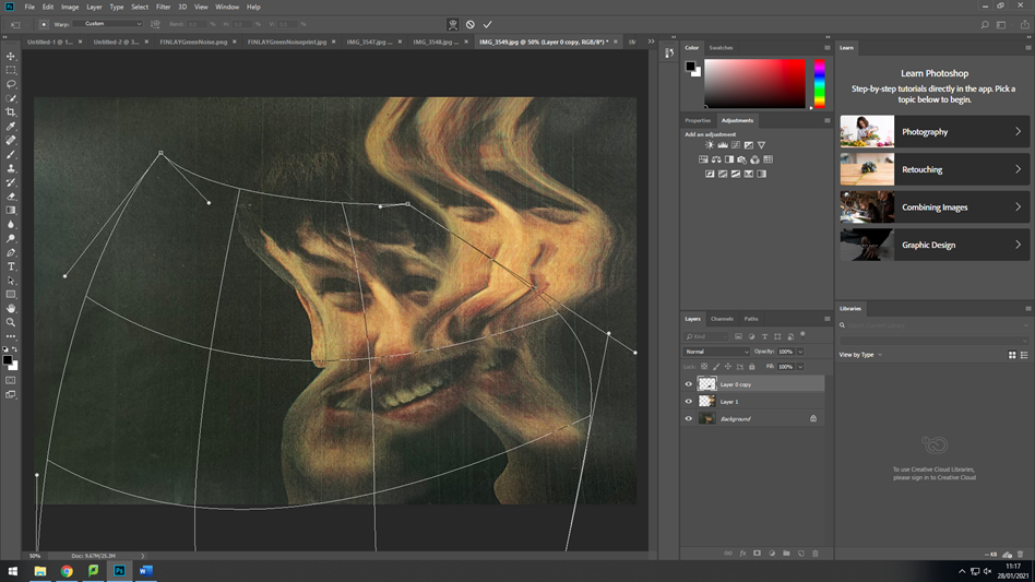
I took these 4 images into Photoshop. Firstly I, found my base layer, which was the one in the top row far left in the selection above. Then, I removed the background of the tall image with the eraser, then added it on top of the base layer. I used the eraser tool with a hardness of 0% to create a gentle gradient into the base layer. Next, I only masked out the lips from the tall face, and made duplicate copies of it. I used the warp tool to change the aspect ratio of it to match the image so it would look like it is being stretched and pulled between the faces. After, I added motion blur to smoothen it out.
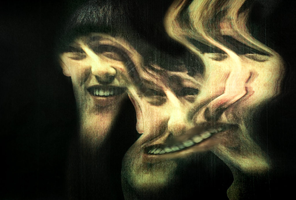
After it all matched, I added another face as Evilsabeth Schmitz-Garcia normally uses 3 faces. I removed the background then uses the eraser tool again to fade it into the base layer (middle face). After, I masked out the right eye from the new face then used the warp tool the connect it to the middle faces eye. I would need to use the eraser tool to get rid of the sharp edges.#
Once I had finished the composition of the image, I renamed all of the layers, then fattened the image. I added adjustment layers to make it more in the style of Evilsabeth Schmitz-Garcia. I used a hue/saturation where I added the green effect that Schmitz-Garcia uses in here final images. The brightness/contrast adjustment is a normal adjustment where I brightened the images and made the blacks more dark.
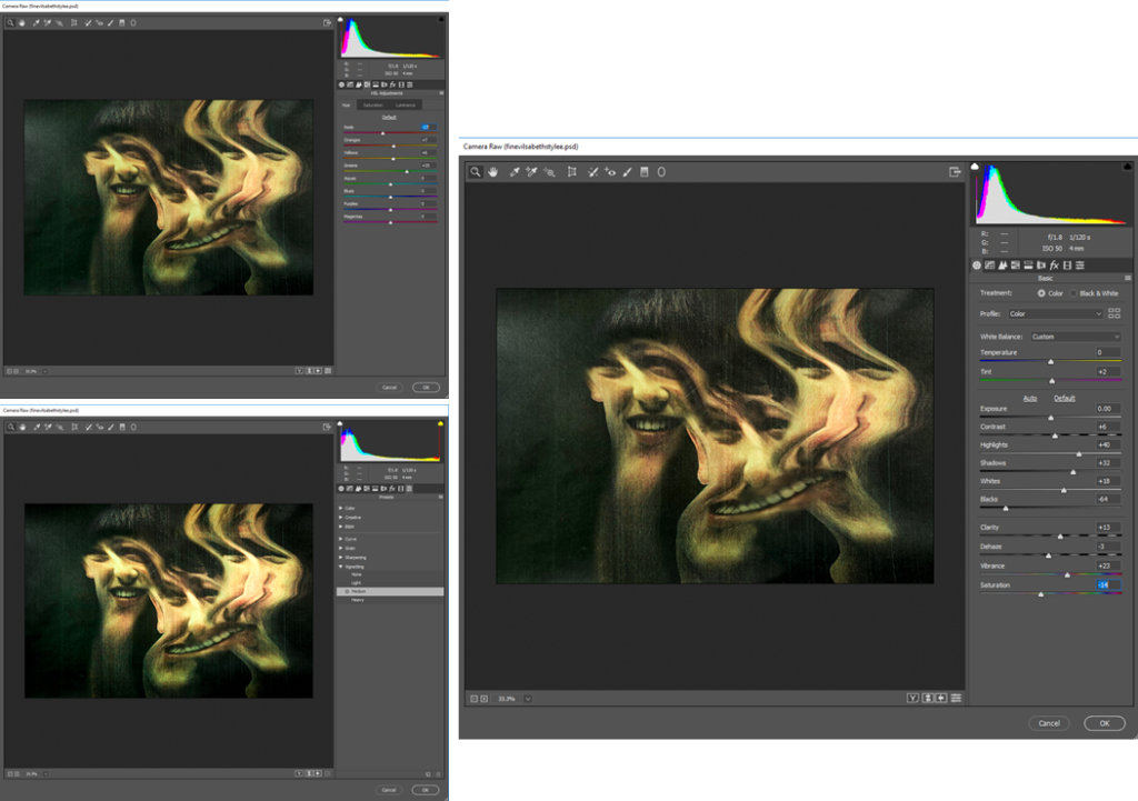
Finally I added a camera-RAW filter to touch up the final image. I started off by changing the tint, highlights, shadows, blacks, and the white. (right image). Secondly, I changed the individual colours, but mostly the greens, yellows, and oranges. The greens I increased the most as it was one of the more distinguishable colours. The yellows and oranges I also increased to counter the green. As it was too strong in some areas.
After, I realised that the background was too shiny as I took the images of the paper with a camera. So, I decided to go over the background with the black brush tool and made opacity 75%. It fixed the problem and removed the lighter areas.
That is how I edited my image in the style of Evilsabeth Schmitz-Garcia.
Final Image
Evaluation
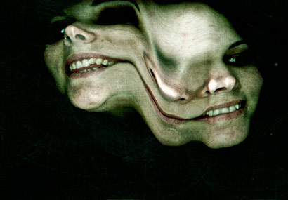
Reviewing my image, I like how it turned out, and I feel that there is a strong connection between my image and Evilsabeth Schmitz-Garcia’s image. The main reason she displayed her images in her style was to capture people with multiple personality disorder. I feel that the manipulation in my image shows that perfectly as there is no sharp interrupting lines between images, instead it looks like it is all one image. The colours mostly match. I feel that the camera raw filter really helped me achieve this look. The scanner produced lines on the my images similar to Evilsabeth Schmitz-Garcia image. This is because I actually used a scanner and was a good idea even though it was risky, and I didn’t think it would work.
This is my image side by side with Evilsabeth Schmitz-Garcia’s image that I based mine off, and inspired me. As you can see they are fairly equal. Overall i think it turned out well.
Critique
Looking back it all went smoothly, except from when I went to print it and it turned out really dark. This is an easy fix, I could of printed it on higher quality paper or better printer. I fixed it by making the image really bright before printing, so when it printed it would be how it was on the screen.
Also if the printer saved a digital copy of the scan I wouldn’t need to take photos of the manipulated results, therefore getting a clearer version. Although, it did add more texture to the image, so it turned out better.
Originally, I was going the use the liquify filter in Photoshop to create the result. In the end I didn’t use it at all. Instead, I used the photocopier, which was a good idea.
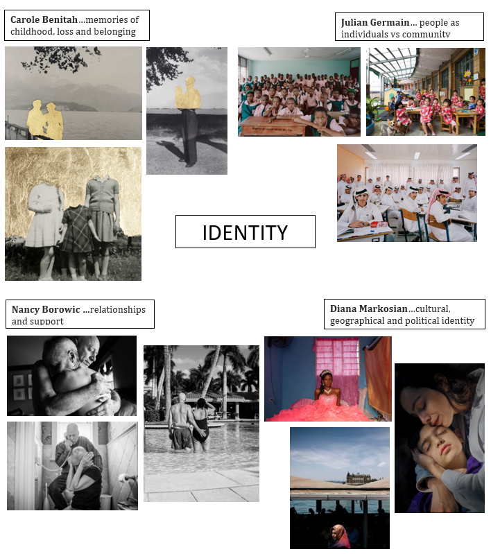
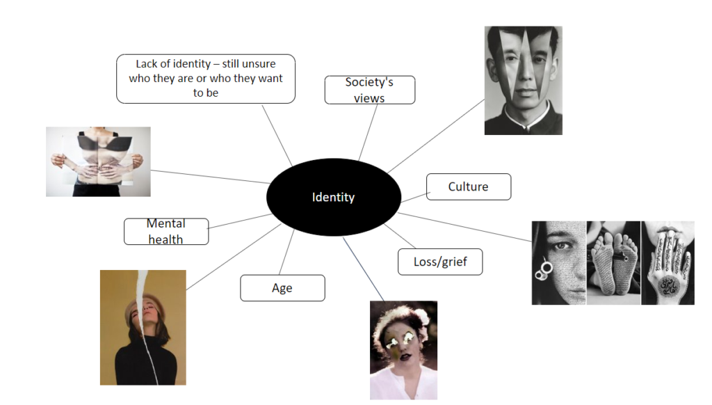
The distinguishing character or personality of an individual defines identity. Identity is who you are, the way you think about yourself, the way you are viewed by the world and the characteristics that define you. How we define ourselves is a self-representation of our culture, interests, relationships and efficacy in doing the things that matter to us. Our sense of identity and belonging is impacted by various factors, including our experiences, community and our physical environment.
Identity also helps us to make decisions and to know how to behave. We’re constantly faced with complex decisions and circumstances. With no prior beliefs about what we should do, weighing all the options and making a decision would be near impossible. Having a sense of what kind of person you are makes it much easier to decide how you should behave, and to have confidence in your choice between options. This makes decisions that would otherwise be agonising virtually effortless. However, strong identities can also be dangerous. The drive to protect your identity can be overpowering. Sometimes we can get so caught up in this that we neglect other important things: like being open-minded, truth-seeking, and kind to others. It’s hard to think clearly and objectively about something that you identify strongly with, it is possible that this is the driving force behind a lot of conflict in the world.
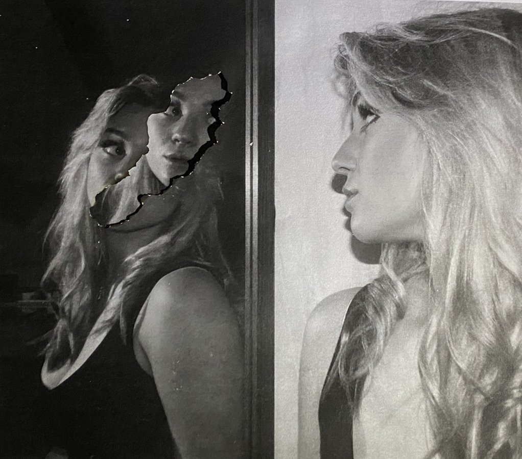
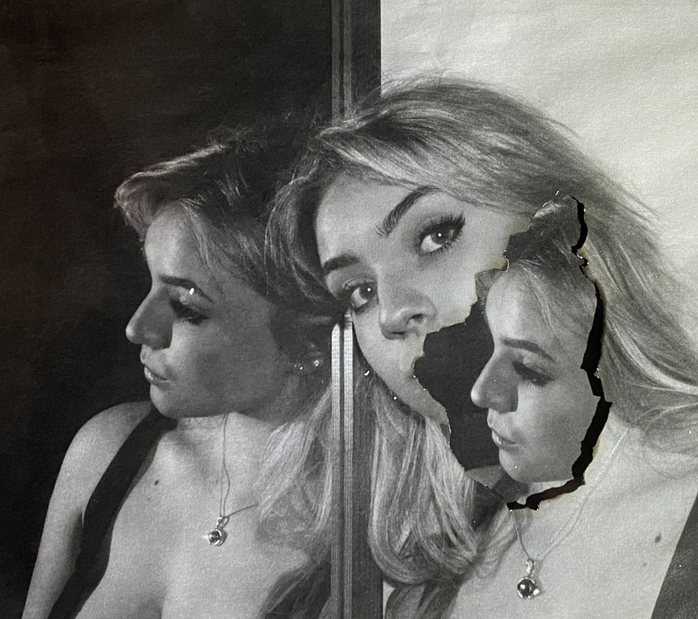
After going through my edited images, I decided that the two above were my most successful images. I wanted two images: One where the subject was facing the camera and one where she was facing the mirror. I think these two images would work well together placed vertically- and to achieve that I cropped both images and rotated them slightly to align the centre where the frame of the mirror divides both sides.
To explain the reasoning one last time, these photographs represent how everybody around you has a different perspective and different angle of how they see you in their mind to how you may see yourself, for example when you look into a mirror. However this is meaningless- you only look one way. Its all about perspective. In these images, the in the centre on this images is a frame (the mirror frame), which divides these two perspectives. One successful feature of these images is that the two sides completely contrast in tones. The background of one is very dark and the other is very light. As for the burns and parts of images coming through in Image 1 simply show a form of distortion. Part of the subjects face is cut out, but just replaced with the same image below just slightly moved. In image 2, it represents reality- the mirror image colliding with how others see you, this is because it can be true. People can see you the way you see yourself even if you don’t realise that. ‘There is dark in light and light in dark’. One thing I could have done is also printing and burning these photographs on photographic paper, this would have creating a melting effect, in addition some warmer colours around the burnt point.
When deciding how to display my images on paper, I though about some creative things, however this could distract the viewer and had no real meaning. I want my images to be clear and the focus point.
I took a photo of a plain picture frame and placed my images on using photoshop, however I didn’t like this outcome- there’s not enough contrast and depth bringing my images forward, they are also very close together making the viewer almost looking at these images as a whole rather than evaluating each them separately.
I liked this display a lot more than the previous one, It separates the images as well as making it clear that they are part of one idea. The small white border contrasts the black paper and makes my photographs pop, keeping the same black and white theme.
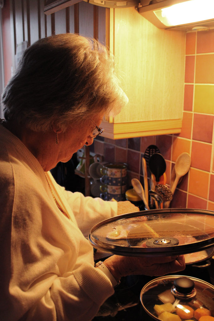
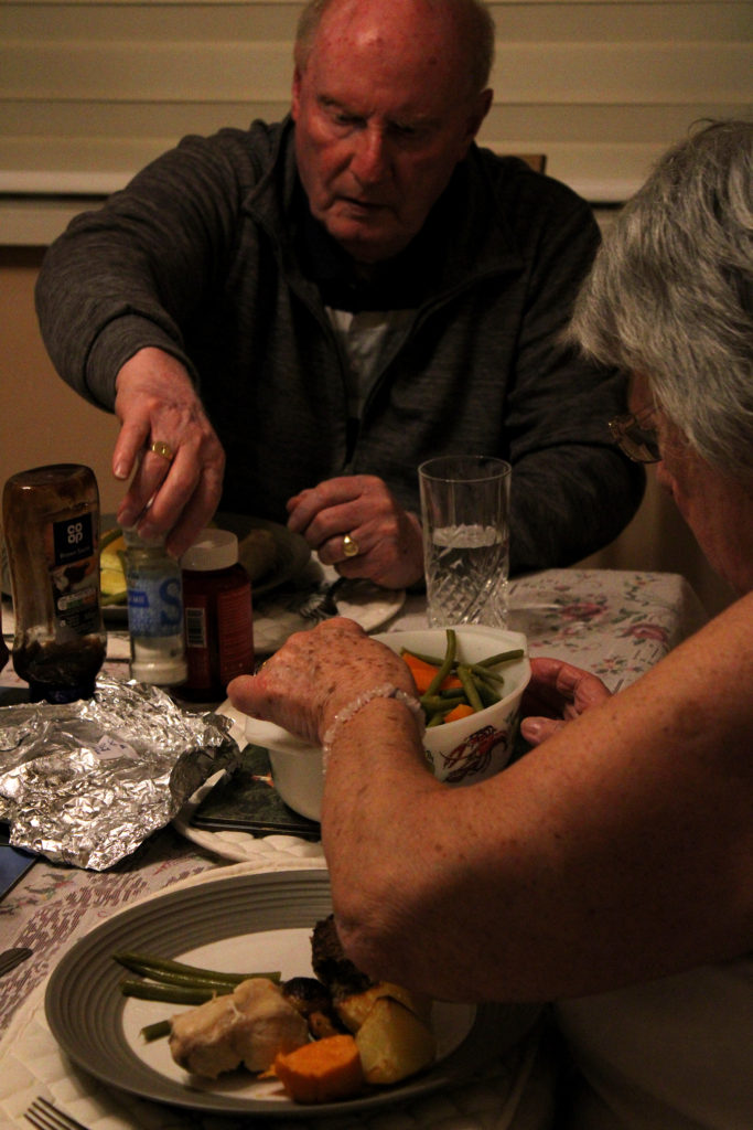
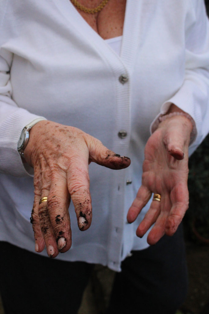
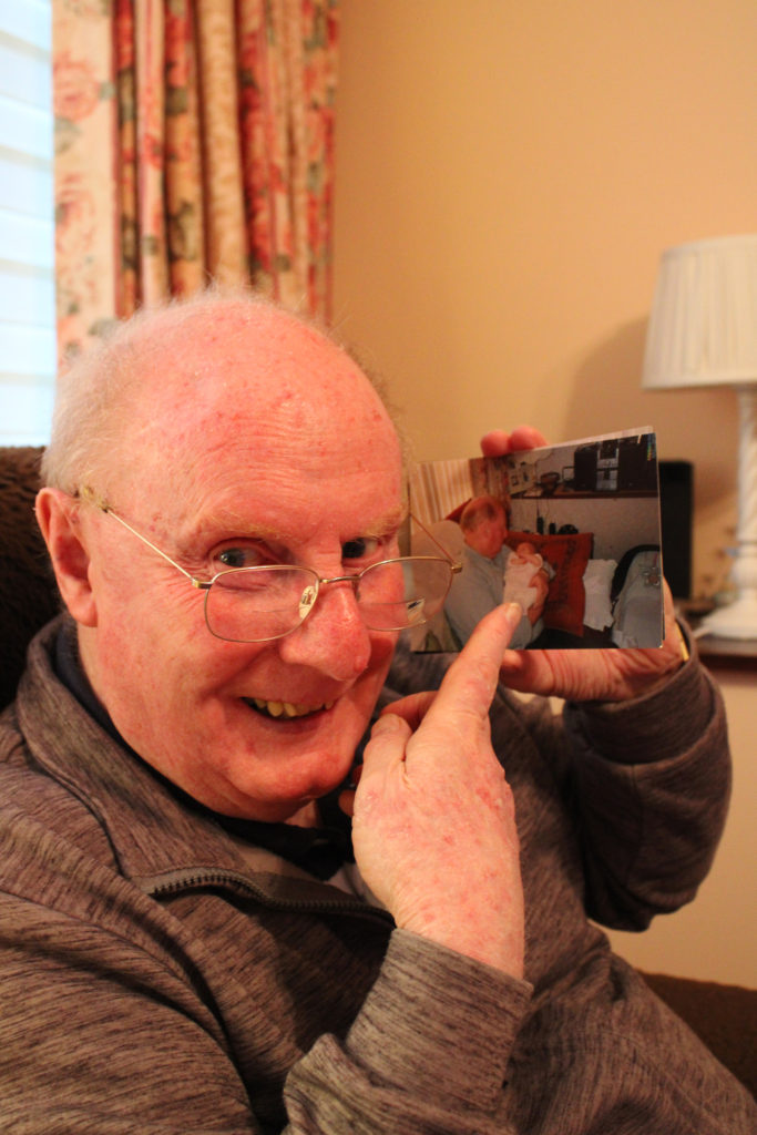
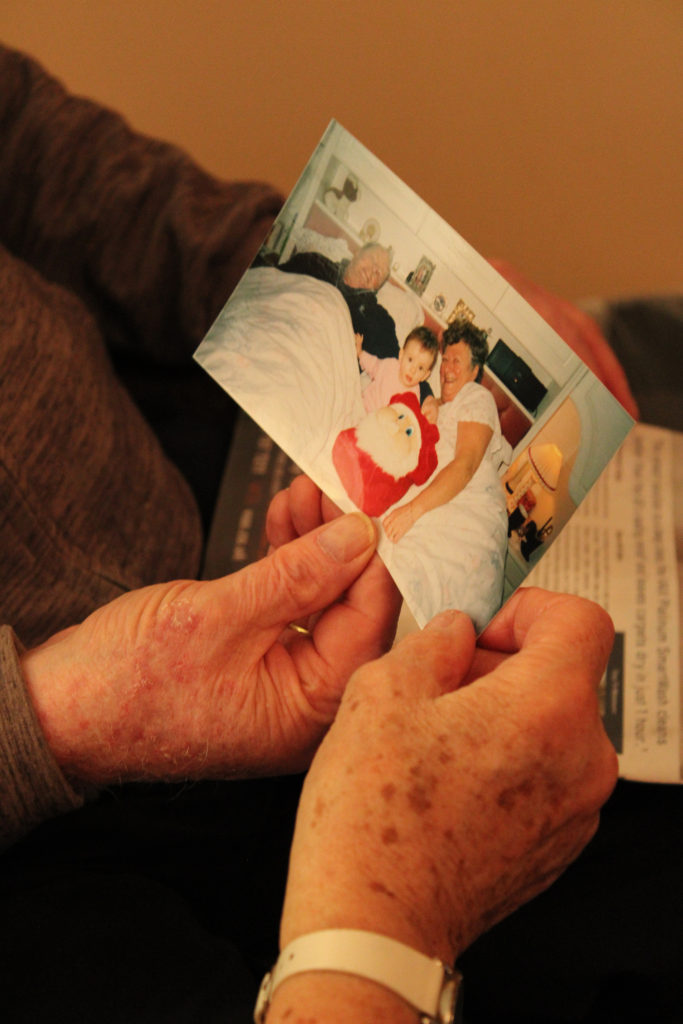
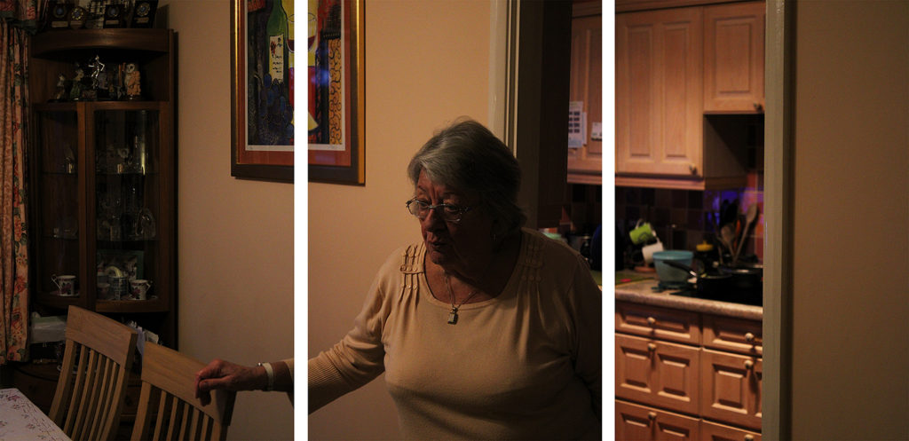
During my editing process of these 3 sequences I decided to keep it quite minimalistic, only heightening or lowering the saturation and brightness so that each group fit together better. Similar to the work of Julian Germain, I wanted to focus on creating a warm, happy environment within each group of images. When editing, I found it important to keep saturation of bright colours high, in order to reflect the joyful energy that overwhelms you when entering my grandparents home. I really enjoy how each sequence has a strong contrast between highlight and shadow, I think this range of tones creates quite an impactful image that quickly catches the observer’s eye while also helping them to understand the influence family has on identity- as if the light overweighs the shadow and makes it clear how important family relationships are.
Experimenting With Multi Exposure
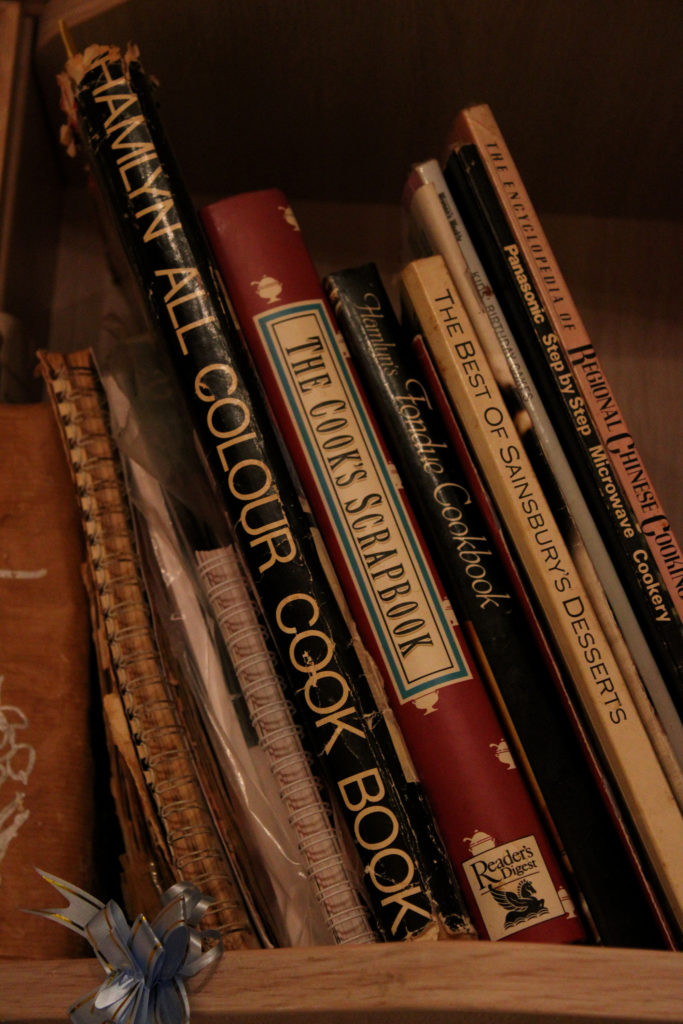
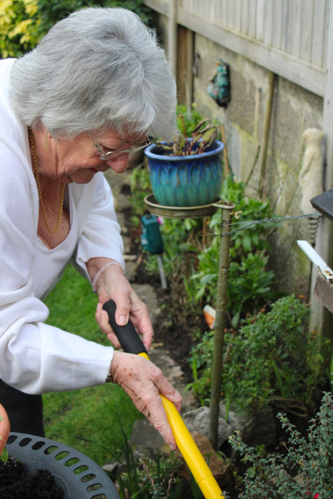
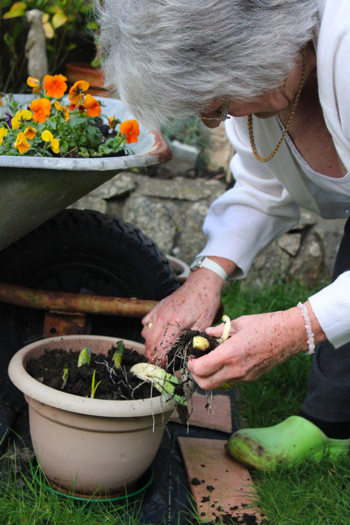
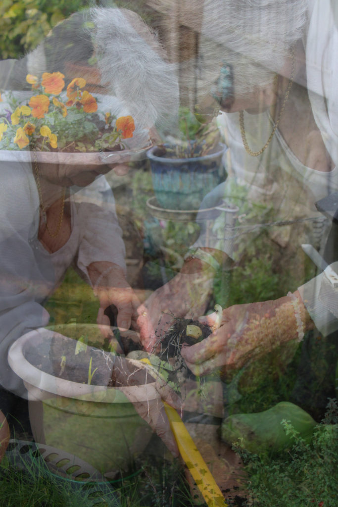
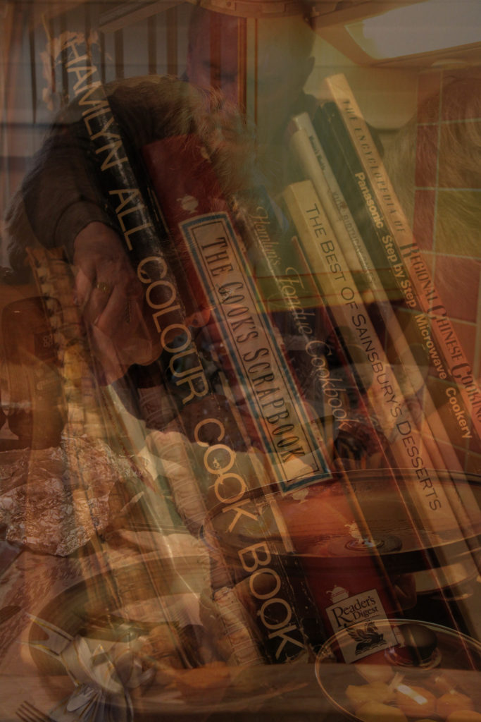
I decided to experiment with creating two multi-exposure images to see whether telling the story was as easy with each image overlapping each other, to them being next to each other. I produced these two images on Photoshop by copying each layer and then pasting them over one another, lessening the opacity each time. I really like how multi-exposure images look and how they can tell a story through repetition- the work of visual artists such as Man Ray are very inspirational to me when creating these types of pieces. I believe that someone’s identity can be very much influenced not only by their surroundings, but what they choose to do in them. When creating these experiments it was clear to me that my grandparents identify immensely with the hobbies they do, I think these multi-exposure pieces really emphasise the importance of these activities to them and show the overwhelming joy the receive from doing what they love. Additionally, the images overlapping each other symbolises the many layers of meaning these scenes hold, like they are echoes of the past that my grandparents remember each time they start the cycle of activities again. Furthermore, I really like how in the second image the focus is on the cookery books yet the other 2 images are layered on top of them. I decided to make this editing choice because of my grandmother’s freedom in the kitchen- she owns so many recipe books yet never ends up sticking to the recipes inside them. This multi-exposure technique symbolises the overcoming love my grandmother has for cooking and how she would prefer to make up her own exciting meals rather than following what someone else tells her to do in a book. These two images hold many interesting ideas and connotations, however I believe the multi-exposure editing actually makes it quite difficult to really see what each images is, and the quality of the images themselves. I think when evaluating my ideas for my final pieces, these images wouldn’t flow as nicely when telling my grandparents story as the prior sequences would.
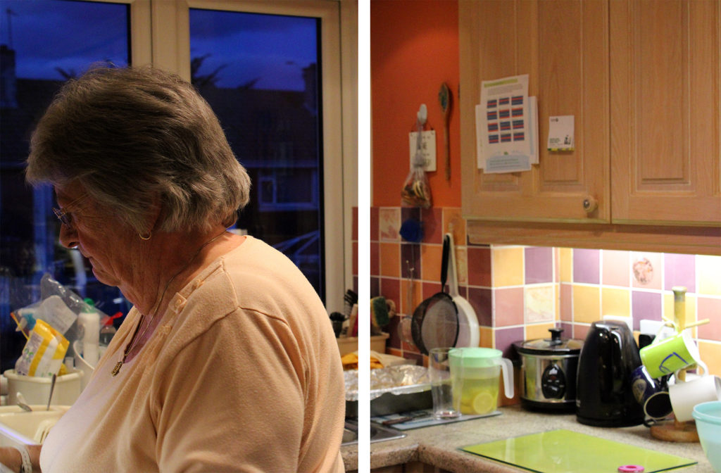
David Hilliard Inspired Photoshoot
When editing these three images from my David Hilliard inspired photoshoot I decided to, again do minimal editing, but also experiment with how vibrancy and colour can effect the mood or atmosphere of an image. These three images hold many vibrant colours, with the repetition of orange in the kitchen walls providing the clear dominant colour throughout. To keep this vibrancy, I slightly heightened the saturation of each image to really emphasise the bright atmosphere inside my grandparents home- which has impacted my family’s identity for the better through times of sorrow and loss. In addition, I wanted to make sure each element of this special room, such as mugs and kitchen utensils in the background, were easily recognisable. This was because my grandparents are not the biggest fans of change, nearly everything in their kitchen has been their since I was a toddler; the memories they all hold of us baking together when I was little are very special to me. In order to keep these things noticeable, I used the ‘sharpen’ tool on Photoshop for better clarity in each photograph.
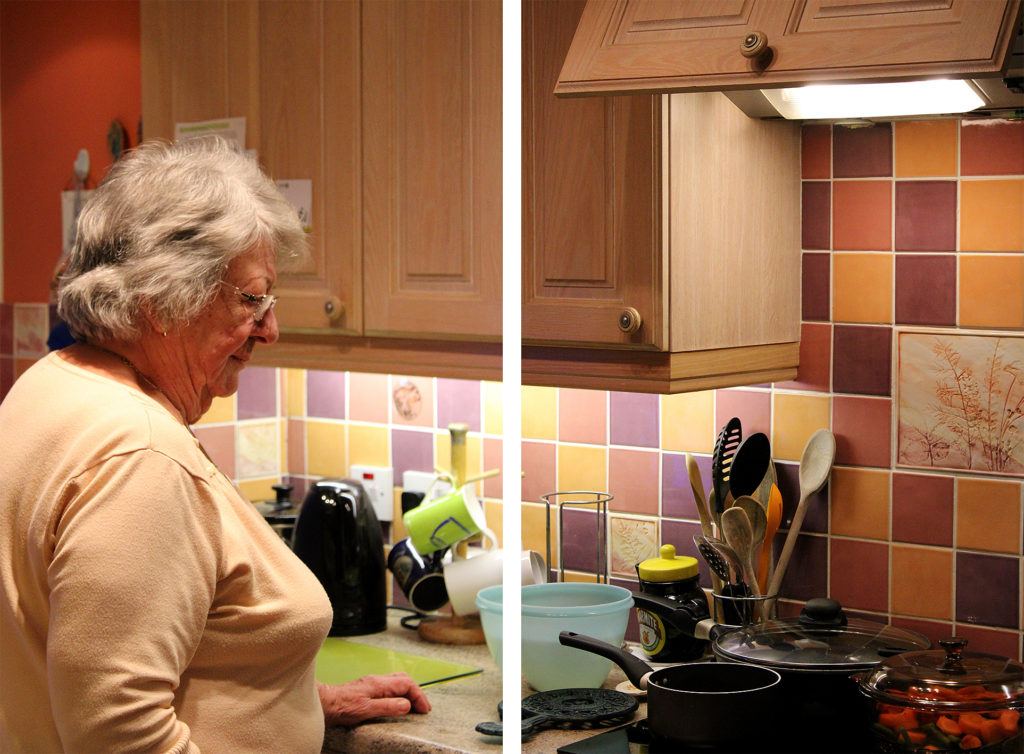
Experimenting With Black and White
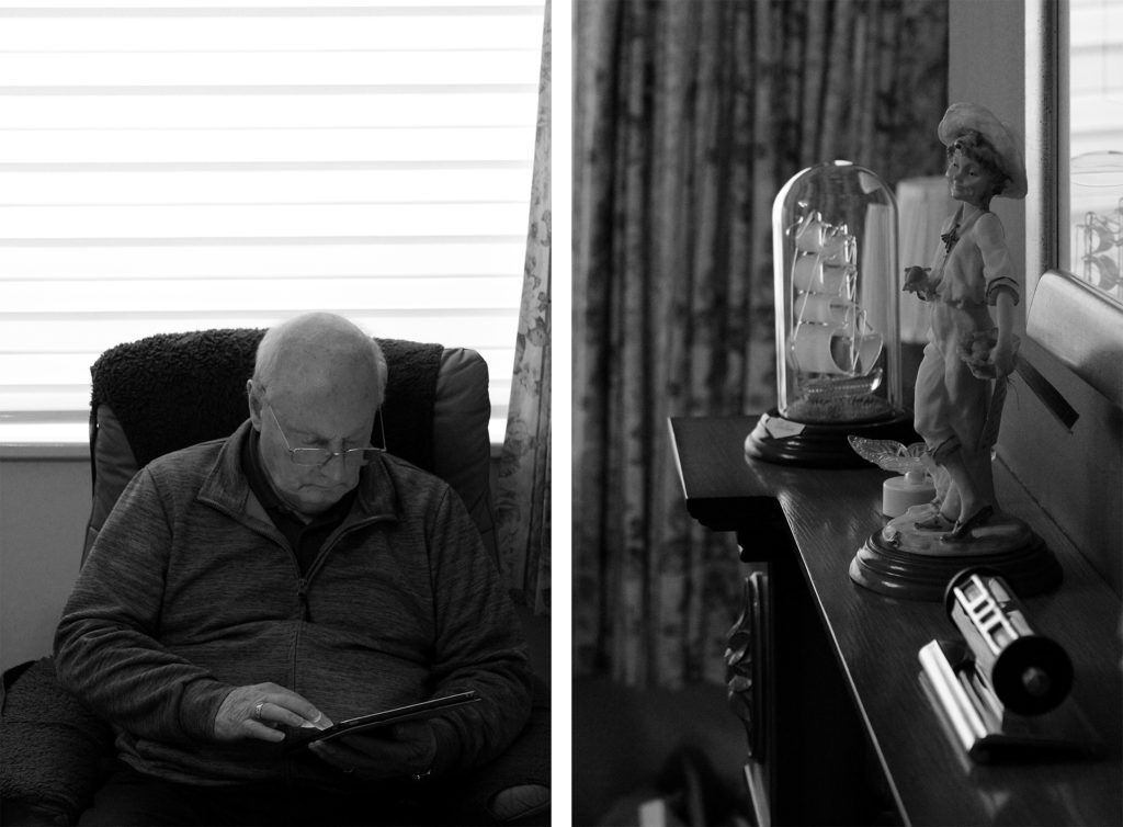
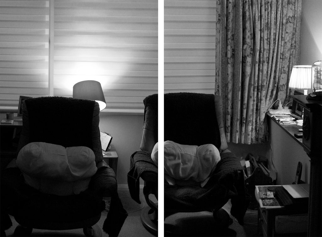
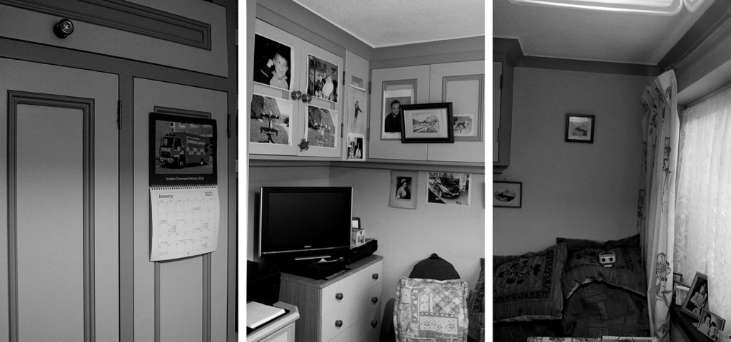
I chose to edit these specific three arrangements in black and white to experiment further with how colour can effect the atmosphere of an image- however in these images I believe the lack of colour actually influences the message and meaning of the photos. The unsaturated filter mirrors the photographs that were taken when my grandparents were children themselves, the black and white image is nostalgic to them and holds many happy memories. In fact, many of the images on the walls of my grandparents home were taken before colour cameras, so this editing links strongly to their childhood and their home itself. I love how the black and white filter emphasises the strong dark and light tones in these photos, it allows the observer to see a range of shadows that fall across each image. Furthermore, this editing clearly shows that the top two images have quite unbalanced tones, leaning more towards the shadow than highlight, whereas the bottom sequence is balanced between light and dark. Moreover, I chose these particular three images because of their link to my family’s identity, they hold many fond memories from past gatherings and childhood. The image exhibiting my grandparent’s chairs is very special to me, the area is a place in their home they will nearly always be and I love how the black and white editing allows the image to link with their past. Additionally, I chose to edit the bottom image due to its sentimentality towards my whole family’s life, with pictures on each wall depicting former achievements and the room’s joyful memories of family BBQs where we would set out drinks tables along with mountains of food. I think this unsaturated editing has added lots of links to the past to these images, however it has also taken away the warm happy atmosphere- it is possible the black and white filter has added a more gloomy mood to the photos so when choosing final images I will need to consider which option is best.
Identity can be defined in many different ways. Identity can be described as the fact of being who or what a person or thing is, the way you are viewed by the world and the characteristics that define you. However people in photography normally portray the word identity as something that you truly are whether you show it to the world or not, for example being gay but not coming out. The photography based around identity tries to portray the real identity of the person being photographed and show who they truly are compared to how the world sees them. Identity photography can also be used to show objects, people or hobbies people love and they feel expresses them.
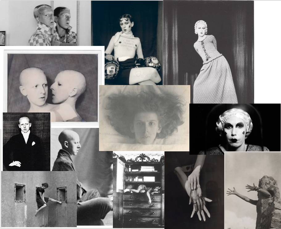
Claude Cahun
Examples of Claude Cahun’s work
Claude Cahun was born in France on the 24th October 1894 and was born as Lucy Schwob. Lucy Schwob later became Claude Cahun to be gender neutral. She was a lesbian, photographer, sculptor and writer. Cahun was born into a prominent intellectual Jewish family with a Mother who suffered mental health issues meaning she was brought up by her blind Grandmother. As a teenager Claude suffered from multiple mental health issues such as depression , anorexia and suicidal thoughts. Also at this time she met her love and future lifelong partner Suzanne Malherbe, however Claude’s Father married Malherbes mother making them step-sisters although this did not stop them. She began making photographic self-portraits as early as 1912 (aged 18), and continued taking images of herself through the 1930s. Her images portray a dizzying kaleidoscopic mix of mystery, exuberance, and sobriety. She had an obsession with examining gender, using herself as subject. A year later she published her first collaboration with Malherbe titled “Vues et visions”. In her self-portraits, she presented herself sometimes as a man, sometimes as a woman, and sometimes so heavily made-up and costumed that it was impossible to determine her persona’s gender. A series of self-portraits from 1927–29 show her masquerading as a feminized male wearing lipstick, painted-on heart-shaped rouge, and a shirt with painted-on black nipples that reads, “I am in training, don’t kiss me.” Cahun died on December 8th , 1954 and it wasn’t until 40 years later that her work was noticed and appreciated by people.
I will be taking photos of landscapes and buildings so I will not need anyone to be in the photo. I will be taking the pictures.
What
I want to take pictures of important places/landscapes and buildings around Jersey that are linked to me and my family.
Why
I want to focus on buildings and settings because I want to show more about how the location I live in affects me and what places have meaning to them. I want to show that the history and memories of certain places can impact how we view something and how it can relate to specific people.
Where
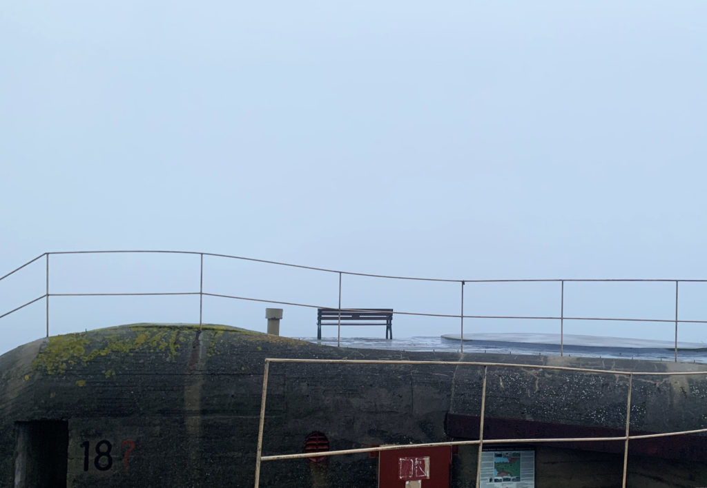
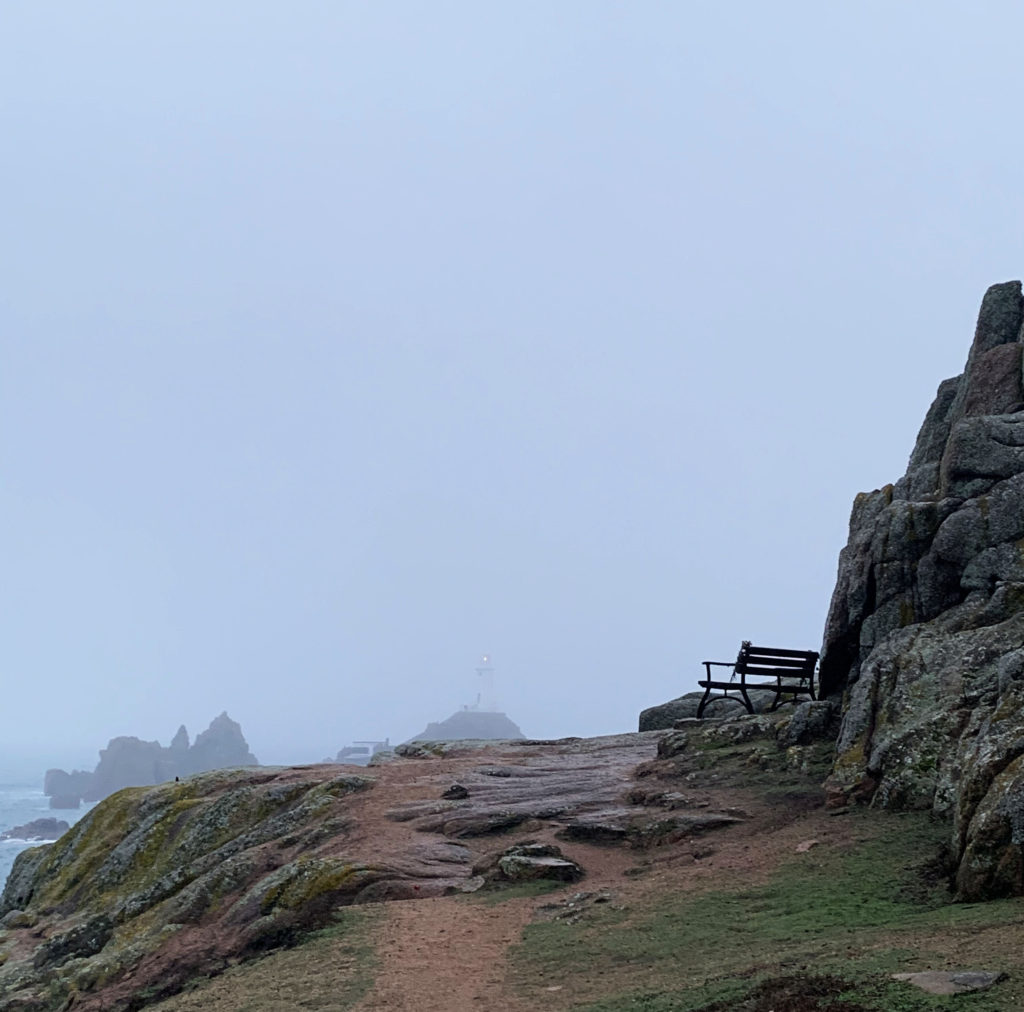
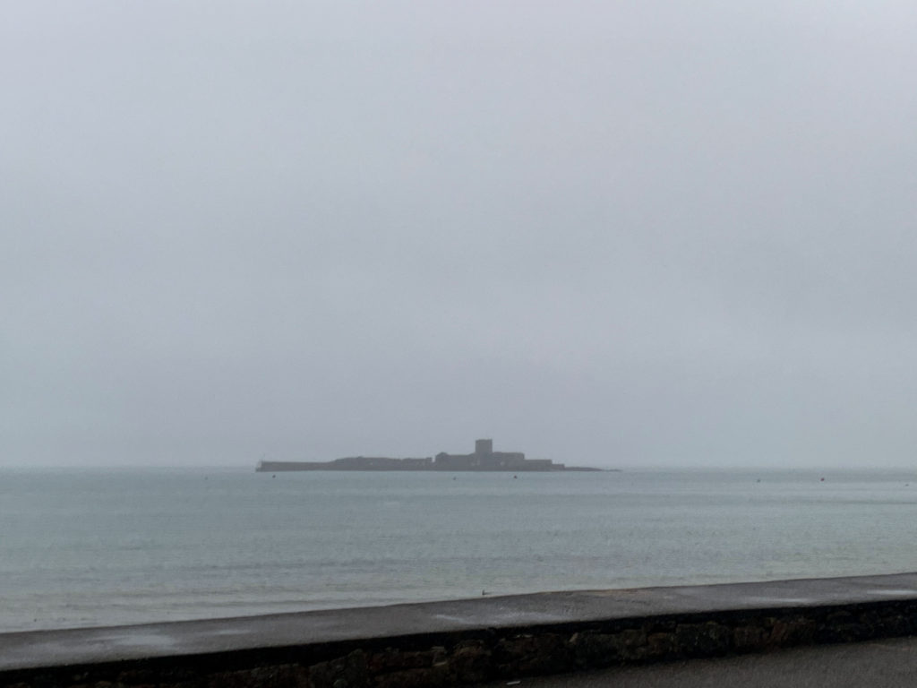
I will go to Corbiere Lighthouse because my mums parents (my grandparents) favourite place is Corbiere and they live in England so I associate Corbiere with my grandparents, which is part of me as my grandparents are part of my family history. Corbiere also has an impact on Jerseys identity and history as it is surrounded by bunkers from when the Germans occupied Jersey.
When
I will go on a day where the sky is grey and there is no sun because I want the images to feel isolated. I also want to have one main subject of the photo and the background to be empty and simple.
How
I will be using a digital camera.
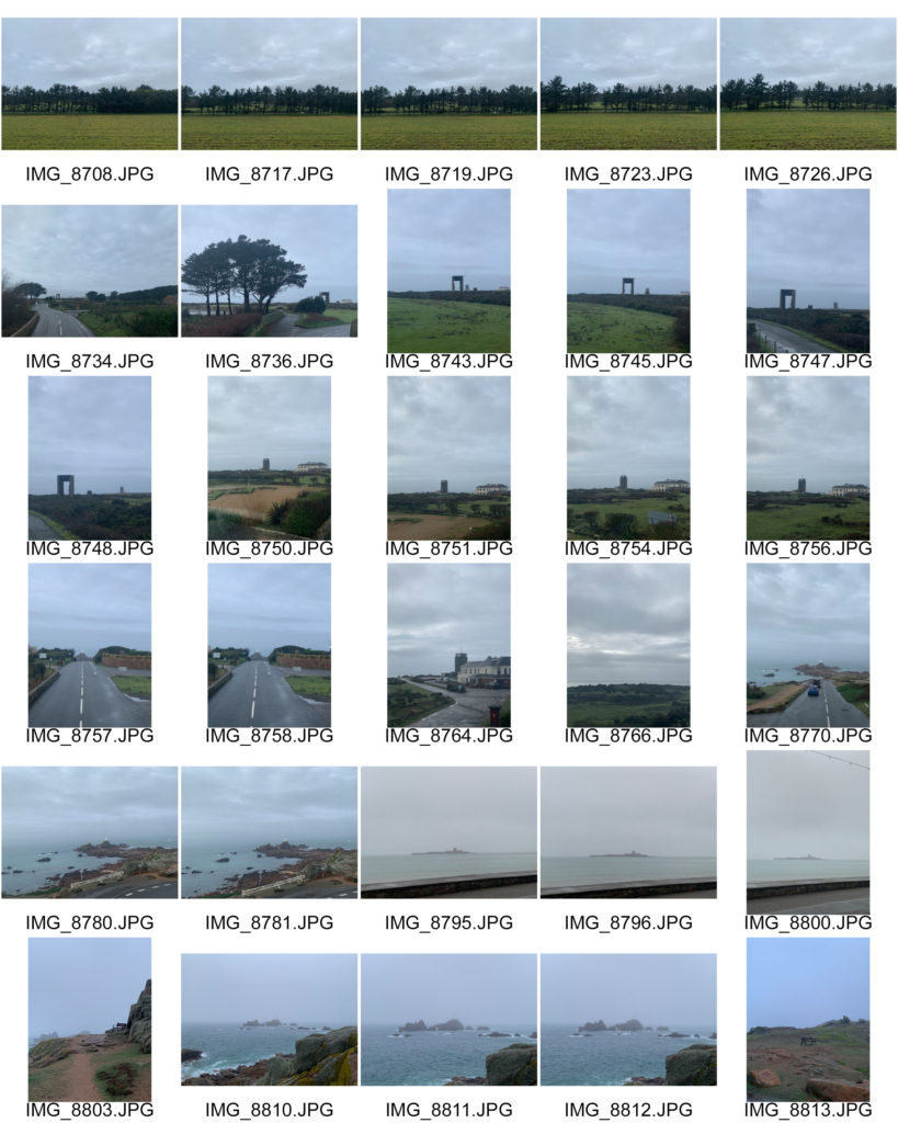
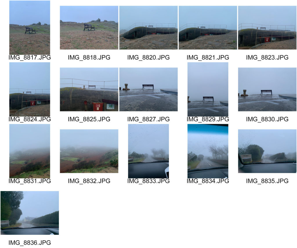
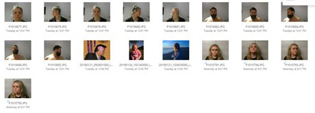
Contact Sheet
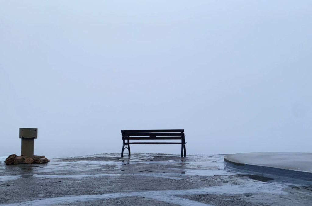
I chose to go on a day where it was misty and foggy because I knew that the sky would be empty and smooth which is what I wanted, it also added a sinister mood to the photos. When taking the photos I tried to focus on the positioning as I wanted the same horizonal split shown in some of Alec Soth’s work. I found a bunker with a bench on the top which I thought would be good to photograph as it links to the idea of isolation especially as it was facing the empty sky. To take the above images I used my phone because it was too damp for my camera however the images still came out how I wanted.
What: Self-portraits with different “traditional clothes” of different cultures and then show myself.
When: Monday 25th of January.
Where: Like in the first shoot the place was not the most important so I took the images in a room in my house where could find a white wall I also used lamps.
Why:
To show the different I grow up in and show what they made me.
Contact Sheets
First Selection
Seconde test
Edited
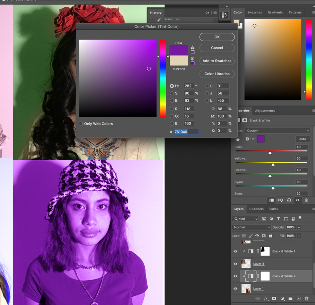
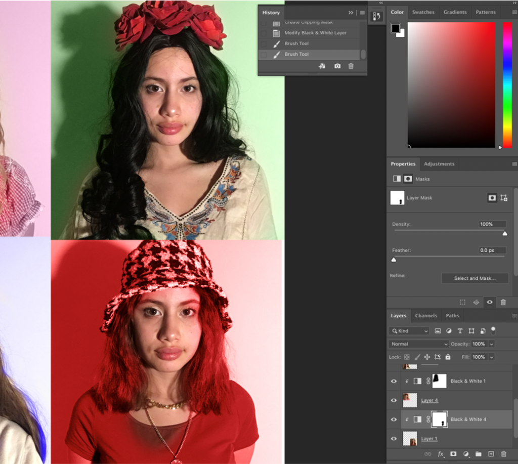
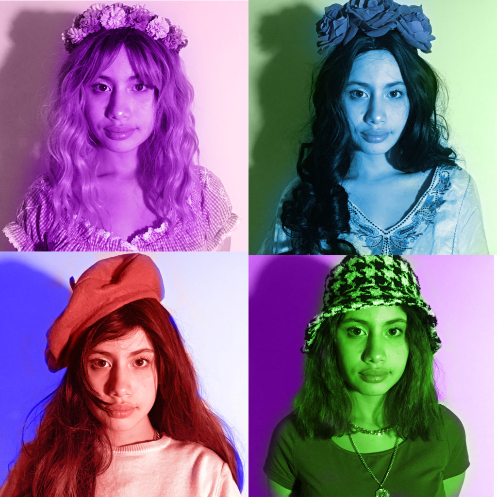
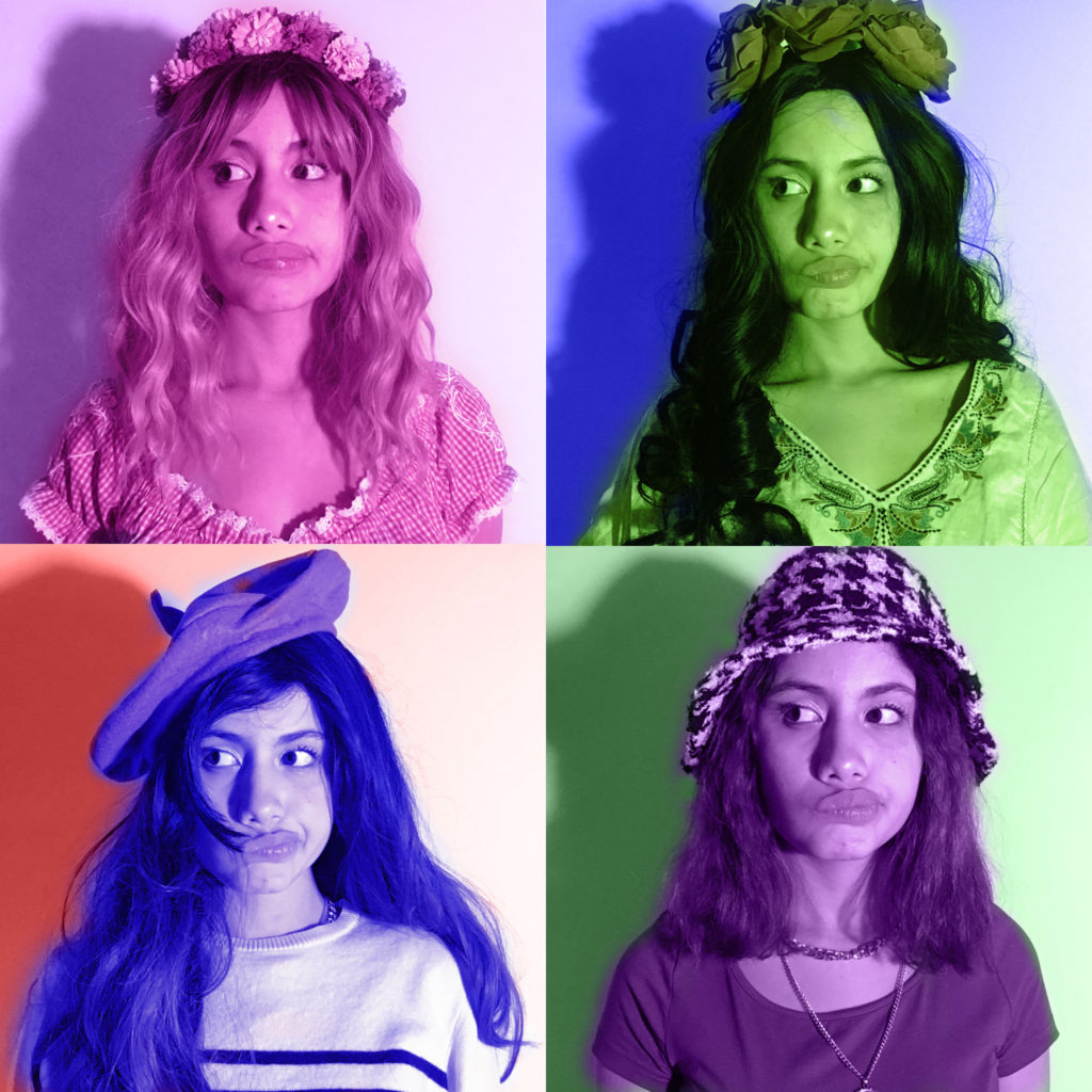
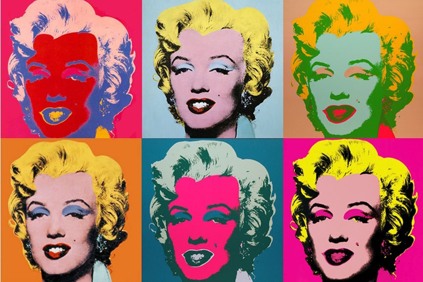
To create these colour effects I used photoshop. To start I had to crop the selected images then paste them on a white sheet for that I had to change the image to layer then the copy and finally the pasted on the sheet. Then when the images were well placed I started with the colour. For that I select a layer then create a black and white mask. The problem is when we create a mask the software selects all the images so to cancel it I double clicked to have the option “create clipping mask” which selects only the chosen image. After that I chose the colour I wanted. But as I wanted the background to be a different colour than me I had to erase the colour on me and for that I use the “brush tool”. In the end to have colour on me I repeat the same process
Comparison
The first thing we notice is that they are roughly the same style just what I was looking for. We can notice the same colours as: pink, purple, red, green and blue. The work of Andy Warhol has several colour contrasts, you can see it on the hair, the skin, the background and the make-up of Marilyn Monroe. On my work I wanted to have a shadow so that when I change it colour, the shadow will change the colour to darker. However we have one thing in common and it is always the same poses what is done on purpose.
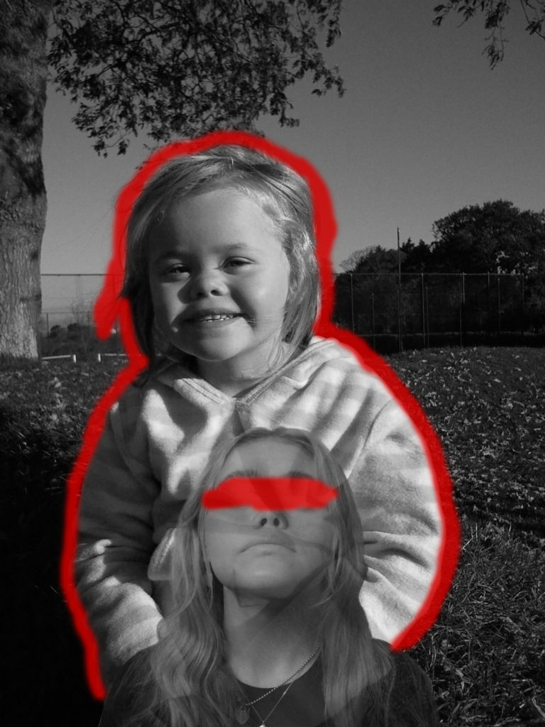
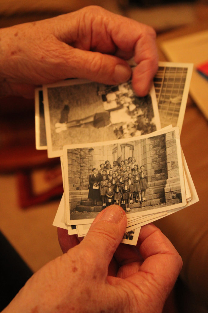
As I was using old family photos for this final piece, I wanted to incorporate my own photography into these images. Therefore, I took simple headshots of my mum, dad, and myself at different angles in order to show comparison between the past and present. I used softer lighting for these portraits as I was going to cut them out and wanted to avoid harsh shadows.