CC – FINAL OUTCOME IN THE STYLE OF Birthe Piontek

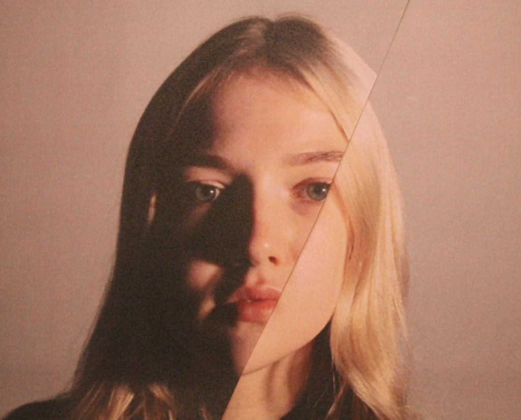
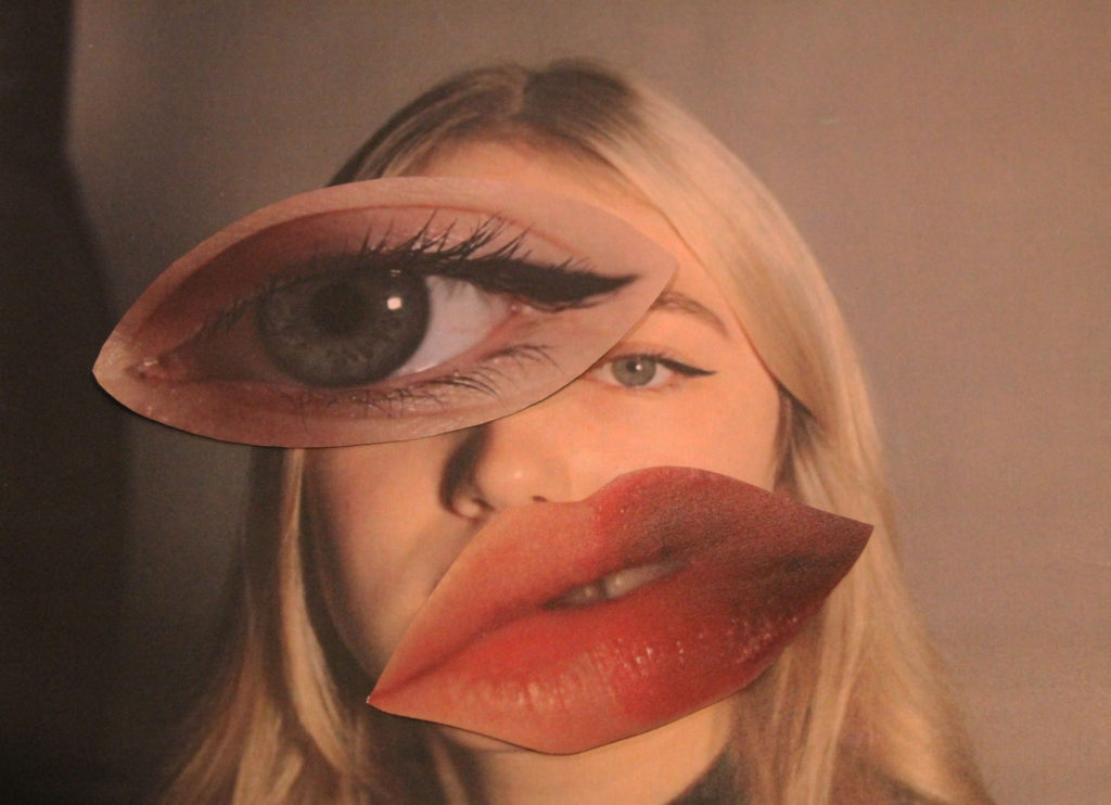
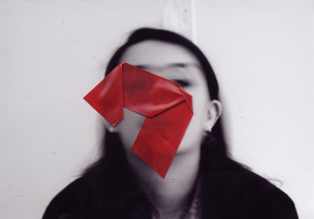
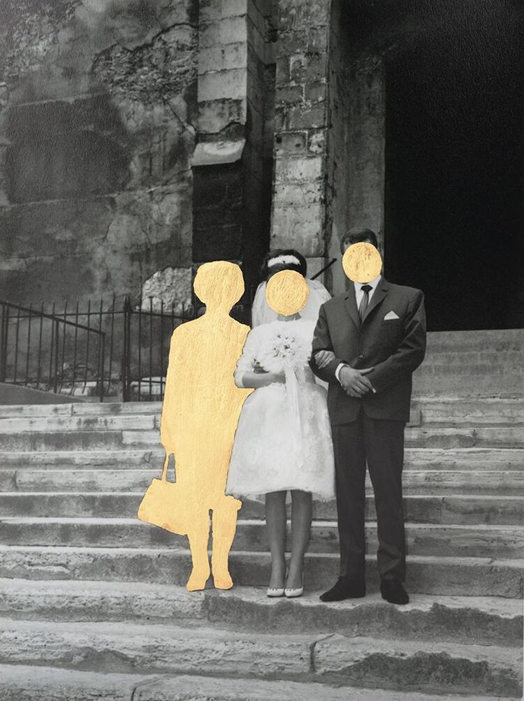
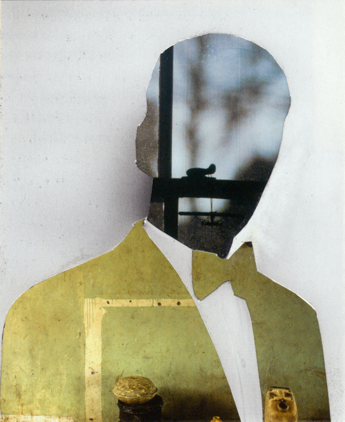
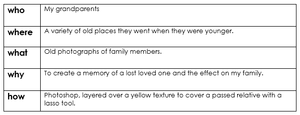
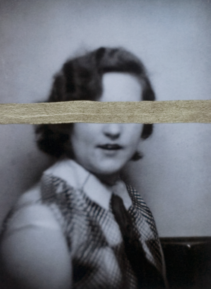
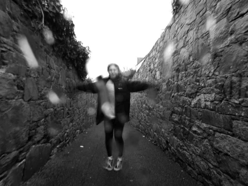
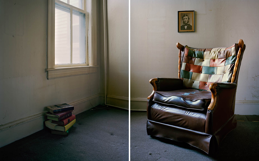
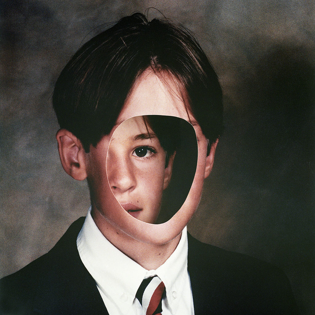
I wanted to create a set of images in the style of Birthe Piontek. This is the image that inspired me.

Firstly, I chose 2images to edit. I would edit 1 with no face, and create the hole in the head effect. And 1 of the face inside and 1 outside the head, as I think it relates to hiding your identity and the opposite showing your identity.

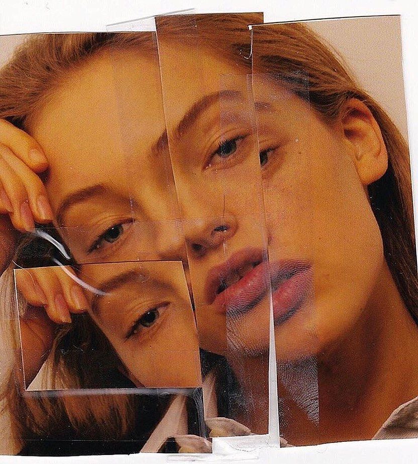
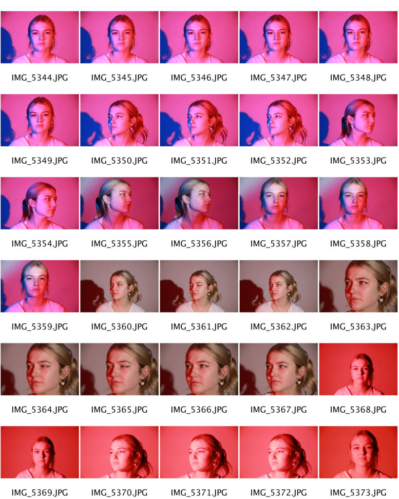
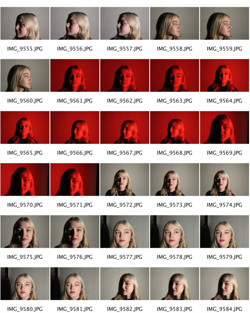
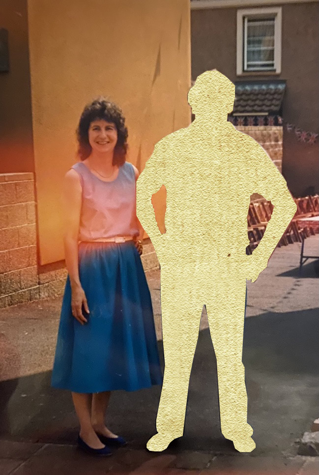
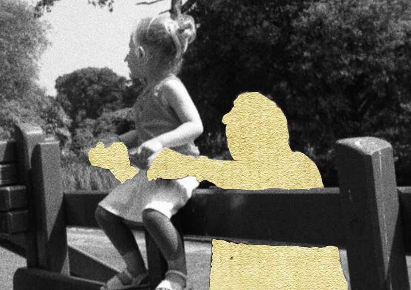
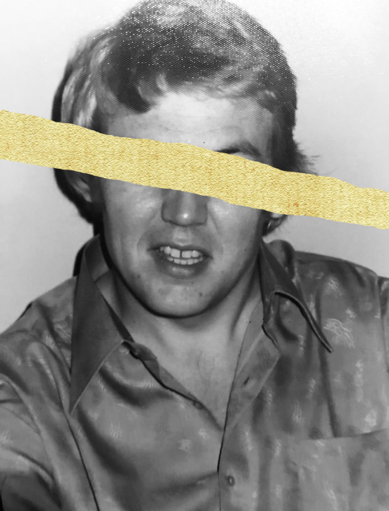
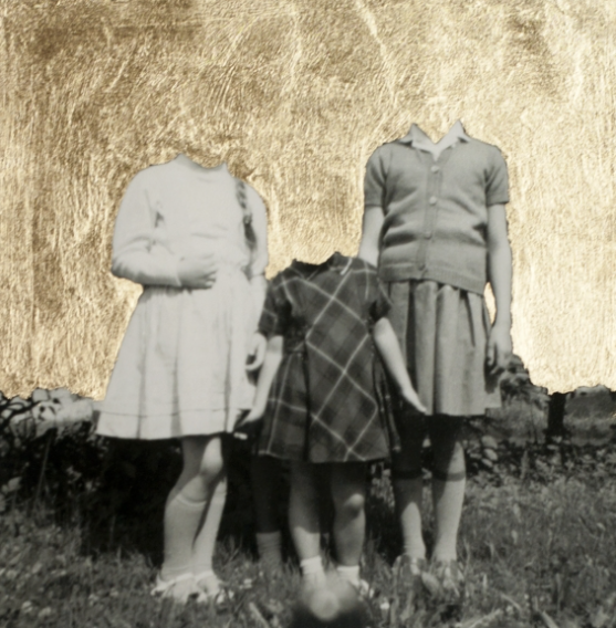
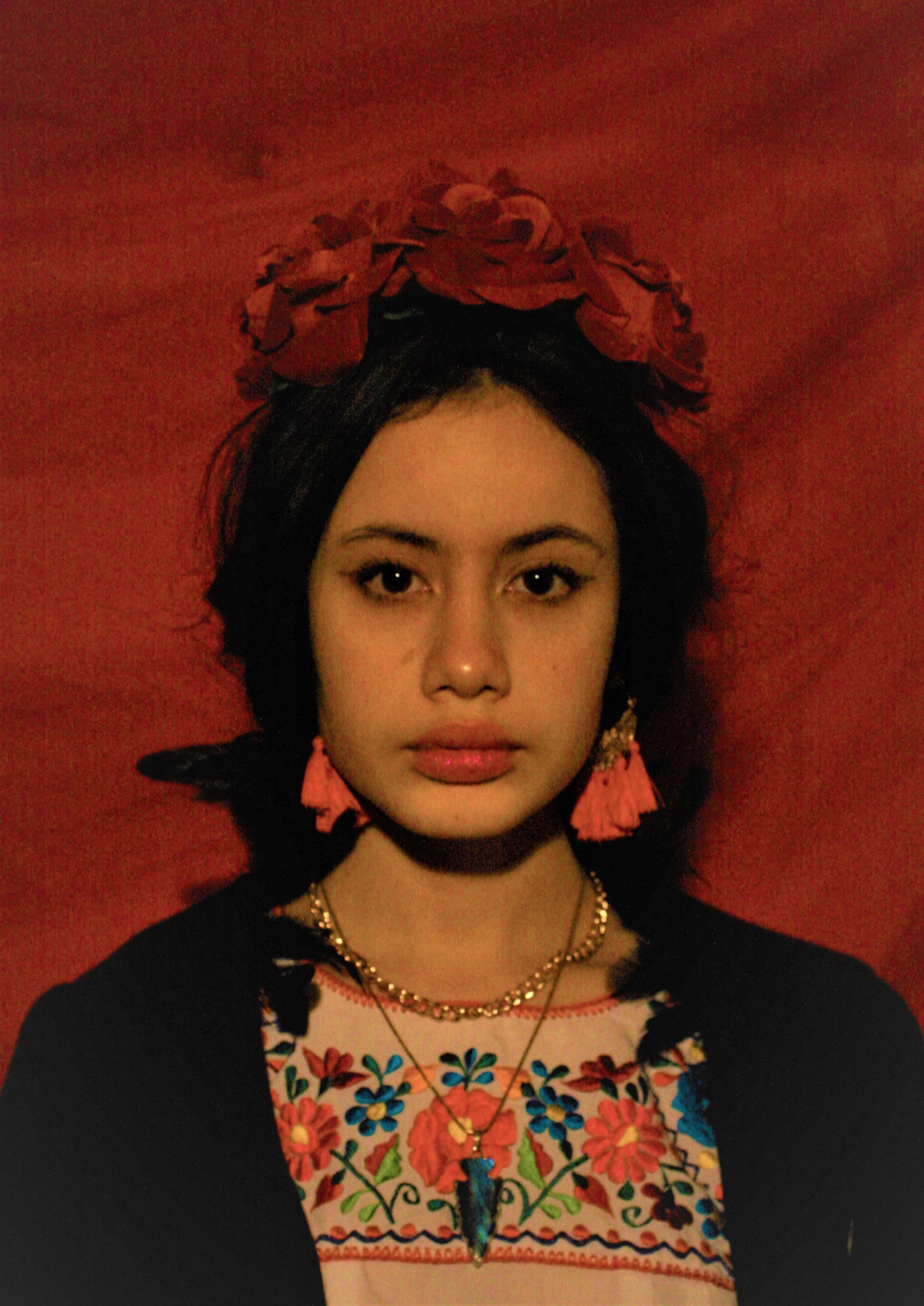
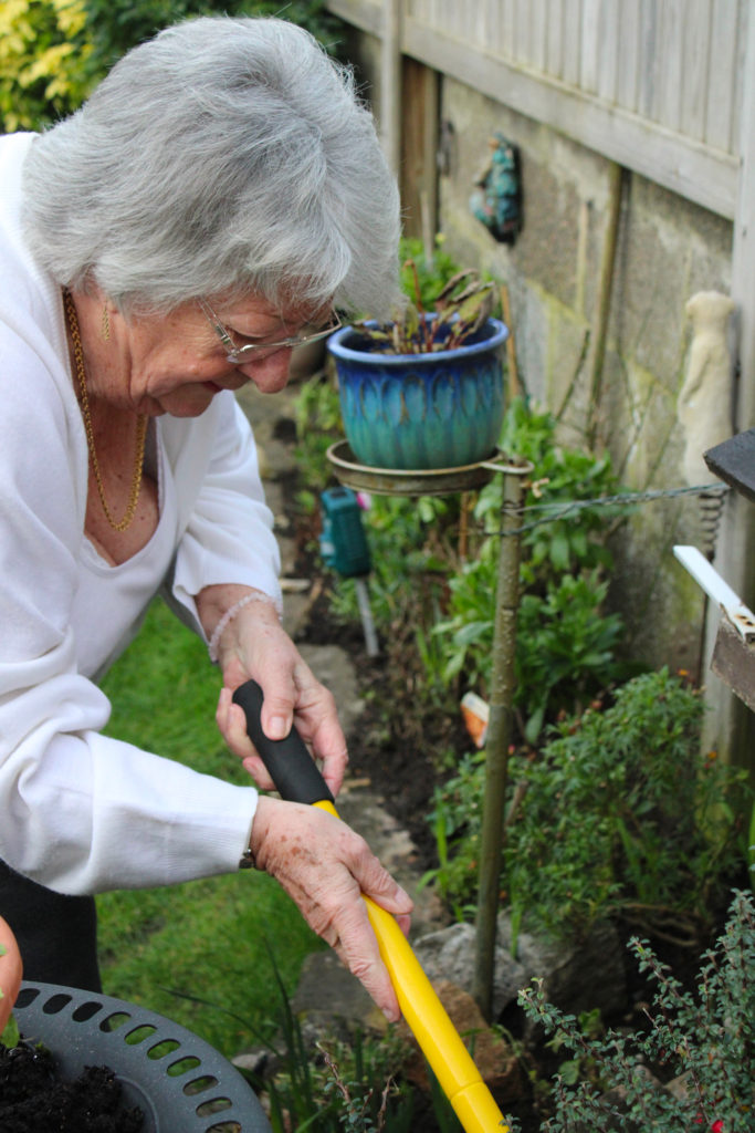
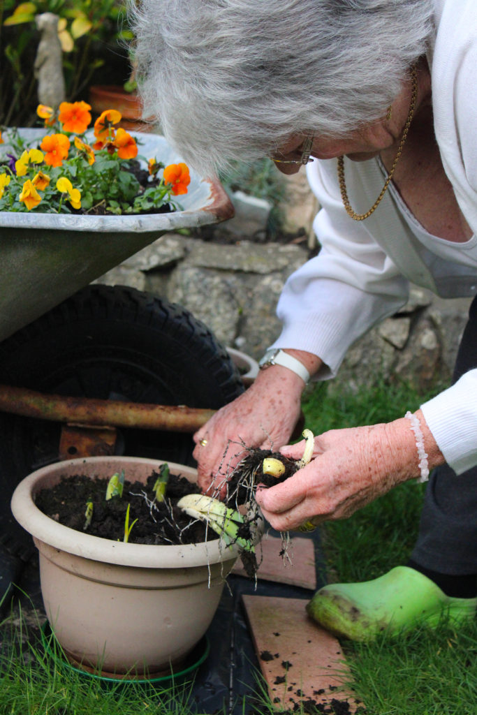
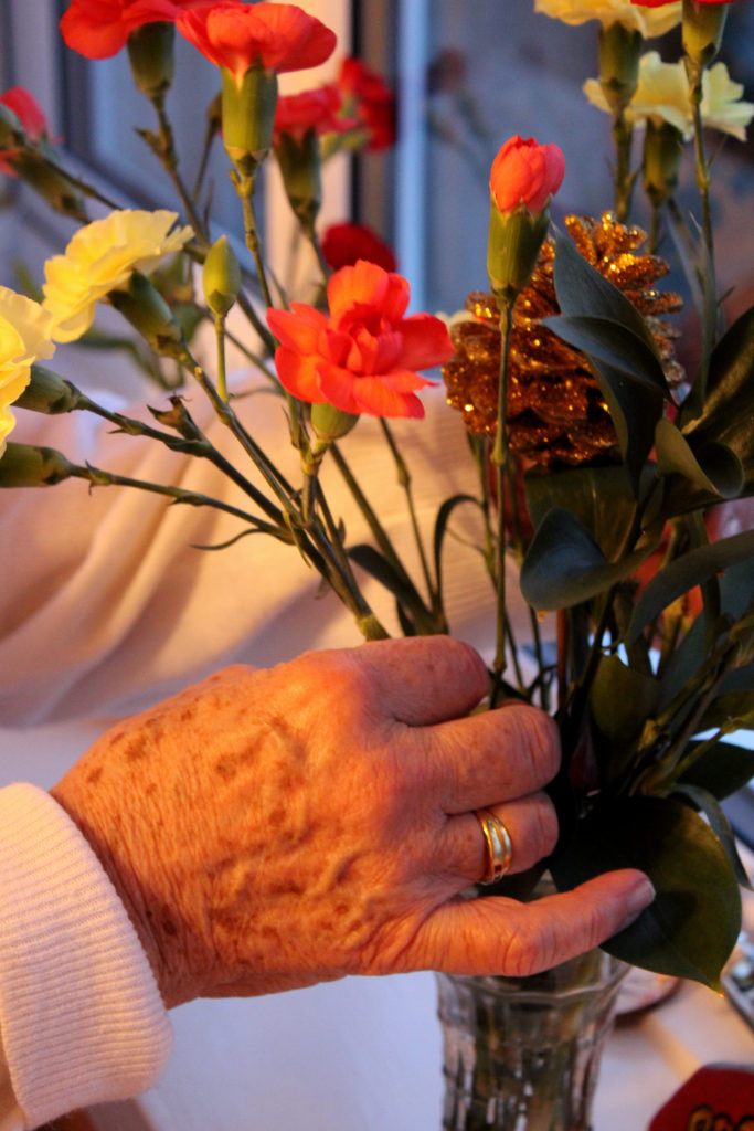
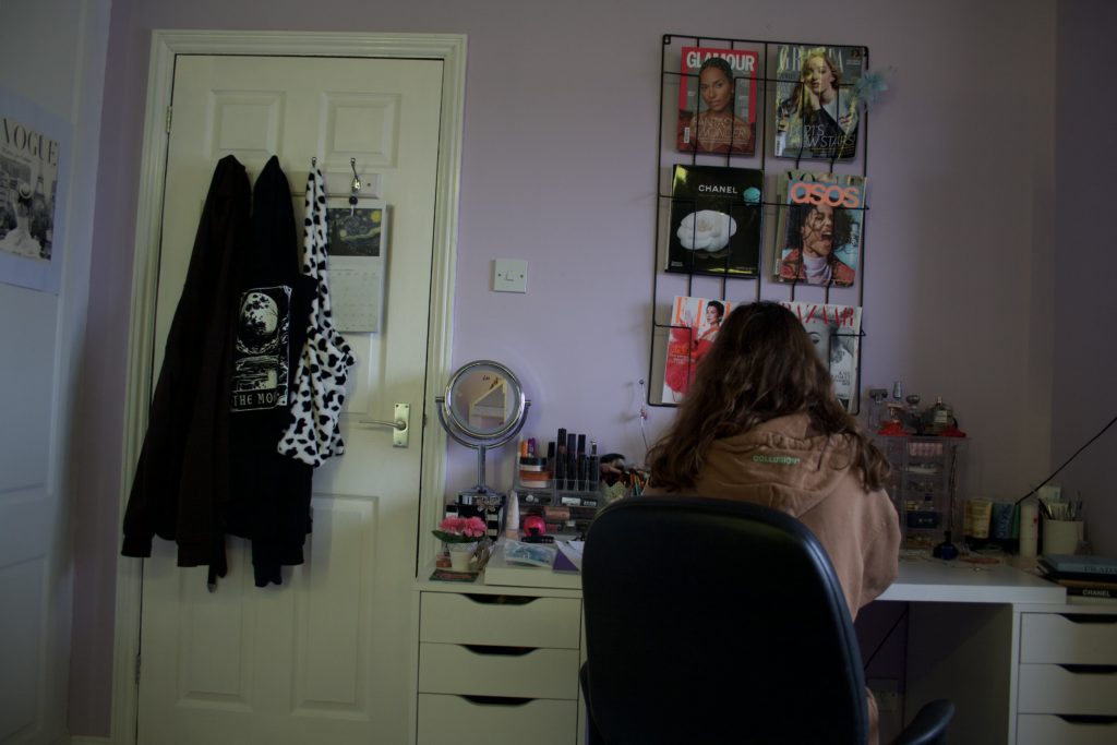
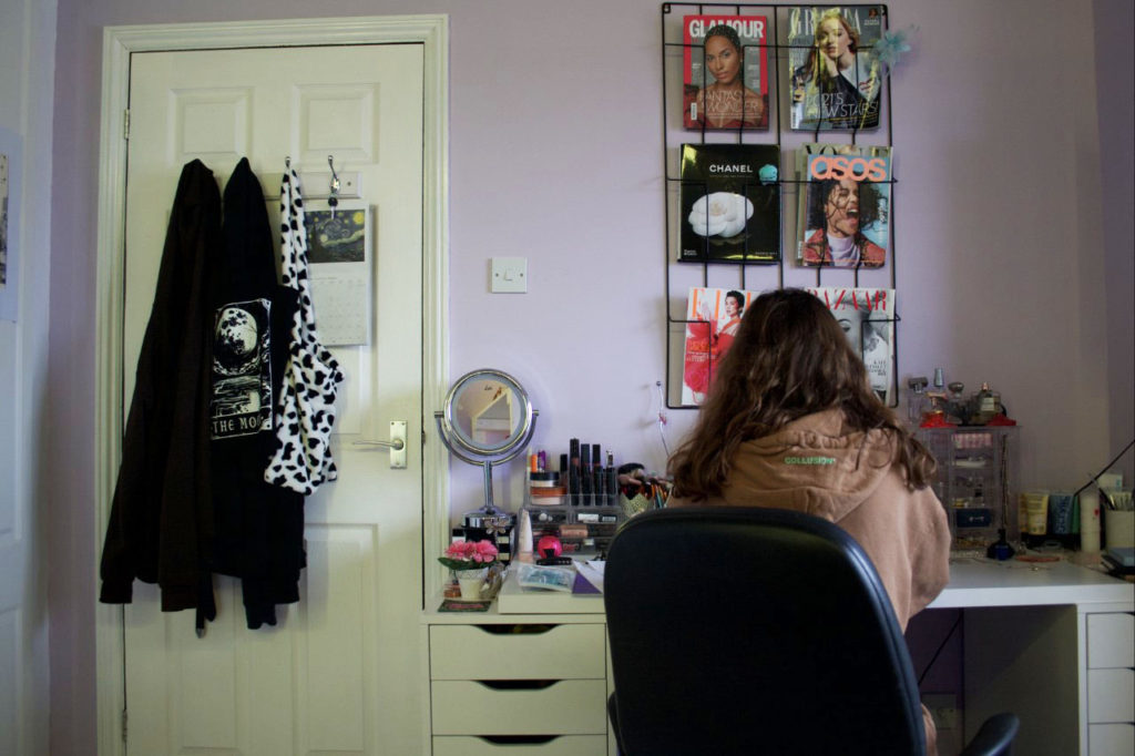
I chose these 2 images to edit :

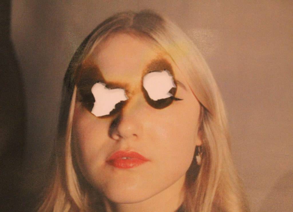
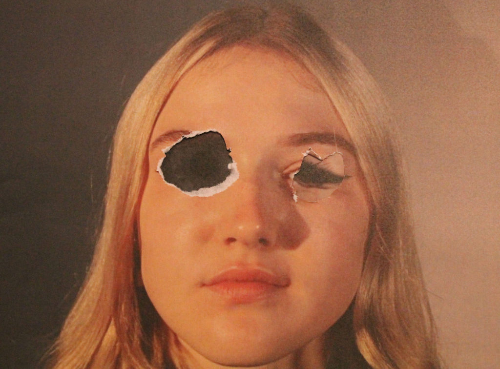
Process of editing the hole in the head.

I started off by removing the background. I used the object selection tool then select and mask option then I refined the edges to make it smooth.

I then put the background in, which was a normal cloudy day. The problem was that the subject was a different colour to the background and it didn’t match. I used the curves adjustment and used the dark colour picker to select the darkest colour in the background then put that on the darkest colour on the subject. I did this for the mid-tones and highlights. This made it so both the subject and background matched. I added gaussian blur to the background.

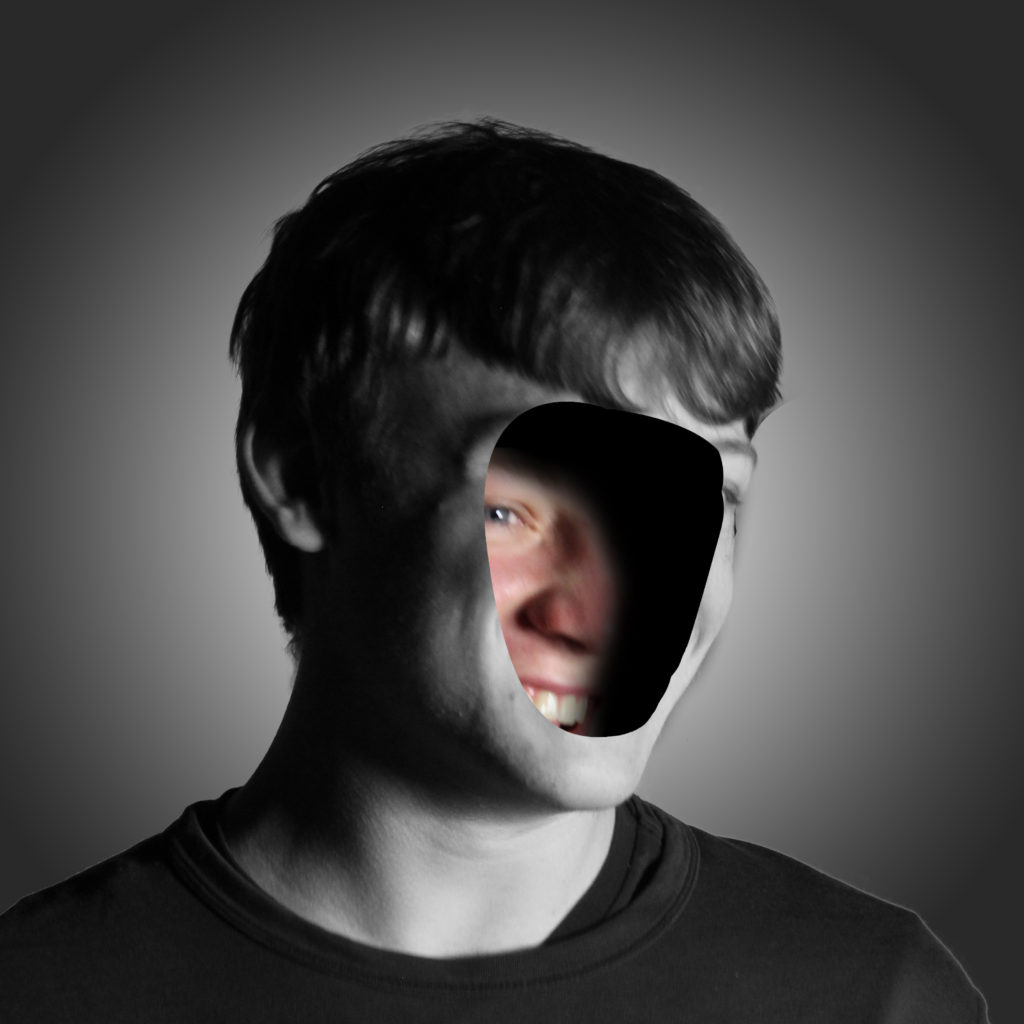
I used the pen tool to create a smooth mask of the face then I deleted the selection, which made the hole in the face effect.

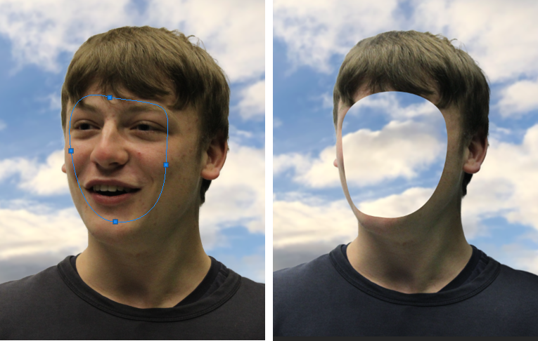
It didn’t look normal, so I used the pen tool again to create an edge, I changed the colour to a skin tone so it looked normal. Although the whole of the image was 3D except from the hole in the face.

I used the pen tool to create the second layer which signified a 3D aspect. I added a shadow by creating a clipping mask, then using a black brush tool with 0% hardness. To contrast the shadow I added highlights by using a white brush tool with 0% hardness, after I added a soft light blend option, which made it more smooth.

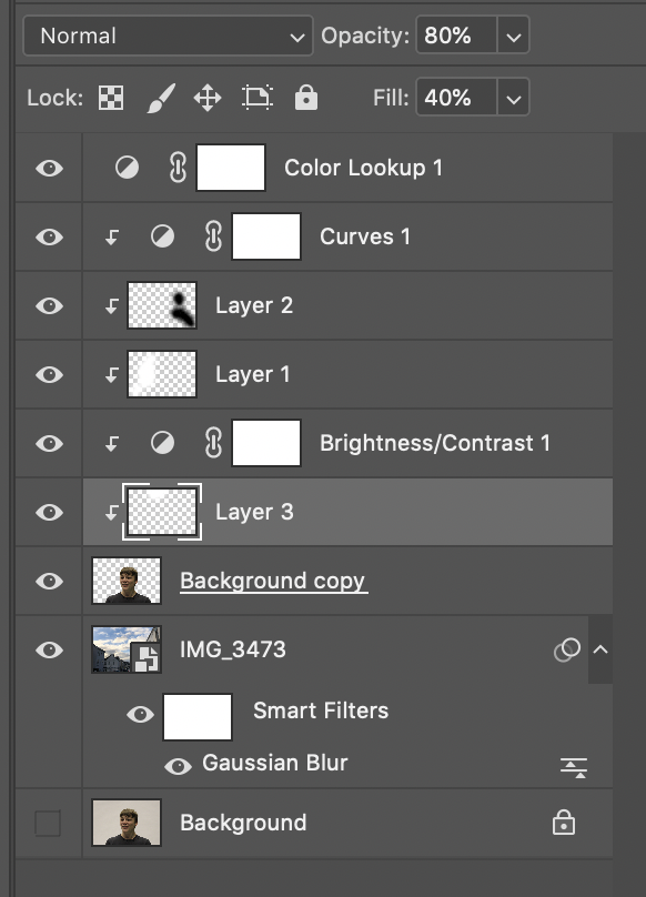
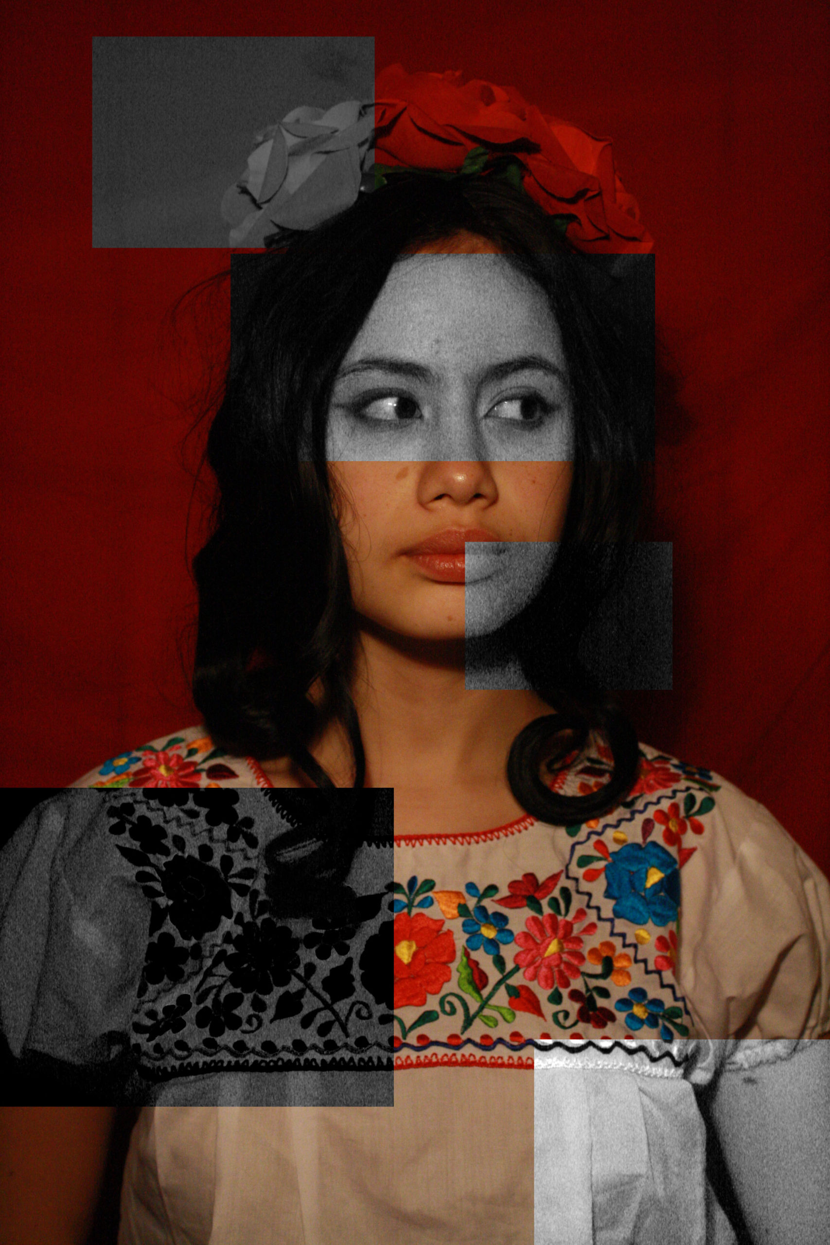
These were all the layers with adjustments, so you can see the structure.
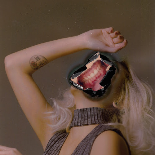
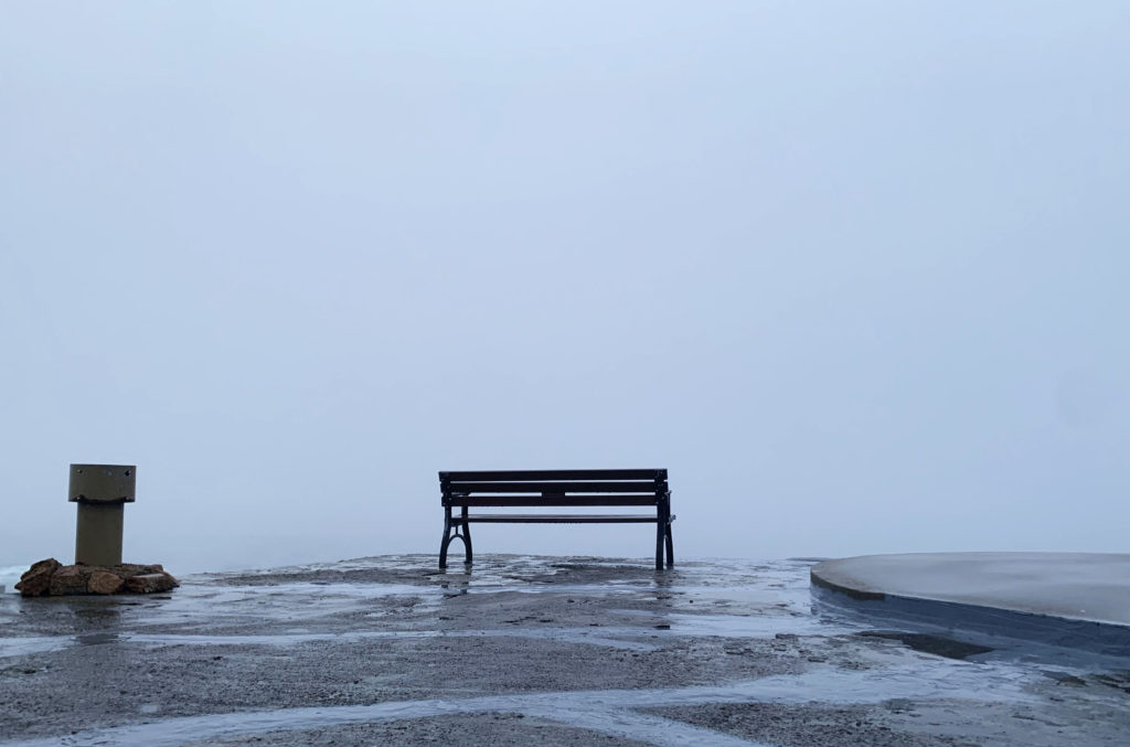
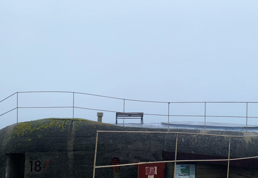
Final Image – 1

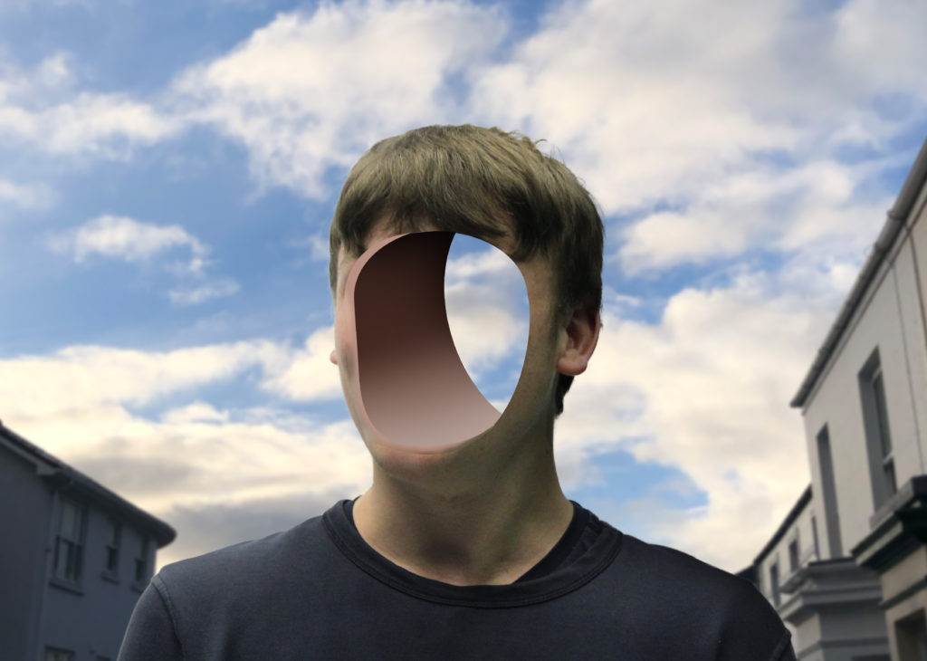
Reviewing my image, I really like how it turned out, as it is similar to Birthe Piontek’s image where he removed the face and you can see behind it. The background is clean and fits well.
I feel that the gaussian blur in the background makes you focus on the subject more.
I also like how you can clearly see through the background through the hole.

Critique

I don’t really like how the inside of the hole is fake, maybe I could of taken a sample of the skin off the face and textured the inside to make it realistic.
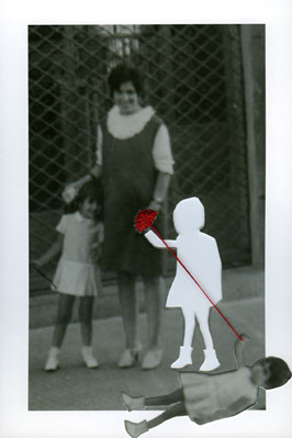
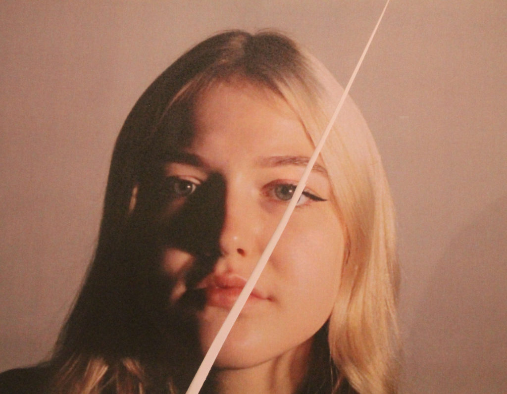
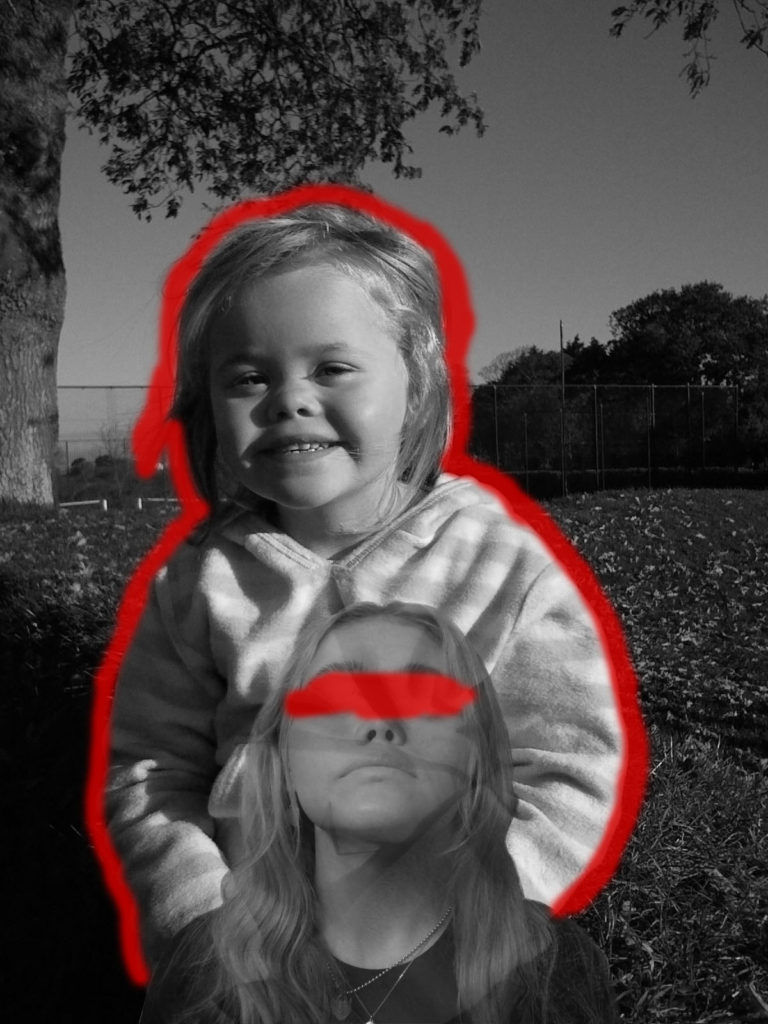
Process of editing face inside the head/off the head.

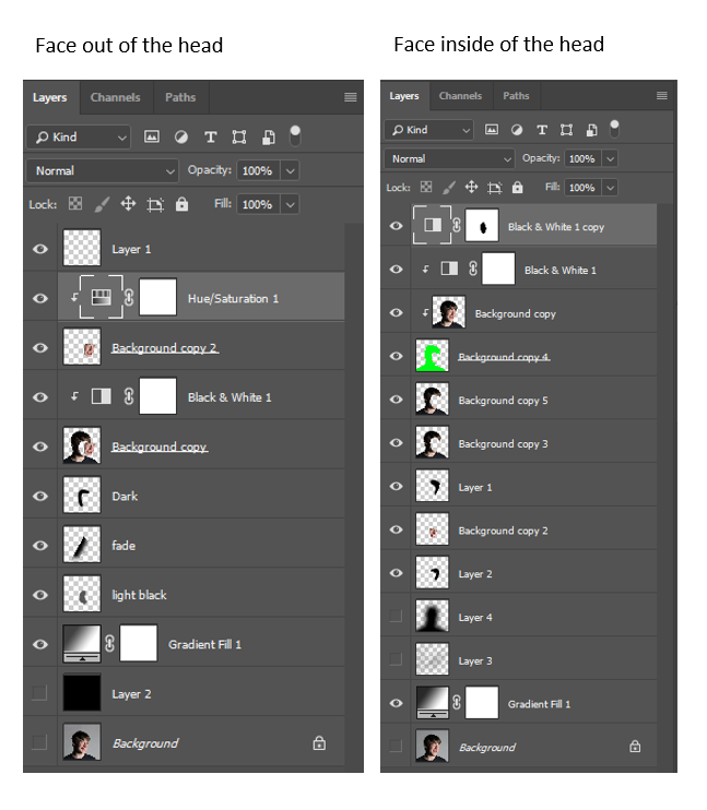
Firstly, I used the pen tool to create a clean mask selection of the face.
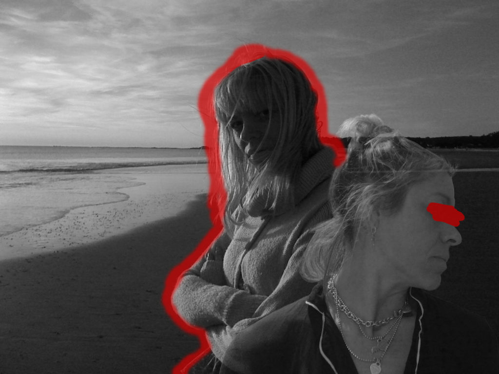
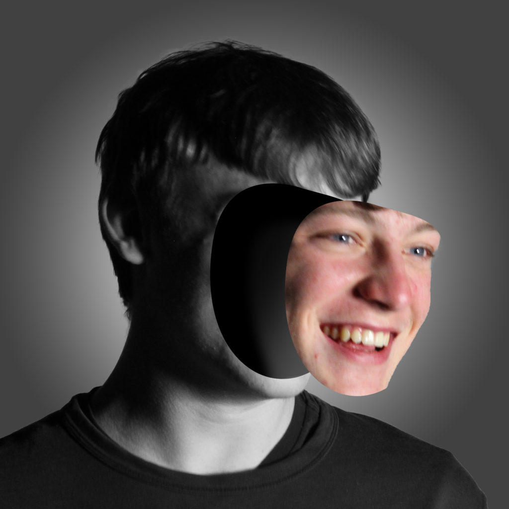
For the face inside I had to make sure that the mask wasn’t touching the edge. For the face outside the head I had to make sure that it was over the edge, to get all the side of the face. I moved the face outside the head to create the effect that it was coming off.

Next I used a black brush tool to create shadows and to blend the face into the shadows, which create a nice blend.

I used a black and white adjustment layer and put it on everything except of the mask of the face, because I think it gave a unique touch.
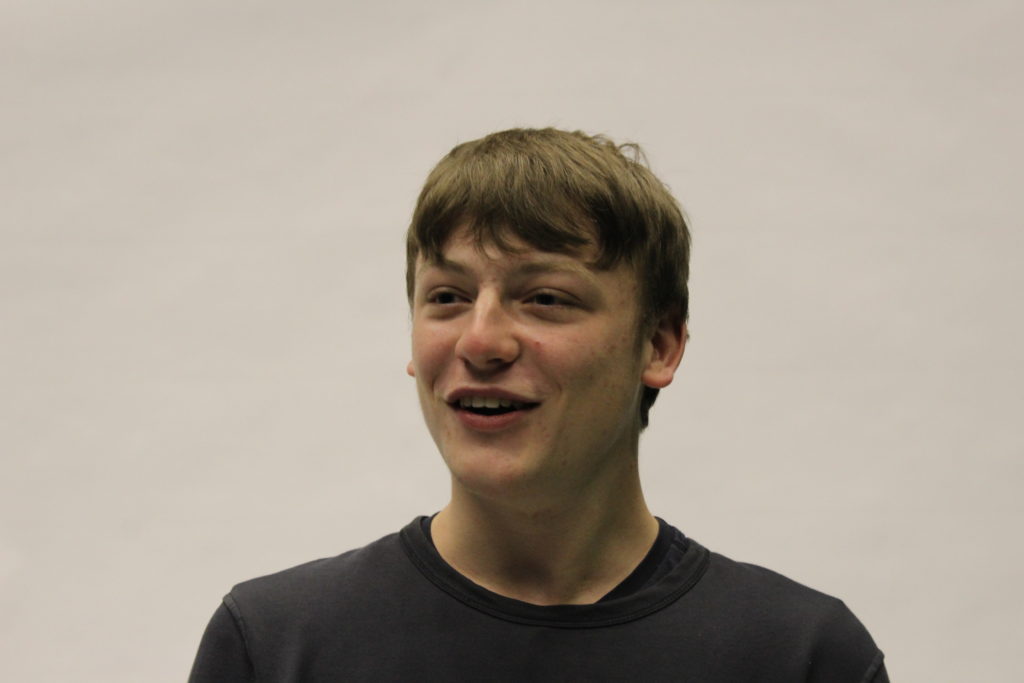
Final Images – 2

Evaluation

I like how this image turned out, as it unique and in the style of Birthe Piontek. I feel like the black and white filter works well, as the saying “showing your true colours” I think that it represents it as the face is the only coloured part in this image.
I think this image shows someone that is confident, and someone that “puts their face out there.”
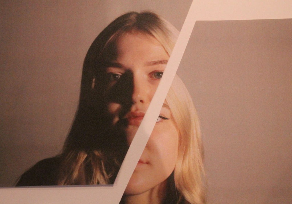
Final Image – 3

Evaluation

I think this images composition, is better. Not only is it in the same style as Birthe Piontek, but I think it shows someone that is more shy, therefore hiding their identity. It shows that as the face is hiding behind in the head.

Critique

I think the original mask of the face could be smoother as there is some ridges in the image, such as the pointy chin in the image where the face is coming off.
Also if the photo was a bit more clear, and facing towards the camera, it would be easier to mask out, instead its at an awkward angle, therefore harder to accurately mask a selection of the face.
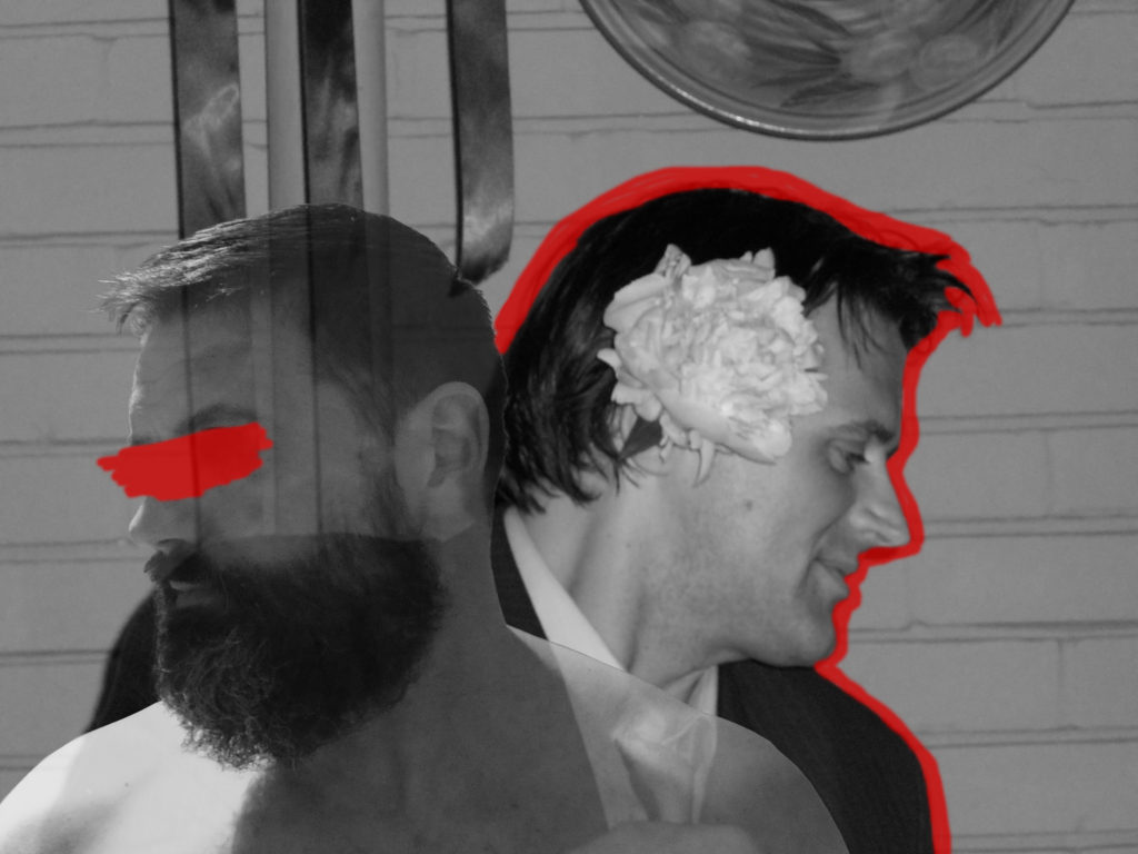
You can see how similar they are side by side.

FINAL IDENTITY

Final images

To create my final images I took photos of a fellow student. I took photos of looking dead at the camera. To create the lighting in my images I used a mixture of one point and two point lighting. This created shadows on parts of her face to add a contrast of lighting.
Once I had a good amount of images from different angles and different types of lighting, I then selected 20 images that I thought where my strongest images. I decided to merge my 2 shoots together as I felt this would give me the best outcome as I could use my strengths from both shoots.
I then printed out these images and started experimenting in ways similar to Rosanna Jones style. I cut out parts of the models face and stuck them on top of an image of her face to create an enlarged effect. This also related to Rosanna’s style of the idea of notions of embodiment. I also experimented with burning the models eyes on a piece of paper, similar to an image from Rosanna’s “Destroy” shoot. Although as my image was printed onto regular paper , not photograph paper, it created a yellow tinge to the area around the eyes.
I also decided to experiment with using colour filters and creating a ‘half and half’ visual. Although Rosanna herself did not do this, I still felt it could link to her aims of exploring visual identity as blue is seen as a colour related to boys/men and pink relating to girls/women, so using a comparison of both colours could create that uncertainty of visual identity.
Once my images were taken I adjusted there saturation and cropped them on Adobe Photoshop, but this was the only editing I had to do to my images.

I felt my process went well as I feel I came out with some strong images which relate well to my photographer. I did experiment with some images that did not turn out the way I wanted them too or how I felt they would look so I did not use those images. I tried replicating some of Rosanna’s images but also tried to be creative and come up with some of my own ideas which still relate to Rosanna’s aims.
I am pleased with all my final outcomes and feel that I have picked my strongest images from the ones taken. All my images relate to Rosanna’s

I feel as there is a strong link between my images and Rosanna Jones’ images and ideas, therefore I am confident my images represent my intention of exploring notions of embodiment and visual identity.

IDENTITY SHOOT

Initial ideas:

My shoot is based on tearing up images that society creates off how people should look and feel a certain way. My photoshoot was based off Rosanna Jones shoots “Destroy” , “Girls” and “Burn”. All of these projects focus on destroying and manipulating photos. I am going to take photos of my friend in the photography studio with artificial lighting. I will then print out selected images from my 2 shoots and manipulate the images in multiple ways. I am thinking of ripping up some images and sticking tape and objects onto the images to create images similar to the style of Rosanna Jones.

Rosanna Jones

Rosanna Jones is a photographer from London. Rosanna’s work specialises in a blend experimental blend of art and photography and celebrates the possibilities with an image. Her trademark is based on ripping up, painting over and destroying images. Her work is aimed at examining visual identity and notions of embodiment. Rosanna says that her images hold a personal meaning for her and reflects her own personal life. Jones work draws attention to the idea that a persons photo can immortalise them.


Shoot Plan:


Who – I will be photographing a fellow photography student.

Where – The photography studio, using artificial lighting.

When – During a school day, as I used artificial lighting it did not matter what the time of the day was.

Shoot 1:

Shoot 2:

Image selection

controlled conditions – identity

Carolle Benitah

French Moroccan photographer Carolle Bénitah, who worked for ten years as a fashion designer before turning to photography in 2001, explores memory, family and the passage of time.  Often pairing old family snapshots with handmade accents, such as embroidery, beading and ink drawings, Bénitah seeks to reinterpret her own history as daughter, wife, and mother.

Benitah has a series of photographs called “I Will Never Forget You”

Jamais je ne T’oublierai

She describes her family photographs as “Ghosts who follow me quietly, and I take them over to build an imaginary family album in order to repair oblivion.” …..”I am rebuilding the memory of my family that I missed, I am inventing another one made to measure where I resurrect all the ancestors who have disappeared, the territories that I did not know and that have been praised to me.”

My edits inspired by Benitah

Benitah’s image
My edit

Benitah repairs old family photos and rebuilds a memory that is missed, in her work she resurrects ancestors who have passed. I took inspiration from her work as I related to her loss of a loved one. Benitah covers the people in the pictures who will never be forgotten. She also covered parts of people related to the passed relatives to resemble that, because they died, they’ve lost a part of themselves as well.

Carolle often pairing old family snapshots with handmade accents, such as embroidery, beading and ink drawings, I took a technological approach when inspired by her work. I had my old family photograph as the background and the yellow background as another layer, used a lasso tool to select the part I wanted textured then replaced it with yellow to represent who had passed and how the family relatives notice they’re missing and the big gap in their family and their heart.

I chose to have my photo in black and white, partly to match Benitah’s work and to give it an old fashioned look, however I also chose to have it greyscale to represent the loss of brightness and colour that the passed relative gave the family’s life. She covers parts of her photos to identify absent memories, the image below was taken before i was born, therefore a time I cannot remember.

I particularly liked this image of Benitah’s as she creates the sense that all family members of the passed lost their identities when someone significant died, like they’ve lost a part of themselves. Her project “jamais je ne t’oublierai” creates the feeling of despair and sorrow which her viewers can empathise towards. Benitah’s photos are a good way of bringing back happy memories of times when the family was unite. The use of black and white emphasises the way the families life has lost it’s colour now that they’ve lost that one person. The greyscale tones also vary from light to dark and the contrast emphasises the highlights and shadows in the photograph.

Identity and Place – Final Images and Evaluation

Carolle Benitah Inspired Photoshoot

I believe my attempt at recreating Carolle Benitah’s work with the theme of identity and place was successful as you can see clear similarities between my work and the work of Benitah, and I think I executed my ideas clearly by using inspiration of Carolle Benitah but adding my own ideas and methods to the images. I decided to colour over the eyes in each image as Benitah, herself often does this and I believe it adds a sense of curiosity and mystery as to how the individual has changed throughout their past purely through their appearance, and removing the eyes removes the emotion from the face, which allows the viewer to focus on the blank expression and the change in appearance, rather than emotion or personality.

In terms of identity and place, I think my images represent this theme well as it displays the past of both my relatives and myself, and how this formed my identity. I decided to also show the past versions of my parents as they also helped to form my identity, and it also shows how their own identity has changed from their past.

Francesca Woodman Inspired Photoshoot

I decided to study Francesca Woodman’s work for this project as she focuses on the struggle of mental illness and especially depression. Myself and my family, as well as millions of others, have struggled with their mental health in different periods of time which is why I believe it is an important part of a person’s identity, as it can affect both physical and emotional aspects of someone’s identity. I decided to use Woodman’s common method of long exposure, I feel like this represents mental illness in the sense that it produces a ghost-like movement and some may say living with a mental illness is almost like a ghost living in the present world, as they can feel excluded and lonely.

I think my attempt at recreating Francesca Woodman’s work was successful as similarities can be identified, the main similarity being the use of long exposure to give the photographs an uneasy atmosphere. I also used Woodman’s theme of the monochromatic filters for the same reason.

There is also visual differences between my work and the work of Francesca Woodman, such as the natural lighting used by Woodman is slightly softer and not as bright. Her photos also contain a lot of empty space, whereas the only empty space in my images is in the sky.

If I was to re-shoot these images I would have done them in an empty building with natural, soft lighting in order to achieve the same sort of shadows that Woodman’s images display. I also believe the use of the negative space would have added to the ominous aesthetic of the images, so I would change my location in order to shoot these images again.

final images

Final images

photo that I chose:

The first two pictures are from the same shoot “Mexican identity”. This shoot helped me demonstrate one of my origins … Mexico. Why did I want to do this shoot? Since I was little my mother shows me this culture which also mine. I grew up with Spanish, Mexican music, Mexicans in their daily life … One of the famous people I knew from an early age was Frida Kahlo. She is a very famous Mexican painter and around the world. I love Frida Kahlo’s paintings. I have always admired the way Frida Kahlo expresses herself behind her paintings. She is not afraid to show her fears nor passion or her pain. I decided to take inspiration from one of her self-portraits. Not to express my feelings but to somehow honour her. To show the great pride of Mexico. The second photo is a way for me to represent the past that’s why some parts are in black and white.

The third picture is from my “multiple cultures identity” shoot. I was very lucky to have grown up Mexican cultures I was able to grow up with two completely different … Austrian and French. So for this project I had to show this part of me because is very important for me. To do that I search for traditional and stereotypes style that represents the countries I grow up in. The first (pink) I chose a short blonde wig for this photo. As accessory a crown of small pink and purple flowers and as clothing a small traditional Austrian shirt. The second one a long black wig, a wreath of large red flowers and as clothes a typical Mexican t-shirt. The third (red and blue) we can notice the famous Parisian beret that I combined with a sweater with black and white stripes. The last photo is to show me how I am, without stereotypes and traditional clothing. What I want to demonstrate with my photos and that I do not always show my cultures outside but they, as always, mentally.

Review and Reflection


I like the rendering of my photos I think I managed to interpret what I wanted to show but if it was to be done again I will focus more on small details because in presenting my work I have several ideas for the photos that I took and unfortunately I did not have the time to infiltrate these small details. What I mean by “small details” is like for example the inspirational image of Andy Warhol I would have liked to have different colours on my hair, my lips really like Andy Warhol the problem is I have think about it too late. Another problem that i have seen in my images especially my first shoot is the light. Many of my photos were quite obscure but apart from that I’m very happy with the result.

Identity and Place – Final Images

Final Images

‘Identify With What, Who and Where You Love’

I have chosen these final images due to their strong link to family identity and their reflection of my grandparents love. Additionally, I decided to subtitle this project ‘Identify With What, Who and Where You Love’ as I believe it completely encompasses my project’s aim to highlight the importance of how family relationships, childhood memories and nostalgic surroundings all have an immense impact on somebody’s identity over time.

Firstly, I chose three image sequences from my Julian Germain inspired photoshoot which feature my grandparents doing the activities they value the most. My effective use of vibrancy and colour illustrates the joy and contentment they receive from even the smallest things, such as fixing a flower arrangement or cooking up a family dinner. Furthermore, I believe my composition of these sequences powerfully alludes to the cyclical theme of love and how a certain thing one does, such as gardening, can hold so many positive memories that when its repeated over and over again it reminds us of the moments that shaped our life. I plan on positioning these three sequences in the order seen above, as each lead on from the other reflecting the changing time of day in a repetitive pattern. As my photographs document afternoon into evening, my arrangement of images grow warmer as they go on. This orange glow that surrounds each photo paints a welcoming safe atmosphere around my grandparents home, giving the impression they feel comfortable and at ease.

My final two chosen arrangements are from my David Hilliard inspired photoshoot, using multi-panel compositions to reflect specific moments of my family’s past. I selected these two arrangements due to their link to special areas of my grandparents home which remind me of my childhood as well as reminding them of theirs. The first piece shows my grandmother cooking in the kitchen, depicting her passion for providing for her loved ones. I love the way my David Hilliard inspired editing emphasises the contrast between the dark blue sky to the bright orange wall. This reflects the idea that even if its cold and dark outside, warmth and love will radiate through the home that holds my family’s memories. The second arrangement highlights the importance of place influencing identity over time- as these chairs have been around in my family for decades they echo remembrance to the moments that have shaped our lives.

Julian Germain Comparison

I have decided to compare these three images by Julian Germain to one of my favourite sequences as they hold many similarities as well as some differences. Firstly, the most obvious similarity is that both arrangements show someone either cooking, eating or drinking- reflecting the trivial aspects of everyday life. Additionally, the compositions of each image are related in the way that the first of each set shows a still life image, the second displays someone cooking and the third presents these subjects as the main focal point. Germain’s project ‘for every minute you are angry you lose 60 seconds of happiness’ has a very naturalistic candid nature, his images resonate with the observer in a way of reminding them about appreciating the small things in life. I have mirrored this idea in my images by presenting my grandparents in their home environment, conducting activities they feel talented at and proud of. This strongly links to Germain’s ideas on presenting people without self-importance and showing how what someone may see as tedious or mundane, others may pride their whole identity on. Furthermore, our pieces link in terms of repetition and theme of colour- although Germain uses a motif teal colour in his images and I have used the repetition of orange, we can still see the similarity in how colour can represent meaning. For example, the blues seen in Germain’s images create a calm serene atmosphere, reflecting his subjects contentment in life. However, the bright sunset orange tones in my sequence evoke a warm feeling from the observer and successfully radiates the hospitable atmosphere inside my grandparents home.

David Hilliard Comparison

One clear similarity between David Hilliard’s image and mine is their focus on place, an area that has obvious meaning and past. Both images show old chairs with stories behind them, connoting the idea that your identity may be influenced by the rooms in your home holding special memories from childhood, or even present normalities you anticipate seeing everyday. Hilliard’s image implies his relationship with his father is breaking down, made clear by his use of composition separating where he would sit from the rest of the room; perhaps symbolising his fathers disconnection to their life. However, as my project focuses on the positive aspects of family relationships, my image displays two chairs close together, symbolising my grandparents closeness and love for each other. Furthermore, Hilliard has captured an image with more cold colours and a central theme of emptiness, whereas I have photographed a busier image with hot colours revolving around the topic of intimacy and affection. This contrast effectively shows the difference between families identities and how they maintain or dispute relationships with each other. Moreover, there is a similarity within the lines of each image, Hilliard has captured the thin straight lines of his window which could epitomise the little family he has left. Nevertheless, I have photographed the repeated thick lines from the blinds, indicating towards my large family and strong relationships we have with one another. Although mine and David Hilliard’s work have differences, both still emphasise the theme of identity while embodying the contrast between a positive family relationship, and an negative one.

Review and Reflection

My aims and intentions for this ‘Identity and Place’ project were to reflect the importance of family relationships, love and upbringing having an effect on somebody’s identity. I wanted to capture images depicting how my grandparent’s home is a place of safety and nostalgia, holding memories of family for generations. Additionally, I wanted to explore how certain lighting choices, settings and motivations impacted the atmosphere and message of an image, I found it important to display the joyful mood of their home to mirror the positive relationship I have with my family. I believe my final outcomes successfully present identity as a concept influenced by those we love and care for. My use of candid portrait photography effectively shows the naturalism of my grandparents happiness and expresses the idea that contentment can come from the smallest of things. During my photoshoots inspired by photographers such as Julian Germain and David Hilliard, I produced images with confidence, showing the significance of our surroundings shaping our lives. I love how my images use a diverse range of camera angles, colours and perspective to solidify the idea of identity linking with family and the nostalgic memories surrounding my grandparent’s home. If I were to further develop this project, or in future projects similar to this, I would like to study painters and graphic designers as well as just photographers to explore a wider range of photographic techniques.

Identity and Place – Francesca Woodman comparison to my work

This image has an empty alt attribute; its file name is 50628.jpg
“Space 2, Providence, Rhode Island” – Francesca Woodman (1976)
My Work

I believe my work is similar to the work of Francesca Woodman but they also have their differences. They are similar in the sense that they both use the method of long exposure to capture the movement of the model in the photo in an almost ghost-like way. They both also have a monochromatic theme, which adds to the ominous atmosphere, as well as the dark coloured clothing which features in my work and the work of woodman.

However, they are different in the sense that the natural lighting used by woodman is slightly softer than the one in my photo. The setting of Francesca Woodman’s photograph is also filled with empty, negative space whereas my image contains a lot of filled, positive space. The overall composition of Woodman’s images are a lot more simple than my own, as she takes her photographs in an empty room which I did not have access to within the time limit of the project.

Identity and Place – Carolle Benitah comparison to my work

Photos-Souvenirs - Photographs and text by Carolle Benitah | LensCulture
“Pomplondin” – Carolle Benitah (from series ‘Photos-Souvenirs’ published 2016)
My Work

My recreation of Carolle Benitah’s work has both similarities and differences to Benitah’s images, for example they are similar in the sense that the images are brought to life with thin lines of colour, which juxtaposes against the monochrome background. I chose to add colour through the paintbrush tool on photoshop, whereas Benitah uses the traditional method of embroidery.

I used old family photos in my final photographs, which Benitah also uses in her work. I chose to combine my own photography into my work so I took simple portrait headshots of my mum, dad, and myself.

The main difference between my work and the work of Carolle Benitah is that I digitally edited my photographs, and Benitah edits her images physically.

If I was to do this project again I would have attempted Benitah’s method of embroidery to add colour to my photographs, as I feel like digitally editing colour onto the images removes a sense of rawness from the images, and I think the contrast in textures and patterns would have created more interest to the viewer.

Identity: Final Outcomes

Rania Matar

Image 1
Image 2
Outcome 1
Outcome 2

Both photos work with the idea of identity and I think I portrayed the topic well. I made sure that the objects and things that were around me that describe me were still viable and clear.

With both outcomes I adjusted the brightness, contrast and exposure to make sure they were brighter because when I took the photos they came out darker then I thought. In outcome 2 I also straightened the picture as it was slanted.

Both photos do not have the same undertone due to the initial lighting used however if I was to present them I would not put them together and would only keep one. Outcome 1 is more cool toned which I do not like as much because I think it makes it personal and makes the mood cold. Whereas Outcome 2 is warmer and gives it more life.

Alec Soth

Image 1
Image 2
Image 3
Outcome 1
Outcome 2
Outcome 3

All three of these photos have the same positioning of Alec Soth’s image where he has a main subject in the centre and the background is plain. I have also incorporated the split horizontally to split the images into two. The story with outcome 1 and 3 is that I wanted to portray a sense of lost identity and emptiness. The location being Corbiere has a deeper meaning that links to me personally because it is an important place to me as it reminds me of my grandparents.

When editing Outcome 1 and 3 I cropped the images so that the bench would be in the middle. On all three outcomes I adjusted the brightness, contrast, exposure and gamma correction. I made the sky brighter and adjusted the exposure of each image to make sure the sky was plain but then adjusted the contrast higher so that the land was still darker. I also adjusted the gamma correction so that the land would still have colour and not be washed out. On outcome 1 I used the clone tool to get rid of some rocks that were in the sea in the bottom left so that the background was plain.

Image 4
Outcome 4

When taking this photo I wanted to focus on the topic identity and how these images are about Corbiere and my grandparents. When they visit they sit on the bench photographed in the above image which is what I associate with the location.

I adjusted the brightness, exposure, contrast and gamma correction so that the background was lighter and clearer but the land was still clear.