Luke Gram
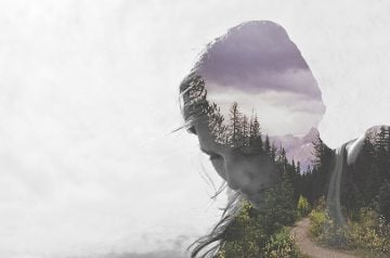
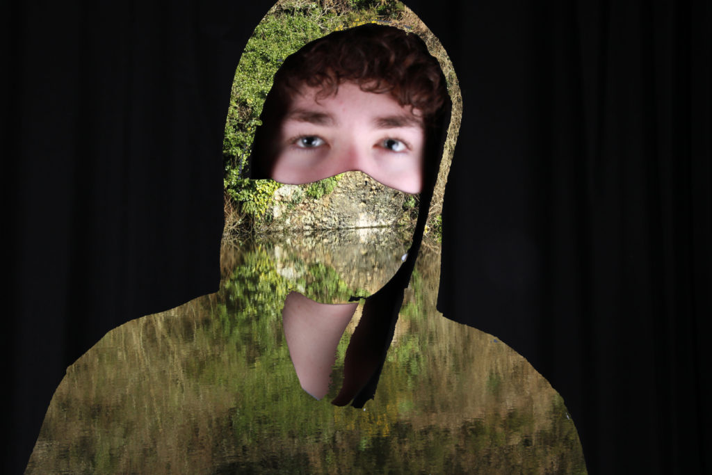
The first image shows a woman whose body is transparent showing a mystical scene of the forest, flowers and the clouds and sky. However the second shows a masked subject whose clothes and mask have been removed and replaced with a beautiful scene of still water on a lake which perfectly reflects the headland made up of stone, bushes and flowers onto the pristine water. Both of the images show a human subject and some of their body has been replaced with images of nature. Both also have plain backgrounds framing the natural images as if to prevent too much being seen and missing out the meaning and link to personal identity. However, the first image shows a forest and sky with a view of mountains in the distance. But the other image has a very short depth compared to the depth of the other image.
Evaluation of my Outcome
Overall I am happy with how my Luke Gram inspired work came out, and I believe it has both inspiration from my chosen photographer’s work but also some of my own attempt. I like the range of colours and the way all of the edits turned out. If I were to redo this photoshoot and edit I would find a good day with good weather but also with bad weather and take photos of the same things in different weather conditions. I believe this would further be useful to contrast and show personal identity and emotions.
Pablo Picasso

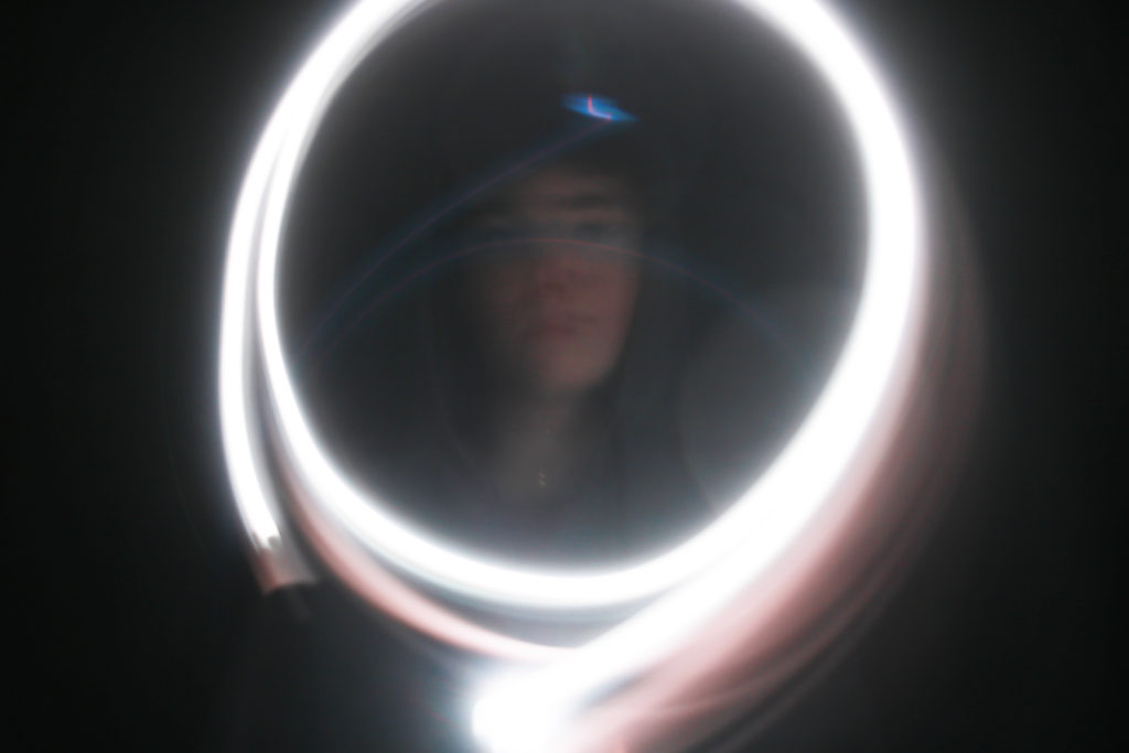
The first image shows Pablo Picasso in a small room with a small window, a drawing of a bull on an easel behind Picasso and a light drawing of the same bull in the air. The second image shows a subjects face that has been partially lit in the middle of a circle of light. Both images use light to draw in the air using a camera on a slow shutter speed. The first image has a longer depth because it was taken in a lit room compared to the second. The second image has been taken in a dark room with the only source of light being the apparatus used to make the drawings with the light.
Evaluation
With my take on Pablo Picasso’s light drawing’s, I am quite happy with the way it turned out but I know how I could improve if a redid the photoshoot. I like how all the photos came out and my favourite was the image that resembles a mirror of light with my face being framed in the centre. This image turned out better than I thought and really captures both Picasso’s way of expressing identity and my personal identity. If I redid the photoshoot I would take a wider variety of photos and drawings and use a different range of colours.
Kensuke Koike
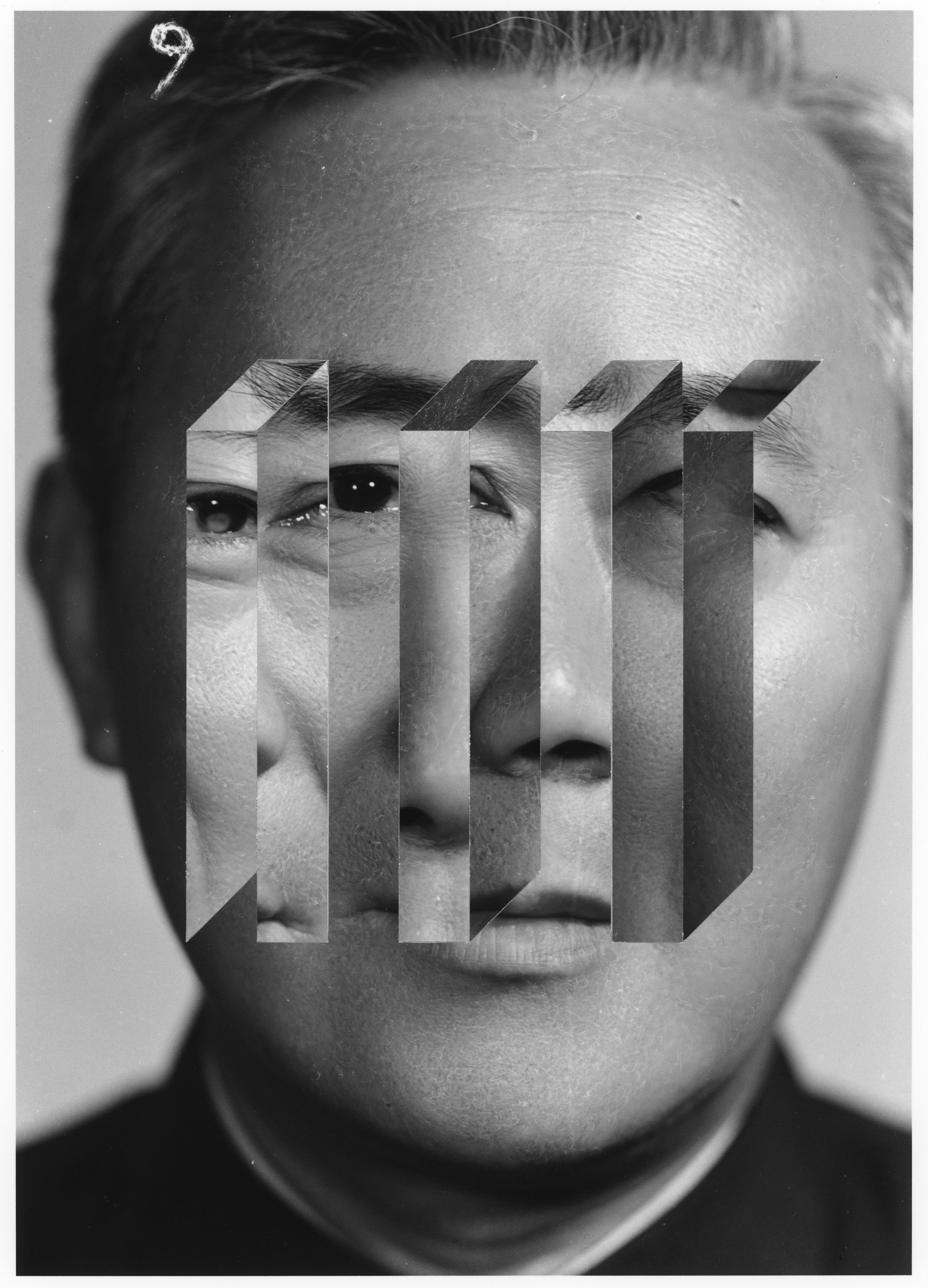
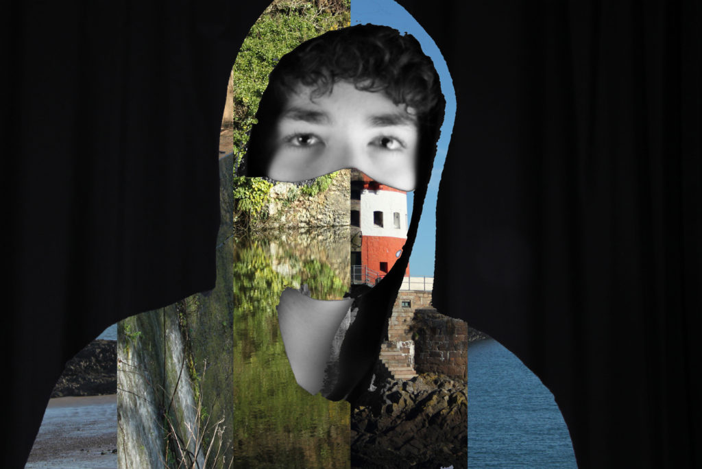
The first image shows a mans face in black and white with sections of another individuals facial features added to the image. The second image shows a subject wearing a mask and jumper that has been replaced with a combination of different images whose face and neck are in black and white. Both have sections of different images on them that shouldn’t be there and don’t match and both images have black and white facial features. Both images have a fairly short depth of field. However the first image is only in black and white compared to both colour and black and white in the second.
Evaluation
Personally, I am happy with the way my take on Kensuke Koike’s representation of identity. I like the image above because it resembles Kensuke’s work and shows many different portions of images that fit together. It captures the general method of slicing portions of different images and putting them together to shows a variety of different settings. If I redid the photoshoot I would go to a wider variety of locations to take photos and use many more photos and rectangles to show different settings.

Ollie you’re growing in confidence but in future ensure your development of ideas are sustained and informed by the work of other photographers and remain focused on the theme ‘identity’. In addition ensure that your final outcome realises your initial intentions and that you comment thoroughly on this in your evaluation.